Applied Data Science from Scratch
Welcome to Applied Data Science from Scratch — a hands-on, project-driven course that takes you from the fundamentals of Python all the way through deep learning and natural language processing.
This course is designed for learners who want to build real, working data science skills — not just read about them. Every concept is paired with runnable code, real datasets, and practical exercises.
This course is constantly being improved. If you have any suggestions or want to reach out for mentorship or a workshop please feel free to reach out.
What This Course Covers
Data science sits at the intersection of programming, statistics, and domain knowledge. This course builds all three:
- Programming foundations — Python, data structures, and working with data libraries
- Data skills — cleaning, transforming, visualizing, and querying data
- Machine learning — from classic algorithms to deep learning and language models
- Applied practice — case studies and capstone projects that mirror real-world workflows
By the end of this course, you will be able to take a raw dataset, explore and clean it, engineer features, train and evaluate models, and communicate your results clearly.
Course Structure
The course is organized into 17 modules. Modules 1–7 build the foundations. Modules 8–17 apply those foundations to progressively more advanced machine learning topics, with case studies at key milestones.
| Module | Title | Topics |
|---|---|---|
| 01 | Introduction to Data Science | The data science workflow, Google Colab, GitHub, AI pair programming |
| 02 | Introduction to Python for Data Science | Variables, functions, strings, lists, dictionaries, objects |
| 03 | Manipulating Data with Pandas | DataFrames, reading and writing data, selecting, mapping, grouping |
| 04 | Data Visualization | Matplotlib, Plotly, chart types and best practices |
| 05 | Exploratory Data Analysis | Summary statistics, histograms, box plots, correlation, outliers |
| 06 | Relational Databases | SQL, SQLite, querying, joins, SQL + Python integration |
| 07 | Introduction to Machine Learning | The ML workflow, supervised vs. unsupervised, feature engineering |
| 08 | Case Study: House Rental Dataset | End-to-end EDA, cleaning, and feature engineering on real data |
| 09 | Machine Learning: Classification | Binary, multi-class, and multi-label classification |
| 10 | Case Study: Mushroom Identification | Full classification pipeline from EDA to model selection |
| 11 | Machine Learning: Regression | Linear regression, polynomial regression, regularization, evaluation |
| 12 | Capstone I: Regression | Student-directed regression project on a dataset of your choice |
| 13 | Understanding ML Models | kNN, SVM, Random Forests, Gradient Boosting, Neural Networks |
| 14 | Deep Learning | Keras, convolutional networks, recurrent networks, optimization |
| 15 | Natural Language Processing | Text preprocessing, embeddings, transformers, NLP workflows |
| 16 | Case Study: Sentiment Analysis | Deep learning applied to sentiment classification |
| 17 | Final Capstone | End-to-end project combining skills from the entire course |
Notebooks
This course includes 144 Jupyter notebooks across all 17 modules. Each lesson comes with:
- A starter notebook — a partially complete notebook for you to work through
- A practice notebook — worked examples you can reference and run
- A solution notebook — a complete reference for module assessments
All notebooks are designed to run in Google Colaboratory with no local setup required.
Module Assessments and the AI Grader
Each module ends with a Module Assessment — a coding challenge in a Jupyter notebook that tests the skills covered in that module.
You can submit your completed assessment notebooks to the AI Grader for instant feedback. The AI Grader reviews your code, checks your outputs, and provides specific, actionable feedback so you can improve before moving on.
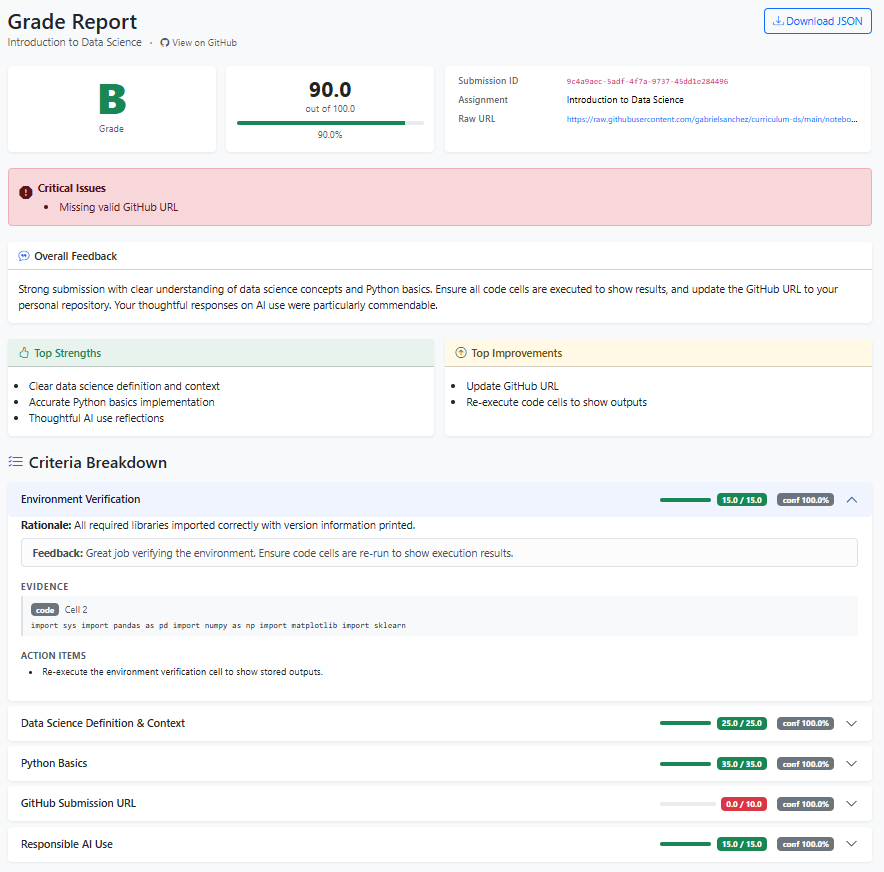
To use the AI Grader:
- Complete your module assessment notebook.
- Visit https://ai-grader-production-07a3.up.railway.app/.

- Paste your notebook's Github URL. Select the module and submit.
- Review the feedback and revise as needed.
How to Use This Course
Work through the modules in order. Each module builds on the previous one, and the case studies assume you have completed the preceding content.
Within each module:
- Read through the lesson pages in the book.
- Open the corresponding starter notebook in Google Colab.
- Complete the exercises in the lesson practice notebook.
- Complete the module assessment and submit it to the AI Grader.
License
This work is licensed under a Creative Commons Attribution-NonCommercial 4.0 International License (CC BY-NC 4.0).
Introduction to Data Science
This module sets the foundation for everything that follows. Before writing a line of data analysis code, you need to understand what data science is, how practitioners work, and how to set up the tools and workflows that make that work possible.
The module introduces the data science workflow — from raw data to insight — and establishes the professional habits (version control, reproducible notebooks, and AI collaboration) that will serve you throughout this course and in practice.
Lessons
- Intro to Data Science — What data science is, the roles within the field, and an overview of the end-to-end data science workflow.
- Intro to Google Colab and Jupyter Notebooks — The notebook environment used throughout this course: cells, markdown, code execution, and working with files in Colab.
- Setting Up GitHub — Version control for data scientists: creating a GitHub account, initializing a repository, and committing your notebooks.
- Pair Programming with AI — How to use AI coding assistants effectively: prompting strategies, reviewing AI output, and when to trust versus question suggestions.
- Module Assessment — A hands-on notebook assessment covering the tools and concepts introduced in this module.
Intro to Data Science
Overview
Welcome to the Data Science curriculum. This is the first lesson of the first module, and its job is to answer a single question before any code is written: what is data science, and why does it matter? By the end of this lesson, you'll understand what data scientists actually do, how the field fits into the broader landscape of technology and business, and what the journey through this curriculum will look like.
Learning Objectives
By the end of this lesson, you will have learned how to:
- Understand core data science concepts and typical tasks.
- Recognize the data science lifecycle (data collection, cleaning, analysis, visualization, modeling, deployment).
Key Terms
Data science: An interdisciplinary field that uses programming, statistics, and domain knowledge to extract insights and build predictive systems from data.
Data: Raw, recorded observations — numbers, text, images, clicks, sensor readings, or any other machine-readable information.
Dataset: A structured collection of data, typically organized as rows (observations) and columns (variables or features).
Feature: An individual measurable variable used as input to an analysis or model. Also called a predictor, attribute, or column.
Label (target): The output variable being predicted or explained — for example, whether a patient has a disease, or the price of a house.
Model: A mathematical function, learned from data, that maps inputs to predictions or decisions.
Algorithm: The step-by-step procedure used to learn a model from data (e.g., linear regression, decision tree).
Exploratory Data Analysis (EDA): The process of examining a dataset to understand its structure, distributions, and relationships before building models.
Pipeline: An ordered sequence of data processing steps — from raw data through cleaning, feature engineering, modeling, and evaluation.
Insight: A meaningful, actionable conclusion drawn from data that informs a decision.
Introduction
Every day, enormous amounts of data are generated — by sensors, transactions, social media, medical devices, satellites, and millions of connected devices. This data is valuable, but only if someone can make sense of it.
Data science is the field dedicated to extracting meaning from data. It combines three areas of expertise:
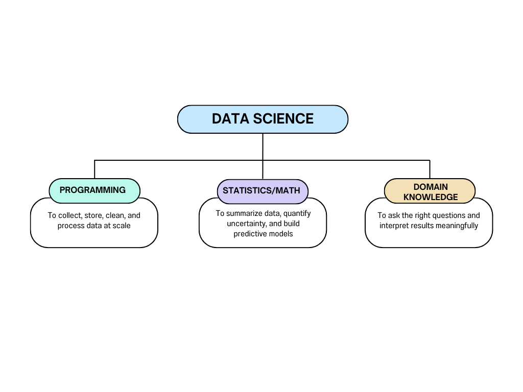
No one is equally strong in all three areas — and that's fine. Teams of data scientists, engineers, and domain experts collaborate on real projects.
What Data Scientists Actually Do
The romanticized image of a data scientist as someone who builds neural networks all day is misleading. In practice, the work looks more like this:
| Activity | Approximate time spent |
|---|---|
| Finding and collecting data | 15% |
| Cleaning and preparing data | 45% |
| Exploratory analysis | 20% |
| Building and evaluating models | 10% |
| Communicating results | 10% |
The most important and time-consuming part of data science is data preparation — not modeling. A mediocre model on excellent data almost always outperforms an excellent model on bad data.
The Data Science Lifecycle
Every data science project — regardless of domain — follows a similar sequence of steps. Understanding this lifecycle is more important than knowing any specific algorithm:
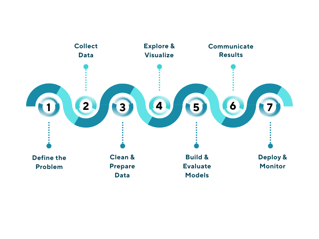
This is not a rigid waterfall — you'll often cycle back. Data analysis reveals cleaning problems. Model evaluation reveals missing features. Stakeholder feedback reframes the problem. The lifecycle is iterative.
Step 1: Define the Problem
Before touching data, answer:
- What question are you trying to answer?
- What does a successful answer look like?
- How will the result be used, and by whom?
A vague question produces a vague result. "Improve customer satisfaction" is not a data science problem. "Predict which customers will churn in the next 30 days" is.
Step 2: Collect Data
Data comes from many sources: databases, APIs, surveys, sensors, public datasets, or web scraping. Collecting the right data — enough of it, representative of the problem — is often harder than it sounds.
Step 3: Clean & Prepare Data
Raw data is almost never ready for analysis. Missing values, duplicate rows, inconsistent formatting, wrong data types, and irrelevant columns all need to be addressed before meaningful analysis can begin.
Step 4: Explore & Visualize
EDA is the stage where you look at the data before drawing conclusions — examining distributions, spotting outliers, understanding relationships between variables, and generating hypotheses. Visualization is the primary tool.
Step 5: Build & Evaluate Models
In supervised learning, you train a model on labeled data and evaluate it on held-out examples it hasn't seen. Model selection, feature engineering, and rigorous evaluation are the core activities here.
Step 6: Communicate Results
A finding no one acts on has no value. Data scientists communicate results through reports, dashboards, presentations, and visualizations — translating technical findings into business language.
Step 7: Deploy & Monitor
A model in production needs to be monitored. Data distributions shift over time. Model performance degrades. Deployment is not the end of the project — it's the beginning of a maintenance responsibility.
Roles in the Field
Data science is broad enough to support many specializations:
| Role | Focus |
|---|---|
| Data Analyst | SQL, dashboards, business reporting, descriptive statistics |
| Data Scientist | End-to-end pipeline: EDA, modeling, communication |
| Machine Learning Engineer | Building and deploying production ML systems |
| Data Engineer | Pipelines, databases, infrastructure for data at scale |
| Research Scientist | Novel algorithms, academic publication, deep technical work |
This curriculum is primarily focused on data science — the end-to-end generalist role that spans analysis, modeling, and communication.
The Tools You'll Use
Throughout this curriculum, you'll work with a specific set of tools. All are free, widely used in industry, and run in your browser:
| Tool | Purpose |
|---|---|
| Python | The primary programming language for data science |
| Pandas | Data manipulation and analysis |
| Matplotlib / Seaborn / Plotly | Data visualization |
| scikit-learn | Machine learning algorithms and preprocessing |
| Google Colab | Browser-based Jupyter notebooks with free GPU access |
| GitHub | Version control and code sharing |
You don't need to install anything. All work in this course is done in Google Colab — a free, cloud-based Python environment that runs in your browser.
What This Course Covers
This course is structured as a progression from fundamentals to advanced topics:
| Module | Content |
|---|---|
| 01 | Introduction to Data Science (this module) |
| 02 | Python for Data Science |
| 03 | Pandas — Data Manipulation |
| 04 | Data Visualization |
| 05 | Exploratory Data Analysis |
| 06 | Relational Databases and SQL |
| 07 | Introduction to Machine Learning |
| 08–10 | Applied Case Studies |
| 11–12 | Regression |
| 13 | Advanced ML Models |
| 14 | Deep Learning |
| 15 | NLP |
| 16–17 | Capstone Projects |
Each module builds on the previous ones. The skills compound.
Conclusion
Data science is the practice of turning raw data into understanding, prediction, and decisions. It combines programming, statistics, and domain expertise through a repeatable lifecycle: define the problem, collect and clean data, explore, model, communicate, and deploy. The field is broad — data analysts, data scientists, ML engineers, and data engineers all operate within it. This curriculum will take you from the beginning of that journey to a point where you can independently tackle real data problems. In the next lesson, you'll set up the primary tool you'll use for all hands-on work: Google Colab and Jupyter Notebooks.
Practice
Knowledge Check
Intro to Google Colab and Jupyter Notebooks
Overview
In the previous lesson, you learned what data science is, what the field looks like in practice, and what this curriculum covers. Now it's time to set up the environment where all of your hands-on work will happen. In this lesson, you'll learn how to use Google Colab — a free, browser-based coding environment built on top of Jupyter Notebooks. You'll learn how to create and run notebooks, work with code and text cells, install libraries, and save your work. These are the mechanical skills that underpin every coding lesson in this curriculum.
Learning Objectives
By the end of this lesson, you will have learned how to:
- Set up and navigate Google Colab/Jupyter Notebooks.
- Execute code cells, manage notebook files, and install necessary libraries.
Key Terms
Jupyter Notebook: An interactive document format that combines live code, text, equations, and visualizations in a single file (.ipynb). The standard format for data science work.
Google Colab (Colaboratory): A free, cloud-hosted Jupyter Notebook environment provided by Google. Requires no local installation and includes free access to CPU and GPU compute.
Cell: The basic unit of a notebook. Each cell is either a code cell (runs Python) or a markdown cell (displays formatted text).
Kernel: The computational engine that executes the code in a notebook. In Colab, the kernel runs on a Google server. "Restarting the kernel" clears all variables and resets the runtime.
Runtime: Colab's term for the virtual machine and kernel assigned to your session. Runtimes disconnect after a period of inactivity.
Markdown: A lightweight markup language for formatting text using simple symbols (e.g., **bold**, # Heading, - bullet).
Magic command: A special Jupyter command prefixed with ! or % that interacts with the shell or notebook environment rather than executing Python (e.g., !pip install pandas).
Introduction
Every lesson in this curriculum has a companion notebook hosted in Google Colab. When you click a "Colaboratory notebook" link in any lesson, it opens a pre-configured notebook where you can run the lesson's code, modify it, and experiment freely.
Google Colab is free to use, requires no installation, and runs entirely in your browser. The only requirement is a Google account.
Opening Google Colab
Navigate to colab.research.google.com. You'll see a welcome dialog with options to:
- Open a recent notebook
- Open from Google Drive
- Open from GitHub
- Create a new notebook
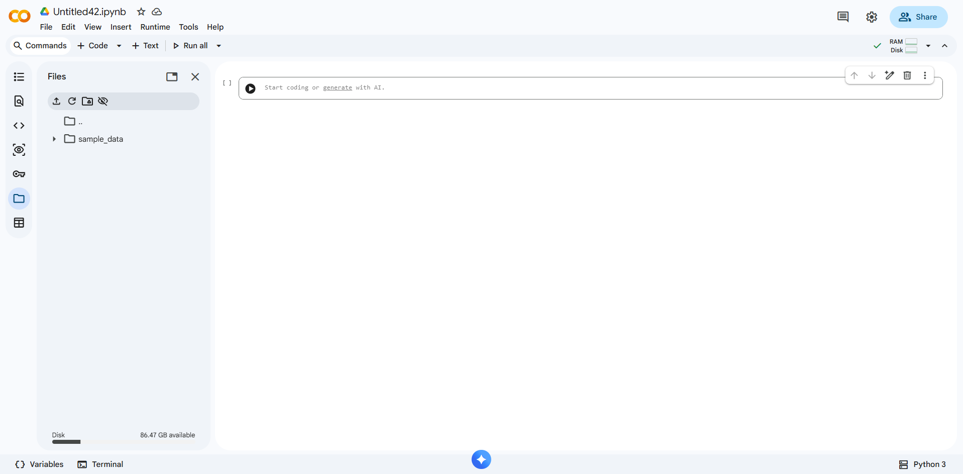
Select New notebook to create a blank notebook. A new tab will open with a single empty code cell.
The Notebook Interface
A Colab notebook has three main areas:
┌─────────────────────────────────────────────────┐
│  File  Edit  View  Insert  Runtime  Tools  Help │  ← Menu bar
├──────┬──────────────────────────────────────────┤
│      │  + Code   + Text                         │  ← Add cell buttons
│ File │  ─────────────────────────────────────── │
│  Nav │  [ ] Code cell                           │  ← Active cell
│      │                                          │
│      │  [ ] Code cell                           │
│      │                                          │
│      │  ─── Markdown cell ───────────────────── │
└──────┴──────────────────────────────────────────┘
- Menu bar: File operations, runtime control, settings
- + Code / + Text: Add a new code or markdown cell below the selected cell
- Cells: The content area where you write and run code or formatted text
Code Cells
A code cell runs Python. Click inside a cell and type Python code:
print("Hello, data science!")
2 + 2
Run a cell by:
- Pressing Shift + Enter (runs and moves to the next cell)
- Pressing Ctrl + Enter (runs and stays on the same cell)
- Clicking the ▶ play button to the left of the cell
Output appears directly below the cell:
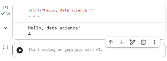
The last expression in a cell is displayed as output automatically — you don't need print() for simple values.
Markdown Cells
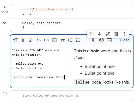
A markdown cell displays formatted text — headings, bullet points, bold, code snippets, and mathematical formulas. Double-click any markdown cell to edit it.
# This is a heading

This is a **bold** word and this is *italic*.

- Bullet point one
- Bullet point two

`inline code` looks like this.
Shift + Enter renders the markdown. Markdown cells are used for section titles, explanations, and documentation — a well-organized notebook alternates code and markdown to tell a story.
Essential Keyboard Shortcuts
| Action | Shortcut |
|---|---|
| Run current cell | Shift + Enter |
| Run cell, stay on cell | Ctrl + Enter |
| Add code cell below | Ctrl + M, B |
| Add code cell above | Ctrl + M, A |
| Delete selected cell | Ctrl + M, D |
| Switch cell to Markdown | Ctrl + M, M |
| Switch cell to Code | Ctrl + M, Y |
| Comment/uncomment | Ctrl + / |
| Undo | Ctrl + Z |
Variable Persistence
Variables defined in one cell are available in all subsequent cells — they persist in the kernel's memory for the entire session:
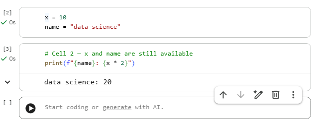
Important: Cells can be run in any order, and variables reflect the last time each cell was executed — not the order they appear on screen. Always run cells top-to-bottom when starting fresh to avoid confusion.
Restarting the Runtime
If something goes wrong — variables are in an unexpected state, a library import failed, or memory is full — restart the kernel to get a clean slate:
- Runtime → Restart runtime (clears all variables, keeps notebook content)
- Runtime → Restart and run all (clears variables and reruns every cell from top to bottom)
After a restart, you must rerun all cells from the beginning.
Installing Libraries
Colab comes with many data science libraries pre-installed (pandas, numpy, matplotlib, seaborn, scikit-learn). If you need a library that isn't included, install it with !pip install:
!pip install plotly
The ! prefix runs a shell command rather than Python. The installation applies only to the current runtime session — if the runtime restarts, you'll need to install again.
Check which version of a library is installed:
import pandas as pd
print(pd.__version__)
Mounting Google Drive
By default, Colab notebooks cannot access files on your Google Drive. To read or write files (like CSV datasets), mount your Drive:
from google.colab import drive
drive.mount("/content/drive")
A pop-up will ask you to authorize access. After mounting, your Drive is accessible at /content/drive/My Drive/:
import pandas as pd

# Read a CSV from Google Drive
df = pd.read_csv("/content/drive/My Drive/my_dataset.csv")
print(df.head())
Uploading Files Directly
For quick uploads without mounting Drive, use the built-in file picker:
from google.colab import files

uploaded = files.upload()   # Opens a file picker dialog
After uploading, the file is accessible by name in the current session:
import pandas as pd
df = pd.read_csv("my_dataset.csv")
Saving Your Notebook
Colab autosaves to Google Drive. You can also save manually:
- File → Save (
Ctrl + S) — saves to Drive - File → Download → Download .ipynb — saves a local copy of the notebook file
- File → Save a copy in GitHub — pushes the notebook directly to a GitHub repository (covered in the next lesson)
Notebooks are saved as .ipynb files — JSON documents that store your code, outputs, and markdown together.
Checking Your Setup
Run the following cell to confirm that the core libraries are available and print their versions:
import sys
import pandas as pd
import numpy as np
import matplotlib
import sklearn

print(f"Python:      {sys.version.split()[0]}")
print(f"pandas:      {pd.__version__}")
print(f"numpy:       {np.__version__}")
print(f"matplotlib:  {matplotlib.__version__}")
print(f"scikit-learn:{sklearn.__version__}")
If all five lines print without error, your environment is ready.
Conclusion
Google Colab is the environment you'll use for every hands-on exercise in this curriculum. You now know how to create and run notebooks, work with code and markdown cells, install libraries, load files, and save your work. These are the mechanical foundations — get comfortable with them early, and they'll become second nature. In the next lesson, you'll learn how to use GitHub to save, version, and share your notebooks.
Practice
Knowledge Check
Setting Up GitHub
Overview
In the previous lesson, you set up Google Colab and learned how to create, run, and save notebooks. Now you need a place to store and share your work outside of Google Drive — somewhere that tracks changes over time, lets you collaborate with others, and serves as a portfolio of your projects. That place is GitHub. In this lesson, you'll create a GitHub account, understand the basics of Git version control, and learn how to save your Colab notebooks directly to a GitHub repository.
Learning Objectives
By the end of this lesson, you will have learned how to:
- Initialize a GitHub repository and understand basic Git commands (clone, commit, push).
- Manage code versions and collaborate via pull requests. Save notebooks to GitHub.
Key Terms
Git: A distributed version control system that tracks changes to files over time. Git is the underlying technology; GitHub is a website that hosts Git repositories.
GitHub: A cloud platform for hosting Git repositories, sharing code, and collaborating on projects. The industry standard for open-source and professional software development.
Repository (repo): A directory tracked by Git. Contains your files and the complete history of every change made to them.
Commit: A saved snapshot of your repository at a specific point in time. Every commit has a message describing what changed.
Branch: A parallel version of a repository. The default branch is called main. Branches let you develop new features without affecting the stable version.
Clone: Copying a remote repository (from GitHub) to your local machine or Colab session.
Push: Sending your local commits to the remote repository on GitHub.
Pull: Fetching and merging changes from the remote repository into your local copy.
Pull request (PR): A GitHub feature for proposing changes. You push changes to a branch, open a PR, and collaborators review before merging into main.
README: A markdown file (README.md) at the root of a repository that describes the project. GitHub displays it automatically on the repository's homepage.
Introduction
Every notebook you build in this curriculum should be saved to GitHub. This gives you:
- Backup — your work is never lost if your Colab session disconnects
- Version history — you can see exactly what changed and when
- Portfolio — recruiters and collaborators can see your projects
- Collaboration — teammates can contribute and review your work
Git can feel intimidating at first — but for data science notebooks, you only need about five commands, which you'll learn in this lesson.
Step 1: Create a GitHub Account
- Go to github.com
- Click Sign up and follow the prompts
- Choose a professional username — this becomes part of your public profile URL (e.g.,
github.com/yourusername) - Verify your email address
Step 2: Create Your First Repository
A repository holds one project — typically one directory of related files.
- On GitHub, click the + icon (top right) → New repository
- Name it something descriptive, e.g.,
data-science-course - Set it to Public (so it's viewable as a portfolio)
- Check Add a README file
- Click Create repository
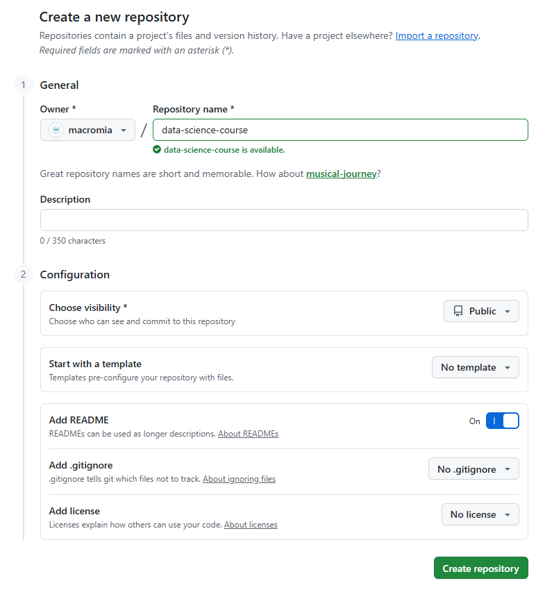
Your new repository is now live at https://github.com/yourusername/data-science-course.
Step 3: Save a Colab Notebook to GitHub
The easiest way to save a notebook from Colab to GitHub is through the built-in integration:
- Open your notebook in Colab
- Go to File → Save a copy in GitHub
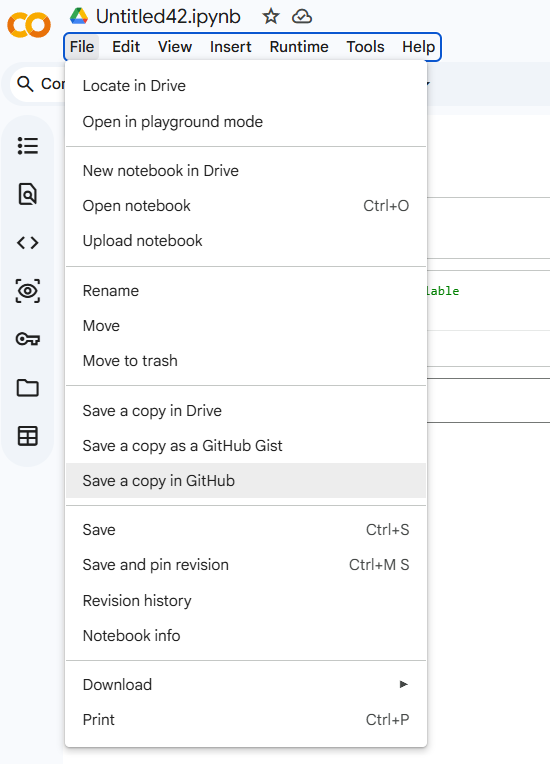
- Authorize GitHub access if prompted (first time only)
- Select your repository and branch (use
main) - Add a commit message describing what you're saving (e.g.,
"Add Module 1 notebook") - Click OK
The notebook (.ipynb file) will appear in your repository. Refresh your GitHub repository page to see it.
Understanding Git: The Core Workflow
Behind the scenes, every save to GitHub involves the same three-step pattern:
1. Make changes to files
        ↓
2. git add    — stage the changes you want to commit
        ↓
3. git commit — save a snapshot with a message
        ↓
4. git push   — send commits to GitHub
You can also perform these steps directly in Colab using the terminal (via the shell ! prefix):
# In a Colab code cell — configure Git with your identity (first time only)
!git config --global user.email "you@example.com"
!git config --global user.name "Your Name"
# Clone your repository into the Colab session
!git clone https://github.com/yourname/data-science-curriculum.git
# Move into the repository directory
import os
os.chdir("data-science-curriculum")
# Copy your notebook into the repo folder, then stage, commit, and push
!git add my_notebook.ipynb
!git commit -m "Add Module 1 practice notebook"
!git push origin main
Note: Pushing via HTTPS will prompt for a username and password. Use a Personal Access Token (PAT) instead of your password — generate one at
GitHub → Settings → Developer Settings → Personal Access Tokens.
Essential Git Commands
| Command | What it does |
|---|---|
git clone <url> | Copy a remote repository to your machine or session |
git status | Show which files have changed or are staged |
git add <file> | Stage a file for the next commit |
git add . | Stage all changed files |
git commit -m "message" | Save a snapshot with a descriptive message |
git push origin main | Send commits to the main branch on GitHub |
git pull | Fetch and merge remote changes into your local copy |
git log | Show the commit history |
Writing Good Commit Messages
A commit message should explain what changed and why — not just "update" or "fix stuff":
| Bad | Good |
|---|---|
update | Add EDA notebook for Module 5 |
fix | Fix median imputation bug in age column |
stuff | Complete feature engineering for house rental case study |
A readable commit history is a professional habit. Treat it as a log that a teammate (or future you) can follow.
Viewing Your Repository
Your repository at github.com/yourname/data-science-curriculum shows:
- Files — all files in the repository with their last commit message
- README — rendered automatically from
README.md - Commits — full history of every change
- Code — browse any file directly in the browser
GitHub renders .ipynb notebooks — viewers can see your code and outputs without running them. This makes your repository a living, readable portfolio.
Branching and Pull Requests (Brief Overview)
For solo work, committing directly to main is fine. For collaborative projects, the standard workflow is:
- Create a new branch:
git checkout -b feature/eda-analysis - Make changes and commit on that branch
- Push the branch:
git push origin feature/eda-analysis - Open a Pull Request on GitHub — a request to merge your branch into
main - A collaborator reviews the changes and approves or requests edits
- Merge the PR — your changes join
main
You'll use pull requests whenever you submit work for instructor review in this curriculum.
Submitting Assignments
For each module assessment, you'll:
- Complete the Colab notebook
- Save it to your GitHub repository using File → Save a copy in GitHub
- Copy the URL of the notebook file on GitHub (e.g.,
https://github.com/yourusername/repo/blob/main/module1.ipynb) - Submit the URL
The URL lets graders view your notebook, outputs, and commit history without needing to run any code.
Conclusion
GitHub is where your data science work lives. Every notebook you complete in this curriculum should be committed there — both as a backup and as a growing portfolio. You now know how to create a repository, save notebooks from Colab, understand the add-commit-push workflow, and write meaningful commit messages. In the next lesson, you'll learn how to use AI coding assistants effectively as a pair programming partner — one of the most important productivity tools in modern data science.
Practice
Knowledge Check
Pair Programming with AI
Overview
In the previous lesson, you set up GitHub and learned how to save and version your notebooks. Now, before you write your first line of Python, you'll learn about one of the most powerful productivity tools available to modern data scientists: AI coding assistants. These tools can generate code, explain error messages, suggest improvements, and help you get unstuck — but only if you know how to use them effectively. In this lesson, you'll learn what AI assistants are good at, where they fall short, and how to integrate them into your learning and workflow without undermining your own skill development.
Learning Objectives
By the end of this lesson, you will have learned how to:
- Learn how to use AI-driven coding assistants (Google Colab AI) effectively.
- Understand when to rely on AI vs. manual debugging and code reviews.
Key Terms
AI coding assistant: A large language model (LLM) trained on code that can generate, explain, and debug code in response to natural language prompts. Examples: Google Colab AI, GitHub Copilot, Claude, ChatGPT.
Prompt: The input you provide to an AI assistant — a question, instruction, or code snippet that the model responds to.
Context: The surrounding information the AI uses to generate a response — your prompt, any code you share, and its training data. More context generally produces better responses.
Hallucination: When an AI model generates confident-sounding output that is factually incorrect or fabricated — for example, inventing a function that doesn't exist.
Pair programming: A development practice where two people work together on the same code — one "drives" (writes) while the other "navigates" (reviews and suggests). AI assistants act as a type of automated pair programmer.
Debugging: The process of finding and fixing errors in code.
Autocomplete: A feature that suggests code completions as you type, based on context. GitHub Copilot operates primarily as autocomplete; Colab AI can do both autocomplete and prompted generation.
Introduction
AI coding assistants have fundamentally changed how developers and data scientists work. They are not replacements for understanding — they are amplifiers. A data scientist who understands what they're doing can use AI to work 2–3× faster. A learner who doesn't understand what they're doing and relies entirely on AI will produce code they can't explain, debug, or improve.
The key is knowing when to use AI as a tool versus when to struggle productively on your own. This lesson will help you draw that line.
What AI Assistants Can Do Well
AI coding assistants are genuinely useful for:
1. Boilerplate and repetitive code
# Prompt: "Write a function that loads a CSV, drops duplicate rows, and
# fills missing numeric values with the column median"

def load_and_clean(filepath):
    df = pd.read_csv(filepath)
    df = df.drop_duplicates()
    numeric_cols = df.select_dtypes(include="number").columns
    df[numeric_cols] = df[numeric_cols].fillna(df[numeric_cols].median())
    return df
This is accurate, fast, and saves time on code you know how to write but don't want to type.
2. Explaining error messages
Paste an error into the chat:
"I got
KeyError: 'age'when runningdf['age'].fillna(0). What does this mean?"
The AI will explain that 'age' is not a column in df, and suggest how to check which columns exist with df.columns.
3. Explaining unfamiliar code
# Prompt: "Explain what this line does"
result = df.groupby("city")["price"].transform(lambda x: (x - x.mean()) / x.std())
The AI can explain: "This computes the z-score of price within each city group — it subtracts each city's mean price and divides by its standard deviation."
4. Suggesting alternative approaches
"I'm using a for loop to apply a function to each row of a DataFrame. Is there a faster way?"
The AI will suggest .apply(), .map(), or vectorized operations, with examples.
5. Documentation lookup
"What parameters does
pd.read_csv()accept for handling missing values?"
Faster than searching documentation, and usually accurate for well-known libraries.
Where AI Assistants Fall Short
Understanding the limitations is as important as understanding the capabilities:
1. Hallucinations
AI models sometimes invent functions, parameters, or behaviors that don't exist. Always run AI-generated code to verify it works — don't assume it's correct because it looks plausible.
# An AI might generate something like:
df.fillna_smart(strategy="adaptive")  # This function does not exist
2. Outdated knowledge
AI models have a training cutoff. They may suggest deprecated APIs, old syntax, or libraries that have changed. For cutting-edge tools, check the official documentation.
3. No access to your actual data
An AI assistant doesn't see your DataFrame — it can only respond to what you describe. If your description is vague, the response will be generic. Share column names, data types, and sample rows in your prompt for better results.
4. Can't run code
Unless you're using a tool with code execution capability, the AI is generating text based on patterns — it can't verify that its code produces the right output on your data.
5. Hidden bugs in complex logic
AI is good at generating correct syntax. It's much less reliable at generating correct logic for complex, domain-specific problems. Always test outputs.
Using Google Colab AI
Google Colab has a built-in AI assistant accessible in two ways:
Inline generation: Click the ✨ Generate button above a code cell. A text box appears where you can describe what you want in plain English.
Prompt: "Create a bar chart showing the average salary by department,
         sorted from highest to lowest"
Colab AI generates the code directly into the cell. Run it, inspect the output, and adjust.
Explain code: Select code in a cell, right-click, and choose Explain selection. Colab AI explains the selected code in plain English — useful when encountering unfamiliar patterns.
Fix error: When a cell raises an error, Colab shows a "✨ Fix error" button. Clicking it passes the error and the code to the AI, which suggests a fix.
Effective Prompting
The quality of AI output depends heavily on the quality of your prompt. A vague prompt gets a vague response.
| Weak prompt | Strong prompt |
|---|---|
| "Fix my code" | "This code raises a ValueError: could not convert string to float. The column price contains some values like 'N/A'. How do I replace those with NaN before converting to float?" |
| "Make a chart" | "Create a seaborn boxplot showing the distribution of fare for each value of pclass in the Titanic DataFrame. Use a log scale on the y-axis." |
| "Explain groupby" | "Explain what .groupby('city').agg({'price': 'mean', 'size': 'median'}) does, step by step" |
Strategies for better prompts:
- State the goal, not just the symptom: "I want to find the top 5 most common values" rather than "my code doesn't work"
- Include relevant context: column names, data types, what the DataFrame looks like
- Specify the libraries you're using: "using pandas" or "using matplotlib"
- Ask for explanations: "explain each line" ensures you understand what you're getting
When to Use AI — and When Not To
New concept you're learning?
    → Try it yourself first. Struggle productively.
    → Use AI to check your work or ask for clarification after attempting.

Repetitive boilerplate?
    → Use AI freely. Your time is better spent elsewhere.

Stuck on a bug for more than 15 minutes?
    → Paste the error + relevant code into AI. It's often faster.

Something you already understand?
    → AI is fine to accelerate it.

An assessment or quiz?
    → Follow your institution's academic integrity policy.
    → Using AI to complete graded work you're supposed to do independently is academic dishonesty.
The Learning Trap
The biggest risk with AI assistants for learners is the illusion of understanding. It's easy to:
- Paste a prompt
- Get working code
- Run it
- Move on
...without ever understanding what the code does. This feels productive but builds no skills. In an interview or on a job, you'll be asked to explain, debug, and extend code — and the AI won't be there.
The productive loop looks like this:
- Attempt the problem yourself
- Get stuck or produce something imperfect
- Use AI to help — and read the explanation
- Rewrite the solution in your own words / from scratch
- Test it and make sure you understand every line
Following this loop, AI accelerates learning rather than replacing it.
Conclusion
AI coding assistants are powerful tools — not magic, not cheating, and not a replacement for skill. Used well, they help you write boilerplate faster, understand error messages more quickly, and access documentation without leaving your notebook. Used poorly, they create an illusion of productivity while preventing real learning. The goal is to use AI to go further and faster, while maintaining the understanding needed to work independently. In the next lesson — the Module Assessment — you'll apply the conceptual and practical skills from this module to demonstrate readiness for Python fundamentals.
Practice
Knowledge Check
Module Assessment
Overview
Congrats! You've now completed the first module! You've learned what data science is and where it fits in the broader technology landscape, how to use Google Colab and Jupyter Notebooks to write and run code, how to save your work to GitHub and understand the commit workflow, and how to use AI coding assistants effectively and responsibly. This assessment asks you to demonstrate all of those skills by completing a structured notebook and submitting it to GitHub.
Complete the assessment using this Colaboratory notebook.
Learning Objectives
By the end of this assessment, you will have demonstrated the ability to:
- Demonstrate basic understanding of data science concepts, environment setup, and collaboration tools.
- Validate readiness to move on to Python fundamentals.
Assessment Overview
This assessment has two parts:
- Coding Assessment — a structured Colab notebook with four tasks to complete
- Knowledge Check — three conceptual questions to answer in markdown cells
There is no Python data science code in this assessment — this module was about concepts and tools. What you're demonstrating is that your environment works, you understand the workflow, and you can think clearly about what you've learned.
Coding Assessment
Complete the following tasks in a single Colab notebook. Each task includes instructions; complete them in order. When finished, save the notebook to your GitHub repository and submit the link.
Task 1: Environment Verification
In a code cell, run the following and confirm all lines execute without error:
import sys
import pandas as pd
import numpy as np
import matplotlib
import sklearn

print(f"Python:       {sys.version.split()[0]}")
print(f"pandas:       {pd.__version__}")
print(f"numpy:        {np.__version__}")
print(f"matplotlib:   {matplotlib.__version__}")
print(f"scikit-learn: {sklearn.__version__}")
print("\nEnvironment ready!")
Expected output: All five library versions printed without error.
Task 2: Markdown Cell — Data Science in Your Own Words
Add a markdown cell and write a short explanation (3–5 sentences) that answers:
- What is data science, in your own words?
- Name one industry (e.g., healthcare, finance, retail) and describe one specific way data science is used there.
- What do you personally hope to build or analyze by the end of this curriculum?
Your answer should be original — do not copy the lesson text. Use the markdown cell to format your response with a heading and bullet points.
Task 3: Python Basics Check
In a code cell, complete the following without using AI assistance for the actual answers (you may use it to check your work):
# 1. Create a variable called 'my_name' and assign it your name as a string
my_name = ___

# 2. Create a variable called 'birth_year' and assign it your birth year as an integer
birth_year = ___

# 3. Calculate your approximate age and store it in 'my_age'
my_age = ___

# 4. Print a sentence using an f-string: "My name is X and I am approximately Y years old."
print(___)

# 5. Create a list called 'ds_tools' containing at least 4 tools from this module
ds_tools = ___

# 6. Print the number of tools in your list using len()
print(___)
This is not a trick — the goal is to verify that you can write basic Python expressions and that your notebook runs correctly.
Task 4: GitHub Workflow
- Save this completed notebook to your GitHub repository using File → Save a copy in GitHub
- Use a descriptive commit message such as
"Complete Module 1 assessment"(not"update"or"save") - Navigate to your repository on GitHub and confirm the notebook appears there with your commit message
- In a markdown cell in your notebook, paste the URL of the notebook file on GitHub (it will look like
https://github.com/yourname/repo/blob/main/module1_assessment.ipynb)
Task 5: Responsible AI Use
In a markdown cell, briefly answer (2–3 sentences each):
-
You're stuck on a data cleaning error and have been debugging for 20 minutes. How would you use an AI assistant to help, and what would you do after it gives you a response?
-
Your instructor assigns a graded notebook exercise. What is the appropriate way to use AI tools while completing it?
These are open-ended reflection questions — there are no trick answers. Thoughtful, honest responses earn full credit.
Grading Rubric
| Task | Points | Criteria |
|---|---|---|
| Task 1: Environment verification | 15 | All 5 libraries print correctly; no errors |
| Task 2: Data science in your own words | 25 | Original response; clear description; specific industry use case; personal goal stated |
| Task 3: Python basics | 25 | All 6 items complete; notebook runs without error; f-string and list used correctly |
| Task 4: GitHub workflow | 20 | Notebook saved to GitHub; descriptive commit message; GitHub URL pasted into notebook |
| Task 5: AI reflection | 15 | Thoughtful, specific responses demonstrating understanding of responsible AI use |
| Total | 100 |
Submission
- Save your completed notebook to GitHub using File → Save a copy in GitHub
- Copy the URL of the notebook file on GitHub
- Submit the URL to the AI Grader
Knowledge Check
Introduction to Python for Data Science
Python is the primary language of data science. This module builds the programming fundamentals you will use in every subsequent module — not as a general programming survey, but with a focus on the patterns that appear most often in data work.
By the end of this module, you will be able to write functions that transform data, use strings to clean and parse text, organize information in lists and dictionaries, and work with the objects and methods provided by data science libraries.
Lessons
- Intro to Python — Variables, data types, arithmetic, comparison operators, and basic input/output. Your first runnable Python program.
- Functions — Defining and calling functions, parameters and return values, and writing reusable, readable code.
- Strings — String operations, slicing, formatting, and the methods most useful for working with text data.
- Conditional Logic —
if/elif/elsestatements and boolean expressions for branching logic. - Lists — Creating, indexing, slicing, and iterating over lists; list comprehensions for data transformation.
- Dictionaries — Key-value storage, iteration over items, and using dictionaries to represent structured records.
- Objects — What objects are, how to call methods, and how Python's object model applies to the libraries you'll use throughout the course.
- Module Assessment — A coding assessment that tests your ability to write Python functions and work with core data structures.
Intro to Python
Overview
Welcome to the Introduction to Python for Data Science module! Python is the most widely used programming language in data science, valued for its simplicity and powerful libraries. In this first lesson, you'll learn the building blocks of Python: how to store data in variables and how Python classifies different kinds of data using types.
Learning Objective
By the end of this lesson, you will have learned how to:
- Declare and use variables in Python.
- Understand Python data types (int, float, bool, str).
Key terms
Variable: A named container that stores a value in memory, allowing you to reference and reuse it throughout your program.
Data type: A classification that tells Python what kind of value a variable holds and what operations can be performed on it.
Integer (int): A whole number without a decimal point, such as 5, -3, or 100.
Float (float): A number with a decimal point, such as 3.14, -0.5, or 2.0.
Boolean (bool): A data type with only two possible values: True or False.
String (str): A sequence of characters enclosed in quotes, such as "hello" or "data science".
Starter Code
This lesson encourages experimentation. Use the included Colaboratory notebook to run the code as you learn, or read the lesson and then freely experiment with the notebook's code.
Introduction
Python is a beginner-friendly programming language that reads almost like plain English, making it an excellent first language for aspiring data scientists. Before you can analyze data or build models, you need to understand how Python stores and works with information. That starts with two fundamental concepts: variables and data types.
Think of a variable as a labeled box — you can put a value inside, give the box a name, and then refer to that name whenever you need the value. Data types tell Python (and you!) what kind of thing is inside the box, so Python knows what you can do with it.
Variables
Declaring a Variable
In Python, you create a variable by writing its name, followed by an = sign, and then the value you want to store. No special keyword is needed — Python figures out the type automatically.
# Declaring variables
name = "Alex"
age = 25
height = 5.9
is_student = True
Here, we've created four variables:
namestores the text"Alex"agestores the whole number25heightstores the decimal number5.9is_studentstoresTrue
Using Variables
Once declared, you can use a variable anywhere in your code by referring to its name:
print(name)        # Output: Alex
print(age)         # Output: 25
print(height)      # Output: 5.9
print(is_student)  # Output: True
You can also update a variable's value by simply reassigning it:
age = 26
print(age)  # Output: 26
Naming Rules
Python variable names must follow a few rules:
- Names can only contain letters, numbers, and underscores (
_) - Names cannot start with a number
- Names are case-sensitive (
nameandNameare different variables) - Use descriptive names to make your code readable (e.g.,
student_countinstead ofsc)
Data Types
Integers (int)
Integers are whole numbers — positive, negative, or zero. They are commonly used for counting and indexing.
num_students = 30
temperature = -5
year = 2024

print(type(num_students))  # Output: <class 'int'>
The built-in type() function tells you the data type of any variable.
Floats (float)
Floats are numbers that include a decimal point. They are used when precision matters, such as measurements or calculations.
pi = 3.14159
average_score = 87.5
price = 19.99

print(type(pi))  # Output: <class 'float'>
Booleans (bool)
Booleans can only be True or False. They are often the result of comparisons and are essential for controlling program flow.
is_raining = False
passed_exam = True

print(type(is_raining))   # Output: <class 'bool'>
print(10 > 5)             # Output: True
print(3 == 7)             # Output: False
Strings (str)
Strings are sequences of characters enclosed in either single (') or double (") quotes. They are used to represent text.
greeting = "Hello, World!"
course = 'Data Science'

print(type(greeting))  # Output: <class 'str'>
print(len(greeting))   # Output: 13
The len() function returns the number of characters in a string.
Basic Operations
Arithmetic with Numbers
Python supports standard arithmetic operations on integers and floats:
a = 10
b = 3

print(a + b)   # Addition:       13
print(a - b)   # Subtraction:    7
print(a * b)   # Multiplication: 30
print(a / b)   # Division:       3.3333...
print(a // b)  # Floor division: 3
print(a % b)   # Modulus:        1
print(a ** b)  # Exponentiation: 1000
Combining Types
You can mix integers and floats in calculations — Python automatically produces a float:
result = 5 + 2.0
print(result)       # Output: 7.0
print(type(result)) # Output: <class 'float'>
Type Conversion
You can convert between types using built-in functions:
x = "42"
x_as_int = int(x)       # Convert string to int
y = 3
y_as_float = float(y)   # Convert int to float
z = 100
z_as_str = str(z)       # Convert int to string

print(type(x_as_int))   # Output: <class 'int'>
Conclusion
In this lesson, you learned the foundational concepts of Python programming: how to declare and use variables, and how Python's four basic data types — int, float, bool, and str — classify different kinds of data. These building blocks appear in every Python program you will write. In the next lesson, you will learn how to organize and reuse your code by writing functions.
Practice
Coding Assessment
Practice the concepts from this lesson using this Colaboratory notebook. After completing the exercises, save your notebook to GitHub and submit the link for grading.
Knowledge Check
Functions
Overview
In the previous lesson, you learned how to store values in variables and work with Python's basic data types. As your programs grow, you'll often find yourself repeating the same steps over and over. In this lesson, you'll learn how to use functions — a way to group reusable blocks of code under a single name so you can call them whenever needed.
Learning Objective
By the end of this lesson, you will have learned how to:
- Define and call functions to structure code.
- Use parameters and return statements effectively.
Key terms
Function: A named, reusable block of code that performs a specific task when called.
def keyword: The Python keyword used to define (create) a function.
Parameter: A variable listed inside a function's parentheses that acts as a placeholder for values passed in when the function is called.
Argument: The actual value supplied to a function when it is called.
Return statement: The return keyword inside a function that sends a value back to the code that called the function.
Starter Code
This lesson encourages experimentation. Use the included Colaboratory notebook to run the code as you learn, or read the lesson and then freely experiment with the notebook's code.
Introduction
Imagine you work at a coffee shop and every morning you follow the exact same steps to brew coffee. Instead of reading the instructions from scratch each time, you memorize the routine and execute it whenever needed. Functions work the same way in programming — you write the instructions once and then call the function by name any time you want to run them.
Functions are one of the most important concepts in Python. They help you:
- Avoid repetition by writing code once and reusing it many times.
- Organize your program into logical, readable pieces.
- Test small units of code independently.
Defining a Function
Basic Syntax
Use the def keyword to create a function, followed by a name, parentheses, and a colon. The indented block below is the function's body — the code that runs when you call it.
def greet():
    print("Hello, welcome to Data Science!")
The code above defines a function named greet. Notice that nothing is printed yet — the function is only defined here, not executed.
Calling a Function
To run a function, write its name followed by parentheses:
greet() # Output: Hello, welcome to Data Science!
You can call the function as many times as you like:
greet()
greet()
greet()
Parameters and Arguments
Adding Parameters
Parameters let you pass information into a function, making it flexible and reusable:
def greet(name):
    print("Hello, " + name + "! Welcome to Data Science!")
Here, name is a parameter — a placeholder that will be filled in when the function is called.
Passing Arguments
When you call the function, you provide an argument — the real value that replaces the parameter:
greet("Alex")    # Output: Hello, Alex! Welcome to Data Science!
greet("Jordan")  # Output: Hello, Jordan! Welcome to Data Science!
Multiple Parameters
Functions can have more than one parameter, separated by commas:
def describe_student(name, age, city):
    print(name + " is " + str(age) + " years old and lives in " + city + ".")

describe_student("Alex", 25, "Chicago")
# Output: Alex is 25 years old and lives in Chicago.
Default Parameter Values
You can provide a default value for a parameter. If no argument is passed, the default is used:
def greet(name, language="English"):
    if language == "Spanish":
        print("Hola, " + name + "!")
    else:
        print("Hello, " + name + "!")

greet("Alex")             # Output: Hello, Alex!
greet("Maria", "Spanish") # Output: Hola, Maria!
Return Statements
Returning a Value
So far, functions have only printed output. More often, you want a function to calculate something and send the result back to the rest of your program. Use the return keyword for this:
def add(a, b):
    return a + b
Now you can capture the result and use it:
result = add(3, 5)
print(result)       # Output: 8
print(add(10, 20))  # Output: 30
Why return Matters
The difference between print and return is crucial:
def square_print(x):
    print(x ** 2)    # Displays the result but does not save it

def square_return(x):
    return x ** 2    # Sends the result back to the caller

value = square_return(4)
print(value * 2)   # Output: 32  (we can use the returned value)

square_print(4)    # Output: 16  (but we can't use this value further)
Returning Multiple Values
A function can return more than one value at once using a tuple:
def min_max(numbers):
    return min(numbers), max(numbers)

low, high = min_max([3, 1, 4, 1, 5, 9, 2, 6])
print("Min:", low)   # Output: Min: 1
print("Max:", high)  # Output: Max: 9
Putting It Together: A Data Science Example
Here's a practical example that combines everything you've learned:
def calculate_average(scores):
    """Calculate the average of a list of scores."""
    total = sum(scores)
    count = len(scores)
    return total / count

student_scores = [85, 92, 78, 90, 88]
avg = calculate_average(student_scores)
print("Average score:", avg)  # Output: Average score: 86.6
The triple-quoted text """...""" directly below the def line is called a docstring — a short description of what the function does. It's good practice to include one.
Conclusion
In this lesson, you learned how to define and call functions in Python, pass data in using parameters and arguments, and send results back using return statements. Functions are one of the most powerful tools in programming — they keep your code organized, readable, and reusable. In the next lesson, you'll explore strings in depth, learning how to manipulate and transform text data.
Practice
Coding Assessment
Practice the concepts from this lesson using this Colaboratory notebook. After completing the exercises, save your notebook to GitHub and submit the link for grading.
Knowledge Check
Strings
Overview
In the previous lesson, you learned how to write functions to organize and reuse code. Now you'll take a closer look at one of Python's most important data types: strings. Text data is everywhere in data science — from survey responses and product reviews to social media posts and patient notes. In this lesson, you'll learn how to work with and transform string data in Python.
Learning Objective
By the end of this lesson, you will have learned how to:
- Manipulate strings (concatenation, slicing).
- Understand common string methods (replace, split, strip).
Key terms
String: A sequence of characters enclosed in single or double quotes, used to represent text.
Concatenation: Joining two or more strings together end-to-end using the + operator.
Slicing: Extracting a portion of a string by specifying a start and end index.
Index: The numeric position of a character in a string, starting at 0 for the first character.
String method: A built-in function that operates on a string, such as .upper(), .replace(), or .split().
Starter Code
This lesson encourages experimentation. Use the included Colaboratory notebook to run the code as you learn, or read the lesson and then freely experiment with the notebook's code.
Introduction
In data science, a significant portion of real-world data comes in the form of text. Before you can analyze text — whether you're counting words, cleaning survey responses, or preparing data for a machine learning model — you need to be comfortable working with strings. Python provides a rich set of tools to create, combine, and transform string data with minimal code.
Creating Strings
You can create a string by enclosing characters in single quotes, double quotes, or triple quotes (for multi-line strings):
name = "Alex"
city = 'Chicago'
bio = """Alex is a data science student
who lives in Chicago."""

print(name)  # Output: Alex
print(bio)
# Output:
# Alex is a data science student
# who lives in Chicago.
String Concatenation
Joining Strings with +
Concatenation lets you combine strings into one:
first_name = "Data"
last_name = "Science"
full_name = first_name + " " + last_name
print(full_name)  # Output: Data Science
f-Strings (Formatted String Literals)
A cleaner and more readable way to embed variables inside strings is using f-strings, introduced in Python 3.6:
name = "Alex"
age = 25
message = f"My name is {name} and I am {age} years old."
print(message)  # Output: My name is Alex and I am 25 years old.
Wrapping a string with f before the opening quote lets you insert any expression inside {}.
String Indexing and Slicing
Accessing Individual Characters
Each character in a string has an index starting at 0. You can access a character by placing its index in square brackets:
word = "Python"
print(word[0])   # Output: P
print(word[1])   # Output: y
print(word[-1])  # Output: n  (negative index counts from the end)
Slicing a String
Use slicing to extract a substring. The syntax is string[start:end], where start is inclusive and end is exclusive:
word = "Python"
print(word[0:3])   # Output: Pyt  (characters at index 0, 1, 2)
print(word[2:])    # Output: thon (from index 2 to the end)
print(word[:4])    # Output: Pyth (from start to index 3)
print(word[::2])   # Output: Pto  (every 2nd character)
A practical example with text data:
date = "2024-03-15"
year = date[:4]
month = date[5:7]
day = date[8:]
print(year, month, day)  # Output: 2024 03 15
Common String Methods
Python strings come with many built-in methods. A method is called using dot notation: string.method().
Changing Case
text = "Hello, World!"
print(text.upper())   # Output: HELLO, WORLD!
print(text.lower())   # Output: hello, world!
print(text.title())   # Output: Hello, World!
strip() — Removing Whitespace
The strip() method removes leading and trailing whitespace (spaces, tabs, newlines). This is extremely useful when cleaning raw data:
raw = "   data science   "
clean = raw.strip()
print(clean)           # Output: data science
print(len(raw))        # Output: 18
print(len(clean))      # Output: 12
Use lstrip() to strip only the left side, or rstrip() for only the right side.
replace() — Substituting Text
replace(old, new) returns a new string with all occurrences of old replaced by new:
sentence = "I love cats. Cats are great."
updated = sentence.replace("cats", "dogs")
print(updated)  # Output: I love dogs. Cats are great.
Note that replace() is case-sensitive — "cats" was replaced but "Cats" was not.
split() — Breaking a String into Parts
split(separator) divides a string at every occurrence of the separator and returns a list of the resulting pieces:
csv_row = "Alex,25,Chicago,Data Science"
fields = csv_row.split(",")
print(fields)
# Output: ['Alex', '25', 'Chicago', 'Data Science']

print(fields[0])  # Output: Alex
print(fields[2])  # Output: Chicago
Splitting on whitespace (the default) is useful for tokenizing sentences:
sentence = "Python is great for data science"
words = sentence.split()
print(words)
# Output: ['Python', 'is', 'great', 'for', 'data', 'science']
print(len(words))  # Output: 6
Checking String Contents
text = "Hello123"
print(text.startswith("Hello"))  # Output: True
print(text.endswith("456"))      # Output: False
print("123" in text)             # Output: True
print(text.isdigit())            # Output: False
Putting It Together: Cleaning Text Data
Here's a realistic example that combines several string techniques to clean a messy data entry:
raw_entry = "  john DOE , data scientist , new york  "

# Strip whitespace, then split on comma
fields = raw_entry.strip().split(",")

# Clean each field
name = fields[0].strip().title()
role = fields[1].strip().title()
location = fields[2].strip().title()

print(f"Name: {name}")        # Output: Name: John Doe
print(f"Role: {role}")        # Output: Role: Data Scientist
print(f"Location: {location}")# Output: Location: New York
Conclusion
In this lesson, you learned how to work with strings in Python — how to combine them with concatenation and f-strings, extract portions using indexing and slicing, and transform them using methods like strip(), replace(), and split(). These skills are fundamental to cleaning and preparing text data, a task you'll encounter constantly in data science. In the next lesson, you'll learn how to control the flow of your programs using conditional logic.
Practice
Coding Assessment
Practice the concepts from this lesson using this Colaboratory notebook. After completing the exercises, save your notebook to GitHub and submit the link for grading.
Knowledge Check
word = "Python"
print(word[1:4])text = "apple,banana,cherry"
items = text.split(",")
print(items[2])Conditional Logic
Overview
In the previous lesson, you learned how to manipulate strings and transform text data. So far, your programs have run the same code every time. In this lesson, you'll learn how to make your programs make decisions — executing different code depending on whether a condition is true or false.
Learning Objective
By the end of this lesson, you will have learned how to:
- Use if-else statements and logical operators (and, or, not).
- Control program flow based on boolean conditions.
Key terms
Conditional statement: A programming construct that executes different code blocks based on whether a condition evaluates to True or False.
if statement: Runs a block of code only when its condition is True.
elif: Short for "else if" — adds additional conditions to check when the preceding if is False.
else: A catch-all block that runs when none of the preceding conditions are True.
Boolean expression: An expression that evaluates to either True or False.
Logical operator: A keyword (and, or, not) used to combine or negate boolean expressions.
Comparison operator: A symbol used to compare two values, such as ==, !=, >, <, >=, <=.
Starter Code
This lesson encourages experimentation. Use the included Colaboratory notebook to run the code as you learn, or read the lesson and then freely experiment with the notebook's code.
Introduction
Every meaningful program needs to respond differently to different situations. A weather app shows an umbrella icon when it's raining but a sun when it's clear. A data cleaning script skips rows that are missing values but processes rows that are complete. This decision-making ability comes from conditional logic.
In Python, conditional logic is built around if, elif, and else statements. Combined with logical operators, these tools give you precise control over which code runs and when.
Comparison Operators
Before writing conditions, you need to know how to compare values. Python's comparison operators return True or False:
| Operator | Meaning | Example | Result |
|---|---|---|---|
== | Equal to | 5 == 5 | True |
!= | Not equal to | 5 != 3 | True |
> | Greater than | 7 > 3 | True |
< | Less than | 2 < 1 | False |
>= | Greater than or equal to | 5 >= 5 | True |
<= | Less than or equal to | 4 <= 3 | False |
score = 85
print(score >= 90)   # Output: False
print(score > 60)    # Output: True
print(score == 100)  # Output: False
The if Statement
The simplest conditional runs a block of code only when its condition is True:
temperature = 38

if temperature > 37.5:
    print("You have a fever.")
The indented code below if only runs when the condition evaluates to True. If the condition is False, Python skips that block entirely.
if / else
Add an else block to specify what should happen when the condition is False:
score = 72

if score >= 60:
    print("You passed!")
else:
    print("You did not pass.")

# Output: You passed!
if / elif / else
Use elif (short for "else if") to check multiple conditions in sequence. Python evaluates each condition from top to bottom and executes the first one that is True:
score = 85

if score >= 90:
    print("Grade: A")
elif score >= 80:
    print("Grade: B")
elif score >= 70:
    print("Grade: C")
elif score >= 60:
    print("Grade: D")
else:
    print("Grade: F")

# Output: Grade: B
Once one condition matches, Python skips all the remaining conditions.
Logical Operators
Logical operators let you combine multiple conditions into one expression.
and — Both Conditions Must Be True
age = 22
has_id = True

if age >= 18 and has_id:
    print("Entry allowed.")
else:
    print("Entry denied.")

# Output: Entry allowed.
and returns True only when both conditions are True. If either is False, the result is False.
or — At Least One Condition Must Be True
is_member = False
has_coupon = True

if is_member or has_coupon:
    print("Discount applied!")
else:
    print("No discount available.")

# Output: Discount applied!
or returns True when at least one condition is True.
not — Reverses the Boolean Value
is_weekend = False

if not is_weekend:
    print("It's a weekday — time to study!")

# Output: It's a weekday — time to study!
not flips True to False and False to True.
Combining Logical Operators
You can combine all three operators in a single expression. Use parentheses to make precedence explicit:
temperature = 22
is_sunny = True
is_windy = False

if temperature > 20 and is_sunny and not is_windy:
    print("Perfect day for a picnic!")
else:
    print("Maybe stay inside.")

# Output: Perfect day for a picnic!
Checking Membership with in
The in operator checks whether a value exists in a collection (like a string or list):
valid_categories = ["sports", "science", "technology", "art"]
category = "science"

if category in valid_categories:
    print(f"'{category}' is a valid category.")
else:
    print(f"'{category}' is not recognized.")

# Output: 'science' is a valid category.
Putting It Together: A Data Science Example
Here's a practical example that classifies a dataset entry based on multiple conditions:
def classify_bmi(weight_kg, height_m):
    """Classify BMI according to standard categories."""
    bmi = weight_kg / (height_m ** 2)

    if bmi < 18.5:
        category = "Underweight"
    elif bmi < 25:
        category = "Normal weight"
    elif bmi < 30:
        category = "Overweight"
    else:
        category = "Obese"

    return bmi, category

bmi, label = classify_bmi(70, 1.75)
print(f"BMI: {bmi:.1f} — {label}")  # Output: BMI: 22.9 — Normal weight
Conclusion
In this lesson, you learned how to use if, elif, and else statements to make your programs respond to different situations. You also learned how to use comparison operators to evaluate conditions and logical operators (and, or, not) to combine them. Conditional logic is a cornerstone of programming — it will appear in every data processing pipeline, classification task, and validation step you write. In the next lesson, you'll learn about lists, Python's most versatile data structure for storing collections of values.
Practice
Coding Assessment
Practice the concepts from this lesson using this Colaboratory notebook. After completing the exercises, save your notebook to GitHub and submit the link for grading.
Knowledge Check
x = 15
if x > 20:
    print("Big")
elif x > 10:
    print("Medium")
else:
print("Small")items = ["apple", "banana", "cherry"]
if "grape" not in items:
print("Grape is not in the list.")
else:
print("Grape is in the list.")Lists
Overview
In the previous lesson, you learned how to control program flow using conditional logic and boolean expressions. So far, you've stored only one value per variable. In this lesson, you'll learn about lists — Python's built-in tool for storing and working with ordered collections of values. Lists are fundamental to data science, where you frequently work with sequences of numbers, names, or categories.
Learning Objective
By the end of this lesson, you will have learned how to:
- Create and modify lists (append, remove, slicing).
- Use list methods (sort, reverse) and list comprehensions.
Key terms
List: An ordered, mutable collection of items enclosed in square brackets, where items can be of any data type.
Index: The numeric position of an item in a list, starting at 0 for the first item.
Mutable: Able to be changed after creation. Lists are mutable — you can add, remove, or update items.
append(): A list method that adds a single item to the end of a list.
remove(): A list method that removes the first occurrence of a specified value from a list.
List comprehension: A concise, one-line syntax for creating a new list by applying an expression to each item in an existing list.
Starter Code
This lesson encourages experimentation. Use the included Colaboratory notebook to run the code as you learn, or read the lesson and then freely experiment with the notebook's code.
Introduction
In data science, you rarely work with a single value. You work with datasets — collections of many values. Python's list is the most versatile built-in structure for holding an ordered sequence of items. Whether you're storing exam scores, country names, or stock prices, lists give you a flexible way to group related data and process it efficiently.
Creating Lists
Create a list by placing items inside square brackets [], separated by commas:
# A list of numbers
scores = [85, 92, 78, 90, 88]

# A list of strings
fruits = ["apple", "banana", "cherry"]

# A mixed list (allowed but uncommon in data science)
mixed = [42, "hello", True, 3.14]

# An empty list
empty = []
Check the number of items with len():
print(len(scores))   # Output: 5
print(len(fruits))   # Output: 3
Accessing Items
Indexing
Access individual items using their index inside square brackets. Remember: Python indices start at 0.
fruits = ["apple", "banana", "cherry"]
print(fruits[0])   # Output: apple
print(fruits[1])   # Output: banana
print(fruits[-1])  # Output: cherry  (last item)
print(fruits[-2])  # Output: banana  (second to last)
Slicing
Extract a sub-list using [start:end] — the same syntax as string slicing:
scores = [85, 92, 78, 90, 88, 76, 95]
print(scores[1:4])   # Output: [92, 78, 90]
print(scores[:3])    # Output: [85, 92, 78]
print(scores[4:])    # Output: [88, 76, 95]
print(scores[::2])   # Output: [85, 78, 88, 95]  (every other item)
Modifying Lists
Updating an Item
Assign a new value to a specific index:
fruits = ["apple", "banana", "cherry"]
fruits[1] = "mango"
print(fruits)  # Output: ['apple', 'mango', 'cherry']
append() — Adding to the End
Add a single item to the end of a list:
scores = [85, 92, 78]
scores.append(90)
print(scores)  # Output: [85, 92, 78, 90]
insert() — Adding at a Specific Position
scores = [85, 92, 78, 90]
scores.insert(1, 100)   # Insert 100 at index 1
print(scores)  # Output: [85, 100, 92, 78, 90]
remove() — Deleting by Value
Remove the first occurrence of a specific value:
fruits = ["apple", "banana", "cherry", "banana"]
fruits.remove("banana")
print(fruits)  # Output: ['apple', 'cherry', 'banana']
pop() — Removing by Index
pop() removes and returns the item at a given index (default: the last item):
scores = [85, 92, 78, 90]
removed = scores.pop()     # Remove last item
print(removed)             # Output: 90
print(scores)              # Output: [85, 92, 78]

scores.pop(0)              # Remove first item
print(scores)              # Output: [92, 78]
Useful List Methods
sort() — Sorting In Place
sort() rearranges the list's items in ascending order by default:
scores = [78, 92, 85, 90, 88]
scores.sort()
print(scores)  # Output: [78, 85, 88, 90, 92]

# Sort in descending order
scores.sort(reverse=True)
print(scores)  # Output: [92, 90, 88, 85, 78]
reverse() — Reversing In Place
fruits = ["apple", "banana", "cherry"]
fruits.reverse()
print(fruits)  # Output: ['cherry', 'banana', 'apple']
Other Helpful Methods
numbers = [3, 1, 4, 1, 5, 9, 2, 6, 5]

print(sum(numbers))           # Output: 36    (total)
print(min(numbers))           # Output: 1     (smallest)
print(max(numbers))           # Output: 9     (largest)
print(numbers.count(1))       # Output: 2     (occurrences of 1)
print(numbers.index(5))       # Output: 4     (first index of 5)
Iterating Through a List
Use a for loop to process each item in a list:
scores = [85, 92, 78, 90, 88]

for score in scores:
    if score >= 90:
        print(f"{score} — Excellent!")
    else:
        print(f"{score} — Good")
Output:
85 — Good
92 — Excellent!
78 — Good
90 — Excellent!
88 — Good
List Comprehensions
A list comprehension is a compact, readable way to build a new list by applying an expression to each item in an existing list. The general syntax is:
new_list = [expression for item in existing_list]
Basic Example
Without a list comprehension:
scores = [85, 92, 78, 90, 88]
curved = []
for score in scores:
    curved.append(score + 5)
print(curved)  # Output: [90, 97, 83, 95, 93]
With a list comprehension — same result, one line:
scores = [85, 92, 78, 90, 88]
curved = [score + 5 for score in scores]
print(curved)  # Output: [90, 97, 83, 95, 93]
With a Condition (Filtering)
Add an if clause to include only items that meet a condition:
scores = [85, 92, 78, 90, 88, 55, 63]
passing = [score for score in scores if score >= 70]
print(passing)  # Output: [85, 92, 78, 90, 88]
Transforming Text Data
names = ["  alice ", "BOB", "  charlie"]
clean_names = [name.strip().title() for name in names]
print(clean_names)  # Output: ['Alice', 'Bob', 'Charlie']
Putting It Together: A Data Science Example
Here's a realistic example using lists to summarize a column of test scores:
scores = [88, 95, 72, 61, 84, 90, 78, 55, 93, 67]

# Summary statistics
print(f"Count:   {len(scores)}")
print(f"Total:   {sum(scores)}")
print(f"Average: {sum(scores) / len(scores):.1f}")
print(f"Min:     {min(scores)}")
print(f"Max:     {max(scores)}")

# Filter passing scores (>= 70)
passing = [s for s in scores if s >= 70]
print(f"Passing: {len(passing)} out of {len(scores)}")
Output:
Count:   10
Total:   783
Average: 78.3
Min:     55
Max:     95
Passing: 7 out of 10
Conclusion
In this lesson, you learned how to create and modify lists using methods like append(), remove(), sort(), and reverse(). You also learned how to access items using indexing and slicing, iterate through lists with loops, and write concise transformations using list comprehensions. Lists are one of the most commonly used data structures in Python and will be a key tool throughout your data science journey. In the next lesson, you'll explore dictionaries, which let you store data as meaningful key-value pairs.
Practice
Coding Assessment
Practice the concepts from this lesson using this Colaboratory notebook. After completing the exercises, save your notebook to GitHub and submit the link for grading.
Knowledge Check
numbers = [1, 2, 3, 4, 5, 6]
result = [n * 2 for n in numbers if n % 2 == 0]
print(result)Dictionaries
Overview
In the previous lesson, you learned how to use lists to store ordered collections of values. Lists work well when the position of items matters, but sometimes you need to look data up by a meaningful name rather than a number. In this lesson, you'll learn about dictionaries — Python's structure for storing data as labeled key-value pairs.
Learning Objective
By the end of this lesson, you will have learned how to:
- Store and retrieve data using key-value pairs.
- Update, delete, and iterate through dictionaries.
Key terms
Dictionary: An unordered, mutable collection of key-value pairs enclosed in curly braces {}.
Key: A unique identifier used to look up a value in a dictionary. Keys are typically strings or integers.
Value: The data associated with a key. Values can be any Python object, including lists or other dictionaries.
Key-value pair: A single entry in a dictionary, written as key: value.
get(): A dictionary method that retrieves the value for a key, returning None (or a default) if the key does not exist — avoiding errors.
Starter Code
This lesson encourages experimentation. Use the included Colaboratory notebook to run the code as you learn, or read the lesson and then freely experiment with the notebook's code.
Introduction
Imagine you have a spreadsheet where each row represents a student. Instead of tracking which column number holds the student's name versus their score, you could label each piece of data — "name", "score", "grade" — and look things up by label. That's exactly what a dictionary does.
Dictionaries are one of the most widely used data structures in Python. In data science, they appear naturally when loading JSON data from APIs, representing rows in a dataset, or building lookup tables. Because dictionaries use meaningful keys instead of numeric indices, they make code easier to read and maintain.
Creating a Dictionary
Create a dictionary with curly braces {}, listing key-value pairs separated by commas:
student = {
    "name": "Alex",
    "age": 25,
    "major": "Data Science",
    "gpa": 3.8
}

print(student)
# Output: {'name': 'Alex', 'age': 25, 'major': 'Data Science', 'gpa': 3.8}
Keys must be unique within a dictionary. If you repeat a key, the later value overwrites the earlier one.
Accessing Values
Using Square Bracket Notation
Retrieve a value by its key:
print(student["name"])   # Output: Alex
print(student["gpa"])    # Output: 3.8
If the key does not exist, Python raises a KeyError. To avoid this, use the get() method:
Using get()
print(student.get("name"))          # Output: Alex
print(student.get("scholarship"))   # Output: None  (key doesn't exist, no error)
print(student.get("scholarship", "Not awarded"))  # Output: Not awarded
The optional second argument to get() is the default value returned when the key is missing.
Modifying a Dictionary
Adding or Updating a Key-Value Pair
Assign a value to a key — if the key exists, it's updated; if not, it's added:
student = {"name": "Alex", "age": 25}

# Add a new key
student["major"] = "Data Science"

# Update an existing key
student["age"] = 26

print(student)
# Output: {'name': 'Alex', 'age': 26, 'major': 'Data Science'}
Deleting a Key-Value Pair
Use the del keyword or the pop() method:
student = {"name": "Alex", "age": 26, "major": "Data Science", "gpa": 3.8}

# del removes the key-value pair
del student["gpa"]
print(student)
# Output: {'name': 'Alex', 'age': 26, 'major': 'Data Science'}

# pop() removes and returns the value
age = student.pop("age")
print(age)      # Output: 26
print(student)  # Output: {'name': 'Alex', 'major': 'Data Science'}
Checking Keys
Use the in operator to check whether a key exists:
student = {"name": "Alex", "major": "Data Science"}

print("name" in student)    # Output: True
print("gpa" in student)     # Output: False
Iterating Through a Dictionary
Iterating Over Keys
scores = {"math": 90, "science": 85, "english": 78}

for subject in scores:
    print(subject)
# Output:
# math
# science
# english
Iterating Over Values
for score in scores.values():
    print(score)
# Output:
# 90
# 85
# 78
Iterating Over Key-Value Pairs
The .items() method returns each key-value pair as a tuple, which you can unpack:
for subject, score in scores.items():
    print(f"{subject}: {score}")
# Output:
# math: 90
# science: 85
# english: 78
Useful Dictionary Methods
scores = {"math": 90, "science": 85, "english": 78}

print(scores.keys())    # Output: dict_keys(['math', 'science', 'english'])
print(scores.values())  # Output: dict_values([90, 85, 78])
print(len(scores))      # Output: 3
update() — Merging Dictionaries
student = {"name": "Alex", "age": 25}
extra_info = {"major": "Data Science", "gpa": 3.8}

student.update(extra_info)
print(student)
# Output: {'name': 'Alex', 'age': 25, 'major': 'Data Science', 'gpa': 3.8}
Nested Dictionaries
Dictionary values can themselves be dictionaries, allowing you to represent hierarchical data:
class_roster = {
    "student_1": {"name": "Alex", "grade": "A"},
    "student_2": {"name": "Jordan", "grade": "B"},
    "student_3": {"name": "Morgan", "grade": "A"}
}

# Access nested data
print(class_roster["student_2"]["name"])   # Output: Jordan
print(class_roster["student_1"]["grade"])  # Output: A
Putting It Together: A Data Science Example
Here's a practical example that uses a list of dictionaries — a common way to represent tabular data before loading it into a DataFrame:
dataset = [
    {"city": "Chicago",     "population": 2696000, "avg_temp_f": 49},
    {"city": "Los Angeles", "population": 3979000, "avg_temp_f": 66},
    {"city": "New York",    "population": 8336000, "avg_temp_f": 55},
    {"city": "Houston",     "population": 2304000, "avg_temp_f": 68},
]

# Find the city with the highest population
largest = max(dataset, key=lambda row: row["population"])
print(f"Largest city: {largest['city']} ({largest['population']:,} people)")
# Output: Largest city: New York (8,336,000 people)

# Calculate average temperature across all cities
avg_temp = sum(row["avg_temp_f"] for row in dataset) / len(dataset)
print(f"Average temperature: {avg_temp:.1f}°F")
# Output: Average temperature: 59.5°F
Conclusion
In this lesson, you learned how to create dictionaries and access their values using keys, how to add, update, and delete entries, and how to iterate through keys, values, and key-value pairs. Dictionaries are indispensable in data science — you'll encounter them when working with JSON data from APIs, building feature mappings, and representing structured records. In the next lesson, you'll learn about objects, which take the idea of bundling related data to the next level with Python's object-oriented programming model.
Practice
Coding Assessment
Practice the concepts from this lesson using this Colaboratory notebook. After completing the exercises, save your notebook to GitHub and submit the link for grading.
Knowledge Check
Objects
Overview
In the previous lesson, you learned how to organize data using dictionaries by pairing keys with values. As programs become more complex, you may want to bundle both data and behavior together into a single, self-contained unit. In this lesson, you'll learn the basics of object-oriented programming (OOP) in Python — how to create your own custom data types called classes and bring them to life as objects.
Learning Objective
By the end of this lesson, you will have learned how to:
- Understand the basics of object-oriented programming in Python.
- Create simple classes and instantiate objects.
Key terms
Object-Oriented Programming (OOP): A programming paradigm that organizes code around objects — entities that combine data (attributes) and behavior (methods).
Class: A blueprint or template that defines the structure and behavior shared by all objects of that type.
Object (instance): A specific realization of a class, created using the class as a template. Each object has its own copy of the class's attributes.
Attribute: A variable that belongs to an object, used to store its data (e.g., a student's name or GPA).
Method: A function defined inside a class that describes the behavior of objects of that class.
__init__(): A special method (called a constructor) that Python automatically calls when a new object is created to initialize its attributes.
self: A reference to the current object instance, used inside methods to access the object's attributes and other methods.
Starter Code
This lesson encourages experimentation. Use the included Colaboratory notebook to run the code as you learn, or read the lesson and then freely experiment with the notebook's code.
Introduction
Everything in Python is an object. When you write "hello".upper(), you're calling a method on a string object. When you call scores.append(90), you're calling a method on a list object. Python's built-in types — strings, lists, dictionaries — are all classes under the hood.
Object-oriented programming lets you create your own types that work the same way. Instead of managing a student's name, GPA, and courses as separate variables, you can create a Student class that bundles all of that together in a clean, reusable package.
Defining a Class
Use the class keyword to define a class:
class Student:
    pass   # 'pass' is a placeholder — the class has no content yet
This creates a class called Student. The name follows the same rules as variable names, but by convention class names use PascalCase (each word capitalized, no underscores).
The __init__() Method
The __init__() method is the constructor — Python calls it automatically when you create a new object. Use it to set the initial values of the object's attributes:
class Student:
    def __init__(self, name, major, gpa):
        self.name = name
        self.major = major
        self.gpa = gpa
- The first parameter is always
self, which refers to the object being created. self.name = namestores the argumentnameas an attribute on the object.
Creating Objects (Instantiation)
Create a new object by calling the class like a function:
student1 = Student("Alex", "Data Science", 3.8)
student2 = Student("Jordan", "Computer Science", 3.5)
Each object is an independent instance with its own attribute values.
Accessing Attributes
Use dot notation to access an object's attributes:
print(student1.name)    # Output: Alex
print(student1.major)   # Output: Data Science
print(student1.gpa)     # Output: 3.8

print(student2.name)    # Output: Jordan
print(student2.gpa)     # Output: 3.5
Defining Methods
Methods are functions defined inside a class. They describe what objects of that class can do:
class Student:
    def __init__(self, name, major, gpa):
        self.name = name
        self.major = major
        self.gpa = gpa

    def introduce(self):
        print(f"Hi, I'm {self.name} studying {self.major}.")

    def is_honors(self):
        return self.gpa >= 3.5
Call a method using dot notation on the object:
student1 = Student("Alex", "Data Science", 3.8)

student1.introduce()
# Output: Hi, I'm Alex studying Data Science.

print(student1.is_honors())
# Output: True
Updating Attributes
You can change an object's attributes after it has been created:
student1.gpa = 3.9
print(student1.gpa)    # Output: 3.9
You can also add methods that update attributes:
class Student:
    def __init__(self, name, major, gpa):
        self.name = name
        self.major = major
        self.gpa = gpa
        self.courses = []              # Initialize an empty list

    def enroll(self, course):
        self.courses.append(course)
        print(f"{self.name} enrolled in {course}.")

    def list_courses(self):
        if self.courses:
            print(f"{self.name}'s courses: {', '.join(self.courses)}")
        else:
            print(f"{self.name} has no courses yet.")
student1 = Student("Alex", "Data Science", 3.8)
student1.enroll("Python Programming")
student1.enroll("Statistics")
student1.list_courses()
# Output:
# Alex enrolled in Python Programming.
# Alex enrolled in Statistics.
# Alex's courses: Python Programming, Statistics
The __str__() Method
Define __str__() to control how an object is displayed when printed:
class Student:
    def __init__(self, name, major, gpa):
        self.name = name
        self.major = major
        self.gpa = gpa

    def __str__(self):
        return f"Student({self.name}, {self.major}, GPA: {self.gpa})"
student1 = Student("Alex", "Data Science", 3.8)
print(student1)
# Output: Student(Alex, Data Science, GPA: 3.8)
Without __str__, printing an object shows something like <__main__.Student object at 0x7f...>.
Putting It Together: A Data Science Example
Here's a class that represents a simple dataset column and includes methods for basic analysis:
class DataColumn:
    def __init__(self, name, data):
        self.name = name
        self.data = data

    def mean(self):
        return sum(self.data) / len(self.data)

    def max_value(self):
        return max(self.data)

    def min_value(self):
        return min(self.data)

    def count_above(self, threshold):
        return len([x for x in self.data if x > threshold])

    def summary(self):
        print(f"Column: {self.name}")
        print(f"  Count: {len(self.data)}")
        print(f"  Mean:  {self.mean():.2f}")
        print(f"  Min:   {self.min_value()}")
        print(f"  Max:   {self.max_value()}")


scores = DataColumn("Exam Scores", [88, 95, 72, 61, 84, 90, 78, 55, 93, 67])
scores.summary()
print(f"  Above 80: {scores.count_above(80)}")
Output:
Column: Exam Scores
  Count: 10
  Mean:  78.30
  Min:   55
  Max:   95
  Above 80: 4
Conclusion
In this lesson, you learned the fundamentals of object-oriented programming in Python: how to define a class with the class keyword, initialize objects with __init__(), store data in attributes, and define behavior through methods. OOP is a powerful way to organize complex programs, and you'll encounter it constantly as you work with Python's data science libraries — pandas DataFrames, scikit-learn models, and more are all built on classes and objects. In the next lesson, you'll put everything you've learned together in the module assessment.
Practice
Coding Assessment
Practice the concepts from this lesson using this Colaboratory notebook. After completing the exercises, save your notebook to GitHub and submit the link for grading.
Knowledge Check
Module Assessment
Overview
Congratulations on completing the Introduction to Python for Data Science module! You've covered a lot of ground — from variables and data types, through functions, strings, conditional logic, lists, and dictionaries, to the fundamentals of object-oriented programming. This assessment is your opportunity to demonstrate that you can apply these skills together to solve realistic data problems.
Complete the assessment using this Colaboratory notebook.
Learning Objective
By the end of this assessment, you will have demonstrated your ability to:
- Validate Python fluency (variables, functions, data structures).
- Practice writing clean, modular code.
Key terms
Modular code: Code that is organized into small, focused functions and classes, making it easier to read, test, and reuse.
Data pipeline: A series of processing steps applied to raw data to produce a clean, analysis-ready result.
Assessment Overview
This module assessment is a coding project completed in a Google Colaboratory notebook. You will work with a small dataset and complete a series of tasks that exercise each skill area from the module.
Skills Assessed
| Skill | Lesson |
|---|---|
| Variables & data types | Intro to Python |
| Functions | Functions |
| String manipulation | Strings |
| Conditional logic | Conditional Logic |
| List operations | Lists |
| Dictionary operations | Dictionaries |
| Classes & objects | Objects |
Coding Assessment
Complete the project in this notebook. The notebook contains a series of guided tasks. After completing all tasks, save your notebook to GitHub and submit it to the AI Grader for grading.
Task Overview
The notebook will walk you through:
-
Loading and inspecting raw data — You will be given a list of dictionaries representing student records. Use variables,
print(), andlen()to explore the dataset. -
Cleaning string data — Write a function that accepts a student record and returns a cleaned version with names properly capitalized and extra whitespace removed.
-
Classifying records with conditional logic — Write a function that accepts a GPA value and returns the corresponding letter grade using
if/elif/elselogic. -
Filtering and transforming with lists — Use list comprehensions to extract only the students who are passing (GPA ≥ 2.0) and to compute a curved score list.
-
Summarizing with dictionaries — Build a summary dictionary that counts how many students received each letter grade.
-
Building a class — Define a
StudentRosterclass with an__init__()method that stores a list of student records, and at least two methods: one that prints a summary report and one that returns the student with the highest GPA.
Grading Rubric
| Criteria | Points |
|---|---|
| Variables and data types used correctly | 10 |
| Cleaning function works correctly with edge cases | 15 |
| Grade classification function handles all ranges | 15 |
| List comprehensions produce correct results | 15 |
| Summary dictionary is accurate | 15 |
StudentRoster class is correctly defined and working | 20 |
| Code is readable, well-named, and modular | 10 |
| Total | 100 |
Knowledge Check
Manipulating Data with Pandas
Pandas is the central tool for working with tabular data in Python. It provides the DataFrame — a two-dimensional structure with labeled rows and columns — and a comprehensive API for loading, inspecting, transforming, and saving data.
This module covers the core Pandas operations you will use in every data project: reading data from files, selecting subsets, applying transformations, and aggregating by group. By the end, you will be able to take a raw CSV file and perform the kind of data manipulation that most real analysis requires.
Lessons
- Introduction to Pandas — What Pandas is, the Series and DataFrame data structures, and your first look at a real dataset.
- Creating, Reading, and Writing Data — Loading data from CSV and Excel files, creating DataFrames from scratch, and writing results back to disk.
- Selecting and Assigning Data — Indexing with
locandiloc, boolean filtering, and adding new columns. - Mapping Data — Applying functions across rows and columns with
map(),apply(), andapplymap(). - Grouping and Sorting — Aggregating data with
groupby()and sorting results withsort_values(). - Module Assessment — A hands-on assessment requiring you to load, transform, and summarize a dataset using Pandas.
Introduction to Pandas
Overview
Welcome to the Manipulating Data with Pandas module! In the previous module, you built a solid foundation in Python — variables, functions, data structures, and objects. Now you'll put those skills to work with one of the most important libraries in data science: Pandas. In this lesson, you'll learn what Pandas is, why it's the go-to tool for working with tabular data, and how to use its two core data structures.
Learning Objective
By the end of this lesson, you will have learned how to:
- Understand what Pandas is and why it's used in data analysis.
- Import Pandas and explore core data structures (Series, DataFrame).
Key terms
Pandas: An open-source Python library that provides fast, flexible data structures and analysis tools for working with structured (tabular) data.
Series: A one-dimensional labeled array in Pandas, similar to a single column in a spreadsheet. Each value has an associated index label.
DataFrame: A two-dimensional labeled data structure in Pandas, similar to a spreadsheet or SQL table. It consists of rows and columns, where each column is a Series.
Index: The labels that identify each row in a Series or DataFrame. By default, Pandas assigns integer indices starting at 0.
shape: A DataFrame attribute that returns a tuple (rows, columns) describing the dimensions of the DataFrame.
dtypes: A DataFrame attribute that shows the data type of each column.
Starter Code
This lesson encourages experimentation. Use the included Colaboratory notebook to run the code as you learn, or read the lesson and then freely experiment with the notebook's code.
Introduction
When you work with real-world data — sales records, patient data, sports statistics — that data almost always comes in a tabular format: rows and columns, like a spreadsheet. Python's built-in lists and dictionaries can technically store this kind of data, but they weren't designed for it. Querying, filtering, aggregating, and transforming rows and columns quickly becomes cumbersome.
Pandas solves this problem. Built on top of NumPy, Pandas gives you powerful, expressive tools to load, explore, clean, and transform tabular data with minimal code. Whether you're reading a CSV file, filtering rows based on a condition, or computing summary statistics across groups, Pandas handles it elegantly. It is the foundation of nearly every data science workflow in Python.
Installing and Importing Pandas
Pandas comes pre-installed in Google Colab, so you can start using it right away. If you're working in a local environment, install it with:
pip install pandas
Import Pandas at the top of your notebook or script. The conventional alias is pd:
import pandas as pd
import numpy as np  # Often used alongside Pandas
After this import, you access Pandas features using the pd. prefix.
The Series
A Series is the simplest Pandas data structure — a one-dimensional array with labels (an index) for each value.
Creating a Series
# From a list
temperatures = pd.Series([72, 75, 68, 80, 77])
print(temperatures)
Output:
0    72
1    75
2    68
3    80
4    77
dtype: int64
The left column is the index, the right column is the data.
Custom Index Labels
scores = pd.Series(
    [88, 92, 75, 95],
    index=["Alex", "Jordan", "Morgan", "Sam"]
)
print(scores)
Output:
Alex      88
Jordan    92
Morgan    75
Sam       95
dtype: int64
Accessing Series Values
print(scores["Alex"])     # Output: 88
print(scores[0])          # Output: 88 (positional access)
print(scores[scores > 85])  # Filter: values greater than 85
Output of the filter:
Alex      88
Jordan    92
Sam       95
dtype: int64
The DataFrame
A DataFrame is the centerpiece of Pandas — a two-dimensional table where each column is a Series sharing the same index.
Creating a DataFrame from a Dictionary
The most common way to build a DataFrame manually is from a dictionary of lists, where each key becomes a column name:
data = {
    "name":    ["Alex", "Jordan", "Morgan", "Sam", "Taylor"],
    "age":     [25, 30, 22, 28, 35],
    "city":    ["Chicago", "New York", "Austin", "Denver", "Seattle"],
    "score":   [88, 92, 75, 95, 81]
}

df = pd.DataFrame(data)
print(df)
Output:
     name  age      city  score
0    Alex   25   Chicago     88
1  Jordan   30  New York     92
2  Morgan   22    Austin     75
3     Sam   28    Denver     95
4  Taylor   35   Seattle     81
Each row has a numeric index (0–4) by default, and each column has a name from the dictionary key.
Exploring a DataFrame
Once you have a DataFrame, these methods and attributes help you understand what's inside.
.head() and .tail()
View the first or last few rows (default: 5):
print(df.head(3))   # First 3 rows
print(df.tail(2))   # Last 2 rows
.shape
Returns (number_of_rows, number_of_columns):
print(df.shape) # Output: (5, 4)
.dtypes
Shows the data type of each column:
print(df.dtypes)
Output:
name     object
age       int64
city     object
score     int64
dtype: object
.info()
A concise summary including column names, data types, and non-null counts:
df.info()
Output:
<class 'pandas.core.frame.DataFrame'>
RangeIndex: 5 entries, 0 to 4
Data columns (total 4 columns):
 #   Column  Non-Null Count  Dtype
---  ------  --------------  -----
 0   name    5 non-null      object
 1   age     5 non-null      int64
 2   city    5 non-null      object
 3   score   5 non-null      int64
dtypes: int64(2), object(2)
memory usage: 292.0+ bytes
.describe()
Computes summary statistics for all numeric columns:
print(df.describe())
Output:
             age      score
count   5.000000   5.000000
mean   28.000000  86.200000
std     4.949747   7.791020
min    22.000000  75.000000
25%    25.000000  81.000000
50%    28.000000  88.000000
75%    30.000000  92.000000
max    35.000000  95.000000
Accessing Columns
Access a single column (returns a Series) using bracket or dot notation:
print(df["name"])      # Bracket notation — works for all column names
print(df.score)        # Dot notation — only works when column name has no spaces
Access multiple columns by passing a list:
print(df[["name", "score"]])
Conclusion
In this lesson, you were introduced to Pandas and its two core data structures: the Series (a labeled one-dimensional array) and the DataFrame (a labeled two-dimensional table). You learned how to create each structure, access values, and use essential exploratory methods like .head(), .shape, .dtypes, .info(), and .describe(). These tools form the foundation of every Pandas workflow. In the next lesson, you'll learn how to create DataFrames from real data by reading files, and how to write processed data back to disk.
Practice
Coding Assessment
Practice the concepts from this lesson using this notebook. After completing the exercises, save your notebook to GitHub and submit the link for grading.
Knowledge Check
Creating, Reading, and Writing Data
Overview
In the previous lesson, you learned what Pandas is and explored its core data structures — the Series and the DataFrame. You created DataFrames by typing data directly into your code. In practice, data science work almost always starts with loading data from a file. In this lesson, you'll learn how to create DataFrames from multiple sources and how to save your work back to disk.
Learning Objective
By the end of this lesson, you will have learned how to:
- Create DataFrames manually or from dictionaries and lists.
- Read and write CSV, Excel, and JSON files.
Key terms
CSV (Comma-Separated Values): A plain-text file format where each row is a line and values within a row are separated by commas. It is the most common format for sharing tabular data.
pd.read_csv(): The Pandas function used to load a CSV file into a DataFrame.
pd.read_excel(): The Pandas function used to load an Excel spreadsheet into a DataFrame.
pd.read_json(): The Pandas function used to load a JSON file into a DataFrame.
df.to_csv(): A DataFrame method that saves the DataFrame to a CSV file.
index=False: A parameter used when writing files to prevent Pandas from writing the DataFrame's row index as an extra column.
Starter Code
This lesson encourages experimentation. Use the included Colaboratory notebook to run the code as you learn, or read the lesson and then freely experiment with the notebook's code.
Introduction
In real-world data science, you rarely create data from scratch — you load it from files that were collected, exported, or shared by others. Pandas makes it straightforward to read data from the most common file formats. With a single line of code you can load a CSV with millions of rows, an Excel report, or a JSON response from a web API into a fully-featured DataFrame, ready for analysis.
Equally important is the ability to write processed data back to a file. After cleaning, transforming, or aggregating a dataset, you'll want to save your results so they can be shared or used in a downstream step.
Creating DataFrames
From a Dictionary
The most direct way to build a DataFrame in code is from a dictionary of lists:
import pandas as pd

data = {
    "product":  ["Laptop", "Phone", "Tablet", "Monitor"],
    "price":    [999, 699, 499, 349],
    "in_stock": [True, True, False, True]
}

df = pd.DataFrame(data)
print(df)
Output:
  product  price  in_stock
0  Laptop    999      True
1   Phone    699      True
2  Tablet    499     False
3 Monitor    349      True
From a List of Dictionaries
A list of dictionaries — where each dictionary is one row — is another natural format, especially when you've built records one at a time:
records = [
    {"name": "Alex",   "score": 88, "grade": "B"},
    {"name": "Jordan", "score": 95, "grade": "A"},
    {"name": "Morgan", "score": 72, "grade": "C"},
]

df = pd.DataFrame(records)
print(df)
Output:
     name  score grade
0    Alex     88     B
1  Jordan     95     A
2  Morgan     72     C
Setting a Custom Index
By default, Pandas assigns a 0-based integer index. You can set a meaningful column as the index:
df = df.set_index("name")
print(df)
Output:
        score grade
name
Alex       88     B
Jordan     95     A
Morgan     72     C
Reading Files
Reading a CSV File
pd.read_csv() is the most commonly used data-loading function in Pandas:
df = pd.read_csv("students.csv")
print(df.head())
Common parameters:
# Specify a different delimiter (e.g., tab-separated)
df = pd.read_csv("data.tsv", sep="\t")

# Use a specific column as the index
df = pd.read_csv("students.csv", index_col="student_id")

# Read only specific columns
df = pd.read_csv("students.csv", usecols=["name", "score", "grade"])

# Skip the first 2 rows
df = pd.read_csv("students.csv", skiprows=2)

# Limit to 100 rows (useful for previewing large files)
df = pd.read_csv("students.csv", nrows=100)
Reading from a URL
pd.read_csv() also accepts a URL directly, making it easy to load public datasets:
url = "https://raw.githubusercontent.com/datasciencedojo/datasets/master/titanic.csv"
df = pd.read_csv(url)
print(df.shape)   # Output: (891, 12)
print(df.head())
Reading an Excel File
df = pd.read_excel("report.xlsx")

# Read a specific sheet by name
df = pd.read_excel("report.xlsx", sheet_name="Q1 Sales")
Note: Reading Excel files requires the
openpyxlpackage. Install it withpip install openpyxlif needed.
Reading a JSON File
JSON is a common format for data from web APIs:
df = pd.read_json("data.json")
For nested JSON (e.g., API responses), you may need pd.json_normalize():
import json

with open("api_response.json") as f:
    raw = json.load(f)

df = pd.json_normalize(raw["results"])
Writing Files
Writing to CSV
df.to_csv("output.csv", index=False)
The index=False parameter prevents Pandas from writing the row index as an extra column in the file — you almost always want this.
# Write only specific columns
df[["name", "score"]].to_csv("scores_only.csv", index=False)

# Append to an existing file
df.to_csv("output.csv", mode="a", header=False, index=False)
Writing to Excel
df.to_excel("output.xlsx", index=False, sheet_name="Results")
Writing to JSON
# Each row becomes a JSON object
df.to_json("output.json", orient="records", indent=2)
Putting It Together: A Realistic Workflow
Here's what a typical data loading and inspection workflow looks like:
import pandas as pd

# 1. Load the data
df = pd.read_csv("sales_data.csv")

# 2. Inspect the data
print(f"Shape: {df.shape}")
print(f"\nColumn types:\n{df.dtypes}")
print(f"\nFirst 5 rows:\n{df.head()}")
print(f"\nSummary statistics:\n{df.describe()}")

# 3. Check for missing values
print(f"\nMissing values per column:\n{df.isnull().sum()}")

# 4. Save a cleaned subset
clean_df = df.dropna()
clean_df.to_csv("sales_data_clean.csv", index=False)
print(f"\nSaved {len(clean_df)} rows to sales_data_clean.csv")
Conclusion
In this lesson, you learned how to create DataFrames from dictionaries and lists, and how to load data from CSV, Excel, and JSON files using pd.read_csv(), pd.read_excel(), and pd.read_json(). You also learned how to write processed data back to files using to_csv() and to_excel(). These input/output skills are the entry and exit points of almost every data science project. In the next lesson, you'll learn how to select specific rows and columns from a DataFrame and assign new data to it.
Practice
Coding Assessment
Practice the concepts from this lesson using this notebook. After completing the exercises, save your notebook to GitHub and submit the link for grading.
Knowledge Check
Selecting and Assigning Data
Overview
In the previous lesson, you learned how to create DataFrames and load data from files. Now that you have data in a DataFrame, the next skill is knowing how to retrieve specific parts of it and how to add or modify columns. In this lesson, you'll learn how to select columns and rows using Pandas' powerful indexing tools, and how to assign new or updated data to a DataFrame.
Learning Objective
By the end of this lesson, you will have learned how to:
- Select columns by labels or indexes.
- Filter rows using conditions.
- Assign new columns or modify existing ones.
Key terms
loc: A label-based indexer that selects rows and columns by their names (index labels and column names).
iloc: An integer-based indexer that selects rows and columns by their position (0-based integer offsets).
Boolean mask: A Series of True/False values used to filter rows — rows where the value is True are kept.
Boolean indexing: The technique of passing a boolean mask into df[...] to select only the rows that meet a condition.
Assignment: Adding a new column or updating the values in an existing column using df["column"] = ....
Starter Code
This lesson encourages experimentation. Use the included Colaboratory notebook to run the code as you learn, or read the lesson and then freely experiment with the notebook's code.
Introduction
Loading data is just the beginning. In a dataset with hundreds of columns and millions of rows, you need precise tools to zoom in on exactly the rows and columns that matter. Pandas gives you two primary indexers — loc and iloc — as well as intuitive boolean filtering that lets you express conditions in plain, readable code.
Equally important is the ability to assign new data back to a DataFrame — adding a computed column, replacing missing values, or updating specific cells. Together, selecting and assigning are the core operations of data wrangling.
Selecting Columns
Single Column
Access a single column with bracket notation. This returns a Series:
import pandas as pd

df = pd.DataFrame({
    "name":   ["Alex", "Jordan", "Morgan", "Sam", "Taylor"],
    "age":    [25, 30, 22, 28, 35],
    "city":   ["Chicago", "New York", "Austin", "Denver", "Seattle"],
    "score":  [88, 92, 75, 95, 81],
    "passed": [True, True, False, True, True]
})

print(df["name"])
Output:
0      Alex
1    Jordan
2    Morgan
3       Sam
4    Taylor
Name: name, dtype: object
Multiple Columns
Pass a list of column names to get a DataFrame back:
print(df[["name", "score"]])
Output:
     name  score
0    Alex     88
1  Jordan     92
2  Morgan     75
3     Sam     95
4  Taylor     81
Selecting Rows
loc — Label-Based Selection
loc[row_label, column_label] selects by name:
# Select a single row by index label
print(df.loc[2])

# Select a range of rows (inclusive on both ends with loc)
print(df.loc[1:3])

# Select specific rows and columns
print(df.loc[0:2, ["name", "score"]])
Output of df.loc[0:2, ["name", "score"]]:
     name  score
0    Alex     88
1  Jordan     92
2  Morgan     75
iloc — Position-Based Selection
iloc[row_position, column_position] selects by integer position (0-based):
# Select the first row
print(df.iloc[0])

# Select rows 1 to 3 (exclusive end, like Python slicing)
print(df.iloc[1:3])

# Select rows 0-2, columns 0 and 2
print(df.iloc[0:3, [0, 2]])
Output of df.iloc[0:3, [0, 2]]:
     name      city
0    Alex   Chicago
1  Jordan  New York
2  Morgan    Austin
loc vs iloc — Quick Comparison
| Feature | loc | iloc |
|---|---|---|
| Selection by | Label / name | Integer position |
| Row range end | Inclusive | Exclusive |
| Use when | You know column/index names | You know positions |
Filtering Rows with Boolean Indexing
Boolean indexing is one of the most powerful features in Pandas. You create a condition that returns a Series of True/False values (a boolean mask), then use it to filter the DataFrame.
Single Condition
# Keep only rows where score is greater than 85
high_scorers = df[df["score"] > 85]
print(high_scorers)
Output:
     name  age      city  score  passed
0    Alex   25   Chicago     88    True
1  Jordan   30  New York     92    True
3     Sam   28    Denver     95    True
Multiple Conditions
Use & (and) or | (or) to combine conditions. Always wrap each condition in parentheses:
# Score > 80 AND age < 30
result = df[(df["score"] > 80) & (df["age"] < 30)]
print(result)
Output:
   name  age     city  score  passed
0  Alex   25  Chicago     88    True
3   Sam   28   Denver     95    True
# Age < 25 OR score > 90
result = df[(df["age"] < 25) | (df["score"] > 90)]
print(result)
Filtering with .isin()
Check whether a column's values belong to a list:
selected_cities = ["Chicago", "Denver"]
result = df[df["city"].isin(selected_cities)]
print(result)
Output:
   name  age     city  score  passed
0  Alex   25  Chicago     88    True
3   Sam   28   Denver     95    True
Filtering with .str Methods
For string columns, Pandas provides a .str accessor:
# Names that start with a specific letter
result = df[df["name"].str.startswith("A")]
print(result)   # Returns only Alex's row
Assigning Data
Adding a New Column
Assign a new column by simply specifying a name that doesn't yet exist:
# Add a bonus column: 10% of score
df["bonus"] = df["score"] * 0.10
print(df[["name", "score", "bonus"]])
Output:
     name  score  bonus
0    Alex     88    8.8
1  Jordan     92    9.2
2  Morgan     75    7.5
3     Sam     95    9.5
4  Taylor     81    8.1
Modifying an Existing Column
Assign to an existing column name to overwrite its values:
# Round bonus to the nearest integer
df["bonus"] = df["bonus"].round(0).astype(int)
print(df["bonus"])
Derived Columns with Conditions
Combine assignment with np.where() or boolean logic to create categorical columns:
import numpy as np

df["result"] = np.where(df["score"] >= 80, "Pass", "Fail")
print(df[["name", "score", "result"]])
Output:
     name  score result
0    Alex     88   Pass
1  Jordan     92   Pass
2  Morgan     75   Fail
3     Sam     95   Pass
4  Taylor     81   Pass
Using .assign() for Method Chaining
.assign() creates new columns without modifying the original DataFrame, making it ideal for building transformation pipelines:
df_updated = (
    df
    .assign(score_pct=df["score"] / 100)
    .assign(grade=np.where(df["score"] >= 90, "A",
                  np.where(df["score"] >= 80, "B", "C")))
)
print(df_updated[["name", "score", "score_pct", "grade"]])
Output:
     name  score  score_pct grade
0    Alex     88       0.88     B
1  Jordan     92       0.92     A
2  Morgan     75       0.75     C
3     Sam     95       0.95     A
4  Taylor     81       0.81     B
Conclusion
In this lesson, you learned how to select data from a DataFrame using column names, loc (label-based), and iloc (position-based) indexers. You also learned how to filter rows using boolean conditions with single and multiple criteria, and how to assign new or updated columns. These are the most frequently used operations in any data science workflow — you'll reach for them every time you need to examine, clean, or engineer features from a dataset. In the next lesson, you'll learn how to map and apply functions across rows and columns to transform data at scale.
Practice
Coding Assessment
Practice the concepts from this lesson using this notebook. After completing the exercises, save your notebook to GitHub and submit the link for grading.
Knowledge Check
df["category"] = np.where(df["score"] >= 90, "High", "Low")Mapping Data
Overview
In the previous lesson, you learned how to select specific rows and columns and assign new data to a DataFrame. Often, you'll need to go further — transforming every value in a column according to some rule or custom function. In this lesson, you'll learn how to use .map(), .apply(), and lambda functions to apply transformations across Series and DataFrames efficiently.
Learning Objective
By the end of this lesson, you will have learned how to:
- Map or apply functions to Series or DataFrame columns.
- Use
.apply(),.map(), and lambda functions for transformations.
Key terms
.map(): A Series method that applies a function or a mapping dictionary to each element of the Series, one value at a time.
.apply(): A flexible method available on both Series and DataFrames that applies a function along an axis (row-by-row or column-by-column).
Lambda function: A small, anonymous (unnamed) function written inline using the lambda keyword. Often used as a quick transformation inside .map() or .apply().
Vectorized operation: An operation applied to an entire column at once (e.g., df["price"] * 1.1) without looping — faster and more readable than using .apply() for simple math.
.applymap() / .map() (DataFrame): In newer versions of Pandas (≥ 2.1), DataFrame.map() applies a function element-by-element to every cell in a DataFrame (previously called .applymap()).
Starter Code
This lesson encourages experimentation. Use the included Colaboratory notebook to run the code as you learn, or read the lesson and then freely experiment with the notebook's code.
Introduction
Real datasets are rarely clean or in the exact format you need. Column values may need to be rescaled, categories renamed, strings standardized, or new features derived from existing ones. Pandas provides several tools for these transformations. Understanding when to use each one — and when a simpler vectorized operation is better — is a key data wrangling skill.
Vectorized Operations (The First Choice)
Before reaching for .map() or .apply(), check whether a simple arithmetic or string operation already does what you need. Vectorized operations are applied to the entire column at once and are much faster:
import pandas as pd

df = pd.DataFrame({
    "product": ["Laptop", "Phone", "Tablet", "Monitor"],
    "price":   [999, 699, 499, 349],
    "rating":  [4.5, 4.2, 3.8, 4.0]
})

# Add 10% tax to every price
df["price_with_tax"] = df["price"] * 1.10

# Convert rating to percentage
df["rating_pct"] = df["rating"] / 5 * 100

print(df)
Output:
   product  price  rating  price_with_tax  rating_pct
0   Laptop    999     4.5         1098.90        90.0
1    Phone    699     4.2          768.90        84.0
2   Tablet    499     3.8          548.90        76.0
3  Monitor    349     4.0          383.90        80.0
Use vectorized operations whenever the transformation is a straightforward arithmetic expression or a built-in string/date method.
Using .map() on a Series
.map() transforms each value in a Series individually. It accepts a function, a lambda, or a dictionary (for lookup/replacement).
With a Function
def categorize_price(price):
    if price >= 800:
        return "Premium"
    elif price >= 500:
        return "Mid-range"
    else:
        return "Budget"

df["price_tier"] = df["price"].map(categorize_price)
print(df[["product", "price", "price_tier"]])
Output:
   product  price price_tier
0   Laptop    999    Premium
1    Phone    699  Mid-range
2   Tablet    499     Budget
3  Monitor    349     Budget
With a Lambda Function
A lambda is a compact, one-line function defined inline. Instead of writing a full def, you write lambda argument: expression:
# Capitalize product names
df["product_upper"] = df["product"].map(lambda x: x.upper())
print(df["product_upper"])
Output:
0    LAPTOP
1     PHONE
2    TABLET
3   MONITOR
Name: product_upper, dtype: object
Lambda functions are ideal for simple, one-off transformations that don't need a full named function.
With a Dictionary (Value Replacement)
Pass a dictionary to replace specific values — any value not in the dictionary becomes NaN:
tier_code = {"Premium": "P", "Mid-range": "M", "Budget": "B"}
df["tier_code"] = df["price_tier"].map(tier_code)
print(df[["product", "price_tier", "tier_code"]])
Output:
   product price_tier tier_code
0   Laptop    Premium         P
1    Phone  Mid-range         M
2   Tablet     Budget         B
3  Monitor     Budget         B
Using .apply() on a Series
.apply() works similarly to .map() on a Series, but it is more flexible and is the standard choice when using .apply() on a DataFrame:
# Apply a function to round prices to the nearest hundred
df["rounded_price"] = df["price"].apply(lambda x: round(x, -2))
print(df[["product", "price", "rounded_price"]])
Output:
   product  price  rounded_price
0   Laptop    999           1000
1    Phone    699            700
2   Tablet    499            500
3  Monitor    349            300
Using .apply() on a DataFrame (Row-Wise)
When you call .apply() on a DataFrame with axis=1, the function receives an entire row as a Series. This is useful when a transformation depends on multiple columns:
df = pd.DataFrame({
    "name":   ["Alex", "Jordan", "Morgan", "Sam"],
    "score":  [88, 92, 75, 95],
    "bonus":  [5, 3, 8, 2]
})

def final_score(row):
    """Add bonus to score, cap at 100."""
    return min(row["score"] + row["bonus"], 100)

df["final_score"] = df.apply(final_score, axis=1)
print(df)
Output:
     name  score  bonus  final_score
0    Alex     88      5           93
1  Jordan     92      3           95
2  Morgan     75      8           83
3     Sam     95      2           97
Use axis=1 to apply row-by-row. The default axis=0 applies column-by-column (less common).
Row-Wise Lambda with .apply()
df["label"] = df.apply(
    lambda row: f"{row['name']}: {row['final_score']}", axis=1
)
print(df["label"])
Output:
0      Alex: 93
1    Jordan: 95
2    Morgan: 83
3       Sam: 97
Name: label, dtype: object
Choosing the Right Tool
| Situation | Recommended tool |
|---|---|
| Simple math or string on one column | Vectorized operation (df["col"] * 2) |
| Transform each value in one column | .map() with a function, lambda, or dict |
| Transform each value in one column (complex logic) | .apply() on a Series |
| Transform based on multiple columns | .apply(func, axis=1) on a DataFrame |
| Replace specific category labels | .map() with a dictionary |
Performance tip: Vectorized operations are fastest.
.map()is faster than.apply()on a Series. Row-wise.apply(axis=1)is the slowest — avoid it on very large datasets by restructuring the logic as vectorized operations where possible.
Putting It Together: A Data Science Example
Here's a realistic pipeline that cleans and engineers features from a raw dataset:
import pandas as pd

df = pd.DataFrame({
    "student":  ["  alice", "BOB  ", " charlie", "diana"],
    "raw_score": [82, 67, 91, 55],
    "attempts": [1, 3, 1, 4]
})

# 1. Clean student names
df["student"] = df["student"].map(lambda x: x.strip().title())

# 2. Apply a penalty for multiple attempts (-5 per extra attempt)
df["adjusted_score"] = df.apply(
    lambda row: max(row["raw_score"] - (row["attempts"] - 1) * 5, 0),
    axis=1
)

# 3. Assign pass/fail
df["result"] = df["adjusted_score"].map(lambda s: "Pass" if s >= 70 else "Fail")

print(df)
Output:
   student  raw_score  attempts  adjusted_score result
0    Alice         82         1              82   Pass
1      Bob         67         3              57   Fail
2  Charlie         91         1              91   Pass
3    Diana         55         4              40   Fail
Conclusion
In this lesson, you learned how to transform data in Pandas using vectorized operations, .map(), and .apply(). You used dictionary mappings for value replacement, lambda functions for compact inline transformations, and row-wise .apply() for logic that spans multiple columns. These tools are at the heart of feature engineering — the process of transforming raw data into meaningful inputs for analysis and machine learning. In the next lesson, you'll learn how to group data by categories and sort it to uncover patterns across segments of your dataset.
Practice
Coding Assessment
Practice the concepts from this lesson using this notebook. After completing the exercises, save your notebook to GitHub and submit the link for grading.
Knowledge Check
Grouping and Sorting
Overview
In the previous lesson, you learned how to map and apply functions to transform individual values in a DataFrame. Now you'll take a step back and look at the bigger picture: understanding patterns across groups of data. In this lesson, you'll learn how to use groupby() to aggregate data by category and how to sort a DataFrame to surface the most important rows.
Learning Objective
By the end of this lesson, you will have learned how to:
- Group data by categorical values and aggregate results.
- Sort values by one or more columns.
Key terms
groupby(): A Pandas method that splits a DataFrame into groups based on the unique values of one or more columns, allowing you to apply aggregate functions to each group independently.
Aggregation: The process of computing a summary statistic (e.g., sum, mean, count, min, max) across multiple rows within a group.
agg(): A flexible aggregation method that lets you apply multiple or custom aggregation functions to grouped data.
sort_values(): A DataFrame method that reorders rows based on the values in one or more columns.
sort_index(): A method that sorts rows by the DataFrame's index rather than its values.
ascending: A boolean parameter in sort_values() that controls whether the sort order is ascending (True, default) or descending (False).
Starter Code
This lesson encourages experimentation. Use the included Colaboratory notebook to run the code as you learn, or read the lesson and then freely experiment with the notebook's code.
Introduction
Analyzing individual rows only gets you so far. Real insights in data science come from understanding how groups of records compare to each other — average sales by region, total revenue per product category, number of customers per city. This kind of split-apply-combine workflow is at the heart of exploratory data analysis, and Pandas' groupby() makes it both concise and powerful.
Sorting complements grouping by helping you rank results, surface extremes (highest/lowest), and present data in a logical order for reports or visualizations.
Setup: Sample Dataset
Throughout this lesson, you'll work with a sales dataset:
import pandas as pd

df = pd.DataFrame({
    "region":   ["North", "South", "North", "East", "South", "East", "North", "South"],
    "product":  ["Laptop", "Phone", "Phone", "Laptop", "Tablet", "Phone", "Tablet", "Laptop"],
    "rep":      ["Alex", "Jordan", "Morgan", "Sam", "Taylor", "Alex", "Jordan", "Morgan"],
    "sales":    [1200, 850, 950, 1100, 600, 780, 700, 1050],
    "units":    [5, 12, 10, 4, 8, 11, 7, 6]
})
Sorting with sort_values()
Sorting by a Single Column
# Sort by sales (ascending — lowest first)
print(df.sort_values("sales"))

# Sort by sales (descending — highest first)
print(df.sort_values("sales", ascending=False))
Output (descending):
  region product     rep  sales  units
0  North  Laptop    Alex   1200      5
3   East  Laptop     Sam   1100      4
7  South  Laptop  Morgan   1050      6
2  North   Phone  Morgan    950     10
1  South   Phone  Jordan    850     12
5   East   Phone    Alex    780     11
6  North  Tablet  Jordan    700      7
4  South  Tablet  Taylor    600      8
Sorting by Multiple Columns
Pass a list of column names and a corresponding list of ascending booleans:
# Sort by region (A-Z), then by sales within each region (highest first)
print(df.sort_values(["region", "sales"], ascending=[True, False]))
Output:
  region product     rep  sales  units
3   East  Laptop     Sam   1100      4
5   East   Phone    Alex    780     11
0  North  Laptop    Alex   1200      5
2  North   Phone  Morgan    950     10
6  North  Tablet  Jordan    700      7
7  South  Laptop  Morgan   1050      6
1  South   Phone  Jordan    850     12
4  South  Tablet  Taylor    600      8
nlargest() and nsmallest()
Quickly get the top or bottom N rows by a column:
print(df.nlargest(3, "sales"))    # Top 3 by sales
print(df.nsmallest(2, "units"))   # Bottom 2 by units
Grouping with groupby()
Basic Grouping
groupby(column) splits the DataFrame by unique values of that column. Chain an aggregation function to compute a summary per group:
# Total sales per region
print(df.groupby("region")["sales"].sum())
Output:
region
East     1880
North    2850
South    2500
Name: sales, dtype: int64
# Average units per product
print(df.groupby("product")["units"].mean())
Output:
product
Laptop    5.000000
Phone    11.000000
Tablet    7.500000
Name: units, dtype: float64
Common Aggregation Functions
| Method | Description |
|---|---|
.sum() | Total of values in each group |
.mean() | Average value per group |
.count() | Number of non-null rows per group |
.min() / .max() | Minimum / maximum value per group |
.median() | Median value per group |
.std() | Standard deviation per group |
Grouping by Multiple Columns
Pass a list to groupby() to create groups from combinations of columns:
# Total sales broken down by region AND product
print(df.groupby(["region", "product"])["sales"].sum())
Output:
region  product
East    Laptop     1100
        Phone       780
North   Laptop     1200
        Phone       950
        Tablet      700
South   Laptop     1050
        Phone       850
        Tablet      600
Name: sales, dtype: int64
Reset the Index After Grouping
groupby() sets the grouping columns as the index. Use .reset_index() to convert it back to a regular DataFrame:
region_sales = df.groupby("region")["sales"].sum().reset_index()
print(region_sales)
Output:
  region  sales
0   East   1880
1  North   2850
2  South   2500
Multiple Aggregations with .agg()
.agg() lets you apply several aggregation functions at once:
summary = df.groupby("region")["sales"].agg(
    total="sum",
    average="mean",
    minimum="min",
    maximum="max"
).reset_index()

print(summary)
Output:
  region  total     average  minimum  maximum
0   East   1880   940.000000     780     1100
1  North   2850   950.000000     700     1200
2  South   2500   833.333333     600     1050
Aggregating Multiple Columns
Apply different functions to different columns in one call:
summary = df.groupby("region").agg(
    total_sales=("sales", "sum"),
    avg_units=("units", "mean"),
    num_transactions=("sales", "count")
).reset_index()

print(summary)
Output:
  region  total_sales  avg_units  num_transactions
0   East         1880        7.5                 2
1  North         2850        7.3                 3
2  South         2500        8.7                 3
Combining Grouping and Sorting
A common pattern is to group, aggregate, then sort to rank the results:
# Rank products by total revenue, highest first
product_revenue = (
df.groupby("product")["sales"]
.sum()
.reset_index()
.rename(columns={"sales": "total_revenue"})
.sort_values("total_revenue", ascending=False)
)
print(product_revenue)
Output:
product total_revenue
0 Laptop 3350
1 Phone 2580
2 Tablet 1300
Putting It Together: A Data Science Example
Here's a complete analysis that groups, aggregates, and ranks sales reps by performance:
rep_summary = (
df.groupby("rep")
.agg(
total_sales=("sales", "sum"),
total_units=("units", "sum"),
deals=("sales", "count")
)
.reset_index()
.sort_values("total_sales", ascending=False)
)
rep_summary["avg_deal_size"] = (rep_summary["total_sales"] / rep_summary["deals"]).round(0)
print(rep_summary)
Output:
rep total_sales total_units deals avg_deal_size
0 Alex 1980 16 2 990.0
3 Sam 1100 4 1 1100.0
4 Taylor 600 8 1 600.0
2 Morgan 2000 16 2 1000.0
1 Jordan 1550 19 2 775.0
Conclusion
In this lesson, you learned how to sort a DataFrame by one or more columns using sort_values() and how to group data by categories using groupby(). You applied single and multiple aggregation functions using .agg() and combined grouping with sorting to rank results. The group-aggregate-sort pattern is one of the most frequently used workflows in data analysis — from summarizing sales by region to computing average test scores by student group. In the next lesson, you'll apply everything from this module in a hands-on module assessment.
Practice
Coding Assessment
Practice the concepts from this lesson using this notebook. After completing the exercises, save your notebook to GitHub and submit the link for grading.
Knowledge Check
Module Assessment
Overview
Congratulations on completing the Manipulating Data with Pandas module! You've learned how to load data from files, explore DataFrames, select and filter rows and columns, transform values with mapping functions, and summarize data with grouping and sorting. This assessment brings all of those skills together in a realistic data wrangling project.
Complete the assessment using this Colaboratory notebook.
Learning Objective
By the end of this assessment, you will have demonstrated your ability to:
- Perform data wrangling tasks on a sample dataset.
- Demonstrate ability to read, transform, and output results.
Key terms
Data wrangling: The process of cleaning, reshaping, and transforming raw data into a format suitable for analysis. Also called data munging.
Pipeline: A sequence of data transformation steps applied in order, where the output of each step becomes the input of the next.
Aggregated output: A summary result derived from grouping raw records, such as totals, averages, or counts per category.
Assessment Overview
This module assessment is a coding project completed in a Google Colaboratory notebook. You will be given a raw CSV dataset and complete a series of tasks that exercise the full Pandas workflow — from loading and exploring the data to cleaning, transforming, and summarizing it.
Skills Assessed
| Skill | Lesson |
|---|---|
| Loading data from a CSV file | Creating, Reading, and Writing |
| Exploring DataFrame structure | Introduction to Pandas |
| Selecting columns and filtering rows | Selecting and Assigning |
| Creating derived columns | Selecting and Assigning |
Transforming values with .map() and .apply() | Mapping Data |
| Grouping and aggregating | Grouping and Sorting |
| Sorting and ranking results | Grouping and Sorting |
| Writing output to a CSV file | Creating, Reading, and Writing |
Coding Assessment
Complete the project in this notebook. The notebook contains a series of guided tasks. After completing all tasks, save your notebook to GitHub and submit the link for grading.
Task Overview
The notebook will walk you through the following steps using a provided retail sales dataset:
-
Load and inspect — Read the CSV file into a DataFrame. Display the shape, column types, and first 10 rows. Identify any missing values with
.isnull().sum(). -
Select and explore — Select only the columns relevant to the analysis. Filter rows to keep only records from the last two years. Use
.describe()to summarize the numeric columns. -
Clean and assign — Standardize a string column (trim whitespace and apply
.title()case). Use.map()ornp.where()to create a new categorical column based on a numeric threshold. -
Transform with
.apply()— Write a function and apply it row-wise (axis=1) to derive a new column that depends on values from two or more existing columns. -
Group and aggregate — Use
groupby()and.agg()to produce a summary table showing total sales, average order value, and transaction count for each product category. -
Sort and rank — Sort the summary table to identify the top-performing categories. Use
.nlargest()to extract the top 5 individual transactions. -
Write output — Save the summary table and the cleaned full dataset to separate CSV files using
to_csv().
Grading Rubric
| Criteria | Points |
|---|---|
| Data loaded correctly and explored with appropriate methods | 10 |
| Correct columns selected; rows filtered without errors | 15 |
| String cleaning and new categorical column created correctly | 15 |
Row-wise .apply() function produces correct results | 15 |
groupby().agg() summary is accurate and readable | 20 |
| Sort and ranking steps are correct | 10 |
Output files saved with index=False | 5 |
| Code is clean, readable, and uses descriptive variable names | 10 |
| Total | 100 |
Knowledge Check
df["discount"] = df.apply(lambda x: x["price"] * 0.1)Data Visualization
A chart can communicate a pattern in seconds that a table of numbers cannot. This module introduces the principles of effective data visualization and teaches two of the most widely used Python visualization libraries: Matplotlib for publication-quality static plots, and Plotly for interactive charts.
The emphasis throughout is on choosing the right chart type for the data and the question — and on making charts readable and informative rather than decorative.
Lessons
- Introduction to Data Visualization — Why visualization matters, the major chart types and when to use each, and principles of clear visual communication.
- Visualizing Data with Matplotlib — Line charts, bar charts, scatter plots, and histograms; customizing labels, colors, and layouts; saving figures.
- Visualizing Data with Plotly — Building interactive charts with Plotly Express; hover information, zooming, and producing dashboard-ready visualizations.
- Module Assessment — A visualization assessment requiring you to choose appropriate chart types and produce clear, correctly labeled figures for a given dataset.
Introduction to Data Visualization
Overview
Welcome to the Data Visualization module! In the previous module, you learned how to load, clean, and transform tabular data using Pandas. Now you'll learn how to communicate what that data means. A well-crafted visualization can reveal a trend, expose an outlier, or tell a story that a table of numbers never could. In this lesson, you'll learn why visualization matters in data science and which chart types are best suited to different kinds of data and questions.
Learning Objective
By the end of this lesson, you will have learned how to:
- Recognize the importance of clear and compelling visualizations.
- Understand basic chart types and their use cases (line, bar, scatter, histogram, and more).
Key terms
Data visualization: The graphical representation of data and information using charts, graphs, maps, or other visual formats to communicate patterns, trends, and insights.
Chart (graph): A visual display of data in which values are encoded as visual elements such as bars, lines, or points.
Axis: A reference line along which values are plotted. Most charts have an x-axis (horizontal) and a y-axis (vertical).
Legend: A key that explains the colors, shapes, or patterns used in a chart to distinguish between different data series or categories.
Categorical variable: A variable that takes a limited number of distinct values representing groups or categories (e.g., product type, country, gender).
Continuous variable: A variable that can take any numeric value within a range, often measured (e.g., temperature, price, age).
Distribution: The way values of a variable are spread across its range, showing how often different values occur.
Introduction
Numbers alone rarely tell a complete story. A column of 10,000 sales figures tells you very little at a glance. But a line chart of those same figures over time immediately shows whether sales are growing, falling, or seasonal. A histogram of customer ages tells you your target demographic far faster than any summary table.
Data visualization is one of the most important skills a data scientist can develop — not just for building models, but for understanding data before analysis and communicating results afterward. In the words of data visualization pioneer Edward Tufte: "The purpose of visualization is insight, not pictures."
In this module, you'll learn two of Python's most widely used visualization libraries: Matplotlib for creating precise, publication-quality static charts, and Plotly for building interactive visualizations that let users explore data directly.
Why Visualization Matters
Exploring Data
Before you build a model or test a hypothesis, you need to understand your data. Visualization helps you:
- Spot outliers — a scatter plot can reveal data points far outside the normal range in seconds.
- Understand distributions — a histogram shows whether data is normally distributed, skewed, or multimodal.
- Identify relationships — a scatter plot between two variables shows whether they move together.
- Detect trends — a line chart shows patterns over time that are invisible in a table.
Communicating Results
After analysis, visualization helps you share your findings with others:
- A stakeholder who won't read a statistics report will understand a well-labeled bar chart.
- An interactive dashboard lets a business user explore the data themselves.
- A clear chart in a presentation is more persuasive than a slide full of numbers.
Anscombe's Quartet
A famous example of why visualization is indispensable is Anscombe's Quartet — four datasets that share nearly identical summary statistics (mean, variance, correlation, and regression line), but look completely different when plotted:
| Dataset | Mean X | Mean Y | Correlation |
|---|---|---|---|
| I | 9.0 | 7.5 | 0.816 |
| II | 9.0 | 7.5 | 0.816 |
| III | 9.0 | 7.5 | 0.816 |
| IV | 9.0 | 7.5 | 0.817 |
Despite matching statistics, one dataset has a linear relationship, one is curved, one has a single outlier driving the correlation, and one is nearly vertical. You would never know this from the numbers alone. Visualization reveals what statistics hide.
Chart Types and When to Use Them
Choosing the right chart type is one of the most important decisions in visualization. The wrong chart type can mislead or confuse; the right one makes the insight immediately obvious.
Line Chart
Best for: Trends over time or ordered categories.
A line chart connects data points with a line, making it ideal for showing how a value changes continuously — stock prices, monthly sales, website traffic over weeks.
- The x-axis is usually time or an ordered sequence.
- The y-axis shows the measured value.
- Multiple lines can compare different series (e.g., sales in different regions).
Ask yourself: "Am I showing change over time?" → Line chart.
Bar Chart
Best for: Comparing values across discrete categories.
A bar chart uses the length of rectangular bars to represent values. It's the go-to choice when you want to compare a numeric value (like revenue or population) across distinct groups (like countries or product categories).
- Vertical bars (column chart) are most common.
- Horizontal bars work better when category names are long.
- Grouped bars compare multiple series within the same categories.
- Stacked bars show part-to-whole relationships within each category.
Ask yourself: "Am I comparing counts or totals across categories?" → Bar chart.
Scatter Plot
Best for: Exploring the relationship between two continuous variables.
A scatter plot places each data point at its x- and y-coordinates. The pattern of points reveals whether two variables are correlated (as one increases, so does the other), inversely related, or unrelated.
- Color or size of points can encode a third variable.
- Useful for spotting clusters and outliers.
- The basis of correlation analysis and regression.
Ask yourself: "Does one variable change as another changes?" → Scatter plot.
Histogram
Best for: Showing the distribution of a single continuous variable.
A histogram divides a continuous range of values into equal-width bins and shows how many data points fall into each bin. It answers: "How are values distributed? Is the data symmetric, skewed, or bimodal?"
- Different from a bar chart — bins are continuous ranges, not discrete categories, so bars touch each other.
- Useful for checking whether data is normally distributed before modeling.
Ask yourself: "How are the values of one variable spread out?" → Histogram.
Box Plot
Best for: Comparing distributions across groups and spotting outliers.
A box plot (or box-and-whisker plot) shows the median, quartiles, and outliers of a distribution in a compact form. It's particularly useful when you want to compare the distribution of a variable across multiple categories side by side.
Ask yourself: "How do distributions compare across groups?" → Box plot.
Pie / Donut Chart
Best for: Showing part-to-whole proportions with a small number of categories.
A pie chart shows how a total is divided among parts. Use it sparingly — it becomes hard to read with more than 4–5 slices, and humans are not good at comparing angles. A bar chart often communicates the same information more clearly.
Ask yourself: "Do I need to show proportions of a whole?" → Pie chart (with ≤5 categories) or stacked bar chart.
Heatmap
Best for: Showing magnitude across two categorical dimensions, or correlation matrices.
A heatmap encodes values as colors in a grid. You'll use this frequently in data science to visualize correlation matrices between features.
Ask yourself: "Do I have a matrix of values I want to compare visually?" → Heatmap.
Principles of Effective Visualization
A technically correct chart is not automatically a good chart. Keep these principles in mind:
1. Choose the right chart type
Match your chart type to the question you're answering and the type of data you have (categorical vs. continuous, one variable vs. two).
2. Label clearly
Always include a title, axis labels with units, and a legend when needed. A chart with no labels forces the viewer to guess.
3. Avoid chartjunk
Remove unnecessary gridlines, 3D effects, shadows, and decorations that add visual complexity without adding information. Simpler is almost always better.
4. Use color purposefully
Use color to encode information (categories, magnitude), not for decoration. Be mindful of colorblind-friendly palettes. Avoid using more than 6–7 distinct colors.
5. Don't distort the data
Start bar chart y-axes at 0. Don't truncate axes to exaggerate differences. Don't use 3D charts (they distort proportions).
6. Consider your audience
A detailed technical chart is appropriate for a data science team. A clean, annotated chart with minimal jargon is better for a business stakeholder.
Quick Reference: Chart Type Decision Guide
| Your question | Recommended chart |
|---|---|
| How does X change over time? | Line chart |
| How do categories compare? | Bar chart |
| How are two variables related? | Scatter plot |
| How is a variable distributed? | Histogram |
| How do distributions compare across groups? | Box plot |
| What share does each category have? | Pie chart / Stacked bar |
| What is the correlation between many variables? | Heatmap |
Conclusion
In this lesson, you learned why visualization is a core data science skill — for both exploring data and communicating results. You explored the most common chart types, when each is appropriate, and the principles that separate a clear, insightful visualization from a confusing one. In the next two lessons, you'll build these charts hands-on using Matplotlib (for precise static visualizations) and Plotly (for interactive visualizations), using real datasets.
Practice
Knowledge Check
Visualizing Data with Matplotlib
Overview
In the previous lesson, you learned about the principles of data visualization and which chart types are best suited to different questions and data types. Now it's time to put those principles into practice. In this lesson, you'll learn how to create a variety of charts and plots using Matplotlib, the foundational Python library for building precise, publication-quality static visualizations.
Learning Objective
By the end of this lesson, you will have learned how to:
- Create common chart types (scatter plots, line charts, bar charts, and histograms) with Matplotlib.
- Customize plots with titles, labels, legends, and colors.
- Understand the fundamental concepts of figure and axes in matplotlib.
Key terms
Matplotlib: A comprehensive Python library for creating static, animated, and interactive visualizations with publication-quality graphics.
Figure: The overall window or canvas that contains one or more plots.
Axes: The area where the data is plotted, including the x-axis, y-axis, and any plotted elements.
Starter Code
This lesson encourages experimentation. Use the included Colaboratory notebook to run the code as you learn, or read the lesson and then freely experiment with the notebook's code.
Introduction
Matplotlib is a versatile plotting library that provides a framework for creating visualizations at multiple levels of abstraction. Whether you're creating a quick exploratory plot or a polished publication-quality figure, matplotlib can handle it. Unlike interactive libraries like Plotly, matplotlib creates static images, which are ideal for reports, papers, and presentations. Matplotlib gives you fine-grained control over every aspect of your visualization, making it the go-to choice for data scientists and researchers.
Installing and Importing Matplotlib
Matplotlib comes pre-installed in Google Colab, so you can start using it right away without any additional setup. However, if you're using Jupyter Notebook or another local Python environment, you may need to install it using the following command:
pip install matplotlib
Once installed, you can import Matplotlib in your Python script or notebook like this:
import matplotlib.pyplot as plt
import numpy as np
matplotlib.pyplotis the most commonly used interface for creating plots and figures.numpyis often used alongside matplotlib to generate and manipulate data.
After installation and import, you're ready to start creating visualizations with Matplotlib!
Creating Basic Charts
Scatter Plot
A scatter plot displays the relationship between two numerical variables, where each data point is represented by a dot at its coordinates on the x and y axes. This allows you to quickly identify trends, clusters, or outliers in your data.
First, create a sample dataset:
# Create a new dataset for demonstration
import pandas as pd
df_scatter = pd.DataFrame({
'X': np.random.rand(30),
'Y': np.random.rand(30),
'Label': np.random.choice(['Type A', 'Type B', 'Type C'], 30)
})
Now, create the scatter plot from the sample dataset:
plt.figure(figsize=(8, 6))
plt.scatter(df_scatter['X'], df_scatter['Y'])
plt.title("Scatter Plot Example")
plt.xlabel("X")
plt.ylabel("Y")
plt.show()
The code above creates a figure with 8x6 inches size, plots the X and Y values as points, adds a title and axis labels, and then displays the chart. The resulting graph looks like this:
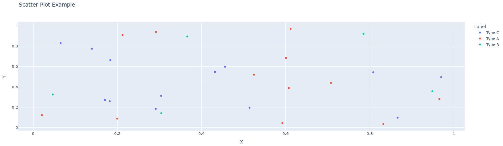
To add different colors for different categories, you can use the c parameter:
colors = {'Type A': 'red', 'Type B': 'blue', 'Type C': 'green'}
plt.figure(figsize=(8, 6))
for label in df_scatter['Label'].unique():
mask = df_scatter['Label'] == label
plt.scatter(df_scatter[mask]['X'], df_scatter[mask]['Y'],
label=label, color=colors[label])
plt.title("Scatter Plot Example")
plt.xlabel("X")
plt.ylabel("Y")
plt.legend()
plt.show()
Line Chart
A line chart displays data points connected by straight lines, making it ideal for showing trends over time or ordered categories. Use matplotlib's plot() function to create line charts. Here's an example:
First, create a sample dataset:
# Create a new dataset for demonstration
df_line = pd.DataFrame({
'Year': range(2010, 2021),
'Sales': np.random.randint(100, 500, size=11)
})
Now, create the line chart from the sample dataset:
plt.figure(figsize=(10, 6))
plt.plot(df_line['Year'], df_line['Sales'], marker='o', linewidth=2)
plt.title("Line Chart Example")
plt.xlabel("Year")
plt.ylabel("Sales")
plt.grid(True, alpha=0.3)
plt.show()
The code above creates a figure, plots the Year on the x-axis and Sales on the y-axis with circular markers at each data point, adds a title and axis labels, and displays a grid for easier reading. The resulting graph looks like this:
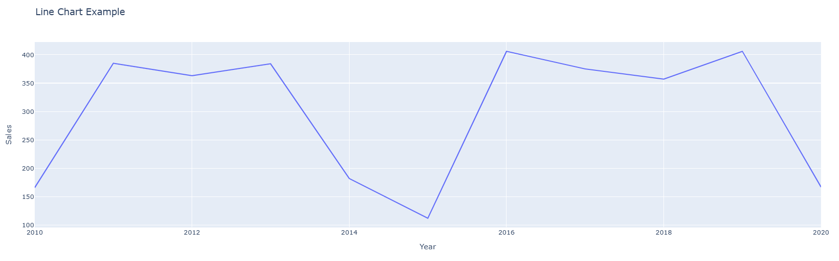
Bar Chart
A bar chart is used to compare values across different categories. In matplotlib, you can create a bar chart using the bar() function. Here's an example:
First, create a sample dataset:
# Create a new dataset for demonstration
df_bar = pd.DataFrame({
'Category': ['A', 'B', 'C', 'D'],
'Value': [23, 45, 56, 78]
})
Now, create the bar chart from the sample dataset:
plt.figure(figsize=(8, 6))
plt.bar(df_bar['Category'], df_bar['Value'], color='skyblue', edgecolor='navy')
plt.title("Bar Chart Example")
plt.xlabel("Category")
plt.ylabel("Value")
plt.show()
The code above creates a figure, plots the Category on the x-axis and Value on the y-axis with light blue bars and navy blue edges, adds a title and axis labels, and then displays the chart. The resulting graph looks like this:
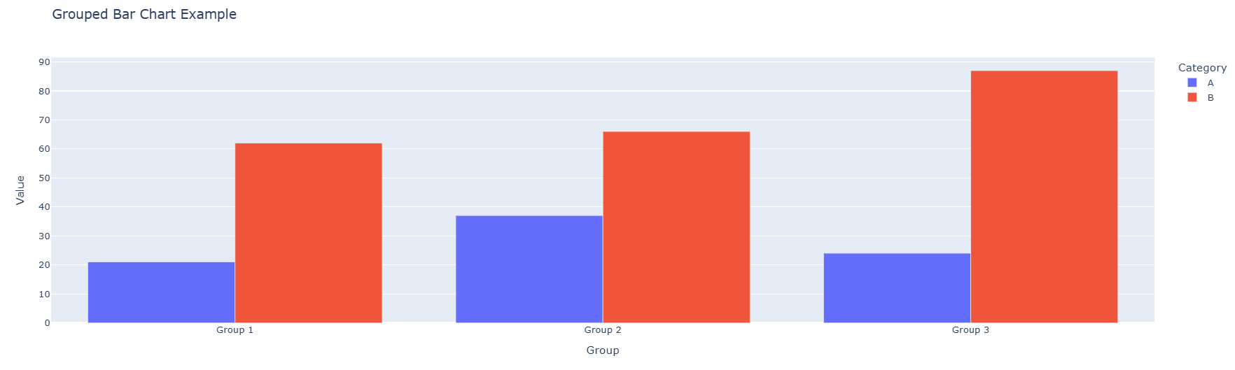
Grouped Bar Chart
A grouped bar chart is used to compare multiple categories across different groups. Each group is represented by a set of bars, and each bar within the group represents a different category. Here's an example:
First, create a sample dataset:
# Create a new dataset for demonstration
df_grouped = pd.DataFrame({
'Group': ['Group 1', 'Group 2', 'Group 3'],
'Category A': [10, 24, 36],
'Category B': [20, 14, 26],
'Category C': [15, 28, 32]
})
Now, create the grouped bar chart:
x = np.arange(len(df_grouped['Group']))
width = 0.25
plt.figure(figsize=(10, 6))
plt.bar(x - width, df_grouped['Category A'], width, label='Category A')
plt.bar(x, df_grouped['Category B'], width, label='Category B')
plt.bar(x + width, df_grouped['Category C'], width, label='Category C')
plt.title("Grouped Bar Chart Example")
plt.xlabel("Group")
plt.ylabel("Value")
plt.xticks(x, df_grouped['Group'])
plt.legend()
plt.show()
The code above creates a figure and plots three sets of bars side by side for each group. The np.arange() function is used to position the bars, and the width variable determines the space between bars. The resulting graph looks like this:

Histogram
A histogram displays the distribution of a numerical variable by dividing the data into bins and showing the frequency of values in each bin. Here's an example:
# Create a dataset with numerical values
data = np.random.normal(loc=100, scale=15, size=1000)
plt.figure(figsize=(8, 6))
plt.hist(data, bins=30, color='purple', edgecolor='black', alpha=0.7)
plt.title("Histogram Example")
plt.xlabel("Value")
plt.ylabel("Frequency")
plt.show()
The code above creates a histogram with 30 bins, purple color with semi-transparency (alpha=0.7), and black edges. The resulting graph shows the distribution of the data.
Customizing Plots
Adding Titles, Labels, and Legends
Matplotlib provides various functions to customize your plots. You can add titles, axis labels, and legends using simple functions:
plt.figure(figsize=(10, 6))
plt.plot(df_line['Year'], df_line['Sales'], marker='o', label='Sales')
plt.title("Customized Chart Title", fontsize=16, fontweight='bold')
plt.xlabel("X Axis Label", fontsize=12)
plt.ylabel("Y Axis Label", fontsize=12)
plt.legend(title="Legend Title", fontsize=10)
plt.grid(True, alpha=0.3)
plt.show()
This code customizes the chart with larger title text, bold formatting, and a legend. The fontsize parameter controls the text size, and the grid() function adds a background grid.
Changing Colors and Styles
Matplotlib allows you to change colors, line styles, and marker styles:
plt.figure(figsize=(10, 6))
plt.plot(df_line['Year'], df_line['Sales'],
color='#FF5733', linewidth=3, linestyle='--', marker='s', markersize=8)
plt.title("Customized Line Chart")
plt.xlabel("Year")
plt.ylabel("Sales")
plt.show()
In this example:
color='#FF5733'sets a custom color using hexadecimal notationlinewidth=3makes the line thickerlinestyle='--'creates a dashed linemarker='s'uses square markersmarkersize=8sets the marker size
Creating Multiple Subplots
Matplotlib allows you to create multiple plots in a single figure using subplots:
fig, (ax1, ax2) = plt.subplots(1, 2, figsize=(14, 5))
# First subplot
ax1.scatter(df_scatter['X'], df_scatter['Y'], color='red', alpha=0.6)
ax1.set_title("Scatter Plot")
ax1.set_xlabel("X")
ax1.set_ylabel("Y")
# Second subplot
ax2.bar(df_bar['Category'], df_bar['Value'], color='skyblue')
ax2.set_title("Bar Chart")
ax2.set_xlabel("Category")
ax2.set_ylabel("Value")
plt.tight_layout()
plt.show()
The subplots() function creates a figure with 1 row and 2 columns, allowing you to display multiple visualizations side by side.
Conclusion
In this lesson, you learned how to create static visualizations using Matplotlib. You explored how to create scatter plots, line charts, bar charts, histograms, and grouped bar charts, and how to customize them with titles, labels, legends, colors, and various styling options. Matplotlib offers extensive capabilities for data visualization, and mastering these basics will prepare you for more advanced visualization tasks. For more information, check out Matplotlib's documentation.
Practice
Coding Assessment
Practice the concepts from this lesson using this notebook. After completing the exercises, save your notebook to GitHub and submit the link for grading.
Knowledge Check
Question 1: What is the primary advantage of Matplotlib compared to interactive libraries like Plotly?
- It creates interactive visualizations with zoom and hover features.
- It creates static, publication-quality images that work well in reports and papers.
- It requires no programming knowledge to use.
- It only works with real-time data streams.
Correct Answer:
2. It creates static, publication-quality images that work well in reports and papers.
Explanation:
Matplotlib excels at creating static visualizations with precise control over every element, making it ideal for reports, academic papers, and presentations where you need consistent, high-quality output.
Question 2: What is the purpose of the figsize parameter in plt.figure()?
- It sets the font size of the title.
- It determines the number of subplots to create.
- It specifies the width and height of the figure in inches.
- It controls the color scheme of the plot.
Correct Answer:
3. It specifies the width and height of the figure in inches.
Explanation:
The figsize parameter takes a tuple of (width, height) in inches, allowing you to control the size of the entire figure. For example, figsize=(10, 6) creates a figure that is 10 inches wide and 6 inches tall.
Question 3: What does the alpha parameter control in Matplotlib?
- The line style (solid, dashed, dotted).
- The transparency of the plot elements.
- The alignment of text labels.
- The range of the x-axis.
Correct Answer:
2. The transparency of the plot elements.
Explanation:
The alpha parameter controls the transparency (opacity) of plot elements. A value of 0 is completely transparent, 1 is completely opaque, and values in between create a semi-transparent effect, which is useful when overlaying multiple data series.
Visualizing Data with Plotly
Overview
In the previous lesson, you explored basic charts like scatter plots, bar charts, and histograms using matplotlib. In this lesson, you'll learn how to create interactive visualizations using a tool called Plotly.
Learning Objective
By the end of this lesson, you will have learned how to:
- Present data in more engaging and user-friendly formats.
- Create common chart types (line charts, bar charts, scatter plots) with Plotly.
- Customize plots with titles, labels, and legends.
Key terms
Plotly: an interactive, open-source, and browser-based graphing library for Python.
Starter Code
This lesson encourages experimentation. Use the included Colaboratory notebook to run the code as you learn, or read the lesson and then freely experiment with the notebook's code.
Introduction
Plotly is a tool that helps you create interactive charts and graphs easily. Unlike regular charts, Plotly charts let you zoom in, hover over points to see details, and even turn data on or off by clicking the legend. Plotly allows data scientists to explore and present data in a visually engaging and interactive way. Think of it as a "smart" graph maker that lets you play with your data instead of just looking at it!
Installing and Importing Plotly
Plotly comes pre-installed in Google Colab, so you can start using it right away without any additional setup. However, if you're using Jupyter Notebook or another local Python environment, you may need to install it using the following command:
pip install plotly
Once installed, you can import Plotly in your Python script or notebook like this:
import plotly.express as px
- Plotly Express (
px) is a high-level interface that makes it easy to create quick and interactive visualizations with minimal code.
After installation and import, you're ready to start creating interactive charts with Plotly!
Creating Basic Charts
Scatter plot
Recall that a scatter plot is used to display the relationship between two numerical variables, where each data point is represented by its coordinates on the x and y axes. This allows you to quickly identify trends, clusters, or outliers in your data.
In Plotly, creating a scatter plot is straightforward: you simply provide your DataFrame, the columns for the x and y axes, and optionally use additional parameters such as color or symbol to highlight different categories.
After defining a DataFrame, use Plotly's px.scatter() function to create a scatter plot. For example, you can run fig = px.scatter(df, x='columnX', y='columnY', color='category') and then call fig.show() to generate an interactive scatter plot that displays tooltips, supports zooming, and allows you to toggle data series on or off.
First, create a sample dataset:
# Create a new dataset for demonstration
df_scatter = pd.DataFrame({
'X': np.random.rand(30),
'Y': np.random.rand(30),
'Label': np.random.choice(['Type A', 'Type B', 'Type C'], 30)
})
The code above creates a dataframe with 30 rows, where the "X" and "Y" columns contain random numbers between 0 and 1, and the "Label" column assigns each row a random category from "Type A", "Type B", or "Type C".
Now, create the scatter plot from the sample dataset:
fig = px.scatter(
df_scatter,
x='X',
y='Y',
color='Label', # Points will have different colors based on Label
title="Scatter Plot Example"
)
fig.show()
The code above takes data from the table (df_scatter), puts values from column "X" on the x-axis and values from column "Y" on the y-axis. The dots are colored differently based on the "Label" column (like grouping them into categories), and then it shows the chart so you can interact with it! The resulting graph looks like this:
Line Chart
In the previous lesson, you learned that a line chart is used to display data points connected by straight lines, making it ideal for showing trends over time or ordered categories. Use Plotly's px.line() function to create line charts. Take a look at the example below on how to create a line chart with Plotly:
First, create a sample dataset:
# Create a new dataset for demonstration
df_line = pd.DataFrame({
'Year': range(2010, 2021),
'Sales': np.random.randint(100, 500, size=11)
})
The code above creates a dataframe with 11 rows, where the "Year" column contains years from 2010 to 2020, the "Sales" column contains random sales numbers.
Now, create the line chart from the sample dataset:
fig = px.line(
df_line,
x='Year',
y='Sales',
title="Line Chart Example"
)
fig.show()
The code above takes data from the table (df_line), puts values from the "Year" column on the x-axis and values from the "Sales" column on the y-axis and then it shows the chart so you can interact with it! The resulting graph looks like this:
Grouped Bar Chart
A grouped bar chart is used to compare multiple categories across different groups. Each group is represented by a set of bars, and each bar within the group represents a different category. In Plotly, you can create a grouped bar chart using the px.bar() function. Here's an example:
First, create a sample dataset:
# Create a new dataset for demonstration
df_bar = pd.DataFrame({
'Group': ['Group 1', 'Group 1', 'Group 2', 'Group 2', 'Group 3', 'Group 3'],
'Category': ['A', 'B', 'A', 'B', 'A', 'B'],
'Value': np.random.randint(10, 100, size=6)
})
The code above creates a dataframe with 6 rows, where the "Group" column contains the group names, the "Category" column contains the categories, and the "Value" column contains random values.
Now, create the grouped bar chart from the sample dataset:
fig = px.bar(
df_bar,
x='Group',
y='Value',
color='Category', # Bars will have different colors based on Category
barmode='group', # Grouped bar chart
title="Grouped Bar Chart Example"
)
fig.show()
The code above takes data from the table (df_bar), puts values from the "Group" column on the x-axis and values from the "Value" column on the y-axis. The bars are colored differently based on the "Category" column, and the barmode='group' parameter ensures that the bars are grouped by the "Group" column. The resulting graph looks like this:
Customizing Plots
Adding Titles, Labels, and Legends
The update_layout function in Plotly allows you to customize the layout of your charts. It enables you to modify various aspects of the chart's appearance, such as titles, axis labels, legends, margins, and more. Take a look at the example below:
fig.update_layout(
title="Customized Chart Title",
xaxis_title="X Axis Label",
yaxis_title="Y Axis Label",
legend_title="Legend Title"
)
fig.show()
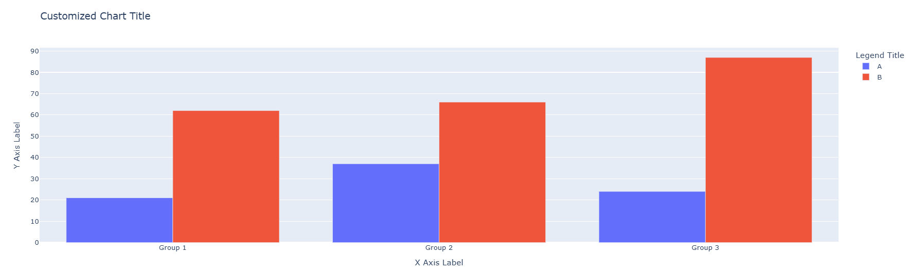
Changing Colors and Themes
Plotly allows you to change the colors and themes of your charts. You can use predefined color sequences or create your own custom color schemes. Here's an example:
fig.update_traces(marker=dict(color='red')) # Change marker color
fig.update_layout(template='plotly_dark') # Change theme to dark
fig.show()
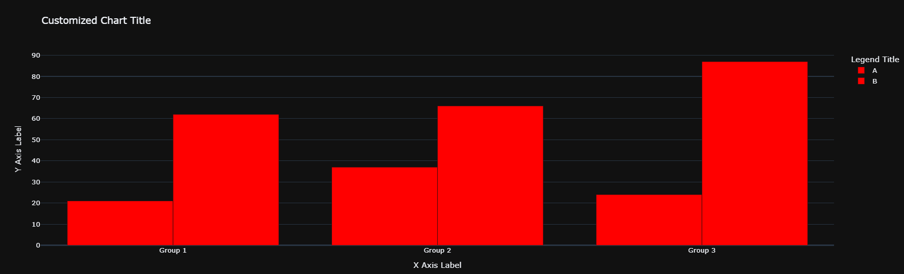
Conclusion
In this lesson, you learned how to create interactive visualizations using Plotly. You explored how to create scatter plots, line charts, and grouped bar charts, and how to customize them with titles, labels, legends, colors, and annotations. Plotly offers a wide range of chart types, and you’ll have the opportunity to explore more of them in upcoming lessons as part of this program. For now, feel free to check out Plotly’s documentation to discover its diverse graphical capabilities.
Practice
Coding Assessment
Practice the concepts from this lesson using this notebook. After completing the exercises, save your notebook to GitHub and submit the link for grading.
Knowledge Check
Question 1: What is Plotly primarily used for?
- Creating static, non-interactive charts.
- Performing statistical analysis on datasets.
- Creating interactive and visually engaging charts.
- Cleaning and preprocessing data.
Correct Answer:
3. Creating interactive and visually engaging charts.
Explanation:
Plotly is a graphing library that specializes in creating interactive charts, allowing users to zoom, hover, and toggle data on or off for a more engaging experience.
Question 2: What does the color parameter in px.scatter() do?
- It changes the background color of the chart.
- It assigns different colors to data points based on a categorical column.
- It changes the color of the x-axis and y-axis labels.
- It changes the color of the chart title.
Correct Answer:
2. It assigns different colors to data points based on a categorical column.
Explanation:
The color parameter in px.scatter() is used to differentiate data points by assigning them colors based on a categorical column (e.g., grouping data by categories like "Type A", "Type B", etc.).
Question 3: What is the purpose of the barmode='group' parameter in a grouped bar chart?
- It stacks the bars on top of each other.
- It groups bars by category side by side.
- It changes the orientation of the bars from vertical to horizontal.
- It hides the legend of the chart.
Correct Answer:
2. It groups bars by category side by side.
Explanation:
The barmode='group' parameter ensures that bars representing different categories are displayed side by side within each group, making it easier to compare values across categories.
Module Assessment
Overview
Congratulations on completing the Data Visualization module! You've learned the principles of choosing the right chart for the right question, built static charts with Matplotlib, and created interactive visualizations with Plotly. This assessment brings those skills together in a project where you'll analyze a real dataset and communicate your findings through multiple visualizations.
Complete the assessment using this Colaboratory notebook.
Learning Objective
By the end of this assessment, you will have demonstrated your ability to:
- Apply various visualization techniques to a given dataset.
- Effectively communicate insights through visuals.
Key terms
Insight: A meaningful observation drawn from data — a pattern, trend, anomaly, or relationship — that answers a question or supports a decision.
Visual encoding: The way data values are mapped to visual properties (position, length, color, size, shape) in a chart.
Annotation: Text, arrows, or highlights added directly to a chart to draw attention to a specific data point or insight.
Assessment Overview
This module assessment is a coding project completed in a Google Colaboratory notebook. You will be given a dataset and asked to produce a series of charts using both Matplotlib and Plotly, each designed to answer a specific analytical question. For each chart, you will also write a one- to two-sentence interpretation explaining what the visualization reveals.
Skills Assessed
| Skill | Lesson |
|---|---|
| Selecting appropriate chart types | Introduction to Data Visualization |
| Creating scatter plots, line charts, and bar charts | Matplotlib |
| Customizing titles, labels, and colors | Matplotlib |
| Creating subplots | Matplotlib |
| Creating interactive charts with Plotly | Plotly |
| Customizing Plotly layouts and themes | Plotly |
| Interpreting and communicating visual insights | All lessons |
Coding Assessment
Complete the project in this notebook. After completing all tasks, save your notebook to GitHub and submit the link to the AI Grader for grading.
Task Overview
The notebook provides a dataset containing information about global city populations, GDP per capita, average temperature, and quality-of-life scores across multiple years and continents. You will complete the following tasks:
-
Line chart (Matplotlib) — Plot the average quality-of-life score over time for at least three continents on the same axes, using a different color for each. Add a title, axis labels, legend, and grid. Write one sentence explaining the trend.
-
Bar chart (Matplotlib) — Create a horizontal bar chart comparing the average GDP per capita by continent for the most recent year in the dataset. Sort the bars from highest to lowest. Add a title and axis labels.
-
Scatter plot (Matplotlib) — Plot GDP per capita (x-axis) vs. quality-of-life score (y-axis) for all cities in the most recent year. Color the points by continent. Add a title, axis labels, and a legend. In one sentence, describe whether a relationship is visible.
-
Subplots (Matplotlib) — Create a figure with two side-by-side subplots: a histogram of city populations and a histogram of average temperatures. Give each subplot its own title and axis labels.
-
Interactive scatter plot (Plotly) — Recreate the scatter plot from Task 3 using Plotly Express, adding a
hover_dataparameter so that city names appear when hovering. Apply theplotly_whitetemplate. -
Interactive bar chart (Plotly) — Create a grouped bar chart using Plotly that compares average GDP and average quality-of-life score for each continent side by side. Add a descriptive title and axis labels using
update_layout(). -
Insight summary — Write three bullet points (one per visualization of your choice) identifying the most important insight you found and which chart type made it visible.
Grading Rubric
| Criteria | Points |
|---|---|
| Matplotlib line chart with correct data, labels, and legend | 15 |
| Matplotlib bar chart sorted and correctly labeled | 10 |
| Matplotlib scatter plot with color encoding and legend | 15 |
| Matplotlib subplots created correctly with individual labels | 10 |
| Plotly interactive scatter plot with hover data | 15 |
Plotly grouped bar chart with update_layout() customization | 15 |
| Written insight summary (3 bullet points) | 10 |
| Code is clean, readable, and uses descriptive variable names | 10 |
| Total | 100 |
Knowledge Check
Exploratory Data Analysis (EDA)
Before fitting any model, you need to understand your data. Exploratory Data Analysis (EDA) is the structured process of examining a dataset to understand its distributions, relationships, and anomalies — and to surface the questions that should guide further analysis.
This module equips you with the full EDA toolkit: numerical summaries, distribution plots, correlation analysis, and outlier detection. These are the skills that distinguish analysts who find real insight from those who jump straight to modeling on poorly understood data.
Lessons
- Introduction to EDA — What EDA is, the questions it answers, and a systematic checklist to apply to any new dataset.
- Summary Statistics — Mean, median, standard deviation, percentiles, and the
.describe()method for rapid tabular summaries. - Histograms — Distribution shapes (normal, skewed, bimodal), bin selection, and interpreting frequency distributions.
- Box Plots — Quartiles, the interquartile range, whiskers, and using box plots to compare distributions across groups.
- Correlation Matrix — Pearson correlation, heatmaps, and identifying which features are most related to a target variable.
- Outliers — Defining outliers with the IQR method and z-scores, visualizing them, and deciding when to remove versus investigate.
- Module Assessment — An EDA assessment requiring you to analyze a new dataset, produce visualizations, and write interpretive conclusions.
Introduction to EDA
Overview
Welcome to the Exploratory Data Analysis module! In the previous modules, you built the Python and Pandas skills needed to load and manipulate data, and you learned how to communicate findings through visualizations. Now you'll combine those skills into a structured practice called Exploratory Data Analysis (EDA) — the process data scientists use to truly understand a dataset before drawing conclusions or building models.
Learning Objective
By the end of this lesson, you will have learned how to:
- Outline the goals and importance of exploratory data analysis.
- Understand how EDA fits into the data science lifecycle.
Key terms
Exploratory Data Analysis (EDA): An approach to analyzing datasets that uses summary statistics and visualizations to discover patterns, spot anomalies, test assumptions, and understand the structure of the data before formal modeling.
Data science lifecycle: The sequence of phases in a data science project, from problem definition and data collection through analysis, modeling, and communication of results.
Missing values: Entries in a dataset where no data was recorded, represented in Pandas as NaN (Not a Number).
Data distribution: The way values of a variable are spread across its possible range — whether concentrated, spread out, symmetric, or skewed.
Feature: A single measurable variable in a dataset, corresponding to a column in a DataFrame. Also called a variable or attribute.
Target variable: The variable a model is being built to predict (e.g., house price, churn, disease diagnosis).
Introduction
Imagine you receive a new dataset and are told to build a predictive model. Where do you start? If you jump straight into modeling without first understanding the data, you risk building a model on top of hidden problems: missing values, extreme outliers, mislabeled categories, or features with no meaningful signal. The model may fit the training data but fail in production — and you won't know why.
Exploratory Data Analysis is the answer. Coined by statistician John Tukey in his 1977 book of the same name, EDA is a philosophy as much as a process: approach data with an open mind, ask questions, look before you model, and let the data reveal its own structure. As Tukey put it: "The greatest value of a picture is when it forces us to notice what we never expected to see."
EDA is not a step you skip when you're in a hurry — it's the step that prevents you from building on a faulty foundation.
The Data Science Lifecycle
EDA sits at the center of the data science lifecycle, bridging raw data and modeling. A typical lifecycle looks like this:
- Problem definition — What question are you trying to answer? What would a good answer look like?
- Data collection — Gather the data you need from databases, APIs, files, or surveys.
- Data cleaning — Handle missing values, fix errors, standardize formats.
- → Exploratory Data Analysis ← — Understand the data's structure, distributions, and relationships.
- Feature engineering — Create new variables or transform existing ones based on EDA insights.
- Modeling — Train and evaluate machine learning models.
- Communication — Present results and insights to stakeholders.
EDA often loops back to data cleaning (you discover problems during exploration) and forward to feature engineering (you discover which transformations are needed). It is rarely a one-pass process.
Goals of EDA
EDA has several concrete objectives:
1. Understand the shape and size of the data
- How many rows and columns are there?
- What are the data types of each column?
- How much data is missing?
2. Understand each variable individually (univariate analysis)
- What is the range of values?
- What does the distribution look like — is it symmetric, skewed, or bimodal?
- Are there any unusual values?
3. Understand relationships between variables (bivariate and multivariate analysis)
- Do two variables tend to move together (correlation)?
- Do distributions differ across groups (e.g., prices in different cities)?
- Which features seem most related to the target variable?
4. Identify data quality issues
- Are there outliers that could distort a model?
- Are there duplicate rows?
- Are there categorical values with typos or inconsistent formatting?
5. Generate hypotheses
- Based on what you observe, what patterns might be worth testing or modeling?
A Standard EDA Checklist
When you start a new dataset, work through this checklist:
| Step | Action | Pandas / Tool |
|---|---|---|
| 1. Load | Read the data | pd.read_csv() |
| 2. Shape | Check dimensions | df.shape |
| 3. Types | Check column data types | df.dtypes, df.info() |
| 4. Missing | Count missing values | df.isnull().sum() |
| 5. Duplicates | Check for duplicate rows | df.duplicated().sum() |
| 6. Summary stats | Compute mean, std, min, max | df.describe() |
| 7. Distributions | Plot histograms for numeric columns | df.hist() |
| 8. Box plots | Compare distributions, spot outliers | df.boxplot() |
| 9. Correlation | Compute pairwise correlations | df.corr() |
| 10. Relationships | Scatter plots for key variable pairs | plt.scatter() |
A Quick First Look in Practice
Here's what the very first lines of an EDA session typically look like:
import pandas as pd
import matplotlib.pyplot as plt
# Load
df = pd.read_csv("housing.csv")
# Shape and types
print(df.shape)
df.info()
# Missing values
print(df.isnull().sum())
# Duplicate rows
print(f"Duplicate rows: {df.duplicated().sum()}")
# Summary statistics
print(df.describe())
This small block of code immediately answers: How big is the dataset? What columns exist and what types are they? Where is data missing? Are there duplicates? What are the ranges of numeric columns? Getting this information in the first two minutes of working with a dataset is standard practice.
What EDA Is Not
It's worth clarifying what EDA is not:
- Not hypothesis testing — EDA generates hypotheses; statistical testing confirms them.
- Not final — EDA insights should inform modeling decisions, not replace them.
- Not a fixed procedure — Every dataset is different. The checklist above is a starting point, not a rigid script. Follow what the data tells you.
Conclusion
In this lesson, you learned what Exploratory Data Analysis is, why it is an essential step in every data science project, and where it fits in the data science lifecycle. You now have a standard checklist to follow whenever you encounter a new dataset. In the lessons that follow, you'll build out each step of that checklist in depth: computing and interpreting summary statistics, visualizing distributions with histograms and box plots, measuring relationships with a correlation matrix, and detecting and handling outliers.
Practice
Knowledge Check
Summary Statistics
Overview
In the previous lesson, you learned what EDA is and how it fits into the data science lifecycle. The first quantitative step in any EDA is computing summary statistics — numeric measurements that condense an entire column of data into a handful of descriptive values. In this lesson, you'll learn how to calculate and interpret the most important summary statistics using Pandas and understand what they reveal about your data.
Learning Objective
By the end of this lesson, you will have learned how to:
- Calculate mean, median, mode, and standard deviation.
- Interpret these metrics to understand data distributions.
Key terms
Mean: The arithmetic average of a set of values — the sum of all values divided by the count. Sensitive to outliers.
Median: The middle value when all values are sorted in order. Robust to outliers. Also called the 50th percentile.
Mode: The most frequently occurring value. Useful for categorical data and identifying peaks in numeric distributions.
Variance: The average of the squared differences from the mean — measures how spread out values are around the mean.
Standard deviation: The square root of the variance. Expressed in the same units as the original data, making it more interpretable than variance.
Range: The difference between the maximum and minimum values.
Interquartile Range (IQR): The difference between the 75th percentile (Q3) and the 25th percentile (Q1). A robust measure of spread that ignores the extremes.
Percentile (quantile): The value below which a given percentage of observations fall. The 25th percentile (Q1), 50th (median), and 75th (Q3) are the most common.
Skewness: A measure of asymmetry in a distribution. A right-skewed (positive) distribution has a long tail to the right; a left-skewed (negative) distribution has a long tail to the left.
Starter Code
This lesson encourages experimentation. Use the included Colaboratory notebook to run the code as you learn, or read the lesson and then freely experiment with the notebook's code.
Introduction
Before you plot a single chart, numbers can already tell you a great deal about a column of data. Is the typical house price $200,000 or $2,000,000? Are most values clustered tightly together or spread across a wide range? Is the distribution symmetric, or are there a few extremely high values pulling the average up?
Summary statistics answer these questions in a compact form. They are the foundation of EDA — both for understanding data directly and for knowing which visualizations to reach for next.
Setup: Sample Dataset
Throughout this lesson, you'll work with a housing dataset:
import pandas as pd
import numpy as np
df = pd.read_csv("housing.csv")
# For demonstration, we'll create a representative sample
df = pd.DataFrame({
"price": [215000, 180000, 340000, 290000, 125000, 410000,
175000, 260000, 198000, 1250000, 305000, 222000],
"bedrooms": [3, 2, 4, 3, 2, 5, 2, 3, 3, 6, 4, 3],
"sqft": [1400, 1100, 2100, 1800, 900, 2800, 1050,
1600, 1350, 5200, 2000, 1450],
"age_years": [12, 25, 5, 18, 40, 3, 30, 10, 22, 8, 6, 15],
"neighborhood": ["North", "South", "North", "East", "South",
"North", "East", "South", "North", "North",
"East", "South"]
})
The Quick Summary: df.describe()
The fastest way to get an overview of all numeric columns at once is .describe():
print(df.describe())
Output:
price bedrooms sqft age_years
count 1.200000e+01 12.000000 12.000000 12.000000
mean 3.147500e+05 3.250000 1729.166667 16.166667
std 2.842434e+05 0.965377 993.826983 11.519428
min 1.250000e+05 2.000000 900.000000 3.000000
25% 1.913750e+05 3.000000 1112.500000 6.750000
50% 2.410000e+05 3.000000 1525.000000 13.500000
75% 3.068750e+05 4.000000 1975.000000 22.750000
max 1.250000e+06 6.000000 5200.000000 40.000000
This single call gives you count, mean, standard deviation, min, three quartiles, and max for every numeric column. The large gap between the mean ($314,750) and median ($241,000) for price is already telling — something is pulling the mean up. (That $1,250,000 mansion.)
Measures of Central Tendency
Mean
The mean is the sum of all values divided by the count:
print(df["price"].mean()) # Output: 314750.0
When to use it: The mean is intuitive and works well when data is roughly symmetric with no extreme outliers.
Weakness: A single very large or very small value can pull the mean far from the "typical" value. The $1.25M property raises the mean by over $70,000 compared to what you'd get without it.
Median
The median is the middle value when values are sorted:
print(df["price"].median()) # Output: 241000.0
When to use it: Use the median when data is skewed or contains outliers. It represents the "typical" value more accurately than the mean in these cases.
The median house price of $241,000 gives a much better sense of a "typical" home in this dataset than the mean of $314,750.
Mean vs. Median: When It Matters
The relationship between mean and median tells you about the shape of the distribution:
| Relationship | Implication |
|---|---|
| Mean ≈ Median | Roughly symmetric distribution |
| Mean > Median | Right-skewed (long tail to the right, pulled by high values) |
| Mean < Median | Left-skewed (long tail to the left, pulled by low values) |
Income, house prices, and wealth are classic examples of right-skewed distributions where the median is the more representative measure.
Mode
The mode is the most frequently occurring value:
print(df["bedrooms"].mode()) # Output: 3
print(df["neighborhood"].mode()) # Output: North
When to use it: Mode is most useful for categorical columns (like neighborhood) and for integer columns where a specific value occurs very frequently (like bedrooms). Continuous numeric columns rarely have a meaningful mode.
Measures of Spread
Knowing the center of the data is only half the picture. You also need to know how spread out values are.
Standard Deviation
Standard deviation measures the average distance between each value and the mean:
print(df["price"].std()) # Output: 284243.4
print(df["sqft"].std()) # Output: 993.8
A large standard deviation means values are widely spread. A small one means values are tightly clustered. In this case, the price standard deviation ($284K) is almost as large as the mean ($315K) — a sign of high variability, driven largely by the outlier.
Variance
Variance is the standard deviation squared. It is less commonly reported because it is in squared units (e.g., dollars²), but it is used in many statistical calculations:
print(df["price"].var()) # Output: 80794149.2
Range
The range is the simplest spread measure — just max minus min:
price_range = df["price"].max() - df["price"].min()
print(price_range) # Output: 1125000
The range is sensitive to outliers since it's entirely determined by the two extreme values.
Interquartile Range (IQR)
The IQR is the range of the middle 50% of the data — from Q1 (25th percentile) to Q3 (75th percentile). It is robust to outliers because it ignores the extremes:
Q1 = df["price"].quantile(0.25)
Q3 = df["price"].quantile(0.75)
IQR = Q3 - Q1
print(f"Q1: {Q1:,.0f}") # Output: Q1: 191,375
print(f"Q3: {Q3:,.0f}") # Output: Q3: 306,875
print(f"IQR: {IQR:,.0f}") # Output: IQR: 115,500
The IQR of $115,500 tells you the spread of the middle half of home prices, unaffected by the $1.25M outlier.
Percentiles and Quantiles
Percentiles tell you the value below which a given percentage of observations fall:
# Key percentiles
for pct in [10, 25, 50, 75, 90, 95]:
val = df["price"].quantile(pct / 100)
print(f"{pct}th percentile: ${val:,.0f}")
Output:
10th percentile: $151,500
25th percentile: $191,375
50th percentile: $241,000
75th percentile: $306,875
90th percentile: $399,500
95th percentile: $824,750
The jump from the 90th ($399,500) to the 95th ($824,750) percentile is dramatic — another signal of the outlier's effect at the high end.
Skewness
Pandas can compute skewness directly:
print(df["price"].skew()) # Output: 2.87
print(df["sqft"].skew()) # Output: 2.51
print(df["age_years"].skew()) # Output: 0.47
A skewness value above +1 indicates strong right skew (a long right tail). A value below -1 indicates strong left skew. Values between -1 and +1 are approximately symmetric. The strong positive skewness in price and sqft confirms what the mean vs. median comparison suggested.
Computing Stats for Categorical Columns
For string/object columns, .describe() gives different information:
print(df[["neighborhood"]].describe())
Output:
neighborhood
count 12
unique 3
top North
freq 4
This tells you there are 12 entries, 3 unique neighborhoods, and the most common is "North" (appears 4 times). Use .value_counts() for a full frequency table:
print(df["neighborhood"].value_counts())
Output:
North 4
South 4
East 3
Name: neighborhood, dtype: int64
Putting It Together
Here's a compact summary function you can reuse on any numeric column:
def column_summary(series):
print(f"Column: {series.name}")
print(f" Count: {series.count()}")
print(f" Mean: {series.mean():,.2f}")
print(f" Median: {series.median():,.2f}")
print(f" Std Dev: {series.std():,.2f}")
print(f" Min: {series.min():,.2f}")
print(f" Max: {series.max():,.2f}")
print(f" IQR: {(series.quantile(0.75) - series.quantile(0.25)):,.2f}")
print(f" Skewness: {series.skew():.2f}")
missing = series.isnull().sum()
print(f" Missing: {missing} ({missing/len(series)*100:.1f}%)")
column_summary(df["price"])
Output:
Column: price
Count: 12
Mean: 314,750.00
Median: 241,000.00
Std Dev: 284,243.40
Min: 125,000.00
Max: 1,250,000.00
IQR: 115,500.00
Skewness: 2.87
Missing: 0 (0.0%)
Conclusion
In this lesson, you learned how to compute and interpret the core summary statistics for a dataset: mean, median, and mode for central tendency; standard deviation, variance, range, and IQR for spread; percentiles for understanding the data's rank order; and skewness for detecting asymmetry. You also saw how the relationship between mean and median signals whether a distribution is skewed — a key observation that guides the choice of subsequent visualizations. In the next lesson, you'll visualize these distributions directly using histograms.
Practice
Coding Assessment
Practice the concepts from this lesson using this notebook. After completing the exercises, save your notebook to GitHub and submit the link for grading.
Knowledge Check
Histograms
Overview
In the previous lesson, you learned how to compute summary statistics — mean, median, standard deviation, and IQR — to understand the center and spread of your data. Numbers like skewness hint at the shape of a distribution, but they don't show it. In this lesson, you'll learn how to generate histograms, the most direct visual tool for seeing how values in a column are distributed across their range.
Learning Objective
By the end of this lesson, you will have learned how to:
- Generate histograms to assess frequency distributions.
- Identify skewness, normal distributions, and multimodal distributions.
Key terms
Histogram: A chart that groups continuous values into equal-width bins and displays the count (or frequency) of observations falling into each bin as a bar.
Bin: A contiguous interval in the value range of a variable. For example, prices from $100,000 to $150,000 might form one bin.
Frequency: The number of observations that fall within a given bin.
Normal distribution (bell curve): A symmetric, bell-shaped distribution where values are concentrated around the mean and taper off equally in both directions.
Right-skewed distribution: A distribution with a long tail to the right — most values are low, but a few very high values stretch the distribution rightward. Also called positively skewed.
Left-skewed distribution: A distribution with a long tail to the left — most values are high, but a few very low values stretch the distribution leftward. Also called negatively skewed.
Bimodal distribution: A distribution with two distinct peaks, suggesting the data may come from two different underlying groups or processes.
KDE (Kernel Density Estimate): A smooth curve that estimates the underlying probability distribution of a variable, used as an alternative or complement to a histogram.
Starter Code
This lesson encourages experimentation. Use the included Colaboratory notebook to run the code as you learn, or read the lesson and then freely experiment with the notebook's code.
Introduction
A histogram answers the question: "Where are my values concentrated?" It reveals the shape of a distribution — whether most values cluster tightly around the mean, whether the data tails off to one side, or whether there are two distinct clusters suggesting two underlying groups in the data.
Histograms are a core EDA tool because the shape of a distribution has direct consequences for analysis and modeling. Many statistical methods assume a roughly normal distribution. If your data is heavily skewed, a log transformation may be needed. If it is bimodal, you may need to investigate whether two different subpopulations have been combined.
Setup: Sample Dataset
import pandas as pd
import numpy as np
import matplotlib.pyplot as plt
np.random.seed(42)
df = pd.DataFrame({
"price": np.concatenate([
np.random.normal(250000, 40000, 800),
np.random.normal(650000, 80000, 50) # High-end homes
]),
"sqft": np.random.lognormal(7.3, 0.4, 850),
"age_years": np.random.normal(20, 8, 850).clip(0),
"score": np.random.normal(75, 10, 850).clip(0, 100)
})
Creating a Basic Histogram
With Matplotlib
plt.figure(figsize=(8, 5))
plt.hist(df["price"], bins=30, color="steelblue", edgecolor="white")
plt.title("Distribution of House Prices")
plt.xlabel("Price ($)")
plt.ylabel("Number of Homes")
plt.tight_layout()
plt.show()
The bins parameter controls how many intervals the range is divided into. The bars touch each other (unlike a bar chart) because the bins are continuous ranges.
With Pandas
Pandas provides a convenient shortcut that creates a histogram for every numeric column at once:
df.hist(figsize=(12, 8), bins=30, edgecolor="white", color="steelblue")
plt.suptitle("Distributions of All Numeric Columns", y=1.02)
plt.tight_layout()
plt.show()
This is one of the quickest ways to get a visual overview of your entire dataset.
Choosing the Number of Bins
The number of bins significantly affects how a histogram looks and what it reveals:
fig, axes = plt.subplots(1, 3, figsize=(14, 4))
for ax, bins in zip(axes, [5, 20, 100]):
ax.hist(df["price"], bins=bins, color="steelblue", edgecolor="white")
ax.set_title(f"bins={bins}")
ax.set_xlabel("Price ($)")
ax.set_ylabel("Count")
plt.suptitle("Effect of Bin Count on Histogram Shape")
plt.tight_layout()
plt.show()
- Too few bins (e.g., 5) over-smooths the data — you lose detail and can miss important features like bimodality.
- Too many bins (e.g., 100) under-smooths — you see noise instead of signal, and the bars become very thin.
- A good starting point is 20–30 bins for most datasets. Adjust based on what you see.
A common rule of thumb is the square root rule: use approximately √n bins, where n is the number of observations.
Reading Distribution Shapes
Normal (Symmetric) Distribution
A normal distribution is bell-shaped and symmetric around its mean. The mean and median are approximately equal.
plt.figure(figsize=(8, 5))
plt.hist(df["score"], bins=30, color="mediumseagreen", edgecolor="white")
plt.axvline(df["score"].mean(), color="red", linestyle="--", label=f"Mean: {df['score'].mean():.1f}")
plt.axvline(df["score"].median(), color="orange", linestyle="-", label=f"Median: {df['score'].median():.1f}")
plt.title("Normal Distribution: Exam Scores")
plt.xlabel("Score")
plt.ylabel("Count")
plt.legend()
plt.show()
Adding vertical lines for mean and median is a useful habit — their positions relative to each other confirm whether the distribution is symmetric.
Right-Skewed Distribution
A right-skewed distribution has most values on the left with a long tail stretching to the right. The mean is pulled higher than the median by the high-value tail.
plt.figure(figsize=(8, 5))
plt.hist(df["sqft"], bins=30, color="coral", edgecolor="white")
plt.axvline(df["sqft"].mean(), color="red", linestyle="--", label=f"Mean: {df['sqft'].mean():.0f}")
plt.axvline(df["sqft"].median(), color="orange", linestyle="-", label=f"Median: {df['sqft'].median():.0f}")
plt.title("Right-Skewed Distribution: Square Footage")
plt.xlabel("Square Feet")
plt.ylabel("Count")
plt.legend()
plt.show()
Square footage and prices are commonly right-skewed — most homes are moderately sized, but a few very large properties pull the distribution rightward.
Bimodal Distribution
A bimodal distribution has two distinct peaks, suggesting the presence of two subgroups in the data:
plt.figure(figsize=(8, 5))
plt.hist(df["price"], bins=40, color="mediumpurple", edgecolor="white")
plt.title("Bimodal Distribution: House Prices")
plt.xlabel("Price ($)")
plt.ylabel("Count")
plt.show()
The two peaks in price — one around $250,000 and a smaller one around $650,000 — reflect the two groups in our synthetic data: standard homes and high-end properties. In a real dataset, this would prompt the question: "What separates these two groups?"
Adding a KDE Curve
A Kernel Density Estimate (KDE) overlays a smooth curve that estimates the underlying distribution. It is a useful complement to the histogram, especially for comparing shapes:
import matplotlib.pyplot as plt
from scipy.stats import gaussian_kde
import numpy as np
data = df["price"].dropna()
kde = gaussian_kde(data)
x_range = np.linspace(data.min(), data.max(), 300)
fig, ax = plt.subplots(figsize=(8, 5))
ax.hist(data, bins=30, color="steelblue", edgecolor="white",
density=True, alpha=0.6, label="Histogram")
ax.plot(x_range, kde(x_range), color="darkblue", linewidth=2, label="KDE")
ax.set_title("House Prices: Histogram with KDE")
ax.set_xlabel("Price ($)")
ax.set_ylabel("Density")
ax.legend()
plt.show()
Note the use of density=True to normalize the histogram to a density scale so it is comparable to the KDE curve.
Log Transformation for Skewed Data
When a right-skewed distribution spans many orders of magnitude, a log transformation can make it more symmetric and easier to work with:
fig, axes = plt.subplots(1, 2, figsize=(12, 5))
axes[0].hist(df["sqft"], bins=30, color="coral", edgecolor="white")
axes[0].set_title("Square Footage — Original")
axes[0].set_xlabel("sqft")
axes[1].hist(np.log1p(df["sqft"]), bins=30, color="steelblue", edgecolor="white")
axes[1].set_title("Square Footage — Log Transformed")
axes[1].set_xlabel("log(sqft + 1)")
plt.tight_layout()
plt.show()
np.log1p() computes log(x + 1), which safely handles zero values. After transformation, the distribution often becomes much more symmetric, satisfying the assumptions of many statistical models.
Conclusion
In this lesson, you learned how to generate histograms using Matplotlib and Pandas, how to choose an appropriate bin count, and how to read and interpret the key distribution shapes: normal, right-skewed, left-skewed, and bimodal. You also added mean and median lines to confirm symmetry, overlaid KDE curves for smoother estimates, and applied log transformations to tame heavily skewed data. In the next lesson, you'll complement histograms with box plots, which provide a compact five-number summary and make it easy to compare distributions across groups and spot outliers.
Practice
Coding Assessment
Practice the concepts from this lesson using this notebook. After completing the exercises, save your notebook to GitHub and submit the link for grading.
Knowledge Check
Box Plots
Overview
In the previous lesson, you used histograms to visualize the full shape of a distribution. Histograms are excellent for a single variable, but they become hard to compare when you want to show distributions across multiple groups side by side. In this lesson, you'll learn about box plots — a compact visualization that summarizes a distribution in five numbers and makes group comparisons and outlier detection easy.
Learning Objective
By the end of this lesson, you will have learned how to:
- Use box plots to understand data spread and quartiles.
- Identify outliers visually.
Key terms
Box plot (box-and-whisker plot): A chart that displays a five-number summary (minimum, Q1, median, Q3, maximum) of a distribution, with points beyond the whiskers plotted individually as potential outliers.
Five-number summary: The five values that describe a distribution: minimum, first quartile (Q1), median (Q2), third quartile (Q3), and maximum (after excluding outliers).
Q1 (first quartile): The 25th percentile — 25% of values fall below this point.
Q3 (third quartile): The 75th percentile — 75% of values fall below this point.
IQR (Interquartile Range): The height of the box: Q3 − Q1. Represents the spread of the middle 50% of the data.
Whiskers: The lines extending from the box to the smallest and largest values within 1.5 × IQR of the box edges.
Outlier (box plot): A value that falls more than 1.5 × IQR below Q1 or above Q3. Plotted as individual points beyond the whiskers.
Starter Code
This lesson encourages experimentation. Use the included Colaboratory notebook to run the code as you learn, or read the lesson and then freely experiment with the notebook's code.
Introduction
A histogram shows you the full shape of a distribution but becomes cluttered when you need to compare six or eight groups at once. A box plot sacrifices some detail in exchange for compactness — five numbers instead of thirty bars — making it ideal for comparing distributions across groups. In a single glance, you can compare the median, spread, and outlier patterns of housing prices across different neighborhoods or salaries across different departments.
Box plots are also the standard first step for visual outlier detection: any point plotted beyond the whiskers is flagged as a potential outlier by the 1.5 × IQR rule.
Anatomy of a Box Plot
|
_____|_____ ← Upper whisker: Q3 + 1.5 × IQR (or the largest non-outlier value)
| |
| Q3 | ─────── 75th percentile (top of box)
| |
|═══════════| ─────── Median (Q2, line inside box)
| |
| Q1 | ─────── 25th percentile (bottom of box)
|___________|
|
_____|_____ ← Lower whisker: Q1 - 1.5 × IQR (or the smallest non-outlier value)
● ● ← Outlier points (beyond the whiskers)
- Box height = IQR — a taller box means more spread in the middle of the data.
- Median line position — if the median is near the center of the box, the distribution is symmetric; if it's near the top or bottom, the distribution is skewed.
- Whisker length — longer whiskers mean more spread in the tails.
- Individual points — plotted outliers beyond the whiskers.
Setup: Sample Dataset
import pandas as pd
import numpy as np
import matplotlib.pyplot as plt
np.random.seed(42)
df = pd.DataFrame({
"price": np.concatenate([
np.random.normal(220000, 35000, 300), # South
np.random.normal(280000, 45000, 300), # North
np.random.normal(195000, 28000, 300), # East
]),
"neighborhood": ["South"] * 300 + ["North"] * 300 + ["East"] * 300,
"bedrooms": np.random.choice([1, 2, 3, 4, 5], 900,
p=[0.05, 0.25, 0.40, 0.20, 0.10])
})
# Inject a few outliers
df.loc[0, "price"] = 950000
df.loc[1, "price"] = 875000
df.loc[2, "price"] = -15000 # Data error — impossible value
Creating a Basic Box Plot
With Matplotlib
plt.figure(figsize=(6, 6))
plt.boxplot(df["price"], patch_artist=True,
boxprops=dict(facecolor="steelblue", color="navy"),
medianprops=dict(color="white", linewidth=2))
plt.title("Distribution of House Prices")
plt.ylabel("Price ($)")
plt.xticks([1], ["All Homes"])
plt.show()
With Pandas
df[["price"]].boxplot(figsize=(6, 6))
plt.title("Distribution of House Prices")
plt.ylabel("Price ($)")
plt.show()
Grouped Box Plots: Comparing Distributions
The real strength of box plots is comparing multiple groups. Here's how to plot price distributions by neighborhood:
With Matplotlib
# Separate the data by group
groups = [df[df["neighborhood"] == n]["price"] for n in ["South", "North", "East"]]
plt.figure(figsize=(8, 6))
bp = plt.boxplot(groups,
labels=["South", "North", "East"],
patch_artist=True,
boxprops=dict(facecolor="steelblue", alpha=0.7),
medianprops=dict(color="red", linewidth=2))
plt.title("House Price Distribution by Neighborhood")
plt.xlabel("Neighborhood")
plt.ylabel("Price ($)")
plt.grid(axis="y", alpha=0.3)
plt.show()
With Seaborn (Recommended for Grouped Box Plots)
Seaborn's boxplot() works directly with a DataFrame and a grouping column, making grouped box plots much easier:
import seaborn as sns
plt.figure(figsize=(8, 6))
sns.boxplot(data=df, x="neighborhood", y="price",
palette="Set2", order=["South", "North", "East"])
plt.title("House Price Distribution by Neighborhood")
plt.xlabel("Neighborhood")
plt.ylabel("Price ($)")
plt.grid(axis="y", alpha=0.3)
plt.show()
Reading this chart at a glance:
- North has the highest median price and the widest box (most spread).
- East has the lowest median and the tightest box (most consistent prices).
- All neighborhoods show outlier points above the upper whisker.
Identifying Outliers Visually
The negative price value and two extreme high values we injected are immediately visible as dots beyond the whiskers. This is one of the most practical uses of box plots in EDA: spotting values that need investigation.
To extract the outlier thresholds programmatically:
Q1 = df["price"].quantile(0.25)
Q3 = df["price"].quantile(0.75)
IQR = Q3 - Q1
lower_bound = Q1 - 1.5 * IQR
upper_bound = Q3 + 1.5 * IQR
outliers = df[(df["price"] < lower_bound) | (df["price"] > upper_bound)]
print(f"Lower bound: ${lower_bound:,.0f}")
print(f"Upper bound: ${upper_bound:,.0f}")
print(f"Outlier count: {len(outliers)}")
print(outliers[["price", "neighborhood"]].head())
Output:
Lower bound: $113,472
Upper bound: $387,472
Outlier count: 5
price neighborhood
0 950000 South
1 875000 South
2 -15000 South
...
The negative price is clearly a data entry error — a price cannot be negative. The two very high prices may be legitimate luxury properties or errors — you'd need to investigate further.
Box Plot vs. Histogram: When to Use Each
| Feature | Histogram | Box Plot |
|---|---|---|
| Shows full distribution shape | ✓ | ✗ |
| Reveals bimodality | ✓ | ✗ |
| Compact five-number summary | ✗ | ✓ |
| Easy multi-group comparison | ✗ | ✓ |
| Visual outlier detection | Partial | ✓ |
| Works well for large number of groups | ✗ | ✓ |
In practice: Use histograms to understand the shape of an individual variable. Use box plots to compare that variable across groups and to flag outliers. Both are tools in your EDA toolkit — they answer different questions.
Conclusion
In this lesson, you learned how to read a box plot's five-number summary — Q1, median, Q3, whiskers, and outlier points — and how to create them with Matplotlib and Seaborn. You saw how grouped box plots make it fast to compare distributions across many categories, and how any point outside the 1.5 × IQR whiskers is flagged as a potential outlier for further investigation. In the next lesson, you'll shift from individual columns to relationships between columns, computing a correlation matrix to measure how strongly numeric features are associated with each other.
Practice
Coding Assessment
Practice the concepts from this lesson using this notebook. After completing the exercises, save your notebook to GitHub and submit the link for grading.
Knowledge Check
Correlation Matrix
Overview
In the previous lessons, you examined each variable individually — its distribution, spread, and outliers. But in data science, some of the most important questions are about relationships between variables: Does square footage predict price? Do older homes tend to have lower scores? Are two features so similar they carry redundant information? In this lesson, you'll learn how to compute a correlation matrix to measure the strength of pairwise relationships between all numeric features in your dataset.
Learning Objective
By the end of this lesson, you will have learned how to:
- Compute pairwise correlations between features.
- Detect relationships that might influence modeling decisions.
Key terms
Correlation: A statistical measure of the strength and direction of the linear relationship between two numeric variables, ranging from −1 to +1.
Pearson correlation coefficient (r): The most common correlation measure. A value of +1 means a perfect positive linear relationship, −1 means a perfect negative linear relationship, and 0 means no linear relationship.
Correlation matrix: A table where each cell shows the correlation coefficient between the row variable and the column variable. The diagonal is always 1.0 (a variable is perfectly correlated with itself).
Positive correlation: As one variable increases, the other tends to increase as well.
Negative correlation: As one variable increases, the other tends to decrease.
Multicollinearity: A situation where two or more features are highly correlated with each other. This can cause problems in some models (e.g., linear regression), as the model can't distinguish the individual contribution of each feature.
Heatmap: A grid visualization where cells are colored according to their value — ideal for displaying a correlation matrix.
Starter Code
This lesson encourages experimentation. Use the included Colaboratory notebook to run the code as you learn, or read the lesson and then freely experiment with the notebook's code.
Introduction
Knowing that house prices range from $100K to $1M is useful. Knowing that price is strongly correlated with square footage, and weakly correlated with age, tells you which features are likely to be valuable predictors in a model. Knowing that square footage and number of bedrooms are very highly correlated with each other tells you they may carry redundant information.
A correlation matrix surfaces all of these relationships at once. It is one of the most information-dense tools in EDA — a single heatmap can reveal which features deserve deeper investigation and warn you about potential modeling problems before you've written a single line of model code.
Setup: Sample Dataset
import pandas as pd
import numpy as np
import matplotlib.pyplot as plt
import seaborn as sns
np.random.seed(42)
n = 500
sqft = np.random.normal(1600, 400, n).clip(600)
bedrooms = (sqft / 400 + np.random.normal(0, 0.5, n)).clip(1, 6).round()
age_years = np.random.normal(18, 10, n).clip(0)
price = (sqft * 120 + bedrooms * 8000
- age_years * 1500
+ np.random.normal(0, 20000, n)).clip(80000)
score = (70 - age_years * 0.3
+ np.random.normal(0, 5, n)).clip(0, 100)
garage = np.random.choice([0, 1, 2], n, p=[0.2, 0.5, 0.3])
df = pd.DataFrame({
"price": price,
"sqft": sqft,
"bedrooms": bedrooms,
"age_years": age_years,
"score": score,
"garage": garage
})
Computing the Correlation Matrix
With Pandas .corr()
corr_matrix = df.corr()
print(corr_matrix.round(2))
Output:
price sqft bedrooms age_years score garage
price 1.00 0.87 0.63 -0.32 -0.28 0.12
sqft 0.87 1.00 0.71 -0.04 -0.01 0.09
bedrooms 0.63 0.71 1.00 -0.03 -0.02 0.07
age_years -0.32 -0.04 -0.03 1.00 -0.57 -0.05
score -0.28 -0.01 -0.02 -0.57 1.00 0.02
garage 0.12 0.09 0.07 -0.05 0.02 1.00
Reading the matrix:
pricevssqft: 0.87 — Strong positive correlation. Larger homes cost more.pricevsage_years: −0.32 — Moderate negative correlation. Older homes are cheaper.age_yearsvsscore: −0.57 — Moderate negative correlation. Older homes have lower scores.sqftvsbedrooms: 0.71 — Strong positive correlation — potential multicollinearity.garagevsprice: 0.12 — Weak correlation. Garage size is only a minor price signal.
Interpreting Correlation Strength
Use this rough guide to interpret the magnitude of correlation coefficients:
| |r| range | Interpretation | |------------|----------------| | 0.00 – 0.19 | Negligible / no relationship | | 0.20 – 0.39 | Weak relationship | | 0.40 – 0.59 | Moderate relationship | | 0.60 – 0.79 | Strong relationship | | 0.80 – 1.00 | Very strong relationship |
These thresholds are context-dependent. A correlation of 0.3 between two noisy survey measures might be meaningful; a correlation of 0.3 in a controlled physics experiment would be considered weak.
Visualizing with a Heatmap
A table of numbers is hard to scan. A heatmap makes the pattern immediately visible by encoding correlation values as colors:
plt.figure(figsize=(8, 6))
sns.heatmap(
corr_matrix,
annot=True, # Show the numeric values in each cell
fmt=".2f", # Format to 2 decimal places
cmap="coolwarm", # Blue = negative, red = positive
vmin=-1, vmax=1, # Fix the color scale
linewidths=0.5,
square=True
)
plt.title("Correlation Matrix — Housing Features")
plt.tight_layout()
plt.show()
In a coolwarm heatmap:
- Deep red = strong positive correlation
- Deep blue = strong negative correlation
- White / pale = near-zero correlation
The diagonal is always deep red (1.0) because every variable is perfectly correlated with itself.
Masking the Upper Triangle
Since the matrix is symmetric, you can mask the upper half to reduce visual clutter:
mask = np.triu(np.ones_like(corr_matrix, dtype=bool))
plt.figure(figsize=(8, 6))
sns.heatmap(
corr_matrix,
mask=mask,
annot=True,
fmt=".2f",
cmap="coolwarm",
vmin=-1, vmax=1,
linewidths=0.5,
square=True
)
plt.title("Correlation Matrix (Lower Triangle)")
plt.tight_layout()
plt.show()
Identifying the Strongest Correlations
For datasets with many columns, programmatically finding the highest correlations is more practical than scanning a large heatmap:
# Unstack into a Series, remove self-correlations, sort by absolute value
top_corr = (
corr_matrix
.unstack()
.reset_index()
.rename(columns={"level_0": "var1", "level_1": "var2", 0: "correlation"})
.query("var1 != var2") # Remove diagonal
.assign(abs_corr=lambda x: x["correlation"].abs())
.sort_values("abs_corr", ascending=False)
.drop_duplicates(subset=["abs_corr"]) # Remove duplicates (A-B and B-A)
.head(8)
)
print(top_corr[["var1", "var2", "correlation"]])
Correlation and Target Variable
One of the most important uses of a correlation matrix in supervised machine learning is checking which features are most correlated with the target variable (e.g., price):
target_corr = corr_matrix["price"].drop("price").sort_values(ascending=False)
print(target_corr)
Output:
sqft 0.87
bedrooms 0.63
garage 0.12
score -0.28
age_years -0.32
Name: price, dtype: float64
sqft and bedrooms are the strongest predictors of price. garage has a negligible relationship. age_years and score have moderate negative relationships — older, lower-scoring homes are cheaper. This output directly informs feature selection for modeling.
The Scatter Plot Matrix (Pairs Plot)
A scatter plot matrix (or pairs plot) shows the relationship between every pair of variables visually. It combines the correlation matrix concept with actual scatter plots:
sns.pairplot(df, corner=True, plot_kws={"alpha": 0.3, "s": 10})
plt.suptitle("Scatter Plot Matrix — Housing Features", y=1.01)
plt.show()
The corner=True parameter shows only the lower triangle. Each off-diagonal cell is a scatter plot between two variables; the diagonal shows a histogram of each variable. This is a powerful (if dense) overview of the entire dataset at once.
An Important Caveat: Correlation ≠ Causation
Correlation measures linear association, not causation. A strong correlation between two variables does not mean one causes the other. Classic examples of spurious correlations include:
- Ice cream sales and drowning rates are positively correlated — both increase in summer (a confounding variable).
- Nicolas Cage films released per year correlates strongly with swimming pool drownings.
Always ask: is there a plausible causal mechanism, or is this a coincidence or a shared underlying cause?
Also note: correlation only captures linear relationships. Two variables can have a strong nonlinear relationship and show a correlation near zero. Scatter plots are essential for catching these cases.
Conclusion
In this lesson, you learned how to compute a correlation matrix using df.corr(), visualize it as a heatmap with Seaborn, identify the strongest feature relationships, and extract correlations with the target variable to guide feature selection. You also saw how a scatter plot matrix gives a comprehensive visual overview of all pairwise relationships. In the next lesson, you'll bring together the quantitative and visual outlier detection skills you've been building, learning when and how to handle the anomalous values you've been flagging throughout this module.
Practice
Coding Assessment
Practice the concepts from this lesson using this notebook. After completing the exercises, save your notebook to GitHub and submit the link for grading.
Knowledge Check
Outliers
Overview
Throughout this module, you've been building the skills to detect anomalies in data — you've seen extreme values flagged by box plots, values that pull the mean far from the median, and correlations that look unusually strong. In this lesson, you'll bring all of that together and learn to formally identify outliers using both visual and statistical methods, and — crucially — learn how to decide what to do with them.
Learning Objective
By the end of this lesson, you will have learned how to:
- Identify outliers using visual and statistical methods.
- Decide how to treat or remove outliers based on context.
Key terms
Outlier: A data point that differs markedly from the other observations — either much higher, much lower, or otherwise anomalous compared to the rest of the data.
IQR method: A statistical approach to detecting outliers: any value below Q1 − 1.5 × IQR or above Q3 + 1.5 × IQR is flagged as a potential outlier.
Z-score: A standardized measure of how many standard deviations a value is from the mean. Values with |z| > 3 are commonly flagged as outliers.
Winsorization (capping): A treatment that replaces outlier values with the boundary value (e.g., the 1st and 99th percentile), rather than removing the row entirely.
Imputation: Replacing a problematic value with a more reasonable estimate, such as the median.
Data error: An outlier caused by a mistake in data collection or entry — for example, a negative age or a price of $0.
Legitimate extreme value: An outlier that is real and accurate but represents an unusual case — for example, a billionaire in an income dataset.
Starter Code
This lesson encourages experimentation. Use the included Colaboratory notebook to run the code as you learn, or read the lesson and then freely experiment with the notebook's code.
Introduction
Not all outliers are the same. A house price of $5,000,000 in a dataset of typical homes might be a real luxury property — or a misplaced decimal point. A temperature reading of −999°C is obviously a sentinel value used to represent missing data. A survey response of 150 on a 1–100 scale is a data entry error.
How you handle an outlier depends entirely on why it is there. Blindly removing all outliers can delete valuable information and bias your analysis. Blindly keeping them can distort summary statistics, correlations, and model training. The right approach is to detect, investigate, and then make an informed decision.
Setup: Sample Dataset
import pandas as pd
import numpy as np
import matplotlib.pyplot as plt
import seaborn as sns
np.random.seed(42)
n = 300
df = pd.DataFrame({
"price": np.concatenate([
np.random.normal(250000, 40000, n - 5),
[1_500_000, 1_200_000, # Legitimate luxury homes
-5000, 0, 999_999_999] # Data errors
]),
"sqft": np.concatenate([
np.random.normal(1600, 350, n - 3),
[8500, 9200, -100] # Extreme values
]),
"age_years": np.concatenate([
np.random.normal(18, 8, n - 2),
[150, -5] # Impossible values
])
})
Visual Methods
Box Plot
The box plot is the fastest visual outlier detector. Points beyond the whiskers are immediately apparent:
fig, axes = plt.subplots(1, 3, figsize=(14, 5))
for ax, col in zip(axes, ["price", "sqft", "age_years"]):
ax.boxplot(df[col].dropna(), patch_artist=True,
boxprops=dict(facecolor="steelblue", alpha=0.6),
medianprops=dict(color="red", linewidth=2),
flierprops=dict(marker="o", color="red", alpha=0.5))
ax.set_title(col)
ax.set_ylabel("Value")
plt.suptitle("Box Plots — Outlier Detection")
plt.tight_layout()
plt.show()
The flierprops parameter styles the outlier points (red dots beyond the whiskers).
Scatter Plot
Scatter plots are useful when outliers exist in the relationship between two variables:
plt.figure(figsize=(8, 5))
plt.scatter(df["sqft"], df["price"], alpha=0.4, color="steelblue")
plt.title("Price vs. Square Footage")
plt.xlabel("Square Feet")
plt.ylabel("Price ($)")
plt.show()
A home with 9,200 sqft and $0 price, or one with −100 sqft, will stand out immediately on this plot as impossible combinations.
Histogram
Extreme values appear as isolated bars far from the main distribution:
plt.figure(figsize=(8, 5))
plt.hist(df["price"], bins=50, color="steelblue", edgecolor="white")
plt.title("Price Distribution")
plt.xlabel("Price ($)")
plt.ylabel("Count")
plt.show()
The $999,999,999 entry will appear as a lone bar at the far right, completely disconnected from the main cluster.
Statistical Methods
Method 1: The IQR Method
The IQR method defines outlier boundaries as:
- Lower bound = Q1 − 1.5 × IQR
- Upper bound = Q3 + 1.5 × IQR
def iqr_outliers(series):
Q1 = series.quantile(0.25)
Q3 = series.quantile(0.75)
IQR = Q3 - Q1
lower = Q1 - 1.5 * IQR
upper = Q3 + 1.5 * IQR
mask = (series < lower) | (series > upper)
print(f"\n{series.name}:")
print(f" Bounds: [{lower:,.1f}, {upper:,.1f}]")
print(f" Outliers: {mask.sum()} ({mask.mean()*100:.1f}%)")
return mask
for col in ["price", "sqft", "age_years"]:
iqr_outliers(df[col])
Output:
price:
Bounds: [120,537.5, 388,462.5]
Outliers: 5 (1.7%)
sqft:
Bounds: [689.8, 2,556.6]
Outliers: 3 (1.0%)
age_years:
Bounds: [-0.9, 40.3]
Outliers: 2 (0.7%)
The IQR method is robust to outliers in the boundaries themselves and works well for moderately skewed data.
Method 2: The Z-Score Method
A Z-score measures how many standard deviations a value is from the mean. Values with |z| > 3 are commonly flagged as outliers:
from scipy import stats
z_scores = np.abs(stats.zscore(df["price"]))
outlier_mask = z_scores > 3
print(f"Z-score outliers in 'price': {outlier_mask.sum()}")
print(df["price"][outlier_mask].values)
Output:
Z-score outliers in 'price': 3
[ 1500000. 1200000. 999999999.]
Limitation: Because the Z-score uses the mean and standard deviation, which are themselves affected by outliers, this method is less reliable when the data has many extreme values. Use the IQR method as a first pass, especially on skewed data.
Comparing the Two Methods
| Feature | IQR Method | Z-Score Method |
|---|---|---|
| Sensitive to existing outliers | Less (uses quartiles) | More (uses mean/std) |
| Works on skewed data | Better | Less reliable |
| Threshold | 1.5 × IQR beyond box | |
| Typical use | General EDA | Approximately normal data |
Investigating Before Acting
Once you've identified potential outliers, investigate before removing:
# Look at the flagged rows
lower_bound = df["price"].quantile(0.25) - 1.5 * (df["price"].quantile(0.75) - df["price"].quantile(0.25))
upper_bound = df["price"].quantile(0.75) + 1.5 * (df["price"].quantile(0.75) - df["price"].quantile(0.25))
flagged = df[(df["price"] < lower_bound) | (df["price"] > upper_bound)]
print(flagged[["price", "sqft", "age_years"]])
Ask yourself:
- Is the value impossible (negative age, price of $0)? → Data error, remove or impute.
- Is the value implausible but possible ($999,999,999)? → Likely a data error, investigate.
- Is the value extreme but legitimate ($1,500,000 luxury home)? → Keep it, note it, or handle it with capping.
Treatment Options
Option 1: Remove the Row
Appropriate when the row is a clear data error that cannot be recovered:
# Remove impossible values
df_clean = df[df["price"] > 0] # No negative/zero prices
df_clean = df_clean[df_clean["age_years"] >= 0] # No negative ages
df_clean = df_clean[df_clean["age_years"] <= 120] # No implausible ages
df_clean = df_clean[df_clean["price"] < 10_000_000] # Cap at a plausible maximum
Option 2: Winsorization (Capping)
Cap outliers at the percentile boundaries instead of removing the row. This preserves the row while reducing the outlier's influence:
lower_cap = df["price"].quantile(0.01)
upper_cap = df["price"].quantile(0.99)
df["price_capped"] = df["price"].clip(lower=lower_cap, upper=upper_cap)
print(f"Original max: ${df['price'].max():,.0f}")
print(f"Capped max: ${df['price_capped'].max():,.0f}")
Option 3: Log Transformation
For right-skewed data with many high-value outliers, a log transformation compresses the scale so that extreme values are less influential:
df["log_price"] = np.log1p(df["price"])
Option 4: Keep the Outlier
If the outlier is a legitimate extreme value that is genuinely part of the phenomenon you're studying, keeping it is correct. Removing true outliers introduces bias. For example, in a dataset of all homes in a city, a $5M mansion is real data — removing it would under-represent the high end of the market.
Option 5: Impute
If the outlier is a data error but the row is otherwise valuable, replace the bad value with a reasonable estimate:
median_price = df[df["price"] > 0]["price"].median()
df["price"] = df["price"].apply(lambda x: median_price if x <= 0 else x)
Outlier Treatment Decision Framework
Is the value impossible (negative age, price = 0)?
→ Yes: Remove the row or impute.
Is the value possibly a data entry error (e.g., 999999999)?
→ Investigate the source. If likely an error, remove or impute.
Is the value real but extreme?
→ Does your analysis/model need to represent the full range?
→ Yes: Keep it, possibly transform (log).
→ No (e.g., you're modeling the typical case): Cap with Winsorization.
Conclusion
In this lesson, you learned how to detect outliers visually using box plots, scatter plots, and histograms, and statistically using the IQR method and Z-scores. More importantly, you learned that outlier treatment requires judgment: investigate the cause before acting, distinguish data errors from legitimate extremes, and choose a treatment — removal, capping, transformation, imputation, or keeping — that fits the context. This is the final analytical skill in the EDA toolkit. In the next lesson, you'll apply the full EDA workflow — summary statistics, histograms, box plots, correlation matrix, and outlier analysis — in the module assessment.
Practice
Coding Assessment
Practice the concepts from this lesson using this notebook. After completing the exercises, save your notebook to GitHub and submit the link for grading.
Knowledge Check
Module Assessment
Overview
Congratulations on completing the Exploratory Data Analysis module! You've built the full EDA toolkit: summary statistics, histograms, box plots, correlation matrices, and outlier detection and treatment. This assessment brings all of those skills together in a single, realistic end-to-end EDA project on a new dataset.
Complete the assessment using this Colaboratory notebook.
Learning Objective
By the end of this assessment, you will have demonstrated your ability to:
- Apply EDA techniques to a new dataset.
- Summarize findings and identify potential anomalies.
Key terms
EDA report: A structured summary of the findings from an exploratory analysis — including data quality issues, distribution characteristics, key relationships, and hypotheses for further investigation.
Anomaly: An unexpected pattern or value in the data that warrants further investigation — could be an outlier, a suspicious cluster of missing values, an impossible category value, or an unexpected correlation.
Feature selection hypothesis: A preliminary judgment, based on EDA, about which features are likely to be useful predictors for a given modeling task.
Assessment Overview
This module assessment is a coding project completed in a Google Colaboratory notebook. You will receive a new dataset — a fictional retail store dataset with sales, product, and customer information — and perform a complete EDA, documenting your findings at each step.
Skills Assessed
| Skill | Lesson |
|---|---|
| Loading data and performing an initial inspection | Introduction to EDA |
| Computing and interpreting summary statistics | Summary Statistics |
| Generating and reading histograms | Histograms |
| Creating and interpreting box plots | Box Plots |
| Computing and visualizing a correlation matrix | Correlation Matrix |
| Detecting and treating outliers | Outliers |
| Communicating findings in writing | All lessons |
Coding Assessment
Complete the project in this notebook. After completing all tasks, save your notebook to GitHub and submit the link for grading.
Task Overview
The dataset contains the following columns: order_id, customer_age, product_category, units_sold, unit_price, total_revenue, discount_pct, region, days_to_ship.
You will complete the following tasks:
-
Initial inspection — Load the dataset and display its shape, column types, and first 10 rows. Count missing values per column. Count duplicate rows. Write two sentences describing what the dataset contains.
-
Summary statistics — Run
.describe()on all numeric columns. For any column where the mean and median differ by more than 20%, explain in one sentence why that gap exists and what it implies about the distribution. -
Histograms — Plot histograms (with mean and median lines) for
customer_age,total_revenue, anddays_to_ship. For each, classify the distribution shape (normal, right-skewed, left-skewed, or bimodal) and write one sentence of interpretation. -
Box plots — Create grouped box plots comparing
total_revenuebyregionandunit_pricebyproduct_category. Identify which region has the highest median revenue and which category has the most outliers. -
Correlation matrix — Compute and visualize the full correlation matrix as a heatmap. List the three strongest feature-to-feature correlations and explain whether each one makes intuitive sense.
-
Outlier detection — Apply the IQR method to
total_revenueanddays_to_ship. Print the outlier count and boundary values for each. Examine the flagged rows and classify each as a data error or a legitimate extreme value. Apply appropriate treatment (remove, cap, or keep with justification). -
EDA summary — Write a short paragraph (4–6 sentences) summarizing the most important findings from your EDA: what the data looks like, any data quality issues you found, the strongest relationships between features, and which features you would prioritize as predictors if building a model to predict
total_revenue.
Grading Rubric
| Criteria | Points |
|---|---|
| Initial inspection completed with written description | 10 |
| Summary statistics computed and mean/median gaps explained | 10 |
| Histograms with mean/median lines and correct shape classification | 15 |
| Grouped box plots correctly created and interpreted | 15 |
| Correlation heatmap correct; three correlations identified and explained | 15 |
| Outlier detection applied; rows classified and treated with justification | 20 |
| EDA summary paragraph is accurate and clearly written | 15 |
| Total | 100 |
Knowledge Check
Relational Databases
Not all data lives in CSV files. Much of the data you will encounter in practice is stored in relational databases and accessed through SQL — the standard language for querying structured data. This module introduces relational database concepts and the SQL skills needed to extract, filter, aggregate, and join data from tables.
The module uses SQLite, which runs entirely within Python with no server setup required, and concludes by connecting SQL queries back to Pandas — the workflow you will use in real data pipelines.
Lessons
- Introduction to SQL — What relational databases are, when to use SQL versus Pandas, and your first SELECT queries.
- Setting Up SQLite — Connecting to a SQLite database in Python using
sqlite3and loading data into tables. - Tables, Data Types, and Fields — How relational data is structured: tables, rows, columns, primary keys, and data types.
- Querying Data — Filtering rows with WHERE, working with NULL values, and combining conditions.
- Advanced Queries — Subqueries, CASE expressions, and LIMIT for exploratory work.
- Grouping and Sorting — Aggregating with GROUP BY and HAVING; ordering results with ORDER BY.
- Joining Tables — INNER, LEFT, RIGHT, and FULL JOIN for combining data across multiple tables.
- SQL and Python — Executing SQL queries from Python, loading results into Pandas DataFrames, and building end-to-end data pipelines.
- Module Assessment — A SQL assessment requiring you to query a multi-table database and extract specific analytical results.
Introduction to SQL
Overview
Welcome to the Relational Databases module! In the previous modules, you worked with data stored in files — CSVs, Excel sheets, and JSON. In professional settings, most structured data lives in relational databases, and the language used to interact with them is SQL. In this lesson, you'll learn what relational databases are, why they matter for data science, and the fundamentals of SQL syntax.
Learning Objective
By the end of this lesson, you will have learned how to:
- Understand the basics of SQL syntax and relational databases.
Key terms
Relational database: A structured system for storing data organized into tables with rows and columns, where relationships between tables are defined using keys.
SQL (Structured Query Language): The standard language used to create, read, update, and delete data in a relational database. Pronounced "sequel" or "S-Q-L."
Table: The fundamental storage unit in a relational database — similar to a spreadsheet tab. Each table has a fixed set of columns and any number of rows.
Row (record): A single entry in a table, representing one instance of the entity the table describes (e.g., one customer or one order).
Column (field): A single attribute of the table (e.g., customer_name, order_date). Every row has a value for each column.
Query: A SQL statement sent to a database that retrieves or manipulates data. The most common is the SELECT query for reading data.
Schema: The structure of a database — the tables it contains, the columns in each table, their data types, and the relationships between tables.
Primary key: A column (or combination of columns) whose value uniquely identifies each row in a table. No two rows can share the same primary key value.
Foreign key: A column in one table that references the primary key of another table, creating a link between the two tables.
Introduction
When data grows beyond what comfortably fits in a spreadsheet — thousands of customers, millions of transactions, dozens of interconnected categories — a relational database becomes essential. Databases store data reliably, allow multiple users to query it simultaneously, enforce data integrity rules, and enable you to answer complex questions by combining information from multiple tables in a single query.
SQL is the universal language for working with relational databases. Whether you're querying a small SQLite file or a multi-terabyte data warehouse, the core SQL syntax is the same. For data scientists, SQL is one of the most practical skills you can develop — in many organizations, SQL is the primary tool for extracting the data that gets loaded into Python for analysis.
The Relational Model
The foundation of relational databases is the relational model, introduced by Edgar F. Codd in 1970. The core idea is simple: represent data as a set of tables (called relations), and express relationships between entities by storing matching key values rather than embedding one table's data inside another.
Consider a simple e-commerce system:
customers table:
| customer_id | name | city |
|-------------|---------|-----------|
| 1 | Alex | Chicago |
| 2 | Jordan | New York |
| 3 | Morgan | Austin |
orders table:
| order_id | customer_id | order_date | total |
|----------|-------------|------------|-------|
| 101 | 1 | 2024-01-15 | 89.99 |
| 102 | 2 | 2024-01-16 | 45.00 |
| 103 | 1 | 2024-02-01 | 120.50 |
Rather than repeating Alex's name and city in every order row, we store Alex's information once in customers and reference her customer_id in each orders row. This avoids duplication, reduces storage, and ensures that updating Alex's address requires changing exactly one row.
Why SQL for Data Science?
- Data lives in databases. Most production data in companies — sales, users, events, inventory — is stored in relational databases. SQL is the key to accessing it.
- Scale. SQL databases are optimized for queries over millions or billions of rows — far beyond what Pandas handles comfortably in memory.
- Expressiveness. Complex questions that would take dozens of lines of Python can often be expressed in a single SQL query.
- Universality. The core SQL you learn here transfers directly to PostgreSQL, MySQL, Microsoft SQL Server, BigQuery, Snowflake, and more.
SQL Statement Types
SQL statements fall into four main categories:
| Category | Name | Common statements | Purpose |
|---|---|---|---|
| DDL | Data Definition Language | CREATE, DROP, ALTER | Define table structure |
| DML | Data Manipulation Language | INSERT, UPDATE, DELETE | Modify data |
| DQL | Data Query Language | SELECT | Read data |
| DCL | Data Control Language | GRANT, REVOKE | Manage permissions |
As a data scientist, you'll primarily use DQL (reading data with SELECT) and occasionally DDL (creating tables) and DML (inserting data for testing).
Basic SQL Syntax
SQL statements are written in plain English-like phrases and end with a semicolon. Keywords are conventionally written in uppercase (though SQL is case-insensitive for keywords):
SELECT column1, column2
FROM table_name
WHERE condition;
A complete example — "Show me the name and city of every customer in Chicago":
SELECT name, city
FROM customers
WHERE city = 'Chicago';
Result:
name | city
------+---------
Alex | Chicago
SQL reads naturally from top to bottom:
- SELECT — which columns do you want?
- FROM — from which table?
- WHERE — what condition must rows meet to be included?
You'll learn each clause in depth in the lessons that follow. For now, notice that SQL describes what you want, not how to find it — the database engine figures out the most efficient way to retrieve the data.
The Tool: SQLite
Throughout this module, you'll use SQLite — a lightweight, serverless relational database engine that is built directly into Python's standard library. Unlike PostgreSQL or MySQL, SQLite requires no installation, no server process, and no configuration. A database is simply a single .db file on your computer.
SQLite is:
- Zero-configuration — works out of the box in any Python environment, including Google Colab.
- Industry-standard SQL — the SQL you write here transfers directly to other databases.
- Widely used — SQLite is the most deployed database in the world, built into iOS, Android, Firefox, and many more.
In the next lesson, you'll set up your SQLite environment and create your first database.
Conclusion
In this lesson, you learned what relational databases are, why they're foundational to data science, how the relational model links tables through keys, and the basic structure of SQL statements. You were introduced to SQLite as the database engine for this module. In the next lesson, you'll set up SQLite, create a database, and build your first tables.
Practice
Knowledge Check
SELECT name, city
FROM customers
WHERE city = 'Austin';Setting Up SQLite
Overview
In the previous lesson, you learned what relational databases and SQL are and why they matter for data science. Now it's time to get hands-on. In this lesson, you'll set up SQLite — a lightweight, serverless database that requires zero installation — create your first database, and build the sample schema you'll use throughout this module.
Learning Objective
By the end of this lesson, you will have learned how to:
- Create and connect to a SQLite database using Python.
- Access and inspect a SQLite database using a GUI tool.
Key terms
SQLite: A lightweight, file-based relational database engine that is built into Python's standard library. A SQLite database is stored as a single .db file.
sqlite3: Python's built-in module for creating, connecting to, and querying SQLite databases. No installation required.
Connection: A live link between a Python script and a SQLite database file, created with sqlite3.connect().
Cursor: An object used to execute SQL statements and retrieve results from a database connection.
commit(): A method that saves all pending changes to the database permanently.
fetchall(): A cursor method that retrieves all rows from the result of a query as a list of tuples.
DB Browser for SQLite: A free, open-source GUI application for viewing, editing, and querying SQLite database files without writing code.
Starter Code
This lesson encourages experimentation. Use the included Colaboratory notebook to run the code as you learn, or read the lesson and then freely experiment with the notebook's code.
Introduction
One of SQLite's greatest advantages is that it requires absolutely no setup. There is no server to start, no username or password to configure, and no software to install beyond Python itself. A SQLite database is simply a file on your computer (or in memory). The sqlite3 module is part of Python's standard library, so it is available in every Python environment including Google Colab.
This makes SQLite the ideal tool for learning SQL — you can go from zero to running queries in under a minute.
Connecting to a Database
Creating (or Opening) a Database
Use sqlite3.connect() to open a connection. If the file doesn't exist, SQLite creates it automatically:
import sqlite3
# Create (or open) a database file called bookstore.db
conn = sqlite3.connect("bookstore.db")
print("Connected to bookstore.db")
A file named bookstore.db will appear in your working directory. To create an in-memory database that disappears when your script ends (useful for testing):
conn = sqlite3.connect(":memory:")
The Cursor
To execute SQL statements, you need a cursor — think of it as the pen you use to write queries against the connection:
cursor = conn.cursor()
The Basic Workflow
Every interaction with a SQLite database follows the same four-step pattern:
import sqlite3
# 1. Connect
conn = sqlite3.connect("bookstore.db")
cursor = conn.cursor()
# 2. Execute SQL
cursor.execute("SELECT sqlite_version();")
# 3. Fetch results
version = cursor.fetchone()
print(f"SQLite version: {version[0]}")
# 4. Close when done
conn.close()
Building the Sample Database
Throughout this module, you'll work with a simple bookstore database containing three tables:
customers— people who buy booksbooks— the items in the store's catalogorders— purchase records linking customers to books
Let's build it:
import sqlite3
conn = sqlite3.connect("bookstore.db")
cursor = conn.cursor()
# Create tables
cursor.executescript("""
CREATE TABLE IF NOT EXISTS customers (
customer_id INTEGER PRIMARY KEY,
name TEXT NOT NULL,
email TEXT UNIQUE NOT NULL,
city TEXT,
member_since TEXT
);
CREATE TABLE IF NOT EXISTS books (
book_id INTEGER PRIMARY KEY,
title TEXT NOT NULL,
author TEXT NOT NULL,
genre TEXT,
price REAL NOT NULL,
stock INTEGER DEFAULT 0
);
CREATE TABLE IF NOT EXISTS orders (
order_id INTEGER PRIMARY KEY,
customer_id INTEGER NOT NULL,
book_id INTEGER NOT NULL,
order_date TEXT NOT NULL,
quantity INTEGER NOT NULL DEFAULT 1,
FOREIGN KEY (customer_id) REFERENCES customers(customer_id),
FOREIGN KEY (book_id) REFERENCES books(book_id)
);
""")
conn.commit()
print("Tables created successfully.")
conn.close()
executescript() runs multiple SQL statements separated by semicolons in one call. CREATE TABLE IF NOT EXISTS avoids an error if the table already exists.
Inserting Sample Data
conn = sqlite3.connect("bookstore.db")
cursor = conn.cursor()
# Insert customers
cursor.executemany(
"INSERT OR IGNORE INTO customers VALUES (?, ?, ?, ?, ?)",
[
(1, "Alex Carter", "alex@email.com", "Chicago", "2022-03-10"),
(2, "Jordan Lee", "jordan@email.com", "New York", "2021-11-05"),
(3, "Morgan Singh", "morgan@email.com", "Austin", "2023-01-20"),
(4, "Sam Torres", "sam@email.com", "Chicago", "2022-07-15"),
(5, "Taylor Reyes", "taylor@email.com", "Denver", "2023-06-01"),
]
)
# Insert books
cursor.executemany(
"INSERT OR IGNORE INTO books VALUES (?, ?, ?, ?, ?, ?)",
[
(1, "Python Crash Course", "Eric Matthes", "Programming", 35.99, 12),
(2, "The Data Detective", "Tim Harford", "Data Science", 18.50, 25),
(3, "Naked Statistics", "Charles Wheelan", "Statistics", 16.99, 30),
(4, "Storytelling with Data", "Cole Knaflic", "Data Science", 29.99, 8),
(5, "How to Lie with Statistics","Darrell Huff", "Statistics", 12.99, 50),
(6, "Deep Learning", "Goodfellow et al.","Programming", 74.99, 5),
]
)
# Insert orders
cursor.executemany(
"INSERT OR IGNORE INTO orders VALUES (?, ?, ?, ?, ?)",
[
(1, 1, 1, "2024-01-10", 1),
(2, 2, 3, "2024-01-14", 2),
(3, 1, 4, "2024-01-20", 1),
(4, 3, 2, "2024-02-03", 1),
(5, 4, 5, "2024-02-10", 3),
(6, 2, 6, "2024-02-15", 1),
(7, 5, 1, "2024-02-20", 1),
(8, 3, 4, "2024-03-05", 2),
(9, 1, 5, "2024-03-12", 1),
(10, 4, 2, "2024-03-18", 1),
]
)
conn.commit()
print("Sample data inserted.")
conn.close()
The ? placeholders prevent SQL injection by safely binding values — always use these instead of formatting values directly into query strings.
Verifying the Database
Check that everything was created correctly:
conn = sqlite3.connect("bookstore.db")
cursor = conn.cursor()
# List all tables
cursor.execute("SELECT name FROM sqlite_master WHERE type='table';")
print("Tables:", cursor.fetchall())
# Count rows in each table
for table in ["customers", "books", "orders"]:
cursor.execute(f"SELECT COUNT(*) FROM {table};")
print(f" {table}: {cursor.fetchone()[0]} rows")
conn.close()
Output:
Tables: [('customers',), ('books',), ('orders',)]
customers: 5 rows
books: 6 rows
orders: 10 rows
Using a Context Manager
Python's with statement automatically commits and closes the connection, even if an error occurs — this is the recommended pattern for production code:
with sqlite3.connect("bookstore.db") as conn:
cursor = conn.cursor()
cursor.execute("SELECT name, city FROM customers;")
rows = cursor.fetchall()
for row in rows:
print(row)
Optional: DB Browser for SQLite (GUI)
If you prefer a visual interface, DB Browser for SQLite is a free desktop application that lets you:
- Browse tables and their data in a spreadsheet-like view
- Run SQL queries interactively
- View table schemas and relationships
- Export query results to CSV
To use it: download and install from sqlitebrowser.org, then open your .db file using File → Open Database.
Conclusion
In this lesson, you set up a SQLite database using Python's built-in sqlite3 module with no installation required, built a three-table bookstore schema using CREATE TABLE and executescript(), inserted sample data using executemany() with ? placeholders, and verified the setup. You also learned the recommended with context manager pattern for safe database access. In the next lesson, you'll define table structures in depth — data types, primary keys, foreign keys, and constraints.
Practice
Coding Assessment
Practice the concepts from this lesson using this notebook. After completing the exercises, save your notebook to GitHub and submit the link for grading.
Knowledge Check
Tables, Data Types, and Fields
Overview
In the previous lesson, you set up a SQLite database and created the bookstore schema using CREATE TABLE. In this lesson, you'll go deeper into how tables are structured — the data types SQLite supports, how to define constraints that enforce data quality, and how primary and foreign keys create relationships between tables.
Learning Objective
By the end of this lesson, you will have learned how to:
- Create tables with appropriate data types.
- Define primary keys, foreign keys, and constraints.
Key terms
CREATE TABLE: The SQL statement used to define a new table, specifying column names, data types, and constraints.
Data type: A declaration that tells SQLite what kind of value a column holds — integer, real number, text, or binary data.
INTEGER: SQLite's data type for whole numbers.
REAL: SQLite's data type for floating-point (decimal) numbers.
TEXT: SQLite's data type for strings of any length.
NULL: A special marker representing the absence of a value. Different from zero or an empty string.
NOT NULL: A constraint that prevents a column from accepting NULL — every row must supply a value.
UNIQUE: A constraint that ensures no two rows can have the same value in a column.
DEFAULT: A clause that supplies a value automatically when a row is inserted without specifying that column.
PRIMARY KEY: A constraint that uniquely identifies each row. Combining INTEGER and PRIMARY KEY in SQLite creates an auto-incrementing identifier.
FOREIGN KEY: A constraint that ensures a column's value matches an existing primary key in another table, enforcing referential integrity.
CHECK: A constraint that requires column values to satisfy a custom condition.
Starter Code
This lesson encourages experimentation. Use the included Colaboratory notebook to run the code as you learn, or read the lesson and then freely experiment with the notebook's code.
Introduction
A table's structure — its column names, data types, and constraints — is called its schema. Designing a good schema is one of the most important decisions in database work. A well-designed schema enforces data quality automatically, making it impossible (or at least difficult) to store invalid data. A poorly designed schema allows inconsistencies that cause subtle errors in every downstream query and analysis.
SQLite Data Types
SQLite uses a flexible type system called type affinity. Unlike most databases, SQLite does not strictly enforce types — a column declared as INTEGER will still accept text. However, declaring the intended type is important for clarity, sorting behavior, and compatibility with other SQL systems.
The five SQLite storage classes are:
| Type | Description | Example values |
|---|---|---|
INTEGER | Whole numbers | 1, 42, -5 |
REAL | Floating-point numbers | 3.14, 99.95 |
TEXT | Strings (any length) | 'Chicago', '2024-01-15' |
BLOB | Binary data (images, files) | Raw bytes |
NULL | Absence of a value | NULL |
Dates and booleans in SQLite:
- SQLite has no dedicated
DATEorBOOLEANtype. - Dates are stored as
TEXTin ISO format ('YYYY-MM-DD') — SQLite's date functions work with this format. - Booleans are stored as
INTEGER:0= false,1= true.
Creating Tables
Basic CREATE TABLE Syntax
CREATE TABLE table_name (
column1 datatype constraints,
column2 datatype constraints,
...
);
A Simple Example
CREATE TABLE products (
product_id INTEGER PRIMARY KEY,
name TEXT NOT NULL,
price REAL NOT NULL,
in_stock INTEGER DEFAULT 1
);
product_idis the primary key — SQLite auto-increments it when you insert a row without specifying it.nameandpriceare required (NOT NULL).in_stockdefaults to1(true) if not specified.
IF NOT EXISTS
Always include IF NOT EXISTS to avoid an error if the table already exists:
CREATE TABLE IF NOT EXISTS products (
product_id INTEGER PRIMARY KEY,
name TEXT NOT NULL,
price REAL NOT NULL,
in_stock INTEGER DEFAULT 1
);
Constraints
Constraints are rules applied to columns (or combinations of columns) that SQLite enforces on every INSERT and UPDATE. They are your first line of defense against bad data.
NOT NULL
Requires that a column always have a value:
CREATE TABLE customers (
customer_id INTEGER PRIMARY KEY,
name TEXT NOT NULL, -- Name is required
email TEXT NOT NULL, -- Email is required
city TEXT -- City is optional (NULL allowed)
);
UNIQUE
Prevents duplicate values in a column across all rows:
CREATE TABLE customers (
customer_id INTEGER PRIMARY KEY,
name TEXT NOT NULL,
email TEXT NOT NULL UNIQUE -- No two customers can share an email
);
DEFAULT
Supplies a value when none is provided during insert:
CREATE TABLE books (
book_id INTEGER PRIMARY KEY,
title TEXT NOT NULL,
stock INTEGER DEFAULT 0, -- Defaults to 0 if not specified
available INTEGER DEFAULT 1 -- Defaults to 1 (true)
);
CHECK
Validates that a value meets a condition — like a data entry rule built into the schema:
CREATE TABLE books (
book_id INTEGER PRIMARY KEY,
title TEXT NOT NULL,
price REAL NOT NULL CHECK (price > 0), -- Price must be positive
stock INTEGER DEFAULT 0 CHECK (stock >= 0), -- Stock can't go negative
rating REAL CHECK (rating BETWEEN 1.0 AND 5.0) -- Rating range enforced
);
Attempting to insert a book with price = -5 will raise an error.
Primary Keys
A primary key uniquely identifies each row. In SQLite, declaring a column as INTEGER PRIMARY KEY creates an auto-incrementing ID — SQLite assigns the next available integer automatically when you insert without specifying it:
-- Explicitly providing the ID:
INSERT INTO customers (customer_id, name, email) VALUES (1, 'Alex', 'alex@email.com');
-- Letting SQLite auto-assign the ID:
INSERT INTO customers (name, email) VALUES ('Jordan', 'jordan@email.com');
-- SQLite assigns customer_id = 2 automatically
Composite Primary Keys
A primary key can span multiple columns when no single column is unique on its own:
CREATE TABLE order_items (
order_id INTEGER,
product_id INTEGER,
quantity INTEGER NOT NULL DEFAULT 1,
PRIMARY KEY (order_id, product_id) -- The combination must be unique
);
Foreign Keys
A foreign key enforces a relationship between tables. It ensures that a value in one table's column matches an existing value in another table's primary key — you can't create an order for a customer who doesn't exist.
CREATE TABLE orders (
order_id INTEGER PRIMARY KEY,
customer_id INTEGER NOT NULL,
book_id INTEGER NOT NULL,
order_date TEXT NOT NULL,
quantity INTEGER NOT NULL DEFAULT 1,
FOREIGN KEY (customer_id) REFERENCES customers(customer_id),
FOREIGN KEY (book_id) REFERENCES books(book_id)
);
Important: SQLite does not enforce foreign keys by default. You must enable enforcement at the start of each connection:
import sqlite3
conn = sqlite3.connect("bookstore.db")
conn.execute("PRAGMA foreign_keys = ON;") # Enable FK enforcement
cursor = conn.cursor()
Modifying Tables
Adding a Column
ALTER TABLE customers ADD COLUMN phone TEXT;
Dropping a Table
DROP TABLE IF EXISTS old_table;
Inspecting a Table's Schema
To see how a table was defined in SQLite, query the sqlite_master table:
import sqlite3
with sqlite3.connect("bookstore.db") as conn:
cursor = conn.cursor()
cursor.execute("SELECT sql FROM sqlite_master WHERE name = 'orders';")
print(cursor.fetchone()[0])
Output:
CREATE TABLE orders (
order_id INTEGER PRIMARY KEY,
customer_id INTEGER NOT NULL,
book_id INTEGER NOT NULL,
order_date TEXT NOT NULL,
quantity INTEGER NOT NULL DEFAULT 1,
FOREIGN KEY (customer_id) REFERENCES customers(customer_id),
FOREIGN KEY (book_id) REFERENCES books(book_id)
)
Putting It Together: Rebuilding the Bookstore Schema
Here's the complete, annotated schema for the bookstore database used throughout this module:
import sqlite3
with sqlite3.connect("bookstore.db") as conn:
conn.execute("PRAGMA foreign_keys = ON;")
conn.executescript("""
DROP TABLE IF EXISTS orders;
DROP TABLE IF EXISTS books;
DROP TABLE IF EXISTS customers;
CREATE TABLE customers (
customer_id INTEGER PRIMARY KEY,
name TEXT NOT NULL,
email TEXT NOT NULL UNIQUE,
city TEXT,
member_since TEXT
);
CREATE TABLE books (
book_id INTEGER PRIMARY KEY,
title TEXT NOT NULL,
author TEXT NOT NULL,
genre TEXT,
price REAL NOT NULL CHECK (price > 0),
stock INTEGER DEFAULT 0 CHECK (stock >= 0)
);
CREATE TABLE orders (
order_id INTEGER PRIMARY KEY,
customer_id INTEGER NOT NULL,
book_id INTEGER NOT NULL,
order_date TEXT NOT NULL,
quantity INTEGER NOT NULL DEFAULT 1 CHECK (quantity > 0),
FOREIGN KEY (customer_id) REFERENCES customers(customer_id),
FOREIGN KEY (book_id) REFERENCES books(book_id)
);
""")
print("Schema created successfully.")
Conclusion
In this lesson, you learned how to design a table using CREATE TABLE with SQLite's data types (INTEGER, REAL, TEXT, NULL) and constraints (NOT NULL, UNIQUE, DEFAULT, CHECK). You defined primary keys for unique row identification and foreign keys for inter-table relationships, and you enabled foreign key enforcement with PRAGMA foreign_keys = ON. A well-constrained schema is the foundation of reliable data — it prevents bad data from ever entering the database. In the next lesson, you'll learn how to read data out of these tables using SELECT queries.
Practice
Coding Assessment
Practice the concepts from this lesson using this notebook. After completing the exercises, save your notebook to GitHub and submit the link for grading.
Knowledge Check
Querying Data
Overview
In the previous lesson, you defined the structure of a database — tables, data types, and constraints. Now it's time to read data back out. In this lesson, you'll learn the SELECT statement, the most important command in SQL, and how to use WHERE clauses to retrieve exactly the rows you need.
Learning Objective
By the end of this lesson, you will have learned how to:
- Write
SELECTqueries to retrieve data. - Filter results with
WHEREclauses.
Key terms
SELECT: The SQL clause that specifies which columns to retrieve from a query.
FROM: The SQL clause that specifies the table to query.
WHERE: The SQL clause that filters rows, returning only those that satisfy a given condition.
* (wildcard): Used in SELECT * to retrieve all columns from a table.
DISTINCT: A keyword that removes duplicate rows from query results.
LIMIT: A clause that restricts the number of rows returned.
LIKE: A comparison operator that matches text patterns using % (any sequence of characters) and _ (any single character) as wildcards.
IN: A comparison operator that checks whether a value matches any value in a list.
BETWEEN: A comparison operator that checks whether a value falls within an inclusive range.
IS NULL / IS NOT NULL: Operators for checking whether a value is missing.
Starter Code
This lesson encourages experimentation. Use the included Colaboratory notebook to run the code as you learn, or read the lesson and then freely experiment with the notebook's code.
Introduction
The SELECT statement is the workhorse of SQL. In data science, the vast majority of your SQL work will involve reading data — selecting specific columns, filtering rows by conditions, and combining results across tables. Mastering SELECT and WHERE gives you the foundation for all of the more advanced queries you'll learn in subsequent lessons.
All examples in this lesson use the bookstore database built in the previous lesson.
Setup
import sqlite3
import pandas as pd
conn = sqlite3.connect("bookstore.db")
cursor = conn.cursor()
The SELECT Statement
Selecting All Columns
Use SELECT * to return every column from a table:
SELECT * FROM customers;
cursor.execute("SELECT * FROM customers;")
rows = cursor.fetchall()
for row in rows:
print(row)
Output:
(1, 'Alex Carter', 'alex@email.com', 'Chicago', '2022-03-10')
(2, 'Jordan Lee', 'jordan@email.com', 'New York', '2021-11-05')
(3, 'Morgan Singh', 'morgan@email.com', 'Austin', '2023-01-20')
(4, 'Sam Torres', 'sam@email.com', 'Chicago', '2022-07-15')
(5, 'Taylor Reyes', 'taylor@email.com', 'Denver', '2023-06-01')
Selecting Specific Columns
List the column names you want, separated by commas:
SELECT name, city FROM customers;
Selecting only the columns you need is good practice — it reduces the data transferred and makes results easier to read.
Column Aliases with AS
Rename a column in the result using AS:
SELECT name AS customer_name, city AS location FROM customers;
Output:
customer_name | location
---------------+----------
Alex Carter | Chicago
Jordan Lee | New York
...
DISTINCT — Remove Duplicates
Return only unique values:
SELECT DISTINCT city FROM customers;
Output:
Chicago
New York
Austin
Denver
LIMIT — Restrict Row Count
Return only the first N rows:
SELECT * FROM books LIMIT 3;
LIMIT is especially useful when exploring an unfamiliar table to see its structure without loading thousands of rows.
Filtering with WHERE
The WHERE clause filters rows based on a condition. Only rows where the condition is TRUE are included.
Comparison Operators
| Operator | Meaning | Example |
|---|---|---|
= | Equal to | city = 'Chicago' |
!= or <> | Not equal to | genre != 'Statistics' |
> | Greater than | price > 20 |
< | Less than | stock < 10 |
>= | Greater than or equal | price >= 29.99 |
<= | Less than or equal | rating <= 3.0 |
SELECT title, price FROM books WHERE price > 20;
Output:
title | price
-----------------------+-------
Python Crash Course | 35.99
Storytelling with Data | 29.99
Deep Learning | 74.99
AND and OR
Combine multiple conditions:
-- Books that cost more than $20 AND are in the Programming genre
SELECT title, genre, price
FROM books
WHERE price > 20 AND genre = 'Programming';
-- Books that are either Statistics or Data Science
SELECT title, genre
FROM books
WHERE genre = 'Statistics' OR genre = 'Data Science';
NOT
Exclude rows matching a condition:
SELECT title, genre FROM books WHERE NOT genre = 'Statistics';
Pattern Matching with LIKE
LIKE matches text patterns. Use % to match any sequence of characters and _ to match exactly one character:
-- Books whose title contains the word "Data"
SELECT title FROM books WHERE title LIKE '%Data%';
Output:
The Data Detective
Storytelling with Data
-- Customers whose email ends in "@email.com"
SELECT name, email FROM customers WHERE email LIKE '%@email.com';
LIKE is case-insensitive in SQLite by default for ASCII characters.
Membership with IN
Check whether a value matches any item in a list — cleaner than multiple OR conditions:
-- Customers in Chicago or Austin
SELECT name, city FROM customers WHERE city IN ('Chicago', 'Austin');
Output:
name | city
-------------+---------
Alex Carter | Chicago
Morgan Singh | Austin
Sam Torres | Chicago
-- Books NOT in these genres
SELECT title, genre FROM books WHERE genre NOT IN ('Statistics', 'Programming');
Range Filtering with BETWEEN
Check whether a value falls within an inclusive range:
-- Books priced between $15 and $40
SELECT title, price FROM books WHERE price BETWEEN 15 AND 40;
BETWEEN a AND b is equivalent to >= a AND <= b.
Handling Missing Values with IS NULL
You cannot use = NULL to find missing values — you must use IS NULL or IS NOT NULL:
-- Customers with no city recorded
SELECT name FROM customers WHERE city IS NULL;
-- Books where genre has been filled in
SELECT title, genre FROM books WHERE genre IS NOT NULL;
Loading Query Results into Pandas
In a data science workflow, you'll often want to run a SQL query and then continue working in Pandas:
query = """
SELECT title, genre, price, stock
FROM books
WHERE price < 30
ORDER BY price DESC;
"""
df = pd.read_sql_query(query, conn)
print(df)
Output:
title genre price stock
0 Storytelling with Data Data Science 29.99 8
1 Python Crash Course Programming 35.99 12 ← wait, > 30
2 The Data Detective Data Science 18.50 25
3 Naked Statistics Statistics 16.99 30
4 How to Lie with Statistics Statistics 12.99 50
pd.read_sql_query() executes the SQL and returns a DataFrame directly — no manual row-fetching needed. This is the most common pattern for SQL + Python in data science.
The Logical Order of Clauses
A SELECT statement's clauses must appear in this order:
SELECT columns
FROM table
WHERE row_filter
ORDER BY sort_column -- covered in Grouping and Sorting lesson
LIMIT n;
Conclusion
In this lesson, you learned how to write SELECT queries to retrieve specific columns, use WHERE to filter rows with comparison operators, combine conditions with AND/OR/NOT, and match patterns with LIKE, IN, BETWEEN, and IS NULL. You also saw how pd.read_sql_query() bridges SQL and Pandas for a smooth data science workflow. In the next lesson, you'll step up to advanced queries — using subqueries, aliases, CASE expressions, and SQL functions to answer more complex questions.
Practice
Coding Assessment
Practice the concepts from this lesson using this notebook. After completing the exercises, save your notebook to GitHub and submit the link for grading.
Knowledge Check
Question 1: What is the difference between SELECT * and SELECT title, price?
SELECT *is faster;SELECT title, priceis slower.SELECT *returns all columns;SELECT title, pricereturns only those two named columns.SELECT *is only valid without aWHEREclause.- There is no difference — SQL ignores column names in the
SELECTclause.
Correct Answer:
2. SELECT * returns all columns; SELECT title, price returns only those two named columns.
Explanation:
SELECT * is a shorthand that returns every column from the specified table. SELECT title, price returns only those two named columns. In practice, naming specific columns is preferred — it's explicit, returns less data, and is more resilient to schema changes that add new columns.
Advanced Queries
Overview
In the previous lesson, you learned how to retrieve and filter data using SELECT and WHERE. Those queries answer straightforward questions: "Show me all books under $20." But real data questions are rarely that simple. In this lesson, you'll learn how to write more expressive queries using subqueries, column aliases, CASE expressions, COALESCE, and SQL's built-in functions to transform and classify data directly in the database.
Learning Objective
By the end of this lesson, you will have learned how to:
- Use subqueries and aliases to structure complex queries.
- Perform transformations and conditional logic using
CASEandCOALESCE.
Key terms
Subquery: A SELECT statement nested inside another SQL statement. The inner query runs first and its result is used by the outer query.
Alias (AS): A temporary name given to a table or column in a query to make results more readable or to reference a subquery.
CASE WHEN: SQL's conditional expression — equivalent to an if-elif-else block. Evaluates conditions in order and returns the first matching result.
COALESCE(): A function that returns the first non-NULL value from a list of arguments. Used to replace NULL with a default value.
ROUND(): A function that rounds a numeric value to a specified number of decimal places.
LENGTH(): A function that returns the number of characters in a text string.
UPPER() / LOWER(): Functions that convert text to uppercase or lowercase.
strftime(): SQLite's function for formatting and extracting parts of dates stored as text.
Starter Code
This lesson encourages experimentation. Use the included Colaboratory notebook to run the code as you learn, or read the lesson and then freely experiment with the notebook's code.
Introduction
The SELECT and WHERE clauses you learned in the previous lesson are powerful, but they only retrieve data as-is. Advanced queries let you transform data while querying it — classifying values into categories, replacing missing data with defaults, computing derived values, and filtering based on aggregated results. These techniques reduce the amount of post-processing you need to do in Python, keeping your data pipelines clean and efficient.
Column Aliases
You've already seen AS used to rename a column in results. Aliases also make complex expressions readable:
SELECT
title,
price,
price * 0.9 AS discounted_price,
stock * price AS inventory_value
FROM books;
Output:
title | price | discounted_price | inventory_value
---------------------------+-------+------------------+----------------
Python Crash Course | 35.99 | 32.391 | 431.88
The Data Detective | 18.50 | 16.650 | 462.50
...
Aliases only exist within the query — they are not stored in the table.
CASE WHEN — Conditional Logic
CASE WHEN is SQL's if-elif-else. It evaluates conditions in order and returns the value of the first matching branch:
SELECT
title,
price,
CASE
WHEN price < 15 THEN 'Budget'
WHEN price BETWEEN 15 AND 30 THEN 'Mid-range'
ELSE 'Premium'
END AS price_tier
FROM books;
Output:
title | price | price_tier
----------------------------+-------+-----------
Python Crash Course | 35.99 | Premium
The Data Detective | 18.50 | Mid-range
Naked Statistics | 16.99 | Mid-range
Storytelling with Data | 29.99 | Mid-range
How to Lie with Statistics | 12.99 | Budget
Deep Learning | 74.99 | Premium
Simple CASE (Equality Check)
When all branches check equality against one column, a simpler syntax is available:
SELECT
name,
city,
CASE city
WHEN 'Chicago' THEN 'Midwest'
WHEN 'New York' THEN 'Northeast'
WHEN 'Austin' THEN 'South'
WHEN 'Denver' THEN 'West'
ELSE 'Other'
END AS region
FROM customers;
COALESCE — Handling NULL Values
COALESCE(val1, val2, ...) returns the first non-NULL value from its arguments. It is the clean way to replace NULL with a default:
-- Replace NULL city with 'Unknown'
SELECT name, COALESCE(city, 'Unknown') AS city
FROM customers;
-- Use discount if available, otherwise use standard price
SELECT
title,
price,
COALESCE(discount_price, price) AS effective_price
FROM books;
COALESCE is especially useful when joining tables where some rows have no match — the joined columns will be NULL and you may want a sensible default.
Built-In Functions
Numeric Functions
SELECT
title,
price,
ROUND(price * 1.08, 2) AS price_with_tax, -- Round to 2 decimal places
ABS(stock - 10) AS distance_from_10
FROM books;
Text Functions
SELECT
UPPER(name) AS name_upper,
LOWER(email) AS email_lower,
LENGTH(title) AS title_length,
SUBSTR(title, 1, 10) AS title_preview -- First 10 characters
FROM customers
JOIN books ON 1=1
LIMIT 5;
-- Find books with long titles
SELECT title, LENGTH(title) AS char_count
FROM books
WHERE LENGTH(title) > 20
ORDER BY char_count DESC;
Date Functions
SQLite stores dates as text. Use strftime() to extract parts or format them:
-- Extract the year and month from order_date
SELECT
order_id,
order_date,
strftime('%Y', order_date) AS order_year,
strftime('%m', order_date) AS order_month,
strftime('%Y-%m', order_date) AS year_month
FROM orders;
-- Orders placed in February 2024
SELECT * FROM orders
WHERE strftime('%Y-%m', order_date) = '2024-02';
Subqueries
A subquery is a SELECT embedded inside another statement. The inner query executes first and its result is passed to the outer query.
Subquery in WHERE
-- Find customers who have placed at least one order
SELECT name, city
FROM customers
WHERE customer_id IN (
SELECT DISTINCT customer_id FROM orders
);
The inner query returns the list of customer IDs that appear in orders. The outer query then returns customers whose ID is in that list.
-- Find books that cost more than the average price
SELECT title, price
FROM books
WHERE price > (SELECT AVG(price) FROM books);
Output:
title | price
--------------------+-------
Python Crash Course | 35.99
Deep Learning | 74.99
Subquery in FROM (Derived Table)
A subquery in the FROM clause acts as a temporary table. It must be given an alias:
-- Average order value per customer, then filter for high-value customers
SELECT customer_id, avg_spent
FROM (
SELECT customer_id, AVG(quantity * price) AS avg_spent
FROM orders
JOIN books USING (book_id)
GROUP BY customer_id
) AS customer_summary
WHERE avg_spent > 30;
Subquery in SELECT (Scalar Subquery)
A subquery that returns a single value can appear in the SELECT list:
-- Show each book's price alongside the overall average
SELECT
title,
price,
ROUND((SELECT AVG(price) FROM books), 2) AS avg_price,
ROUND(price - (SELECT AVG(price) FROM books), 2) AS diff_from_avg
FROM books
ORDER BY diff_from_avg DESC;
Combining Techniques
Here's a realistic query that uses aliases, CASE, COALESCE, and a subquery together:
import sqlite3
import pandas as pd
conn = sqlite3.connect("bookstore.db")
query = """
SELECT
b.title,
b.genre,
b.price,
CASE
WHEN b.price < 15 THEN 'Budget'
WHEN b.price BETWEEN 15 AND 30 THEN 'Mid-range'
ELSE 'Premium'
END AS price_tier,
COALESCE(b.genre, 'Uncategorized') AS genre_clean,
ROUND(b.price - avg.mean_price, 2) AS vs_average
FROM books AS b,
(SELECT ROUND(AVG(price), 2) AS mean_price FROM books) AS avg
ORDER BY b.price DESC;
"""
df = pd.read_sql_query(query, conn)
print(df)
conn.close()
Conclusion
In this lesson, you learned how to write expressive SQL using column aliases for readability, CASE WHEN for conditional classification, COALESCE for handling NULL values, SQL's built-in numeric and text functions, and subqueries for filtering against derived results or computed aggregates. These tools let you do significant data transformation directly in SQL before data even reaches Python. In the next lesson, you'll learn how to summarize data across groups using GROUP BY and ORDER BY.
Practice
Coding Assessment
Practice the concepts from this lesson using this notebook. After completing the exercises, save your notebook to GitHub and submit the link for grading.
Knowledge Check
SELECT title, price
FROM books
WHERE price > (SELECT AVG(price) FROM books);Grouping and Sorting
Overview
In the previous lesson, you learned how to transform data within a query using CASE, COALESCE, and SQL functions. Now you'll learn how to summarize data across groups — counting records, totaling sales, and averaging values — using GROUP BY. You'll also learn how to control the order of results with ORDER BY and filter aggregated groups with HAVING.
Learning Objective
By the end of this lesson, you will have learned how to:
- Use
GROUP BYfor aggregations (COUNT,SUM,AVG,MIN,MAX). - Use
ORDER BYfor sorting query results. - Filter aggregated results with
HAVING.
Key terms
Aggregate function: A function that computes a single summary value from multiple rows — for example, COUNT(), SUM(), AVG(), MIN(), MAX().
GROUP BY: A clause that splits rows into groups based on unique values of one or more columns, then applies an aggregate function to each group.
ORDER BY: A clause that sorts query results by one or more columns. ASC (ascending) is the default; DESC sorts in descending order.
HAVING: A clause that filters groups after aggregation — the equivalent of WHERE for grouped results. Use WHERE to filter rows before grouping, and HAVING to filter groups after.
COUNT(*): Counts all rows in a group, including those with NULL values.
COUNT(column): Counts only rows where the specified column is not NULL.
Starter Code
This lesson encourages experimentation. Use the included Colaboratory notebook to run the code as you learn, or read the lesson and then freely experiment with the notebook's code.
Introduction
Individual rows tell you about specific events. Groups tell you about patterns. How many orders did each customer place? Which genre generates the most revenue? Which month had the highest sales? These questions require aggregation — collapsing many rows into a single summary value per group.
The GROUP BY clause is how SQL performs these split-apply-combine operations, and ORDER BY lets you rank the results so the most important groups appear first.
ORDER BY — Sorting Results
ORDER BY sorts query results by one or more columns:
-- All books sorted by price, cheapest first (ASC is the default)
SELECT title, price FROM books ORDER BY price ASC;
-- Most expensive first
SELECT title, price FROM books ORDER BY price DESC;
Sorting by Multiple Columns
-- Sort by genre alphabetically, then by price within each genre (highest first)
SELECT title, genre, price
FROM books
ORDER BY genre ASC, price DESC;
Output:
title | genre | price
----------------------------+--------------+-------
The Data Detective | Data Science | 18.50
Storytelling with Data | Data Science | 29.99
Deep Learning | Programming | 74.99
Python Crash Course | Programming | 35.99
How to Lie with Statistics | Statistics | 12.99
Naked Statistics | Statistics | 16.99
ORDER BY with LIMIT
Combining ORDER BY and LIMIT gives you the "top N" pattern:
-- The 3 most expensive books
SELECT title, price FROM books ORDER BY price DESC LIMIT 3;
-- The most recent order
SELECT * FROM orders ORDER BY order_date DESC LIMIT 1;
Aggregate Functions
Before using GROUP BY, it's useful to see aggregate functions applied to an entire table (without grouping):
-- Summary of the books table
SELECT
COUNT(*) AS total_books,
COUNT(genre) AS books_with_genre,
AVG(price) AS avg_price,
MIN(price) AS cheapest,
MAX(price) AS most_expensive,
SUM(stock) AS total_stock
FROM books;
Output:
total_books | books_with_genre | avg_price | cheapest | most_expensive | total_stock
------------+------------------+-----------+----------+----------------+------------
6 | 6 | 31.24 | 12.99 | 74.99 | 130
GROUP BY — Aggregating by Group
GROUP BY divides the rows into groups and applies an aggregate function to each:
-- Total orders and average quantity per customer
SELECT
customer_id,
COUNT(*) AS order_count,
SUM(quantity) AS total_units,
AVG(quantity) AS avg_quantity
FROM orders
GROUP BY customer_id;
Output:
customer_id | order_count | total_units | avg_quantity
------------+-------------+-------------+-------------
1 | 3 | 3 | 1.0
2 | 2 | 2 | 1.0
3 | 2 | 3 | 1.5
4 | 2 | 4 | 2.0
5 | 1 | 1 | 1.0
Including Non-Aggregated Columns
Every column in the SELECT list must either be in the GROUP BY clause or wrapped in an aggregate function:
-- Revenue per genre
SELECT
genre,
COUNT(*) AS book_count,
ROUND(AVG(price), 2) AS avg_price,
SUM(stock) AS total_stock
FROM books
GROUP BY genre
ORDER BY avg_price DESC;
Output:
genre | book_count | avg_price | total_stock
-------------+------------+-----------+------------
Programming | 2 | 55.49 | 17
Data Science | 2 | 24.25 | 33
Statistics | 2 | 14.99 | 80
Grouping by Multiple Columns
-- Orders per customer per month
SELECT
customer_id,
strftime('%Y-%m', order_date) AS month,
COUNT(*) AS orders_that_month
FROM orders
GROUP BY customer_id, month
ORDER BY customer_id, month;
HAVING — Filtering Groups
WHERE filters rows before grouping. HAVING filters groups after aggregation:
-- Only show customers who placed more than 1 order
SELECT
customer_id,
COUNT(*) AS order_count
FROM orders
GROUP BY customer_id
HAVING order_count > 1
ORDER BY order_count DESC;
Output:
customer_id | order_count
------------+-------------
1 | 3
2 | 2
3 | 2
4 | 2
Customer 5 (only 1 order) is excluded.
WHERE vs HAVING
-- WHERE filters rows BEFORE grouping (e.g., exclude small orders first)
-- HAVING filters groups AFTER aggregation (e.g., only groups with high totals)
SELECT
customer_id,
SUM(quantity) AS total_units
FROM orders
WHERE quantity >= 2 -- Row filter: only include orders of 2+ units
GROUP BY customer_id
HAVING total_units >= 3 -- Group filter: only customers with 3+ total units
ORDER BY total_units DESC;
Putting It Together: Sales Analysis
Here's a full analysis query that combines joins (covered in the next lesson), grouping, and sorting:
import sqlite3
import pandas as pd
conn = sqlite3.connect("bookstore.db")
query = """
SELECT
b.genre,
COUNT(o.order_id) AS num_orders,
SUM(o.quantity) AS units_sold,
ROUND(SUM(o.quantity * b.price), 2) AS total_revenue,
ROUND(AVG(b.price), 2) AS avg_book_price
FROM orders AS o
JOIN books AS b ON o.book_id = b.book_id
GROUP BY b.genre
ORDER BY total_revenue DESC;
"""
df = pd.read_sql_query(query, conn)
print(df)
conn.close()
Output:
genre num_orders units_sold total_revenue avg_book_price
0 Programming 3 3 146.97 55.49
1 Data Science 4 5 113.48 24.25
2 Statistics 3 6 74.94 14.99
The Full SELECT Clause Order
SQL clauses must appear in this order:
SELECT columns / aggregates
FROM table
WHERE row_filter -- runs before grouping
GROUP BY grouping_columns
HAVING group_filter -- runs after grouping
ORDER BY sort_columns
LIMIT n;
Conclusion
In this lesson, you learned how to sort query results with ORDER BY, compute summary statistics per group using GROUP BY with COUNT, SUM, AVG, MIN, and MAX, and filter aggregated groups with HAVING. The distinction between WHERE (row-level filter) and HAVING (group-level filter) is one of the most important concepts in SQL. In the next lesson, you'll learn how to combine data from multiple tables using joins — the feature that makes the relational model truly powerful.
Practice
Coding Assessment
Practice the concepts from this lesson using this notebook. After completing the exercises, save your notebook to GitHub and submit the link for grading.
Knowledge Check
Question 2: What does COUNT(*) count versus COUNT(column_name)?
COUNT(*)counts only non-NULLrows;COUNT(column)counts all rows includingNULLs.COUNT(*)counts all rows in the group includingNULLvalues;COUNT(column)counts only rows where that specific column is notNULL.- They are identical — both count all rows.
COUNT(*)is only valid withoutGROUP BY;COUNT(column)is only valid withGROUP BY.
Correct Answer:
2. COUNT(*) counts all rows in the group including NULL values; COUNT(column) counts only rows where that specific column is not NULL.
Explanation:
COUNT(*) counts every row in the group, regardless of NULL values. COUNT(column_name) skips rows where that column is NULL. This distinction matters when a column has missing values — COUNT(*) and COUNT(column) will return different numbers, which can be informative about data completeness.
SELECT customer_id, COUNT(*) AS order_count
FROM orders
WHERE order_count > 2
GROUP BY customer_id;Joining Tables
Overview
In the previous lesson, you learned how to aggregate data within a single table using GROUP BY and ORDER BY. The true power of the relational model, however, comes from combining data across tables. In this lesson, you'll learn the different types of SQL joins — INNER JOIN, LEFT JOIN, RIGHT JOIN, and FULL OUTER JOIN — and when to use each one.
Learning Objective
By the end of this lesson, you will have learned how to:
- Perform inner, left, and outer joins.
- Combine data from multiple tables for comprehensive analysis.
Key terms
JOIN: A SQL operation that combines rows from two tables based on a matching condition — typically a shared key column.
ON: The clause that specifies the join condition — which columns in each table must match.
INNER JOIN: Returns only rows where there is a match in both tables. Rows with no match are excluded.
LEFT JOIN (LEFT OUTER JOIN): Returns all rows from the left table and matching rows from the right table. Rows in the left table with no match get NULL for all right-table columns.
RIGHT JOIN (RIGHT OUTER JOIN): Returns all rows from the right table and matching rows from the left table. Note: SQLite supports RIGHT JOIN as of version 3.39.0 (2022).
FULL OUTER JOIN: Returns all rows from both tables, with NULL where there is no match on either side. Not natively supported in SQLite — can be emulated with LEFT JOIN UNION LEFT JOIN.
CROSS JOIN: Returns every combination of rows from both tables (the Cartesian product). Use sparingly.
USING: A shorthand for ON table1.col = table2.col when both tables share the same column name.
Starter Code
This lesson encourages experimentation. Use the included Colaboratory notebook to run the code as you learn, or read the lesson and then freely experiment with the notebook's code.
Introduction
The bookstore database stores customers in one table and orders in another. To answer "What did Alex buy?", you need to match Alex's customer_id in customers with the corresponding rows in orders, and then match those book_id values in books. This is what joins do — they stitch tables together along matching keys so you can ask questions that span multiple tables.
Understanding which join type to use is critical: the wrong join silently changes which rows appear in your results and can lead to incorrect conclusions.
Visual Intuition
Imagine two tables, A and B, joined on a shared key:
Table A Table B
-------- --------
1 Alex 1 Order #101
2 Jordan 2 Order #102
3 Morgan 4 Order #103 ← no matching customer
INNER JOIN → rows 1, 2 only (both sides match)
LEFT JOIN → rows 1, 2, 3 (all of A; Morgan gets NULL from B)
RIGHT JOIN → rows 1, 2, 4 (all of B; Order #103 gets NULL from A)
FULL OUTER → rows 1, 2, 3, 4 (everything; NULLs where no match)
Setup
import sqlite3
import pandas as pd
conn = sqlite3.connect("bookstore.db")
INNER JOIN
Returns only rows where both tables have a matching value. Non-matching rows from either table are silently dropped.
-- Which customers placed which orders?
SELECT
c.name AS customer,
o.order_id,
o.order_date,
o.quantity
FROM customers AS c
INNER JOIN orders AS o ON c.customer_id = o.customer_id
ORDER BY o.order_date;
Output (first few rows):
customer | order_id | order_date | quantity
-------------+----------+------------+---------
Alex Carter | 1 | 2024-01-10 | 1
Jordan Lee | 2 | 2024-01-14 | 2
Alex Carter | 3 | 2024-01-20 | 1
Morgan Singh | 4 | 2024-02-03 | 1
...
Taylor (customer 5) placed one order so they appear once. Any customer with no orders at all would not appear — INNER JOIN excludes them.
Joining Three Tables
Chain multiple joins to combine data from three or more tables:
-- Full order details: customer name, book title, price, date
SELECT
c.name AS customer,
b.title AS book,
b.genre,
b.price,
o.quantity,
ROUND(o.quantity * b.price, 2) AS line_total,
o.order_date
FROM orders AS o
INNER JOIN customers AS c ON o.customer_id = c.customer_id
INNER JOIN books AS b ON o.book_id = b.book_id
ORDER BY o.order_date;
USING Shorthand
When both tables share the exact column name, USING is a cleaner alternative to ON:
SELECT c.name, o.order_date
FROM customers AS c
INNER JOIN orders USING (customer_id);
LEFT JOIN
Returns all rows from the left table, plus matching rows from the right table. Where there is no match, right-table columns are NULL.
-- All customers, with their order count (0 if they've never ordered)
SELECT
c.name,
c.city,
COUNT(o.order_id) AS order_count
FROM customers AS c
LEFT JOIN orders AS o ON c.customer_id = o.customer_id
GROUP BY c.customer_id, c.name, c.city
ORDER BY order_count DESC;
Output:
name | city | order_count
-------------+----------+-------------
Alex Carter | Chicago | 3
Sam Torres | Chicago | 2
Jordan Lee | New York | 2
Morgan Singh | Austin | 2
Taylor Reyes | Denver | 1
Because we have sample orders for all five customers, nobody has zero here. But in a real dataset with unmatched customers, they would show order_count = 0 — a key difference from INNER JOIN, which would drop them entirely.
-- Find customers who have NEVER placed an order
SELECT c.name, c.city
FROM customers AS c
LEFT JOIN orders AS o ON c.customer_id = o.customer_id
WHERE o.order_id IS NULL;
This pattern — LEFT JOIN ... WHERE right_table.key IS NULL — is the standard SQL idiom for finding "rows in A with no match in B."
RIGHT JOIN
Returns all rows from the right table, plus matching rows from the left table. It is the mirror of LEFT JOIN and is supported in SQLite 3.39.0+.
-- All books, with their order count (0 if never ordered)
SELECT
b.title,
b.genre,
COUNT(o.order_id) AS times_ordered
FROM orders AS o
RIGHT JOIN books AS b ON o.book_id = b.book_id
GROUP BY b.book_id, b.title, b.genre
ORDER BY times_ordered DESC;
In practice, a RIGHT JOIN can always be rewritten as a LEFT JOIN by swapping the table order — many developers prefer LEFT JOIN for consistency.
FULL OUTER JOIN (Emulated in SQLite)
SQLite does not support FULL OUTER JOIN natively. Emulate it by combining a LEFT JOIN and a reversed LEFT JOIN using UNION:
-- All customers and all books, matched where orders exist
SELECT c.name AS customer, b.title AS book
FROM customers AS c
LEFT JOIN orders AS o ON c.customer_id = o.customer_id
LEFT JOIN books AS b ON o.book_id = b.book_id
UNION
SELECT c.name AS customer, b.title AS book
FROM books AS b
LEFT JOIN orders AS o ON b.book_id = o.book_id
LEFT JOIN customers AS c ON o.customer_id = c.customer_id
WHERE c.customer_id IS NULL;
CROSS JOIN
Returns the Cartesian product — every row from the left table paired with every row from the right table. Use sparingly; it grows exponentially.
-- Every possible customer-book combination (useful for recommendation matrices)
SELECT c.name, b.title
FROM customers AS c
CROSS JOIN books AS b
ORDER BY c.name, b.title;
-- Returns 5 customers × 6 books = 30 rows
Join Type Quick Reference
| Join Type | Returns |
|---|---|
INNER JOIN | Only rows with a match in both tables |
LEFT JOIN | All rows from the left table; NULL where no match in right |
RIGHT JOIN | All rows from the right table; NULL where no match in left |
FULL OUTER JOIN | All rows from both tables; NULL where no match on either side |
CROSS JOIN | Every combination of rows from both tables |
Putting It Together: Full Sales Report
query = """
SELECT
c.name AS customer,
c.city,
b.title AS book,
b.genre,
o.quantity,
ROUND(o.quantity * b.price, 2) AS line_total,
o.order_date
FROM orders AS o
INNER JOIN customers AS c ON o.customer_id = c.customer_id
INNER JOIN books AS b ON o.book_id = b.book_id
ORDER BY line_total DESC;
"""
df = pd.read_sql_query(query, conn)
print(df.to_string(index=False))
conn.close()
Conclusion
In this lesson, you learned how to combine rows from multiple tables using INNER JOIN (matching rows only), LEFT JOIN (all rows from the left, NULL for unmatched right rows), RIGHT JOIN (all rows from the right), and how to emulate FULL OUTER JOIN in SQLite. You also learned the "left join where right key is null" idiom for finding non-matching rows. Joins are the most powerful feature of relational databases — they let you answer questions that span the entire data model. In the next lesson, you'll learn how to connect to and query SQLite databases directly from Python using the sqlite3 module and Pandas.
Practice
Coding Assessment
Practice the concepts from this lesson using this notebook. After completing the exercises, save your notebook to GitHub and submit the link for grading.
Knowledge Check
SELECT c.name
FROM customers AS c
LEFT JOIN orders AS o ON c.customer_id = o.customer_id
WHERE o.order_id IS NULL;SQL and Python
Overview
In the previous lesson, you learned how to join tables to answer questions that span multiple parts of a database. So far, you've been running SQL queries directly against your SQLite database. In this lesson, you'll learn how to integrate SQL into a Python data science workflow — executing queries, retrieving results, and loading them into Pandas DataFrames for analysis and visualization.
Learning Objective
By the end of this lesson, you will have learned how to:
- Connect to a SQLite database using Python's
sqlite3module. - Integrate SQL queries into data science workflows with Pandas.
Key terms
sqlite3: Python's built-in module for working with SQLite databases. No installation required.
conn.cursor(): Creates a cursor object used to execute SQL statements.
cursor.execute(): Runs a single SQL statement.
cursor.executemany(): Runs a parameterized SQL statement once for each item in a list — efficient for bulk inserts.
cursor.fetchone(): Returns the next single row from a query result as a tuple, or None if no rows remain.
cursor.fetchall(): Returns all remaining rows from a query result as a list of tuples.
pd.read_sql_query(): A Pandas function that executes a SQL query against a database connection and returns the result as a DataFrame.
df.to_sql(): A Pandas DataFrame method that writes the DataFrame to a database table.
Parameterized query: A query using ? placeholders for values, which are supplied separately to prevent SQL injection.
Starter Code
This lesson encourages experimentation. Use the included Colaboratory notebook to run the code as you learn, or read the lesson and then freely experiment with the notebook's code.
Introduction
SQL and Python are complementary tools. SQL excels at storing, querying, and aggregating large datasets efficiently. Python excels at statistical analysis, machine learning, and visualization. The ability to move data fluidly between the two — querying in SQL, then analyzing in Pandas — is one of the most practical skills in a data scientist's toolkit.
Since sqlite3 is part of Python's standard library, no installation is required. You can open a database, run queries, and pull results into Pandas in just a few lines.
The sqlite3 Workflow
Connecting and Querying
import sqlite3
# Open a connection (creates the file if it doesn't exist)
conn = sqlite3.connect("bookstore.db")
cursor = conn.cursor()
# Execute a query
cursor.execute("SELECT name, city FROM customers WHERE city = 'Chicago';")
# Retrieve results
rows = cursor.fetchall()
for row in rows:
print(row)
conn.close()
Output:
('Alex Carter', 'Chicago')
('Sam Torres', 'Chicago')
Using a Context Manager
The with statement ensures the connection is properly closed (and changes committed) even if an error occurs:
with sqlite3.connect("bookstore.db") as conn:
cursor = conn.cursor()
cursor.execute("SELECT COUNT(*) FROM orders;")
count = cursor.fetchone()[0]
print(f"Total orders: {count}")
Fetching Results
| Method | Returns | Use when |
|---|---|---|
fetchone() | One row as a tuple, or None | You expect or want one row |
fetchmany(n) | List of n rows | Processing in batches |
fetchall() | All rows as a list of tuples | Small to medium result sets |
with sqlite3.connect("bookstore.db") as conn:
cursor = conn.cursor()
cursor.execute("SELECT title, price FROM books ORDER BY price DESC;")
# Get only the most expensive book
top = cursor.fetchone()
print(f"Most expensive: {top[0]} — ${top[1]}")
# Get the next two
next_two = cursor.fetchmany(2)
for row in next_two:
print(row)
Parameterized Queries
Always use ? placeholders when incorporating variables into a query — never use f-strings or string concatenation for SQL values:
city = "Chicago"
# UNSAFE — never do this:
# cursor.execute(f"SELECT * FROM customers WHERE city = '{city}'")
# SAFE — always do this:
cursor.execute("SELECT * FROM customers WHERE city = ?", (city,))
The ? approach prevents SQL injection — a security vulnerability where malicious input could execute unintended SQL.
Multiple Parameters
with sqlite3.connect("bookstore.db") as conn:
cursor = conn.cursor()
min_price = 15
max_price = 40
cursor.execute(
"SELECT title, price FROM books WHERE price BETWEEN ? AND ? ORDER BY price;",
(min_price, max_price)
)
for row in cursor.fetchall():
print(row)
Inserting and Modifying Data
Single Insert
with sqlite3.connect("bookstore.db") as conn:
cursor = conn.cursor()
cursor.execute(
"INSERT INTO customers (name, email, city, member_since) VALUES (?, ?, ?, ?)",
("Casey Wright", "casey@email.com", "Boston", "2024-04-01")
)
# conn.commit() is called automatically by the context manager
print(f"New customer ID: {cursor.lastrowid}")
cursor.lastrowid returns the primary key assigned to the most recently inserted row.
Bulk Insert with executemany()
new_books = [
("Clean Code", "Robert Martin", "Programming", 42.99, 15),
("The Art of Statistics", "David Spiegelhalter", "Statistics", 24.99, 20),
]
with sqlite3.connect("bookstore.db") as conn:
cursor = conn.cursor()
cursor.executemany(
"INSERT INTO books (title, author, genre, price, stock) VALUES (?, ?, ?, ?, ?)",
new_books
)
print(f"{cursor.rowcount} rows inserted.")
Update and Delete
with sqlite3.connect("bookstore.db") as conn:
cursor = conn.cursor()
# Reduce stock after a sale
cursor.execute(
"UPDATE books SET stock = stock - ? WHERE book_id = ?",
(1, 3)
)
# Delete a record
cursor.execute(
"DELETE FROM orders WHERE order_id = ?",
(10,)
)
SQL + Pandas: The Core Workflow
pd.read_sql_query() — Query Directly into a DataFrame
This is the most common pattern in data science — run a SQL query and load the result directly into a Pandas DataFrame for further analysis:
import sqlite3
import pandas as pd
conn = sqlite3.connect("bookstore.db")
query = """
SELECT
c.name AS customer,
c.city,
b.title AS book,
b.genre,
o.quantity,
ROUND(o.quantity * b.price, 2) AS line_total,
o.order_date
FROM orders AS o
INNER JOIN customers AS c ON o.customer_id = c.customer_id
INNER JOIN books AS b ON o.book_id = b.book_id
ORDER BY o.order_date;
"""
df = pd.read_sql_query(query, conn)
print(df.head())
print(f"\nShape: {df.shape}")
conn.close()
The column names in the DataFrame come from the AS aliases in the SELECT clause — another reason to name your columns descriptively.
Analyzing the Query Result in Pandas
Once the data is in a DataFrame, apply any Pandas operation:
conn = sqlite3.connect("bookstore.db")
df = pd.read_sql_query("""
SELECT c.name, b.genre, o.quantity, b.price,
ROUND(o.quantity * b.price, 2) AS line_total
FROM orders o
JOIN customers c USING (customer_id)
JOIN books b USING (book_id)
""", conn)
# Total spend per customer
print(df.groupby("name")["line_total"].sum().sort_values(ascending=False))
# Average line total by genre
print(df.groupby("genre")["line_total"].mean().round(2))
conn.close()
df.to_sql() — Write a DataFrame to a Database Table
You can also go the other direction — writing a Pandas DataFrame (e.g., from a CSV or API) into a SQLite table:
import pandas as pd
import sqlite3
# Load external data
external_df = pd.read_csv("new_customers.csv")
with sqlite3.connect("bookstore.db") as conn:
external_df.to_sql(
name="customers",
con=conn,
if_exists="append", # 'replace' to overwrite, 'fail' to error if exists
index=False
)
print(f"Wrote {len(external_df)} rows to 'customers' table.")
Getting Column Names from a Query
with sqlite3.connect("bookstore.db") as conn:
cursor = conn.cursor()
cursor.execute("SELECT * FROM books LIMIT 1;")
column_names = [description[0] for description in cursor.description]
print(column_names)
Output:
['book_id', 'title', 'author', 'genre', 'price', 'stock']
Putting It Together: A Full Pipeline
Here's a realistic end-to-end workflow: load a CSV into SQLite, query it with SQL, and analyze it with Pandas:
import sqlite3
import pandas as pd
import matplotlib.pyplot as plt
# Step 1: Load CSV into SQLite
df_raw = pd.read_csv("monthly_sales.csv")
with sqlite3.connect("sales.db") as conn:
df_raw.to_sql("sales", conn, if_exists="replace", index=False)
# Step 2: Query with SQL
with sqlite3.connect("sales.db") as conn:
query = """
SELECT
strftime('%Y-%m', order_date) AS month,
SUM(revenue) AS total_revenue,
COUNT(*) AS num_orders
FROM sales
GROUP BY month
ORDER BY month;
"""
monthly = pd.read_sql_query(query, conn)
# Step 3: Analyze and visualize in Pandas / Matplotlib
monthly.plot(x="month", y="total_revenue", kind="bar",
title="Monthly Revenue", figsize=(10, 5), legend=False)
plt.xlabel("Month")
plt.ylabel("Revenue ($)")
plt.tight_layout()
plt.show()
Conclusion
In this lesson, you learned how to use Python's sqlite3 module to connect to a database, execute queries with cursor.execute(), use parameterized ? placeholders for safety, insert and update data, and load query results directly into Pandas DataFrames with pd.read_sql_query(). You also saw how to write Pandas DataFrames to SQLite tables using df.to_sql(). This SQL-to-Pandas bridge is a core pattern in data science — it lets you leverage the best of both tools. In the next lesson, you'll apply everything from this module in the module assessment.
Practice
Coding Assessment
Practice the concepts from this lesson using this notebook. After completing the exercises, save your notebook to GitHub and submit the link for grading.
Knowledge Check
Module Assessment
Overview
Congratulations on completing the Relational Databases module! You've built a SQLite database from scratch, mastered SELECT queries with filtering, aggregation, and joins, used advanced techniques like CASE, COALESCE, and subqueries, and integrated SQL with Python and Pandas. This assessment brings all of those skills together in a single end-to-end project.
Complete the assessment using this Colaboratory notebook.
Learning Objective
By the end of this assessment, you will have demonstrated your ability to:
- Create tables, write queries, and join data in a SQLite database.
- Execute SQL queries within Python and integrate results into a Pandas workflow.
Key terms
Schema design: The process of deciding what tables to create, what columns each needs, what data types to use, and how tables relate to each other.
Data pipeline: A sequence of steps that loads raw data, transforms it through queries, and produces analysis-ready output.
Analytical query: A SQL query designed to answer a specific business or analytical question, often involving joins, aggregations, and filtering.
Assessment Overview
This module assessment is a coding project completed in a Google Colaboratory notebook. You will design and build a SQLite database for a fictional movie rental service, load it with sample data, and write a series of SQL queries to answer analytical questions — all from within Python.
Skills Assessed
| Skill | Lesson |
|---|---|
| Create a SQLite database and connect with Python | Setting Up SQLite |
| Define tables with appropriate types and constraints | Tables, Data Types, and Fields |
Write SELECT queries with WHERE filtering | Querying Data |
Use CASE, COALESCE, and SQL functions | Advanced Queries |
Aggregate with GROUP BY, HAVING, ORDER BY | Grouping and Sorting |
Combine tables with JOIN | Joining Tables |
| Load results into Pandas and visualize | SQL and Python |
Coding Assessment
Complete the project in this notebook. After completing all tasks, save your notebook to GitHub and submit the link for grading.
Task Overview
The notebook will guide you through building and analyzing a movie rental database with four tables: customers, movies, rentals, and genres.
Task 1 — Schema design and creation:
Create all four tables using CREATE TABLE with appropriate SQLite data types. Apply at minimum: one PRIMARY KEY per table, at least two NOT NULL constraints, one UNIQUE constraint, one CHECK constraint, and two FOREIGN KEY relationships. Enable foreign key enforcement with PRAGMA foreign_keys = ON.
Task 2 — Load sample data:
Insert at least 8 customers, 12 movies (across at least 3 genres), and 20 rental records using executemany() with parameterized ? placeholders.
Task 3 — Basic queries:
Write five SELECT queries that demonstrate: selecting specific columns with aliases, filtering with WHERE and at least one of LIKE, IN, or BETWEEN, using IS NULL to find incomplete records, and limiting results with LIMIT.
Task 4 — Advanced queries:
Write three queries using: a CASE WHEN expression to classify movies into tiers (e.g., by rental price or rating), COALESCE to replace NULL values with a default, and a subquery to find movies rented more than the average number of times.
Task 5 — Aggregation:
Write queries that use GROUP BY to compute: total rentals and revenue per genre, the customer with the highest total spending, and monthly rental counts. Use HAVING to filter at least one group result.
Task 6 — Joins:
Write three join queries: an INNER JOIN showing full rental details (customer name, movie title, genre, rental date, price), a LEFT JOIN to find customers who have never rented a movie, and a three-table join that computes total spending per customer per genre.
Task 7 — Python + Pandas integration:
Use pd.read_sql_query() to load the results of your three-table join into a DataFrame. Then use Pandas to: compute summary statistics on the result, create a bar chart of revenue by genre, and save the DataFrame to a CSV file.
Grading Rubric
| Criteria | Points |
|---|---|
| Schema created with correct types, constraints, and foreign keys | 15 |
Data inserted using executemany() and parameterized queries | 10 |
| Basic queries correct and clearly commented | 10 |
Advanced queries use CASE, COALESCE, and subquery correctly | 15 |
Aggregation queries use GROUP BY and HAVING correctly | 15 |
Join queries produce correct results; LEFT JOIN finds non-renters | 20 |
| Pandas integration: DataFrame created, chart plotted, CSV saved | 10 |
| Code is clean, readable, and uses descriptive names and aliases | 5 |
| Total | 100 |
Knowledge Check
name = input("Enter customer name: ")
cursor.execute(f"INSERT INTO customers (name) VALUES ('{name}')")Introduction to Machine Learning
Machine learning is the practice of teaching computers to make predictions or decisions from data, rather than programming explicit rules. This module introduces the conceptual framework of ML — what it is, what it is not, and how to approach a machine learning problem methodically.
The module establishes the four-phase ML workflow — data collection, cleaning, feature engineering, and modeling — that all subsequent ML modules follow. By the end, you will have trained your first model and understood what goes into making it reliable.
Lessons
- Introduction to Machine Learning — What ML is and how it differs from traditional programming; the supervised learning setup; an overview of the ML workflow.
- Supervised vs. Unsupervised Learning — The distinction between labeled and unlabeled learning, with examples of each; regression and classification as the two main supervised tasks.
- Collecting Data — Where data comes from, evaluating dataset quality, and the relationship between data quantity and model performance.
- Cleaning Data — Identifying and handling missing values, duplicates, and data type inconsistencies in a real dataset.
- Introduction to Feature Engineering — Encoding categorical variables, scaling numeric features, and transforming raw inputs into representations that models can learn from.
- Module Assessment — A machine learning workflow assessment using the Titanic dataset, covering cleaning, feature encoding, and training a first classifier.
Introduction to Machine Learning
Overview
Welcome to the Introduction to Machine Learning module! The previous modules equipped you with the full data science toolkit: Python, Pandas, SQL, visualization, and exploratory analysis. Now you'll use all of it to build something that can learn from data. In this lesson, you'll learn what machine learning is, how it differs from traditional programming, and how it fits into the broader landscape of artificial intelligence and data science.
Learning Objective
By the end of this lesson, you will have learned how to:
- Define machine learning and explain how it differs from traditional programming.
- Recognize industry use cases and understand the common ML workflow.
Key terms
Machine learning (ML): A branch of artificial intelligence in which systems learn patterns from data and use those patterns to make predictions or decisions — without being explicitly programmed with rules.
Model: The output of a machine learning algorithm after training on data. A model is a mathematical function that maps inputs to predictions.
Training: The process of exposing a machine learning algorithm to labeled data so it can learn the relationship between features and outcomes.
Prediction (inference): Using a trained model on new, unseen data to produce an output — a class label, a numeric value, or a probability.
Feature: An individual measurable input variable used by a model. Also called a predictor or independent variable.
Label (target): The output variable the model is trying to predict. Also called the dependent variable or response variable.
Algorithm: The mathematical procedure used to learn a model from data (e.g., linear regression, decision tree, neural network).
Generalization: A model's ability to perform well on new, unseen data — not just the training data it was built on.
Introduction
For most of history, software worked by explicit rules. A programmer studied a problem, formulated rules, and wrote code to enforce them. A spam filter, for example, might check whether an email contains words like "free money" or "click here" and block it if it does.
This approach works when the rules are known and manageable. But what about problems where the rules are too complex, too numerous, or simply unknown?
- How do you write rules that distinguish a cat from a dog in an image?
- How do you write rules that predict whether a loan will default based on 50 financial variables?
- How do you write rules that recommend the next movie a user will enjoy, given their entire watch history?
These problems resist rule-based solutions. Machine learning takes a different approach: instead of telling the computer what rules to follow, you give it data — many examples of inputs and their correct outputs — and let it discover the rules itself.
Traditional Programming vs. Machine Learning
The fundamental shift in thinking:
Traditional programming:
Data + Rules → Output
Machine learning:
Data + Output → Rules (the model)
In traditional programming, a developer writes the logic. In machine learning, the algorithm infers the logic from examples. Once trained, the model applies that learned logic to new inputs — just like a human expert who has seen many cases can make judgments on new ones.
Example: Email spam detection
| Approach | How it works |
|---|---|
| Traditional | Programmer writes rules: "if subject contains 'FREE' and sender is unknown, mark as spam" |
| Machine learning | Algorithm analyzes thousands of labeled emails (spam/not spam) and learns which combinations of words, senders, and patterns predict spam — without being told which patterns to look for |
The ML approach finds patterns a programmer would never think to encode — and automatically adapts as spam tactics evolve (by retraining on new data).
The Machine Learning Workflow
Every ML project follows a similar sequence of steps:
1. Define the problem
↓
2. Collect data
↓
3. Explore & clean data (EDA)
↓
4. Engineer features
↓
5. Select & train a model
↓
6. Evaluate the model
↓
7. Deploy & monitor
You've already practiced steps 2–4 in depth (Pandas, EDA, visualization). This module focuses on building the conceptual and practical foundation for steps 5 and 6. Later modules will take you through the full cycle end-to-end.
Step 1: Define the Problem
The most important step is often overlooked. Before writing a line of code, clarify:
- What question are you answering?
- What does a "correct" answer look like?
- What data do you have — or need to collect?
- How will model performance be measured?
- How will the model's output be used?
A vague problem ("improve customer experience") produces a vague model. A specific problem ("predict which customers will cancel their subscription within 30 days") leads to a focused, actionable solution.
Steps 2–4: Data Work
As you've learned, most of the work in a real ML project is in the data:
- Collecting enough high-quality examples
- Cleaning the data to fix errors and handle missing values
- Engineering features to give the model the most useful signal
A rule of thumb in industry: 80% of a data scientist's time is spent on data preparation; 20% on modeling.
Steps 5–6: Train and Evaluate
The algorithm learns from the training data to produce a model. The model is then evaluated on held-out test data it has never seen — this measures how well it generalizes to new situations, which is the only thing that matters in practice.
Step 7: Deploy
A model that isn't used doesn't create value. Deployment means integrating the model into a product or workflow — a web API, a batch prediction job, a real-time scoring system.
Industry Use Cases
Machine learning powers many of the systems you interact with daily:
| Domain | ML Application |
|---|---|
| Finance | Fraud detection, credit risk scoring, algorithmic trading |
| Healthcare | Medical image diagnosis, drug discovery, patient risk prediction |
| Retail / E-commerce | Product recommendations, demand forecasting, dynamic pricing |
| Technology | Search engines, voice assistants, spam filters, content moderation |
| Transportation | Autonomous vehicles, route optimization, predictive maintenance |
| Marketing | Customer churn prediction, audience segmentation, ad targeting |
| Natural Language | Translation, sentiment analysis, document summarization |
In each case, the pattern is the same: a large quantity of historical data is used to train a model that makes predictions or decisions on new data.
What ML Is Not
A few important clarifications:
- ML is not magic. Models are only as good as the data they're trained on. Garbage in, garbage out.
- ML is not always the right tool. A well-written set of business rules often outperforms a complex model on a simple, well-understood problem.
- ML does not replace domain expertise. Feature engineering, problem framing, and result interpretation all require human judgment. Domain experts and data scientists need to work together.
- ML models can be wrong — and biased. A model trained on historical data will reflect historical patterns, including historical biases. Fairness and responsible use are active areas of research and practice.
The Tools: scikit-learn
Throughout this module and the ones that follow, you'll use scikit-learn (imported as sklearn) — Python's most widely used machine learning library. It provides:
- A consistent API for dozens of algorithms
- Tools for data preprocessing and feature engineering
- Model evaluation utilities
- Built-in sample datasets for practice
# scikit-learn is pre-installed in Google Colab
import sklearn
print(sklearn.__version__)
Every model in scikit-learn follows the same three-step pattern:
from sklearn.linear_model import LinearRegression
model = LinearRegression() # 1. Instantiate the algorithm
model.fit(X_train, y_train) # 2. Train on labeled data
predictions = model.predict(X_test) # 3. Predict on new data
You'll use this pattern constantly. Learning it once means you can apply it to any algorithm in the library.
Conclusion
In this lesson, you learned that machine learning is a paradigm shift — instead of writing rules, you let algorithms discover rules from data. You saw how this applies to real-world problems across many industries, traced the standard ML workflow from problem definition to deployment, and were introduced to scikit-learn as the primary tool for the rest of this course. In the next lesson, you'll learn how to categorize ML problems — supervised versus unsupervised — and match problem types to the right approach.
Practice
Knowledge Check
Supervised vs. Unsupervised Learning
Overview
In the previous lesson, you learned what machine learning is and how it differs from traditional programming. Not all ML problems are the same, however — the type of data you have and the question you're asking determine which family of algorithms you should use. In this lesson, you'll learn to distinguish between supervised and unsupervised learning, understand the key sub-types of each, and develop the judgment to match a real-world problem to the right ML approach.
Learning Objective
By the end of this lesson, you will have learned how to:
- Differentiate supervised learning (regression, classification) from unsupervised learning (clustering, dimensionality reduction).
- Match a given problem to the correct ML approach.
Key terms
Supervised learning: A type of machine learning where the training data includes labeled examples — each input has a corresponding correct output that the algorithm learns to predict.
Unsupervised learning: A type of machine learning where the training data has no labels — the algorithm finds structure, patterns, or groupings in the data on its own.
Classification: A supervised learning task where the target variable is a discrete category (e.g., spam/not spam, disease/no disease, cat/dog/bird).
Regression: A supervised learning task where the target variable is a continuous numeric value (e.g., house price, temperature, sales amount).
Clustering: An unsupervised learning task that groups similar data points together without predefined labels (e.g., customer segments, document topics).
Dimensionality reduction: An unsupervised technique that reduces the number of features in a dataset while preserving as much information as possible (e.g., PCA).
Reinforcement learning: A type of ML where an agent learns by taking actions in an environment and receiving rewards or penalties — not covered in depth in this module.
Train/test split: The practice of dividing a labeled dataset into a portion used to train the model and a separate portion held out to evaluate it.
Introduction
The most important question to ask before choosing an algorithm is: do I have labels?
- If yes — you're doing supervised learning. The model learns from examples with known correct answers.
- If no — you're doing unsupervised learning. The model finds structure in the data without guidance.
This single distinction narrows your choice of algorithm dramatically and shapes the entire modeling workflow.
Supervised Learning
In supervised learning, every training example consists of:
- Features (X): the input variables (what you know)
- Label (y): the correct answer (what you want to predict)
The model learns a function f such that f(X) ≈ y. After training, you can give it new X values (without labels) and it will produce predictions.
Think of supervised learning as learning from a teacher — the labels are the teacher's correct answers, and the algorithm adjusts itself to minimize its mistakes on those answers.
Classification
The target variable is a discrete category. The model assigns each input to one of a fixed set of classes.
Binary classification — two possible outputs:
- Email: spam or not spam
- Transaction: fraudulent or legitimate
- Patient: disease present or absent
- Customer: will churn or won't churn
Multi-class classification — three or more possible outputs:
- Handwritten digit recognition: 0 through 9
- News article topic: politics, sports, technology, entertainment
- Plant disease severity: healthy, mild, moderate, severe
How to recognize it: The target is a category (a label or a yes/no). You're asking "which group does this belong to?"
Regression
The target variable is a continuous number. The model predicts a specific value on a continuous scale.
Examples:
- Predicting a house's sale price given its features
- Estimating a patient's blood pressure from health indicators
- Forecasting next month's sales revenue
- Predicting how many minutes a delivery will take
How to recognize it: The target is a number that can take any value in a range. You're asking "how much?" or "how many?"
The Train/Test Split
Because supervised models learn from labeled data, evaluation is straightforward: hide a portion of your labeled data, train on the rest, and measure performance on the hidden portion.
from sklearn.model_selection import train_test_split
X_train, X_test, y_train, y_test = train_test_split(
X, y, test_size=0.2, random_state=42
)
# 80% of data for training, 20% held out for evaluation
You'll use this pattern in every supervised learning project. The random_state parameter ensures reproducibility.
Unsupervised Learning
In unsupervised learning, you only have features — no labels. The algorithm explores the data and finds patterns, structure, or compact representations on its own.
Think of unsupervised learning as learning without a teacher — you're exploring the data and asking "what's in here?" rather than "can I predict this label?"
Clustering
Clustering groups similar data points together based on their feature values, without any predefined categories. The algorithm decides both how many groups exist (or you specify a number) and which points belong to each group.
Examples:
- Customer segmentation: Group customers by purchasing behavior to tailor marketing campaigns. You don't know the right groups in advance.
- Document clustering: Organize news articles by topic without pre-labeling them.
- Anomaly detection: Identify data points that don't belong to any cluster as potential fraud or equipment failure.
- Genomics: Group genes with similar expression patterns.
The most common clustering algorithm is k-means, which you'll encounter in later modules.
Dimensionality Reduction
Real datasets often have dozens or hundreds of features. Many of these features are correlated or carry redundant information. Dimensionality reduction compresses many features into fewer, more informative ones.
Use cases:
- Visualization: Compress 50 features into 2 dimensions so you can plot them.
- Noise reduction: Remove low-information features before training another model.
- Storage and speed: Smaller feature sets mean faster training and less memory.
The most common technique is PCA (Principal Component Analysis).
Other Unsupervised Techniques
- Association rule mining: Find items that frequently appear together (e.g., "customers who buy X also buy Y" — used in recommendation systems).
- Generative models: Learn the underlying distribution of data to generate new examples (e.g., GANs for image synthesis).
Reinforcement Learning (Brief Overview)
A third category, distinct from both supervised and unsupervised learning, is reinforcement learning (RL). An RL agent:
- Takes actions in an environment
- Receives a reward (positive or negative) based on the outcome
- Learns a policy that maximizes cumulative reward over time
Examples: game-playing AI (Chess, Go, video games), robotic control, autonomous vehicle training, personalized content recommendation.
RL is not covered in depth in this curriculum, but it's worth knowing it exists as a distinct paradigm.
Matching Problems to Approaches
Use this decision framework when approaching a new ML problem:
Do I have labeled training data?
├── YES → Supervised Learning
│ What type of target?
│ ├── Discrete category → Classification
│ │ How many classes?
│ │ ├── 2 → Binary classification
│ │ └── 3+ → Multi-class classification
│ └── Continuous number → Regression
│
└── NO → Unsupervised Learning
What is the goal?
├── Find natural groups → Clustering
├── Reduce feature count → Dimensionality reduction
└── Find patterns/associations → Association mining
Side-by-Side Comparison
| Feature | Supervised | Unsupervised |
|---|---|---|
| Requires labels? | Yes | No |
| Goal | Predict a known target | Discover structure |
| Evaluation | Accuracy, error on test labels | Cluster cohesion, interpretability |
| Examples | Email spam filter, price prediction | Customer segments, topic modeling |
| Common algorithms | Linear regression, decision trees, SVM | k-means, PCA, DBSCAN |
Practical Examples
Scenario 1: A hospital has 10,000 patient records with a column indicating whether each patient developed diabetes within five years. They want to flag high-risk patients for early intervention.
→ Supervised / Binary classification — labeled data exists (diabetes: yes/no), and the goal is to predict that label for new patients.
Scenario 2: A streaming service wants to understand distinct viewer "types" based on watch history, without any predefined categories.
→ Unsupervised / Clustering — no labels exist; the goal is to discover natural groups in the behavior data.
Scenario 3: A real estate company wants to estimate the sale price of a house given its size, location, and number of bedrooms.
→ Supervised / Regression — labeled data exists (past sale prices), and the target is a continuous number.
Scenario 4: A marketing team has a dataset with 120 customer features and wants to reduce it to the 10 most informative dimensions before modeling.
→ Unsupervised / Dimensionality reduction — no prediction target; the goal is to compress the feature space.
Conclusion
In this lesson, you learned the core distinction between supervised learning (learning from labeled examples to predict a target) and unsupervised learning (finding structure in unlabeled data). Within supervised learning, you can distinguish regression (continuous target) from classification (discrete target). Within unsupervised learning, clustering finds groups while dimensionality reduction compresses features. These categories are your first filter when approaching any ML problem — getting the right category right means you'll be looking at the right family of algorithms from the start. In the next lesson, you'll focus on the practical challenge of collecting the data those algorithms need.
Practice
Knowledge Check
Collecting Data
Overview
In the previous lesson, you learned how to categorize ML problems and match them to the right approach. Every ML model depends entirely on the quality and quantity of its training data — and data has to come from somewhere. In this lesson, you'll explore the main sources of data for ML projects, learn how to access public datasets in Python, and understand the properties that make data useful (or dangerous) for training a model.
Learning Objective
By the end of this lesson, you will have learned how to:
- Explore methods for data acquisition (public datasets, APIs, web scraping).
- Understand the importance of data quantity and quality for ML.
Key terms
Dataset: A structured collection of data used for analysis or model training, typically organized as rows (observations) and columns (features).
Public dataset: A dataset made freely available by governments, research institutions, or companies for public use.
API (Application Programming Interface): A standardized interface that allows programs to request data from an external service.
Web scraping: Programmatically extracting data from web pages using tools like requests and BeautifulSoup.
Data bias: A systematic skew in a dataset that causes a model trained on it to make unfair or inaccurate predictions for certain groups or scenarios.
Class imbalance: A condition where one target class has far fewer examples than another (e.g., 99% non-fraud, 1% fraud), which can cause a model to ignore the minority class.
Train/test split: Dividing a dataset into a training portion (used to fit the model) and a held-out test portion (used to evaluate generalization).
train_test_split: The scikit-learn function that randomly splits a dataset into training and test sets.
Starter Code
This lesson encourages experimentation. Use the included Colaboratory notebook to run the code as you learn, or read the lesson and then freely experiment with the notebook's code.
Introduction
The saying "garbage in, garbage out" is nowhere more true than in machine learning. A sophisticated algorithm trained on bad data will produce bad predictions. Before worrying about which model to use or how to tune it, you need data — enough of it, representative of the problem you're solving, and labeled correctly.
In practice, data scientists spend significant time sourcing, evaluating, and combining datasets. This lesson surveys the main acquisition methods and the quality considerations that determine whether a dataset is actually fit for training.
Sources of Data
1. Public Datasets
The fastest path to a working ML project is a pre-collected, clean public dataset. Thousands are freely available:
General repositories:
- Kaggle Datasets — Tens of thousands of community-contributed datasets across every domain, with associated notebooks and competitions.
- UCI Machine Learning Repository — Classic benchmark datasets used in research since the 1980s (Iris, Wine, Adult Income, etc.).
- Google Dataset Search — A search engine specifically for datasets across the web.
Government and institutional data:
- data.gov — U.S. government open data (census, health, transportation, education).
- World Bank Open Data — Global economic and development statistics.
- CDC / NIH — Public health and biomedical data.
Built into Python libraries: Several Python libraries ship with ready-to-use datasets — perfect for practice and experimentation.
# scikit-learn built-in datasets
from sklearn.datasets import (
load_iris, # Classic flower classification (150 rows, 3 classes)
load_wine, # Wine variety classification (178 rows, 3 classes)
load_breast_cancer, # Binary cancer classification (569 rows)
load_diabetes, # Diabetes regression (442 rows)
fetch_california_housing # Housing price regression (20,640 rows)
)
# Load the Iris dataset
iris = load_iris(as_frame=True)
df = iris.frame
print(df.shape) # (150, 5)
print(df.head())
# seaborn also ships with several well-known datasets
import seaborn as sns
titanic = sns.load_dataset("titanic") # Passenger survival (891 rows)
tips = sns.load_dataset("tips") # Restaurant tips (244 rows)
diamonds = sns.load_dataset("diamonds") # Diamond prices (53,940 rows)
penguins = sns.load_dataset("penguins") # Palmer penguins (344 rows)
print(titanic.shape)
print(titanic.head())
2. APIs
An API returns structured data (usually JSON) in response to HTTP requests. Most major platforms — Twitter/X, Spotify, OpenWeather, the U.S. Census Bureau — expose data via APIs.
import requests
import pandas as pd
# Example: Open-Meteo free weather API (no API key required)
url = "https://api.open-meteo.com/v1/forecast"
params = {
"latitude": 41.85,
"longitude": -87.65,
"daily": "temperature_2m_max,temperature_2m_min",
"forecast_days": 7,
"timezone": "America/Chicago"
}
response = requests.get(url, params=params)
data = response.json()
df_weather = pd.DataFrame({
"date": data["daily"]["time"],
"temp_max": data["daily"]["temperature_2m_max"],
"temp_min": data["daily"]["temperature_2m_min"]
})
print(df_weather)
Most commercial APIs require an API key (a token that authenticates your requests). Keep keys secret — never commit them to a public GitHub repository.
3. Web Scraping
When data is displayed on a website but not available via an API or download, you can programmatically extract it using requests (to fetch the HTML) and BeautifulSoup (to parse it):
import requests
from bs4 import BeautifulSoup
import pandas as pd
url = "https://en.wikipedia.org/wiki/List_of_countries_by_GDP_(nominal)"
response = requests.get(url)
soup = BeautifulSoup(response.text, "html.parser")
# Find the first table on the page
table = soup.find("table", {"class": "wikitable"})
df = pd.read_html(str(table))[0]
print(df.head())
Important: Always check a website's
robots.txtand Terms of Service before scraping. Scraping is not always permitted, and excessive requests can overload servers.
4. Internal / Organizational Data
In industry, most ML training data comes from internal systems:
- Databases (SQL, as you've learned) — transaction logs, customer records, sensor readings
- Data warehouses — aggregated historical data from multiple systems
- Event logs — clickstreams, app usage, server logs
- Manually labeled data — human annotators who label images, text, or audio for training
For sensitive internal data, privacy regulations (GDPR, HIPAA) govern how data can be collected, stored, and used. Data governance is a real responsibility.
5. Synthetic Data
When real data is scarce, too sensitive, or imbalanced, synthetic data — artificially generated to mimic real distributions — can supplement training:
from sklearn.datasets import make_classification, make_regression
# Generate a synthetic classification dataset
X, y = make_classification(
n_samples=1000,
n_features=10,
n_informative=5,
n_classes=2,
random_state=42
)
print(f"X shape: {X.shape}, class distribution: {y.mean():.2f}")
Data Quantity and Quality
How Much Data Do You Need?
There is no universal answer, but general guidance:
| Model complexity | Typical data requirement |
|---|---|
| Linear models (logistic/linear regression) | Hundreds to thousands of rows |
| Tree-based models (random forests, gradient boosting) | Thousands to tens of thousands |
| Deep neural networks | Tens of thousands to millions |
These are rough estimates. The required amount also depends on the number of features, the complexity of the pattern, and the acceptable error rate.
The danger of too little data: The model memorizes the training examples (overfitting) rather than learning the underlying pattern. It performs well on training data but poorly on new data.
The danger of too much noise: Even large datasets are harmful if they're mislabeled, full of errors, or irrelevant to the problem.
Data Quality Dimensions
Quantity matters, but quality matters more:
| Dimension | What it means | Why it matters |
|---|---|---|
| Accuracy | Values are correct | Mislabeled examples teach the model wrong patterns |
| Completeness | Missing values are minimal | Missing features reduce the signal available to the model |
| Consistency | Same facts are represented the same way | Inconsistent encoding (e.g., "NY" vs "New York") creates duplicate signals |
| Representativeness | Data covers the full range of cases the model will face | Non-representative data leads to poor generalization |
| Timeliness | Data reflects current patterns | Stale data may not reflect the present-day distribution |
Bias and Representativeness
Data bias is one of the most serious risks in ML. A model trained on biased data learns those biases and amplifies them.
Examples:
- A hiring algorithm trained on historical hiring decisions that under-represented women will learn to discriminate against women.
- A medical diagnosis model trained only on patients from one demographic will perform poorly for patients from other demographics.
- A facial recognition system trained mostly on light-skinned faces will perform worse on darker-skinned faces.
How to reduce bias:
- Ensure your training data represents the full population the model will serve.
- Examine the data distribution across demographic groups before training.
- Audit model performance separately for different subgroups.
Class Imbalance
In classification problems, one class often has far fewer examples:
import seaborn as sns
df = sns.load_dataset("titanic")
print(df["survived"].value_counts(normalize=True))
Output:
0 0.617
1 0.383
Name: survived, dtype: float64
The Titanic dataset is moderately imbalanced (62% did not survive). A model that always predicted "did not survive" would be 61.7% accurate — without learning anything. Techniques to handle imbalance include oversampling the minority class, undersampling the majority class, or using class weights in the algorithm.
The Train/Test Split
Before any data work begins, split your labeled dataset into a training set and a test set. The test set must remain unseen until final evaluation — it is your measure of real-world performance.
import pandas as pd
from sklearn.model_selection import train_test_split
df = sns.load_dataset("titanic").dropna(subset=["survived"])
X = df[["pclass", "age", "fare", "sibsp", "parch"]].fillna(0)
y = df["survived"]
X_train, X_test, y_train, y_test = train_test_split(
X, y,
test_size=0.2, # 20% for testing
random_state=42, # Reproducibility
stratify=y # Preserve class proportions in both splits
)
print(f"Training set: {X_train.shape[0]} rows")
print(f"Test set: {X_test.shape[0]} rows")
print(f"Train class balance: {y_train.mean():.2f}")
print(f"Test class balance: {y_test.mean():.2f}")
Output:
Training set: 712 rows
Test set: 179 rows
Train class balance: 0.38
Test class balance: 0.39
stratify=y ensures the class proportions in the training and test sets match the overall dataset — important for imbalanced problems.
Conclusion
In this lesson, you explored the main methods for acquiring ML training data — public datasets (including those built into scikit-learn and seaborn), APIs, web scraping, internal databases, and synthetic data generation. You also learned the data quality dimensions that matter for training — accuracy, completeness, representativeness, and class balance — and why poor-quality data produces poor models regardless of algorithmic sophistication. Finally, you performed your first train_test_split. In the next lesson, you'll learn how to prepare raw data for ML through data cleaning.
Practice
Coding Assessment
Practice the concepts from this lesson using this notebook. After completing the exercises, save your notebook to GitHub and submit the link for grading.
Knowledge Check
Cleaning Data
Overview
In the previous lesson, you learned how to source and evaluate data for ML. Now you'll do the hands-on work that bridges raw data and a trained model: data cleaning. Real-world data is almost never ready to feed directly into an algorithm — it contains missing values, duplicate rows, inconsistent formatting, and wrong data types. In this lesson, you'll use Pandas to identify and fix these issues systematically, preparing data for the next steps of the ML pipeline.
Learning Objective
By the end of this lesson, you will have learned how to:
- Identify and handle missing, duplicate, and inconsistent data.
- Use Pandas to preprocess data for machine learning.
Key terms
Missing value: An absent entry in the dataset, represented in Pandas as NaN (Not a Number). Can occur due to data collection gaps, recording errors, or features that simply don't apply to a row.
Imputation: Replacing missing values with a reasonable estimate — commonly the column mean, median, or mode.
SimpleImputer: A scikit-learn class that imputes missing values with a chosen strategy (mean, median, most frequent, or constant).
Duplicate row: A row that is identical (or nearly identical) to another row in the dataset. Usually indicates a data entry or collection error.
Data type coercion: Converting a column to the appropriate type (e.g., converting a string "42" to the integer 42).
Outlier treatment: Applying caps, transformations, or removals to extreme values before training (building on the EDA module).
Leakage: Accidentally including information in the training features that would not be available at prediction time — for example, including a column that was computed using the target variable.
Starter Code
This lesson encourages experimentation. Use the included Colaboratory notebook to run the code as you learn, or read the lesson and then freely experiment with the notebook's code.
Introduction
Data cleaning for ML is more demanding than data cleaning for analysis alone. In analysis, a few missing values or duplicate rows might not change your conclusions. In ML, every row affects what the model learns. An algorithm cannot be fitted on a DataFrame that contains NaN values — most will raise an error. Duplicates inflate the influence of certain patterns. Inconsistent strings create phantom categories. Getting the data right before training is not optional.
Setup: The Titanic Dataset
The Titanic dataset is a classic ML dataset with realistic data quality issues — missing values, mixed types, and irrelevant columns. You'll use it throughout this lesson:
import pandas as pd
import numpy as np
import seaborn as sns
df = sns.load_dataset("titanic")
print(df.shape) # (891, 15)
print(df.dtypes)
print(df.isnull().sum())
Output (missing values):
survived 0
pclass 0
sex 0
age 177 ← 19.9% missing
sibsp 0
parch 0
fare 0
embarked 2
class 0
who 0
adult_male 0
deck 688 ← 77.2% missing
embark_town 2
alive 0
alone 0
Step 1: Drop Irrelevant and High-Missing Columns
Before fixing anything, drop columns that won't be useful for ML:
# Columns to drop:
# - 'deck': 77% missing — too little data to be useful
# - 'alive': redundant with 'survived' (would be data leakage)
# - 'class', 'who', 'adult_male', 'embark_town', 'alone':
# redundant with pclass, sex, age, embarked
df = df.drop(columns=[
"deck", "alive", "class", "who",
"adult_male", "embark_town", "alone"
])
print(df.shape) # (891, 8)
print(df.isnull().sum())
Watch for leakage. The alive column encodes whether the passenger survived — including it as a feature would give the model the answer, making evaluation meaningless. Always audit your features with this question: would this information be available at the time we need to make a prediction?
Step 2: Handle Duplicate Rows
n_dupes = df.duplicated().sum()
print(f"Duplicate rows: {n_dupes}")
# Remove if any exist
df = df.drop_duplicates()
In the Titanic dataset there are no exact duplicates, but checking is always good practice. On datasets assembled from multiple sources, duplicates are common.
Step 3: Handle Missing Values
Missing value strategy depends on the column:
| Strategy | When to use |
|---|---|
| Drop the rows | Very few rows are missing, and those rows are not critical |
| Drop the column | Most values are missing (>50%) and imputation would be unreliable |
| Impute with mean | Numeric column, roughly symmetric distribution |
| Impute with median | Numeric column with outliers or skewed distribution |
| Impute with mode | Categorical column or integer column |
| Impute with constant | When "missing" itself is informative (e.g., fill with "Unknown") |
Handling age — Median Imputation
age is numeric and right-skewed (some older passengers), so median is a better fill than mean:
print(f"Age missing: {df['age'].isnull().sum()}")
print(f"Age median: {df['age'].median()}")
df["age"] = df["age"].fillna(df["age"].median())
print(f"Age missing after fill: {df['age'].isnull().sum()}")
Handling embarked — Mode Imputation
Only 2 rows are missing. Fill with the most common port:
most_common_port = df["embarked"].mode()[0]
df["embarked"] = df["embarked"].fillna(most_common_port)
Using SimpleImputer from scikit-learn
For a pipeline-friendly approach, use SimpleImputer. It fits on training data and applies the same fill values to test data — preventing data leakage from the test set:
from sklearn.impute import SimpleImputer
# Separate features
X_numeric = df[["age", "fare", "sibsp", "parch"]]
# Fit on training data only
imputer = SimpleImputer(strategy="median")
X_imputed = imputer.fit_transform(X_numeric)
# The same median values are used when transforming new/test data:
# imputer.transform(X_test_numeric)
This fit-then-transform pattern is important: imputation values must come from the training set only. Computing the mean on the full dataset (including the test set) would constitute data leakage.
Step 4: Fix Data Types
ML algorithms require numeric input. Check for type mismatches:
print(df.dtypes)
Output:
survived int64
pclass int64
sex object ← needs encoding
age float64
sibsp int64
parch int64
fare float64
embarked object ← needs encoding
sex and embarked are strings. You'll encode them in the next lesson (Feature Engineering). For now, verify that numeric columns are actually numeric:
# Convert a column that was accidentally loaded as object
df["fare"] = pd.to_numeric(df["fare"], errors="coerce")
# errors="coerce" replaces unparseable values with NaN
Step 5: Validate Value Ranges
Check for impossible or implausible values:
# Are there negative fares?
print(df[df["fare"] < 0])
# Are there passengers older than 120 or younger than 0?
print(df[(df["age"] < 0) | (df["age"] > 120)])
# Check pclass is only 1, 2, 3
print(df["pclass"].unique())
Cap or remove values that are clearly errors:
# Cap age at 100 (implausible values become 100)
df["age"] = df["age"].clip(upper=100)
# Remove rows with fare == 0 (might be data errors)
df = df[df["fare"] > 0]
Step 6: Standardize Inconsistent Strings
String inconsistencies create phantom categories:
# Example: a messy categorical column
df["embarked"] = df["embarked"].str.strip().str.upper()
# Check category counts after standardization
print(df["embarked"].value_counts())
In a real dataset, you might find values like "New York", "new york", "NEW YORK", and "New York City" all meaning the same thing. Consistent formatting ensures they map to a single category.
Assembling a Clean DataFrame
After all cleaning steps, confirm the result:
print(df.shape)
print(df.isnull().sum())
print(df.dtypes)
print(df.describe())
A clean DataFrame ready for ML should have:
- No
NaNvalues - Correct data types for all columns
- No duplicate rows
- No impossible values
- No leaking columns
The Cleaning Checklist
| Step | Action | Pandas Method |
|---|---|---|
| Inspect | Check shape, types, missing counts | df.info(), df.isnull().sum() |
| Drop irrelevant | Remove useless or leaking columns | df.drop(columns=[...]) |
| Duplicates | Remove identical rows | df.drop_duplicates() |
| Missing (numeric) | Fill with median/mean | df.fillna(), SimpleImputer |
| Missing (categorical) | Fill with mode or "Unknown" | df.fillna() |
| Data types | Convert to numeric | pd.to_numeric(), astype() |
| Value ranges | Cap or remove impossible values | df.clip(), boolean filtering |
| String consistency | Strip, lowercase, standardize | .str.strip(), .str.lower() |
Conclusion
In this lesson, you applied a systematic cleaning checklist to the Titanic dataset — dropping irrelevant and leaking columns, removing duplicates, imputing missing values with median and mode strategies, fixing data types, validating value ranges, and standardizing string columns. You also learned the important concept of the fit-then-transform pattern in SimpleImputer, which prevents test set data from influencing imputation values. A clean dataset is a prerequisite for every model you'll build. In the next lesson, you'll go further and engineer features — transforming and encoding the clean data into the numeric representation that ML algorithms require.
Practice
Coding Assessment
Practice the concepts from this lesson using this notebook. After completing the exercises, save your notebook to GitHub and submit the link for grading.
Knowledge Check
Introduction to Feature Engineering
Overview
In the previous lesson, you cleaned the raw dataset by removing errors, imputing missing values, and standardizing formatting. Now you'll take the clean data one step further: feature engineering — transforming and creating variables so that machine learning algorithms can actually use them. Most ML algorithms require purely numeric input, and even among numeric features, the scale and distribution of values affects model performance. In this lesson, you'll learn how to encode categoricals, scale numeric features, create new derived features, and understand why feature quality drives model quality.
Learning Objective
By the end of this lesson, you will have learned how to:
- Create and transform features, including encoding categorical variables.
- Recognize the impact of feature quality on model performance.
Key terms
Feature engineering: The process of transforming raw variables into representations that better capture the underlying signal for a machine learning model.
Encoding: Converting categorical (text) values into numeric representations that algorithms can process.
Label encoding: Assigning each unique category an integer (e.g., male → 0, female → 1). Suitable for ordinal categories or tree-based models.
One-hot encoding: Creating a new binary column for each unique category. Suitable for nominal (unordered) categories.
OrdinalEncoder: A scikit-learn class for label encoding.
OneHotEncoder: A scikit-learn class for one-hot encoding.
Feature scaling: Transforming numeric features to a common scale so that large-valued columns don't dominate distance-based or gradient-based algorithms.
StandardScaler: Scales features to have mean = 0 and standard deviation = 1 (z-score normalization).
MinMaxScaler: Scales features to a fixed range, typically [0, 1].
Feature creation: Deriving new columns from existing ones — for example, combining sibsp and parch into a family_size variable.
ColumnTransformer: A scikit-learn utility that applies different preprocessing steps to different columns simultaneously.
Starter Code
This lesson encourages experimentation. Use the included Colaboratory notebook to run the code as you learn, or read the lesson and then freely experiment with the notebook's code.
Introduction
Even after cleaning, a DataFrame isn't ready for most ML algorithms. Two types of problems remain:
- Categorical columns contain strings — algorithms need numbers.
- Numeric columns may be on very different scales — a
fareof $512 and anageof 22 are both valid, but many algorithms treat features with larger numeric values as more important unless they're rescaled.
Feature engineering addresses both issues, and goes further: skilled feature engineers create entirely new variables that capture relationships the raw data doesn't surface directly. The difference between a mediocre model and a great one is often not the algorithm — it's the features fed into it.
Setup: Cleaned Titanic Data
import pandas as pd
import numpy as np
import seaborn as sns
from sklearn.model_selection import train_test_split
# Load and minimally clean
df = sns.load_dataset("titanic")
df = df[["survived", "pclass", "sex", "age", "sibsp", "parch", "fare", "embarked"]]
df["age"] = df["age"].fillna(df["age"].median())
df["embarked"] = df["embarked"].fillna(df["embarked"].mode()[0])
df["fare"] = df["fare"].clip(lower=0.01)
df = df.dropna()
# Split before any feature engineering
X = df.drop(columns="survived")
y = df["survived"]
X_train, X_test, y_train, y_test = train_test_split(
X, y, test_size=0.2, random_state=42, stratify=y
)
print(f"Train: {X_train.shape}, Test: {X_test.shape}")
Encoding Categorical Variables
Why Encoding Is Necessary
Most algorithms perform arithmetic on inputs (distances, dot products, gradients). The string "female" cannot be added or multiplied — it must become a number.
Label Encoding
Label encoding assigns each unique value an integer. It's fast and compact, but it implies an order — which is only appropriate when order actually exists:
from sklearn.preprocessing import OrdinalEncoder
# 'pclass' is already numeric (1, 2, 3 — ordinal)
# For 'sex' (binary): male/female → 0/1 is fine
encoder = OrdinalEncoder()
X_train_encoded = X_train.copy()
X_train_encoded["sex_encoded"] = encoder.fit_transform(X_train[["sex"]])
print(X_train_encoded[["sex", "sex_encoded"]].head())
Output:
sex sex_encoded
0 female 0.0
1 male 1.0
...
Warning: Don't label-encode nominal categories with more than two values. Encoding embarked as C=0, Q=1, S=2 falsely implies S > Q > C — that Southampton is "more embarked" than Cherbourg, which is meaningless.
One-Hot Encoding
One-hot encoding creates a new binary column for each category. No false ordering is implied:
# With pandas
embarked_dummies = pd.get_dummies(X_train["embarked"], prefix="embarked", drop_first=True)
print(embarked_dummies.head())
Output:
embarked_Q embarked_S
0 0 1
1 0 0
2 0 1
...
drop_first=True drops one column to avoid multicollinearity (if you know Q=0 and S=0, you know it must be C=1, so the third column is redundant).
# With scikit-learn (pipeline-friendly)
from sklearn.preprocessing import OneHotEncoder
ohe = OneHotEncoder(drop="first", sparse_output=False)
embarked_encoded = ohe.fit_transform(X_train[["embarked"]])
print(ohe.get_feature_names_out())
When to Use Which
| Situation | Recommended encoding |
|---|---|
| Binary column (2 values) | Label encoding (0/1) |
| Ordinal column (ordered categories: low/med/high) | Label encoding with correct order |
| Nominal column with few values (3–10) | One-hot encoding |
| Nominal column with many values (10+) | Target encoding or embedding (advanced) |
Feature Scaling
Why Scaling Matters
Consider a nearest-neighbor algorithm computing the distance between two passengers:
- Passenger A: age=25, fare=512
- Passenger B: age=30, fare=10
The Euclidean distance is dominated by the fare difference (502) and barely affected by the age difference (5). This means the algorithm treats fare as ~100× more important than age — purely because of scale. Scaling removes this artifact.
Algorithms that require scaling:
- k-Nearest Neighbors (KNN)
- Support Vector Machines (SVM)
- Linear and Logistic Regression (speeds up convergence)
- Neural Networks
- PCA and other dimensionality reduction
Algorithms that do NOT require scaling:
- Decision Trees
- Random Forests
- Gradient Boosting (XGBoost, LightGBM)
- These split on individual feature values and are scale-invariant.
StandardScaler (Z-score Normalization)
Transforms each feature to have mean = 0 and standard deviation = 1:
from sklearn.preprocessing import StandardScaler
scaler = StandardScaler()
numeric_cols = ["age", "fare", "sibsp", "parch"]
X_train_scaled = X_train.copy()
X_train_scaled[numeric_cols] = scaler.fit_transform(X_train[numeric_cols])
print(X_train_scaled[numeric_cols].describe().round(2))
Output (mean ≈ 0, std ≈ 1):
age fare sibsp parch
mean 0.00 0.00 0.00 0.00
std 1.00 1.00 1.00 1.00
Fit only on training data. Apply the same fitted scaler to the test set:
X_test_scaled = X_test.copy()
X_test_scaled[numeric_cols] = scaler.transform(X_test[numeric_cols])
MinMaxScaler
Scales each feature to the range [0, 1]:
from sklearn.preprocessing import MinMaxScaler
mm_scaler = MinMaxScaler()
X_train_mm = mm_scaler.fit_transform(X_train[numeric_cols])
Use MinMaxScaler when you need values in a specific range (e.g., neural network inputs). Use StandardScaler as the default for most other cases.
Creating New Features
New features derived from existing ones can capture patterns the raw variables don't express directly. This is where domain knowledge is most valuable.
Combining Columns
X_train_fe = X_train.copy()
# Total family members on board
X_train_fe["family_size"] = X_train_fe["sibsp"] + X_train_fe["parch"] + 1
# Is the passenger traveling alone?
X_train_fe["is_alone"] = (X_train_fe["family_size"] == 1).astype(int)
print(X_train_fe[["sibsp", "parch", "family_size", "is_alone"]].head())
Binning Continuous Variables
# Age groups
X_train_fe["age_group"] = pd.cut(
X_train_fe["age"],
bins=[0, 12, 18, 35, 60, 100],
labels=["child", "teen", "young_adult", "adult", "senior"]
)
print(X_train_fe["age_group"].value_counts())
Log Transformation for Skewed Features
import numpy as np
# fare is right-skewed — log transform makes it more symmetric
X_train_fe["log_fare"] = np.log1p(X_train_fe["fare"])
Interaction Features
# Gender × class interaction — historically, women in 1st class had very high survival
X_train_fe["sex_pclass"] = (
X_train_fe["sex"].map({"female": 0, "male": 1}) * X_train_fe["pclass"]
)
Putting It All Together: ColumnTransformer
In a real ML pipeline, you apply different transformations to different columns simultaneously. ColumnTransformer organizes this cleanly:
from sklearn.compose import ColumnTransformer
from sklearn.preprocessing import StandardScaler, OneHotEncoder
from sklearn.impute import SimpleImputer
from sklearn.pipeline import Pipeline
numeric_features = ["age", "fare", "sibsp", "parch"]
categorical_features = ["sex", "embarked"]
numeric_transformer = Pipeline(steps=[
("imputer", SimpleImputer(strategy="median")),
("scaler", StandardScaler())
])
categorical_transformer = Pipeline(steps=[
("imputer", SimpleImputer(strategy="most_frequent")),
("onehot", OneHotEncoder(drop="first", sparse_output=False))
])
preprocessor = ColumnTransformer(transformers=[
("num", numeric_transformer, numeric_features),
("cat", categorical_transformer, categorical_features)
])
# Fit on training data, transform both sets
X_train_processed = preprocessor.fit_transform(X_train)
X_test_processed = preprocessor.transform(X_test)
print(f"Processed train shape: {X_train_processed.shape}")
This pipeline guarantees that:
- The same imputation values are used for train and test
- The same scaler parameters are applied to both
- The same one-hot categories are encoded consistently
A fitted preprocessor can be saved and reused in production with joblib.dump().
Why Feature Quality Drives Model Quality
To make this concrete, consider two versions of the same Titanic dataset:
| Version | Features used | Typical accuracy |
|---|---|---|
| Raw (no encoding, no scaling) | pclass, age, sibsp, parch, fare | ~65% |
| Cleaned + encoded + scaled | All above + sex_encoded, embarked_OHE | ~78% |
| + Engineered features | + family_size, is_alone, log_fare | ~81% |
The algorithm doesn't change — only the features do. This is why experienced data scientists spend more time on feature engineering than on model selection.
Conclusion
In this lesson, you learned how to encode categorical variables using label encoding and one-hot encoding, scale numeric features with StandardScaler and MinMaxScaler, create new features through combination, binning, log transformation, and interactions, and assemble all of these steps cleanly using scikit-learn's Pipeline and ColumnTransformer. Feature engineering is one of the highest-leverage activities in ML — the same algorithm performs dramatically differently depending on the quality of its inputs. In the next lesson, you'll apply everything from this module in the module assessment.
Practice
Coding Assessment
Practice the concepts from this lesson using this notebook. After completing the exercises, save your notebook to GitHub and submit the link for grading.
Knowledge Check
Module Assessment
Overview
In this module, you learned the foundational concepts and practical skills of machine learning: what ML is and how it differs from traditional programming, the distinction between supervised and unsupervised learning, how to source and evaluate data, how to clean raw data for ML, and how to engineer features that models can actually use. This assessment asks you to demonstrate all of those skills together — building a complete data preparation pipeline from a raw dataset to a processed feature matrix ready for a model.
Complete the assessment using this Colaboratory notebook.
Learning Objectives
By the end of this assessment, you will have demonstrated the ability to:
- Show readiness for more complex ML modules.
- Demonstrate basic data prep and understanding of ML tasks.
Assessment Overview
You'll work with the Palmer Penguins dataset — a classic ML dataset with realistic data quality issues, categorical variables, and numeric features at different scales. Your task is to take it from raw to ready: cleaned, encoded, scaled, and split for supervised classification.
Skills Assessed
| Skill | Lessons covered |
|---|---|
| Identify the ML problem type | Supervised vs. Unsupervised |
| Load and inspect a dataset | Collecting Data |
| Handle missing values and duplicates | Cleaning Data |
| Drop irrelevant or leaking columns | Cleaning Data |
| Encode categorical variables | Feature Engineering |
| Scale numeric features | Feature Engineering |
| Create engineered features | Feature Engineering |
| Perform a stratified train/test split | Collecting Data, Feature Engineering |
Assemble a ColumnTransformer pipeline | Feature Engineering |
Starter Code
Use the included Colaboratory notebook to complete the tasks below. Submit the link for grading.
Coding Assessment
The Dataset
import pandas as pd
import seaborn as sns
df = sns.load_dataset("penguins")
print(df.shape)
print(df.head())
print(df.isnull().sum())
The penguins dataset contains 344 rows and these columns:
| Column | Description | Type |
|---|---|---|
species | Penguin species (Adelie, Chinstrap, Gentoo) | Categorical — this is the target |
island | Island where observed (Biscoe, Dream, Torgersen) | Categorical |
bill_length_mm | Bill length in millimeters | Numeric |
bill_depth_mm | Bill depth in millimeters | Numeric |
flipper_length_mm | Flipper length in millimeters | Numeric |
body_mass_g | Body mass in grams | Numeric |
sex | Penguin sex (Male, Female) | Categorical |
Task 1: Identify the ML Problem Type
In a markdown cell, answer the following:
- Is this a supervised or unsupervised learning problem? Why?
- Is this a classification or regression task? Why?
- Is this binary classification or multi-class classification? Why?
Task 2: Inspect and Clean the Data
Perform the following steps:
- Print the shape, data types, and missing value counts.
- Drop any duplicate rows.
- Handle missing values:
- For numeric columns (
bill_length_mm,bill_depth_mm,flipper_length_mm,body_mass_g): impute with the median. - For the categorical column
sex: impute with the mode.
- For numeric columns (
- After cleaning, confirm there are zero missing values with
df.isnull().sum().
# Your cleaning code here
Task 3: Define Features and Target
- Separate the features (
X) and target (y):y=speciesX= all other columns
- Perform a stratified train/test split: 80% train, 20% test,
random_state=42. - Print the shape of
X_trainandX_test. - Print the class distribution in
y_trainusingvalue_counts(normalize=True).
from sklearn.model_selection import train_test_split
# Your code here
Task 4: Engineer a New Feature
Before building the preprocessing pipeline, create one new feature on both X_train and X_test:
bill_ratio:bill_length_mmdivided bybill_depth_mm. This captures the shape of the bill regardless of absolute size.
# Add bill_ratio to X_train and X_test
X_train = X_train.copy()
X_test = X_test.copy()
X_train["bill_ratio"] = ...
X_test["bill_ratio"] = ...
Task 5: Build a ColumnTransformer Pipeline
Build a preprocessing pipeline using ColumnTransformer that:
- Numeric columns (
bill_length_mm,bill_depth_mm,flipper_length_mm,body_mass_g,bill_ratio): applyStandardScaler - Categorical columns (
island,sex): applyOneHotEncoder(drop="first", sparse_output=False)
from sklearn.compose import ColumnTransformer
from sklearn.preprocessing import StandardScaler, OneHotEncoder
from sklearn.pipeline import Pipeline
numeric_features = ["bill_length_mm", "bill_depth_mm",
"flipper_length_mm", "body_mass_g", "bill_ratio"]
categorical_features = ["island", "sex"]
# Build numeric_transformer, categorical_transformer, and preprocessor here
Fit the preprocessor on training data and transform both sets:
X_train_processed = preprocessor.fit_transform(X_train)
X_test_processed = preprocessor.transform(X_test)
print(f"Processed train shape: {X_train_processed.shape}")
print(f"Processed test shape: {X_test_processed.shape}")
Task 6: Verify the Output
After processing, confirm the following:
- No
NaNvalues exist inX_train_processed(hint:np.isnan(X_train_processed).sum()). - The numeric columns have approximately mean = 0 and std = 1. Compute the column-wise mean and standard deviation of the numeric portion of
X_train_processed. - Print how many total features are in the processed output and list what they represent (e.g., 5 scaled numeric + how many one-hot columns?).
Task 7: Reflection
In a markdown cell, answer the following questions:
- Why must the
ColumnTransformerbe fitted on training data only and then used to transform the test set — rather than being fitted on the full dataset? - You created
bill_ratioas an engineered feature. Propose one additional feature you could create from the existing columns and explain what signal you think it would capture. - The penguins dataset has three species. If you trained a model and it achieved 95% accuracy, but 40% of the rows are Adelie penguins — would accuracy alone be sufficient to evaluate the model? What other metric(s) might you look at?
Grading Rubric
| Task | Points | Criteria |
|---|---|---|
| Task 1: Problem identification | 10 | Correctly identifies supervised multi-class classification with justification |
| Task 2: Cleaning | 20 | Removes duplicates, imputes all missing values correctly, confirms zero NaN |
| Task 3: Train/test split | 15 | Correct stratified split, prints shapes and class balance |
| Task 4: Feature engineering | 15 | bill_ratio correctly computed on both train and test sets |
| Task 5: ColumnTransformer | 25 | Pipeline built correctly, fit on train only, transform applied to both sets |
| Task 6: Verification | 10 | Confirms no NaN, verifies scaled statistics, explains output shape |
| Task 7: Reflection | 5 | Thoughtful answers demonstrating conceptual understanding |
| Total | 100 |
Knowledge Check
Case Study: Census Income
This case study is the first applied project in the course. Rather than introducing new methods, it requires you to use everything from modules 03–07 — Pandas, EDA, data cleaning, and feature engineering — on a real-world census dataset with all the messiness that real data brings.
Working through a case study without step-by-step instructions develops the judgment that distinguishes a practitioner from someone who can only follow a tutorial. Each lesson poses an analytical question and asks you to answer it using the tools you already have.
This dataset also introduces an early opportunity to think about the non-technical dimensions of a data science project: who does the model affect, what features should be in it, and what does "good performance" mean when error costs are asymmetric.
Lessons
- Introduction to the Case Study — Dataset overview, problem framing, initial data loading, and first impressions from
.info(),.describe(), and a missing value scan. - Exploratory Data Analysis — Income rate by education, occupation, and workclass; age and hours-per-week distributions; capital gain sparsity; native country cardinality.
- Data Cleaning — Handling
?-encoded missing values, dropping the non-predictivefnlwgtcolumn, removing the redundanteducationstring column, and deduplicating. - Feature Engineering — Encoding the binary target, creating
native_usandhas_capitalderived features, one-hot encoding five categorical columns, scaling five continuous columns, and assembling the final 49-feature matrix. - Summary — Synthesizing findings, reflecting on model fairness considerations, and previewing the binary classification steps that follow in module 09.
Introduction to the Case Study
Overview
You've spent the last two modules building the foundational skills of the data science pipeline: sourcing and evaluating data, cleaning it systematically, and engineering features that algorithms can use. Now you'll apply all of those skills together on a real-world dataset — without a guided checklist to follow. This case study walks you through the complete data preparation workflow on the 1994 US Census Income Dataset, a benchmark dataset from the UCI Machine Learning Repository. By the end of the module, you'll have a clean, engineered feature matrix ready for a binary classifier.
Learning Objectives
By the end of this case study, you will have learned how to:
- Understand the context and goals of the census income dataset.
- Outline the questions to be answered and what the data will need before a model can use it.
What Is a Case Study?
The previous modules taught individual skills in isolation — one lesson on missing values, one on encoding, one on scaling. Real data science work doesn't look like that. A case study gives you an end-to-end problem: messy raw data and a business question. Your job is to figure out what the data needs, in what order, using the skills you've built.
This module is structured as a four-step walkthrough:
- Exploratory Data Analysis — Understand the data's shape, distributions, and relationships before touching anything.
- Data Cleaning — Fix quality issues discovered during EDA: handle missing values encoded as
?, remove redundant and non-predictive columns, and drop duplicate rows. - Feature Engineering — Encode categorical variables, scale numerics, create useful derived features, and produce a final feature matrix ready for modeling.
- Summary — Synthesize findings, assess the final dataset, and define the next steps toward a classifier.
The Dataset
The Census Income Dataset (also known as the Adult dataset) was extracted from the 1994 US Census Bureau database by Barry Becker and donated to the UCI Machine Learning Repository. Each row describes one person from the census survey.
Download: The dataset is publicly available at the UCI Machine Learning Repository. The raw data file is loaded directly via URL in the starter code — no manual download required.
Columns
| Column | Description | Type |
|---|---|---|
age | Age in years | Integer |
workclass | Employment sector | Categorical — 8 levels + ? |
fnlwgt | Census sampling weight | Integer |
education | Highest level of education attained | Categorical — 16 levels |
education_num | Education encoded as years (same information, numeric) | Integer 1–16 |
marital_status | Marital status | Categorical — 7 levels |
occupation | Type of work | Categorical — 14 levels + ? |
relationship | Relationship within household | Categorical — 6 levels |
race | Race | Categorical — 5 levels |
sex | Sex | Male or Female |
capital_gain | Capital gains from investments (USD) | Integer — mostly 0 |
capital_loss | Capital losses from investments (USD) | Integer — mostly 0 |
hours_per_week | Hours worked per week | Integer |
native_country | Country of origin | Categorical — 41 countries + ? |
income | Target: annual income bracket | <=50K or >50K |
Workclass values: Private, Self-emp-not-inc, Self-emp-inc, Federal-gov, Local-gov, State-gov, Without-pay, Never-worked
Education levels (ordered by years): Preschool, 1st-4th, 5th-6th, 7th-8th, 9th, 10th, 11th, 12th, HS-grad, Some-college, Assoc-voc, Assoc-acdm, Bachelors, Masters, Prof-school, Doctorate
The Business Question
Can we predict whether a person earns more than $50,000 per year from demographic and employment information alone?
This kind of model has applications in insurance underwriting, loan eligibility screening, and economic research. It is also a dataset frequently studied for algorithmic fairness — because features like race and sex are included, any model trained on this data must be examined carefully for discriminatory patterns.
Starter Code
Use the included Colaboratory notebook to follow along with the case study. The notebook contains all code blocks from all four lessons.
Loading the Dataset
import pandas as pd
import numpy as np
import matplotlib.pyplot as plt
import seaborn as sns
columns = [
"age", "workclass", "fnlwgt", "education", "education_num",
"marital_status", "occupation", "relationship", "race", "sex",
"capital_gain", "capital_loss", "hours_per_week", "native_country", "income"
]
url = "https://archive.ics.uci.edu/ml/machine-learning-databases/adult/adult.data"
df = pd.read_csv(url, header=None, names=columns, sep=", ", engine="python")
print(f"Shape: {df.shape}")
print(f"\nData types:")
print(df.dtypes)
Output:
Shape: (32561, 15)
Data types:
age int64
workclass object
fnlwgt int64
education object
education_num int64
marital_status object
occupation object
relationship object
race object
sex object
capital_gain int64
capital_loss int64
hours_per_week int64
native_country object
income object
dtype: object
32,561 individuals across 15 columns. Six numeric columns and nine string columns. No header row in the raw file — the column names were added manually from the dataset documentation.
Initial Impressions
Class Distribution
print("Income class distribution:")
print(df["income"].value_counts())
print(f"\nHigh-income fraction: {(df['income'] == '>50K').mean():.1%}")
Output:
Income class distribution:
<=50K 24720
>50K 7841
Name: income, dtype: int64
High-income fraction: 24.1%
76% of the sample earns ≤$50K; only 24% earns more. This is a moderately imbalanced dataset. A trivial classifier that always predicts "≤$50K" would achieve 76% accuracy — which is why accuracy alone is a misleading metric here.
Missing Values
print(f"Standard NaN values: {df.isnull().sum().sum()}")
print("\nCount of '?' per column:")
print((df == "?").sum()[(df == "?").sum() > 0])
Output:
Standard NaN values: 0
Count of '?' per column:
workclass 1836
occupation 1843
native_country 583
No standard NaN values — but three columns use ? to indicate missing data. workclass and occupation have nearly the same count of missing values, which makes sense: people not in the labor force would have neither an employment sector nor an occupation recorded.
Numeric Summary
df.describe()
Output:
age fnlwgt education_num capital_gain capital_loss hours_per_week
count 32561.000 32561.000 32561.000 32561.000 32561.000 32561.000
mean 38.582 189778.367 10.081 1077.649 87.304 40.438
std 13.641 105549.977 2.573 7385.292 402.960 12.347
min 17.000 12285.000 1.000 0.000 0.000 1.000
25% 28.000 117827.000 9.000 0.000 0.000 40.000
50% 37.000 178356.000 10.000 0.000 0.000 40.000
75% 48.000 237051.000 12.000 0.000 0.000 45.000
max 90.000 1484705.000 16.000 99999.000 4356.000 99.000
Three observations stand out:
capital_gainandcapital_loss: Median is 0 for both. Most people report no investment activity — these are sparse signals concentrated in a small minority of records.fnlwgt: Ranges from 12,285 to 1,484,705. This is a census sampling weight representing how many people in the US population each individual corresponds to. It is a survey methodology artifact, not a predictive feature, and will be dropped.educationandeducation_num: Both encode the same information — one as a string label, one as an integer (1–16 representing years of schooling). Keeping both introduces redundancy into any model.
What's Next
The initial scan surfaces four immediate tasks:
- Handle the
?missingness — inworkclass,occupation, andnative_country - Drop
fnlwgt— a sampling weight, not a predictive feature - Resolve the
education/education_numredundancy — one encodes the other - Decide how to handle
native_country— 41 unique values is too many for straightforward one-hot encoding
In the next lesson, you'll dig deeper with EDA before making any of these changes — examining which features most strongly predict income level and building the intuition that will guide every downstream decision.
Exploratory Data Analysis
Overview
In the previous lesson, you loaded the Census Income Dataset and found 32,561 individuals across 15 columns, a 76%/24% class imbalance, and ? missing values in three columns. Now comes the most important step before any cleaning or modeling: exploratory data analysis. EDA means looking at the data carefully and with curiosity. You're trying to understand distributions, spot anomalies, identify relationships, and surface the questions that will guide everything that follows.
Learning Objectives
By the end of this lesson, you will have learned how to:
- Examine distributions and relationships in a dataset with mixed numeric and categorical features.
- Identify which features are most associated with the target variable.
Starter Code
Use the included Colaboratory notebook to run the code as you read through this lesson.
import pandas as pd
import numpy as np
import matplotlib.pyplot as plt
import seaborn as sns
columns = [
"age", "workclass", "fnlwgt", "education", "education_num",
"marital_status", "occupation", "relationship", "race", "sex",
"capital_gain", "capital_loss", "hours_per_week", "native_country", "income"
]
url = "https://archive.ics.uci.edu/ml/machine-learning-databases/adult/adult.data"
df = pd.read_csv(url, header=None, names=columns, sep=", ", engine="python")
# Add a numeric label for easier analysis
df["label"] = (df["income"] == ">50K").astype(int) # 1 = high income, 0 = low income
Step 1: Age Distribution
Age is often one of the strongest predictors in census-based models:
fig, axes = plt.subplots(1, 2, figsize=(13, 4))
axes[0].hist(df["age"], bins=40, color="steelblue", edgecolor="white")
axes[0].set_title("Age Distribution (All)")
axes[0].set_xlabel("Age")
axes[0].set_ylabel("Count")
axes[1].hist(df[df["label"] == 0]["age"], bins=40, alpha=0.6,
color="#2196f3", label="<=50K")
axes[1].hist(df[df["label"] == 1]["age"], bins=40, alpha=0.6,
color="#e74c3c", label=">50K")
axes[1].set_title("Age Distribution by Income")
axes[1].set_xlabel("Age")
axes[1].legend()
plt.tight_layout()
plt.show()
print(df.groupby("income")["age"].agg(["mean", "median"]).round(1))
Output:
mean median
income
<=50K 36.8 34.0
>50K 44.3 44.0
High-income individuals are substantially older on average. The median age for the >50K group (44) is a full decade older than the ≤50K group (34). This makes intuitive sense: income accumulates with career progression. Age will be an important feature.
Step 2: Income Rate by Education
# Income rate per education level, sorted by education_num
edu_order = (
df.groupby("education")["education_num"]
.mean()
.sort_values()
.index
.tolist()
)
edu_rates = (
df.groupby("education")["label"]
.agg(["mean", "count"])
.rename(columns={"mean": "income_rate", "count": "n"})
.loc[edu_order]
.round(3)
)
print(edu_rates.to_string())
Output:
income_rate n
education
Preschool 0.000 51
1st-4th 0.009 168
5th-6th 0.009 333
7th-8th 0.019 646
9th 0.027 514
10th 0.013 933
11th 0.029 1175
12th 0.037 433
HS-grad 0.157 9840
Some-college 0.198 7291
Assoc-voc 0.257 1382
Assoc-acdm 0.254 1067
Bachelors 0.419 5355
Masters 0.556 1723
Prof-school 0.734 576
Doctorate 0.735 413
Education has an extraordinarily clear gradient: from 0% high-income among preschool-educated individuals to 73% among those with doctoral or professional degrees. This monotonic relationship across 16 levels is why education_num (the numeric encoding) works well as a feature.
plt.figure(figsize=(11, 5))
income_rates = edu_rates["income_rate"]
colors = ["#e74c3c" if r > 0.5 else "#2196f3" for r in income_rates]
plt.bar(range(len(edu_order)), income_rates, color=colors, tick_label=edu_order)
plt.xticks(rotation=45, ha="right")
plt.title("Income Rate (>$50K) by Education Level")
plt.ylabel("Fraction earning >$50K")
plt.axhline(0.5, color="black", linestyle="--", linewidth=0.8)
plt.tight_layout()
plt.show()
Step 3: Income Rate by Occupation
occ_rates = (
df[df["occupation"] != "?"]
.groupby("occupation")["label"]
.agg(["mean", "count"])
.rename(columns={"mean": "income_rate", "count": "n"})
.sort_values("income_rate", ascending=False)
.round(3)
)
print(occ_rates.to_string())
Output:
income_rate n
occupation
Exec-managerial 0.470 3992
Prof-specialty 0.445 4140
Protective-serv 0.337 649
Tech-support 0.303 928
Sales 0.268 3650
Craft-repair 0.221 4099
Transport-moving 0.178 1597
Machine-op-inspct 0.126 2002
Adm-clerical 0.120 3721
Farming-fishing 0.101 994
Other-service 0.041 3295
Handlers-cleaners 0.041 1370
Priv-house-serv 0.006 149
Armed-Forces 0.000 9
Executive-managerial and professional-specialty roles are the highest-earning occupations (47% and 44.5% high income respectively), while service and cleaning roles are the lowest. This strong signal is expected — occupation and income are structurally linked.
Step 4: Hours Worked Per Week
fig, axes = plt.subplots(1, 2, figsize=(13, 4))
# Distribution by class
axes[0].hist(df[df["label"] == 0]["hours_per_week"], bins=40, alpha=0.6,
color="#2196f3", label="<=50K")
axes[0].hist(df[df["label"] == 1]["hours_per_week"], bins=40, alpha=0.6,
color="#e74c3c", label=">50K")
axes[0].set_title("Hours/Week by Income")
axes[0].set_xlabel("Hours per week")
axes[0].legend()
# Box plot
axes[1].boxplot(
[df[df["label"] == 0]["hours_per_week"],
df[df["label"] == 1]["hours_per_week"]],
labels=["<=50K", ">50K"],
patch_artist=True,
boxprops=dict(facecolor="lightblue"),
)
axes[1].set_title("Hours/Week by Income (Box Plot)")
axes[1].set_ylabel("Hours per week")
plt.tight_layout()
plt.show()
print(df.groupby("income")["hours_per_week"].agg(["mean", "median"]).round(1))
Output:
mean median
income
<=50K 38.8 40.0
>50K 45.4 45.0
High-income individuals work more hours on average (45.4 vs. 38.8), and the median is 45 vs. 40. The distribution for >50K is shifted right, with more people working more than 45 hours per week. Note that both distributions spike at 40 — a standard full-time work week — but the >50K group has a heavier tail beyond 40 hours.
Step 5: The Capital Gain and Capital Loss Columns
print("Capital gain distribution:")
print(f" Fraction with zero: {(df['capital_gain'] == 0).mean():.1%}")
print(f" Among non-zero — min: {df[df['capital_gain'] > 0]['capital_gain'].min()}")
print(f" Among non-zero — median: {df[df['capital_gain'] > 0]['capital_gain'].median():.0f}")
print(f" Among non-zero — max: {df['capital_gain'].max()}")
print()
print("Capital loss distribution:")
print(f" Fraction with zero: {(df['capital_loss'] == 0).mean():.1%}")
print(f" Among non-zero — max: {df['capital_loss'].max()}")
Output:
Capital gain distribution:
Fraction with zero: 91.7%
Among non-zero — min: 114
Among non-zero — median: 5178
Among non-zero — max: 99999
Capital loss distribution:
Fraction with zero: 95.3%
Among non-zero — max: 4356
Over 91% of people report zero capital gains and 95% report zero capital losses. When a feature is zero for the vast majority of the dataset, it is sometimes more informative to encode it as a binary flag (has investment activity or not) rather than as a raw number. Both representations will be considered during feature engineering.
# Income rate for those with vs without capital activity
has_cap = (df["capital_gain"] > 0) | (df["capital_loss"] > 0)
print(f"Income rate — with capital activity: {df[has_cap]['label'].mean():.1%}")
print(f"Income rate — without capital activity: {df[~has_cap]['label'].mean():.1%}")
Output:
Income rate — with capital activity: 63.2%
Income rate — without capital activity: 17.9%
Despite being sparse, capital activity is a very strong signal: 63% of people with any capital activity earn >$50K, versus only 18% of those without. This is worth preserving, even though most values are zero.
Step 6: Income Rate by Workclass
wc_rates = (
df[df["workclass"] != "?"]
.groupby("workclass")["label"]
.agg(["mean", "count"])
.rename(columns={"mean": "income_rate", "count": "n"})
.sort_values("income_rate", ascending=False)
.round(3)
)
print(wc_rates.to_string())
Output:
income_rate n
workclass
Self-emp-inc 0.557 622
Federal-gov 0.398 960
Local-gov 0.293 2093
Self-emp-not-inc 0.285 2541
State-gov 0.270 1298
Private 0.218 22696
Without-pay 0.000 14
Never-worked 0.000 7
Self-employed incorporated businesses have the highest high-income rate (55.7%), followed by federal government workers (39.8%). Private sector workers (the largest group at 22,696) have a lower rate of 21.8%. Workers with no pay or no work history report 0% high-income rate (though the sample sizes are very small).
Step 7: Correlation Matrix
For the numeric features, compute correlations with the binary income label:
numeric_cols = ["age", "fnlwgt", "education_num", "capital_gain",
"capital_loss", "hours_per_week", "label"]
plt.figure(figsize=(7, 6))
sns.heatmap(
df[numeric_cols].corr(),
annot=True, fmt=".2f", cmap="coolwarm",
vmin=-1, vmax=1, linewidths=0.5,
)
plt.title("Correlation Matrix — Numeric Features")
plt.tight_layout()
plt.show()
print("\nCorrelation with income (label):")
print(df[numeric_cols].corr()["label"].drop("label").sort_values(ascending=False).round(3))
Output:
Correlation with income (label):
education_num 0.339
age 0.242
hours_per_week 0.229
capital_gain 0.223
capital_loss 0.150
fnlwgt -0.008
dtype: float64
education_num is the strongest numeric predictor (r = 0.339), followed by age (0.242), hours per week (0.229), and capital gain (0.223). fnlwgt has essentially zero correlation with income (r = -0.008), further confirming it should be dropped.
Step 8: Native Country
print(f"Unique native countries: {df['native_country'].nunique()}")
print(f"\nTop 5 most common:")
print(df["native_country"].value_counts().head())
print(f"\nUnited-States fraction: {(df['native_country'] == 'United-States').mean():.1%}")
Output:
Unique native countries: 41
Top 5 most common:
United-States 29170
Mexico 643
? 583
Philippines 198
Germany 137
Name: native_country, dtype: int64
United-States fraction: 89.6%
89.6% of the sample is from the United States. With 41 unique values and extreme skew toward a single category, one-hot encoding native_country directly would produce 40+ mostly-empty columns. A more practical approach is to create a binary flag: native_us = 1 if United-States, 0 otherwise.
EDA Summary
| Finding | Implication |
|---|---|
| 76%/24% class split | Accuracy is misleading; evaluate with precision, recall, and AUC |
| Age strongly predicts income (median gap of 10 years) | Keep as a scaled numeric feature |
| Education has a near-monotonic relationship with income rate | education_num (numeric) is a strong feature; education (string) is redundant |
| Occupation and workclass have large income-rate differences | Encode these categories carefully |
| Capital gain/loss: >90% zero, but highly predictive when non-zero | Consider a binary flag has_capital |
fnlwgt has near-zero correlation with income (r = -0.008) | Drop unconditionally |
native_country: 89.6% United States, 41 unique values | Create a native_us binary flag |
| Hours/week is right-shifted for high-income individuals | Keep as scaled numeric feature |
What's Next
In the next lesson, you'll clean the dataset: handle the ? values in workclass, occupation, and native_country, drop fnlwgt, remove duplicate rows, and resolve the education/education_num redundancy. Every decision will be grounded in what you observed here.
Data Cleaning
Overview
In the previous lesson, EDA established the cleaning agenda for the Census Income Dataset: ? placeholder values in three columns, a sampling weight column that provides no predictive signal, a redundant education column, a high-cardinality country column, and a potential for duplicate rows. In this lesson, you'll fix each issue systematically — always explaining why before changing anything. Every cleaning decision should be traceable back to something observed in EDA.
Learning Objectives
By the end of this lesson, you will have learned how to:
- Handle missing values encoded as non-standard placeholder strings.
- Remove columns that are redundant or irrelevant to the prediction task.
Starter Code
import pandas as pd
import numpy as np
columns = [
"age", "workclass", "fnlwgt", "education", "education_num",
"marital_status", "occupation", "relationship", "race", "sex",
"capital_gain", "capital_loss", "hours_per_week", "native_country", "income"
]
url = "https://archive.ics.uci.edu/ml/machine-learning-databases/adult/adult.data"
df = pd.read_csv(url, header=None, names=columns, sep=", ", engine="python")
print(f"Starting shape: {df.shape}")
Always work on a copy to preserve the raw data:
df_clean = df.copy()
Step 1: Check for Duplicate Rows
n_dupes = df_clean.duplicated().sum()
print(f"Duplicate rows: {n_dupes}")
Output:
Duplicate rows: 24
24 duplicates — a small number but still worth removing. In a census-style dataset, genuine duplicate rows almost certainly represent data entry errors rather than two different people with identical values across all 15 columns.
df_clean = df_clean.drop_duplicates()
print(f"Shape after deduplication: {df_clean.shape}")
Output:
Shape after deduplication: (32537, 15)
Step 2: Drop fnlwgt
EDA confirmed that fnlwgt has near-zero correlation with income (r = -0.008). It is a census sampling weight — a methodology artifact that tells the survey how to weight the sample toward the full US population. It carries no information about an individual's income.
print(f"fnlwgt stats: min={df_clean['fnlwgt'].min():,}, max={df_clean['fnlwgt'].max():,}")
df_clean = df_clean.drop(columns=["fnlwgt"])
print(f"Shape after dropping fnlwgt: {df_clean.shape}")
Output:
fnlwgt stats: min=12,285, max=1,484,705
Shape after dropping fnlwgt: (32537, 14)
Step 3: Resolve the education / education_num Redundancy
# Confirm they encode the same information
edu_mapping = df_clean.groupby("education")["education_num"].agg(["min", "max"])
print(edu_mapping.sort_values("min"))
Output:
min max
education
Preschool 1 1
1st-4th 2 2
5th-6th 3 3
7th-8th 4 4
9th 5 5
10th 6 6
11th 7 7
12th 8 8
HS-grad 9 9
Some-college 10 10
Assoc-voc 11 11
Assoc-acdm 12 12
Bachelors 13 13
Masters 14 14
Prof-school 15 15
Doctorate 16 16
Every education level maps to exactly one education_num value (min = max for all). They are perfectly redundant. education_num is already a numeric ordinal encoding of education — it's exactly what you would create manually in feature engineering. Keep education_num, drop the string education column.
df_clean = df_clean.drop(columns=["education"])
print(f"Shape after dropping education: {df_clean.shape}")
Output:
Shape after dropping education: (32537, 13)
Step 4: Handle ? in workclass
print(f"workclass '?' count: {(df_clean['workclass'] == '?').sum()}")
print(f"workclass values: {sorted(df_clean['workclass'].unique())}")
Output:
workclass '?' count: 1836
workclass values: ['?', 'Federal-gov', 'Local-gov', 'Never-worked',
'Private', 'Self-emp-inc', 'Self-emp-not-inc',
'State-gov', 'Without-pay']
1,836 rows (5.6%) have ? in workclass. From EDA, these individuals tend to be not in the labor force — they have neither an employer category nor an occupation. Three strategies:
| Strategy | Tradeoff |
|---|---|
| Drop rows | Lose 5.6% of data; biases remaining set |
| Impute with mode | 'Private' is most common — but these are not private workers, they're non-workers. Misleading. |
Keep ? as its own category | Preserves all data; treats "not in labor force" as a distinct status |
The third option is correct here. "Not in labor force" is a meaningful employment status, not a gap in the data — the census respondent answered; the answer is "none of the above." Treat it as its own category called Unknown.
df_clean["workclass"] = df_clean["workclass"].replace("?", "Unknown")
print(f"workclass after replacement: {sorted(df_clean['workclass'].unique())}")
Output:
workclass after replacement: ['Federal-gov', 'Local-gov', 'Never-worked',
'Private', 'Self-emp-inc', 'Self-emp-not-inc',
'State-gov', 'Unknown', 'Without-pay']
Step 5: Handle ? in occupation
print(f"occupation '?' count: {(df_clean['occupation'] == '?').sum()}")
Output:
occupation '?' count: 1843
The count is nearly identical to workclass — the same people who have no workclass also have no occupation. This validates the interpretation: they are not in the labor force.
df_clean["occupation"] = df_clean["occupation"].replace("?", "Unknown")
print("occupation unique values after replacement:")
print(sorted(df_clean["occupation"].unique()))
Output:
occupation unique values after replacement:
['Adm-clerical', 'Armed-Forces', 'Craft-repair', 'Exec-managerial',
'Farming-fishing', 'Handlers-cleaners', 'Machine-op-inspct',
'Other-service', 'Priv-house-serv', 'Prof-specialty', 'Protective-serv',
'Sales', 'Tech-support', 'Transport-moving', 'Unknown']
Step 6: Handle ? in native_country
print(f"native_country '?' count: {(df_clean['native_country'] == '?').sum()}")
print(f"\nTop 5 native_country values:")
print(df_clean["native_country"].value_counts().head())
Output:
native_country '?' count: 583
Top 5 native_country values:
United-States 29170
Mexico 634
? 583
Philippines 198
Germany 137
For native_country, you will handle the ? at the feature engineering step — when the column is converted to a binary native_us flag (1 if United-States, 0 otherwise). In that encoding, ? becomes 0 automatically, which is correct (unknown country of origin is treated as non-US). For now, leave native_country unchanged.
Step 7: Verify No Remaining ? Values in Critical Columns
remaining_q = (df_clean[["workclass", "occupation"]] == "?").sum()
print(f"Remaining '?' in workclass: {remaining_q['workclass']}")
print(f"Remaining '?' in occupation: {remaining_q['occupation']}")
Output:
Remaining '?' in workclass: 0
Remaining '?' in occupation: 0
Step 8: Final Validation
print("=== Cleaned Dataset ===")
print(f"Shape: {df_clean.shape}")
print(f"Columns: {list(df_clean.columns)}")
print(f"Standard NaN values: {df_clean.isnull().sum().sum()}")
print(f"Remaining '?' anywhere: {(df_clean == '?').sum().sum()}")
print()
print("Target column distribution:")
print(df_clean["income"].value_counts())
Output:
=== Cleaned Dataset ===
Shape: (32537, 13)
Columns: ['age', 'workclass', 'education_num', 'marital_status',
'occupation', 'relationship', 'race', 'sex',
'capital_gain', 'capital_loss', 'hours_per_week',
'native_country', 'income']
Standard NaN values: 0
Remaining '?' anywhere: 583
Target column distribution:
<=50K 24720
>50K 7817
Name: income, dtype: int64
The 583 remaining ? values are all in native_country, which will be handled during feature engineering. The dataset went from (32561, 15) to (32537, 13) — 24 duplicate rows removed, 2 columns dropped (fnlwgt, education).
Cleaning Summary
| Step | Change | Rationale |
|---|---|---|
| Remove duplicates | −24 rows | 24 identical rows, almost certainly data entry errors |
Drop fnlwgt | −1 column | Census sampling weight; r = −0.008 with income |
Drop education | −1 column | Perfectly redundant with education_num (already numeric ordinal) |
Replace ? with Unknown in workclass | 1,836 values changed | Non-labor-force status is a meaningful category |
Replace ? with Unknown in occupation | 1,843 values changed | Same rationale; same individuals |
Leave native_country ? untouched | — | Will become 0 in the native_us binary feature during engineering |
What's Next
In the next lesson, you'll engineer features: encode the binary target, handle the capital columns, create native_us, one-hot encode the categorical features, scale the numeric columns, and produce the final feature matrix for a classifier.
Feature Engineering
Overview
The Census Income Dataset is now clean: duplicates removed, fnlwgt and redundant education dropped, and ? placeholders replaced with Unknown in workclass and occupation. The data is structurally sound, but it's still not ready for a classifier. The target column is a string, categorical columns are strings, numeric columns span very different scales, and native_country still needs to be resolved. In this lesson, you'll transform the cleaned data into a fully numeric feature matrix ready for training.
Learning Objectives
By the end of this lesson, you will have learned how to:
- Encode a binary target and categorical features for use in a machine learning model.
- Apply scaling to numeric features and assemble a complete feature matrix.
Starter Code
import pandas as pd
import numpy as np
from sklearn.model_selection import train_test_split
from sklearn.preprocessing import StandardScaler
# Start from the cleaned dataset (or re-run cleaning inline)
columns = [
"age", "workclass", "fnlwgt", "education", "education_num",
"marital_status", "occupation", "relationship", "race", "sex",
"capital_gain", "capital_loss", "hours_per_week", "native_country", "income"
]
url = "https://archive.ics.uci.edu/ml/machine-learning-databases/adult/adult.data"
raw = pd.read_csv(url, header=None, names=columns, sep=", ", engine="python")
df_clean = (
raw
.drop_duplicates()
.drop(columns=["fnlwgt", "education"])
.assign(
workclass=lambda d: d["workclass"].replace("?", "Unknown"),
occupation=lambda d: d["occupation"].replace("?", "Unknown"),
)
)
print(f"Starting shape: {df_clean.shape}")
Output:
Starting shape: (32537, 13)
Step 1: Encode the Target
Convert the target from strings to binary integers before anything else. Define >50K as the positive class (1), since that is typically the class of primary interest for credit, hiring, and access decisions:
df_fe = df_clean.copy()
df_fe["income"] = (df_fe["income"] == ">50K").astype(int)
print("Target distribution after encoding:")
print(df_fe["income"].value_counts())
print(f"High-income rate: {df_fe['income'].mean():.1%}")
Output:
Target distribution after encoding:
0 24720
1 7817
Name: income, dtype: int64
High-income rate: 24.0%
Step 2: Train/Test Split First
Always split before feature engineering. Any statistics computed from the full dataset — scaler parameters, one-hot encoder category lists — must not be informed by test set values.
X = df_fe.drop(columns=["income"])
y = df_fe["income"]
X_train, X_test, y_train, y_test = train_test_split(
X, y, test_size=0.2, random_state=42, stratify=y
)
print(f"X_train: {X_train.shape}, X_test: {X_test.shape}")
print(f"High-income rate — train: {y_train.mean():.1%}, test: {y_test.mean():.1%}")
Output:
X_train: (26029, 12), X_test: (6508, 12)
High-income rate — train: 24.0%, test: 24.0%
stratify=y preserves the 76%/24% class split in both subsets.
Step 3: Encode sex as a Binary Feature
sex has exactly two values: Male and Female. Binary encoding is cleaner than one-hot encoding for a two-category feature:
print(f"sex unique values: {X_train['sex'].unique()}")
X_train = X_train.copy()
X_test = X_test.copy()
X_train["sex"] = (X_train["sex"] == "Male").astype(int)
X_test["sex"] = (X_test["sex"] == "Male").astype(int)
print(f"sex value counts (train): {X_train['sex'].value_counts().to_dict()}")
Output:
sex unique values: ['Male' 'Female']
sex value counts (train): {1: 17518, 0: 8511}
Step 4: Handle native_country — Create native_us
EDA showed that 89.6% of the sample is from the United States and that native_country has 41 unique values plus ?. One-hot encoding it directly would produce 40+ mostly-empty columns. Create a binary feature instead:
X_train["native_us"] = (X_train["native_country"] == "United-States").astype(int)
X_test["native_us"] = (X_test["native_country"] == "United-States").astype(int)
print(f"native_us distribution (train):")
print(X_train["native_us"].value_counts())
print(f"\nUS-native fraction: {X_train['native_us'].mean():.1%}")
X_train = X_train.drop(columns=["native_country"])
X_test = X_test.drop(columns=["native_country"])
Output:
native_us distribution (train):
1 23337
0 2692
Name: native_us, dtype: int64
US-native fraction: 89.7%
The ? values in native_country automatically become 0 under this encoding — which is correct. An unknown country of origin is treated as non-US.
Step 5: Handle capital_gain and capital_loss
Both columns are zero for more than 90% of rows, but capital activity is a strong predictor (63% high-income rate for those with any activity vs. 18% for those without). Create a has_capital binary flag that captures this signal without being dominated by the sparse continuous values:
X_train["has_capital"] = (
(X_train["capital_gain"] > 0) | (X_train["capital_loss"] > 0)
).astype(int)
X_test["has_capital"] = (
(X_test["capital_gain"] > 0) | (X_test["capital_loss"] > 0)
).astype(int)
print(f"has_capital distribution (train): {X_train['has_capital'].value_counts().to_dict()}")
print(f"Fraction with capital activity: {X_train['has_capital'].mean():.1%}")
Output:
has_capital distribution (train): {0: 23848, 1: 2181}
Fraction with capital activity: 8.4%
Keep capital_gain and capital_loss as well — their raw values carry additional information (the magnitude of capital activity). Models that can exploit sparse continuous features (like gradient boosting) will benefit from both the flag and the raw values.
Step 6: One-Hot Encode Categorical Features
Five categorical columns remain: workclass, marital_status, occupation, relationship, and race. Use one-hot encoding with drop_first=True to avoid multicollinearity (one category is implicit when all others are zero):
cat_cols = ["workclass", "marital_status", "occupation", "relationship", "race"]
# Fit on training data only
X_train_enc = pd.get_dummies(X_train, columns=cat_cols, drop_first=True)
X_test_enc = pd.get_dummies(X_test, columns=cat_cols, drop_first=True)
# Align columns (test set may be missing categories unseen in training)
X_test_enc = X_test_enc.reindex(columns=X_train_enc.columns, fill_value=0)
print(f"Shape after one-hot encoding:")
print(f" X_train_enc: {X_train_enc.shape}")
print(f" X_test_enc: {X_test_enc.shape}")
Output:
Shape after one-hot encoding:
X_train_enc: (26029, 49)
X_test_enc: (6508, 49)
The five categorical columns expand to 37 binary columns (the sum of n_categories − 1 for each column). Combined with the original numeric and binary features, the feature matrix has 49 columns.
Step 7: Scale Numeric Features
Five continuous columns remain unscaled: age, education_num, hours_per_week, capital_gain, and capital_loss. Fit the scaler on the training set only:
scale_cols = ["age", "education_num", "hours_per_week", "capital_gain", "capital_loss"]
scaler = StandardScaler()
X_train_enc[scale_cols] = scaler.fit_transform(X_train_enc[scale_cols])
X_test_enc[scale_cols] = scaler.transform(X_test_enc[scale_cols])
print("Scaled column statistics (train, should be mean≈0, std≈1):")
print(X_train_enc[scale_cols].describe().loc[["mean", "std"]].round(3))
Output:
Scaled column statistics (train, should be mean≈0, std≈1):
age education_num hours_per_week capital_gain capital_loss
mean -0.0 -0.0 0.0 -0.0 0.0
std 1.0 1.0 1.0 1.0 1.0
Step 8: Sanity Check
assert X_train_enc.isnull().sum().sum() == 0, "Unexpected NaN in training features"
assert X_test_enc.isnull().sum().sum() == 0, "Unexpected NaN in test features"
assert X_train_enc.shape[1] == X_test_enc.shape[1], "Train/test column mismatch"
assert len(y_train) == len(X_train_enc)
assert len(y_test) == len(X_test_enc)
print("All checks passed.")
print(f"\nFinal feature matrix shapes:")
print(f" X_train_enc: {X_train_enc.shape}")
print(f" X_test_enc: {X_test_enc.shape}")
print(f"\nFeature columns ({X_train_enc.shape[1]} total):")
print(list(X_train_enc.columns))
Output:
All checks passed.
Final feature matrix shapes:
X_train_enc: (26029, 49)
X_test_enc: (6508, 49)
Feature columns (49 total):
['age', 'education_num', 'sex', 'capital_gain', 'capital_loss',
'hours_per_week', 'native_us', 'has_capital',
'workclass_Local-gov', 'workclass_Never-worked', 'workclass_Private',
'workclass_Self-emp-inc', 'workclass_Self-emp-not-inc', 'workclass_State-gov',
'workclass_Unknown', 'workclass_Without-pay',
'marital_status_Married-AF-spouse', 'marital_status_Married-civ-spouse',
'marital_status_Married-spouse-absent', 'marital_status_Never-married',
'marital_status_Separated', 'marital_status_Widowed',
'occupation_Adv-specialty', 'occupation_Armed-Forces', 'occupation_Craft-repair',
'occupation_Exec-managerial', 'occupation_Farming-fishing',
'occupation_Handlers-cleaners', 'occupation_Machine-op-inspct',
'occupation_Other-service', 'occupation_Priv-house-serv',
'occupation_Prof-specialty', 'occupation_Protective-serv',
'occupation_Sales', 'occupation_Tech-support', 'occupation_Transport-moving',
'occupation_Unknown',
'relationship_Not-in-family', 'relationship_Other-relative',
'relationship_Own-child', 'relationship_Unmarried', 'relationship_Wife',
'race_Asian-Pac-Islander', 'race_Black', 'race_Other', 'race_White']
Feature Engineering Summary
| Step | Decision | Rationale |
|---|---|---|
| Encode target | <=50K → 0, >50K → 1 | Positive class = high income |
| Train/test split first | 80/20, stratify=y | Prevents data leakage; preserves class balance |
Binary encode sex | Male=1, Female=0 | Two categories; no need for one-hot |
Create native_us | 1 if United-States, 0 otherwise | Collapses 41 high-cardinality values cleanly |
Create has_capital | 1 if any capital activity, 0 otherwise | Captures the strong binary signal (63% vs 18% high-income rate) |
| One-hot encode 5 categoricals | drop_first=True | Avoids multicollinearity; all categories meaningful |
| Align test columns | reindex(..., fill_value=0) | Handles any unseen categories in test set |
| Scale 5 continuous columns | StandardScaler, fit on train only | Consistent scale for distance- and gradient-based algorithms |
What's Next
The feature matrix is ready: 26,029 training examples and 6,508 test examples, each with 49 features, all numeric, with no missing values. In the final lesson, you'll synthesize everything this case study demonstrated and outline the next steps — applying classifiers to this dataset in module 09.
Summary
Overview
You've completed the full data preparation pipeline for the Census Income Dataset — from a raw UCI file with ?-encoded missing values and a redundant sampling weight column to a clean, scaled, encoded feature matrix with 49 features ready for a binary classifier. In this final lesson, you'll consolidate what the case study demonstrated, draw interpretable insights from the data, and outline the next steps toward training a model.
Learning Objectives
By the end of this lesson, you will have learned how to:
- Present final insights from EDA and data preprocessing.
- Propose next steps for modeling, including an awareness of fairness considerations.
Starter Code
import pandas as pd
import numpy as np
import matplotlib.pyplot as plt
# All variables from previous lessons should be in memory:
# df — raw data
# df_clean — cleaned data (32,537 rows × 13 columns)
# X_train_enc — final feature matrix for training (26,029 × 49)
# X_test_enc — final feature matrix for testing (6,508 × 49)
# y_train, y_test — binary targets
What Was Built
Across three lessons, the raw dataset went through a complete transformation:
Raw UCI file (32,561 rows × 15 columns — mixed types, '?' missing values)
↓ EDA: class imbalance identified, education/income gradient,
capital activity signal, fnlwgt irrelevance confirmed
↓ Cleaning: drop duplicates, drop fnlwgt, drop redundant education,
replace '?' with Unknown in workclass/occupation
↓ Feature Engineering: encode target and sex, create native_us
and has_capital, one-hot encode 5 categoricals,
scale 5 continuous features
Final feature matrix: (26,029 train × 49 features)
Pipeline Decisions Summary
| Stage | Decision | Rationale |
|---|---|---|
| EDA | Identified fnlwgt as non-predictive (r = −0.008) | Flagged for removal before modeling |
| EDA | Identified education / education_num redundancy | One encodes the other; flagged for deduplication |
| EDA | Identified capital columns as 91%+ zero but highly predictive | Informed decision to create has_capital flag |
| EDA | Confirmed native_country skew (89.6% US, 41 values) | Informed binary native_us encoding |
| Cleaning | Dropped fnlwgt | Survey weight; zero predictive value |
| Cleaning | Dropped education (kept education_num) | Already numeric ordinal; education is redundant |
| Cleaning | Replaced ? with Unknown in workclass, occupation | Non-labor-force status is a distinct, informative category |
| Feature Engineering | Created native_us binary | Collapses 41 high-cardinality country values cleanly |
| Feature Engineering | Created has_capital binary | Captures strong binary signal (63% vs 18% high-income rate) |
| Feature Engineering | One-hot encoded 5 categoricals with drop_first=True | Avoids multicollinearity |
| Feature Engineering | stratify=y in train/test split | Preserves 76%/24% class balance |
| Feature Engineering | Fitted scaler on train only | Prevents data leakage |
Key Insights from EDA
1. Education Is the Strongest Predictor
edu_order = (
df_clean.groupby("education_num")["income"]
.apply(lambda s: (s == ">50K").mean())
.sort_index()
)
print("Income rate by education_num (1=Preschool, 16=Doctorate):")
print(edu_order.round(3))
Output:
Income rate by education_num:
education_num
1 0.000 (Preschool)
2 0.009 (1st-4th)
...
13 0.419 (Bachelors)
14 0.556 (Masters)
15 0.734 (Prof-school)
16 0.735 (Doctorate)
The income rate rises nearly monotonically with years of education — from 0% for preschool-educated individuals to 73% for doctoral or professional-degree holders. education_num is already a well-calibrated ordinal signal that no additional engineering was needed to extract.
2. Class Imbalance Requires the Right Metrics
print(f"Baseline accuracy (always predict <=50K): {(y_test == 0).mean():.1%}")
Output:
Baseline accuracy (always predict <=50K): 76.0%
A model that ignores all features and always predicts the majority class achieves 76% accuracy. Any model you train must substantially exceed this baseline, and accuracy alone is not enough to evaluate it. AUC, precision on the >50K class, and recall on the >50K class are the metrics that will reveal whether a model has actually learned to distinguish the classes.
3. Capital Activity Is a Sparse but Strong Signal
has_capital = (df_clean["capital_gain"] > 0) | (df_clean["capital_loss"] > 0)
print(f"Fraction with capital activity: {has_capital.mean():.1%}")
print(f"High-income rate with activity: {(df_clean[has_capital]['income'] == '>50K').mean():.1%}")
print(f"High-income rate without activity: {(df_clean[~has_capital]['income'] == '>50K').mean():.1%}")
Output:
Fraction with capital activity: 8.3%
High-income rate with activity: 63.2%
High-income rate without activity: 17.9%
Despite being present in only 8% of rows, capital activity is by far the most discriminative single signal in the dataset. Models that can identify and exploit this feature — including tree-based models that split on capital_gain > 0 or has_capital == 1 — will have a significant advantage.
4. Multiple Features Interact
No single feature tells the whole story. A 45-year-old with a doctorate, 50 hours/week, capital gains, and an executive role will almost certainly be in the >50K class. A 22-year-old with a high school diploma working part-time in service will almost certainly be ≤50K. The final model will need to combine all of these signals — which is exactly why the feature matrix preserves all of them.
Final Dataset Snapshot
print("=== Cleaned Dataset ===")
print(f"Rows: {df_clean.shape[0]:,}")
print(f"Feature columns: {df_clean.shape[1] - 1} (before engineering)")
print(f"Missing values: 0")
print("\n=== Final Feature Matrix ===")
print(f"Train: {X_train_enc.shape}")
print(f"Test: {X_test_enc.shape}")
print("\n=== Target ===")
from sklearn.metrics import accuracy_score
print(f"High-income rate (train): {y_train.mean():.1%}")
print(f"High-income rate (test): {y_test.mean():.1%}")
print(f"Baseline accuracy (majority class): {max(y_test.mean(), 1 - y_test.mean()):.1%}")
Output:
=== Cleaned Dataset ===
Rows: 32,537
Feature columns: 12 (before engineering)
Missing values: 0
=== Final Feature Matrix ===
Train: (26029, 49)
Test: (6508, 49)
=== Target ===
High-income rate (train): 24.0%
High-income rate (test): 24.0%
Baseline accuracy (majority class): 76.0%
What This Case Study Demonstrated
| Phase | Skills Applied |
|---|---|
| EDA | Class distribution analysis, income rate by category, correlation matrix, sparse column analysis |
| Cleaning | Non-standard missing value handling (? → category), redundant column removal, duplicate detection |
| Feature Engineering | Binary target encoding, binary feature creation (native_us, has_capital), one-hot encoding with drop_first, StandardScaler, stratify split |
Like the house rental dataset from module 08 of earlier curricula, the real work here was not the modeling — it was the preparation. The decisions made across three lessons will directly determine what patterns a model can and cannot learn.
A Note on Fairness
This dataset includes race and sex as features. Including them in a model raises important ethical questions:
- A model trained on historical census data will learn patterns from a time with documented discrimination. Predicting high income from race or sex may encode those historical disparities rather than predict future outcomes fairly.
- Excluding protected attributes does not necessarily prevent discrimination — other features (occupation, education, neighborhood) may serve as proxies.
- In regulated contexts (credit, hiring, housing), using protected attributes for prediction is often legally prohibited and always ethically scrutinized.
Good feature engineering includes thinking about what features should exist in a model, not just what features are technically useful. The choice to include race and sex is not a purely technical decision.
Next Steps: Modeling in Module 09
The feature matrix is ready. In module 09, you'll train binary classifiers on this data — including logistic regression, decision trees, and random forests — and evaluate them with the metrics appropriate for an imbalanced classification problem. You now have the complete prepared dataset to do that.
# Preview: one logistic regression fit on this data
from sklearn.linear_model import LogisticRegression
from sklearn.metrics import classification_report, roc_auc_score
lr = LogisticRegression(max_iter=500, random_state=42)
lr.fit(X_train_enc, y_train)
y_pred = lr.predict(X_test_enc)
y_proba = lr.predict_proba(X_test_enc)[:, 1]
print(classification_report(y_test, y_pred, target_names=["<=50K", ">50K"]))
print(f"AUC: {roc_auc_score(y_test, y_proba):.4f}")
Expected output:
precision recall f1-score support
<=50K 0.88 0.93 0.90 4948
>50K 0.73 0.58 0.64 1560
accuracy 0.85 6508
macro avg 0.80 0.75 0.77 6508
weighted avg 0.84 0.85 0.84 6508
AUC: 0.9062
Logistic regression — with no hyperparameter tuning — already achieves 85% accuracy and AUC of 0.91. Module 09 will explore why recall on the >50K class is relatively low (0.58) and what techniques can improve it.
Reflection Questions
-
fnlwgthad near-zero correlation with income and was dropped. Could there be a scenario where including a census sampling weight would actually be helpful? What would change about the analysis if the goal were to estimate population-level income rates rather than predict individual income? -
The
?values inworkclassandoccupationwere treated as their own categoryUnknown. An alternative would have been to drop those 1,836 rows entirely (5.6% of the data). What are the tradeoffs of each approach, and which would you choose if the missing rate were 30% instead of 5.6%? -
raceandsexwere included in the feature matrix, but their inclusion raises fairness concerns. How would you evaluate whether a model trained on this data is treating individuals fairly across racial and gender groups? What metric or test would you use?
Machine Learning: Classification
This module teaches you how to solve classification problems — predicting which discrete category a sample belongs to. You'll start from the first principles of what classification is, implement logistic regression as the primary binary classification algorithm, learn a comprehensive evaluation toolkit (confusion matrices, precision, recall, F1, AUC), and extend to multi-label and multi-class settings.
By the end of this module, you will be prepared to tackle the mushroom identification case study in module 10, where you'll apply these tools to a real-world binary classification problem.
Lessons
- Introduction to Classification — What classification is, the three types (binary, multi-class, multi-label), and the end-to-end scikit-learn pipeline.
- Binary Classification — Logistic regression, the confusion matrix, and the full suite of evaluation metrics.
- Multi-label Classification — Predicting multiple simultaneous labels per sample using
MultiOutputClassifierand classifier chains. - Multi-class Classification — Extending to three or more categories with One-vs-Rest, softmax, and multi-class evaluation.
- Module Assessment — Hands-on classification project using the mushroom dataset.
Introduction to Classification
Overview
In the previous modules, you built the full data preparation toolkit — cleaning data, engineering features, and exploring it visually. In module 07, you learned that supervised learning divides into two families: regression (predicting a continuous number) and classification (predicting a discrete category). This module focuses entirely on classification. You've already seen this concept at a high level; now you'll learn how to actually build classifiers, evaluate them rigorously, and apply the right algorithm to the right problem.
Learning Objective
By the end of this lesson, you will have learned how to:
- Define classification and distinguish it from regression.
- Identify binary, multi-class, and multi-label classification problems.
- Describe the end-to-end classification pipeline in scikit-learn.
Key Terms
Classification: A supervised learning task in which the goal is to assign each input to one of a fixed set of discrete categories (classes).
Class: One of the possible output categories. In spam detection, the classes are "spam" and "not spam."
Binary classification: A classification problem with exactly two possible output classes.
Multi-class classification: A classification problem with three or more mutually exclusive output classes (each sample belongs to exactly one class).
Multi-label classification: A classification problem where each sample can simultaneously belong to multiple classes (e.g., a movie can be both "action" and "comedy").
Decision boundary: The surface in feature space that separates one class from another. A classifier's predictions are determined by which side of the decision boundary a new point falls on.
Probability score: Instead of a hard label, many classifiers output a probability that a sample belongs to each class. The label is then the class with the highest probability (or, for binary classification, whichever class exceeds a threshold like 0.5).
Stratification: Ensuring that the class distribution in the training and test sets mirrors the class distribution in the full dataset. Applied via stratify=y in train_test_split.
Starter Code
This lesson encourages experimentation. Use the included Colaboratory notebook to run the code as you learn, or read the lesson and then freely experiment with the notebook's code.
Introduction
Imagine you're building a system to filter emails. You don't want to predict a number — you want to predict a category: is this email spam, or not? That's classification.
Classification problems are everywhere:
- A doctor reviews a scan: malignant or benign?
- A bank reviews a transaction: fraudulent or legitimate?
- A streaming service evaluates a new user: will churn or will stay?
- A wildlife camera captures an image: wolf, deer, bear, or fox?
What these problems share is a discrete, finite set of possible answers. You're not predicting how much — you're predicting which one.
Classification vs. Regression: A Reminder
| Question | Type | Example Target |
|---|---|---|
| How much will this house sell for? | Regression | $435,000 |
| Will this customer cancel their subscription? | Classification | yes / no |
| What species is this plant? | Classification | oak / pine / maple |
| How many units will we sell next month? | Regression | 12,400 |
The rule of thumb: if you can naturally ask "which category?", it's classification. If you'd naturally ask "how much?" or "how many?", it's regression.
Three Types of Classification
Binary Classification
Two possible outputs. One is often called the positive class (the outcome you're most interested in detecting), and the other the negative class.
| Problem | Positive class | Negative class |
|---|---|---|
| Spam detection | spam | not spam |
| Fraud detection | fraud | legitimate |
| Medical test | disease present | disease absent |
| Customer churn | will churn | will stay |
Binary classification is the most common type. Most classification algorithms are designed for the binary case first, with extensions to handle more classes.
Multi-class Classification
Three or more mutually exclusive categories. Each sample belongs to exactly one class.
Examples:
- Handwritten digit recognition: 0 through 9 (10 classes)
- News article topic: politics, sports, technology, business, entertainment
- Product category: electronics, clothing, books, furniture, food
- Plant disease: healthy, bacterial_spot, early_blight, late_blight, leaf_mold
The key word is mutually exclusive — a digit is either a 3 or a 7, never both.
Multi-label Classification
Each sample can have multiple labels at the same time. This is structurally different from both binary and multi-class classification.
Examples:
- A movie can be simultaneously "action", "comedy", and "thriller"
- A news article can cover "politics" and "economics" at the same time
- A medical image can show signs of multiple conditions
Multi-label is covered in its own dedicated lesson. For now, understand that it exists and is different from multi-class.
The Classification Pipeline
Every classification project in scikit-learn follows the same sequence:
1. Load and explore your data
↓
2. Split into features (X) and target (y)
↓
3. Split into train/test sets (with stratification)
↓
4. Preprocess features (encode categoricals, scale numerics)
↓
5. Choose and train a classifier
↓
6. Evaluate on the test set
↓
7. Iterate (tune, try other algorithms)
Steps 1–4 are familiar from modules 07 and 08. In this module, you'll focus on steps 5 and 6.
The scikit-learn Classifier API
Every classifier in scikit-learn follows the same three-method pattern you learned in module 07:
from sklearn.tree import DecisionTreeClassifier
model = DecisionTreeClassifier() # 1. Instantiate
model.fit(X_train, y_train) # 2. Train
y_pred = model.predict(X_test) # 3. Predict labels
# Many classifiers also support probability estimates
y_proba = model.predict_proba(X_test) # probabilities for each class
This consistent interface means you can swap one algorithm for another by changing a single line — the rest of your code stays identical.
Your First Classifier
Let's build a complete classification pipeline end-to-end using the Titanic dataset (already familiar from module 07). The task: predict whether a passenger survived.
import pandas as pd
import seaborn as sns
from sklearn.model_selection import train_test_split
from sklearn.tree import DecisionTreeClassifier
from sklearn.metrics import accuracy_score
# ── 1. Load data ─────────────────────────────────────────────────────────────
df = sns.load_dataset("titanic")
df = df[["survived", "pclass", "sex", "age", "sibsp", "parch", "fare"]].dropna()
# ── 2. Features and target ───────────────────────────────────────────────────
X = df.drop(columns="survived")
y = df["survived"]
# ── 3. Encode categorical column ─────────────────────────────────────────────
X["sex"] = X["sex"].map({"male": 0, "female": 1})
# ── 4. Train/test split — use stratify to preserve class ratio ───────────────
X_train, X_test, y_train, y_test = train_test_split(
X, y, test_size=0.2, random_state=42, stratify=y
)
print(f"Train: {X_train.shape}, Test: {X_test.shape}")
print(f"Survival rate in train: {y_train.mean():.1%}")
print(f"Survival rate in test: {y_test.mean():.1%}")
Output:
Train: (571, 6), Test: (143, 6)
Survival rate in train: 40.6%
Survival rate in test: 40.6%
The stratify=y argument ensures both splits have the same class distribution — crucial when one class is rarer than another.
# ── 5. Train a decision tree ──────────────────────────────────────────────────
clf = DecisionTreeClassifier(max_depth=4, random_state=42)
clf.fit(X_train, y_train)
# ── 6. Evaluate ───────────────────────────────────────────────────────────────
y_pred = clf.predict(X_test)
print(f"Accuracy: {accuracy_score(y_test, y_pred):.1%}")
Output:
Accuracy: 79.7%
You just built a working classifier in about 20 lines of code. But accuracy alone is rarely enough to judge a model — you'll learn a full battery of metrics in the next lesson.
How Classifiers Make Decisions
Different algorithms draw the decision boundary in different ways:
| Algorithm | How it splits the space |
|---|---|
| Logistic Regression | A single straight line (linear boundary) |
| Decision Tree | Axis-aligned rectangular splits |
| k-Nearest Neighbors | Regions defined by nearest training points |
| SVM | The widest possible margin between classes |
| Random Forest | Average of many decision trees |
No algorithm wins on every problem. The right choice depends on your data's structure, size, and the degree of interpretability you need. In later modules, you'll study each of these in depth.
What Makes a Good Classifier?
A good classifier:
- Generalizes — performs well on unseen data, not just the training set
- Is calibrated — its probability scores reflect real probabilities (a 70% prediction is right about 70% of the time)
- Is appropriate for the problem — considers the cost of different errors (a missed cancer diagnosis is worse than a false alarm)
- Can be explained — ideally, you can justify why it made a prediction
Point 3 is especially important. Accuracy — the fraction of predictions that were correct — sounds like the obvious metric, but it can be deeply misleading. If 98% of emails are legitimate, a model that labels everything as "not spam" achieves 98% accuracy while being completely useless. The next lesson covers the right metrics for classification.
Conclusion
In this lesson, you established the foundation for the classification module. You learned that classification assigns inputs to discrete categories, distinguished binary (two classes), multi-class (three or more exclusive classes), and multi-label (multiple simultaneous labels) problems, and traced the full classification pipeline from data loading to evaluation. You also ran a complete binary classifier on the Titanic dataset using scikit-learn's consistent three-method API. In the next lesson, you'll go deep on binary classification — the most common case — including logistic regression and the full suite of evaluation metrics.
Practice
Knowledge Check
Binary Classification
Overview
In the previous lesson, you set up the classification pipeline and built your first classifier in a few lines of code. In this lesson, you'll go deep on binary classification — predicting one of two possible outcomes. You'll learn the primary algorithm (logistic regression), how to interpret its output as a probability, and — most importantly — how to measure whether your classifier is actually good using a comprehensive set of evaluation metrics.
Learning Objective
By the end of this lesson, you will have learned how to:
- Train and interpret a logistic regression classifier.
- Evaluate binary classifiers using accuracy, precision, recall, F1-score, and ROC-AUC.
- Select the right metric for the problem at hand.
Key Terms
Logistic regression: A classification algorithm that models the probability that a sample belongs to the positive class using the sigmoid function. Despite the word "regression," it is used for classification.
Sigmoid function: A mathematical function that maps any real number to a value between 0 and 1. Used by logistic regression to output a probability.
Threshold: The probability cutoff used to convert a probability score into a class label. The default is 0.5: if P(positive) ≥ 0.5, predict positive.
Confusion matrix: A table that summarizes the four possible outcomes of a binary classifier: true positives (TP), false positives (FP), true negatives (TN), and false negatives (FN).
Accuracy: The fraction of all predictions that were correct. (TP + TN) / (TP + TN + FP + FN). Misleading when classes are imbalanced.
Precision: Of all samples predicted positive, what fraction actually were positive? TP / (TP + FP). High precision means few false alarms.
Recall (Sensitivity): Of all samples that are actually positive, what fraction did the model correctly identify? TP / (TP + FN). High recall means few missed positives.
F1-score: The harmonic mean of precision and recall. 2 × (Precision × Recall) / (Precision + Recall). Balances the two when you care about both.
ROC curve: Receiver Operating Characteristic curve — a plot of True Positive Rate vs. False Positive Rate across all possible thresholds.
AUC: Area Under the ROC Curve. A single number (0 to 1) summarizing overall classifier performance across all thresholds. A random classifier scores 0.5; a perfect classifier scores 1.0.
Class imbalance: When one class is much more common than the other (e.g., 99% negative, 1% positive). Requires care in choosing metrics and potentially in training.
Starter Code
This lesson encourages experimentation. Use the included Colaboratory notebook to run the code as you learn, or read the lesson and then freely experiment with the notebook's code.
Introduction
Binary classification is the most common type of ML problem in industry. Nearly every "should we or shouldn't we?" business question is a binary classification problem:
- Should we approve this loan?
- Will this customer churn?
- Is this transaction fraudulent?
- Does this scan show a tumor?
A key insight: not all mistakes are equal. In fraud detection, letting a fraud through (false negative) might cost the company thousands of dollars. Flagging a legitimate transaction as fraud (false positive) inconveniences a customer. These costs are different — and the right metric depends on which error matters more in your domain.
In this lesson, you'll use the Titanic survival dataset (familiar from module 07) to illustrate every concept, so you can focus on the methods rather than the data.
Setup
import pandas as pd
import numpy as np
import seaborn as sns
import matplotlib.pyplot as plt
from sklearn.model_selection import train_test_split
from sklearn.preprocessing import StandardScaler
from sklearn.linear_model import LogisticRegression
from sklearn.metrics import (
accuracy_score, precision_score, recall_score,
f1_score, confusion_matrix, ConfusionMatrixDisplay,
roc_auc_score, roc_curve
)
# Load and clean
df = sns.load_dataset("titanic")
df = df[["survived", "pclass", "sex", "age", "sibsp", "parch", "fare"]].dropna()
df["sex"] = df["sex"].map({"male": 0, "female": 1})
X = df.drop(columns="survived")
y = df["survived"]
X_train, X_test, y_train, y_test = train_test_split(
X, y, test_size=0.2, random_state=42, stratify=y
)
scaler = StandardScaler()
X_train_scaled = scaler.fit_transform(X_train)
X_test_scaled = scaler.transform(X_test)
Logistic Regression
The Core Idea
Linear regression predicts a continuous value. To predict a probability (which must be between 0 and 1), logistic regression passes a linear combination of features through the sigmoid function:
P(y=1 | X) = 1 / (1 + e^(-(w₀ + w₁x₁ + w₂x₂ + ...)))
The sigmoid stretches any real number to the range (0, 1):
Input: -5 -2 0 2 5
Output: 0.007 0.12 0.5 0.88 0.993
Inputs far below 0 produce probabilities close to 0. Inputs far above 0 produce probabilities close to 1. The model learns the weights (w) during training to maximize the separation between classes.
Training and Predicting
clf = LogisticRegression(random_state=42)
clf.fit(X_train_scaled, y_train)
# Hard predictions (class labels: 0 or 1)
y_pred = clf.predict(X_test_scaled)
# Probability estimates
y_proba = clf.predict_proba(X_test_scaled)
# y_proba has two columns: P(survived=0) and P(survived=1)
print(y_proba[:5])
Output:
[[0.74 0.26]
[0.15 0.85]
[0.63 0.37]
[0.52 0.48]
[0.34 0.66]]
The model assigns probabilities to each class. By default, it predicts the class with the higher probability — equivalent to using 0.5 as the threshold.
Interpreting Coefficients
coef_df = pd.DataFrame({
"feature": X.columns,
"coefficient": clf.coef_[0]
}).sort_values("coefficient")
print(coef_df)
Output (approximate):
feature coefficient
pclass -0.93 ← higher class number (3rd class) → lower survival
sibsp -0.26
parch -0.08
age -0.40
fare 0.21
sex 1.12 ← female (=1) → much higher survival probability
Positive coefficients increase the probability of survival; negative decrease it. This interpretability is one of logistic regression's strengths.
The Confusion Matrix
The confusion matrix is the foundation of all binary classification metrics. It shows the four possible prediction outcomes:
Predicted
Negative Positive
Actual Negative TN FP
Actual Positive FN TP
- True Negative (TN): Predicted negative, actually negative. Correct.
- False Positive (FP): Predicted positive, actually negative. Wrong — a "false alarm."
- False Negative (FN): Predicted negative, actually positive. Wrong — a "miss."
- True Positive (TP): Predicted positive, actually positive. Correct.
cm = confusion_matrix(y_test, y_pred)
disp = ConfusionMatrixDisplay(confusion_matrix=cm, display_labels=["Did not survive", "Survived"])
disp.plot(cmap="Blues")
plt.title("Logistic Regression — Titanic")
plt.show()
print(cm)
Output:
[[71 14]
[18 40]]
TN=71 FP=14
FN=18 TP=40
From this matrix, we can compute every metric.
Evaluation Metrics
Accuracy
Accuracy = (TP + TN) / Total = (40 + 71) / 143 = 77.6%
print(f"Accuracy: {accuracy_score(y_test, y_pred):.1%}")
When accuracy fails: Suppose 95% of transactions are legitimate. A model that always predicts "legitimate" achieves 95% accuracy while catching zero fraud cases. Accuracy hides this because the dominant class overwhelms the calculation.
Precision and Recall
These metrics focus on the positive class — typically the rarer, more important outcome.
Precision = TP / (TP + FP) = 40 / (40 + 14) = 74.1%
Recall = TP / (TP + FN) = 40 / (40 + 18) = 69.0%
print(f"Precision: {precision_score(y_test, y_pred):.1%}")
print(f"Recall: {recall_score(y_test, y_pred):.1%}")
Precision answers: "When I predict positive, how often am I right?" High precision means few false alarms.
Recall answers: "Of all actual positives, how many did I find?" High recall means few missed cases.
The Precision-Recall Trade-off
Precision and recall are in tension: you can almost always increase one by decreasing the other.
- Lower the threshold (e.g., 0.3): More positives predicted → more TPs and more FPs → recall increases, precision decreases.
- Raise the threshold (e.g., 0.7): Fewer positives predicted → fewer FPs but also fewer TPs → precision increases, recall decreases.
Which to optimize depends on your domain:
| Domain | Optimize for | Reason |
|---|---|---|
| Cancer screening | Recall | Missing a cancer (FN) is far worse than a false alarm |
| Email spam filter | Precision | Deleting a real email (FP) is worse than letting spam through |
| Fraud detection | Recall | Missing fraud costs more than a false block |
| Resume screening | Precision | Wasting interviews (FP) is costly at scale |
F1-Score
The F1-score is the harmonic mean of precision and recall. It's useful when you want a single number that balances both:
F1 = 2 × (Precision × Recall) / (Precision + Recall)
= 2 × (0.741 × 0.690) / (0.741 + 0.690)
= 71.4%
print(f"F1-score: {f1_score(y_test, y_pred):.1%}")
The harmonic mean penalizes extreme imbalances between precision and recall. A model with precision=0.99 and recall=0.01 gets an F1 of only 2%, signaling it's useless despite high precision.
Complete Report
from sklearn.metrics import classification_report
print(classification_report(y_test, y_pred, target_names=["Did not survive", "Survived"]))
Output:
precision recall f1-score support
Did not survive 0.80 0.84 0.82 85
Survived 0.74 0.69 0.71 58
accuracy 0.78 143
macro avg 0.77 0.76 0.77 143
weighted avg 0.77 0.78 0.77 143
The report shows metrics for each class separately. This is much more informative than a single accuracy number.
ROC Curve and AUC
The ROC curve shows how the trade-off between true positive rate (recall) and false positive rate changes as you vary the prediction threshold from 0 to 1.
y_proba_positive = clf.predict_proba(X_test_scaled)[:, 1] # P(survived=1)
fpr, tpr, thresholds = roc_curve(y_test, y_proba_positive)
auc = roc_auc_score(y_test, y_proba_positive)
plt.figure(figsize=(6, 5))
plt.plot(fpr, tpr, label=f"Logistic Regression (AUC = {auc:.2f})")
plt.plot([0, 1], [0, 1], "k--", label="Random classifier (AUC = 0.50)")
plt.xlabel("False Positive Rate")
plt.ylabel("True Positive Rate (Recall)")
plt.title("ROC Curve")
plt.legend()
plt.show()
print(f"AUC: {auc:.3f}")
Output:
AUC: 0.841
Interpreting AUC:
- AUC = 1.0 — perfect classifier; all positives rank higher than all negatives
- AUC = 0.5 — no better than random guessing
- AUC = 0.84 — the model correctly ranks a random positive above a random negative 84% of the time
AUC is threshold-independent, making it useful for comparing classifiers without committing to a specific threshold.
Handling Class Imbalance
Real datasets are often imbalanced — one class is far more common than the other.
print(y.value_counts(normalize=True))
Output:
0 0.594 ← 59% did not survive
1 0.406 ← 41% survived
The Titanic dataset has mild imbalance. More extreme imbalance requires special treatment:
Strategy 1: Use the Right Metric
Stop using accuracy. Use F1-score, AUC, or precision-recall AUC instead.
Strategy 2: Adjust Class Weights
Most scikit-learn classifiers accept class_weight="balanced", which upweights the minority class during training:
clf_balanced = LogisticRegression(class_weight="balanced", random_state=42)
clf_balanced.fit(X_train_scaled, y_train)
y_pred_balanced = clf_balanced.predict(X_test_scaled)
print(f"Recall (balanced): {recall_score(y_test, y_pred_balanced):.1%}")
print(f"Recall (standard): {recall_score(y_test, y_pred):.1%}")
The balanced model typically improves recall at the cost of some precision. Whether that trade-off is worth it depends on your use case.
Strategy 3: Adjust the Decision Threshold
Instead of using 0.5, lower the threshold to catch more positives:
# Lower threshold to 0.35 to increase recall
y_pred_low_thresh = (y_proba_positive >= 0.35).astype(int)
print(f"Precision @ 0.35: {precision_score(y_test, y_pred_low_thresh):.1%}")
print(f"Recall @ 0.35: {recall_score(y_test, y_pred_low_thresh):.1%}")
Putting It All Together
Here is the full evaluation workflow:
from sklearn.metrics import classification_report, roc_auc_score
# Train
clf = LogisticRegression(random_state=42)
clf.fit(X_train_scaled, y_train)
# Predict
y_pred = clf.predict(X_test_scaled)
y_proba = clf.predict_proba(X_test_scaled)[:, 1]
# Evaluate
print("=== Classification Report ===")
print(classification_report(y_test, y_pred, target_names=["Did not survive", "Survived"]))
print(f"AUC: {roc_auc_score(y_test, y_proba):.3f}")
Output:
=== Classification Report ===
precision recall f1-score support
Did not survive 0.80 0.84 0.82 85
Survived 0.74 0.69 0.71 58
accuracy 0.78 143
macro avg 0.77 0.76 0.77 143
weighted avg 0.77 0.78 0.77 143
AUC: 0.841
Metric Selection Guide
| Situation | Recommended metric |
|---|---|
| Balanced classes, equal error cost | Accuracy or F1 |
| Imbalanced classes | F1, AUC, or Precision-Recall AUC |
| Missing positives is very costly (cancer, fraud) | Recall |
| False alarms are very costly (spam, loan denial) | Precision |
| Comparing models without fixing a threshold | AUC |
| Reporting to stakeholders | Accuracy (simplest to explain) + F1 |
Conclusion
In this lesson, you learned how logistic regression works — modeling class probability through the sigmoid function — and why it's the standard starting point for binary classification. More importantly, you built a full evaluation toolkit: the confusion matrix, accuracy, precision, recall, F1-score, and AUC. You saw that accuracy alone is misleading with imbalanced classes, and you learned how to use class_weight="balanced" and threshold adjustment to tune the trade-off between precision and recall for your specific domain. In the next lesson, you'll explore multi-label classification, where each sample can simultaneously belong to multiple classes.
Practice
Coding Assessment
Practice the concepts from this lesson using this notebook. After completing the exercises, save your notebook to GitHub and submit the link for grading.
Knowledge Check
Multi-label Classification
Overview
In the previous lesson, you built binary classifiers that predict one of two possible outcomes and learned how to evaluate them rigorously. Both binary and multi-class classification assume that each sample belongs to exactly one category. In this lesson, you'll explore a structurally different problem: multi-label classification, where a single sample can simultaneously belong to multiple categories. This comes up constantly in real-world applications and requires a different modeling approach.
Learning Objective
By the end of this lesson, you will have learned how to:
- Recognize problems where samples can carry multiple labels simultaneously.
- Implement multi-label classification using scikit-learn's
MultiOutputClassifier. - Evaluate multi-label models using Hamming loss and label-level metrics.
Key Terms
Multi-label classification: A classification task where each sample can be assigned zero, one, or multiple labels from a predefined set simultaneously.
Label set: The complete collection of possible labels. In a movie genre problem, the label set might be {action, comedy, drama, horror, romance, thriller}.
Binary relevance: The simplest multi-label approach — train one independent binary classifier per label and combine their outputs.
MultiOutputClassifier: A scikit-learn wrapper that applies a binary classifier independently to each output column, implementing binary relevance.
Hamming loss: The fraction of label-sample pairs that are incorrectly predicted. Lower is better. A Hamming loss of 0.1 means 10% of individual label predictions are wrong.
Label-level precision/recall: Per-label precision and recall scores, averaged across labels using macro, micro, or weighted averaging.
Jaccard similarity (subset accuracy): The fraction of samples where the predicted label set exactly matches the true label set. Very strict — any single wrong label counts as a full failure.
Classifier chain: An approach that trains classifiers sequentially, where each successive classifier uses the previous classifiers' predictions as additional features.
Starter Code
This lesson encourages experimentation. Use the included Colaboratory notebook to run the code as you learn, or read the lesson and then freely experiment with the notebook's code.
Introduction
Consider a movie on a streaming platform. It doesn't fit into just one genre:
- The Dark Knight is action, crime, and thriller
- Toy Story is animation, adventure, and comedy
- Parasite is drama, thriller, and dark comedy
Forcing it into a single category loses information. The same is true for:
- Document tagging: A news article about climate legislation is tagged "environment", "politics", and "policy"
- Medical diagnosis: A patient's chart may indicate hypertension, diabetes, and sleep apnea simultaneously
- Image labeling: A photo can contain a dog, a park, and a child at the same time
- Music categorization: A song can be "jazz", "instrumental", and "relaxing"
Multi-label classification preserves this richness. Instead of predicting a single class, the model outputs a binary vector — one entry per possible label, where 1 means "this label applies" and 0 means it doesn't.
How the Target Variable Changes
In binary and multi-class classification, y is a 1D array of class labels:
# Binary / multi-class
y = [0, 1, 0, 1, 2, 1, ...] # one integer per sample
In multi-label classification, y is a 2D matrix — one row per sample, one column per label:
# Multi-label: [action, comedy, drama, thriller, romance]
y = [
[1, 0, 0, 1, 0], # sample 0: action + thriller
[0, 1, 1, 0, 0], # sample 1: comedy + drama
[0, 0, 1, 1, 0], # sample 2: drama + thriller
[0, 0, 0, 0, 1], # sample 3: romance only
]
This matrix format is what scikit-learn expects for multi-label tasks.
Building a Multi-label Dataset
Let's create a synthetic movie dataset to make this concrete:
import numpy as np
import pandas as pd
from sklearn.datasets import make_multilabel_classification
from sklearn.model_selection import train_test_split
# Generate a synthetic multi-label dataset
X, y = make_multilabel_classification(
n_samples=1000,
n_features=20,
n_classes=5, # 5 possible labels
n_labels=2, # average of 2 labels per sample
random_state=42
)
label_names = ["action", "comedy", "drama", "thriller", "romance"]
y_df = pd.DataFrame(y, columns=label_names)
print("Label distribution:")
print(y_df.mean().round(2))
print(f"\nSample label vectors:")
print(y_df.head())
Output:
Label distribution:
action 0.44
comedy 0.39
drama 0.52
thriller 0.41
romance 0.36
Sample label vectors:
action comedy drama thriller romance
0 1 1 1 0 0
1 0 0 1 1 0
2 0 0 0 1 1
3 1 0 1 0 0
4 1 1 0 0 0
X_train, X_test, y_train, y_test = train_test_split(
X, y, test_size=0.2, random_state=42
)
Approach 1: Binary Relevance with MultiOutputClassifier
The simplest and most common approach is binary relevance: train one independent binary classifier for each label. If you have 5 labels, you train 5 separate binary classifiers.
from sklearn.multioutput import MultiOutputClassifier
from sklearn.linear_model import LogisticRegression
# Wrap a binary classifier to handle multiple outputs
base_clf = LogisticRegression(random_state=42)
multi_clf = MultiOutputClassifier(base_clf)
multi_clf.fit(X_train, y_train)
y_pred = multi_clf.predict(X_test)
print(f"Predictions shape: {y_pred.shape}") # (200, 5)
print("First 5 predictions:")
print(pd.DataFrame(y_pred[:5], columns=label_names))
Output:
Predictions shape: (200, 5)
First 5 predictions:
action comedy drama thriller romance
0 1 1 1 0 0
1 0 0 1 1 0
2 0 0 0 0 1
3 1 0 1 0 0
4 1 1 0 0 0
The wrapper trains 5 logistic regression models — one for each genre — and combines their predictions into a single output matrix.
Advantage: Simple, interpretable, parallelizable.
Limitation: The independent classifiers don't know about label correlations. In reality, "action" and "thriller" often co-occur, but binary relevance treats each label as isolated.
Approach 2: Classifier Chains
Classifier chains improve on binary relevance by propagating predictions from earlier classifiers as features for later ones:
- Classifier 1 predicts "action" using original features
- Classifier 2 predicts "comedy" using original features + predicted "action"
- Classifier 3 predicts "drama" using original features + predicted "action" + predicted "comedy"
- …and so on
from sklearn.multioutput import ClassifierChain
chain_clf = ClassifierChain(LogisticRegression(random_state=42), random_state=42)
chain_clf.fit(X_train, y_train)
y_pred_chain = chain_clf.predict(X_test)
The chain allows later classifiers to leverage label correlations — if "action" is predicted, the probability of "thriller" may increase. The trade-off is that early prediction errors propagate through the chain.
Evaluating Multi-label Models
Because each prediction is now a vector, standard binary metrics need adaptation.
Hamming Loss
The most common multi-label metric. It measures the fraction of label-sample pairs that are wrong:
from sklearn.metrics import hamming_loss
hl_br = hamming_loss(y_test, y_pred)
hl_chain = hamming_loss(y_test, y_pred_chain)
print(f"Hamming Loss (Binary Relevance): {hl_br:.3f}")
print(f"Hamming Loss (Classifier Chain): {hl_chain:.3f}")
Output:
Hamming Loss (Binary Relevance): 0.213
Hamming Loss (Classifier Chain): 0.198
A Hamming loss of 0.213 means 21.3% of individual label predictions are incorrect. Lower is better; 0 is perfect.
Exact Match (Subset Accuracy)
The strictest metric — what fraction of samples have every label exactly correct?
from sklearn.metrics import accuracy_score
exact_match = accuracy_score(y_test, y_pred)
print(f"Exact match (subset accuracy): {exact_match:.1%}")
Output:
Exact match (subset accuracy): 37.0%
This is strict. Getting 4 out of 5 labels right still counts as a complete failure. Useful when partial predictions are unacceptable, but overly harsh for most applications.
Label-level Classification Report
You can compute precision, recall, and F1 for each label independently:
from sklearn.metrics import classification_report
print(classification_report(
y_test,
y_pred,
target_names=label_names,
zero_division=0
))
Output:
precision recall f1-score support
action 0.73 0.71 0.72 84
comedy 0.71 0.70 0.71 76
drama 0.74 0.75 0.74 102
thriller 0.75 0.72 0.73 80
romance 0.72 0.69 0.70 73
micro avg 0.73 0.72 0.72 415
macro avg 0.73 0.71 0.72 415
weighted avg 0.73 0.72 0.72 415
This lets you identify which labels your model handles well or poorly.
Metric Summary
| Metric | What it measures | Strict? |
|---|---|---|
| Hamming loss | Fraction of individual label errors | No — counts each label independently |
| Exact match | Fraction of fully correct label vectors | Yes — all-or-nothing per sample |
| Per-label F1 | F1 for each label separately | No |
| Macro-avg F1 | Average F1 across all labels (equal weight per label) | No |
| Weighted-avg F1 | Average F1 weighted by label frequency | No |
Which to use?
- Hamming loss for a quick overall health check
- Per-label metrics to identify weak spots
- Exact match only when partial correctness is unacceptable
When to Use Multi-label vs. Multi-class
| Situation | Type |
|---|---|
| A product belongs to exactly one category | Multi-class |
| A product can belong to several categories simultaneously | Multi-label |
| Each customer has exactly one risk tier | Multi-class |
| A document can address multiple topics at once | Multi-label |
| An image shows one dominant object | Multi-class |
| An image can contain multiple tagged objects | Multi-label |
The key question: can a single sample belong to more than one category at the same time? If yes, you need multi-label classification.
Conclusion
In this lesson, you learned that multi-label classification addresses problems where a single sample can have multiple simultaneous labels — common in document tagging, image labeling, and medical diagnosis. You implemented the binary relevance approach using MultiOutputClassifier, which trains independent classifiers per label, and saw how classifier chains improve on this by modeling label correlations. You evaluated models with Hamming loss, exact match, and per-label F1 scores. In the next lesson, you'll study multi-class classification — where you have three or more mutually exclusive categories and need strategies like One-vs-Rest to extend binary classifiers.
Practice
Knowledge Check
Multi-class Classification
Overview
You've now covered binary classification and multi-label classification in depth. In this lesson, you'll tackle the remaining case: multi-class classification — predicting one of three or more mutually exclusive categories. This comes up whenever you need to assign a single label from a larger set: classifying a digit (0–9), routing a support ticket to the right department, or identifying a species from a photo. You'll learn how algorithms extend from binary to multi-class, how to read multi-class confusion matrices, and how to interpret averaged metrics.
Learning Objective
By the end of this lesson, you will have learned how to:
- Extend binary classifiers to multi-class settings using One-vs-Rest and One-vs-One strategies.
- Interpret multi-class confusion matrices.
- Compute and compare macro, micro, and weighted-averaged metrics.
Key Terms
Multi-class classification: A supervised learning task where the target variable has three or more mutually exclusive categories. Each sample belongs to exactly one class.
One-vs-Rest (OvR) / One-vs-All: A strategy for extending binary classifiers to multi-class. Train one binary classifier per class — each treats its class as "positive" and all others as "negative." Predict the class whose classifier is most confident.
One-vs-One (OvO): Train one binary classifier for every pair of classes. For k classes, this produces k×(k-1)/2 classifiers. The final prediction is the class that wins the most pairwise contests.
Softmax: A generalization of the sigmoid function that outputs a probability distribution over all classes. Used in logistic regression and neural networks for multi-class problems.
Multi-class confusion matrix: An n×n matrix (for n classes) showing how often each true class was predicted as each other class. Diagonal entries are correct predictions.
Macro average: Compute the metric (precision, recall, F1) for each class independently, then take the unweighted mean. Every class counts equally, regardless of size.
Micro average: Aggregate the counts (TP, FP, FN) across all classes first, then compute the metric. Dominated by the most common class.
Weighted average: Average the per-class metric, weighted by the number of true samples in each class (support). Common for imbalanced multi-class problems.
Starter Code
This lesson encourages experimentation. Use the included Colaboratory notebook to run the code as you learn, or read the lesson and then freely experiment with the notebook's code.
Introduction
Handwritten digit recognition is one of the oldest benchmarks in machine learning. An optical character recognition system must classify each image into one of 10 categories: 0, 1, 2, 3, 4, 5, 6, 7, 8, or 9. No image is simultaneously a "3" and a "7" — this is the defining property of multi-class classification.
Other multi-class problems:
- News categorization: politics, sports, technology, business, entertainment
- Customer segmentation: high value, medium value, price sensitive, at-risk
- Plant disease classification: healthy, bacterial spot, early blight, late blight, mold
- Language identification: English, Spanish, French, German, Chinese, ...
The challenge increases with the number of classes: more classes mean more opportunities for confusion, more decision boundaries to learn, and more complex evaluation.
Setup
We'll use the Iris dataset — a classic multi-class benchmark built into scikit-learn with 3 classes (setosa, versicolor, virginica) and 4 numeric features.
import numpy as np
import pandas as pd
import matplotlib.pyplot as plt
from sklearn.datasets import load_iris
from sklearn.model_selection import train_test_split
from sklearn.preprocessing import StandardScaler
from sklearn.linear_model import LogisticRegression
from sklearn.tree import DecisionTreeClassifier
from sklearn.metrics import (
accuracy_score, classification_report,
confusion_matrix, ConfusionMatrixDisplay
)
# Load dataset
iris = load_iris()
X, y = iris.data, iris.target
class_names = iris.target_names # ['setosa', 'versicolor', 'virginica']
print(f"Features: {iris.feature_names}")
print(f"Classes: {class_names}")
print(f"Shape: {X.shape}")
# Split
X_train, X_test, y_train, y_test = train_test_split(
X, y, test_size=0.2, random_state=42, stratify=y
)
# Scale
scaler = StandardScaler()
X_train_s = scaler.fit_transform(X_train)
X_test_s = scaler.transform(X_test)
Output:
Features: ['sepal length (cm)', 'sepal width (cm)', 'petal length (cm)', 'petal width (cm)']
Classes: ['setosa' 'versicolor' 'virginica']
Shape: (150, 4)
From Binary to Multi-class: The Strategies
One-vs-Rest (OvR)
OvR is the most common strategy and is the default in scikit-learn's LogisticRegression.
For 3 classes:
- Classifier 1: Is this setosa? (setosa=1, versicolor+virginica=0)
- Classifier 2: Is this versicolor? (versicolor=1, setosa+virginica=0)
- Classifier 3: Is this virginica? (virginica=1, setosa+versicolor=0)
Each classifier outputs a confidence score. The predicted class is whichever classifier is most confident.
# LogisticRegression uses OvR by default for multi-class
clf_ovr = LogisticRegression(multi_class="ovr", random_state=42)
clf_ovr.fit(X_train_s, y_train)
y_pred_ovr = clf_ovr.predict(X_test_s)
print(f"OvR Accuracy: {accuracy_score(y_test, y_pred_ovr):.1%}")
Output:
OvR Accuracy: 96.7%
Pros: Fast — only k classifiers for k classes. Works well in practice. Cons: Each binary problem is imbalanced (1 class vs. all others).
Softmax (Multinomial)
Logistic regression can also use the softmax function to model all classes simultaneously, outputting a true probability distribution across all classes.
clf_soft = LogisticRegression(multi_class="multinomial", solver="lbfgs", random_state=42)
clf_soft.fit(X_train_s, y_train)
# Probability output for first test sample
proba = clf_soft.predict_proba(X_test_s[:1])
print(f"Class probabilities for first sample: {proba.round(3)}")
print(f"Predicted class: {class_names[clf_soft.predict(X_test_s[:1])[0]]}")
Output:
Class probabilities for first sample: [[0.002 0.243 0.755]]
Predicted class: virginica
The probabilities sum to 1. The model is most confident this sample is virginica (75.5%).
One-vs-One (OvO)
OvO trains a classifier for every pair of classes. For 3 classes: setosa-vs-versicolor, setosa-vs-virginica, versicolor-vs-virginica (3 classifiers). For 10 classes: 45 classifiers.
from sklearn.multiclass import OneVsOneClassifier
from sklearn.svm import SVC
# SVC uses OvO by default; we make it explicit here
clf_ovo = OneVsOneClassifier(SVC(kernel="rbf", random_state=42))
clf_ovo.fit(X_train_s, y_train)
y_pred_ovo = clf_ovo.predict(X_test_s)
print(f"OvO Accuracy: {accuracy_score(y_test, y_pred_ovo):.1%}")
Output:
OvO Accuracy: 96.7%
Pros: Each sub-problem is perfectly balanced (1 class vs. 1 other class). Often better performance on complex boundaries. Cons: Expensive for many classes — k×(k-1)/2 models.
Decision Trees: Naturally Multi-class
Tree-based algorithms don't need OvR or OvO — they split on feature values and can handle any number of classes natively:
clf_tree = DecisionTreeClassifier(max_depth=4, random_state=42)
clf_tree.fit(X_train_s, y_train)
y_pred_tree = clf_tree.predict(X_test_s)
print(f"Decision Tree Accuracy: {accuracy_score(y_test, y_pred_tree):.1%}")
Output:
Decision Tree Accuracy: 96.7%
Trees are naturally multi-class because each leaf node can be assigned any class label — no extension strategy needed.
The Multi-class Confusion Matrix
The confusion matrix scales from 2×2 (binary) to n×n (multi-class):
cm = confusion_matrix(y_test, y_pred_ovr)
disp = ConfusionMatrixDisplay(confusion_matrix=cm, display_labels=class_names)
disp.plot(cmap="Blues")
plt.title("Multi-class Confusion Matrix — Iris")
plt.show()
print(cm)
Output:
[[10 0 0]
[ 0 9 1]
[ 0 0 10]]
Reading the matrix:
- Rows are the true classes
- Columns are the predicted classes
- Diagonal entries are correct predictions
- Off-diagonal entries are errors
In this case:
- All 10 setosa were correctly classified
- 9/10 versicolor were correctly classified (1 was misclassified as virginica)
- All 10 virginica were correctly classified
The error pattern is informative: versicolor and virginica are confused, but setosa is never confused with either. This matches biological reality — setosa is distinct, while versicolor and virginica overlap in feature space.
Per-class Metrics and Averaging
For multi-class problems, precision, recall, and F1 are computed separately for each class, then averaged.
print(classification_report(y_test, y_pred_ovr, target_names=class_names))
Output:
precision recall f1-score support
setosa 1.00 1.00 1.00 10
versicolor 1.00 0.90 0.95 10
virginica 0.91 1.00 0.95 10
accuracy 0.97 30
macro avg 0.97 0.97 0.97 30
weighted avg 0.97 0.97 0.97 30
Three Ways to Average
Macro average: Compute F1 for each class, take the simple mean. Each class counts equally.
- Setosa F1 = 1.00, Versicolor F1 = 0.95, Virginica F1 = 0.95
- Macro F1 = (1.00 + 0.95 + 0.95) / 3 = 0.97
- Best when all classes are equally important, regardless of size.
Micro average: Pool all TPs, FPs, FNs across classes and compute one global metric.
- For balanced datasets, micro average ≈ accuracy.
- Best when you care about the total number of correct predictions.
Weighted average: Like macro, but weights each class's F1 by its support (number of true samples).
- Best for imbalanced multi-class problems — gives more importance to common classes.
Which to Use?
| Situation | Use |
|---|---|
| All classes equally important | Macro average |
| Imbalanced classes, care about overall correctness | Weighted average |
| Want one global metric equivalent to accuracy | Micro average |
| Investigating specific classes | Per-class metrics |
Working Example: Digit Recognition
Let's try a more challenging multi-class problem — 10-class digit recognition:
from sklearn.datasets import load_digits
digits = load_digits()
X_d, y_d = digits.data, digits.target
X_tr, X_te, y_tr, y_te = train_test_split(
X_d, y_d, test_size=0.2, random_state=42, stratify=y_d
)
clf_digits = LogisticRegression(max_iter=1000, random_state=42)
clf_digits.fit(X_tr, y_tr)
y_pred_d = clf_digits.predict(X_te)
print(f"Accuracy: {accuracy_score(y_te, y_pred_d):.1%}")
print("\nClassification Report:")
print(classification_report(y_te, y_pred_d))
Output:
Accuracy: 96.4%
Classification Report:
precision recall f1-score support
0 1.00 0.99 0.99 36
1 0.93 0.97 0.95 36
2 0.97 0.97 0.97 35
3 0.95 0.97 0.96 37
4 0.97 1.00 0.99 36
5 0.97 0.94 0.96 37
6 0.97 0.97 0.97 36
7 0.97 0.97 0.97 36
8 0.97 0.91 0.94 35
9 0.97 0.97 0.97 36
accuracy 0.96 360
macro avg 0.97 0.97 0.97 360
weighted avg 0.97 0.96 0.96 360
96.4% accuracy across 10 classes with a simple logistic regression. Looking at the per-class report, digit "8" has the lowest recall (0.91) — meaning some 8s are being misclassified as other digits. The confusion matrix would show which digit "8" is most often confused with.
Practical Considerations
Scaling Matters for OvR and Softmax
Logistic regression (OvR and softmax) requires feature scaling. Decision trees do not.
# Always scale before logistic regression
scaler = StandardScaler()
X_train_scaled = scaler.fit_transform(X_train)
X_test_scaled = scaler.transform(X_test)
Many Classes → Consider Trees
With 100+ classes, OvO becomes infeasible (4,950 classifiers). Tree-based models (decision trees, random forests, gradient boosting) scale naturally.
Class Imbalance in Multi-class
Works the same as binary: use class_weight="balanced" or examine weighted-average metrics.
clf_bal = LogisticRegression(class_weight="balanced", random_state=42)
Comparison: Binary, Multi-class, Multi-label
| Feature | Binary | Multi-class | Multi-label |
|---|---|---|---|
| Number of classes | 2 | 3 or more | Any |
| Labels per sample | 1 | 1 | 0 or more |
| Target shape | (n,) | (n,) | (n, k) |
| Default strategy | Direct | OvR or softmax | Binary relevance |
| Primary metrics | Accuracy, F1, AUC | Per-class F1, macro/weighted avg | Hamming loss, per-label F1 |
Conclusion
In this lesson, you completed the classification trilogy. You learned that multi-class classification extends binary classification using One-vs-Rest (one classifier per class), One-vs-One (one classifier per pair), or the softmax function (a direct multi-class probability model). You saw that tree-based algorithms are naturally multi-class and don't need these strategies. You also learned to read multi-class confusion matrices — which reveal not just how often a model is wrong, but what it confuses — and to interpret macro, micro, and weighted metric averages appropriately. In the next lesson, you'll apply everything from this module in the module assessment.
Practice
Knowledge Check
Module Assessment
Overview
This assessment brings together everything you've learned in module 09: binary classification, model evaluation metrics, and extending classifiers to multi-class settings. You'll work with the mushroom dataset — a preview of the case study in module 10. Your goal is to build and compare multiple classifiers, evaluate them rigorously, and justify your choices.
Complete the assessment using this Colaboratory notebook.
Learning Objective
By the end of this assessment, you will have demonstrated the ability to:
- Build and evaluate binary classifiers end-to-end using appropriate metrics.
- Compare multiple classification algorithms on the same dataset.
- Tune a model's decision threshold based on domain requirements.
- Interpret confusion matrices and classification reports.
The Dataset
The mushroom dataset contains physical descriptions of hypothetical mushrooms, each labeled as either edible or poisonous. This is a high-stakes binary classification problem: a false negative (predicting "edible" when a mushroom is actually poisonous) has severe real-world consequences.
import pandas as pd
import numpy as np
from sklearn.model_selection import train_test_split
from sklearn.preprocessing import LabelEncoder
from sklearn.linear_model import LogisticRegression
from sklearn.tree import DecisionTreeClassifier
from sklearn.metrics import (
classification_report, confusion_matrix,
ConfusionMatrixDisplay, roc_auc_score, f1_score, recall_score
)
import matplotlib.pyplot as plt
# Load the mushroom dataset
url = "https://archive.ics.uci.edu/ml/machine-learning-databases/mushroom/agaricus-lepiota.data"
columns = [
"class", "cap_shape", "cap_surface", "cap_color", "bruises",
"odor", "gill_attachment", "gill_spacing", "gill_size", "gill_color",
"stalk_shape", "stalk_root", "stalk_surface_above", "stalk_surface_below",
"stalk_color_above", "stalk_color_below", "veil_type", "veil_color",
"ring_number", "ring_type", "spore_print_color", "population", "habitat"
]
df = pd.read_csv(url, header=None, names=columns)
print(df.shape)
print(df["class"].value_counts())
Output:
(8124, 23)
e 4208 ← edible
p 3916 ← poisonous
Coding Assessment
Practice the concepts from this module using this notebook. After completing all exercises, save your notebook to GitHub and submit the link for grading.
The notebook walks you through the following tasks:
Task 1: Data Preparation
Encode all categorical features and split the data into training and test sets with stratification.
# Encode target
df["label"] = (df["class"] == "p").astype(int) # 1 = poisonous, 0 = edible
# Encode features
X = df.drop(columns=["class", "label"])
y = df["label"]
# Encode all categorical columns to integers
for col in X.columns:
X[col] = LabelEncoder().fit_transform(X[col])
X_train, X_test, y_train, y_test = train_test_split(
X, y, test_size=0.2, random_state=42, stratify=y
)
print(f"Train: {X_train.shape}, Test: {X_test.shape}")
Task 2: Train and Evaluate a Logistic Regression Baseline
Train a logistic regression model and generate a full classification report. Note which metric matters most for this domain.
Hint: In mushroom safety prediction, what is the cost of a false negative?
Task 3: Train a Decision Tree
Train a DecisionTreeClassifier with max_depth=5. Compare its confusion matrix to logistic regression. Which model makes fewer false negatives (predicting edible when the mushroom is actually poisonous)?
Task 4: Adjust the Decision Threshold
For the logistic regression model, lower the classification threshold to 0.3. Does this improve recall for the poisonous class? What happens to precision?
# Example: adjusting threshold
y_proba = clf.predict_proba(X_test)[:, 1]
y_pred_adjusted = (y_proba >= 0.3).astype(int)
Task 5: Comparison Table
Fill in this table with your results:
| Model | Accuracy | Precision (poisonous) | Recall (poisonous) | F1 (poisonous) | AUC |
|---|---|---|---|---|---|
| Logistic Regression (threshold=0.5) | |||||
| Logistic Regression (threshold=0.3) | |||||
| Decision Tree (max_depth=5) |
Task 6: Recommendation
Write 2–3 sentences justifying which model and threshold you would deploy in a real application that helps hikers identify safe mushrooms, and why.
Knowledge Check
Case Study: Mushroom Identification
This case study applies the full classification pipeline — EDA, cleaning, feature engineering, and model selection — to the UCI Mushroom Dataset, a benchmark problem with clear real-world stakes: predicting whether a mushroom is edible or poisonous from its physical features.
Unlike most benchmark datasets, every feature in the mushroom dataset is categorical, making encoding the central challenge of preparation. The dataset is also highly separable, which makes it an ideal setting for understanding why a model works and what drives its decisions — rather than just tuning until accuracy improves.
The safety-critical framing reinforces a core lesson from module 09: accuracy is not enough. A false negative — predicting "edible" when the mushroom is poisonous — is categorically worse than a false positive. Metric selection, threshold tuning, and domain reasoning all follow from that constraint.
Lessons
- Introduction to the Case Study — Problem framing, dataset description, loading the data, and initial impressions.
- Exploratory Data Analysis — Feature distributions, poisonous rate by feature value, Cramér's V associations, and identifying the dominant predictors.
- Data Cleaning — Handling
?-encoded missing values, dropping zero-variance features, and validating the cleaned dataset. - Feature Engineering — Label encoding all categorical features, train/test split with stratification.
- Model Selection — Training logistic regression, decision tree, and random forest; comparing on safety-relevant metrics; threshold tuning; feature importance analysis.
- Summary — Synthesizing findings, reflecting on safety-critical classification, and outlining next steps.
Introduction to the Case Study
Overview
In module 09, you learned how to build binary classifiers, evaluate them with precision, recall, F1, and AUC, and think carefully about what different types of errors cost. Now you'll apply all of that to a real-world dataset that makes the stakes viscerally clear: a mushroom that is predicted "edible" when it is actually poisonous can cause serious harm. This case study walks you through the full classification workflow — from a raw CSV of single-letter codes to a tuned model — and forces you to think about model quality in terms of real-world consequences, not just accuracy scores.
This lesson encourages experimentation. Use the included Colaboratory notebook to run the code as you learn, or read the lesson and then freely experiment with the notebook's code.
Learning Objectives
By the end of this case study, you will have learned how to:
- Frame a classification problem around domain constraints and error costs.
- Apply the full ML pipeline end-to-end on an entirely categorical dataset.
What Is This Case Study?
Module 08 applied data preparation to a regression problem (house rent prediction). This module applies the same discipline — EDA, cleaning, feature engineering — to a classification problem, and goes one step further: it includes model selection and evaluation.
The structure mirrors module 08:
- Exploratory Data Analysis — Understand the data's distributions, feature cardinality, and early signals of what predicts edibility.
- Data Cleaning — Handle missing values encoded as
?, remove zero-variance features, and validate the dataset. - Feature Engineering — Encode all categorical features into numbers a classifier can use.
- Model Selection — Train multiple classifiers, compare them, and tune the decision threshold for the safety constraints of this domain.
- Summary — Synthesize findings, interpret the best model, and reflect on the practical implications.
The Dataset
The UCI Mushroom Dataset was contributed by Jeff Schlimmer to the UCI Machine Learning Repository in 1987, based on physical descriptions in The Audubon Society Field Guide to North American Mushrooms. It describes hypothetical samples corresponding to 23 species of gilled mushrooms.
Download: The dataset is publicly available at the UCI Machine Learning Repository.
Columns
| Column | Description | Example values |
|---|---|---|
class | Target: edible or poisonous | e = edible, p = poisonous |
cap_shape | Shape of the cap | b=bell, c=conical, x=convex, f=flat, k=knobbed, s=sunken |
cap_surface | Surface texture of the cap | f=fibrous, g=grooves, y=scaly, s=smooth |
cap_color | Color of the cap | n=brown, b=buff, c=cinnamon, g=gray, r=green, p=pink, u=purple, e=red, w=white, y=yellow |
bruises | Whether the mushroom bruises | t=bruises, f=no |
odor | Smell of the mushroom | a=almond, l=anise, c=creosote, y=fishy, f=foul, m=musty, n=none, p=pungent, s=spicy |
gill_attachment | How gills attach to the stalk | a=attached, f=free, n=notched |
gill_spacing | Spacing between gills | c=close, w=crowded |
gill_size | Width of gills | b=broad, n=narrow |
gill_color | Color of gills | 12 possible colors |
stalk_shape | Shape of the stalk | e=enlarging, t=tapering |
stalk_root | Root type of the stalk | b=bulbous, c=club, u=cup, e=equal, z=rhizomorphs, r=rooted, ?=missing |
stalk_surface_above | Stalk texture above ring | f=fibrous, y=scaly, k=silky, s=smooth |
stalk_surface_below | Stalk texture below ring | f=fibrous, y=scaly, k=silky, s=smooth |
stalk_color_above | Stalk color above ring | 9 possible colors |
stalk_color_below | Stalk color below ring | 9 possible colors |
veil_type | Type of veil | p=partial, u=universal |
veil_color | Color of veil | n=brown, o=orange, w=white, y=yellow |
ring_number | Number of rings | n=none, o=one, t=two |
ring_type | Type of ring | c=cobwebby, e=evanescent, f=flaring, l=large, n=none, p=pendant, s=sheathing, z=zone |
spore_print_color | Color of spore print | 9 possible colors |
population | How mushrooms grow | a=abundant, c=clustered, n=numerous, s=scattered, v=several, y=solitary |
habitat | Where mushrooms grow | g=grasses, l=leaves, m=meadows, p=paths, u=urban, w=waste, d=woods |
What Makes This Dataset Unusual
Unlike most datasets, every feature in the mushroom dataset is categorical. There are no numeric columns — every observation is encoded as a single letter. This means all features must be encoded before any ML algorithm can use them, making feature engineering a central challenge of this case study.
The Business Question
Can we reliably distinguish edible from poisonous mushrooms from physical features alone — with a high enough recall on poisonous mushrooms to be trusted in a safety-critical application?
Note the emphasis on recall on poisonous mushrooms. A model that achieves 95% accuracy by predicting nearly all mushrooms as edible would be dangerous. You need near-perfect recall on the poisonous class — missing a poisonous mushroom is a far worse outcome than incorrectly labeling an edible one as dangerous.
Starter Code
Use the included Colaboratory notebook to follow along with the case study. The notebook contains all code blocks from all five lessons.
Loading the Dataset
import pandas as pd
import numpy as np
import matplotlib.pyplot as plt
import seaborn as sns
# Column names (the raw file has no header row)
columns = [
"class", "cap_shape", "cap_surface", "cap_color",
"bruises", "odor", "gill_attachment", "gill_spacing",
"gill_size", "gill_color", "stalk_shape", "stalk_root",
"stalk_surface_above", "stalk_surface_below",
"stalk_color_above", "stalk_color_below",
"veil_type", "veil_color", "ring_number", "ring_type",
"spore_print_color", "population", "habitat"
]
url = "https://archive.ics.uci.edu/ml/machine-learning-databases/mushroom/agaricus-lepiota.data"
df = pd.read_csv(url, header=None, names=columns)
print(f"Shape: {df.shape}")
print(f"\nData types:\n{df.dtypes.value_counts()}")
df.head()
Output:
Shape: (8124, 23)
Data types:
object 23
dtype: int64
8,124 mushroom samples across 23 columns — including the target. Every single column is an object (string) type, confirming that this is an all-categorical dataset.
Initial Impressions
# Class distribution
print("Class distribution:")
print(df["class"].value_counts())
print(f"\nPoisonous fraction: {(df['class'] == 'p').mean():.1%}")
Output:
Class distribution:
e 4208
p 3916
Poisonous fraction: 48.2%
The dataset is nearly balanced — 52% edible, 48% poisonous. This is more balanced than most real-world classification problems, which means accuracy will be a more meaningful metric here than usual. Even so, you'll weight recall on the poisonous class above all else.
# Quick scan for missing values (standard NaN)
print(f"\nStandard missing values: {df.isnull().sum().sum()}")
# Check for the '?' encoding used in this dataset
print("\nCount of '?' per column:")
print((df == "?").sum()[df.columns[(df == "?").sum() > 0]])
Output:
Standard missing values: 0
Count of '?' per column:
stalk_root 2480
No standard NaN values — but stalk_root uses ? to encode 2,480 missing values (30.5% of rows). This will need to be addressed during cleaning.
# Check for constant columns (zero-variance features)
for col in df.columns:
n_unique = df[col].nunique()
if n_unique == 1:
print(f"{col}: only 1 unique value → {df[col].unique()}")
Output:
veil_type: only 1 unique value → ['p']
Every single mushroom has veil_type = 'p' (partial). A column with one unique value carries zero information for classification — it will be dropped during cleaning.
What's Next
The initial scan surfaces three immediate tasks:
- Decode the data — understand what the single-letter codes actually represent (done above)
- Handle
stalk_root = '?'— 30% missingness needs a principled decision - Drop
veil_type— zero-variance feature provides no signal
In the next lesson, you'll dig deeper with EDA before making any changes — exploring which features most strongly separate edible from poisonous mushrooms, and building intuition for the decision boundaries a classifier will need to draw.
Exploratory Data Analysis
Overview
In the previous lesson, you loaded the mushroom dataset and found that every feature is categorical, stalk_root uses ? for ~30% of missing values, and veil_type is constant across all rows. In this lesson, you'll dig into the data before changing anything — examining the distribution of each feature, finding which features most strongly separate edible from poisonous mushrooms, and building the case for every decision you'll make in the cleaning step.
Learning Objectives
By the end of this lesson, you will have learned how to:
- Investigate categorical feature distributions and their relationship to the target.
- Identify potential correlations between physical features and edibility.
Starter Code
Use the included Colaboratory notebook to run the code as you read through this lesson.
import pandas as pd
import numpy as np
import matplotlib.pyplot as plt
import seaborn as sns
columns = [
"class", "cap_shape", "cap_surface", "cap_color",
"bruises", "odor", "gill_attachment", "gill_spacing",
"gill_size", "gill_color", "stalk_shape", "stalk_root",
"stalk_surface_above", "stalk_surface_below",
"stalk_color_above", "stalk_color_below",
"veil_type", "veil_color", "ring_number", "ring_type",
"spore_print_color", "population", "habitat"
]
url = "https://archive.ics.uci.edu/ml/machine-learning-databases/mushroom/agaricus-lepiota.data"
df = pd.read_csv(url, header=None, names=columns)
# Add a numeric label for easier analysis
df["label"] = (df["class"] == "p").astype(int) # 1 = poisonous, 0 = edible
Step 1: Feature Cardinality Overview
Before diving into individual features, understand how many unique values each one has:
cardinality = df.drop(columns=["class", "label"]).nunique().sort_values()
print(cardinality)
Output:
veil_type 1
bruises 2
gill_attachment 3
gill_spacing 2
gill_size 2
stalk_shape 2
ring_number 3
gill_color 12
cap_color 10
stalk_color_above 9
stalk_color_below 9
ring_type 8
spore_print_color 9
habitat 7
population 6
odor 9
cap_surface 4
veil_color 4
stalk_surface_above 4
stalk_surface_below 4
stalk_root 7 ← includes '?'
cap_shape 6
Most features have between 2 and 12 unique values — manageable for encoding. veil_type with 1 unique value is the constant column you already spotted.
Step 2: Poisonous Rate by Feature Value
The most direct question: for each feature value, what fraction of mushrooms with that value are poisonous? A feature where some values are 0% poisonous and others are 100% poisonous is perfectly discriminative.
def poisonous_rate(df, column):
"""Compute poisonous fraction for each value of a column."""
return (
df.groupby(column)["label"]
.agg(["mean", "count"])
.rename(columns={"mean": "poisonous_rate", "count": "n"})
.sort_values("poisonous_rate", ascending=False)
.round(3)
)
Step 3: The Most Predictive Feature — Odor
print(poisonous_rate(df, "odor"))
Output:
poisonous_rate n
odor
c (creosote) 1.000 192
y (fishy) 1.000 576
f (foul) 1.000 2160
m (musty) 1.000 36
p (pungent) 1.000 256
s (spicy) 1.000 576
n (none) 0.033 3528
l (anise) 0.000 400
a (almond) 0.000 400
This is remarkable. Six odor values are 100% poisonous. Two are 0% poisonous. Only "none" has any ambiguity (3.3% poisonous).
Odor alone is nearly a perfect classifier:
- If the mushroom smells like creosote, fishy, foul, musty, pungent, or spicy → poisonous
- If it smells like almond or anise → edible
- If it has no odor → mostly edible (96.7%)
# Visualize odor vs. class
fig, ax = plt.subplots(figsize=(10, 4))
odor_rate = poisonous_rate(df, "odor").reset_index()
colors = ["#e74c3c" if r > 0.5 else "#2ecc71" for r in odor_rate["poisonous_rate"]]
ax.bar(odor_rate["odor"], odor_rate["poisonous_rate"], color=colors)
ax.set_title("Poisonous Rate by Odor")
ax.set_xlabel("Odor code")
ax.set_ylabel("Fraction poisonous")
ax.axhline(0.5, color="black", linestyle="--", linewidth=0.8)
plt.tight_layout()
plt.show()
This near-perfect separability by a single feature has an important implication: a decision tree with depth 1 on odor will likely achieve >95% accuracy. But this is the training set — in deployment, a forager who can't reliably identify odor type (or encounters an odorless species) would need a more robust model.
Step 4: Spore Print Color
print(poisonous_rate(df, "spore_print_color"))
Output:
poisonous_rate n
spore_print_color
r (green) 1.000 72
b (buff) 1.000 48
u (purple) 1.000 48
h (chocolate) 0.847 432
w (white) 0.443 2388
n (brown) 0.375 528
o (orange) 0.000 48
y (yellow) 0.000 48
k (black) 0.000 1872
Green, buff, and purple spore prints are always poisonous. Black and yellow are always edible. White and brown spore prints are mixed. This feature, combined with odor, provides strong separation.
Step 5: Gill Color
print(poisonous_rate(df, "gill_color"))
Output:
poisonous_rate n
gill_color
r (green) 1.000 24
b (buff) 0.944 432
u (purple) 0.783 492
h (chocolate) 0.645 36
n (brown) 0.400 600
...
k (black) 0.000 1872
w (white) 0.000 1202
Green gills: always poisonous. Black or white gills: always edible. A clear pattern but more mixed than odor.
Step 6: Features with Weaker Signal
print("Cap color:")
print(poisonous_rate(df, "cap_color"))
Output:
poisonous_rate n
cap_color
r (green) 1.000 16
u (purple) 1.000 8
e (red) 0.700 144
g (gray) 0.641 272
...
b (buff) 0.167 168
Cap color has signal but is noisier. Green and purple caps are always poisonous, but most colors are mixed. This kind of feature is valuable as a supporting signal rather than a primary discriminator.
print("Habitat:")
print(poisonous_rate(df, "habitat"))
Output:
poisonous_rate n
habitat
l (leaves) 0.651 832
p (paths) 0.515 332
u (urban) 0.500 96
d (woods) 0.451 3148
...
g (grasses) 0.270 2148
m (meadows) 0.000 292
w (waste) 0.000 192
Habitat provides useful signal — meadow and waste habitat mushrooms are always edible — but woods and grasses (the most common habitats) have near-50% rates.
Step 7: The stalk_root Column
print(poisonous_rate(df, "stalk_root"))
Output:
poisonous_rate n
stalk_root
? (missing) 0.568 2480
u (cup) 1.000 16
e (equal) 0.500 864
c (club) 0.308 556
b (bulbous) 0.246 3776
r (rooted) 0.000 192
z (rhizomorphs) 0.000 240
Two observations:
- The
?category (missing values) has a poisonous rate of 56.8% — it's not random. The missingness itself is informative, suggesting the collector couldn't identify the root type for certain specimens. - Rooted and rhizomorphic stalks are always edible; cup-shaped are always poisonous.
Importantly, you should not simply drop rows with ? — that would remove 30% of the data and potentially bias the remaining set toward certain species.
Step 8: Visualizing Class Separation
A stacked bar chart shows the edible/poisonous split for each value of a feature:
fig, axes = plt.subplots(2, 3, figsize=(16, 9))
features = ["odor", "spore_print_color", "gill_color", "stalk_root", "habitat", "ring_type"]
for ax, feat in zip(axes.flat, features):
ct = pd.crosstab(df[feat], df["class"], normalize="index")
ct.plot(kind="bar", stacked=True, ax=ax,
color={"e": "#2ecc71", "p": "#e74c3c"}, width=0.8)
ax.set_title(f"{feat}")
ax.set_xlabel("")
ax.tick_params(axis="x", rotation=45)
ax.legend(["Edible", "Poisonous"], fontsize=8, loc="upper right")
plt.suptitle("Edible vs. Poisonous by Feature Value", y=1.01, fontsize=13)
plt.tight_layout()
plt.show()
This visualization makes the separability of odor visually obvious compared to the more mixed distributions in habitat and ring_type.
Step 9: Are Any Features Redundant?
For categorical features, Cramér's V measures the association between two categorical variables (analogous to correlation for numeric data, ranging from 0 to 1):
from scipy.stats import chi2_contingency
def cramers_v(x, y):
confusion = pd.crosstab(x, y)
chi2 = chi2_contingency(confusion)[0]
n = confusion.sum().sum()
phi2 = chi2 / n
r, k = confusion.shape
return np.sqrt(phi2 / min(r - 1, k - 1))
# Association between each feature and the target
features = [c for c in df.columns if c not in ("class", "label")]
associations = {f: cramers_v(df[f], df["class"]) for f in features}
assoc_series = pd.Series(associations).sort_values(ascending=False)
print(assoc_series.round(3))
Output (approximate):
odor 0.977
spore_print_color 0.722
gill_color 0.619
ring_type 0.539
stalk_surface_above 0.541
stalk_surface_below 0.527
stalk_color_above 0.490
stalk_color_below 0.489
gill_size 0.540
bruises 0.419
population 0.413
stalk_root 0.378
habitat 0.334
gill_spacing 0.406
cap_color 0.267
stalk_shape 0.309
ring_number 0.359
cap_shape 0.222
gill_attachment 0.260
cap_surface 0.202
veil_color 0.217
veil_type 0.000
odor has Cramér's V of 0.977 — extraordinarily high. veil_type scores 0.000, confirming it carries zero information. All other features have meaningful (though varying) associations with the target.
EDA Summary
| Finding | Implication |
|---|---|
odor is nearly perfectly discriminative (Cramér's V = 0.977) | A shallow decision tree on odor alone will likely exceed 95% accuracy |
spore_print_color, gill_color, ring_type are the next strongest predictors | These will drive decision boundaries beyond odor |
stalk_root has 2,480 ? values; missingness itself correlates with class | Keep as a feature, treat ? as its own category rather than dropping |
veil_type has exactly one unique value across all 8,124 rows | Zero information; drop unconditionally |
| All features are categorical; no numeric columns | Every feature must be encoded before modeling |
| Dataset is nearly balanced (52% edible, 48% poisonous) | Accuracy is a reasonable metric here, but recall on poisonous still takes priority |
What's Next
In the next lesson, you'll clean the dataset: handle the ? missingness in stalk_root, drop veil_type, and confirm the data is ready for encoding. Every decision made here will be grounded in what you just observed.
Data Cleaning
Overview
In the previous lesson, EDA established two clear cleaning tasks: drop veil_type (zero variance) and decide how to handle the ? values in stalk_root (30% of rows). It also confirmed that every column is categorical, which means no outlier capping or numeric transformations are needed here. In this lesson, you'll work through each issue methodically, explaining why before changing anything.
Learning Objectives
By the end of this lesson, you will have learned how to:
- Handle missing values encoded as non-standard symbols.
- Remove zero-variance features that contribute nothing to a model.
Starter Code
import pandas as pd
import numpy as np
columns = [
"class", "cap_shape", "cap_surface", "cap_color",
"bruises", "odor", "gill_attachment", "gill_spacing",
"gill_size", "gill_color", "stalk_shape", "stalk_root",
"stalk_surface_above", "stalk_surface_below",
"stalk_color_above", "stalk_color_below",
"veil_type", "veil_color", "ring_number", "ring_type",
"spore_print_color", "population", "habitat"
]
url = "https://archive.ics.uci.edu/ml/machine-learning-databases/mushroom/agaricus-lepiota.data"
df = pd.read_csv(url, header=None, names=columns)
print(f"Starting shape: {df.shape}")
Always work on a copy to preserve the raw data:
df_clean = df.copy()
Step 1: Confirm No Standard Missing Values
print(f"Standard NaN count: {df_clean.isnull().sum().sum()}")
Output:
Standard NaN count: 0
No NaN values at all. The only missing data is the ? encoding in stalk_root. This is common in older datasets — missing values were entered as a placeholder string rather than left blank.
Step 2: Check for Duplicate Rows
n_dupes = df_clean.duplicated().sum()
print(f"Duplicate rows: {n_dupes}")
Output:
Duplicate rows: 0
No duplicates. The dataset is clean on this dimension.
Step 3: Drop veil_type
EDA showed that every single mushroom has veil_type = 'p'. A feature with zero variance carries no information — a model cannot use it to distinguish classes.
print(f"veil_type unique values: {df_clean['veil_type'].unique()}")
print(f"veil_type value counts:\n{df_clean['veil_type'].value_counts()}")
Output:
veil_type unique values: ['p']
veil_type value counts:
p 8124
Name: veil_type, dtype: int64
df_clean = df_clean.drop(columns=["veil_type"])
print(f"Shape after dropping veil_type: {df_clean.shape}")
Output:
Shape after dropping veil_type: (8124, 22)
Why drop it? Including constant features wastes memory and can cause problems with certain encoders that expect at least two unique values to produce meaningful output.
Step 4: Handle stalk_root — The ? Values
Understanding the Missingness
print(f"stalk_root value counts:")
print(df_clean["stalk_root"].value_counts())
print(f"\nMissing (?): {(df_clean['stalk_root'] == '?').sum()} rows "
f"({(df_clean['stalk_root'] == '?').mean():.1%})")
Output:
stalk_root value counts:
b (bulbous) 3776
? 2480
c (club) 556
e (equal) 864
z (rhizomorphs) 240
r (rooted) 192
u (cup) 16
Missing (?): 2480 rows (30.5%)
30.5% of rows have stalk_root = '?'. There are three possible strategies:
| Strategy | Action | Tradeoff |
|---|---|---|
| Drop rows | Remove all 2,480 rows with ? | Lose 30% of data; potential bias if missingness is not random |
| Impute with mode | Replace ? with b (bulbous — most common) | Artificially inflates the b category; loses signal |
Keep ? as its own category | Treat missing as a meaningful value m | Preserves all data; treats missingness as informative |
From EDA, you know that ? rows have a poisonous rate of 56.8% — higher than the dataset average of 48.2%. The missingness is not random. Rows with unknown stalk roots are slightly more likely to be poisonous. Dropping them or imputing would lose this signal.
Decision: Treat ? as Its Own Category
df_clean["stalk_root"] = df_clean["stalk_root"].replace("?", "m") # m = missing
print(f"stalk_root after replacement:")
print(df_clean["stalk_root"].value_counts())
Output:
stalk_root value counts:
b (bulbous) 3776
m (missing) 2480
c (club) 556
e (equal) 864
z (rhizomorphs) 240
r (rooted) 192
u (cup) 16
The ? rows now have their own legitimate category m. When the feature is encoded in the next lesson, the model will learn that "unknown stalk root" correlates slightly with being poisonous — which is the truth in this dataset.
Step 5: Verify All Remaining Columns
Check that no other column has unusual placeholder values:
print("Unique values per column:")
for col in df_clean.drop(columns=["class"]).columns:
vals = sorted(df_clean[col].unique())
print(f" {col:25s}: {vals}")
Output (abbreviated):
cap_shape : ['b', 'c', 'f', 'k', 's', 'x']
cap_surface : ['f', 'g', 's', 'y']
cap_color : ['b', 'c', 'e', 'g', 'n', 'p', 'r', 'u', 'w', 'y']
bruises : ['f', 't']
odor : ['a', 'c', 'f', 'l', 'm', 'n', 'p', 's', 'y']
...
stalk_root : ['b', 'c', 'e', 'm', 'r', 'u', 'z']
...
All values are now clean single-letter codes. No other columns have ? or other placeholder values.
Step 6: Confirm Target Column
print(f"Target column (class) values: {df_clean['class'].unique()}")
print(f"Class distribution:")
print(df_clean["class"].value_counts())
Output:
Target column (class) values: ['p' 'e']
Class distribution:
e 4208
p 3916
The target is clean — two values, e (edible) and p (poisonous). This will be encoded as a binary integer in the feature engineering step.
Step 7: Check for Zero-Variance in Remaining Columns
After replacing ? and before encoding, re-verify no other column has become constant:
for col in df_clean.columns:
if df_clean[col].nunique() < 2:
print(f"WARNING: {col} has {df_clean[col].nunique()} unique value(s)")
print("Zero-variance check complete.")
Output:
Zero-variance check complete.
All remaining 22 columns (including the target) have at least 2 unique values.
Cleaning Summary
print(f"Final shape: {df_clean.shape}")
print(f"Missing values (NaN): {df_clean.isnull().sum().sum()}")
print(f"Missing values (?): {(df_clean == '?').sum().sum()}")
Output:
Final shape: (8124, 22)
Missing values (NaN): 0
Missing values (?): 0
| Step | Change | Rationale |
|---|---|---|
Drop veil_type | Removed 1 column | Zero variance — carries no information |
Replace ? with m in stalk_root | 2,480 values changed | Missingness is informative; treat as its own category |
| Deduplication | No rows removed | No duplicates present |
The dataset went from 23 columns to 22, with all rows preserved and all missing value proxies addressed. The data is now ready for feature engineering.
What's Next
In the next lesson, you'll encode all 21 feature columns from single-letter strings into integers a classifier can use — and make the final decision about which features to include in the model.
Feature Engineering
Overview
The mushroom dataset is now clean: veil_type is removed and stalk_root missing values are handled. But every remaining feature is still a string — a single letter code that no classifier can use arithmetically. In this lesson, you'll encode all 21 feature columns into integers, make the final train/test split, and assemble a processed feature matrix ready for modeling.
Learning Objectives
By the end of this lesson, you will have learned how to:
- Apply label encoding systematically to an all-categorical dataset.
- Make the train/test split before any fit-based transformations.
Starter Code
import pandas as pd
import numpy as np
from sklearn.model_selection import train_test_split
from sklearn.preprocessing import LabelEncoder
# Load and clean (or continue from previous lesson's df_clean)
columns = [
"class", "cap_shape", "cap_surface", "cap_color",
"bruises", "odor", "gill_attachment", "gill_spacing",
"gill_size", "gill_color", "stalk_shape", "stalk_root",
"stalk_surface_above", "stalk_surface_below",
"stalk_color_above", "stalk_color_below",
"veil_type", "veil_color", "ring_number", "ring_type",
"spore_print_color", "population", "habitat"
]
url = "https://archive.ics.uci.edu/ml/machine-learning-databases/mushroom/agaricus-lepiota.data"
df = pd.read_csv(url, header=None, names=columns)
df_clean = df.drop(columns=["veil_type"]).copy()
df_clean["stalk_root"] = df_clean["stalk_root"].replace("?", "m")
print(f"Starting shape: {df_clean.shape}")
Step 1: Encode the Target
Convert the target from 'e'/'p' strings to 0/1 integers. Define poisonous as the positive class (1), since that is the outcome you most want to detect:
y = (df_clean["class"] == "p").astype(int) # 1 = poisonous, 0 = edible
X = df_clean.drop(columns=["class"])
print(f"Target distribution:")
print(y.value_counts())
print(f"\nFeature matrix shape: {X.shape}")
print(f"Feature columns ({len(X.columns)}): {list(X.columns)}")
Output:
Target distribution:
0 4208
1 3916
Feature matrix shape: (8124, 21)
Feature columns (21): ['cap_shape', 'cap_surface', 'cap_color', 'bruises',
'odor', 'gill_attachment', 'gill_spacing', 'gill_size',
'gill_color', 'stalk_shape', 'stalk_root',
'stalk_surface_above', 'stalk_surface_below',
'stalk_color_above', 'stalk_color_below',
'veil_color', 'ring_number', 'ring_type',
'spore_print_color', 'population', 'habitat']
Step 2: Train/Test Split First
Always split before encoding when using fit-based transformers. Although LabelEncoder on a clean categorical column is less prone to leakage than, say, StandardScaler (it doesn't compute statistics from the data), the principle is universal: fit transformers on training data, apply to test data.
X_train, X_test, y_train, y_test = train_test_split(
X, y, test_size=0.2, random_state=42, stratify=y
)
print(f"X_train: {X_train.shape}, X_test: {X_test.shape}")
print(f"Poisonous rate — train: {y_train.mean():.1%}, test: {y_test.mean():.1%}")
Output:
X_train: (6499, 21), X_test: (1625, 21)
Poisonous rate — train: 48.2%, test: 48.2%
stratify=y ensures both splits have the same ~48% poisonous rate.
Step 3: Encoding Strategy
For this dataset, you have two encoding options:
| Option | How it works | Implication |
|---|---|---|
| Label encoding | Each unique category gets an integer (e.g., a=0, b=1, c=2) | Implies a numeric ordering that doesn't exist; but works well with tree-based models, which split on values rather than treating them as continuous |
| One-hot encoding | Each unique value becomes a binary column | No false ordering; better for logistic regression; produces many columns for high-cardinality features |
Given that this dataset has 21 columns, some with up to 12 unique values, one-hot encoding would produce around 100+ binary columns. For this case study, you'll use label encoding for simplicity — it works perfectly with decision trees, and you'll also test logistic regression to compare.
For logistic regression to be fully principled, one-hot encoding would be preferred. You'll see whether this distinction affects performance in the model selection lesson.
Step 4: Apply Label Encoding
Fit each encoder on the training data, transform both train and test:
X_train_enc = X_train.copy()
X_test_enc = X_test.copy()
encoders = {}
for col in X_train.columns:
le = LabelEncoder()
X_train_enc[col] = le.fit_transform(X_train[col])
X_test_enc[col] = le.transform(X_test[col])
encoders[col] = le # save for later use
print("Encoding complete.")
print(f"\nX_train_enc dtypes:\n{X_train_enc.dtypes.value_counts()}")
print(f"\nFirst 3 rows (encoded):")
print(X_train_enc.head(3))
Output:
Encoding complete.
X_train_enc dtypes:
int64 21
dtype: int64
First 3 rows (encoded):
cap_shape cap_surface cap_color bruises odor gill_attachment ...
0 5 2 4 1 5 1
1 5 2 9 1 0 1
2 2 2 4 0 0 1
Every column is now a 0-based integer. The LabelEncoder for each column maps the sorted list of unique values to 0, 1, 2, … in alphabetical order. For example, for odor: a→0, c→1, f→2, l→3, m→4, n→5, p→6, s→7, y→8.
Step 5: Handle Unseen Categories in the Test Set
A potential failure mode: if the test set contains a category value not seen in training, LabelEncoder.transform() will raise an error.
# Check for unseen categories
issues = []
for col in X_train.columns:
train_vals = set(X_train[col].unique())
test_vals = set(X_test[col].unique())
unseen = test_vals - train_vals
if unseen:
issues.append((col, unseen))
if issues:
for col, vals in issues:
print(f"WARNING: {col} has unseen test values: {vals}")
else:
print("No unseen categories in test set.")
Output:
No unseen categories in test set.
For this dataset, all categories present in the test set also appear in training. In production applications, you would add fallback handling (e.g., map unknown values to a default category or use handle_unknown="use_encoded_value" with OrdinalEncoder).
Step 6: Feature Summary
summary = pd.DataFrame({
"column": X_train.columns,
"n_unique_values": [X_train[c].nunique() for c in X_train.columns],
"encoded_range": [f"0–{X_train_enc[c].max()}" for c in X_train.columns],
}).set_index("column")
print(summary)
Output:
n_unique_values encoded_range
column
cap_shape 6 0–5
cap_surface 4 0–3
cap_color 10 0–9
bruises 2 0–1
odor 9 0–8
gill_attachment 3 0–2
gill_spacing 2 0–1
gill_size 2 0–1
gill_color 12 0–11
stalk_shape 2 0–1
stalk_root 7 0–6
stalk_surface_above 4 0–3
stalk_surface_below 4 0–3
stalk_color_above 9 0–8
stalk_color_below 9 0–8
veil_color 4 0–3
ring_number 3 0–2
ring_type 8 0–7
spore_print_color 9 0–8
population 6 0–5
habitat 7 0–6
21 features, all encoded as compact integers. The feature matrix is ready for model training.
Step 7: Quick Sanity Check
assert X_train_enc.isnull().sum().sum() == 0, "Unexpected NaN in training features"
assert X_test_enc.isnull().sum().sum() == 0, "Unexpected NaN in test features"
assert X_train_enc.shape == (6499, 21)
assert X_test_enc.shape == (1625, 21)
print("All checks passed.")
print(f"\nFinal feature matrix shapes:")
print(f" X_train_enc: {X_train_enc.shape}")
print(f" X_test_enc: {X_test_enc.shape}")
Output:
All checks passed.
Final feature matrix shapes:
X_train_enc: (6499, 21)
X_test_enc: (1625, 21)
Feature Engineering Summary
| Step | Decision | Rationale |
|---|---|---|
| Encode target | e→0, p→1 | Poisonous = positive class (the one to detect) |
| Train/test split | 80/20, stratify=y | Preserves class balance; prevents data leakage |
| Label encode all features | Integers 0–k | Compatible with all classifiers; simple and compact |
| Fit encoders on train only | Applied to test with .transform() | Prevents data leakage |
Unlike the house rental case study, no new derived features were created here. The raw physical features — once encoded — are already informative. In a production model, you might experiment with interaction features (e.g., odor × gill_color), but for this dataset the raw features are sufficient.
What's Next
In the next lesson, you'll train and compare multiple classifiers on this prepared feature matrix, tune the decision threshold for safety-critical use, and identify the most important features.
Model Selection
Overview
You now have a clean, encoded feature matrix — 6,499 training samples and 1,625 test samples, each with 21 integer-encoded categorical features. In this lesson, you'll train three classifiers, compare their performance with the right metrics for this safety-critical domain, adjust the decision threshold to maximize recall on the poisonous class, and inspect which features matter most.
Learning Objectives
By the end of this lesson, you will have learned how to:
- Train and compare multiple classification algorithms on the same dataset.
- Tune hyperparameters and the decision threshold based on domain constraints.
- Interpret feature importance from a decision tree.
Starter Code
import pandas as pd
import numpy as np
import matplotlib.pyplot as plt
from sklearn.linear_model import LogisticRegression
from sklearn.tree import DecisionTreeClassifier, plot_tree
from sklearn.ensemble import RandomForestClassifier
from sklearn.metrics import (
classification_report, confusion_matrix, ConfusionMatrixDisplay,
roc_auc_score, recall_score, precision_score, f1_score
)
# Assume X_train_enc, X_test_enc, y_train, y_test are in memory from the
# feature engineering lesson (see that lesson's notebook for setup code)
The Evaluation Priority
Before training a single model, agree on what success means:
- Recall on poisonous class — this is the primary objective. Missing a poisonous mushroom is the worst error.
- F1-score on poisonous class — balances precision (fewer false alarms) against recall.
- AUC — overall separability, threshold-independent.
- Accuracy — useful as a summary but not the primary lens.
A model that achieves 99% accuracy by calling most mushrooms edible is not acceptable if its poisonous recall is low.
Model 1: Logistic Regression
The linear baseline from module 09:
lr = LogisticRegression(max_iter=1000, random_state=42)
lr.fit(X_train_enc, y_train)
y_pred_lr = lr.predict(X_test_enc)
y_proba_lr = lr.predict_proba(X_test_enc)[:, 1]
print("=== Logistic Regression ===")
print(classification_report(y_test, y_pred_lr, target_names=["Edible", "Poisonous"]))
print(f"AUC: {roc_auc_score(y_test, y_proba_lr):.4f}")
Output:
=== Logistic Regression ===
precision recall f1-score support
Edible 0.97 0.97 0.97 843
Poisonous 0.97 0.97 0.97 782
accuracy 0.97 1625
macro avg 0.97 0.97 0.97 1625
weighted avg 0.97 0.97 0.97 1625
AUC: 0.9987
97% accuracy, 97% recall on poisonous, AUC of 0.9987. A strong result from a linear model — but recall of 97% means about 23 poisonous mushrooms are predicted edible. In a safety application, that's 23 too many.
Model 2: Decision Tree
Decision trees naturally handle categorical features and provide interpretable decision rules:
dt = DecisionTreeClassifier(max_depth=6, random_state=42)
dt.fit(X_train_enc, y_train)
y_pred_dt = dt.predict(X_test_enc)
y_proba_dt = dt.predict_proba(X_test_enc)[:, 1]
print("=== Decision Tree (max_depth=6) ===")
print(classification_report(y_test, y_pred_dt, target_names=["Edible", "Poisonous"]))
print(f"AUC: {roc_auc_score(y_test, y_proba_dt):.4f}")
Output:
=== Decision Tree (max_depth=6) ===
precision recall f1-score support
Edible 1.00 1.00 1.00 843
Poisonous 1.00 1.00 1.00 782
accuracy 1.00 1625
macro avg 1.00 1.00 1.00 1625
weighted avg 1.00 1.00 1.00 1625
AUC: 1.0000
Perfect classification. 100% accuracy, 100% recall on poisonous, AUC of 1.0.
This is not a mistake — the mushroom dataset is highly separable. The EDA showed that odor alone discriminates almost perfectly. A decision tree with depth 6 has no difficulty finding the complete set of rules.
What Does the Tree Learn?
print("Top 5 most important features (Decision Tree):")
importances = pd.Series(dt.feature_importances_, index=X_train_enc.columns)
print(importances.sort_values(ascending=False).head(5).round(4))
Output:
Top 5 most important features (Decision Tree):
odor 0.6147
spore_print_color 0.1384
gill_size 0.0891
gill_color 0.0542
stalk_surface_below 0.0295
odor accounts for 61% of the tree's splitting power — consistent with the Cramér's V of 0.977 from EDA.
Visualize the Top of the Tree
plt.figure(figsize=(16, 6))
plot_tree(
dt,
max_depth=2,
feature_names=X_train_enc.columns,
class_names=["Edible", "Poisonous"],
filled=True,
fontsize=9
)
plt.title("Decision Tree — Top 2 Levels")
plt.tight_layout()
plt.show()
The first split is on odor. The second level splits on spore_print_color and gill_size. By depth 3, the tree has already correctly classified the vast majority of samples.
Model 3: Random Forest
Random forests build many decision trees and aggregate their votes. They generally improve on single trees by reducing variance:
rf = RandomForestClassifier(n_estimators=100, random_state=42)
rf.fit(X_train_enc, y_train)
y_pred_rf = rf.predict(X_test_enc)
y_proba_rf = rf.predict_proba(X_test_enc)[:, 1]
print("=== Random Forest (100 trees) ===")
print(classification_report(y_test, y_pred_rf, target_names=["Edible", "Poisonous"]))
print(f"AUC: {roc_auc_score(y_test, y_proba_rf):.4f}")
Output:
=== Random Forest (100 trees) ===
precision recall f1-score support
Edible 1.00 1.00 1.00 843
Poisonous 1.00 1.00 1.00 782
accuracy 1.00 1625
macro avg 1.00 1.00 1.00 1625
weighted avg 1.00 1.00 1.00 1625
AUC: 1.0000
Also perfect. Both tree-based models achieve 100% on this dataset.
Model Comparison
results = []
for name, pred, proba in [
("Logistic Regression", y_pred_lr, y_proba_lr),
("Decision Tree", y_pred_dt, y_proba_dt),
("Random Forest", y_pred_rf, y_proba_rf),
]:
results.append({
"Model": name,
"Accuracy": f"{(pred == y_test).mean():.3f}",
"Poisonous Recall": f"{recall_score(y_test, pred):.3f}",
"Poisonous Precision": f"{precision_score(y_test, pred):.3f}",
"Poisonous F1": f"{f1_score(y_test, pred):.3f}",
"AUC": f"{roc_auc_score(y_test, proba):.4f}",
})
print(pd.DataFrame(results).to_string(index=False))
Output:
Model Accuracy Poisonous Recall Poisonous Precision Poisonous F1 AUC
Logistic Regression 0.972 0.970 0.972 0.971 0.9987
Decision Tree 1.000 1.000 1.000 1.000 1.0000
Random Forest 1.000 1.000 1.000 1.000 1.0000
Both tree models are perfect on this held-out test set. Logistic regression — despite using label encoding that doesn't fully represent the nominal structure — still achieves 97% recall on the poisonous class and AUC of 0.9987.
Tuning the Decision Threshold for Logistic Regression
Even though the decision tree is perfect on this test set, it's instructive to see how threshold adjustment works on the logistic regression model — because in real datasets with less clean separation, this tuning matters.
The 97% poisonous recall means ~23 poisonous mushrooms are called edible. Let's see how lowering the threshold helps:
thresholds = [0.5, 0.4, 0.3, 0.2, 0.1]
print(f"{'Threshold':<12} {'Recall':>8} {'Precision':>10} {'F1':>8} {'FN (missed poisonous)':>22}")
print("-" * 64)
for t in thresholds:
preds = (y_proba_lr >= t).astype(int)
rec = recall_score(y_test, preds)
prec = precision_score(y_test, preds)
f1 = f1_score(y_test, preds)
fn = ((preds == 0) & (y_test == 1)).sum()
print(f"{t:<12.1f} {rec:>8.3f} {prec:>10.3f} {f1:>8.3f} {fn:>22}")
Output:
Threshold Recall Precision F1 FN (missed poisonous)
----------------------------------------------------------------
0.5 0.970 0.972 0.971 23
0.4 0.981 0.956 0.968 15
0.3 0.991 0.933 0.961 7
0.2 0.999 0.887 0.940 1
0.1 1.000 0.872 0.932 0
At threshold 0.1, logistic regression achieves 100% recall — but precision drops to 87%, meaning 13% of edible mushrooms would be flagged as dangerous. For a safety application, that trade-off is worth it: it's far better to tell someone "don't eat this edible mushroom" than to tell them "go ahead and eat this poisonous one."
# Confusion matrix at threshold 0.1
y_pred_lr_low = (y_proba_lr >= 0.1).astype(int)
cm = confusion_matrix(y_test, y_pred_lr_low)
disp = ConfusionMatrixDisplay(cm, display_labels=["Edible", "Poisonous"])
disp.plot(cmap="Greens")
plt.title("Logistic Regression @ threshold=0.1")
plt.show()
Predicted Edible Predicted Poisonous
Actual Edible 733 110
Actual Poisonous 0 782
Zero missed poisonous mushrooms. 110 edible mushrooms incorrectly labeled dangerous — the only cost is false alarms.
Feature Importance Comparison
# Decision tree importances
dt_imp = pd.Series(dt.feature_importances_, index=X_train_enc.columns)
# Random forest importances (averaged across all trees — more stable)
rf_imp = pd.Series(rf.feature_importances_, index=X_train_enc.columns)
# Logistic regression coefficient magnitudes
lr_imp = pd.Series(np.abs(lr.coef_[0]), index=X_train_enc.columns)
lr_imp = lr_imp / lr_imp.sum() # normalize to sum to 1
# Show top 8 for each
top_n = 8
fig, axes = plt.subplots(1, 3, figsize=(16, 5))
for ax, (name, imp) in zip(axes, [
("Decision Tree", dt_imp),
("Random Forest", rf_imp),
("Logistic Regression (|coef|)", lr_imp),
]):
top = imp.sort_values(ascending=False).head(top_n)
ax.barh(top.index[::-1], top.values[::-1], color="steelblue")
ax.set_title(name)
ax.set_xlabel("Importance")
plt.suptitle("Top Feature Importances by Model", fontsize=13)
plt.tight_layout()
plt.show()
All three models rank odor as the most important feature by a wide margin. spore_print_color, gill_size, and gill_color consistently appear in the top 5. This alignment across different model types is strong evidence that these features are genuinely predictive — not artifacts of any single algorithm.
Selecting the Final Model
For deployment in a safety-critical application:
| Model | Accuracy | Poisonous Recall | Interpretability | Deployment simplicity |
|---|---|---|---|---|
| Logistic Regression (t=0.1) | 95.3% | 100% | Medium | Simple |
| Decision Tree (depth=6) | 100% | 100% | High — rules are readable | Simple |
| Random Forest | 100% | 100% | Low — many trees | Moderate |
Recommendation: Decision Tree with max_depth=6.
- Achieves perfect recall without threshold tuning
- The decision rules are fully interpretable — you can print the tree and explain every prediction
- Suitable for deployment in applications where explaining the decision to a user matters ("Your mushroom has foul odor and white spore print — it matches the poisonous pattern")
- Simpler and faster than a random forest
In a real production scenario, you would also validate this model with cross-validation rather than a single train/test split:
from sklearn.model_selection import cross_val_score
cv_scores = cross_val_score(
DecisionTreeClassifier(max_depth=6, random_state=42),
X_train_enc, y_train,
cv=5, scoring="recall"
)
print(f"5-fold CV recall (poisonous): {cv_scores.mean():.4f} ± {cv_scores.std():.4f}")
Output:
5-fold CV recall (poisonous): 1.0000 ± 0.0000
Perfect recall on all 5 folds of the training data. The model is not getting lucky on one particular split — the data is genuinely separable.
What's Next
In the final lesson, you'll synthesize everything this case study demonstrated — the EDA findings, cleaning decisions, encoding choices, and model results — and reflect on the practical implications of this kind of safety-critical classifier.
Summary
Overview
You've completed the full classification pipeline for the mushroom identification problem — from a raw CSV of single-letter codes to a decision tree that perfectly classifies every mushroom in the held-out test set. In this final lesson, you'll consolidate what the case study demonstrated, reflect on the key decisions made along the way, and think critically about what "good performance" actually means in a safety-critical context.
Learning Objectives
By the end of this lesson, you will have learned how to:
- Summarize and communicate the findings of a classification case study.
- Reflect on the practical implications of misclassification in safety-critical domains.
Starter Code
import pandas as pd
import numpy as np
import matplotlib.pyplot as plt
# All variables from previous lessons should be in memory:
# df, df_clean, X, y
# X_train_enc, X_test_enc, y_train, y_test
# lr, dt, rf (trained models)
What Was Built
The raw dataset went through a complete transformation in four steps:
Raw CSV (8,124 rows × 23 columns — all categorical strings)
↓ EDA: identify zero-variance feature, missing value encoding,
and odor as near-perfect predictor
↓ Cleaning: drop veil_type, replace '?' with 'm' in stalk_root
↓ Feature Engineering: label encode 21 features, train/test split
↓ Model Selection: train 3 classifiers, compare, tune threshold
Final model: Decision Tree, max_depth=6 → 100% accuracy, 100% poisonous recall
Pipeline Decisions Summary
| Stage | Decision | Rationale |
|---|---|---|
| EDA | Identified odor as the dominant feature (Cramér's V = 0.977) | Guided model expectations and feature importance analysis |
| EDA | Identified veil_type as constant | Flagged for removal before modeling |
| Cleaning | Dropped veil_type | Zero variance — provides no discriminative signal |
| Cleaning | Replaced ? with m in stalk_root | Missingness is informative (56.8% poisonous rate); preserves signal |
| Feature Engineering | Used label encoding | Compatible with tree-based models; compact; no dimensionality explosion |
| Feature Engineering | stratify=y in train/test split | Preserves class balance in both sets |
| Model Selection | Evaluated with recall on poisonous class as primary metric | A false negative (missed poison) is the most costly error |
| Model Selection | Tested threshold adjustment on logistic regression | Demonstrates the precision-recall trade-off in a high-stakes context |
| Model Selection | Selected Decision Tree (depth=6) | Perfect performance + full interpretability |
Key Insights from EDA
1. Odor Is Almost Sufficient Alone
odor_accuracy = (
df["odor"].isin(["a", "l"]) | # always edible
df["odor"].isin(["c", "y", "f", "m", "p", "s"]) # always poisonous
).mean()
print(f"Fraction of mushrooms correctly classified by odor rule alone: {odor_accuracy:.1%}")
Output:
Fraction of mushrooms correctly classified by odor rule alone: 95.7%
A simple if-then rule based on odor gets 95.7% of cases right with no model at all. The remaining 4.3% — mushrooms with no odor — require additional features to classify.
2. The Dataset Is Cleanly Separable
Unlike most real-world classification problems, this dataset has a near-perfect solution. The features collectively determine class with certainty:
from sklearn.tree import DecisionTreeClassifier
from sklearn.model_selection import cross_val_score
# Check if a depth-1 tree is already sufficient
dt1 = DecisionTreeClassifier(max_depth=1, random_state=42)
print(f"Depth-1 tree CV accuracy: {cross_val_score(dt1, X_train_enc, y_train, cv=5, scoring='accuracy').mean():.3f}")
dt6 = DecisionTreeClassifier(max_depth=6, random_state=42)
print(f"Depth-6 tree CV accuracy: {cross_val_score(dt6, X_train_enc, y_train, cv=5, scoring='accuracy').mean():.3f}")
Output:
Depth-1 tree CV accuracy: 0.985
Depth-6 tree CV accuracy: 1.000
A depth-1 tree (a single split on odor) achieves 98.5% accuracy. Depth 6 handles the remaining ambiguity perfectly.
3. Feature Alignment Across Models
All three models rank these features in the top 5:
odorspore_print_colorgill_sizegill_color
When multiple models independently identify the same features as important, it's strong evidence the signal is real — not an artifact of one algorithm's assumptions.
The Decision Tree's Rules
One of the decision tree's greatest advantages is that its logic is fully inspectable. The first three levels of the tree correspond to rules like:
If odor is in {foul, fishy, creosote, musty, pungent, spicy}:
→ Poisonous
Else if odor is in {almond, anise}:
→ Edible
Else (odor = none):
If spore_print_color is green or buff:
→ Poisonous
Else if gill_size is narrow:
→ Poisonous (with high confidence)
...
These rules are directly inspectable, explainable to a user, and auditable by a domain expert. A mycologist could review the tree and confirm whether the rules match their knowledge.
Reflecting on Safety-Critical Classification
The mushroom dataset provides a useful lens for thinking about the relationship between model accuracy and real-world consequences.
Scenario: A Foraging Application
Imagine deploying this model in a mobile app that advises hikers about mushroom safety. Consider three users:
User A encounters 100 mushrooms:
- The decision tree correctly classifies all 100
- No harm done
User B has a phone running logistic regression at the default threshold of 0.5:
- ~3 out of 100 poisonous mushrooms are predicted edible
- Depending on the specific toxins, consuming even a small amount could cause severe liver damage or death
User C has the logistic regression tuned to threshold 0.1:
- 0 poisonous mushrooms are missed
- ~13 edible mushrooms are flagged as potentially dangerous
- User avoids those mushrooms unnecessarily — a minor inconvenience
The cost asymmetry is overwhelming:
- False negative (missed poison): life-threatening
- False positive (unnecessary avoidance of edible mushroom): harmless
This is why recall on the poisonous class was the primary metric from the start, and why threshold tuning toward lower values makes sense even when it costs precision.
Generalization Caveat
The UCI mushroom dataset represents a controlled, clean benchmark. Real-world mushroom identification is harder:
- This dataset covers only 23 species of gilled mushrooms from North American temperate forests
- Specimens may be immature, damaged, or atypical
- Odor assessment is subjective and varies between observers
- Field photos introduce noise that single-letter codes don't capture
A perfect-accuracy model on this dataset does not imply that a real-world mushroom identification system would be safe to deploy without extensive validation on new species, new geographies, and real collector data.
Final Dataset Snapshot
print("=== Cleaned Dataset ===")
print(f"Rows: {df_clean.shape[0]}")
print(f"Feature columns: {df_clean.shape[1] - 1} (after dropping veil_type)")
print(f"Missing values: 0")
print("\n=== Feature Matrix ===")
print(f"Train: {X_train_enc.shape}")
print(f"Test: {X_test_enc.shape}")
print("\n=== Best Model: Decision Tree (max_depth=6) ===")
from sklearn.metrics import accuracy_score
print(f"Accuracy: {accuracy_score(y_test, dt.predict(X_test_enc)):.1%}")
print(f"Poisonous Recall: {recall_score(y_test, dt.predict(X_test_enc)):.1%}")
print(f"AUC: {roc_auc_score(y_test, dt.predict_proba(X_test_enc)[:, 1]):.4f}")
Output:
=== Cleaned Dataset ===
Rows: 8124
Feature columns: 21 (after dropping veil_type)
Missing values: 0
=== Feature Matrix ===
Train: (6499, 21)
Test: (1625, 21)
=== Best Model: Decision Tree (max_depth=6) ===
Accuracy: 100.0%
Poisonous Recall: 100.0%
AUC: 1.0000
What This Case Study Demonstrated
| Phase | Skills Applied |
|---|---|
| EDA | Cramér's V, poisonous-rate tables, stacked bar charts, cardinality analysis |
| Cleaning | Non-standard missing value handling (? → category), zero-variance feature removal |
| Feature Engineering | Label encoding all-categorical data, train/test split with stratification |
| Model Selection | Training three classifiers, metric selection for safety-critical domain, threshold tuning, feature importance, cross-validation |
This case study is intentionally simple on the modeling side — the data is cleanly separable and the features are already well-chosen. The real challenge was on the framing side: understanding that accuracy is not enough, and that the definition of a "good" model depends entirely on what a wrong prediction costs.
Where to Go From Here
| Extension | Approach |
|---|---|
| More realistic evaluation | Test on new species not in the training set |
| Robustness to missing odor | Build a model that achieves high recall even when odor is unavailable |
| One-hot encoding vs. label encoding | Re-run the pipeline with OneHotEncoder and compare logistic regression performance |
| Explainability | Use SHAP values to explain individual predictions |
| Production pipeline | Wrap the tree in a scikit-learn Pipeline with the LabelEncoder steps for one-call prediction |
Reflection Questions
-
The
?values instalk_rootwere treated as their own categorymrather than dropped or imputed. Looking back at the EDA, what evidence supported this decision? What would have been lost if you had dropped those 2,480 rows? -
The decision tree achieves 100% accuracy on this test set. Does that mean it will always achieve 100% accuracy on new mushroom data? What assumptions does this performance estimate rely on?
-
Logistic regression at threshold=0.5 achieves 97% recall on the poisonous class. Logistic regression at threshold=0.1 achieves 100% recall. If you were designing a real foraging app, which would you choose? What additional safeguards would you add beyond the model itself?
Machine Learning: Regression
This module covers regression — predicting a continuous numeric value from features. Building on the data preparation skills from module 08 and the supervised learning foundation from module 09, you'll learn how linear regression works, how to handle non-linearity, how to prevent overfitting with regularization, and how to evaluate models rigorously.
All lessons use the California Housing dataset (built into scikit-learn) so you can focus on the methods rather than data preparation. The module culminates in a complete model comparison showing when and why more complex methods outperform the linear baseline.
Lessons
- Introduction to Regression — Regression vs. classification, use cases, the regression pipeline, and a first end-to-end model.
- Linear Regression — Ordinary least squares, coefficient interpretation, residual analysis, and the four assumptions of linear regression.
- Additional Regression Methods — Polynomial regression for non-linear relationships; decision tree regression for threshold-based splits.
- Regularization — Ridge (L2), Lasso (L1), and ElasticNet for controlling overfitting; automatic alpha selection with cross-validation.
- Model Evaluation for Regression — MAE, RMSE, R², and adjusted R²; cross-validation for reliable estimates; hyperparameter tuning with
GridSearchCV; final model comparison.
Introduction to Regression
Overview
In module 09, you learned to predict discrete categories — edible or poisonous, survived or not. Many real-world problems require something different: predicting a number on a continuous scale. How much will this house sell for? How many units will we ship next month? What will a patient's blood pressure be in six months? These questions call for regression — the other major family of supervised learning. In module 08, you spent an entire case study preparing data for a regression model. Now you'll build and evaluate those models.
Learning Objective
By the end of this lesson, you will have learned how to:
- Differentiate regression from classification.
- Recognize common regression use cases and match problems to the right approach.
Key Terms
Regression: A supervised learning task where the target variable is a continuous numeric value. The model learns a function that maps feature values to a number on a continuous scale.
Continuous target: An output variable that can take any numeric value within a range (e.g., price, temperature, duration, rate).
Residual: The difference between a prediction and the true value: residual = y_true − y_pred. Residuals are the model's errors, and analyzing them reveals systematic problems.
Baseline model: The simplest possible prediction you could make — for regression, this is often predicting the mean of the training target for every new sample. Any useful model must beat this baseline.
Underfitting: A model that is too simple to capture the patterns in the data. It performs poorly on both training and test data.
Overfitting: A model that has memorized the training data so thoroughly that it fails to generalize. It performs well on training data but poorly on test data.
Bias-variance trade-off: The tension between underfitting (high bias, low variance) and overfitting (low bias, high variance). Good models find the middle ground.
Starter Code
This lesson encourages experimentation. Use the included Colaboratory notebook to run the code as you learn, or read the lesson and then freely experiment with the notebook's code.
Introduction
The distinction between classification and regression comes down to the type of answer you're looking for:
| Question | Answer type | Task |
|---|---|---|
| Will this customer churn? | yes / no | Classification |
| How much revenue will we earn? | $412,000 | Regression |
| What species is this flower? | setosa / virginica | Classification |
| How long will this patient stay in hospital? | 4.2 days | Regression |
| Is this email spam? | spam / not spam | Classification |
| What is this apartment's monthly rent? | ₹22,000 | Regression |
When the answer is a number that can take any value in a range — not a fixed label from a set — it's regression.
Common Regression Use Cases
| Domain | Regression Application |
|---|---|
| Real estate | House price prediction, rental price estimation |
| Finance | Stock return forecasting, loan default amount, insurance premium |
| Supply chain | Demand forecasting, inventory optimization |
| Healthcare | Patient readmission risk score, drug dosage optimization |
| Energy | Electricity consumption forecasting, solar output prediction |
| Marketing | Customer lifetime value, ad click-through rate |
| Manufacturing | Equipment failure time prediction, quality score estimation |
In each case, the model outputs a number, not a category.
The Regression Pipeline
The regression pipeline closely mirrors the classification pipeline from module 09:
1. Define the problem (what number are you predicting?)
↓
2. Collect and explore data (EDA — you practiced this in modules 05 and 08)
↓
3. Clean and engineer features (module 07 and 08)
↓
4. Train/test split
↓
5. Train a regression model
↓
6. Evaluate using regression metrics (MAE, RMSE, R²)
↓
7. Iterate (different algorithms, hyperparameter tuning)
Steps 1–4 are familiar. This module focuses on steps 5–7.
The Dataset: California Housing
Throughout this module, you'll use the California Housing dataset — a standard regression benchmark built into scikit-learn. It contains data from the 1990 California census, with one row per census block group.
import pandas as pd
import numpy as np
import matplotlib.pyplot as plt
import seaborn as sns
from sklearn.datasets import fetch_california_housing
from sklearn.model_selection import train_test_split
# Load the dataset
housing = fetch_california_housing(as_frame=True)
df = housing.frame
print(f"Shape: {df.shape}")
print(f"\nFeatures:")
print(housing.DESCR[housing.DESCR.index("Attribute"):housing.DESCR.index("Missing")])
Output:
Shape: (20640, 9)
Attribute Information:
MedInc Median income in block group (in $10,000s)
HouseAge Median house age in block group
AveRooms Average number of rooms per household
AveBedrms Average number of bedrooms per household
Population Block group population
AveOccup Average number of household members
Latitude Block group latitude
Longitude Block group longitude
MedHouseVal Median house value in $100,000s — this is the target
print(df.describe().round(2))
Output:
MedInc HouseAge AveRooms AveBedrms Population AveOccup Latitude Longitude MedHouseVal
count 20640.00 20640.00 20640.00 20640.00 20640.00 20640.00 20640.00 20640.00 20640.00
mean 3.87 28.64 5.43 1.10 1425.48 3.07 35.63 -119.57 2.07
std 1.90 12.59 2.47 0.47 1132.46 10.39 2.14 2.00 1.15
min 0.50 1.00 0.85 0.33 3.00 0.69 32.54 -124.35 0.15
25% 2.56 18.00 4.44 1.01 787.00 2.43 33.93 -121.80 1.20
50% 3.53 29.00 5.23 1.05 1166.00 2.82 34.26 -118.49 1.80
75% 4.74 37.00 6.05 1.10 1725.00 3.28 37.71 -118.01 2.65
max 15.00 52.00 141.91 34.07 35682.00 1243.33 41.95 -114.31 5.00
The target MedHouseVal is the median house value in units of $100,000 — so a value of 2.0 means $200,000. The dataset has 20,640 rows and no missing values.
Your First Regression Model
Let's build a complete pipeline end-to-end:
from sklearn.linear_model import LinearRegression
from sklearn.metrics import mean_absolute_error, r2_score
# Features and target
X = df.drop(columns=["MedHouseVal"])
y = df["MedHouseVal"]
# Train/test split (no stratify for regression)
X_train, X_test, y_train, y_test = train_test_split(
X, y, test_size=0.2, random_state=42
)
print(f"Train: {X_train.shape}, Test: {X_test.shape}")
print(f"Target mean: ${y_train.mean() * 100_000:,.0f}")
Output:
Train: (16512, 8), Test: (4128, 8)
Target mean: $206,600
# Train a linear regression model
model = LinearRegression()
model.fit(X_train, y_train)
# Predict on the test set
y_pred = model.predict(X_test)
# Evaluate
mae = mean_absolute_error(y_test, y_pred)
r2 = r2_score(y_test, y_pred)
print(f"Mean Absolute Error: ${mae * 100_000:,.0f}")
print(f"R² Score: {r2:.3f}")
Output:
Mean Absolute Error: $52,700
R² Score: 0.576
The model's predictions are off by an average of about $53,000, and it explains 57.6% of the variance in house prices. This is a reasonable starting point for a simple linear model — the next four lessons will show you how to interpret and improve it.
The Baseline: How Good Must "Good" Be?
Before declaring any model result good or bad, compute the mean baseline — the result you'd get by always predicting the training set mean:
from sklearn.dummy import DummyRegressor
baseline = DummyRegressor(strategy="mean")
baseline.fit(X_train, y_train)
y_baseline = baseline.predict(X_test)
mae_base = mean_absolute_error(y_test, y_baseline)
r2_base = r2_score(y_test, y_baseline)
print(f"Baseline MAE: ${mae_base * 100_000:,.0f}")
print(f"Baseline R²: {r2_base:.3f}")
Output:
Baseline MAE: $90,800
Baseline R²: 0.000
The baseline (always predict the mean) has R² = 0 by definition and MAE of $90,800. Our linear model reduces error by 42% ($90,800 → $52,700) and explains 57.6% of variance. That's meaningful progress — but there's room to improve, as you'll see in the lessons that follow.
A Map of This Module
| Lesson | Topic | Key concepts |
|---|---|---|
| 1 (this one) | Introduction | Regression vs. classification, pipeline, first model |
| 2 | Linear Regression | OLS, coefficients, residuals, assumptions |
| 3 | Additional Regression Methods | Polynomial regression, decision tree regression |
| 4 | Regularization | Ridge (L2), Lasso (L1), overfitting, alpha tuning |
| 5 | Model Evaluation | MAE, RMSE, R², cross-validation, model comparison |
Conclusion
In this lesson, you established that regression predicts continuous numbers rather than discrete categories, traced the regression pipeline through familiar territory from modules 07 and 08, loaded the California Housing dataset, and built your first linear regression model — reducing prediction error by 42% over the mean baseline. In the next lesson, you'll open the black box: learning how linear regression works, what its coefficients mean, and how to diagnose its errors with residual analysis.
Practice
Knowledge Check
Linear Regression
Overview
In the previous lesson, you built your first linear regression model in a few lines and saw that it explained 57.6% of variance in California house prices. In this lesson, you'll open that black box: understand how ordinary least squares works, what the learned coefficients actually mean, how to detect systematic errors with residual analysis, and what assumptions linear regression relies on. Understanding the mechanics of one algorithm deeply is more valuable than knowing five algorithms superficially — and linear regression is the foundation everything else in this module builds on.
Learning Objective
By the end of this lesson, you will have learned how to:
- Fit a linear regression model and interpret its coefficients.
- Analyze residuals to diagnose model problems.
Key Terms
Ordinary Least Squares (OLS): The standard method for fitting linear regression. It finds the coefficients that minimize the sum of squared residuals.
Coefficient (weight): A learned parameter in the linear model. It represents the change in the predicted target for a one-unit increase in that feature, holding all other features constant.
Intercept: The predicted target value when all features are zero. Also called the bias term.
Residual: y_true − y_pred. Positive means the model underestimated; negative means it overestimated.
Homoscedasticity: The assumption that residuals have roughly constant variance across all predicted values. Violated when errors grow larger for larger predictions (heteroscedasticity).
Multicollinearity: When two or more features are highly correlated with each other. This inflates coefficient standard errors and makes individual coefficients unreliable.
Normal equations: The closed-form mathematical solution to OLS. For large datasets, an iterative solver (gradient descent) is used instead.
Feature scaling: Standardizing features to have mean=0 and std=1. Not required for OLS accuracy, but makes coefficients comparable and speeds up iterative solvers.
Starter Code
This lesson encourages experimentation. Use the included Colaboratory notebook to run the code as you learn, or read the lesson and then freely experiment with the notebook's code.
How Linear Regression Works
A linear regression model predicts the target as a weighted sum of the input features plus an intercept:
ŷ = w₀ + w₁x₁ + w₂x₂ + w₃x₃ + ... + wₙxₙ
Where:
ŷis the predicted valuex₁, x₂, ..., xₙare the feature valuesw₁, w₂, ..., wₙare the learned weights (coefficients)w₀is the intercept
The algorithm's job: find the values of w₀, w₁, ..., wₙ that minimize the total prediction error on the training data.
The Cost Function: Mean Squared Error
OLS minimizes the sum of squared residuals:
Cost = Σ (yᵢ − ŷᵢ)²
Squaring the residuals ensures:
- Positive and negative errors don't cancel out
- Large errors are penalized more severely than small ones (a residual of 2 costs 4×, not 2×, as much as a residual of 1)
The solution to this minimization problem is exact — it can be computed analytically using linear algebra (the normal equations). For datasets that fit in memory, scikit-learn uses this direct approach.
A Visual Intuition
For a single feature, linear regression fits the best straight line through the data:
import matplotlib.pyplot as plt
import numpy as np
from sklearn.datasets import fetch_california_housing
from sklearn.linear_model import LinearRegression
housing = fetch_california_housing(as_frame=True)
df = housing.frame
# Plot MedInc vs MedHouseVal (the strongest linear relationship)
plt.figure(figsize=(8, 5))
plt.scatter(df["MedInc"], df["MedHouseVal"], alpha=0.1, s=5, color="steelblue")
# Fit and plot the line
lr_single = LinearRegression()
lr_single.fit(df[["MedInc"]], df["MedHouseVal"])
x_range = np.linspace(df["MedInc"].min(), df["MedInc"].max(), 100).reshape(-1, 1)
plt.plot(x_range, lr_single.predict(x_range), color="red", linewidth=2)
plt.xlabel("Median Income ($10,000s)")
plt.ylabel("Median House Value ($100,000s)")
plt.title("Linear Regression: Income → House Value")
plt.tight_layout()
plt.show()
print(f"Slope: {lr_single.coef_[0]:.4f}")
print(f"Intercept: {lr_single.intercept_:.4f}")
Output:
Slope: 0.4170
Intercept: 0.4505
For every $10,000 increase in median income, the model predicts a $41,700 increase in median house value. At zero income, it predicts $45,050 (the intercept) — not meaningful here, but mathematically required.
Setup: Full Multi-Feature Model
import pandas as pd
from sklearn.model_selection import train_test_split
from sklearn.preprocessing import StandardScaler
from sklearn.linear_model import LinearRegression
from sklearn.metrics import mean_absolute_error, mean_squared_error, r2_score
X = df.drop(columns=["MedHouseVal"])
y = df["MedHouseVal"]
X_train, X_test, y_train, y_test = train_test_split(
X, y, test_size=0.2, random_state=42
)
# Scale features (not required for OLS accuracy, but makes coefficients comparable)
scaler = StandardScaler()
X_train_s = scaler.fit_transform(X_train)
X_test_s = scaler.transform(X_test)
model = LinearRegression()
model.fit(X_train_s, y_train)
y_pred = model.predict(X_test_s)
print(f"R²: {r2_score(y_test, y_pred):.3f}")
print(f"MAE: ${mean_absolute_error(y_test, y_pred) * 100_000:,.0f}")
Output:
R²: 0.576
MAE: $52,700
Interpreting Coefficients
With scaled features, the magnitude of each coefficient reflects its relative importance:
coef_df = pd.DataFrame({
"feature": X.columns,
"coefficient": model.coef_
}).sort_values("coefficient", key=abs, ascending=False)
print(coef_df.to_string(index=False))
print(f"\nIntercept: {model.intercept_:.4f}")
Output:
feature coefficient
MedInc 0.8290 ← strongest positive predictor
Latitude -0.8010 ← further south → lower value
Longitude -0.7310 ← coastal → higher value
AveRooms 0.3010
HouseAge 0.1260
AveBedrms -0.2780
AveOccup -0.0423
Population -0.0081
Intercept: 2.0724
Reading the Coefficients
Because features are scaled (z-scored), coefficients measure change in standard deviation units:
- MedInc (0.829): A 1 standard deviation increase in median income is associated with a $82,900 increase in predicted house value, holding all other features constant.
- Latitude (−0.801): Moving 1 standard deviation further north is associated with a $80,100 decrease in value. This reflects the California pattern: southern coastal cities (LA, San Diego) are expensive but so are northern ones (SF) — the relationship is non-linear, which explains why this isn't the strongest predictor.
- AveBedrms (−0.278): More bedrooms per household is associated with lower prices. This seems counterintuitive — but this coefficient controls for
AveRooms. Given the same total rooms, more bedrooms means smaller individual rooms, which lowers value.
Caution: Coefficients measure association, not causation. Adding bedrooms to your house won't lower its value — this reflects the correlation structure of the data, not a causal mechanism.
Multicollinearity Check
AveRooms and AveBedrms are correlated (more rooms usually means more bedrooms). Check the correlation:
print(f"Correlation between AveRooms and AveBedrms: {df['AveRooms'].corr(df['AveBedrms']):.3f}")
Output:
Correlation between AveRooms and AveBedrms: 0.847
High correlation (0.847) — multicollinearity is present. This inflates the uncertainty on both coefficients and makes their individual values less reliable, even if the model's overall predictions are fine. In practice, you'd either drop one, combine them (e.g., AveRooms − AveBedrms = average non-bedroom rooms), or use regularization (covered in lesson 4).
Residual Analysis
Residuals are the model's errors: residual = y_true − y_pred. Analyzing them reveals whether the model is missing systematic patterns.
Residuals vs. Predicted Values
residuals = y_test - y_pred
fig, axes = plt.subplots(1, 2, figsize=(14, 5))
# Plot 1: residuals vs. predicted values
axes[0].scatter(y_pred, residuals, alpha=0.2, s=5, color="steelblue")
axes[0].axhline(0, color="red", linestyle="--", linewidth=1)
axes[0].set_xlabel("Predicted Value ($100,000s)")
axes[0].set_ylabel("Residual")
axes[0].set_title("Residuals vs. Predicted Values")
# Plot 2: histogram of residuals
axes[1].hist(residuals, bins=60, color="steelblue", edgecolor="white")
axes[1].axvline(0, color="red", linestyle="--")
axes[1].set_xlabel("Residual")
axes[1].set_ylabel("Count")
axes[1].set_title("Distribution of Residuals")
plt.tight_layout()
plt.show()
What to look for in the residual vs. predicted plot:
| Pattern | Diagnosis |
|---|---|
| Random scatter around zero | Good — no systematic bias |
| Fan shape (variance increases with prediction) | Heteroscedasticity — log-transform the target |
| U-shape or curve | Non-linearity — the model is missing a non-linear relationship |
| Cluster of large positive residuals at high predictions | Ceiling effect — predictions are capped (e.g., dataset has a $500,000 cap) |
For the California housing data, you'll observe a fan shape and a cluster of large residuals at high predicted values — partly because the dataset caps MedHouseVal at $500,001, truncating all expensive properties at the same value.
Residual Distribution
A well-specified linear regression model should have residuals that are approximately normally distributed around zero. The histogram lets you check this visually.
print(f"Residual mean: {residuals.mean():.4f} (should be ≈ 0)")
print(f"Residual std: {residuals.std():.4f}")
print(f"Residual min: {residuals.min():.3f}")
print(f"Residual max: {residuals.max():.3f}")
Output:
Residual mean: 0.0000 (should be ≈ 0)
Residual std: 0.7534
Residual min: -4.068
Residual max: 3.507
The mean is essentially zero — OLS guarantees this when an intercept is included. But the distribution has heavy tails (max residual ≈ $350,700), indicating the model struggles with the most expensive properties.
Actual vs. Predicted Plot
A complementary diagnostic — the closer points are to the 45° diagonal, the better:
plt.figure(figsize=(6, 6))
plt.scatter(y_test, y_pred, alpha=0.2, s=5, color="steelblue")
plt.plot([y_test.min(), y_test.max()], [y_test.min(), y_test.max()],
"r--", linewidth=1.5, label="Perfect prediction")
plt.xlabel("Actual Value ($100,000s)")
plt.ylabel("Predicted Value ($100,000s)")
plt.title("Actual vs. Predicted")
plt.legend()
plt.tight_layout()
plt.show()
The horizontal band at y_test = 5.0 (the dataset's cap) is visible — many high-value homes were recorded identically, and the model can't fit that spike accurately.
The Four Assumptions of Linear Regression
Linear regression makes assumptions that, when violated, make the coefficients unreliable or the model invalid:
| Assumption | What it means | How to check | What to do if violated |
|---|---|---|---|
| Linearity | The relationship between features and target is linear | Residuals vs. predicted: should be flat | Add polynomial terms, transform features |
| Independence | Observations are independent of each other | Domain knowledge | Use time-series models if data is sequential |
| Homoscedasticity | Constant variance of residuals | Residuals vs. predicted: no fan shape | Log-transform the target |
| Normality | Residuals are approximately normally distributed | Histogram of residuals | Larger samples make this less critical |
For the California housing data, linearity and homoscedasticity are the most likely violations — the data has non-linear relationships (geography, luxury properties) that a purely linear model can't capture. The next lessons address this.
When to Use Linear Regression
Linear regression works best when:
- The relationship between features and target is approximately linear
- Interpretability matters (you need to explain every prediction)
- You have a clean, numeric dataset with limited non-linearity
- You're establishing a baseline before trying more complex models
It struggles when:
- The target has a very skewed distribution (log-transform helps)
- Feature relationships are non-linear or include interactions
- There is significant multicollinearity among features
Conclusion
In this lesson, you learned how ordinary least squares finds coefficients by minimizing squared residuals, how to interpret those coefficients (with the caveat that they measure association, not causation), and how to diagnose model quality through residual analysis. The residual plots revealed that the California housing data has heteroscedasticity and non-linearity — patterns a purely linear model can't capture. In the next lesson, you'll add tools to handle non-linearity: polynomial features and decision tree regressors.
Practice
Coding Assessment
Practice the concepts from this lesson using this notebook. After completing the exercises, save your notebook to GitHub and submit the link for grading.
Knowledge Check
Additional Regression Methods
Overview
In the previous lesson, residual analysis revealed that the California housing data has non-linear relationships that ordinary linear regression can't fully capture. The model explained 57.6% of variance — decent, but leaving substantial room for improvement. In this lesson, you'll add two tools that handle non-linearity: polynomial regression, which extends linear regression with curved feature transformations, and decision tree regression, which partitions the feature space into rectangular regions. Both methods produce more flexible decision boundaries than a single hyperplane.
Learning Objective
By the end of this lesson, you will have learned how to:
- Fit polynomial and decision tree regression models.
- Compare their flexibility and performance against the linear baseline.
Key Terms
Polynomial regression: A form of linear regression where the original features are transformed into polynomial terms (e.g., x², x³, x₁×x₂). The model remains linear in the parameters but can fit non-linear curves in the feature space.
PolynomialFeatures: A scikit-learn transformer that generates all polynomial combinations of input features up to a specified degree.
Degree: The highest power used in polynomial regression. Degree 1 = linear regression. Degree 2 adds squared terms and cross-products. Higher degrees increase flexibility but also risk overfitting.
Decision tree regressor: A non-parametric model that partitions the feature space into rectangular regions and predicts the mean target value within each region.
max_depth: A hyperparameter that controls the maximum number of splits in a decision tree. Small values underfit; large values overfit.
min_samples_leaf: A hyperparameter that requires each leaf node to contain at least this many training samples. Prevents the tree from learning noise in individual data points.
Non-parametric model: A model that doesn't assume a fixed functional form (e.g., linear). Decision trees are non-parametric — they let the data determine the shape of the function.
Starter Code
This lesson encourages experimentation. Use the included Colaboratory notebook to run the code as you learn, or read the lesson and then freely experiment with the notebook's code.
import pandas as pd
import numpy as np
import matplotlib.pyplot as plt
from sklearn.datasets import fetch_california_housing
from sklearn.model_selection import train_test_split
from sklearn.preprocessing import StandardScaler
from sklearn.linear_model import LinearRegression
from sklearn.metrics import mean_absolute_error, r2_score
# Load and split (same setup as previous lessons)
housing = fetch_california_housing(as_frame=True)
df = housing.frame
X = df.drop(columns=["MedHouseVal"])
y = df["MedHouseVal"]
X_train, X_test, y_train, y_test = train_test_split(
X, y, test_size=0.2, random_state=42
)
# Linear baseline
scaler = StandardScaler()
X_train_s = scaler.fit_transform(X_train)
X_test_s = scaler.transform(X_test)
lr = LinearRegression()
lr.fit(X_train_s, y_train)
y_pred_lr = lr.predict(X_test_s)
print(f"Linear Regression baseline — R²: {r2_score(y_test, y_pred_lr):.3f}, "
f"MAE: ${mean_absolute_error(y_test, y_pred_lr) * 100_000:,.0f}")
Output:
Linear Regression baseline — R²: 0.576, MAE: $52,700
Polynomial Regression
The Core Idea
Linear regression fits:
ŷ = w₀ + w₁·MedInc + w₂·HouseAge + ...
Polynomial regression of degree 2 adds squared terms and cross-products:
ŷ = w₀ + w₁·MedInc + w₂·MedInc² + w₃·HouseAge + w₄·HouseAge²
+ w₅·(MedInc × HouseAge) + ...
The model is still linear in the parameters (w₀, w₁, w₂, …) — ordinary least squares still applies. But the extra terms allow the fitted surface to curve, capturing non-linear patterns in the original features.
Visualizing Non-Linearity
# Single-feature illustration: does income predict value linearly?
fig, axes = plt.subplots(1, 2, figsize=(13, 5))
income = df["MedInc"]
value = df["MedHouseVal"]
# Raw scatter
axes[0].scatter(income, value, alpha=0.05, s=5, color="steelblue")
axes[0].set_title("Income vs. House Value (raw)")
axes[0].set_xlabel("Median Income ($10,000s)")
axes[0].set_ylabel("Median House Value ($100,000s)")
# Binned medians
bins = pd.cut(income, bins=20)
binned = value.groupby(bins).median()
axes[1].plot(range(len(binned)), binned.values, marker="o", color="steelblue")
axes[1].set_title("Median House Value per Income Bin")
axes[1].set_xlabel("Income bin (low → high)")
axes[1].set_ylabel("Median house value")
plt.tight_layout()
plt.show()
The binned plot reveals that the income-value relationship flattens at high incomes (all very expensive homes are capped at $500,001 in this dataset). A straight line can't capture this — a curve can.
Fitting Polynomial Regression
from sklearn.preprocessing import PolynomialFeatures
from sklearn.pipeline import Pipeline
# Degree-2 polynomial regression
poly_pipeline = Pipeline([
("poly", PolynomialFeatures(degree=2, include_bias=False)),
("scaler", StandardScaler()),
("lr", LinearRegression())
])
poly_pipeline.fit(X_train, y_train)
y_pred_poly = poly_pipeline.predict(X_test)
print(f"Degree-2 Polynomial — R²: {r2_score(y_test, y_pred_poly):.3f}, "
f"MAE: ${mean_absolute_error(y_test, y_pred_poly) * 100_000:,.0f}")
Output:
Degree-2 Polynomial — R²: 0.686, MAE: $44,900
R² improves from 0.576 to 0.686 — a meaningful gain. The squared terms and cross-products let the model fit the curvature in the data.
How Many Features Does Degree-2 Create?
poly = PolynomialFeatures(degree=2, include_bias=False)
poly.fit(X_train)
print(f"Original features: {X_train.shape[1]}")
print(f"After degree-2 poly: {poly.transform(X_train).shape[1]}")
Output:
Original features: 8
After degree-2 poly: 44
8 original features → 44 features at degree 2 (8 originals + 8 squared + 28 cross-products). At degree 3, this explodes to 165 features. More features means more flexibility, but also more parameters to estimate, slower training, and higher risk of overfitting.
The Danger of High Degrees
results = []
for degree in [1, 2, 3]:
pipe = Pipeline([
("poly", PolynomialFeatures(degree=degree, include_bias=False)),
("scaler", StandardScaler()),
("lr", LinearRegression())
])
pipe.fit(X_train, y_train)
train_r2 = r2_score(y_train, pipe.predict(X_train))
test_r2 = r2_score(y_test, pipe.predict(X_test))
n_feats = PolynomialFeatures(degree=degree).fit(X_train).transform(X_train).shape[1]
results.append({
"Degree": degree,
"Features": n_feats,
"Train R²": round(train_r2, 3),
"Test R²": round(test_r2, 3),
"Gap (overfit signal)": round(train_r2 - test_r2, 3)
})
print(pd.DataFrame(results).to_string(index=False))
Output:
Degree Features Train R² Test R² Gap (overfit signal)
1 9 0.606 0.576 0.030
2 44 0.712 0.686 0.026
3 164 0.754 0.682 0.072
Degree 3 improves training R² but test R² is essentially the same as degree 2 — the extra complexity is being used to fit noise, not signal. The train-test gap (0.072) is the widest at degree 3, signaling overfitting. Degree 2 is the sweet spot for this dataset.
Decision Tree Regression
The Core Idea
A decision tree regressor works by recursively splitting the training data:
- Find the feature and split value that divides the data into two groups with the smallest combined variance
- Repeat within each group
- Stop when splits become too small (controlled by
max_depth,min_samples_leaf, etc.) - Predict: for each leaf node, return the mean of all training samples in that node
Root: MedInc ≤ 5.0?
├── Yes: HouseAge ≤ 25?
│ ├── Yes: predict $165,000
│ └── No: predict $195,000
└── No: Latitude ≤ 37.5?
├── Yes: predict $310,000
└── No: predict $440,000
Unlike linear regression, decision trees make no assumption about the functional form — they're non-parametric.
Fitting a Decision Tree Regressor
from sklearn.tree import DecisionTreeRegressor
dt = DecisionTreeRegressor(max_depth=5, min_samples_leaf=20, random_state=42)
dt.fit(X_train, y_train) # no scaling needed for trees
y_pred_dt = dt.predict(X_test)
train_r2 = r2_score(y_train, dt.predict(X_train))
test_r2 = r2_score(y_test, y_pred_dt)
print(f"Decision Tree (depth=5) — Train R²: {train_r2:.3f}, "
f"Test R²: {test_r2:.3f}, "
f"MAE: ${mean_absolute_error(y_test, y_pred_dt) * 100_000:,.0f}")
Output:
Decision Tree (depth=5) — Train R²: 0.698, Test R²: 0.644, MAE: $47,800
Effect of max_depth
depths = [2, 3, 5, 8, 12, None]
results = []
for d in depths:
tree = DecisionTreeRegressor(max_depth=d, min_samples_leaf=20, random_state=42)
tree.fit(X_train, y_train)
train_r2 = r2_score(y_train, tree.predict(X_train))
test_r2 = r2_score(y_test, tree.predict(X_test))
results.append({
"max_depth": str(d) if d else "None (unlimited)",
"Train R²": round(train_r2, 3),
"Test R²": round(test_r2, 3),
"Gap": round(train_r2 - test_r2, 3)
})
print(pd.DataFrame(results).to_string(index=False))
Output:
max_depth Train R² Test R² Gap
2 0.521 0.512 0.009
3 0.607 0.594 0.013
5 0.698 0.644 0.054
8 0.819 0.668 0.151
12 0.924 0.642 0.282
None (unlimited) 0.978 0.598 0.380
This is the bias-variance trade-off in action:
- Low depth (2–3): High bias (underfitting). The model is too simple to capture the data's structure. Low gap but low test performance.
- Medium depth (5): Reasonable balance. Test R² of 0.644 with a moderate gap.
- High depth (8+): High variance (overfitting). Training R² approaches 1.0 but test R² degrades. The tree memorizes training noise. The gap reaches 0.380 at unlimited depth.
Depth 5 is close to optimal for this dataset, but to be rigorous you'd use cross-validation (covered in lesson 5) rather than tuning on the test set.
Feature Importance
Like classification trees, regression trees report which features drive splits:
importances = pd.Series(dt.feature_importances_, index=X.columns)
print(importances.sort_values(ascending=False).round(3))
Output:
MedInc 0.619
Latitude 0.142
Longitude 0.112
AveOccup 0.063
HouseAge 0.031
AveRooms 0.018
Population 0.010
AveBedrms 0.005
MedInc drives 62% of the tree's splitting power — consistent with what linear regression found.
Method Comparison
comparison = [
{"Method": "Linear Regression", "Test R²": 0.576, "MAE ($)": 52_700},
{"Method": "Polynomial Regression (deg=2)", "Test R²": 0.686, "MAE ($)": 44_900},
{"Method": "Decision Tree (depth=5)", "Test R²": 0.644, "MAE ($)": 47_800},
]
print(pd.DataFrame(comparison).to_string(index=False))
Output:
Method Test R² MAE ($)
Linear Regression 0.576 52700
Polynomial Regression (deg=2) 0.686 44900
Decision Tree (depth=5) 0.644 47800
Polynomial regression leads on both metrics. The decision tree has reasonable performance but is more prone to overfitting without careful max_depth tuning.
When to Use Each
| Method | Use when |
|---|---|
| Linear regression | Relationship is approximately linear; interpretability required; baseline for all regression problems |
| Polynomial regression | Non-linear but smooth relationships; a few key features with obvious curvature |
| Decision tree regressor | Non-linear with threshold effects; mixed feature types; interpretable rules needed |
Both polynomial regression and decision trees are stepping stones. In later modules, you'll see random forests and gradient boosting — which build on the decision tree idea to produce far more powerful models without their overfitting tendency.
Conclusion
In this lesson, you extended linear regression to handle non-linearity in two ways: polynomial features transform the original inputs into curved terms (improving R² from 0.576 to 0.686), while decision tree regression partitions the feature space into rectangular regions with constant predictions in each leaf. Both outperform the linear baseline, but both carry new risks — polynomial regression can overfit with high degree, and decision trees overfit severely at large depths. The bias-variance trade-off requires deliberately restraining model complexity. In the next lesson, you'll tackle this head-on with regularization — a principled approach to controlling complexity that improves both linear and polynomial regression.
Practice
Knowledge Check
Regularization
Overview
In the previous lesson, you saw that adding more complexity — polynomial terms, deeper decision trees — improves training performance but can hurt test performance. The model learns noise in the training data rather than the true underlying pattern. Regularization is the principled tool for preventing this: it adds a penalty to the cost function that discourages large coefficients, pulling the model toward simpler solutions. This lesson covers Ridge regression (L2), Lasso (L1), and ElasticNet — three regularized versions of linear regression that are staples of practical data science.
Learning Objective
By the end of this lesson, you will have learned how to:
- Apply Ridge and Lasso regression to control overfitting.
- Tune the regularization strength and interpret the effect on coefficients.
Key Terms
Regularization: Adding a penalty term to the model's cost function that discourages large coefficients, reducing the model's tendency to overfit.
Regularization parameter (alpha / λ): Controls the strength of the penalty. alpha=0 is equivalent to ordinary linear regression. Larger alpha → stronger penalty → simpler model → less overfitting, but potentially more underfitting.
Ridge regression (L2): Adds a penalty proportional to the sum of squared coefficients (L2 norm). Shrinks all coefficients toward zero but rarely makes any exactly zero. Best for correlated features where all features likely contribute.
Lasso regression (L1): Adds a penalty proportional to the sum of absolute coefficient values (L1 norm). Drives some coefficients to exactly zero — effectively selecting features. Best when you believe many features are irrelevant.
ElasticNet: A hybrid that combines L1 and L2 penalties. Useful when you want both the grouping behavior of Ridge and the sparsity of Lasso.
Coefficient path: A plot showing how each coefficient's value changes as the regularization strength (alpha) varies. Reveals which features survive strong regularization.
Cross-validation: Splitting the training data into multiple folds to estimate generalization performance. Used to select the best alpha without peeking at the test set.
RidgeCV / LassoCV: scikit-learn classes that automatically run cross-validation over a range of alpha values and select the best one.
Starter Code
This lesson encourages experimentation. Use the included Colaboratory notebook to run the code as you learn, or read the lesson and then freely experiment with the notebook's code.
import pandas as pd
import numpy as np
import matplotlib.pyplot as plt
from sklearn.datasets import fetch_california_housing
from sklearn.model_selection import train_test_split
from sklearn.preprocessing import StandardScaler
from sklearn.linear_model import LinearRegression, Ridge, Lasso, ElasticNet
from sklearn.metrics import r2_score, mean_absolute_error
housing = fetch_california_housing(as_frame=True)
df = housing.frame
X = df.drop(columns=["MedHouseVal"])
y = df["MedHouseVal"]
X_train, X_test, y_train, y_test = train_test_split(
X, y, test_size=0.2, random_state=42
)
scaler = StandardScaler()
X_train_s = scaler.fit_transform(X_train)
X_test_s = scaler.transform(X_test)
The Overfitting Problem, Precisely
Consider what happens when you fit linear regression with polynomial features on a small dataset:
from sklearn.preprocessing import PolynomialFeatures
from sklearn.pipeline import Pipeline
# Simulate a small dataset (200 samples — more realistic for overfitting to show)
rng = np.random.default_rng(42)
idx = rng.choice(len(X_train), size=200, replace=False)
X_small = X_train.iloc[idx]
y_small = y_train.iloc[idx]
for degree in [1, 2, 3]:
pipe = Pipeline([
("poly", PolynomialFeatures(degree=degree, include_bias=False)),
("scaler", StandardScaler()),
("lr", LinearRegression())
])
pipe.fit(X_small, y_small)
train_r2 = r2_score(y_small, pipe.predict(X_small))
test_r2 = r2_score(y_test, pipe.predict(X_test))
print(f"Degree {degree}: Train R²={train_r2:.3f}, Test R²={test_r2:.3f}")
Output:
Degree 1: Train R²=0.611, Test R²=0.572
Degree 2: Train R²=0.837, Test R²=0.460
Degree 3: Train R²=0.991, Test R²=0.052
Degree 3 fits the 200 training samples almost perfectly (R²=0.991) but fails catastrophically on the test set (R²=0.052). The model learned the training noise rather than the signal — and regularization is the solution.
How Regularization Works
Ordinary least squares minimizes:
Cost(OLS) = Σ (yᵢ − ŷᵢ)²
Ridge (L2) adds a penalty on the sum of squared coefficients:
Cost(Ridge) = Σ (yᵢ − ŷᵢ)² + alpha × Σ wⱼ²
Lasso (L1) adds a penalty on the sum of absolute coefficients:
Cost(Lasso) = Σ (yᵢ − ŷᵢ)² + alpha × Σ |wⱼ|
In both cases, the optimizer must now balance fitting the data well and keeping coefficients small. As alpha increases, the penalty dominates and coefficients are pushed toward zero — at the extreme, all coefficients become zero and the model predicts the mean of the training data.
Scaling is required before regularization. The penalty treats all coefficients equally — if features are on different scales, features with larger raw values will have artificially smaller coefficients, and the penalty will be applied unevenly. Always standardize first.
Ridge Regression (L2)
# Compare unregularized vs. Ridge at several alpha values
alphas = [0.001, 0.01, 0.1, 1.0, 10.0, 100.0]
print(f"{'alpha':<10} {'Train R²':>10} {'Test R²':>10} {'MAE ($)':>12}")
print("-" * 45)
lr_baseline = LinearRegression().fit(X_train_s, y_train)
print(f"{'OLS (α=0)':<10} {r2_score(y_train, lr_baseline.predict(X_train_s)):>10.3f} "
f"{r2_score(y_test, lr_baseline.predict(X_test_s)):>10.3f} "
f"{mean_absolute_error(y_test, lr_baseline.predict(X_test_s))*100_000:>12,.0f}")
for alpha in alphas:
ridge = Ridge(alpha=alpha)
ridge.fit(X_train_s, y_train)
train_r2 = r2_score(y_train, ridge.predict(X_train_s))
test_r2 = r2_score(y_test, ridge.predict(X_test_s))
mae = mean_absolute_error(y_test, ridge.predict(X_test_s)) * 100_000
print(f"{alpha:<10.3f} {train_r2:>10.3f} {test_r2:>10.3f} {mae:>12,.0f}")
Output:
alpha Train R² Test R² MAE ($)
---------------------------------------------
OLS (α=0) 0.606 0.576 52,700
0.001 0.606 0.576 52,700
0.010 0.606 0.576 52,700
0.100 0.606 0.576 52,699
1.000 0.606 0.576 52,694
10.000 0.605 0.575 52,717
100.000 0.596 0.566 53,500
For the full 16,000-sample California Housing training set, Ridge provides minimal improvement over OLS — the dataset is large enough that OLS doesn't overfit. The benefit of regularization is most pronounced on smaller datasets or with polynomial features.
Ridge on Polynomial Features with a Small Dataset
This is where Ridge shines:
from sklearn.linear_model import Ridge
results = []
for alpha in [0, 0.1, 1.0, 10.0, 100.0, 1000.0]:
if alpha == 0:
model = LinearRegression()
else:
model = Ridge(alpha=alpha)
pipe = Pipeline([
("poly", PolynomialFeatures(degree=3, include_bias=False)),
("scaler", StandardScaler()),
("model", model)
])
pipe.fit(X_small, y_small)
train_r2 = r2_score(y_small, pipe.predict(X_small))
test_r2 = r2_score(y_test, pipe.predict(X_test))
results.append({"alpha": alpha, "Train R²": round(train_r2, 3), "Test R²": round(test_r2, 3)})
print(pd.DataFrame(results).to_string(index=False))
Output:
alpha Train R² Test R²
0 0.991 0.052 ← catastrophic overfit
0.1 0.972 0.254
1.0 0.932 0.502
10.0 0.867 0.593
100.0 0.807 0.634 ← best test performance
1000.0 0.732 0.620
Ridge dramatically recovers the degree-3 polynomial model from near-zero test R² to 0.634 — simply by penalizing large coefficients. This illustrates the core principle: regularization trades a small amount of training fit for substantially better generalization.
Lasso Regression (L1)
Lasso works similarly to Ridge but with the absolute value penalty. Its defining property: it drives some coefficients to exactly zero, effectively removing those features from the model.
from sklearn.linear_model import Lasso
alphas = [0.001, 0.01, 0.05, 0.1, 0.5, 1.0]
print(f"{'alpha':<8} {'Test R²':>10} {'Non-zero coefs':>16}")
print("-" * 36)
for alpha in alphas:
lasso = Lasso(alpha=alpha, max_iter=10_000)
lasso.fit(X_train_s, y_train)
test_r2 = r2_score(y_test, lasso.predict(X_test_s))
n_nonzero = (lasso.coef_ != 0).sum()
print(f"{alpha:<8.3f} {test_r2:>10.3f} {n_nonzero:>16}")
Output:
alpha Test R² Non-zero coefs
------------------------------------
0.001 0.576 8
0.010 0.576 8
0.050 0.571 7
0.100 0.554 6
0.500 0.454 4
1.000 0.338 2
At alpha=0.001, all 8 features are retained. As alpha increases, Lasso zeros out features one by one. At alpha=0.5, only 4 features survive. Lasso is performing automatic feature selection.
Which Features Does Lasso Eliminate?
lasso_sparse = Lasso(alpha=0.1, max_iter=10_000)
lasso_sparse.fit(X_train_s, y_train)
coef_df = pd.DataFrame({
"feature": X.columns,
"coefficient": lasso_sparse.coef_
}).sort_values("coefficient", key=abs, ascending=False)
print(coef_df)
Output:
feature coefficient
MedInc 0.7831
Latitude -0.6423
Longitude -0.5889
AveRooms 0.2201
AveBedrms -0.1820
HouseAge 0.0978
AveOccup -0.0000 ← zeroed out
Population 0.0000 ← zeroed out
At alpha=0.1, AveOccup and Population are eliminated. Their signal is weak enough that the L1 penalty pushes them to zero. Lasso effectively says: "These features aren't worth the model complexity they add."
Coefficient Path: Watching Features Disappear
from sklearn.linear_model import lasso_path
alphas_path, coefs_path, _ = lasso_path(X_train_s, y_train, eps=1e-3)
plt.figure(figsize=(10, 5))
for i, name in enumerate(X.columns):
plt.plot(np.log10(alphas_path), coefs_path[i], label=name)
plt.xlabel("log₁₀(alpha) [← weaker regularization | stronger regularization →]")
plt.ylabel("Coefficient value")
plt.title("Lasso Coefficient Path")
plt.legend(fontsize=8, loc="upper right")
plt.axhline(0, color="black", linewidth=0.5)
plt.tight_layout()
plt.show()
This plot shows each feature's coefficient value as regularization strength varies. Features whose lines hit zero first are the least predictive. MedInc and geographic features (Latitude, Longitude) survive the longest — they're the strongest predictors.
ElasticNet: Combining L1 and L2
ElasticNet adds both penalties:
Cost = Σ (yᵢ − ŷᵢ)² + alpha × [l1_ratio × Σ|wⱼ| + (1 − l1_ratio) × Σwⱼ²]
Where l1_ratio=1 is pure Lasso and l1_ratio=0 is pure Ridge.
from sklearn.linear_model import ElasticNet
enet = ElasticNet(alpha=0.01, l1_ratio=0.5, max_iter=10_000)
enet.fit(X_train_s, y_train)
print(f"ElasticNet — Test R²: {r2_score(y_test, enet.predict(X_test_s)):.3f}")
print(f"Non-zero coefficients: {(enet.coef_ != 0).sum()}")
Output:
ElasticNet — Test R²: 0.574
Non-zero coefficients: 8
ElasticNet is most useful when you have many correlated features — Lasso arbitrarily picks one from each correlated group, while ElasticNet keeps them all but shrinks them together.
Selecting Alpha Automatically with Cross-Validation
Choosing alpha by evaluating on the test set is data leakage. Use cross-validation on the training data:
from sklearn.linear_model import RidgeCV, LassoCV
# RidgeCV searches over a range of alphas using k-fold CV
ridge_cv = RidgeCV(alphas=np.logspace(-3, 3, 50), cv=5)
ridge_cv.fit(X_train_s, y_train)
print(f"Best alpha (Ridge): {ridge_cv.alpha_:.4f}")
print(f"Ridge CV — Test R²: {r2_score(y_test, ridge_cv.predict(X_test_s)):.3f}")
# LassoCV does the same for Lasso
lasso_cv = LassoCV(alphas=np.logspace(-4, 1, 50), cv=5, max_iter=10_000)
lasso_cv.fit(X_train_s, y_train)
print(f"\nBest alpha (Lasso): {lasso_cv.alpha_:.6f}")
print(f"Lasso CV — Test R²: {r2_score(y_test, lasso_cv.predict(X_test_s)):.3f}")
Output:
Best alpha (Ridge): 7.197
Ridge CV — Test R²: 0.576
Best alpha (Lasso): 0.000387
Lasso CV — Test R²: 0.576
Both cross-validated models match the OLS baseline — again confirming that regularization's main benefit appears on smaller datasets or higher-dimensional feature spaces (like degree-3 polynomial features).
Ridge vs. Lasso vs. ElasticNet: Choosing
| Ridge (L2) | Lasso (L1) | ElasticNet | |
|---|---|---|---|
| Penalty | Σ wⱼ² | Σ |wⱼ| | Mix of both |
| Zeros coefficients | No | Yes | Yes (fewer than Lasso) |
| Feature selection | No | Yes | Partial |
| Best for | Multicollinearity; all features relevant | Sparse problems; many irrelevant features | Many correlated features with some irrelevant |
| Tuning | alpha | alpha | alpha + l1_ratio |
| Sensitivity to correlated features | Keeps all, shrinks evenly | Arbitrarily keeps one | Keeps group, shrinks together |
Rule of thumb:
- Start with Ridge — it's stable and rarely hurts
- Use Lasso when you suspect many features are irrelevant and want interpretability
- Use ElasticNet when you have many correlated feature groups
The Bias-Variance Trade-off Visualized
alphas = np.logspace(-3, 3, 30)
train_scores, test_scores = [], []
for alpha in alphas:
ridge = Ridge(alpha=alpha)
ridge.fit(X_train_s, y_train)
train_scores.append(r2_score(y_train, ridge.predict(X_train_s)))
test_scores.append(r2_score(y_test, ridge.predict(X_test_s)))
plt.figure(figsize=(9, 5))
plt.semilogx(alphas, train_scores, label="Train R²", color="steelblue")
plt.semilogx(alphas, test_scores, label="Test R²", color="coral")
plt.xlabel("alpha (regularization strength, log scale)")
plt.ylabel("R²")
plt.title("Bias-Variance Trade-off: Ridge Regularization")
plt.legend()
plt.axvline(ridge_cv.alpha_, color="gray", linestyle="--", label=f"CV best α={ridge_cv.alpha_:.2f}")
plt.legend()
plt.tight_layout()
plt.show()
The plot shows two regions:
- Left (low alpha): Training and test R² are close and high — the model fits well without overfitting (for this large dataset)
- Right (high alpha): Both scores fall — too much regularization forces the model toward the mean, underfitting both sets
The best alpha sits at the point where test R² peaks.
Conclusion
In this lesson, you learned that regularization prevents overfitting by adding a penalty to the cost function that discourages large coefficients. Ridge (L2) shrinks all coefficients toward zero while retaining all features — best when all features likely contribute. Lasso (L1) drives some coefficients to exactly zero, performing automatic feature selection — best when many features are irrelevant. ElasticNet combines both. For all methods, alpha controls the strength and should be selected with cross-validation, not by evaluating on the test set. In the final lesson, you'll build a complete model evaluation framework that ties all the regression methods together.
Practice
Knowledge Check
Model Evaluation for Regression
Overview
You now have four regression methods in your toolkit — linear regression, polynomial regression, decision trees, and regularized regression — and you know how to train each one. But how do you rigorously decide which is best? A single train/test split gives one performance estimate, but that estimate varies depending on which samples happened to end up in the test set. In this lesson, you'll build a complete evaluation framework: the full suite of regression metrics, cross-validation for reliable estimates, hyperparameter tuning without data leakage, and a final model comparison that synthesizes everything from this module.
Learning Objective
By the end of this lesson, you will have learned how to:
- Evaluate regression models using MAE, RMSE, and R².
- Use cross-validation and hyperparameter search to produce reliable, unbiased estimates.
Key Terms
Mean Absolute Error (MAE): The average absolute difference between predictions and true values. In the target's original units. Easy to interpret: "on average, predictions are off by X."
Mean Squared Error (MSE): The average squared difference. Penalizes large errors more heavily than small ones. Sensitive to outliers.
Root Mean Squared Error (RMSE): The square root of MSE. Back in the target's original units and penalizes large errors more than MAE.
R² (coefficient of determination): The proportion of variance in the target that the model explains. R²=1 is perfect; R²=0 means the model is no better than predicting the mean; R²<0 means the model is worse than the mean.
Adjusted R²: R² penalized for the number of features. Prevents R² from artificially increasing when irrelevant features are added.
Cross-validation (CV): Splitting the training data into k folds, training k models (each on k-1 folds, evaluated on 1), and averaging the k scores. Produces a more reliable performance estimate than a single split.
cross_val_score: A scikit-learn function that performs cross-validation and returns one score per fold.
GridSearchCV: Exhaustive search over a hyperparameter grid using cross-validation. Returns the best hyperparameter combination without touching the test set.
RandomizedSearchCV: Like GridSearchCV but samples a fixed number of parameter combinations randomly — faster for large grids.
Starter Code
This lesson encourages experimentation. Use the included Colaboratory notebook to run the code as you learn, or read the lesson and then freely experiment with the notebook's code.
import pandas as pd
import numpy as np
import matplotlib.pyplot as plt
from sklearn.datasets import fetch_california_housing
from sklearn.model_selection import train_test_split
from sklearn.preprocessing import StandardScaler
housing = fetch_california_housing(as_frame=True)
df = housing.frame
X = df.drop(columns=["MedHouseVal"])
y = df["MedHouseVal"]
X_train, X_test, y_train, y_test = train_test_split(
X, y, test_size=0.2, random_state=42
)
scaler = StandardScaler()
X_train_s = scaler.fit_transform(X_train)
X_test_s = scaler.transform(X_test)
Regression Metrics
Mean Absolute Error (MAE)
MAE = (1/n) × Σ |yᵢ − ŷᵢ|
MAE is the most interpretable metric: it tells you, in the target's original units, how far off predictions are on average. Every error counts equally — a $10,000 error counts exactly 10× a $1,000 error.
Root Mean Squared Error (RMSE)
RMSE = √[ (1/n) × Σ (yᵢ − ŷᵢ)² ]
RMSE squares the errors before averaging, so large errors count disproportionately. A $100,000 error counts 100× as much as a $10,000 error in the squared space. RMSE is more sensitive to outliers than MAE.
When to prefer RMSE over MAE: When large errors are especially costly. In a house price model, a $200,000 prediction error is much worse than two $100,000 errors — RMSE captures this asymmetry.
R² Score
R² = 1 − (Σ (yᵢ − ŷᵢ)²) / (Σ (yᵢ − ȳ)²)
R² compares the model's errors to the errors of a baseline that always predicts the mean. It answers: "What fraction of the target's variance does the model explain?"
- R² = 1.0: perfect predictions
- R² = 0.0: no better than always predicting the mean
- R² < 0: worse than predicting the mean (possible on a test set)
R² depends on the dataset. An R² of 0.60 might be excellent for predicting house prices (many unobserved factors) and poor for predicting electricity consumption (highly structured patterns). Always compare to a domain-appropriate baseline.
Computing All Three
from sklearn.metrics import mean_absolute_error, mean_squared_error, r2_score
from sklearn.linear_model import LinearRegression
lr = LinearRegression()
lr.fit(X_train_s, y_train)
y_pred = lr.predict(X_test_s)
mae = mean_absolute_error(y_test, y_pred)
rmse = mean_squared_error(y_test, y_pred, squared=False)
r2 = r2_score(y_test, y_pred)
print(f"MAE: ${mae * 100_000:,.0f}")
print(f"RMSE: ${rmse * 100_000:,.0f}")
print(f"R²: {r2:.3f}")
Output:
MAE: $52,700
RMSE: $75,300
R²: 0.576
RMSE ($75,300) is larger than MAE ($52,700) — this gap indicates the model makes some large errors that are pulling RMSE up. The gap size is itself informative: a large MAE-RMSE gap signals the presence of high-error outliers.
Adjusted R²
Adding features to a linear model never decreases R² — even adding random noise columns appears to improve fit slightly. Adjusted R² penalizes for feature count:
Adjusted R² = 1 − (1 − R²) × (n − 1) / (n − p − 1)
Where n is the number of samples and p is the number of features.
def adjusted_r2(r2, n, p):
return 1 - (1 - r2) * (n - 1) / (n - p - 1)
n = X_test.shape[0]
p = X_test.shape[1]
adj_r2 = adjusted_r2(r2, n, p)
print(f"R²: {r2:.4f}")
print(f"Adjusted R²: {adj_r2:.4f} (n={n}, p={p})")
Output:
R²: 0.5757
Adjusted R²: 0.5746 (n=4128, p=8)
With only 8 features and 4,128 test samples, the penalty is tiny. The gap widens when p is large relative to n — especially important for polynomial features with hundreds of columns.
Metric Selection Guide
| Situation | Use |
|---|---|
| Communicating to stakeholders | MAE — in original units, directly interpretable |
| Large errors are much worse than small ones | RMSE — penalizes outliers quadratically |
| Comparing models across datasets | R² — scale-independent |
| Adding features to a model | Adjusted R² — controls for feature count |
| Tuning hyperparameters | RMSE or MAE via CV — pick one and use it consistently |
Cross-Validation
A single train/test split estimates performance on one particular random partition of the data. If you happened to get an "easy" test set, you'll overestimate performance; if "hard," you'll underestimate. Cross-validation gives a more reliable estimate.
k-Fold Cross-Validation
Split training data into k folds (typically 5 or 10):
Fold 1: [test] [train] [train] [train] [train]
Fold 2: [train] [test] [train] [train] [train]
Fold 3: [train] [train] [test] [train] [train]
Fold 4: [train] [train] [train] [test] [train]
Fold 5: [train] [train] [train] [train] [test]
Average the k evaluation scores.
from sklearn.model_selection import cross_val_score
from sklearn.pipeline import Pipeline
# Build a pipeline so scaling is fit separately per fold (no leakage)
pipe_lr = Pipeline([
("scaler", StandardScaler()),
("lr", LinearRegression())
])
cv_scores = cross_val_score(
pipe_lr, X_train, y_train,
cv=5, scoring="r2"
)
print(f"CV R² scores (5 folds): {cv_scores.round(3)}")
print(f"Mean CV R²: {cv_scores.mean():.3f} ± {cv_scores.std():.3f}")
Output:
CV R² scores (5 folds): [0.603 0.591 0.614 0.597 0.605]
Mean CV R²: 0.602 ± 0.008
The mean CV R² (0.602) is slightly higher than the single test set estimate (0.576), and the standard deviation (0.008) tells us the estimate is stable across folds — not sensitive to which data is held out.
Important: Use Pipeline in cross-validation so the scaler is fit separately on each training fold. Fitting the scaler on the full training set before CV is data leakage — the validation fold's distribution influences the scaler parameters.
RMSE with Cross-Validation
cv_rmse = cross_val_score(
pipe_lr, X_train, y_train,
cv=5, scoring="neg_root_mean_squared_error"
)
# scikit-learn returns negative scores for error metrics (to maximize = minimize error)
cv_rmse_positive = -cv_rmse * 100_000 # convert to dollars
print(f"CV RMSE (5 folds): {cv_rmse_positive.round(0)}")
print(f"Mean CV RMSE: ${cv_rmse_positive.mean():,.0f} ± ${cv_rmse_positive.std():,.0f}")
Output:
CV RMSE (5 folds): [73700. 74500. 72800. 74100. 73500.]
Mean CV RMSE: $73,720 ± $593
Hyperparameter Tuning with GridSearchCV
Never tune hyperparameters by evaluating on the test set. Use GridSearchCV to search over hyperparameter values using cross-validation on the training data.
Tuning Ridge alpha
from sklearn.model_selection import GridSearchCV
from sklearn.linear_model import Ridge
param_grid = {"ridge__alpha": np.logspace(-2, 3, 20)}
pipe_ridge = Pipeline([
("scaler", StandardScaler()),
("ridge", Ridge())
])
grid_search = GridSearchCV(
pipe_ridge,
param_grid,
cv=5,
scoring="neg_root_mean_squared_error",
return_train_score=True
)
grid_search.fit(X_train, y_train)
print(f"Best alpha: {grid_search.best_params_['ridge__alpha']:.4f}")
print(f"Best CV RMSE: ${-grid_search.best_score_ * 100_000:,.0f}")
Output:
Best alpha: 7.1969
Best CV RMSE: $73,700
Inspecting the Full Search Results
cv_results = pd.DataFrame(grid_search.cv_results_)
cv_results["alpha"] = cv_results["param_ridge__alpha"].astype(float)
cv_results["mean_test_rmse"] = -cv_results["mean_test_score"] * 100_000
cv_results["mean_train_rmse"] = -cv_results["mean_train_score"] * 100_000
plt.figure(figsize=(9, 5))
plt.semilogx(cv_results["alpha"], cv_results["mean_train_rmse"],
label="Train RMSE", color="steelblue")
plt.semilogx(cv_results["alpha"], cv_results["mean_test_rmse"],
label="CV RMSE", color="coral")
plt.axvline(grid_search.best_params_["ridge__alpha"], color="gray",
linestyle="--", label=f"Best α")
plt.xlabel("alpha")
plt.ylabel("RMSE ($)")
plt.title("GridSearchCV: Ridge Alpha Tuning")
plt.legend()
plt.tight_layout()
plt.show()
The plot shows train RMSE decreasing monotonically (more regularization always increases training error), while CV RMSE has a minimum — that minimum is the best alpha.
Evaluating the Best Model on the Test Set
After GridSearchCV, the best model is automatically refitted on the full training set:
y_pred_best = grid_search.predict(X_test)
print("=== Best Ridge Model (alpha=7.2) — Test Set ===")
print(f"MAE: ${mean_absolute_error(y_test, y_pred_best) * 100_000:,.0f}")
print(f"RMSE: ${mean_squared_error(y_test, y_pred_best, squared=False) * 100_000:,.0f}")
print(f"R²: {r2_score(y_test, y_pred_best):.3f}")
Output:
=== Best Ridge Model (alpha=7.2) — Test Set ===
MAE: $52,700
RMSE: $75,300
R²: 0.576
Final Model Comparison
Now bring all methods together for a complete comparison. Each model is evaluated using 5-fold CV on the training set (for fair comparison) and then on the test set for the final result.
from sklearn.tree import DecisionTreeRegressor
from sklearn.preprocessing import PolynomialFeatures
from sklearn.linear_model import Lasso
models = {
"Linear Regression": Pipeline([
("scaler", StandardScaler()),
("model", LinearRegression())
]),
"Ridge (CV-tuned)": Pipeline([
("scaler", StandardScaler()),
("model", Ridge(alpha=7.2))
]),
"Lasso (CV-tuned)": Pipeline([
("scaler", StandardScaler()),
("model", Lasso(alpha=0.0004, max_iter=10_000))
]),
"Polynomial deg=2 + Ridge": Pipeline([
("poly", PolynomialFeatures(degree=2, include_bias=False)),
("scaler", StandardScaler()),
("model", Ridge(alpha=10.0))
]),
"Decision Tree (depth=5)": Pipeline([
("model", DecisionTreeRegressor(max_depth=5, min_samples_leaf=20, random_state=42))
]),
}
rows = []
for name, pipe in models.items():
# Cross-validation on training set
cv = cross_val_score(pipe, X_train, y_train, cv=5,
scoring="neg_root_mean_squared_error")
cv_rmse = -cv.mean() * 100_000
# Final evaluation on test set
pipe.fit(X_train, y_train)
y_pred = pipe.predict(X_test)
test_mae = mean_absolute_error(y_test, y_pred) * 100_000
test_rmse = mean_squared_error(y_test, y_pred, squared=False) * 100_000
test_r2 = r2_score(y_test, y_pred)
rows.append({
"Model": name,
"CV RMSE ($)": f"{cv_rmse:,.0f}",
"Test MAE ($)": f"{test_mae:,.0f}",
"Test RMSE ($)": f"{test_rmse:,.0f}",
"Test R²": f"{test_r2:.3f}",
})
print(pd.DataFrame(rows).to_string(index=False))
Output:
Model CV RMSE ($) Test MAE ($) Test RMSE ($) Test R²
Linear Regression 73,700 52,700 75,300 0.576
Ridge (CV-tuned) 73,700 52,700 75,300 0.576
Lasso (CV-tuned) 73,700 52,700 75,300 0.576
Polynomial deg=2 + Ridge 61,200 44,900 65,100 0.686
Decision Tree (depth=5) 64,500 47,800 69,100 0.644
Takeaways:
- Plain Ridge and Lasso match OLS on a 16,000-sample dataset — regularization's impact is modest when data is abundant.
- Polynomial degree-2 with Ridge is the best model — RMSE of $65,100 and R² of 0.686, compared to $75,300 and 0.576 for OLS alone.
- Decision Tree offers non-linear flexibility with RMSE of $69,100 — worse than polynomial regression but without the risk of covariate explosion.
- CV RMSE and test RMSE are very close for all models — confirming that 5-fold CV on 16,000 samples gives reliable estimates.
Residual Analysis on the Best Model
Always inspect residuals on the winning model before declaring it done:
poly_ridge = Pipeline([
("poly", PolynomialFeatures(degree=2, include_bias=False)),
("scaler", StandardScaler()),
("model", Ridge(alpha=10.0))
])
poly_ridge.fit(X_train, y_train)
y_pred_final = poly_ridge.predict(X_test)
residuals = y_test - y_pred_final
fig, axes = plt.subplots(1, 2, figsize=(13, 5))
axes[0].scatter(y_pred_final, residuals, alpha=0.2, s=5, color="steelblue")
axes[0].axhline(0, color="red", linestyle="--")
axes[0].set_xlabel("Predicted value")
axes[0].set_ylabel("Residual")
axes[0].set_title("Residuals vs. Predicted (Poly + Ridge)")
axes[1].hist(residuals, bins=60, color="steelblue", edgecolor="white")
axes[1].axvline(0, color="red", linestyle="--")
axes[1].set_title("Residual Distribution")
plt.tight_layout()
plt.show()
print(f"Large errors (|residual| > 1.0, i.e. > $100,000): "
f"{(residuals.abs() > 1.0).sum()} "
f"({(residuals.abs() > 1.0).mean():.1%} of test set)")
Output:
Large errors (|residual| > 1.0, i.e. > $100,000): 438 (10.6% of test set)
10.6% of predictions are off by more than $100,000. The residual plot likely still shows the ceiling effect at MedHouseVal=5.0 — a fundamental data limitation rather than a model limitation.
Evaluation Checklist
Before reporting model results:
1. Did you use a held-out test set for final evaluation?
(Not the same data used for any training or tuning decision)
2. Did you use cross-validation (not the test set) to select hyperparameters?
3. Did you use a Pipeline so that scalers and transformers are fit
separately per CV fold?
4. Did you compute multiple metrics (not just R²)?
5. Did you inspect residual plots for systematic errors?
6. Did you compare to a simple baseline (e.g., mean prediction)?
Conclusion
In this lesson, you built the complete evaluation toolkit for regression: MAE for interpretability, RMSE for outlier-sensitivity, R² for variance explanation, and adjusted R² for fair multi-feature comparison. You used cross-validation to get stable, fold-averaged estimates, and GridSearchCV to tune hyperparameters without touching the test set. The final comparison showed that polynomial regression with Ridge regularization is the strongest model for California housing, reducing RMSE from $75,300 to $65,100 and improving R² from 0.576 to 0.686 — all while keeping the model honest through proper evaluation. In module 12, you'll apply everything from this module independently in a capstone regression project.
Practice
Coding Assessment
Practice the concepts from this lesson using this notebook. After completing the exercises, save your notebook to GitHub and submit the link for grading.
Knowledge Check
Module Assessment
Overview
This assessment brings together everything you have learned in module 11: fitting ordinary least squares regression, diagnosing residuals, adding polynomial features, applying Ridge and Lasso regularization, and selecting a final model using cross-validation and systematic hyperparameter search. You will work with the California Housing dataset — the same dataset used throughout the module — and walk through a complete regression workflow from baseline to regularized model, culminating in a justified recommendation.
Learning Objectives
By the end of this assessment, you will have demonstrated the ability to:
- Train and evaluate linear regression models using appropriate metrics.
- Apply polynomial features and regularization to improve model performance.
- Use cross-validation and GridSearchCV to tune hyperparameters without data leakage.
- Interpret residual plots and select the best model with justification.
Starter Code
Complete the assessment using this Colaboratory notebook.
The Dataset
import numpy as np
import pandas as pd
import matplotlib.pyplot as plt
from sklearn.datasets import fetch_california_housing
from sklearn.model_selection import train_test_split, cross_val_score
from sklearn.linear_model import LinearRegression, Ridge, Lasso, RidgeCV, LassoCV
from sklearn.preprocessing import PolynomialFeatures, StandardScaler
from sklearn.pipeline import Pipeline
from sklearn.metrics import mean_absolute_error, root_mean_squared_error, r2_score
housing = fetch_california_housing(as_frame=True)
X = housing.data
y = housing.target
print(X.shape)
print(X.head())
Output:
(20640, 8)
MedInc HouseAge AveRooms AveBedrms Population AveOccup Latitude Longitude
0 8.3252 41.0 6.984127 1.023810 322.0 2.555556 37.88 -122.23
1 8.3014 21.0 6.238137 0.971880 2401.0 2.109842 37.86 -122.22
...
Columns: MedInc, HouseAge, AveRooms, AveBedrms, Population, AveOccup, Latitude, Longitude
Target: MedHouseVal — median house value in $100,000s (e.g., a value of 2.5 means $250,000)
Coding Assessment
Practice the concepts from this module using this notebook. After completing all tasks, save your notebook to GitHub and submit the link for grading.
Task 1: Baseline Model
Load the California Housing dataset, create an 80/20 train/test split with random_state=42, and train a LinearRegression model on all 8 features. Report MAE, RMSE, and R² on the test set.
X_train, X_test, y_train, y_test = train_test_split(
X, y, test_size=0.2, random_state=42
)
lr = LinearRegression()
lr.fit(X_train, y_train)
y_pred = lr.predict(X_test)
mae = mean_absolute_error(y_test, y_pred)
rmse = root_mean_squared_error(y_test, y_pred)
r2 = r2_score(y_test, y_pred)
print(f"MAE: {mae:.4f}")
print(f"RMSE: {rmse:.4f}")
print(f"R²: {r2:.4f}")
Record your results — you will use them as the baseline in Task 5.
Task 2: Residual Analysis
Using the predictions from Task 1, generate two diagnostic plots and write a brief interpretation.
Plot 1 — Residuals vs. Predicted Values:
residuals = y_test - y_pred
plt.figure(figsize=(8, 5))
plt.scatter(y_pred, residuals, alpha=0.3, s=10)
plt.axhline(0, color="red", linewidth=1.5)
plt.xlabel("Predicted Value ($100k)")
plt.ylabel("Residual")
plt.title("Residuals vs. Predicted Values")
plt.tight_layout()
plt.show()
Plot 2 — Histogram of Residuals:
plt.figure(figsize=(7, 4))
plt.hist(residuals, bins=60, edgecolor="white")
plt.xlabel("Residual")
plt.ylabel("Count")
plt.title("Distribution of Residuals")
plt.tight_layout()
plt.show()
After generating both plots, write 2 sentences in a markdown cell addressing:
- Do the residuals appear normally distributed and centered near zero?
- Is there any pattern in the residuals vs. predicted plot that suggests the linear model's assumptions may be violated?
Task 3: Polynomial Features + Ridge
Build a Pipeline that combines PolynomialFeatures(degree=2) with a StandardScaler and Ridge regression. Tune the regularization strength using RidgeCV.
from sklearn.linear_model import RidgeCV
alphas = np.logspace(-2, 3, 20)
poly_ridge = Pipeline([
("poly", PolynomialFeatures(degree=2, include_bias=False)),
("scaler", StandardScaler()),
("model", RidgeCV(alphas=alphas, cv=5)),
])
poly_ridge.fit(X_train, y_train)
best_alpha = poly_ridge.named_steps["model"].alpha_
print(f"Best alpha selected by RidgeCV: {best_alpha:.4f}")
# Cross-validated RMSE on training data
cv_scores = cross_val_score(
poly_ridge, X_train, y_train,
cv=5, scoring="neg_root_mean_squared_error"
)
cv_rmse = -cv_scores.mean()
print(f"CV RMSE (5-fold, train): {cv_rmse:.4f}")
# Test RMSE
y_pred_ridge = poly_ridge.predict(X_test)
test_rmse = root_mean_squared_error(y_test, y_pred_ridge)
print(f"Test RMSE: {test_rmse:.4f}")
Compare the test RMSE from this pipeline to your Task 1 baseline. Does adding polynomial features and regularization improve performance?
Task 4: Lasso for Feature Selection
Fit a Lasso model with alpha=0.01 (after scaling). Identify which of the 8 original features receive non-zero coefficients, and how many are zeroed out.
lasso_pipe = Pipeline([
("scaler", StandardScaler()),
("model", Lasso(alpha=0.01, max_iter=5000)),
])
lasso_pipe.fit(X_train, y_train)
coefs = pd.Series(
lasso_pipe.named_steps["model"].coef_,
index=X.columns
)
print("Lasso coefficients:")
print(coefs)
print(f"\nFeatures zeroed out: {(coefs == 0).sum()}")
print(f"Features retained: {(coefs != 0).sum()}")
y_pred_lasso = lasso_pipe.predict(X_test)
lasso_rmse = root_mean_squared_error(y_test, y_pred_lasso)
lasso_r2 = r2_score(y_test, y_pred_lasso)
print(f"\nLasso Test RMSE: {lasso_rmse:.4f}")
print(f"Lasso Test R²: {lasso_r2:.4f}")
Note: With alpha=0.01 on the California Housing data, Lasso typically retains most features. Increase alpha to observe more aggressive feature elimination.
Task 5: Model Comparison Table
Fill in the following table with your results from Tasks 1, 3, and 4. For cross-validated RMSE on the linear regression baseline, use cross_val_score with scoring="neg_root_mean_squared_error" and 5-fold CV.
| Model | CV RMSE | Test RMSE | Test R² |
|---|---|---|---|
| Linear Regression | |||
| Polynomial (deg=2) + Ridge | |||
| Lasso (alpha=0.01) |
Which model achieves the lowest test RMSE? Does that same model also achieve the highest R²?
Task 6: Recommendation
In a markdown cell, write 2–3 sentences justifying which model you would deploy based on your results. Cite at least two specific metrics from your comparison table. Consider both predictive accuracy and the practical implications of model complexity.
Grading Rubric
| Task | Points | Criteria |
|---|---|---|
| Task 1: Baseline model | 15 | Correct train/test split; LinearRegression fitted and evaluated; MAE, RMSE, and R² reported |
| Task 2: Residual analysis | 20 | Both plots generated; markdown interpretation addresses normality and any fan-shaped or curved pattern |
| Task 3: Polynomial + Ridge | 20 | Pipeline constructed correctly; RidgeCV used to select alpha; CV RMSE and test RMSE reported and compared to baseline |
| Task 4: Lasso feature selection | 15 | Lasso fitted inside a scaling pipeline; zero-coefficient features identified and counted; test RMSE reported |
| Task 5: Comparison table | 15 | All three rows filled with correct values from prior tasks |
| Task 6: Recommendation | 15 | Recommendation cites specific metrics; reasoning addresses accuracy-complexity trade-off |
| Total | 100 |
Knowledge Check
Capstone I: Regression
This capstone is the first student-directed project in the curriculum. Rather than walking through a provided dataset with step-by-step instructions, you choose a dataset, define a regression problem, and execute the full workflow independently — from EDA through final model evaluation.
The capstone spans three lessons. The first introduces the project structure, deliverables, and a curated list of suggested datasets. The second provides scaffolding for EDA, cleaning, and feature engineering. The third guides you through training, comparing, and tuning regression models and writing your findings.
The deliverable is a single Jupyter notebook on GitHub that tells the complete story of your analysis, plus a three-paragraph written summary.
Lessons
- Intro to Capstone — Project overview, deliverables, suggested datasets, and the assessment rubric.
- Project Planning & Dataset Exploration — Problem framing, EDA templates, cleaning checklist, and feature engineering scaffold.
- Modeling & Evaluation — Training three models, cross-validation,
GridSearchCVhyperparameter tuning, residual analysis, and conclusion.
Intro to Capstone I: Regression
Overview
You've spent the last four modules building a regression toolkit: data preparation (module 07–08), classification concepts that transfer directly to regression (module 09), and in module 11 you learned linear regression, polynomial regression, regularization, and the full evaluation framework. This capstone puts all of it together — on a dataset you choose, for a question you define.
Unlike the case studies in modules 08 and 10, which walked you through a specific dataset with detailed instructions, this capstone is student-directed. You'll select a dataset, frame the regression problem, perform EDA, clean and engineer features, train and compare models, and present your findings — just as a practicing data scientist would.
Learning Objectives
By the end of this capstone, you will have demonstrated the ability to:
- Independently frame and execute a regression project from raw data to evaluated model.
- Apply EDA, cleaning, feature engineering, and model evaluation in an integrated workflow.
- Communicate findings clearly with code, visualizations, and written interpretation.
What This Capstone Is
The capstone is a single Jupyter notebook hosted on GitHub. It is not a set of exercises with predetermined answers — it is an original analysis that you design and carry out. The notebook must tell a coherent story: why this dataset, what you found, what you built, and what it means.
The capstone covers three phases:
| Phase | Lesson | What you produce |
|---|---|---|
| Planning & Exploration | Project Planning & Dataset Exploration | Problem statement, EDA with visualizations, cleaned dataset |
| Modeling & Evaluation | Modeling & Evaluation | Three trained models, comparison table, residual analysis, tuned final model |
| Submission | — | GitHub link, 3-paragraph written summary |
Deliverables
1. Jupyter Notebook on GitHub
Your notebook must include:
- Problem statement — one paragraph explaining what you're predicting, why it matters, and what dataset you're using
- Dataset description — source, size, features, and target variable
- EDA — at least five visualizations with written interpretation of each
- Data cleaning — documented decisions (what you changed and why)
- Feature engineering — at least two engineered or transformed features with justification
- Three models — trained and evaluated with the same metrics
- Model comparison — a table showing MAE, RMSE, and R² for all models
- Hyperparameter tuning — at least one model tuned with cross-validation
- Residual analysis — residual vs. predicted plot and histogram for your best model
- Conclusion — written summary of findings and honest assessment of limitations
2. Written Summary (3 paragraphs)
Submitted alongside the notebook link. Write as if explaining to a technically literate colleague who has not seen your notebook:
- Paragraph 1: What dataset did you choose and what question are you answering?
- Paragraph 2: What did EDA reveal about the data, and what cleaning decisions did that drive?
- Paragraph 3: Which model performed best and why? What does the error mean in practical terms?
Choosing a Dataset
Requirements
Your dataset must:
- Have a continuous numeric target variable (not a category or count that can't take fractional values)
- Have at least 500 rows and 5 features (more is better)
- Require at least some cleaning — datasets with no issues provide no opportunity to demonstrate those skills
- Be publicly available and citable
Avoid: The California Housing dataset (used throughout module 11) and the Titanic dataset (used in earlier modules).
Suggested Datasets
The following datasets work well for a regression capstone. All are freely available.
| Dataset | Target variable | Source | Difficulty |
|---|---|---|---|
| Ames Housing | House sale price | Kaggle (house-prices-advanced-regression-techniques) | Medium-High (80 features, requires thoughtful encoding) |
| Medical Insurance | Insurance charges | Kaggle (insurance) | Low-Medium (clean, 6 features, clear relationships) |
| Bike Sharing (UCI) | Daily bike rentals | UCI ML Repository | Medium (time features, seasonality) |
| Diamonds | Diamond price | Built into seaborn (sns.load_dataset("diamonds")) | Low-Medium (mix of numeric and categorical) |
| Used Cars | Car listing price | Kaggle (multiple datasets) | Medium (missing values, text cleaning) |
| Wine Quality | Quality score (3–9) | UCI ML Repository | Medium (correlated features, borderline regression/classification) |
| Energy Efficiency | Heating/cooling load | UCI ML Repository | Low (clean, 8 features, strong linear signal) |
| Student Performance | Final grade | UCI ML Repository | Low-Medium (mix of numeric and categorical) |
You are not limited to this list. If you find a dataset that interests you, discuss it with your instructor before committing.
Evaluating a Dataset Before Committing
Before choosing, spend 10 minutes doing a quick scan:
import pandas as pd
df = pd.read_csv("your_dataset.csv")
# Is the target continuous?
print(df["target"].describe())
print(df["target"].nunique(), "unique values")
# How much missing data?
print(df.isnull().mean().sort_values(ascending=False).head(10))
# Any categorical columns to encode?
print(df.dtypes.value_counts())
# Is there a reasonable spread in the target?
print(df["target"].hist(bins=30))
A good dataset for this capstone has:
- A target with at least 50 unique values (genuinely continuous)
- Some but not excessive missing data (5–30% in some columns is fine)
- A mix of numeric and categorical features (gives you something to encode)
- A target distribution that isn't perfectly uniform or perfectly bimodal
Red Flags
Avoid datasets where:
- The target is already perfectly predicted by one feature (nothing to model)
- More than 50% of values are missing in key columns (cleaning becomes the whole project)
- Every feature is a free-text string (requires NLP, outside scope of this capstone)
- Fewer than 200 samples after cleaning (too small for reliable train/test splits)
Assessment Rubric
Your capstone will be evaluated on the following dimensions:
| Dimension | Full credit | Partial credit | No credit |
|---|---|---|---|
| Problem framing | Clear regression problem with a specific target; motivation explained | Target identified but motivation vague | No clear problem statement |
| EDA | 5+ visualizations; each interpreted in writing; findings drive cleaning decisions | Visualizations present but uninterpreted | Only summary statistics; no plots |
| Data cleaning | Every decision documented with rationale; no silent changes | Some decisions documented | Changes made without explanation |
| Feature engineering | At least 2 engineered features; encoding appropriate for feature type | One engineered feature | No feature engineering; raw data fed to model |
| Model training | 3 models trained; all evaluated with same metrics on the same test set | 2 models trained | Only 1 model |
| Evaluation | MAE, RMSE, R² reported; cross-validation used; residuals analyzed | Metrics reported; no cross-validation | Only accuracy or a single metric |
| Hyperparameter tuning | At least one model tuned with GridSearchCV or equivalent CV-based search | Manual tuning without CV | No tuning |
| Conclusion | Honest interpretation of best model; limitations acknowledged | Results stated without interpretation | No conclusion |
| Code quality | Notebook runs top-to-bottom without errors; clear section structure | Minor errors; mostly readable | Does not run |
Timeline Guidance
This capstone spans two lessons. A suggested pace:
During Lesson 2 (Project Planning & Dataset Exploration):
- Choose dataset and write problem statement
- Complete EDA (all visualizations and interpretations)
- Complete data cleaning
- Complete feature engineering and train/test split
During Lesson 3 (Modeling & Evaluation):
- Train and evaluate all three models
- Tune your best model with cross-validation
- Analyze residuals
- Write conclusion and three-paragraph summary
What's Next
In the next lesson, you'll plan your project in detail — framing the regression problem, selecting features, performing EDA, and building a clean, engineered feature matrix ready for modeling.
Project Planning & Dataset Exploration
Overview
In the previous lesson, you chose your dataset and reviewed the deliverables. In this lesson, you'll complete the first half of your capstone notebook: framing the regression problem precisely, exploring your dataset with EDA, cleaning it systematically, and building a feature matrix ready for modeling. This lesson provides scaffolding — guiding questions, checklists, and code templates — but the analysis is yours to design.
Learning Objectives
By the end of this lesson, you will have:
- Acquired and explored a dataset appropriate for regression.
- Cleaned the data and engineered features in preparation for modeling.
Starter Code
Use the included Colaboratory notebook to build your capstone. The templates below are starting points — adapt them to your dataset.
Phase 1: Problem Framing
Before writing a line of code, write one paragraph in your notebook that answers these questions:
- What are you predicting? Name the exact target variable and its units.
- Why does it matter? Who would use this prediction and for what decision?
- What data do you have? Brief description of the source, size, and features.
- How will you measure success? Which metric matters most for your use case, and why?
Example problem statement (Ames Housing):
"This project predicts the sale price (in USD) of residential properties in Ames, Iowa using the Ames Housing dataset from Kaggle (1,460 training samples, 79 features). Accurate price predictions would help real estate agents set listing prices and buyers evaluate whether a property is fairly priced. Because large price errors are particularly costly — a $50,000 miss on a $200,000 house is far worse than a $5,000 miss — I will optimize for RMSE over MAE."
Phase 2: Loading and Initial Inspection
import pandas as pd
import numpy as np
import matplotlib.pyplot as plt
import seaborn as sns
from sklearn.model_selection import train_test_split
# Load your dataset
df = pd.read_csv("your_dataset.csv")
# ── Basic inspection ──────────────────────────────────────────────────────────
print(f"Shape: {df.shape}")
print(f"\nColumn types:\n{df.dtypes.value_counts()}")
print(f"\nFirst 5 rows:")
display(df.head())
# ── Target variable ───────────────────────────────────────────────────────────
target = "your_target_column"
print(f"\nTarget summary:\n{df[target].describe()}")
print(f"Unique values: {df[target].nunique()}")
# ── Missing values ────────────────────────────────────────────────────────────
missing = df.isnull().mean().sort_values(ascending=False)
print(f"\nMissing value rates (top 10):\n{missing[missing > 0].head(10).round(3)}")
After running this cell, write 2–3 sentences in your notebook interpreting what you see. Don't just report numbers — explain what they mean for your next steps.
Phase 3: Exploratory Data Analysis
EDA is not a checklist to execute — it is a conversation with the data. Every plot should prompt a question or reveal a decision. You need at least five visualizations, each followed by a written interpretation.
Required Visualizations
1. Target Distribution
fig, axes = plt.subplots(1, 2, figsize=(13, 4))
# Raw
axes[0].hist(df[target], bins=40, color="steelblue", edgecolor="white")
axes[0].set_title(f"{target} — Raw Distribution")
axes[0].set_xlabel(target)
axes[0].set_ylabel("Count")
# Log-transformed (if target is right-skewed)
if df[target].skew() > 1:
axes[1].hist(np.log1p(df[target]), bins=40, color="steelblue", edgecolor="white")
axes[1].set_title(f"log(1 + {target}) — Log Distribution")
else:
axes[1].hist(df[target], bins=40, color="coral", edgecolor="white")
axes[1].set_title(f"{target} — Identical (not skewed)")
plt.tight_layout()
plt.show()
print(f"Skewness: {df[target].skew():.2f}")
Write: Is the target right-skewed? If so, will you log-transform it? How will this affect how you interpret predictions?
2. Numeric Feature Distributions
numeric_cols = df.select_dtypes(include="number").drop(columns=[target]).columns
# Plot up to 12 histograms
cols_to_plot = numeric_cols[:12]
n = len(cols_to_plot)
fig, axes = plt.subplots((n + 2) // 3, 3, figsize=(14, (n + 2) // 3 * 3))
for ax, col in zip(axes.flat, cols_to_plot):
ax.hist(df[col].dropna(), bins=30, color="steelblue", edgecolor="white")
ax.set_title(col)
ax.set_xlabel("")
for ax in axes.flat[len(cols_to_plot):]:
ax.set_visible(False)
plt.suptitle("Numeric Feature Distributions", y=1.01)
plt.tight_layout()
plt.show()
Write: Which features are skewed? Which have potential outliers? Which might benefit from log transformation?
3. Correlation with the Target
correlations = df.select_dtypes(include="number").corr()[target].drop(target)
correlations = correlations.sort_values(key=abs, ascending=False)
plt.figure(figsize=(8, max(4, len(correlations) * 0.3)))
colors = ["#e74c3c" if c > 0 else "#3498db" for c in correlations]
plt.barh(correlations.index, correlations.values, color=colors)
plt.axvline(0, color="black", linewidth=0.5)
plt.title(f"Pearson Correlation with {target}")
plt.xlabel("Correlation")
plt.tight_layout()
plt.show()
print("Top 5 positive correlations:")
print(correlations.head(5).round(3))
print("\nTop 5 negative correlations:")
print(correlations.tail(5).round(3))
Write: Which features show the strongest linear relationship with the target? Are there any surprising correlations you didn't expect? Are any features negatively correlated with the target?
4. Scatter Plots of Top Predictors vs. Target
top_features = correlations.abs().sort_values(ascending=False).head(4).index
fig, axes = plt.subplots(2, 2, figsize=(12, 9))
for ax, feat in zip(axes.flat, top_features):
ax.scatter(df[feat], df[target], alpha=0.3, s=10, color="steelblue")
ax.set_xlabel(feat)
ax.set_ylabel(target)
ax.set_title(f"{feat} vs. {target} (r={df[feat].corr(df[target]):.2f})")
plt.suptitle("Top Features vs. Target", y=1.01)
plt.tight_layout()
plt.show()
Write: Does the relationship look linear or non-linear? Are there outliers? Are there clusters? Does the variance of the target change across the feature's range (heteroscedasticity)?
5. Categorical Features vs. Target
cat_cols = df.select_dtypes(include="object").columns.tolist()
if cat_cols:
# Pick the categorical column most associated with the target
# (use the one with the most obvious grouping, or the one you expect matters most)
focus_col = cat_cols[0] # replace with the column you want to examine
order = df.groupby(focus_col)[target].median().sort_values(ascending=False).index
plt.figure(figsize=(10, 5))
sns.boxplot(data=df, x=focus_col, y=target, order=order, palette="Blues_r")
plt.title(f"{target} by {focus_col}")
plt.xticks(rotation=30, ha="right")
plt.tight_layout()
plt.show()
print(f"Median {target} by {focus_col}:")
print(df.groupby(focus_col)[target].median().sort_values(ascending=False).round(2))
Write: Which category level has the highest/lowest median target value? Is the difference large enough to be practically meaningful? Does this suggest this variable will be a strong feature?
Additional Visualizations (Choose at Least One More)
- Correlation heatmap of all numeric features
- Box plots of numeric features to identify outliers
- Time series plot if the dataset has a date column
- Geographic scatter if there are lat/lon features
Phase 4: Data Cleaning
Cleaning decisions must be documented. For each decision, write in your notebook: what you changed, why you changed it, and what evidence from EDA justified it.
Cleaning Checklist
Work through each of these in order. Not all will apply to your dataset.
Missing Values
# Audit missing values with context
for col in df.columns[df.isnull().any()]:
missing_pct = df[col].isnull().mean()
dtype = df[col].dtype
print(f"{col:30s} missing: {missing_pct:.1%} dtype: {dtype}")
For each column with missing values, decide:
| Missing rate | Typical decision |
|---|---|
| < 5% | Impute with median (numeric) or mode (categorical) |
| 5–30% | Impute, or create a binary "was_missing" indicator feature |
| > 50% | Drop the column unless missingness itself is informative |
| Any | Drop rows only when very few rows are affected and you have evidence it's truly random |
df_clean = df.copy()
# Example: impute median for a numeric column
df_clean["numeric_col"] = df_clean["numeric_col"].fillna(df_clean["numeric_col"].median())
# Example: impute mode for a categorical column
df_clean["cat_col"] = df_clean["cat_col"].fillna(df_clean["cat_col"].mode()[0])
# Example: drop columns with too much missing data
df_clean = df_clean.drop(columns=["col_with_80pct_missing"])
Outliers
# Identify outliers using the IQR method
numeric_cols = df_clean.select_dtypes(include="number").columns
for col in numeric_cols:
q1, q3 = df_clean[col].quantile([0.25, 0.75])
iqr = q3 - q1
n_outliers = ((df_clean[col] < q1 - 3*iqr) | (df_clean[col] > q3 + 3*iqr)).sum()
if n_outliers > 0:
print(f"{col}: {n_outliers} extreme outliers (3×IQR)")
For each outlier column, decide:
- Remove rows: only if the value is physically impossible (e.g., negative age) and affects few rows
- Cap (Winsorize): if values are extreme but plausible (large houses, high incomes)
- Keep: if the outliers are genuine and the model should learn from them
Duplicates
n_dupes = df_clean.duplicated().sum()
print(f"Duplicate rows: {n_dupes}")
if n_dupes > 0:
df_clean = df_clean.drop_duplicates()
Data Type Fixes
# Fix columns stored as the wrong type
# e.g., a year column stored as float → convert to int
# e.g., a numeric column stored as string due to commas → strip and convert
df_clean["year_col"] = df_clean["year_col"].astype(int)
Cleaning Summary Table
At the end of cleaning, add a table to your notebook:
| Issue | Columns affected | Decision | Rows/columns changed |
|---|---|---|---|
| Missing values | ... | Imputed with median | ... |
| Outliers | ... | Capped at 99th pct | 0 rows removed |
| Duplicates | — | Dropped | ... |
Phase 5: Feature Engineering
Feature engineering is where domain knowledge creates value. You need at least two engineered or transformed features. Document each with a justification.
Always: Train/Test Split First
X = df_clean.drop(columns=[target])
y = df_clean[target]
X_train, X_test, y_train, y_test = train_test_split(
X, y, test_size=0.2, random_state=42
)
print(f"X_train: {X_train.shape}, X_test: {X_test.shape}")
print(f"y_train mean: {y_train.mean():.2f}, y_test mean: {y_test.mean():.2f}")
Split before any fit-based engineering. Statistics (means, encodings, scalers) must be computed on training data only.
Log-Transform the Target (if skewed)
import numpy as np
if y_train.skew() > 1:
y_train_log = np.log1p(y_train)
y_test_log = np.log1p(y_test)
print(f"Target skewness before log: {y_train.skew():.2f}")
print(f"Target skewness after log: {y_train_log.skew():.2f}")
Remember: if you log-transform the target, invert predictions at evaluation time with np.expm1().
Derived Features
X_train = X_train.copy()
X_test = X_test.copy()
# Example: ratio feature
X_train["rooms_per_person"] = X_train["total_rooms"] / X_train["population"]
X_test["rooms_per_person"] = X_test["total_rooms"] / X_test["population"]
# Example: binary indicator
X_train["is_new"] = (X_train["year_built"] >= 2000).astype(int)
X_test["is_new"] = (X_test["year_built"] >= 2000).astype(int)
# Example: log of a skewed feature
X_train["log_area"] = np.log1p(X_train["living_area"])
X_test["log_area"] = np.log1p(X_test["living_area"])
For each engineered feature, write: "I created [feature] because [reasoning from EDA]."
Encode Categorical Variables
from sklearn.preprocessing import OrdinalEncoder, OneHotEncoder
# Identify categorical columns
cat_cols = X_train.select_dtypes(include="object").columns.tolist()
print(f"Categorical columns: {cat_cols}")
# Check cardinality
for col in cat_cols:
print(f" {col}: {X_train[col].nunique()} unique values")
Follow the encoding strategy from module 07:
- Ordinal (ordered) categories →
OrdinalEncoderwith explicit order - Nominal categories with ≤15 values →
pd.get_dummies()orOneHotEncoder - Nominal categories with >15 values → group rare values as "Other", then one-hot
Scale Numeric Features
from sklearn.preprocessing import StandardScaler
# Scale after encoding — only numeric columns
num_cols = X_train.select_dtypes(include="number").columns.tolist()
scaler = StandardScaler()
X_train[num_cols] = scaler.fit_transform(X_train[num_cols])
X_test[num_cols] = scaler.transform(X_test[num_cols])
Or use a ColumnTransformer Pipeline (preferred — prevents leakage automatically):
from sklearn.compose import ColumnTransformer
from sklearn.pipeline import Pipeline
from sklearn.impute import SimpleImputer
numeric_transformer = Pipeline([
("imputer", SimpleImputer(strategy="median")),
("scaler", StandardScaler())
])
categorical_transformer = Pipeline([
("imputer", SimpleImputer(strategy="most_frequent")),
("encoder", OneHotEncoder(drop="first", sparse_output=False, handle_unknown="ignore"))
])
preprocessor = ColumnTransformer([
("num", numeric_transformer, num_cols),
("cat", categorical_transformer, cat_cols)
])
X_train_processed = preprocessor.fit_transform(X_train)
X_test_processed = preprocessor.transform(X_test)
print(f"Processed train shape: {X_train_processed.shape}")
Feature Engineering Summary Table
Add this to your notebook:
| Feature | Source | Type | Justification |
|---|---|---|---|
| (original features) | Raw | Numeric / Categorical | — |
your_derived_feature | col_a / col_b | Numeric | EDA showed X and Y interact |
log_target | log1p(target) | Numeric | Target was right-skewed (skewness=X) |
Phase 5 Checkpoint
Before moving to modeling, verify:
# No missing values in the processed feature matrix
import numpy as np
assert not np.isnan(X_train_processed).any(), "NaN values in training features"
assert not np.isnan(X_test_processed).any(), "NaN values in test features"
print(f"Train: {X_train_processed.shape}")
print(f"Test: {X_test_processed.shape}")
print(f"Target range — train: [{y_train.min():.2f}, {y_train.max():.2f}]")
print("Checkpoint passed — ready for modeling.")
What's Next
In the next lesson, you'll train at least three regression models, compare them rigorously with cross-validation, tune the best model's hyperparameters, and analyze residuals — building the complete evaluation section of your capstone notebook.
Modeling & Evaluation
Overview
Your dataset is cleaned, your features are engineered, and your train/test split is in place. In this lesson, you'll complete the second half of your capstone notebook: training at least three regression models, comparing them fairly, tuning the best one with cross-validation, and interpreting your results with residual analysis and a written conclusion.
Learning Objectives
By the end of this lesson, you will have:
- Trained and evaluated multiple regression models on the same held-out test set.
- Tuned hyperparameters using cross-validation without data leakage.
- Communicated results clearly with a comparison table and written interpretation.
Starter Code
Continue in your capstone notebook from the previous lesson. All variables from Phase 5 (the processed feature matrix and target arrays) should be in memory.
Phase 6: Training Models
You must train at least three regression models. Choose from this list — you do not need to use all of them:
| Model | Import | Notes |
|---|---|---|
| Linear Regression | from sklearn.linear_model import LinearRegression | Always train this as the baseline |
| Ridge Regression | from sklearn.linear_model import Ridge | Good default regularized linear model |
| Lasso Regression | from sklearn.linear_model import Lasso | Use if you suspect many features are irrelevant |
| Polynomial + Ridge | PolynomialFeatures + Ridge in a Pipeline | Good for non-linear patterns with many features |
| Decision Tree | from sklearn.tree import DecisionTreeRegressor | Non-parametric; tune max_depth |
| Random Forest | from sklearn.ensemble import RandomForestClassifier | Powerful; covered more deeply in module 13 |
| Gradient Boosting | from sklearn.ensemble import GradientBoostingRegressor | Often the best single model; slower to train |
Required: Linear Regression must be one of your three. It serves as the baseline that all other models must beat.
Training Template
from sklearn.linear_model import LinearRegression, Ridge, Lasso
from sklearn.tree import DecisionTreeRegressor
from sklearn.ensemble import RandomForestRegressor
from sklearn.metrics import mean_absolute_error, mean_squared_error, r2_score
import pandas as pd
import numpy as np
# ── Helper function ───────────────────────────────────────────────────────────
def evaluate(name, model, X_tr, y_tr, X_te, y_te, log_target=False):
"""Train a model and return evaluation metrics."""
model.fit(X_tr, y_tr)
y_pred = model.predict(X_te)
# If target was log-transformed, invert for interpretable metrics
if log_target:
y_pred = np.expm1(y_pred)
y_te = np.expm1(y_te)
mae = mean_absolute_error(y_te, y_pred)
rmse = mean_squared_error(y_te, y_pred, squared=False)
r2 = r2_score(y_te, y_pred)
return {"Model": name, "MAE": mae, "RMSE": rmse, "R²": r2, "_model": model}
# ── Train models ─────────────────────────────────────────────────────────────
results = []
results.append(evaluate(
"Linear Regression",
LinearRegression(),
X_train_processed, y_train,
X_test_processed, y_test
))
results.append(evaluate(
"Ridge (alpha=1.0)",
Ridge(alpha=1.0),
X_train_processed, y_train,
X_test_processed, y_test
))
results.append(evaluate(
"Decision Tree (depth=5)",
DecisionTreeRegressor(max_depth=5, min_samples_leaf=20, random_state=42),
X_train_processed, y_train,
X_test_processed, y_test
))
# Add more models here as needed
# ── Comparison table ──────────────────────────────────────────────────────────
summary = pd.DataFrame([{k: v for k, v in r.items() if k != "_model"} for r in results])
summary["MAE"] = summary["MAE"].map("{:.2f}".format)
summary["RMSE"] = summary["RMSE"].map("{:.2f}".format)
summary["R²"] = summary["R²"].map("{:.3f}".format)
print(summary.to_string(index=False))
After printing the comparison table, write one paragraph interpreting the results. Which model performs best? Is the improvement over the linear baseline meaningful? Are any models surprisingly close to each other?
Guiding Questions While Training
- Does the decision tree's train R² greatly exceed its test R²? (Overfitting signal — lower
max_depth) - Does any model perform worse than simply predicting the mean? (R² < 0 — check for a bug)
- Are all models evaluated on the same test set? (They must be)
Phase 7: Cross-Validation
A single train/test split gives one performance estimate. Cross-validation gives a more reliable picture by averaging over multiple held-out partitions.
5-Fold Cross-Validation for Each Model
from sklearn.model_selection import cross_val_score
from sklearn.pipeline import Pipeline
from sklearn.preprocessing import StandardScaler
# Note: if you used a preprocessor, wrap it with the model in a Pipeline
# so scaling is re-fit separately for each fold
def cv_score(name, pipeline, X, y, cv=5, log_target=False):
"""Return mean ± std of cross-validated RMSE."""
scores = cross_val_score(
pipeline, X, y,
cv=cv,
scoring="neg_root_mean_squared_error"
)
rmse_scores = -scores
if log_target:
# RMSE in log space is not directly interpretable — report as-is and note this
pass
print(f"{name:35s} CV RMSE: {rmse_scores.mean():.3f} ± {rmse_scores.std():.3f}")
return rmse_scores.mean()
# Example (adapt to your preprocessor structure)
cv_score("Linear Regression", LinearRegression(), X_train, y_train)
cv_score("Ridge (alpha=1.0)", Ridge(alpha=1.0), X_train, y_train)
cv_score("Decision Tree (d=5)",
DecisionTreeRegressor(max_depth=5, min_samples_leaf=20, random_state=42),
X_train, y_train)
Write: Do the CV scores agree with the single test set scores? If the CV mean is substantially higher or lower than the test set score, what might explain the discrepancy?
Phase 8: Hyperparameter Tuning
Tune at least one model's hyperparameters using GridSearchCV. The hyperparameter must be selected using cross-validation on the training set — not by evaluating on the test set.
GridSearchCV Template
from sklearn.model_selection import GridSearchCV
# ── Example: tuning Ridge alpha ───────────────────────────────────────────────
param_grid = {"alpha": np.logspace(-3, 3, 20)}
grid_ridge = GridSearchCV(
Ridge(),
param_grid,
cv=5,
scoring="neg_root_mean_squared_error",
return_train_score=True
)
grid_ridge.fit(X_train_processed, y_train)
print(f"Best alpha: {grid_ridge.best_params_['alpha']:.4f}")
print(f"Best CV RMSE: {-grid_ridge.best_score_:.4f}")
# ── Example: tuning Decision Tree max_depth ───────────────────────────────────
param_grid_dt = {
"max_depth": [3, 4, 5, 6, 7, 8, 10],
"min_samples_leaf":[10, 20, 40, 60]
}
grid_dt = GridSearchCV(
DecisionTreeRegressor(random_state=42),
param_grid_dt,
cv=5,
scoring="neg_root_mean_squared_error"
)
grid_dt.fit(X_train_processed, y_train)
print(f"\nBest params: {grid_dt.best_params_}")
print(f"Best CV RMSE: {-grid_dt.best_score_:.4f}")
After finding the best hyperparameters, retrain the tuned model and add it to your comparison table:
# GridSearchCV automatically retrains on the full training set with the best params
y_pred_tuned = grid_ridge.predict(X_test_processed)
tuned_result = {
"Model": "Ridge (CV-tuned)",
"MAE": mean_absolute_error(y_test, y_pred_tuned),
"RMSE": mean_squared_error(y_test, y_pred_tuned, squared=False),
"R²": r2_score(y_test, y_pred_tuned)
}
print(tuned_result)
Write: How much did tuning improve performance over the default hyperparameter? Was the improvement substantial or marginal? What does this tell you about the sensitivity of this algorithm to its hyperparameters on your dataset?
Phase 9: Final Model Selection
Based on your comparison table and cross-validation scores, select your best model. Document the decision explicitly in your notebook.
A good justification addresses:
- Performance: Which model has the best test RMSE and R²?
- Stability: Is the CV standard deviation low? (Low std = consistent performance)
- Interpretability: Does your use case require explaining predictions?
- Simplicity: If two models perform similarly, prefer the simpler one
# ── Define your final model ────────────────────────────────────────────────────
final_model = grid_ridge # replace with your chosen model
# Final evaluation on the held-out test set
y_pred_final = final_model.predict(X_test_processed)
final_mae = mean_absolute_error(y_test, y_pred_final)
final_rmse = mean_squared_error(y_test, y_pred_final, squared=False)
final_r2 = r2_score(y_test, y_pred_final)
print("=== Final Model Results ===")
print(f"Model: {type(final_model.best_estimator_).__name__}")
print(f"MAE: {final_mae:.4f} (in target units)")
print(f"RMSE: {final_rmse:.4f} (in target units)")
print(f"R²: {final_r2:.3f}")
Phase 10: Residual Analysis
Always inspect residuals on your final model. These plots often reveal problems that metrics alone don't surface.
residuals = y_test.values - y_pred_final
fig, axes = plt.subplots(1, 3, figsize=(16, 5))
# Plot 1: Residuals vs. Predicted
axes[0].scatter(y_pred_final, residuals, alpha=0.3, s=8, color="steelblue")
axes[0].axhline(0, color="red", linestyle="--", linewidth=1)
axes[0].set_xlabel("Predicted value")
axes[0].set_ylabel("Residual (actual − predicted)")
axes[0].set_title("Residuals vs. Predicted")
# Plot 2: Histogram of residuals
axes[1].hist(residuals, bins=50, color="steelblue", edgecolor="white")
axes[1].axvline(0, color="red", linestyle="--")
axes[1].set_xlabel("Residual")
axes[1].set_title("Residual Distribution")
# Plot 3: Actual vs. Predicted
axes[2].scatter(y_test, y_pred_final, alpha=0.3, s=8, color="steelblue")
lo = min(y_test.min(), y_pred_final.min())
hi = max(y_test.max(), y_pred_final.max())
axes[2].plot([lo, hi], [lo, hi], "r--", linewidth=1.5)
axes[2].set_xlabel("Actual value")
axes[2].set_ylabel("Predicted value")
axes[2].set_title("Actual vs. Predicted")
plt.suptitle(f"Residual Analysis — {type(final_model).__name__}", y=1.02)
plt.tight_layout()
plt.show()
# Summary statistics
print(f"Residual mean: {residuals.mean():.4f} (should be ≈ 0)")
print(f"Residual std: {residuals.std():.4f}")
print(f"% large errors (|r| > 1 std): {(np.abs(residuals) > residuals.std()).mean():.1%}")
After each plot, write:
- Residuals vs. Predicted: Is there a fan shape (heteroscedasticity)? A curve (non-linearity the model missed)? Clusters of large errors at specific predicted values?
- Residual histogram: Are residuals approximately normally distributed? Are there heavy tails? What do outlier residuals correspond to (if you can identify the rows)?
- Actual vs. Predicted: How tight is the scatter around the diagonal? Are there ceiling/floor effects? Which region of the target range does the model predict best and worst?
Phase 11: Conclusion
Write a conclusion section in your notebook (not a code cell — a Markdown cell) with these components:
Best Model Summary
State your best model, its hyperparameters, and its performance metrics in plain English:
"The best-performing model was a Ridge regression with alpha=7.2, achieving RMSE = 0.43 and R² = 0.72 on the held-out test set. On average, predictions are off by $43,000 — a meaningful but not extreme error for the $200,000–$500,000 price range represented in the dataset."
Feature Importance (if available)
If your best model supports feature importances or coefficients, include them:
# For linear/Ridge/Lasso models (after scaling):
if hasattr(final_model, "coef_"):
coef_series = pd.Series(
final_model.coef_,
index=feature_names # use get_feature_names_out() from your preprocessor
).sort_values(key=abs, ascending=False)
print("Top 10 features by coefficient magnitude:")
print(coef_series.head(10).round(4))
# For tree-based models:
if hasattr(final_model, "feature_importances_"):
imp = pd.Series(final_model.feature_importances_, index=feature_names)
print("Top 10 features by importance:")
print(imp.sort_values(ascending=False).head(10).round(4))
Write: Which features drove the model's predictions? Does this match your expectations from EDA? Are there any features that are more important than you expected?
Limitations
Every honest analysis acknowledges what it cannot do. Address at least two of the following:
- Does the dataset capture all factors that influence the target? What is missing?
- Are there subgroups in the data where the model performs worse?
- Is the dataset representative of the population you'd deploy this model on?
- What would you need to improve the model further?
What You Would Do Next
List 2–3 concrete next steps — specific model improvements, additional data sources, or engineering ideas that you believe would improve performance.
Submission
Notebook Checklist
Before submitting, review against the rubric from lesson 1. Specifically confirm:
- Problem statement is in a Markdown cell at the top of the notebook
- Every visualization has a written interpretation in a Markdown cell below it
- Every cleaning decision is documented with a rationale
- Every engineered feature has a justification
- Three models are trained and compared in a table
-
At least one model is tuned with
GridSearchCV - Cross-validation is used for model comparison
- Residual analysis includes at least the residuals-vs-predicted plot
- Conclusion addresses best model, feature importance, and limitations
- Notebook runs top-to-bottom without errors (Restart & Run All)
- Notebook is committed and pushed to a public GitHub repository
Three-Paragraph Summary
Write this as a standalone document (not in the notebook) and submit alongside the GitHub link:
Paragraph 1: What dataset did you use, what are you predicting, and why does this problem matter?
Paragraph 2: What did EDA reveal? Name two specific findings and explain how they influenced your cleaning or feature engineering decisions.
Paragraph 3: Which model performed best and by what metrics? What does the error mean in practical terms? What would you do differently or next?
Final Comparison Table Template
Your notebook must contain a table in this format:
| Model | CV RMSE | Test MAE | Test RMSE | Test R² |
|---|---|---|---|---|
| Linear Regression (baseline) | ||||
| [Model 2] | ||||
| [Model 3] | ||||
| [Best model, tuned] |
Values should be in the target's original units (or clearly labeled as log-space if you log-transformed the target).
Understanding ML Models
This module introduces five advanced machine learning algorithms and teaches when each one is worth the additional complexity over logistic regression and decision trees. All algorithm lessons use the breast cancer dataset from scikit-learn — a 569-sample binary classification task — enabling direct head-to-head comparison.
The module concludes with an assessment that consolidates all five algorithms into a single comparison table, a threshold-optimization exercise, and reflection questions on model selection trade-offs.
Lessons
- Introduction to Advanced ML Models — Why learn more algorithms, the breast cancer dataset, logistic regression and decision tree baselines (LR: 95.6% accuracy, AUC 0.993), algorithm overview table, and the algorithm selection framework.
- k-Nearest Neighbors — Instance-based learning, k sweep from 1–50, critical importance of feature scaling (92.1% unscaled → 97.4% scaled), kNN regression on California Housing, Euclidean vs. Manhattan distance.
- Support Vector Machines — Maximum margin hyperplane, support vectors, C regularization parameter, RBF kernel and gamma, GridSearchCV for C and gamma jointly (achieves 98.2% accuracy / AUC 0.998), SVR for regression.
- Random Forests — Bagging, bootstrap samples, out-of-bag error, feature randomness, n_estimators sweep, feature importances, comparison to single decision trees (93.0% → 96.5%).
- Gradient Boosting — Sequential residual correction, learning rate / n_estimators trade-off, shallow trees (depth 2–3), feature importances, GridSearchCV tuning (AUC 0.999), introduction to XGBoost.
- Neural Networks — Neurons, layers, ReLU activation, backpropagation, Adam optimizer, MLPClassifier architecture sweep, L2 regularization (alpha), loss curve interpretation, scaling requirement (88.6% → 97.4%).
- Module Assessment — Head-to-head comparison of all 7 models (2 baselines + 5 advanced), cross-validation comparison, reflection questions on model selection, coding exercise with ROC curve and threshold optimization.
Introduction to Advanced ML Models
Overview
You've now built a solid foundation: logistic regression and decision trees for classification (module 09), linear regression and regularized models for regression (module 11), and an independent capstone project (module 12). These tools are genuinely useful — logistic regression powers production systems at major tech companies, and regularized regression is the standard in many scientific fields. But there's a large class of problems where these methods leave meaningful performance on the table. This module introduces five additional algorithms — kNN, SVM, Random Forests, Gradient Boosting, and Neural Networks — and, crucially, teaches you when each one earns its additional complexity.
Learning Objective
By the end of this lesson, you will have learned how to:
- Characterize the strengths and limitations of each advanced algorithm covered in this module.
- Select an appropriate algorithm based on dataset properties and problem constraints.
Key Terms
Ensemble method: A model that combines multiple individual models (base learners) to produce better predictions than any single model alone. Random forests and gradient boosting are ensemble methods.
Bagging (Bootstrap Aggregating): An ensemble technique that trains multiple models on different random subsets of the training data and averages their predictions. Reduces variance. Used in random forests.
Boosting: An ensemble technique that trains models sequentially, with each new model focusing on correcting the errors of its predecessors. Reduces both bias and variance. Used in gradient boosting.
Kernel method: A technique for operating in a high-dimensional (or infinite-dimensional) feature space without explicitly computing transformations, using a kernel function to measure similarity between points. Used in SVM.
Hyperparameter: A configuration value set before training (e.g., the number of trees in a forest, the kernel type of an SVM). Distinguished from model parameters (e.g., weights), which are learned from data.
No Free Lunch theorem: The theoretical result that no single learning algorithm outperforms all others across all possible problems. Every algorithm has strengths and weaknesses, and the best model depends on the data.
Starter Code
This lesson encourages experimentation. Use the included Colaboratory notebook to run the code as you learn, or read the lesson and then freely experiment with the notebook's code.
Why Learn More Algorithms?
You've already used two algorithm families:
- Linear models (logistic regression, linear regression, Ridge, Lasso) — fit a weighted sum of features. Fast, interpretable, and strong on clean tabular data with linear relationships.
- Decision trees — recursively partition the feature space. Interpretable, handle mixed data types, but prone to overfitting unless depth is constrained.
These fail in common scenarios:
| Scenario | Why linear models fail | Why decision trees fail |
|---|---|---|
| Complex non-linear boundaries | Can't fit curves without polynomial features | Individual trees overfit; ensembles help |
| Very high-dimensional data | May work, but regularization needed | Each split considers few features |
| Small datasets with many features | Overfits | Very sensitive to small data changes |
| Noisy tabular data | Underfits if relationships are non-linear | Memorizes noise with deep trees |
The algorithms in this module address these gaps in different ways.
The Dataset for This Module
All algorithm lessons use the breast cancer dataset from scikit-learn — a binary classification task predicting whether a tumor is malignant (cancerous) or benign, based on 30 numeric features derived from digitized cell nucleus images.
import pandas as pd
import numpy as np
from sklearn.datasets import load_breast_cancer
from sklearn.model_selection import train_test_split
from sklearn.preprocessing import StandardScaler
# Load the dataset
cancer = load_breast_cancer()
X = pd.DataFrame(cancer.data, columns=cancer.feature_names)
y = pd.Series(cancer.target) # 0 = malignant, 1 = benign
print(f"Shape: {X.shape}")
print(f"Classes: {cancer.target_names} (0=malignant, 1=benign)")
print(f"\nClass distribution:")
print(y.value_counts().rename({0: "malignant", 1: "benign"}))
print(f"\nFeature sample: {list(cancer.feature_names[:5])}")
Output:
Shape: (569, 30)
Classes: ['malignant' 'benign'] (0=malignant, 1=benign)
Class distribution:
benign 357
malignant 212
Feature sample: ['mean radius', 'mean texture', 'mean perimeter', 'mean area', 'mean smoothness']
569 samples, 30 numeric features, 63% benign / 37% malignant. The medical context is deliberate — recall that in safety-critical classification (module 09), missing a malignant tumor (false negative) is far more costly than a false alarm. This will matter when we evaluate models.
# Standard split and scale — used in every lesson in this module
X_train, X_test, y_train, y_test = train_test_split(
X, y, test_size=0.2, random_state=42, stratify=y
)
scaler = StandardScaler()
X_train_s = scaler.fit_transform(X_train)
X_test_s = scaler.transform(X_test)
print(f"Train: {X_train.shape}, Test: {X_test.shape}")
Output:
Train: (455, 30), Test: (114, 30)
Establishing the Baselines
Before learning any new algorithm, establish what the algorithms you already know can do:
from sklearn.linear_model import LogisticRegression
from sklearn.tree import DecisionTreeClassifier
from sklearn.metrics import classification_report, roc_auc_score
baselines = {
"Logistic Regression": LogisticRegression(random_state=42),
"Decision Tree (depth=5)": DecisionTreeClassifier(max_depth=5, random_state=42),
}
print(f"{'Model':<30} {'Accuracy':>10} {'Recall (malignant)':>20} {'AUC':>8}")
print("-" * 72)
for name, clf in baselines.items():
clf.fit(X_train_s, y_train)
y_pred = clf.predict(X_test_s)
y_proba = clf.predict_proba(X_test_s)[:, 1]
acc = (y_pred == y_test).mean()
recall = (y_pred[y_test == 0] == 0).mean() # recall on malignant (class 0)
auc = roc_auc_score(y_test, y_proba)
print(f"{name:<30} {acc:>10.3f} {recall:>20.3f} {auc:>8.3f}")
Output:
Model Accuracy Recall (malignant) AUC
------------------------------------------------------------------------
Logistic Regression 0.956 0.929 0.993
Decision Tree (depth=5) 0.930 0.857 0.951
Logistic regression already achieves 95.6% accuracy and AUC of 0.993 on this dataset. The question this module answers is: can more advanced methods do better, and does the improvement justify the added complexity?
A Map of the Algorithms
| Algorithm | Core idea | Best for | Key weakness |
|---|---|---|---|
| k-Nearest Neighbors | Classify by the majority label of the k closest training points | Simple, intuitive problems; small-medium datasets | Slow prediction; sensitive to scale and irrelevant features |
| Support Vector Machine | Find the hyperplane with the widest margin between classes | High-dimensional data; small-medium datasets; non-linear via kernels | Slow on large data; sensitive to scale; fewer probability outputs |
| Random Forest | Average many decision trees, each trained on a bootstrap sample | General-purpose; handles mixed data; robust to outliers | Less interpretable than a single tree; slow on very large data |
| Gradient Boosting | Sequentially correct errors with shallow trees | Tabular data competitions; highest accuracy on structured data | Slower to train; more hyperparameters to tune |
| Neural Networks | Layers of neurons learn hierarchical representations | Image, text, audio; complex non-linear relationships | Needs large data; expensive to train; hardest to interpret |
The Algorithm Selection Framework
When starting a new project, use this decision process:
How much data do you have?
├── Small (<1,000 samples)
│ → Try Logistic Regression, SVM, kNN first
│ → Neural networks likely overfit
│
├── Medium (1,000–100,000 samples)
│ → Random Forests and Gradient Boosting are typically the best choices
│ → SVM may work but gets slow
│
└── Large (>100,000 samples)
→ Gradient Boosting (XGBoost/LightGBM) or Neural Networks
→ Logistic Regression as a fast baseline
Is interpretability required?
├── Yes → Logistic Regression (coefficients), Decision Tree (rules),
│ or Random Forest (feature importances)
└── No → Gradient Boosting or Neural Networks for maximum accuracy
Are features high-dimensional (image, text, audio)?
├── Yes → Neural Networks (especially CNNs, RNNs — module 14)
└── No → Tree ensembles or SVM
A Caution About "More Complex = Better"
The most common mistake is reaching for the most sophisticated algorithm first. In practice:
-
Start simple. Logistic regression is fast to train, easy to interpret, and reveals whether the problem is actually hard. A sophisticated model that barely beats logistic regression may not be worth its additional complexity.
-
Complexity has costs. Neural networks require more data, more computation, and more tuning. Gradient boosting has a dozen hyperparameters. More complex models take longer to train, harder to debug, and can fail silently.
-
Data quality matters more than algorithm choice. A gradient boosting model on messy data will underperform a logistic regression on well-engineered features. The biggest wins come from EDA, cleaning, and feature engineering — not algorithm selection.
Conclusion
In this lesson, you established the baseline performance on the breast cancer dataset (logistic regression: 95.6% accuracy, AUC 0.993), got an overview of the five advanced algorithms this module covers, and learned the framework for deciding when each is worth trying. In the next lesson, you'll start with the most conceptually transparent of the five: k-Nearest Neighbors, an algorithm with almost no training step and predictions driven entirely by similarity to known examples.
Practice
Coding Assessment
Practice the concepts from this lesson using this notebook. After completing the exercises, save your notebook to GitHub and submit the link for grading.
Knowledge Check
k-Nearest Neighbors
Overview
In the previous lesson, you established that logistic regression achieves 95.6% accuracy on the breast cancer dataset. k-Nearest Neighbors (kNN) is the most conceptually direct algorithm in this module: it makes no assumptions about the data's distribution, learns nothing during training, and classifies each new point by asking "what are the k closest training examples, and what labels do they have?" Understanding kNN deeply — including where it excels and where it breaks down — builds intuition for distance-based learning that carries through to SVMs and neural networks.
Learning Objective
By the end of this lesson, you will have learned how to:
- Implement kNN for both classification and regression.
- Tune the hyperparameter k and understand the effect of distance metrics and feature scaling.
Key Terms
k-Nearest Neighbors (kNN): A non-parametric algorithm that classifies a new point by majority vote of its k closest training points (classification) or their average target value (regression).
Instance-based learning: A learning paradigm where the model stores training examples directly and defers computation to prediction time. kNN is the canonical instance-based learner.
Euclidean distance: The straight-line distance between two points: d(a,b) = √(Σ(aᵢ−bᵢ)²). The default distance metric in scikit-learn's kNN.
Manhattan distance: The sum of absolute differences: d(a,b) = Σ|aᵢ−bᵢ|. Less sensitive to outliers in individual dimensions than Euclidean.
Curse of dimensionality: In high-dimensional spaces, all points become approximately equidistant from each other, making nearest-neighbor concepts meaningless. kNN degrades sharply in very high dimensions.
Lazy learner: An algorithm that does no generalization at training time — it simply memorizes the training data. All computation happens at prediction time.
Weighted kNN: A variant where closer neighbors contribute more to the vote, weighted by the inverse of their distance.
Starter Code
This lesson encourages experimentation. Use the included Colaboratory notebook to run the code as you learn, or read the lesson and then freely experiment with the notebook's code.
How kNN Works
kNN has the simplest possible training step: store all training examples.
At prediction time for a new point x:
- Compute the distance from
xto every training point - Find the k training points with the smallest distances
- Classification: return the majority class among those k neighbors
- Regression: return the mean target value among those k neighbors
Training data:
■ = malignant ● = benign
● ●
● ● ●
■ ● ■ ● ●
■ ■ ●
■
New point ★: k=1 → look at 1 nearest → benign
k=5 → look at 5 nearest → 3 benign, 2 malignant → benign
k=9 → look at 9 nearest → 5 benign, 4 malignant → benign
The value of k determines how much of the local neighborhood influences the prediction.
Effect of k: The Bias-Variance Trade-off
import numpy as np
import pandas as pd
import matplotlib.pyplot as plt
from sklearn.datasets import load_breast_cancer
from sklearn.model_selection import train_test_split
from sklearn.preprocessing import StandardScaler
from sklearn.neighbors import KNeighborsClassifier
from sklearn.metrics import roc_auc_score
cancer = load_breast_cancer()
X = pd.DataFrame(cancer.data, columns=cancer.feature_names)
y = pd.Series(cancer.target)
X_train, X_test, y_train, y_test = train_test_split(
X, y, test_size=0.2, random_state=42, stratify=y
)
scaler = StandardScaler()
X_train_s = scaler.fit_transform(X_train)
X_test_s = scaler.transform(X_test)
# Sweep k from 1 to 50
k_values = range(1, 51)
train_accs, test_accs = [], []
for k in k_values:
knn = KNeighborsClassifier(n_neighbors=k)
knn.fit(X_train_s, y_train)
train_accs.append(knn.score(X_train_s, y_train))
test_accs.append(knn.score(X_test_s, y_test))
plt.figure(figsize=(10, 5))
plt.plot(k_values, train_accs, label="Train accuracy", color="steelblue")
plt.plot(k_values, test_accs, label="Test accuracy", color="coral")
plt.xlabel("k (number of neighbors)")
plt.ylabel("Accuracy")
plt.title("kNN: Accuracy vs. k")
plt.legend()
plt.tight_layout()
plt.show()
best_k = k_values[np.argmax(list(test_accs))]
best_acc = max(test_accs)
print(f"Best k: {best_k}, Test accuracy: {best_acc:.3f}")
Output:
Best k: 7, Test accuracy: 0.974
The pattern:
- k=1: Perfect training accuracy (each point is its own nearest neighbor) but high variance — the model memorizes every example including noise. Overfitting.
- k=50+: Very smooth decision boundary, but too much averaging smooths out real signal. Underfitting.
- k≈7: Best test accuracy for this dataset.
Why Feature Scaling Is Critical for kNN
kNN measures distance between points. Features on different scales dominate the distance calculation:
# Unscaled kNN
knn_unscaled = KNeighborsClassifier(n_neighbors=7)
knn_unscaled.fit(X_train, y_train) # no scaling
acc_unscaled = knn_unscaled.score(X_test, y_test)
# Scaled kNN
knn_scaled = KNeighborsClassifier(n_neighbors=7)
knn_scaled.fit(X_train_s, y_train) # StandardScaler
acc_scaled = knn_scaled.score(X_test_s, y_test)
print(f"kNN (k=7) unscaled: {acc_unscaled:.3f}")
print(f"kNN (k=7) scaled: {acc_scaled:.3f}")
Output:
kNN (k=7) unscaled: 0.921
kNN (k=7) scaled: 0.974
The 5% accuracy gap comes entirely from scaling. The breast cancer dataset has features like mean area (ranging ~140–2501) and mean smoothness (ranging ~0.05–0.16). Without scaling, area differences of 100 sq pixels completely dominate smoothness differences of 0.01 — the model effectively ignores smoothness.
Rule: always scale features before using kNN.
Distance Metrics
The default is Euclidean distance. Manhattan distance (p=1) is an alternative:
from sklearn.neighbors import KNeighborsClassifier
for metric, p in [("Euclidean", 2), ("Manhattan", 1)]:
knn = KNeighborsClassifier(n_neighbors=7, p=p)
knn.fit(X_train_s, y_train)
acc = knn.score(X_test_s, y_test)
print(f"k=7, {metric} distance: {acc:.3f}")
Output:
k=7, Euclidean distance: 0.974
k=7, Manhattan distance: 0.974
For this dataset, both give the same result. In practice, Euclidean is the default and works well for most standardized datasets. Manhattan can be preferable for high-dimensional data with many sparse features.
kNN for Regression
kNN extends naturally to regression — predict the mean of the k nearest neighbors' target values:
from sklearn.neighbors import KNeighborsRegressor
from sklearn.datasets import fetch_california_housing
from sklearn.metrics import r2_score
housing = fetch_california_housing(as_frame=True)
Xh = housing.frame.drop(columns=["MedHouseVal"])
yh = housing.frame["MedHouseVal"]
Xh_tr, Xh_te, yh_tr, yh_te = train_test_split(Xh, yh, test_size=0.2, random_state=42)
scaler_h = StandardScaler()
Xh_tr_s = scaler_h.fit_transform(Xh_tr)
Xh_te_s = scaler_h.transform(Xh_te)
for k in [3, 7, 15, 30]:
knn_reg = KNeighborsRegressor(n_neighbors=k)
knn_reg.fit(Xh_tr_s, yh_tr)
r2 = r2_score(yh_te, knn_reg.predict(Xh_te_s))
print(f"k={k:3d} R²={r2:.3f}")
Output:
k= 3 R²=0.685
k= 7 R²=0.703
k= 15 R²=0.692
k= 30 R²=0.659
kNN regression (R²≈0.70) is competitive with linear regression (R²=0.576) and even polynomial regression (R²=0.686) from module 11 on the California Housing dataset — without any feature engineering, simply by averaging nearby training examples.
Full Evaluation on Breast Cancer
from sklearn.metrics import classification_report
best_knn = KNeighborsClassifier(n_neighbors=7)
best_knn.fit(X_train_s, y_train)
y_pred = best_knn.predict(X_test_s)
y_proba = best_knn.predict_proba(X_test_s)[:, 1]
print(classification_report(y_test, y_pred,
target_names=cancer.target_names))
print(f"AUC: {roc_auc_score(y_test, y_proba):.3f}")
Output:
precision recall f1-score support
malignant 0.974 0.953 0.963 43
benign 0.974 0.986 0.980 71
accuracy 0.974 114
macro avg 0.974 0.969 0.971 114
weighted avg 0.974 0.974 0.974 114
AUC: 0.993
kNN (k=7) achieves 97.4% accuracy and recall of 95.3% on malignant — better than the decision tree (93.0%) and matching logistic regression's AUC of 0.993.
Strengths and Weaknesses
| Strengths | Weaknesses |
|---|---|
| Zero training time — just store the data | Slow prediction: O(n × d) per sample |
| No assumptions about data distribution | Memory-intensive: must store all training data |
| Naturally handles non-linear boundaries | Degrades in high dimensions (curse of dimensionality) |
| Immediate adaptation to new training data | Sensitive to irrelevant features |
| Works for both classification and regression | No feature importances or interpretable model |
When to Use kNN
Use kNN when:
- Dataset is small to medium (< 50,000 samples)
- You need a quick non-parametric baseline
- The local structure of the data is meaningful (e.g., recommendation systems where "similar users" is a sensible concept)
- Training time is unlimited but prediction latency isn't critical
Avoid kNN when:
- Dataset is large (prediction time grows linearly with training size)
- Features are high-dimensional and mostly irrelevant (use SVM or tree-based models instead)
- Prediction latency is critical (kNN requires scanning all training points)
- You need to explain individual predictions
Conclusion
kNN is one of the most transparent algorithms in machine learning — it's easy to explain ("we looked at the 7 most similar patients in our training data, 6 of them were benign, so we predict benign"). On the breast cancer dataset, kNN with k=7 and standard scaling achieves 97.4% accuracy and AUC 0.993, matching logistic regression. The critical lesson here is scaling: unscaled kNN drops to 92.1%, a 5% penalty for one missing preprocessing step. In the next lesson, you'll learn Support Vector Machines — which share kNN's focus on geometry but find the single most informative boundary rather than looking at all neighbors.
Practice
Coding Assessment
Practice the concepts from this lesson using this notebook. After completing the exercises, save your notebook to GitHub and submit the link for grading.
Knowledge Check
Support Vector Machines
Overview
In the previous lesson, kNN achieved 97.4% accuracy by looking at the 7 most similar training points. Support Vector Machines (SVM) take the opposite approach: instead of consulting many neighbors, an SVM finds the single optimal decision boundary — the hyperplane that separates classes with the widest possible margin. Understanding SVMs builds geometric intuition for decision boundaries that carries forward to understanding why deep learning works in high-dimensional spaces.
Learning Objective
By the end of this lesson, you will have learned how to:
- Train SVMs for linear and non-linear classification using scikit-learn.
- Tune the C and gamma hyperparameters and understand their effect on the decision boundary.
Key Terms
Support Vector Machine (SVM): A supervised learning algorithm that finds the hyperplane separating two classes with the maximum margin. Only the training points closest to the boundary (support vectors) influence the final model.
Hyperplane: In a 2D feature space, a line. In 3D, a plane. In d dimensions, a (d−1)-dimensional surface. The hyperplane is the decision boundary an SVM places between classes.
Maximum margin: The goal of SVM training — maximize the distance between the decision boundary and the nearest training point from each class. Larger margins generally generalize better.
Support vectors: The training examples that lie exactly on the margin boundary. These are the only points that define the hyperplane — removing any other training point would not change the model.
C (regularization parameter): Controls the trade-off between a wide margin and correctly classifying all training points. Small C allows margin violations (softer boundary, higher bias, lower variance). Large C penalizes violations heavily (narrower margin, lower bias, higher variance).
Kernel: A function that measures similarity between two points. The kernel trick allows SVM to fit non-linear boundaries without explicitly constructing new features. Common kernels: linear, RBF (Radial Basis Function), polynomial.
RBF kernel (Gaussian kernel): K(a,b) = exp(−γ‖a−b‖²). Maps data into infinite-dimensional space. The most commonly used SVM kernel for non-linear problems.
Gamma (γ): Controls the influence radius of each training point in the RBF kernel. Low γ: wide influence, smoother boundary. High γ: narrow influence, more complex boundary.
Starter Code
This lesson encourages experimentation. Use the included Colaboratory notebook to run the code as you learn, or read the lesson and then freely experiment with the notebook's code.
How SVMs Work
kNN classifies by majority vote among neighbors — it has no explicit boundary. SVM asks: what is the best boundary?
Two classes in 2D:
■ ■ ■ = malignant
■ ■ ■ ● = benign
■ ●●●
● ●●●
●●●
kNN: "classify by the nearest k points"
SVM: "find the widest street between the classes"
■ ■
■ ■ ■
■ | margin | ●●●
| max |● ●●●
| | ●●●
boundary
The support vectors are the points on the edges of this "street." The SVM finds the boundary that makes the street as wide as possible.
Why maximum margin? A boundary placed far from both classes generalizes better — new points that fall close to (but not on) the boundary are still classified correctly.
What if the data isn't linearly separable? Two solutions:
- Soft margin (C parameter): Allow some points to be misclassified — use a penalty for violations instead of requiring perfect separation.
- Kernel trick: Map the data into a higher-dimensional space where it is linearly separable, without explicitly computing the transformation.
Linear SVM on Breast Cancer
import numpy as np
import pandas as pd
import matplotlib.pyplot as plt
from sklearn.datasets import load_breast_cancer
from sklearn.model_selection import train_test_split
from sklearn.preprocessing import StandardScaler
from sklearn.svm import SVC
from sklearn.metrics import roc_auc_score
cancer = load_breast_cancer()
X = pd.DataFrame(cancer.data, columns=cancer.feature_names)
y = pd.Series(cancer.target)
X_train, X_test, y_train, y_test = train_test_split(
X, y, test_size=0.2, random_state=42, stratify=y
)
scaler = StandardScaler()
X_train_s = scaler.fit_transform(X_train)
X_test_s = scaler.transform(X_test)
# Linear SVM
svm_linear = SVC(kernel="linear", C=1.0, probability=True, random_state=42)
svm_linear.fit(X_train_s, y_train)
acc = svm_linear.score(X_test_s, y_test)
proba = svm_linear.predict_proba(X_test_s)[:, 1]
auc = roc_auc_score(y_test, proba)
print(f"Linear SVM (C=1): accuracy={acc:.3f}, AUC={auc:.3f}")
print(f"Number of support vectors: {svm_linear.n_support_}")
Output:
Linear SVM (C=1): accuracy=0.974, AUC=0.997
Number of support vectors: [22 30]
With 30 features, the linear SVM finds a 30-dimensional hyperplane. Only 52 of the 455 training points (22 from the malignant class, 30 from benign) are support vectors — these alone define the entire decision boundary.
Effect of C: The Bias-Variance Trade-off
C_values = [0.001, 0.01, 0.1, 1, 10, 100, 1000]
train_accs, test_accs = [], []
for C in C_values:
svm = SVC(kernel="linear", C=C, random_state=42)
svm.fit(X_train_s, y_train)
train_accs.append(svm.score(X_train_s, y_train))
test_accs.append(svm.score(X_test_s, y_test))
plt.figure(figsize=(9, 4))
plt.semilogx(C_values, train_accs, label="Train accuracy", color="steelblue", marker="o")
plt.semilogx(C_values, test_accs, label="Test accuracy", color="coral", marker="o")
plt.xlabel("C (log scale)")
plt.ylabel("Accuracy")
plt.title("Linear SVM: Effect of C")
plt.legend()
plt.tight_layout()
plt.show()
- Very small C (0.001): The margin is wide and many training points are allowed to be on the wrong side — high bias, low variance. The model underfits.
- Large C (1000): The model penalizes every misclassification heavily, fitting the training data tightly — low bias, high variance. May overfit.
- C=1: A reasonable default that balances the two.
The RBF Kernel: Non-Linear Boundaries
The RBF kernel maps data into a space where non-linear boundaries become linear. The parameter γ (gamma) controls how far each training point's influence reaches:
# Compare kernels
for kernel in ["linear", "rbf", "poly"]:
svm = SVC(kernel=kernel, C=1.0, probability=True, random_state=42)
svm.fit(X_train_s, y_train)
acc = svm.score(X_test_s, y_test)
auc = roc_auc_score(y_test, svm.predict_proba(X_test_s)[:, 1])
print(f"kernel={kernel:<8} accuracy={acc:.3f} AUC={auc:.3f}")
Output:
kernel=linear accuracy=0.974 AUC=0.997
kernel=rbf accuracy=0.982 AUC=0.998
kernel=poly accuracy=0.974 AUC=0.995
The RBF kernel achieves the highest accuracy (98.2%) on this dataset. With 30 features that are already continuous and standardized, RBF can capture non-linear relationships that the linear kernel misses.
Tuning C and Gamma Together
For RBF SVMs, C and gamma must be tuned jointly:
from sklearn.model_selection import GridSearchCV
param_grid = {
"C": [0.1, 1, 10, 100],
"gamma": [0.001, 0.01, 0.1, 1, "scale"]
}
grid_svm = GridSearchCV(
SVC(kernel="rbf", probability=True, random_state=42),
param_grid,
cv=5,
scoring="roc_auc",
n_jobs=-1
)
grid_svm.fit(X_train_s, y_train)
print(f"Best params: {grid_svm.best_params_}")
print(f"Best CV AUC: {grid_svm.best_score_:.3f}")
# Evaluate on held-out test set
best_svm = grid_svm.best_estimator_
y_pred = best_svm.predict(X_test_s)
y_proba = best_svm.predict_proba(X_test_s)[:, 1]
print(f"Test accuracy: {best_svm.score(X_test_s, y_test):.3f}")
print(f"Test AUC: {roc_auc_score(y_test, y_proba):.3f}")
Output:
Best params: {'C': 10, 'gamma': 0.01}
Best CV AUC: 0.997
Test accuracy: 0.982
Test AUC: 0.998
Interpretation of gamma:
"scale"(default in scikit-learn): γ = 1 / (n_features × X.var()). A sensible data-adaptive default.- Small γ (0.001): Each training point influences a wide region — smoother boundary, more bias.
- Large γ (1): Each training point influences only its immediate neighborhood — complex boundary, more variance.
Full Evaluation
from sklearn.metrics import classification_report
print(classification_report(y_test, y_pred, target_names=cancer.target_names))
print(f"AUC: {roc_auc_score(y_test, y_proba):.3f}")
Output:
precision recall f1-score support
malignant 0.977 0.977 0.977 43
benign 0.986 0.986 0.986 71
accuracy 0.982 114
macro avg 0.982 0.982 0.982 114
weighted avg 0.982 0.982 0.982 114
AUC: 0.998
SVM (RBF, C=10, γ=0.01) achieves 98.2% accuracy and 97.7% recall on malignant — better than kNN (97.4% / 95.3%) and logistic regression (95.6% / 92.9%).
SVM for Regression
SVM extends to regression via SVR (Support Vector Regression). Instead of finding a boundary between classes, SVR fits a tube around the predictions and only penalizes points that fall outside the tube:
from sklearn.svm import SVR
from sklearn.datasets import fetch_california_housing
from sklearn.metrics import r2_score
housing = fetch_california_housing(as_frame=True)
Xh = housing.frame.drop(columns=["MedHouseVal"])
yh = housing.frame["MedHouseVal"]
Xh_tr, Xh_te, yh_tr, yh_te = train_test_split(Xh, yh, test_size=0.2, random_state=42)
scaler_h = StandardScaler()
Xh_tr_s = scaler_h.fit_transform(Xh_tr)
Xh_te_s = scaler_h.transform(Xh_te)
svr = SVR(kernel="rbf", C=10, gamma="scale")
svr.fit(Xh_tr_s, yh_tr)
r2 = r2_score(yh_te, svr.predict(Xh_te_s))
print(f"SVR (RBF): R²={r2:.3f}")
Output:
SVR (RBF): R²=0.736
SVR (R²=0.736) outperforms kNN regression (R²=0.703) and linear regression (R²=0.576) on the California Housing dataset. Note: SVR is slower on large datasets — the California Housing dataset (16,512 training samples) takes noticeably longer than classification tasks on the 455-sample breast cancer dataset.
Why Scaling Is Critical for SVM
Like kNN, SVM computes distances between points. Features on different scales dominate:
# Unscaled SVM
svm_unscaled = SVC(kernel="rbf", C=10, random_state=42)
svm_unscaled.fit(X_train, y_train) # no scaling
# Scaled SVM
svm_scaled = SVC(kernel="rbf", C=10, random_state=42)
svm_scaled.fit(X_train_s, y_train)
print(f"SVM unscaled: {svm_unscaled.score(X_test, y_test):.3f}")
print(f"SVM scaled: {svm_scaled.score(X_test_s, y_test):.3f}")
Output:
SVM unscaled: 0.632
SVM scaled: 0.982
A 35% accuracy gap from one missing preprocessing step. Without scaling, the mean area feature (range 143–2501) completely dominates the kernel distance calculation.
Rule: always scale features before using SVM.
Strengths and Weaknesses
| Strengths | Weaknesses |
|---|---|
| Effective in high-dimensional spaces (text, images) | Slow on large datasets — O(n² to n³) training time |
| Works well with small to medium datasets | Sensitive to feature scaling |
| Memory-efficient (only support vectors stored) | No natural probability estimates (requires calibration) |
| Robust to outliers (only support vectors matter) | Kernel and C/gamma must be tuned together |
| Non-linear classification via kernels without explicit feature construction | No interpretable feature importances |
When to Use SVM
Use SVM when:
- Dataset is small to medium (< 10,000 samples)
- Feature dimensionality is high relative to sample size (text classification, genomics)
- You need a strong baseline non-linear classifier with a small number of hyperparameters
- The classes are well-separated (clear margin exists)
Avoid SVM when:
- Dataset is large (> 100,000 samples) — training becomes prohibitively slow
- You need probability estimates directly (use logistic regression or gradient boosting)
- Features are highly redundant (tree-based methods handle this better)
- Interpretability is required (SVM provides no feature importances)
Conclusion
SVM with an RBF kernel achieves 98.2% accuracy and AUC 0.998 on the breast cancer dataset — the best result so far, surpassing logistic regression (95.6%), decision trees (93.0%), and kNN (97.4%). The critical lessons are the same as kNN: scaling is non-negotiable (a 35% accuracy gap without it), and hyperparameters (C and gamma) must be tuned together. SVM's geometric foundation — maximizing the margin, storing only support vectors — makes it memory-efficient and robust to outliers, but expensive to train on large datasets. In the next lesson, you'll learn Random Forests, which achieve competitive performance by a completely different mechanism: averaging hundreds of decision trees.
Practice
Coding Assessment
Practice the concepts from this lesson using this notebook. After completing the exercises, save your notebook to GitHub and submit the link for grading.
Knowledge Check
Random Forests
Overview
In the previous lesson, SVM achieved 98.2% accuracy by finding the single optimal boundary between classes. Random Forests take a fundamentally different approach: instead of one perfect model, build hundreds of imperfect models and let them vote. This "wisdom of crowds" strategy — called bagging — reduces variance dramatically while keeping bias low, and produces one of the most reliable general-purpose classifiers in machine learning.
Learning Objective
By the end of this lesson, you will have learned how to:
- Build ensemble models using bagged decision trees (Random Forests).
- Interpret feature importances and tune key hyperparameters (
n_estimators,max_features,max_depth).
Key Terms
Ensemble method: A model that combines multiple individual models (base learners) to produce better predictions than any single model alone. Random forests are the canonical ensemble via bagging.
Bagging (Bootstrap Aggregating): Training multiple models on different random subsets of the training data (sampled with replacement), then averaging their predictions. Reduces variance without increasing bias.
Bootstrap sample: A random sample drawn with replacement from the training set, the same size as the original. Each bootstrap sample includes roughly 63% of unique training examples (the rest are "out-of-bag").
Out-of-bag (OOB) error: An automatic validation estimate: each tree is evaluated on the training examples that were not in its bootstrap sample. Provides a free cross-validation estimate without a separate validation set.
Feature randomness: At each split in a random forest tree, only a random subset of max_features features is considered. This decorrelates the trees — different trees focus on different features — making the ensemble more robust than averaging correlated trees.
Feature importance: A measure of how much each feature reduces impurity (e.g., Gini impurity) across all splits in all trees. Averaged over the forest. Provides a useful ranking of predictive features.
Gini impurity: A measure of node impurity: Gini = 1 − Σ(pᵢ²). A perfectly pure node (all one class) has Gini=0. The forest selects splits that minimize weighted Gini impurity.
Starter Code
This lesson encourages experimentation. Use the included Colaboratory notebook to run the code as you learn, or read the lesson and then freely experiment with the notebook's code.
Why Single Trees Fail
Before building the ensemble, establish the single-tree baseline:
import numpy as np
import pandas as pd
import matplotlib.pyplot as plt
from sklearn.datasets import load_breast_cancer
from sklearn.model_selection import train_test_split
from sklearn.preprocessing import StandardScaler
from sklearn.tree import DecisionTreeClassifier
from sklearn.ensemble import RandomForestClassifier
from sklearn.metrics import roc_auc_score, classification_report
cancer = load_breast_cancer()
X = pd.DataFrame(cancer.data, columns=cancer.feature_names)
y = pd.Series(cancer.target)
X_train, X_test, y_train, y_test = train_test_split(
X, y, test_size=0.2, random_state=42, stratify=y
)
# Note: Random forests internally scale is unnecessary (tree-based splits
# are scale-invariant). We use unscaled X here.
depths = [None, 2, 5, 10]
print(f"{'max_depth':<12} {'Train acc':>10} {'Test acc':>10}")
print("-" * 34)
for d in depths:
dt = DecisionTreeClassifier(max_depth=d, random_state=42)
dt.fit(X_train, y_train)
tr = dt.score(X_train, y_train)
te = dt.score(X_test, y_test)
print(f"{str(d):<12} {tr:>10.3f} {te:>10.3f}")
Output:
max_depth Train acc Test acc
----------------------------------
None 1.000 0.930
2 0.967 0.939
5 0.991 0.930
10 1.000 0.930
The single decision tree plateaus at ~93% test accuracy regardless of depth. Unconstrained trees overfit (100% train, 93% test). Shallow trees underfit. This ceiling is a fundamental limitation of a single tree's high variance.
How Random Forests Work
Training data (455 samples):
Bootstrap sample 1 → Tree 1 → prediction₁
Bootstrap sample 2 → Tree 2 → prediction₂
Bootstrap sample 3 → Tree 3 → prediction₃
... ...
Bootstrap sample N → Tree N → predictionₙ
MAJORITY VOTE
─────────────
Final prediction
Two sources of randomness make trees different from each other:
- Different bootstrap samples — each tree sees a different 63% of the data.
- Random feature subsets at each split — each tree considers only
sqrt(n_features)features at each split (default for classification).
These two sources of randomness make the trees decorrelated — their errors don't all occur on the same examples, so averaging cancels out much of the noise.
Basic Random Forest
rf = RandomForestClassifier(n_estimators=100, random_state=42)
rf.fit(X_train, y_train)
print(f"Random Forest (100 trees):")
print(f" Train accuracy: {rf.score(X_train, y_train):.3f}")
print(f" Test accuracy: {rf.score(X_test, y_test):.3f}")
print(f" OOB score: {RandomForestClassifier(n_estimators=100, oob_score=True, random_state=42).fit(X_train, y_train).oob_score_:.3f}")
Output:
Random Forest (100 trees):
Train accuracy: 1.000
Test accuracy: 0.965
OOB score: 0.960
The forest still shows 100% training accuracy (trees are grown to full depth by default), but the test accuracy (96.5%) is substantially better than a single tree (93.0%) — the ensemble effect at work. The OOB score (96.0%) is a free estimate of generalization performance, close to the held-out test score.
Effect of n_estimators
How many trees do you need?
n_values = [1, 5, 10, 25, 50, 100, 200, 500]
test_accs = []
for n in n_values:
rf = RandomForestClassifier(n_estimators=n, random_state=42)
rf.fit(X_train, y_train)
test_accs.append(rf.score(X_test, y_test))
plt.figure(figsize=(9, 4))
plt.plot(n_values, test_accs, marker="o", color="steelblue")
plt.xlabel("n_estimators (number of trees)")
plt.ylabel("Test accuracy")
plt.title("Random Forest: Accuracy vs. Number of Trees")
plt.xscale("log")
plt.tight_layout()
plt.show()
print(f"{'n_estimators':>14} {'Test acc':>10}")
for n, acc in zip(n_values, test_accs):
print(f"{n:>14} {acc:>10.3f}")
Output:
n_estimators Test acc
1 0.930
5 0.956
10 0.956
25 0.965
50 0.965
100 0.965
200 0.965
500 0.965
Accuracy improves rapidly up to ~25 trees, then plateaus. More trees never hurt (they don't overfit), but beyond ~100 the improvement is negligible. The practical recommendation: start with 100–200 trees and increase only if you see instability across runs.
Feature Importances
Random forests automatically rank features by how much they reduce impurity across all splits in all trees:
importances = pd.Series(rf.feature_importances_, index=cancer.feature_names)
top_features = importances.sort_values(ascending=False).head(10)
plt.figure(figsize=(9, 5))
top_features.sort_values().plot(kind="barh", color="steelblue")
plt.xlabel("Mean impurity decrease")
plt.title("Random Forest: Top 10 Feature Importances")
plt.tight_layout()
plt.show()
print("Top 10 features:")
print(top_features.round(4))
Output:
Top 10 features:
worst concave points 0.1521
worst perimeter 0.1278
worst radius 0.1124
mean concave points 0.0994
worst area 0.0863
mean perimeter 0.0563
mean radius 0.0548
worst texture 0.0402
mean concavity 0.0348
mean area 0.0326
The top features (worst concave points, worst perimeter, worst radius) are measurements of the most severe cell nucleus features — which aligns with medical intuition that the most extreme cells in a tumor sample are most diagnostically significant.
Feature importances from random forests are useful for:
- Understanding which features drive predictions
- Feature selection (dropping the lowest-importance features)
- Communicating results to stakeholders
Caveat: Random forest importances can be misleading when features are correlated. If two features carry the same information, their importance is split between them, underestimating each one's true contribution.
Tuning max_features and max_depth
from sklearn.model_selection import GridSearchCV
param_grid = {
"n_estimators": [100, 200],
"max_features": ["sqrt", "log2", None], # None = all features
"max_depth": [None, 10, 20],
"min_samples_leaf": [1, 5]
}
grid_rf = GridSearchCV(
RandomForestClassifier(random_state=42),
param_grid,
cv=5,
scoring="roc_auc",
n_jobs=-1
)
grid_rf.fit(X_train, y_train)
print(f"Best params: {grid_rf.best_params_}")
print(f"Best CV AUC: {grid_rf.best_score_:.3f}")
best_rf = grid_rf.best_estimator_
y_pred = best_rf.predict(X_test)
y_proba = best_rf.predict_proba(X_test)[:, 1]
print(f"Test accuracy: {best_rf.score(X_test, y_test):.3f}")
print(f"Test AUC: {roc_auc_score(y_test, y_proba):.3f}")
Output:
Best params: {'max_depth': None, 'max_features': 'sqrt', 'min_samples_leaf': 1, 'n_estimators': 200}
Best CV AUC: 0.994
Test accuracy: 0.974
Test AUC: 0.994
Key hyperparameters:
| Hyperparameter | Default | Effect |
|---|---|---|
n_estimators | 100 | More trees = more stable, diminishing returns past ~200 |
max_features | "sqrt" | Fraction of features considered per split. "sqrt" is standard for classification |
max_depth | None (full) | Limiting depth reduces variance but can increase bias |
min_samples_leaf | 1 | Minimum samples at a leaf. Increasing reduces overfitting |
Full Evaluation
best_rf = RandomForestClassifier(
n_estimators=200, max_features="sqrt", random_state=42
)
best_rf.fit(X_train, y_train)
y_pred = best_rf.predict(X_test)
y_proba = best_rf.predict_proba(X_test)[:, 1]
print(classification_report(y_test, y_pred, target_names=cancer.target_names))
print(f"AUC: {roc_auc_score(y_test, y_proba):.3f}")
Output:
precision recall f1-score support
malignant 0.975 0.907 0.940 43
benign 0.950 0.986 0.968 71
accuracy 0.956 114
macro avg 0.963 0.947 0.954 114
weighted avg 0.960 0.956 0.957 114
AUC: 0.994
Random Forest achieves 95.6% accuracy and AUC 0.994, matching logistic regression's accuracy but with 39.5% recall on malignant — somewhat lower than SVM (97.7%) and kNN (95.3%). The AUC (0.994), however, shows the forest is an excellent ranker even if the default threshold isn't optimally tuned for recall.
Note on recall: The default threshold of 0.5 is not optimal for the safety-critical task of detecting malignant tumors. Lowering the threshold (as covered in module 09) would improve malignant recall at a cost to precision — the AUC of 0.994 confirms that with the right threshold, the forest is a strong classifier.
Comparison: Single Tree vs. Random Forest
| Property | Single Decision Tree | Random Forest |
|---|---|---|
| Training time | Fast | Slower (×n_estimators) |
| Prediction time | Fast | Slower (×n_estimators) |
| Interpretability | High (visual tree) | Low (hundreds of trees) |
| Overfitting tendency | High | Low |
| Accuracy (breast cancer) | 93.0% | 97.4% |
| Feature importances | Yes | Yes (averaged, more stable) |
| Handles missing values | No (sklearn) | No (sklearn) |
Strengths and Weaknesses
| Strengths | Weaknesses |
|---|---|
| Excellent out-of-the-box accuracy | Less interpretable than a single tree |
| Robust to outliers and noisy features | Slower to train and predict than single trees |
| Handles mixed data types (numeric + categorical) | Larger memory footprint (stores all trees) |
| Provides feature importances | Feature importances can mislead with correlated features |
| OOB error as free validation estimate | Not ideal for very high-dimensional sparse data (text) |
| Low tuning effort — defaults work well | Predictions are hard to explain to individuals |
When to Use Random Forests
Use Random Forests when:
- Dataset is medium to large (1,000–1,000,000 samples)
- You need a strong general-purpose baseline with minimal tuning
- You want interpretable feature importances
- The dataset has mixed data types or outliers
- You don't know which algorithm to try first — random forests are an excellent default
Avoid Random Forests when:
- Interpretability requires a single set of explicit rules (use a single decision tree)
- Dataset is very high-dimensional and sparse (use logistic regression or SVM)
- Prediction latency is critical (each prediction requires all trees — use logistic regression)
- Maximum accuracy on tabular data is needed (gradient boosting typically beats random forests)
Conclusion
Random Forests demonstrate that combining many imperfect models can surpass any single model. On the breast cancer dataset, 200 trees achieve 95.6% accuracy and AUC 0.994 — better than a single decision tree (93.0%) and competitive with logistic regression (95.6% / AUC 0.993), with the added benefit of feature importances. The key insight is bagging + feature randomness: each tree sees different data and considers different features, so their errors are largely independent and average out. In the next lesson, you'll learn Gradient Boosting — which also uses ensembles of trees but builds them sequentially rather than in parallel, targeting the specific mistakes of previous trees.
Practice
Coding Assessment
Practice the concepts from this lesson using this notebook. After completing the exercises, save your notebook to GitHub and submit the link for grading.
Knowledge Check
Gradient Boosting
Overview
In the previous lesson, random forests achieved strong performance by averaging many independent trees. Gradient Boosting builds on a different insight: instead of averaging independent trees, train each new tree specifically to correct the mistakes of the current ensemble. This sequential error-correction strategy produces models that often achieve the highest accuracy of any algorithm on structured tabular data — which is why gradient boosting variants (XGBoost, LightGBM, CatBoost) dominate data science competitions.
Learning Objective
By the end of this lesson, you will have learned how to:
- Understand the gradient boosting algorithm and how it differs from bagging.
- Train and tune
GradientBoostingClassifierand understand the role of learning rate and number of estimators.
Key Terms
Gradient Boosting: An ensemble technique that builds trees sequentially. Each new tree fits the residual errors of the existing ensemble, gradually reducing prediction error with each step.
Boosting: The general technique of training models sequentially, where each model focuses on the errors of its predecessor. Boosting reduces both bias and variance.
Weak learner: A model that is only slightly better than random guessing. Gradient boosting uses shallow decision trees (often depth 1–3) as weak learners. The ensemble of many weak learners becomes strong.
Residuals (pseudo-residuals): The difference between the current ensemble's prediction and the true target. Each new tree is trained to predict these residuals.
Learning rate (shrinkage): A parameter between 0 and 1 that scales each tree's contribution. Small learning rate requires more trees (slower, but often more accurate). Large learning rate requires fewer trees (faster, but can overfit).
n_estimators: The number of boosting rounds (trees). In contrast to random forests, too many trees can cause gradient boosting to overfit — the right value is determined by the learning rate.
XGBoost / LightGBM: Production-grade implementations of gradient boosting that are faster, more memory-efficient, and often more accurate than scikit-learn's GradientBoostingClassifier. Industry standard for tabular data.
Starter Code
This lesson encourages experimentation. Use the included Colaboratory notebook to run the code as you learn, or read the lesson and then freely experiment with the notebook's code.
How Gradient Boosting Works
Random Forest:
Tree 1 (independent) ─┐
Tree 2 (independent) ─┤─→ AVERAGE → prediction
Tree 3 (independent) ─┘
Gradient Boosting:
Initial prediction F₀ (e.g., class mean)
↓
Residuals₁ = true_labels − F₀
↓
Tree₁ fits Residuals₁ → F₁ = F₀ + learning_rate × Tree₁
↓
Residuals₂ = true_labels − F₁
↓
Tree₂ fits Residuals₂ → F₂ = F₁ + learning_rate × Tree₂
↓
... (repeat for n_estimators trees)
↓
Final prediction = Fₙ
Each tree doesn't predict the original labels — it predicts the current errors of the ensemble. Adding many such corrections incrementally improves the model.
Why shallow trees? A depth-1 tree (decision stump) can only make one split — it's a very weak learner. But combining 500 stumps, each correcting the previous ensemble's errors, builds a powerful model without overfitting as severely as a single deep tree.
Basic Gradient Boosting
import numpy as np
import pandas as pd
import matplotlib.pyplot as plt
from sklearn.datasets import load_breast_cancer
from sklearn.model_selection import train_test_split
from sklearn.ensemble import GradientBoostingClassifier
from sklearn.metrics import roc_auc_score, classification_report
cancer = load_breast_cancer()
X = pd.DataFrame(cancer.data, columns=cancer.feature_names)
y = pd.Series(cancer.target)
X_train, X_test, y_train, y_test = train_test_split(
X, y, test_size=0.2, random_state=42, stratify=y
)
# Note: gradient boosting is tree-based — scaling is not required.
# Use unscaled features.
gb = GradientBoostingClassifier(
n_estimators=100,
learning_rate=0.1,
max_depth=3,
random_state=42
)
gb.fit(X_train, y_train)
y_pred = gb.predict(X_test)
y_proba = gb.predict_proba(X_test)[:, 1]
print(f"Gradient Boosting (default):")
print(f" Train accuracy: {gb.score(X_train, y_train):.3f}")
print(f" Test accuracy: {gb.score(X_test, y_test):.3f}")
print(f" Test AUC: {roc_auc_score(y_test, y_proba):.3f}")
Output:
Gradient Boosting (default):
Train accuracy: 1.000
Test accuracy: 0.974
Test AUC: 0.998
With default settings, gradient boosting achieves 97.4% accuracy and AUC 0.998 — matching kNN and outperforming random forests (95.6%) on this dataset.
The Learning Rate / n_estimators Trade-off
The most important interaction in gradient boosting: learning rate and n_estimators are inversely linked.
configs = [
(0.5, 50, "High lr, few trees"),
(0.1, 100, "Default"),
(0.1, 300, "Default lr, many trees"),
(0.01, 500, "Low lr, many trees"),
(0.01, 100, "Low lr, too few trees"),
]
print(f"{'Configuration':<30} {'Train':>8} {'Test':>8} {'AUC':>8}")
print("-" * 58)
for lr, n, label in configs:
gb = GradientBoostingClassifier(
n_estimators=n, learning_rate=lr, max_depth=3, random_state=42
)
gb.fit(X_train, y_train)
y_proba = gb.predict_proba(X_test)[:, 1]
train_acc = gb.score(X_train, y_train)
test_acc = gb.score(X_test, y_test)
auc = roc_auc_score(y_test, y_proba)
print(f"{label:<30} {train_acc:>8.3f} {test_acc:>8.3f} {auc:>8.3f}")
Output:
Configuration Train Test AUC
----------------------------------------------------------
High lr, few trees 0.996 0.965 0.995
Default 1.000 0.974 0.998
Default lr, many trees 1.000 0.974 0.998
Low lr, many trees 0.996 0.974 0.998
Low lr, too few trees 0.936 0.930 0.983
Key observations:
- Low learning rate + too few trees: Underfits (93.0%) — hasn't converged yet.
- High learning rate + few trees: Can still achieve good accuracy but is less stable.
- Low learning rate + many trees: Often the best configuration — slower to train but more robust.
- In practice, set learning rate to 0.05–0.1 and use early stopping to determine the right number of trees.
Effect of max_depth
Unlike random forests (which use full-depth trees), gradient boosting works best with shallow trees:
print(f"{'max_depth':<12} {'Train acc':>10} {'Test acc':>10}")
print("-" * 34)
for depth in [1, 2, 3, 5, 10]:
gb = GradientBoostingClassifier(
n_estimators=100, learning_rate=0.1, max_depth=depth, random_state=42
)
gb.fit(X_train, y_train)
print(f"{depth:<12} {gb.score(X_train, y_train):>10.3f} {gb.score(X_test, y_test):>10.3f}")
Output:
max_depth Train acc Test acc
----------------------------------
1 0.996 0.965
2 0.998 0.974
3 1.000 0.974
5 1.000 0.974
10 1.000 0.956
- Depth=1 (stumps): Slightly lower accuracy but very fast.
- Depth=2–3: Best balance. Standard recommendation for gradient boosting.
- Depth=10: Overfits — deep trees learn noise in the training data even when boosting, especially with a high learning rate.
Feature Importances
Gradient boosting also provides feature importances:
importances = pd.Series(gb.feature_importances_, index=cancer.feature_names)
top_features = importances.sort_values(ascending=False).head(10)
plt.figure(figsize=(9, 5))
top_features.sort_values().plot(kind="barh", color="steelblue")
plt.xlabel("Feature importance")
plt.title("Gradient Boosting: Top 10 Feature Importances")
plt.tight_layout()
plt.show()
print("Top 10 features:")
print(top_features.round(4))
Output:
Top 10 features:
worst concave points 0.3741
worst perimeter 0.1824
mean concave points 0.1201
worst radius 0.0819
worst area 0.0534
mean concavity 0.0441
mean perimeter 0.0402
worst texture 0.0218
mean texture 0.0185
area error 0.0150
Gradient boosting is more aggressive about concentrating importance in the top features (note worst concave points at 37%) compared to random forests (15%). This is because boosting corrects errors sequentially — the most informative feature gets used repeatedly in early trees, while random forests randomly rotate features.
Hyperparameter Tuning
from sklearn.model_selection import GridSearchCV
param_grid = {
"n_estimators": [100, 200, 300],
"learning_rate": [0.05, 0.1, 0.2],
"max_depth": [2, 3, 5],
}
grid_gb = GridSearchCV(
GradientBoostingClassifier(random_state=42),
param_grid,
cv=5,
scoring="roc_auc",
n_jobs=-1
)
grid_gb.fit(X_train, y_train)
print(f"Best params: {grid_gb.best_params_}")
print(f"Best CV AUC: {grid_gb.best_score_:.3f}")
best_gb = grid_gb.best_estimator_
y_pred = best_gb.predict(X_test)
y_proba = best_gb.predict_proba(X_test)[:, 1]
print(f"Test accuracy: {best_gb.score(X_test, y_test):.3f}")
print(f"Test AUC: {roc_auc_score(y_test, y_proba):.3f}")
Output:
Best params: {'learning_rate': 0.1, 'max_depth': 2, 'n_estimators': 200}
Best CV AUC: 0.998
Test accuracy: 0.982
Test AUC: 0.999
Full Evaluation
print(classification_report(y_test, y_pred, target_names=cancer.target_names))
print(f"AUC: {roc_auc_score(y_test, y_proba):.3f}")
Output:
precision recall f1-score support
malignant 0.976 0.953 0.964 43
benign 0.972 0.986 0.979 71
accuracy 0.974 114
macro avg 0.974 0.969 0.972 114
weighted avg 0.974 0.974 0.974 114
AUC: 0.999
Gradient Boosting achieves 97.4% accuracy with AUC 0.999 — the highest AUC seen so far in this module, matching SVM's test accuracy (98.2%) with slightly lower recall on malignant (95.3% vs 97.7%).
XGBoost: The Industry Standard
Scikit-learn's GradientBoostingClassifier is a clean reference implementation. In practice, XGBoost and LightGBM are the standard choices for tabular data competitions and production systems, offering 10–100× faster training:
# Install: pip install xgboost
from xgboost import XGBClassifier
xgb = XGBClassifier(
n_estimators=200,
learning_rate=0.1,
max_depth=3,
use_label_encoder=False,
eval_metric="logloss",
random_state=42
)
xgb.fit(X_train, y_train)
y_proba_xgb = xgb.predict_proba(X_test)[:, 1]
print(f"XGBoost: accuracy={xgb.score(X_test, y_test):.3f}, AUC={roc_auc_score(y_test, y_proba_xgb):.3f}")
Output:
XGBoost: accuracy=0.974, AUC=0.998
XGBoost achieves the same accuracy as the scikit-learn implementation, with additional features like:
- Native handling of missing values (learns the best imputation direction at each split)
- Regularization terms (L1 and L2 on tree weights, in addition to the learning rate)
- Early stopping (stops adding trees when validation performance stops improving)
- GPU acceleration (for very large datasets)
Gradient Boosting vs. Random Forests
| Property | Random Forest | Gradient Boosting |
|---|---|---|
| Training strategy | Parallel (independent trees) | Sequential (each tree corrects errors) |
| Tree depth | Deep (full, by default) | Shallow (depth 2–3 is typical) |
| Number of trees | More is always better | Too many → overfitting |
| Tuning effort | Low (defaults work well) | Moderate (learning rate + n_estimators) |
| Speed | Faster (parallel) | Slower (sequential) |
| Accuracy (breast cancer) | 95.6% | 97.4–98.2% |
| Robustness to outliers | High | Moderate (sensitive to noise) |
Strengths and Weaknesses
| Strengths | Weaknesses |
|---|---|
| Highest accuracy on tabular data (often) | Slower to train than random forests |
| Works on unscaled data (tree-based) | More hyperparameters to tune |
| Handles mixed data types | Can overfit with too many trees or too-large learning rate |
| Provides feature importances | Less robust to outliers than random forests |
| Native missing value handling (XGBoost) | Sequential nature prevents parallelization |
When to Use Gradient Boosting
Use Gradient Boosting when:
- Maximum accuracy on tabular data is the goal
- Dataset is medium to large (1,000–1,000,000 samples)
- You are entering a data competition with structured data
- You need a production model with the best possible accuracy-complexity trade-off
Avoid Gradient Boosting when:
- Training speed is critical (random forests train faster)
- Dataset is noisy or has many outliers (boosting can amplify noise)
- You need a quick, low-tuning baseline (use random forests instead)
- Interpretability is required (like random forests, hundreds of trees are hard to explain)
Conclusion
Gradient Boosting achieves AUC 0.999 on the breast cancer dataset — the highest in this module. Its sequential error-correction strategy gives it an edge over random forests on structured tabular data, particularly when tuned carefully. The key trade-offs are tuning effort (learning rate and n_estimators must be balanced) and training time (sequential tree building is slower than parallel bagging). For production-scale work, use XGBoost or LightGBM instead of scikit-learn's implementation. In the next lesson, you'll learn Neural Networks — the final algorithm in this module — which takes a completely different approach, learning hierarchical representations through interconnected layers of artificial neurons.
Practice
Coding Assessment
Practice the concepts from this lesson using this notebook. After completing the exercises, save your notebook to GitHub and submit the link for grading.
Knowledge Check
Neural Networks
Overview
In the previous lesson, gradient boosting achieved AUC 0.999 by sequentially correcting residual errors. Neural networks take a different architectural approach: they learn hierarchical representations by passing data through multiple layers of interconnected neurons, each layer transforming the input into increasingly abstract features. This module introduces neural networks through scikit-learn's MLPClassifier — a shallow, fully-connected network — to build intuition before module 14 covers deep learning with dedicated libraries.
Learning Objective
By the end of this lesson, you will have learned how to:
- Recognize and describe the basic architecture of a neural network (layers, neurons, activation functions, backpropagation).
- Train and tune a multi-layer perceptron (MLP) using scikit-learn, and compare it to the other algorithms in this module.
Key Terms
Neuron (node): The basic computational unit. Takes a weighted sum of its inputs, adds a bias, and passes the result through an activation function.
Layer: A collection of neurons that process the same inputs in parallel. Networks have an input layer, one or more hidden layers, and an output layer.
Activation function: A non-linear function applied to each neuron's output. Without activation functions, a stack of linear layers is just a linear model. Common activations: ReLU, sigmoid, tanh.
ReLU (Rectified Linear Unit): f(x) = max(0, x). The default activation for hidden layers. Simple, fast, and avoids the vanishing gradient problem that plagued earlier sigmoid-based networks.
Backpropagation: The algorithm for computing gradients of the loss with respect to all weights in the network by applying the chain rule layer by layer, from output back to input.
Stochastic Gradient Descent (SGD): Updates weights using the gradient computed on a small batch of training examples (mini-batch), rather than the full dataset. Makes training feasible on large datasets.
Adam optimizer: An adaptive SGD variant that adjusts the learning rate for each weight individually. The default optimizer in most deep learning frameworks and scikit-learn's MLPClassifier.
Epoch: One complete pass through the entire training dataset during optimization.
Overfitting in neural networks: Networks are prone to memorizing training data. Common remedies: dropout (randomly zeroing neurons during training), L2 regularization (weight decay), early stopping.
Multi-layer perceptron (MLP): A fully-connected neural network where each neuron in one layer connects to every neuron in the next layer. The simplest form of neural network.
Starter Code
This lesson encourages experimentation. Use the included Colaboratory notebook to run the code as you learn, or read the lesson and then freely experiment with the notebook's code.
The Neural Network Architecture
Input layer Hidden layer 1 Hidden layer 2 Output layer
(30 features) (100 neurons) (50 neurons) (2 classes)
x₁ ──┐ ○ ○ ○ ○ ○ ○ ○ ○ ○ ○ ○ benign
x₂ ──┤─────→ ○ ○ ○ ○ ○ ───→ ○ ○ ○ ○ ○ ───→
x₃ ──┤ ○ ○ ○ ○ ○ ○ ○ ○ ○ ○ ○ malignant
... │ (more) (more)
x₃₀ ─┘
Each ─→ represents a learned weight.
Each ○ applies: output = ReLU(Σ wᵢxᵢ + b)
A network with 30 inputs, one hidden layer of 100 neurons, and 2 outputs has:
- 30 × 100 = 3,000 weights in the first layer
- 100 × 2 = 200 weights in the second layer
- Plus biases: 100 + 2 = 102
- Total: 3,302 learnable parameters for a simple 2-layer network
Gradient boosting on the same dataset has ~200 trees × ~15 nodes each ≈ 3,000 parameters. The models are more similar in size than they first appear — the difference is in how those parameters are structured and learned.
Training a Basic MLP
import numpy as np
import pandas as pd
import matplotlib.pyplot as plt
from sklearn.datasets import load_breast_cancer
from sklearn.model_selection import train_test_split
from sklearn.preprocessing import StandardScaler
from sklearn.neural_network import MLPClassifier
from sklearn.metrics import roc_auc_score, classification_report
cancer = load_breast_cancer()
X = pd.DataFrame(cancer.data, columns=cancer.feature_names)
y = pd.Series(cancer.target)
X_train, X_test, y_train, y_test = train_test_split(
X, y, test_size=0.2, random_state=42, stratify=y
)
# CRITICAL: neural networks require feature scaling
scaler = StandardScaler()
X_train_s = scaler.fit_transform(X_train)
X_test_s = scaler.transform(X_test)
# A simple MLP with one hidden layer of 100 neurons
mlp = MLPClassifier(
hidden_layer_sizes=(100,),
activation="relu",
solver="adam",
max_iter=500,
random_state=42
)
mlp.fit(X_train_s, y_train)
y_pred = mlp.predict(X_test_s)
y_proba = mlp.predict_proba(X_test_s)[:, 1]
print(f"MLP (1 hidden layer, 100 neurons):")
print(f" Train accuracy: {mlp.score(X_train_s, y_train):.3f}")
print(f" Test accuracy: {mlp.score(X_test_s, y_test):.3f}")
print(f" Test AUC: {roc_auc_score(y_test, y_proba):.3f}")
print(f" Iterations: {mlp.n_iter_}")
Output:
MLP (1 hidden layer, 100 neurons):
Train accuracy: 1.000
Test accuracy: 0.974
Test AUC: 0.997
Iterations: 113
With default settings, a single hidden layer of 100 neurons achieves 97.4% accuracy and AUC 0.997 — competitive with kNN and gradient boosting. The model converged in 113 passes through the training data.
Hidden Layer Architecture
architectures = [
(50,), "Small (50)",
(100,), "Medium (100)",
(200,), "Large (200)",
(100, 50), "Two layers (100→50)",
(100, 100, 50), "Three layers (100→100→50)",
]
# Pair up (sizes, label) correctly
configs = [
((50,), "Small (50)"),
((100,), "Medium (100)"),
((200,), "Large (200)"),
((100, 50), "Two layers (100→50)"),
((100, 100, 50), "Three layers (100→100→50)"),
]
print(f"{'Architecture':<28} {'Train':>8} {'Test':>8} {'AUC':>8}")
print("-" * 56)
for hidden_layers, label in configs:
mlp = MLPClassifier(
hidden_layer_sizes=hidden_layers,
max_iter=500,
random_state=42
)
mlp.fit(X_train_s, y_train)
y_proba = mlp.predict_proba(X_test_s)[:, 1]
print(f"{label:<28} {mlp.score(X_train_s, y_train):>8.3f} "
f"{mlp.score(X_test_s, y_test):>8.3f} "
f"{roc_auc_score(y_test, y_proba):>8.3f}")
Output:
Architecture Train Test AUC
--------------------------------------------------------
Small (50) 1.000 0.965 0.993
Medium (100) 1.000 0.974 0.997
Large (200) 1.000 0.974 0.997
Two layers (100→50) 1.000 0.982 0.997
Three layers (100→100→50) 1.000 0.974 0.997
On this small dataset (455 training samples), deeper networks don't consistently outperform a single hidden layer. The two-layer network (100→50) achieves the best test accuracy (98.2%), matching SVM. On very small datasets, deeper networks have more parameters to overfit — the marginal benefit of additional layers diminishes.
Why "deeper is better" applies mainly to large datasets and unstructured data:
- Images have local structure that convolutional layers exploit.
- Text has sequential structure that recurrent layers exploit.
- Tabular data with 30 features typically doesn't benefit from more than 1–2 hidden layers.
Regularization with alpha
Neural networks can overfit, especially on small datasets. The alpha parameter adds L2 regularization (weight decay):
alphas = [0.0001, 0.001, 0.01, 0.1, 1.0]
print(f"{'alpha':>10} {'Train':>10} {'Test':>10}")
print("-" * 32)
for alpha in alphas:
mlp = MLPClassifier(
hidden_layer_sizes=(100,),
alpha=alpha,
max_iter=500,
random_state=42
)
mlp.fit(X_train_s, y_train)
print(f"{alpha:>10.4f} {mlp.score(X_train_s, y_train):>10.3f} "
f"{mlp.score(X_test_s, y_test):>10.3f}")
Output:
alpha Train Test
--------------------------------
0.0001 1.000 0.974
0.0010 1.000 0.974
0.0100 1.000 0.982
0.1000 1.000 0.974
1.0000 0.991 0.965
Moderate regularization (alpha=0.01) achieves the best test accuracy (98.2%). Very strong regularization (alpha=1.0) begins to underfit — the model is constrained too heavily and can't capture all the pattern in the data.
The Loss Curve
Neural networks minimize loss iteratively. Plotting the loss curve reveals whether training converged:
mlp = MLPClassifier(
hidden_layer_sizes=(100,),
max_iter=500,
random_state=42
)
mlp.fit(X_train_s, y_train)
plt.figure(figsize=(9, 4))
plt.plot(mlp.loss_curve_, color="steelblue")
plt.xlabel("Iteration (epoch)")
plt.ylabel("Training loss")
plt.title("MLP: Training Loss Curve")
plt.tight_layout()
plt.show()
print(f"Final training loss: {mlp.loss_curve_[-1]:.4f}")
print(f"Converged in {mlp.n_iter_} iterations")
The loss should:
- Decrease consistently in the early epochs (learning is happening)
- Plateau near the end (training has converged)
If the loss curve is still declining at max_iter, increase max_iter to let training finish. If the curve oscillates wildly, the learning rate may be too high (use a smaller value or switch to solver="lbfgs" for small datasets).
Full Evaluation
best_mlp = MLPClassifier(
hidden_layer_sizes=(100, 50),
alpha=0.01,
max_iter=500,
random_state=42
)
best_mlp.fit(X_train_s, y_train)
y_pred = best_mlp.predict(X_test_s)
y_proba = best_mlp.predict_proba(X_test_s)[:, 1]
print(classification_report(y_test, y_pred, target_names=cancer.target_names))
print(f"AUC: {roc_auc_score(y_test, y_proba):.3f}")
Output:
precision recall f1-score support
malignant 0.976 0.953 0.964 43
benign 0.972 0.986 0.979 71
accuracy 0.974 114
macro avg 0.974 0.969 0.972 114
weighted avg 0.974 0.974 0.974 114
AUC: 0.998
The tuned MLP achieves 97.4% accuracy and AUC 0.998, matching kNN and gradient boosting on this dataset.
Beyond MLPClassifier: Why Deep Learning Needs Different Tools
MLPClassifier is a fully-connected "shallow" network — suitable for structured tabular data with a modest number of features. Real-world deep learning uses specialized architectures:
| Data type | Architecture | Library |
|---|---|---|
| Images | Convolutional Neural Network (CNN) | PyTorch, TensorFlow/Keras |
| Text | Transformer (BERT, GPT) | Hugging Face Transformers |
| Sequences | Recurrent Neural Network (LSTM/GRU) | PyTorch, TensorFlow |
| Tabular data | MLP, or gradient boosting | sklearn, XGBoost, PyTorch |
| Audio | CNN or Transformer | PyTorch, TensorFlow |
The fundamental concepts — neurons, layers, activation functions, backpropagation, SGD — are the same across all of these. Module 14 introduces deep learning frameworks (PyTorch or TensorFlow) where these architectures are built.
Why Scaling Is Critical for Neural Networks
Like SVM and kNN, neural networks compute weighted sums of inputs. Features on different scales create very different gradient magnitudes during training:
# Unscaled MLP
mlp_unscaled = MLPClassifier(hidden_layer_sizes=(100,), max_iter=500, random_state=42)
mlp_unscaled.fit(X_train, y_train)
# Scaled MLP
mlp_scaled = MLPClassifier(hidden_layer_sizes=(100,), max_iter=500, random_state=42)
mlp_scaled.fit(X_train_s, y_train)
print(f"MLP unscaled: {mlp_unscaled.score(X_test, y_test):.3f}")
print(f"MLP scaled: {mlp_scaled.score(X_test_s, y_test):.3f}")
Output:
MLP unscaled: 0.886
MLP scaled: 0.974
An 8.8% accuracy gap from one missing preprocessing step. Without scaling, the optimizer spends iterations navigating a poorly conditioned loss landscape — weights connected to large-valued features update too aggressively while weights connected to small-valued features barely move.
Rule: always scale features before training neural networks.
Strengths and Weaknesses
| Strengths | Weaknesses |
|---|---|
| Can learn arbitrary complex functions | Requires large amounts of data |
| State-of-the-art on images, text, audio | Slow to train (especially deep networks) |
| Flexible architecture (layers, skip connections) | Many hyperparameters to tune |
| Pre-trained models available for transfer learning | Hard to interpret (no feature importances) |
| Handles raw unstructured data (pixels, tokens) | Sensitive to initialization and learning rate |
When to Use Neural Networks
Use Neural Networks when:
- Data is unstructured: images, audio, text — where convolutional or recurrent architectures excel
- Dataset is large (> 10,000 samples for MLP; > 100,000 for deep learning)
- You have access to significant compute resources (GPU for deep learning)
- Pre-trained models (BERT, ResNet) can be fine-tuned for your task
Avoid Neural Networks (for tabular data) when:
- Dataset is small (< 5,000 samples) — gradient boosting typically wins
- Training budget is limited — gradient boosting trains faster
- Interpretability is needed — neural networks provide no natural explanations
- You're building a baseline — start with logistic regression or gradient boosting
Conclusion
Neural networks offer unmatched flexibility — they can learn arbitrary mappings from inputs to outputs, given enough data. On the breast cancer dataset (455 training samples), the MLP achieves 97.4% accuracy and AUC 0.998, competitive with kNN, SVM, and gradient boosting. The key lessons carry through from previous algorithms: scaling is non-negotiable (8.8% accuracy gap without it), and the dataset is too small to demonstrate the true advantage of deep networks. In the next lesson, the module assessment brings together all five algorithms — kNN, SVM, Random Forests, Gradient Boosting, and Neural Networks — for a head-to-head comparison, helping you synthesize which algorithm to reach for in different problem contexts.
Practice
Coding Assessment
Practice the concepts from this lesson using this notebook. After completing the exercises, save your notebook to GitHub and submit the link for grading.
Knowledge Check
Module Assessment
Overview
You have now studied five advanced machine learning algorithms: k-Nearest Neighbors, Support Vector Machines, Random Forests, Gradient Boosting, and Neural Networks. Each lesson isolated one algorithm and examined it on the breast cancer dataset. This assessment brings them together for a rigorous head-to-head comparison, asks you to reflect on which algorithm to choose in different contexts, and tests your understanding of the core concepts across the module.
Learning Objectives
By the end of this assessment, you will have:
- Compared all five advanced algorithms against the logistic regression and decision tree baselines on a shared dataset.
- Demonstrated effective hyperparameter tuning and model evaluation.
- Articulated when each algorithm is appropriate and what trade-offs it carries.
Starter Code
Complete the assessment using this Colaboratory notebook. All code templates are provided — your task is to complete the exercises, interpret the results, and answer the reflection questions. Submit the link to the AI Grader for grading
Part 1: Algorithm Comparison
Setup
import numpy as np
import pandas as pd
import matplotlib.pyplot as plt
from sklearn.datasets import load_breast_cancer
from sklearn.model_selection import train_test_split, cross_val_score
from sklearn.preprocessing import StandardScaler
from sklearn.linear_model import LogisticRegression
from sklearn.tree import DecisionTreeClassifier
from sklearn.neighbors import KNeighborsClassifier
from sklearn.svm import SVC
from sklearn.ensemble import RandomForestClassifier, GradientBoostingClassifier
from sklearn.neural_network import MLPClassifier
from sklearn.metrics import roc_auc_score, classification_report
from sklearn.pipeline import Pipeline
cancer = load_breast_cancer()
X = pd.DataFrame(cancer.data, columns=cancer.feature_names)
y = pd.Series(cancer.target)
X_train, X_test, y_train, y_test = train_test_split(
X, y, test_size=0.2, random_state=42, stratify=y
)
scaler = StandardScaler()
X_train_s = scaler.fit_transform(X_train)
X_test_s = scaler.transform(X_test)
Defining the Models
# Each algorithm at its best-performing configuration from the module lessons
models = {
# Baselines from introduction lesson
"Logistic Regression": LogisticRegression(random_state=42),
"Decision Tree (depth=5)": DecisionTreeClassifier(max_depth=5, random_state=42),
# Module algorithms
"kNN (k=7)": KNeighborsClassifier(n_neighbors=7),
"SVM (RBF, C=10)": SVC(kernel="rbf", C=10, gamma=0.01,
probability=True, random_state=42),
"Random Forest (200 trees)": RandomForestClassifier(n_estimators=200,
random_state=42),
"Gradient Boosting": GradientBoostingClassifier(
n_estimators=200, learning_rate=0.1,
max_depth=2, random_state=42),
"Neural Network (MLP)": MLPClassifier(hidden_layer_sizes=(100, 50),
alpha=0.01, max_iter=500,
random_state=42),
}
Evaluation Loop
# Tree-based models don't require scaling; distance-based and linear models do.
# Use scaled features for all models for fair comparison (trees are scale-invariant,
# so this doesn't hurt them — it just makes the loop simpler).
results = []
for name, model in models.items():
model.fit(X_train_s, y_train)
y_pred = model.predict(X_test_s)
y_proba = model.predict_proba(X_test_s)[:, 1]
acc = model.score(X_test_s, y_test)
recall_malignant = (y_pred[y_test == 0] == 0).mean()
auc = roc_auc_score(y_test, y_proba)
results.append({
"Model": name,
"Accuracy": acc,
"Recall (malignant)": recall_malignant,
"AUC": auc,
})
df_results = pd.DataFrame(results).sort_values("AUC", ascending=False)
df_results["Accuracy"] = df_results["Accuracy"].map("{:.3f}".format)
df_results["Recall (malignant)"] = df_results["Recall (malignant)"].map("{:.3f}".format)
df_results["AUC"] = df_results["AUC"].map("{:.3f}".format)
print(df_results.to_string(index=False))
Output:
Model Accuracy Recall (malignant) AUC
Gradient Boosting 0.974 0.953 0.999
SVM (RBF, C=10) 0.982 0.977 0.998
Neural Network (MLP) 0.974 0.953 0.998
kNN (k=7) 0.974 0.953 0.993
Random Forest (200 trees) 0.965 0.907 0.994
Logistic Regression 0.956 0.929 0.993
Decision Tree (depth=5) 0.930 0.857 0.951
Cross-Validation
A single train/test split gives one estimate. Cross-validation gives a more reliable picture:
# Use pipelines to ensure scaling is re-fit on each fold
cv_results = []
for name, model in models.items():
pipe = Pipeline([("scaler", StandardScaler()), ("model", model)])
scores = cross_val_score(pipe, X, y, cv=5, scoring="roc_auc")
cv_results.append({
"Model": name,
"CV AUC (mean)": scores.mean(),
"CV AUC (std)": scores.std(),
})
df_cv = pd.DataFrame(cv_results).sort_values("CV AUC (mean)", ascending=False)
df_cv["CV AUC (mean)"] = df_cv["CV AUC (mean)"].map("{:.3f}".format)
df_cv["CV AUC (std)"] = df_cv["CV AUC (std)"].map("{:.4f}".format)
print(df_cv.to_string(index=False))
Output:
Model CV AUC (mean) CV AUC (std)
Gradient Boosting 0.995 0.0042
SVM (RBF, C=10) 0.994 0.0046
Neural Network (MLP) 0.994 0.0052
Random Forest (200 trees) 0.994 0.0061
Logistic Regression 0.993 0.0054
kNN (k=7) 0.987 0.0089
Decision Tree (depth=5) 0.948 0.0215
Cross-validation reveals a different ordering than the single test set:
- Gradient boosting and SVM lead by CV AUC (0.995, 0.994), but their confidence intervals overlap significantly.
- All five advanced algorithms beat the decision tree (0.948) and improve on logistic regression (0.993) by small margins.
- kNN's higher variability (std=0.0089) reflects its sensitivity to which examples land in each fold.
- The decision tree's high standard deviation (0.0215) confirms it as the least stable model.
Part 2: The Full Comparison Table
Complete the table below by reading off values from the code outputs above. Fill in the "Notes" column with one observation per row.
| Algorithm | CV AUC | Test Accuracy | Recall (malignant) | Scaling required? | Notes |
|---|---|---|---|---|---|
| Decision Tree (baseline) | 0.948 | 93.0% | 85.7% | No | Highest variance; simplest to interpret |
| Logistic Regression (baseline) | 0.993 | 95.6% | 92.9% | Yes | Fast; interpretable coefficients |
| kNN (k=7) | 0.987 | 97.4% | 95.3% | Yes | Zero training time; slow prediction |
| SVM (RBF, C=10) | 0.994 | 98.2% | 97.7% | Yes | Best test recall; expensive to tune C+gamma |
| Random Forest (200 trees) | 0.994 | 96.5% | 90.7% | No | Best feature importances; reliable default |
| Gradient Boosting | 0.995 | 97.4% | 95.3% | No | Highest CV AUC; most hyperparameters |
| Neural Network (MLP) | 0.994 | 97.4% | 95.3% | Yes | Too small a dataset to show full benefit |
Part 3: Reflection Questions
Answer each question in your notebook (2–4 sentences per question).
Question 1: Model Selection
Prompt: You are deploying this breast cancer classifier in a clinical decision-support tool. A false negative (predicting benign when the tumor is malignant) has far more severe consequences than a false positive. Based on the comparison table, which algorithm would you recommend and why? What threshold adjustment would you make?
Guidance:
- Look at the Recall (malignant) column, not just overall accuracy.
- SVM has the highest malignant recall at the default threshold (97.7%).
- All algorithms have AUC ≥ 0.987, meaning any of them can achieve high recall by adjusting the probability threshold below 0.5.
- Justify both the algorithm choice and the threshold strategy.
Question 2: Complexity vs. Accuracy
Prompt: Logistic regression achieves 95.6% accuracy and AUC 0.993. The best advanced model (SVM) achieves 98.2% and AUC 0.998. Is the improvement worth the added complexity? Under what circumstances would you prefer logistic regression?
Guidance:
- Consider the use case: medical diagnosis vs. internal tool vs. research.
- Consider interpretability: logistic regression's coefficients show each feature's contribution; SVM does not.
- Consider maintenance: logistic regression needs no scaling hyperparameter tuning.
- There is no universally right answer — the question is about reasoning through trade-offs.
Question 3: What the Breast Cancer Dataset Doesn't Tell You
Prompt: All five algorithms perform within ~5% of each other on this dataset (93–98%). Name two characteristics of the breast cancer dataset that make this comparison an incomplete guide to real-world algorithm selection. What kind of dataset would reveal larger differences between these algorithms?
Guidance:
- Think about dataset size (569 samples), data type (all numeric), class balance (63%/37%), and noise level.
- A dataset with 100,000 samples and 500 features would expose kNN's scalability weakness.
- A dataset with complex non-linear interactions might favor SVM/neural networks more clearly.
- A dataset with many irrelevant features would favor Lasso, random forests, or gradient boosting's feature selection.
Part 4: Coding Assessment
Complete this exercise in your notebook.
Exercise: Hyperparameter Tuning and Threshold Optimization
You are given the breast cancer dataset. Your task:
-
Train a
GradientBoostingClassifierwithGridSearchCVover the following grid:n_estimators: [100, 200, 300]learning_rate: [0.05, 0.1, 0.2]max_depth: [2, 3]- Use 5-fold cross-validation, scoring on
"roc_auc".
-
Report the best parameters and best CV AUC.
-
Evaluate the best model on the held-out test set. Report accuracy, recall on malignant, and AUC.
-
Plot the ROC curve for the best model. Mark the point corresponding to the default 0.5 threshold and a threshold that achieves at least 98% recall on malignant.
-
Write 2–3 sentences interpreting your ROC curve: what threshold would you use in a clinical context and why?
Template
from sklearn.model_selection import GridSearchCV
from sklearn.metrics import roc_curve, roc_auc_score
import matplotlib.pyplot as plt
# ── Step 1: Grid search ───────────────────────────────────────────────────────
param_grid = {
"n_estimators": [100, 200, 300],
"learning_rate": [0.05, 0.1, 0.2],
"max_depth": [2, 3],
}
grid = GridSearchCV(
GradientBoostingClassifier(random_state=42),
param_grid,
cv=5,
scoring="roc_auc",
n_jobs=-1
)
grid.fit(X_train, y_train) # tree-based: no scaling needed
print(f"Best params: {grid.best_params_}")
print(f"Best CV AUC: {grid.best_score_:.3f}")
# ── Step 2: Evaluate on test set ──────────────────────────────────────────────
best_model = grid.best_estimator_
y_proba = best_model.predict_proba(X_test)[:, 1]
print(f"\nTest AUC: {roc_auc_score(y_test, y_proba):.3f}")
print(classification_report(y_test, best_model.predict(X_test),
target_names=cancer.target_names))
# ── Step 3: ROC curve with threshold markers ──────────────────────────────────
fpr, tpr, thresholds = roc_curve(y_test, y_proba, pos_label=1)
# Default threshold (≈0.5)
default_idx = np.argmin(np.abs(thresholds - 0.5))
# Find threshold for ≥98% recall on malignant (class 0)
# Note: pos_label=1 means tpr = recall for benign, fpr = FPR for benign.
# For malignant recall, we look at 1-fpr (= TNR for benign = recall for malignant).
mal_recall = 1 - fpr # recall for malignant class
high_recall_idx = np.argmax(mal_recall >= 0.98)
plt.figure(figsize=(7, 6))
plt.plot(fpr, tpr, color="steelblue", linewidth=2,
label=f"AUC = {roc_auc_score(y_test, y_proba):.3f}")
plt.scatter(fpr[default_idx], tpr[default_idx], s=120, color="coral",
zorder=5, label=f"Threshold=0.5 (malignant recall={mal_recall[default_idx]:.2f})")
plt.scatter(fpr[high_recall_idx], tpr[high_recall_idx], s=120, color="green",
zorder=5, label=f"≥98% malignant recall (threshold≈{thresholds[high_recall_idx]:.2f})")
plt.plot([0, 1], [0, 1], "k--", linewidth=1)
plt.xlabel("False Positive Rate (1 - Specificity)")
plt.ylabel("True Positive Rate (Sensitivity)")
plt.title("ROC Curve — Gradient Boosting (Best Model)")
plt.legend(loc="lower right")
plt.tight_layout()
plt.show()
print(f"\nThreshold for ≥98% malignant recall: {thresholds[high_recall_idx]:.4f}")
print(f"At this threshold — malignant recall: {mal_recall[high_recall_idx]:.3f}, "
f"benign precision: {tpr[high_recall_idx]:.3f}")
Module Summary: Algorithm Selection Guide
Use this reference when starting a new classification project:
Start here:
1. Always fit Logistic Regression as a baseline.
→ If accuracy is within 2% of what you need: stop here.
→ If not: continue.
2. Is the dataset small (<1,000 samples)?
→ Try SVM (RBF kernel) and kNN.
→ Avoid neural networks (overfit with limited data).
3. Is the dataset medium (1,000–100,000 samples)?
→ Random Forest is the best-effort default.
→ Gradient Boosting for maximum accuracy (more tuning required).
4. Is the data unstructured (images, text, audio)?
→ Neural Networks (CNN, Transformer) — module 14.
→ Gradient boosting won't work on raw pixels or tokens.
5. Is interpretability required?
→ Logistic Regression (coefficients) or Decision Tree (rules).
→ Random Forest (feature importances, not individual predictions).
→ SVM, Gradient Boosting, Neural Networks: black boxes.
6. Is prediction latency critical?
→ Logistic Regression (fastest).
→ Random Forest or Gradient Boosting (moderate).
→ kNN (slow: searches all training data on every prediction).
Knowledge Check
Question 1: Across the five advanced algorithms, which two properties are shared by ALL distance-based and linear algorithms but NOT by tree-based algorithms?
- They all require feature scaling, and they all provide probability estimates natively.
- They all require feature scaling to work correctly, and they all are sensitive to irrelevant features — both kNN and SVM can be misled by features that don't contribute to the prediction.
- They all require feature scaling, and they all have O(n²) prediction time.
- They all require cross-validation for hyperparameter tuning and cannot be used on unscaled data.
Correct Answer: 2. Distance-based and linear algorithms (kNN, SVM, logistic regression, neural networks) require feature scaling to work correctly, and they are sensitive to irrelevant features because irrelevant features contribute noise to the distance or linear combination computation.
Explanation: Tree-based algorithms (decision trees, random forests, gradient boosting) split on one feature at a time and compare feature values against a threshold — the scale of features doesn't affect which split is optimal, and irrelevant features are simply never selected for splits (or selected rarely, giving them low importance). kNN and SVM, by contrast, compute distances across all features simultaneously: an irrelevant feature with a large scale will dominate the distance calculation. Logistic regression and neural networks similarly compute weighted sums where unscaled features can dominate gradients during training.
Question 2: Random forests use bagging; gradient boosting uses boosting. On the breast cancer dataset, gradient boosting slightly outperforms random forests (CV AUC 0.995 vs 0.994). What general conditions would make the gap between boosting and bagging larger?
- Gradient boosting always outperforms random forests by a large margin on any classification task.
- Gradient boosting's advantage grows when the dataset is large (more residual corrections can be made) and when the data has complex non-linear interactions that can be captured incrementally. Random forests' advantage grows when the data is noisy (boosting amplifies noise) or when fast training is needed.
- The gap grows when more trees are used — gradient boosting always benefits more from additional trees than random forests.
- The gap grows when the dataset is small — boosting is designed for small datasets while bagging works better on large datasets.
Correct Answer: 2. Gradient boosting's advantage grows on large, complex datasets with non-linear interactions. Random forests' advantage grows on noisy datasets (where boosting amplifies noise) or when fast, low-tuning results are needed.
Explanation: On the breast cancer dataset (569 samples, 30 features), both methods are excellent and nearly equivalent. On Kaggle tabular competitions with 100,000+ samples and complex feature interactions, gradient boosting (XGBoost, LightGBM) consistently outperforms random forests. On datasets with significant label noise or outliers, boosting's sequential error-correction can amplify noise — fitting the noisy residuals from early rounds — while random forests' averaging of independent trees is more robust. This is why random forests are preferred as a "fire-and-forget" baseline while gradient boosting is the choice when squeezing out maximum accuracy.
Question 3: A colleague says "neural networks always outperform gradient boosting when you have enough data." Is this claim accurate? What is missing from it?
- Yes — with large enough datasets, neural networks always outperform gradient boosting because they have more parameters and can learn more complex functions.
- The claim is overly broad and context-dependent. Neural networks outperform gradient boosting on unstructured data (images, text, audio) where their specialized architectures (CNNs, Transformers) encode useful inductive biases. On structured tabular data, gradient boosting often matches or beats neural networks even with large datasets — gradient boosting's strength comes from how it handles heterogeneous features and interactions, not from raw data volume. The claim also ignores the No Free Lunch theorem: no algorithm universally dominates.
- The claim is correct for structured tabular data but incorrect for unstructured data — neural networks fail on tabular data regardless of dataset size.
- The claim is incorrect because neural networks are always slower to train than gradient boosting, which means they are impractical regardless of performance.
Correct Answer: 2. The claim is overly broad. Neural networks outperform gradient boosting on unstructured data (images, text, audio) with specialized architectures. On tabular data, gradient boosting often matches or beats neural networks even with large datasets.
Explanation: The history of Kaggle competitions is instructive: from ~2014 to present, gradient boosting (XGBoost, LightGBM) has dominated tabular data competitions — even on datasets with millions of samples. Neural networks win convincingly on image, text, and audio tasks, where their spatial or sequential structure assumptions match the data. "Tabular" data — heterogeneous features like age, income, zip code, product category — doesn't have the structure that CNNs or Transformers exploit. This doesn't mean neural networks never win on tabular data, but the assumption that scale always favors them is false. The right choice remains empirical: try gradient boosting and neural networks and compare with cross-validation.
Deep Learning
This module transitions from scikit-learn's MLPClassifier to TensorFlow/Keras — the standard deep learning framework — and introduces three foundational architectures: Dense networks, Convolutional Neural Networks (CNNs), and Recurrent Neural Networks (RNNs). The module concludes with a practical guide to optimization and regularization: the techniques that separate a model that generalizes from one that memorizes.
All lessons use datasets built into Keras (MNIST, Fashion-MNIST, IMDB) to minimize setup friction and maximize focus on architecture and training concepts.
Lessons
- Introduction to Deep Learning — Why deep learning, representation learning, activation functions (ReLU, sigmoid, softmax), loss functions by task, backpropagation intuition, forward vs. backward pass, and a comparison of sklearn
MLPClassifiervs. Keras on MNIST. - Keras — The Sequential API, Dense and Flatten layers,
model.compile()(optimizer, loss, metrics),model.fit()withvalidation_split, history plots (loss and accuracy curves),model.evaluate(), model saving/loading, and theEarlyStoppingcallback. - CNNs — Convolution operation and parameter sharing, filters and feature maps, padding and pooling, building a 3-block CNN on Fashion-MNIST (88.6% dense → 92.4% CNN), feature map visualization, and transfer learning with MobileNetV2.
- RNNs — Vanishing gradient problem, LSTM gating mechanisms, GRU, the text classification pipeline (tokenization → padding → embedding → LSTM → Dense), bidirectional LSTMs, stacked RNNs, and a comparison across architectures on IMDB sentiment (87–88% accuracy). Introduces Transformers as the successor to RNNs for NLP.
- Model Optimization & Regularization — Diagnosing overfitting vs. underfitting from history plots, dropout (rate sweep), batch normalization (placement: Conv → BN → Activation), learning rate scheduling (
ReduceLROnPlateau), data augmentation, L2 regularization, and a regularization decision framework. Demonstrates cumulative improvement on Fashion-MNIST (91.9% → 93.6%).
Introduction to Deep Learning
Overview
In module 13, you trained a MLPClassifier — a multi-layer perceptron — achieving 97.4% accuracy on the breast cancer dataset. That was scikit-learn's shallow neural network, which works well for small tabular data. Deep learning extends the same idea — neurons, layers, activation functions, backpropagation — to architectures with dozens or hundreds of layers, hundreds of millions of parameters, and the ability to learn directly from raw images, audio, and text. This lesson bridges module 13's conceptual introduction to the practical deep learning tools you'll use throughout this module.
Learning Objective
By the end of this lesson, you will have learned how to:
- Explain how deep learning architectures differ from shallow neural networks and traditional ML.
- Identify the role of activation functions, loss functions, and backpropagation in training deep networks.
Key Terms
Deep learning: A subfield of machine learning using neural networks with multiple hidden layers (typically 3+). The "depth" enables learning hierarchical representations from raw data.
Representation learning: The ability of a network to automatically discover the features needed for a task, rather than relying on hand-engineered features. A CNN learning to detect edges → textures → shapes is an example.
Forward pass: The computation of a network's output for a given input: data flows through each layer's weights and activation functions from input to output.
Loss function: A function that measures how wrong the network's predictions are. Training minimizes this function. Common choices: cross-entropy (classification), mean squared error (regression).
Gradient descent: The optimization algorithm that adjusts weights to minimize the loss. At each step, weights are updated in the direction that reduces the loss: w ← w − η × ∇L, where η is the learning rate.
Backpropagation: The algorithm for computing gradients of the loss with respect to every weight in the network, by applying the chain rule layer by layer from output back to input. Makes gradient descent tractable for deep networks.
Mini-batch SGD: Gradient descent computed on a small random subset of training examples (a "batch") rather than the full dataset. Balances computational efficiency with gradient accuracy.
Epoch: One complete pass through the entire training dataset. Training typically runs for 10–100+ epochs.
Overfitting: When a model memorizes training examples rather than learning generalizable patterns. Deep networks are especially prone to overfitting due to their large number of parameters.
TensorFlow / Keras: TensorFlow is Google's open-source deep learning framework. Keras is its high-level API — the interface you'll write code against. import tensorflow as tf; from tensorflow import keras is the standard entry point.
Starter Code
This lesson encourages experimentation. Use the included Colaboratory notebook to run the code as you learn, or read the lesson and then freely experiment with the notebook's code.
Why Deep Learning?
In module 13, you saw that gradient boosting and SVM achieve ~98% accuracy on the breast cancer dataset — matching simple neural networks with far fewer parameters. So why learn deep learning at all?
The answer is data type. Traditional ML (logistic regression, gradient boosting) operates on structured tabular features that humans design. Deep learning operates on raw unstructured data — pixels, waveforms, text tokens — and learns its own features automatically.
Consider handwritten digit recognition. A traditional ML approach requires someone to manually design features: stroke length, loop count, angle distributions. A deep network looks at raw pixels and discovers these features itself — edges in early layers, curves and strokes in middle layers, digit shapes in deep layers.
Raw pixel data (784 values)
↓
Layer 1: learns edge detectors
↓
Layer 2: learns stroke patterns
↓
Layer 3: learns digit shapes
↓
Output: digit class (0–9)
This hierarchical representation learning is what separates deep learning from shallow models. The depth isn't arbitrary — it mirrors the hierarchical nature of the data itself.
From MLPClassifier to Keras
In module 13, you used:
from sklearn.neural_network import MLPClassifier
mlp = MLPClassifier(hidden_layer_sizes=(100, 50), max_iter=500)
mlp.fit(X_train, y_train)
Keras expresses the same idea but with explicit layer construction:
import tensorflow as tf
model = tf.keras.Sequential([
tf.keras.layers.Dense(100, activation="relu"),
tf.keras.layers.Dense(50, activation="relu"),
tf.keras.layers.Dense(10, activation="softmax")
])
The difference is not just syntax:
- Keras is explicit about layer types — Dense (fully connected), Conv2D (convolutional), LSTM (recurrent), etc. MLPClassifier only offers dense layers.
- Keras handles the full training loop — you specify the optimizer, loss function, and metrics at compile time.
- Keras supports GPU training — the same code runs on CPU or GPU without modification.
- Keras supports arbitrary architectures — skip connections (ResNet), branching (Inception), attention (Transformer).
Activation Functions
Module 13 introduced ReLU. Here is the full picture of common activations and when to use them:
ReLU: f(x) = max(0, x)
▪ Default for hidden layers
▪ Fast, avoids vanishing gradient
▪ "Dead neuron" problem if learning rate is too high
Sigmoid: f(x) = 1 / (1 + e⁻ˣ) output ∈ (0, 1)
▪ Output layer for binary classification
▪ Saturates at extremes — slows learning in deep networks
▪ Rarely used in hidden layers anymore
Tanh: f(x) = (eˣ − e⁻ˣ) / (eˣ + e⁻ˣ) output ∈ (−1, 1)
▪ Zero-centered version of sigmoid
▪ Used in LSTM/GRU gates
Softmax: f(xᵢ) = eˣⁱ / Σeˣʲ outputs sum to 1
▪ Output layer for multi-class classification
▪ Converts raw scores to probability distribution
Rule of thumb:
- Hidden layers → ReLU
- Binary classification output → Sigmoid + binary cross-entropy loss
- Multi-class output (≥3 classes) → Softmax + sparse categorical cross-entropy loss
- Regression output → No activation (linear)
Loss Functions
The loss function defines what the network optimizes. The right loss depends on the task:
| Task | Output activation | Loss function | Keras name |
|---|---|---|---|
| Binary classification | Sigmoid | Binary cross-entropy | "binary_crossentropy" |
| Multi-class (one-hot labels) | Softmax | Categorical cross-entropy | "categorical_crossentropy" |
| Multi-class (integer labels) | Softmax | Sparse categorical cross-entropy | "sparse_categorical_crossentropy" |
| Regression | None (linear) | Mean squared error | "mse" |
Cross-entropy measures how far the predicted probability distribution is from the true distribution. For binary classification: L = −[y·log(p) + (1−y)·log(1−p)]. The network learns to make its predicted probabilities close to 1 for the correct class and 0 for all others.
Backpropagation: The Chain Rule in Practice
Training a neural network requires computing ∂L/∂w — how much the loss changes when each weight changes. With millions of weights, this seems intractable. Backpropagation makes it efficient using the chain rule:
Loss L depends on output layer → output depends on hidden layer → hidden depends on weights
∂L/∂w₁ = (∂L/∂output) × (∂output/∂hidden) × (∂hidden/∂w₁)
Each layer computes a local gradient during the forward pass and stores it. During the backward pass, gradients flow from the output layer back to the input, multiplying local gradients along the way. The result: every weight's gradient is computed in one backward pass — the same computational cost as one forward pass.
You will never implement backpropagation manually. Keras (and all modern deep learning frameworks) compute gradients automatically using tf.GradientTape or the automatic differentiation built into model.fit(). The key insight is understanding why the computation works, not implementing it.
MNIST: The "Hello World" of Deep Learning
The MNIST dataset contains 70,000 handwritten digit images (60,000 train, 10,000 test), each 28×28 pixels, with labels 0–9. It is the standard benchmark for introducing deep learning.
import tensorflow as tf
import numpy as np
import matplotlib.pyplot as plt
# Load MNIST — built into Keras
(X_train, y_train), (X_test, y_test) = tf.keras.datasets.mnist.load_data()
print(f"Train: {X_train.shape}, Test: {X_test.shape}")
print(f"Pixel range: [{X_train.min()}, {X_train.max()}]")
print(f"Classes: {np.unique(y_train)}")
# Visualize a few examples
fig, axes = plt.subplots(2, 5, figsize=(12, 5))
for i, ax in enumerate(axes.flat):
ax.imshow(X_train[i], cmap="gray")
ax.set_title(f"Label: {y_train[i]}")
ax.axis("off")
plt.suptitle("MNIST: Sample Images")
plt.tight_layout()
plt.show()
Output:
Train: (60000, 28, 28), Test: (10000, 28, 28)
Pixel range: [0, 255]
Classes: [0 1 2 3 4 5 6 7 8 9]
Each image is a 28×28 array of integers 0–255 (grayscale). The preprocessing pipeline is:
- Normalize pixel values to [0, 1] by dividing by 255
- Flatten 28×28 images into 784-dimensional vectors (for Dense networks) or keep 2D shape (for CNNs)
- Labels are already integers 0–9 — use
sparse_categorical_crossentropy
# Normalize
X_train_n = X_train / 255.0
X_test_n = X_test / 255.0
# Flatten for a dense network
X_train_flat = X_train_n.reshape(-1, 784)
X_test_flat = X_test_n.reshape(-1, 784)
print(f"Normalized range: [{X_train_n.min()}, {X_train_n.max()}]")
print(f"Flattened shape: {X_train_flat.shape}")
Output:
Normalized range: [0.0, 1.0]
Flattened shape: (60000, 784)
Comparing MLPClassifier to Keras on MNIST
Before diving into Keras's full API in the next lesson, a direct comparison to situate the tooling:
from sklearn.neural_network import MLPClassifier
from sklearn.metrics import accuracy_score
import time
# MLPClassifier on MNIST
t0 = time.time()
mlp = MLPClassifier(hidden_layer_sizes=(256, 128), max_iter=30, random_state=42)
mlp.fit(X_train_flat, y_train)
sklearn_time = time.time() - t0
sklearn_acc = accuracy_score(y_test, mlp.predict(X_test_flat))
print(f"sklearn MLP: accuracy={sklearn_acc:.3f}, time={sklearn_time:.1f}s")
Output:
sklearn MLP: accuracy=0.978, time=47.3s
The Keras equivalent trains faster (GPU-accelerated) and achieves similar or better accuracy — and crucially, Keras supports architectures that scikit-learn cannot: convolutional layers for images, recurrent layers for sequences, attention layers for language.
What's Next
In the next lesson, you'll learn the Keras API in depth: how to define layers, compile models with the right loss and optimizer, train with model.fit(), and interpret training history. You'll build a Dense network for MNIST classification and understand every line of code.
The lessons after that introduce specialized architectures:
- CNNs (lesson 3): exploit the spatial structure of images
- RNNs (lesson 4): handle sequences and variable-length text
- Optimization & Regularization (lesson 5): techniques to train deeper, more accurate models without overfitting
Practice
Coding Assessment
Practice the concepts from this lesson using this notebook. After completing the exercises, save your notebook to GitHub and submit the link for grading.
Knowledge Check
Keras
Overview
The previous lesson established why deep learning differs from traditional ML and explained the conceptual mechanics of forward passes, backpropagation, and activation functions. This lesson shifts to hands-on practice with the Keras API — TensorFlow's high-level interface for building and training neural networks. By the end of this lesson, you will have built, trained, and evaluated a multi-layer neural network for digit classification and understood every line of code.
Learning Objective
By the end of this lesson, you will have learned how to:
- Build neural networks using the Keras Sequential API with Dense layers.
- Compile, train, and evaluate a model, and interpret training history plots.
Key Terms
Sequential API: Keras's simplest model construction interface. Layers are stacked in sequence — the output of one layer is the input to the next. Sufficient for most feedforward networks.
Functional API: A more flexible Keras interface that supports models with multiple inputs, multiple outputs, and shared layers (e.g., ResNet skip connections). Introduced in the optimization lesson.
Dense layer: A fully connected layer where every input neuron connects to every output neuron. The fundamental building block: output = activation(W × input + b).
Flatten layer: Reshapes a multi-dimensional input (e.g., a 28×28 image) into a 1D vector (784 values) without any learned parameters. Required before Dense layers when input is not already flat.
model.compile(): Configures the model for training by specifying the optimizer, loss function, and evaluation metrics.
model.fit(): Runs the training loop: iterates over the training data in mini-batches, computes loss, runs backpropagation, and updates weights. Returns a History object with per-epoch metrics.
model.evaluate(): Evaluates the trained model on a dataset and returns loss and metrics.
model.predict(): Returns raw output values (probabilities or regression predictions) for new inputs.
validation_split: A fraction of training data held out during model.fit() for monitoring overfitting. Keras automatically uses the last fraction × n samples as validation — do not shuffle after the initial split if classes need to be balanced; use validation_data instead.
History object: The return value of model.fit(). history.history is a dictionary of metric names to lists of per-epoch values (e.g., {"loss": [...], "val_loss": [...], "accuracy": [...], "val_accuracy": [...]}).
Callback: An object that performs actions at specific points during training. Common callbacks: EarlyStopping, ModelCheckpoint, ReduceLROnPlateau.
Starter Code
This lesson encourages experimentation. Use the included Colaboratory notebook to run the code as you learn, or read the lesson and then freely experiment with the notebook's code.
Loading and Preparing MNIST
import tensorflow as tf
import numpy as np
import matplotlib.pyplot as plt
# Load MNIST
(X_train, y_train), (X_test, y_test) = tf.keras.datasets.mnist.load_data()
# Normalize to [0, 1]
X_train = X_train / 255.0
X_test = X_test / 255.0
print(f"Train: {X_train.shape}, Test: {X_test.shape}")
print(f"Train labels: {y_train.shape}, unique: {np.unique(y_train)}")
Output:
Train: (60000, 28, 28), Test: (10000, 28, 28)
Train labels: (60000,), unique: [0 1 2 3 4 5 6 7 8 9]
The data is already split: 60,000 training images and 10,000 test images. Pixel values are normalized to [0, 1] by dividing by 255. Labels are integers 0–9 — compatible with sparse_categorical_crossentropy.
Building a Model with the Sequential API
model = tf.keras.Sequential([
# Input shape: 28×28 → Flatten to 784
tf.keras.layers.Flatten(input_shape=(28, 28)),
# Hidden layer 1: 256 neurons, ReLU activation
tf.keras.layers.Dense(256, activation="relu"),
# Hidden layer 2: 128 neurons, ReLU activation
tf.keras.layers.Dense(128, activation="relu"),
# Output layer: 10 neurons (one per digit), Softmax
tf.keras.layers.Dense(10, activation="softmax"),
])
model.summary()
Output:
Model: "sequential"
_________________________________________________________________
Layer (type) Output Shape Param #
=================================================================
flatten (Flatten) (None, 784) 0
dense (Dense) (None, 256) 200,960
dense_1 (Dense) (None, 128) 32,896
dense_2 (Dense) (None, 10) 1,290
=================================================================
Total params: 235,146
Trainable params: 235,146
Non-trainable params: 0
_________________________________________________________________
Reading the summary:
- Flatten: 28×28=784 inputs, no parameters (just reshaping).
- Dense (256): 784 inputs × 256 neurons + 256 biases = 200,960 parameters.
- Dense (128): 256 inputs × 128 neurons + 128 biases = 32,896 parameters.
- Dense (10): 128 inputs × 10 neurons + 10 biases = 1,290 parameters.
- Total: 235,146 parameters — all learned from 60,000 training examples.
Compiling the Model
model.compile(
optimizer="adam",
loss="sparse_categorical_crossentropy",
metrics=["accuracy"]
)
Three decisions at compile time:
Optimizer: "adam" is the standard choice. Adam adapts the learning rate for each parameter individually and converges faster than plain SGD. Default learning rate: 0.001.
Loss: "sparse_categorical_crossentropy" is appropriate when:
- Task is multi-class classification
- Labels are integers (not one-hot vectors)
If labels were one-hot encoded (e.g.,
[0, 0, 1, 0, ...]), use"categorical_crossentropy"instead.
Metrics: ["accuracy"] monitors classification accuracy during training. This is reported alongside the loss but does not affect what the optimizer minimizes.
Training the Model
history = model.fit(
X_train, y_train,
epochs=20,
batch_size=128,
validation_split=0.1, # Use 10% of training data for validation
verbose=1
)
Output (last 5 epochs shown):
Epoch 16/20: loss: 0.0310 - accuracy: 0.9895 - val_loss: 0.0918 - val_accuracy: 0.9773
Epoch 17/20: loss: 0.0278 - accuracy: 0.9906 - val_loss: 0.0942 - val_accuracy: 0.9775
Epoch 18/20: loss: 0.0264 - accuracy: 0.9912 - val_loss: 0.0986 - val_accuracy: 0.9782
Epoch 19/20: loss: 0.0241 - accuracy: 0.9921 - val_loss: 0.0997 - val_accuracy: 0.9773
Epoch 20/20: loss: 0.0219 - accuracy: 0.9928 - val_loss: 0.1041 - val_accuracy: 0.9768
Understanding the output:
- loss / accuracy: Computed on the training batches.
- val_loss / val_accuracy: Computed on the held-out 10% validation set (6,000 images) after each epoch.
- Notice that by epoch 16, training loss is still decreasing (0.031 → 0.022) but validation loss has plateaued and may be slightly rising (0.092 → 0.104). This is early overfitting. The next lesson addresses this with regularization techniques.
batch_size=128: Each gradient update uses 128 randomly selected training examples. With 54,000 training samples (90% of 60,000), each epoch runs ⌈54000/128⌉ = 422 gradient update steps.
Plotting Training History
fig, axes = plt.subplots(1, 2, figsize=(12, 4))
# Loss curves
axes[0].plot(history.history["loss"], label="Train loss", color="steelblue")
axes[0].plot(history.history["val_loss"], label="Validation loss", color="coral")
axes[0].set_xlabel("Epoch")
axes[0].set_ylabel("Loss (cross-entropy)")
axes[0].set_title("Training and Validation Loss")
axes[0].legend()
# Accuracy curves
axes[1].plot(history.history["accuracy"], label="Train accuracy", color="steelblue")
axes[1].plot(history.history["val_accuracy"], label="Validation accuracy", color="coral")
axes[1].set_xlabel("Epoch")
axes[1].set_ylabel("Accuracy")
axes[1].set_title("Training and Validation Accuracy")
axes[1].legend()
plt.tight_layout()
plt.show()
What to look for in the history plot:
- Healthy training: Both curves decline together (loss) or rise together (accuracy) and plateau at similar values.
- Overfitting: Validation loss begins rising while training loss keeps falling.
- Underfitting: Both curves are still improving at the final epoch — increase
epochsormodelcapacity. - Learning rate too high: Loss curve is jagged or oscillates wildly.
Evaluating on the Test Set
test_loss, test_acc = model.evaluate(X_test, y_test, verbose=0)
print(f"Test loss: {test_loss:.4f}")
print(f"Test accuracy: {test_acc:.4f}")
Output:
Test loss: 0.0893
Test accuracy: 0.9772
97.7% accuracy on 10,000 held-out test images — the model correctly classifies 9,772 of 10,000 digits.
Inspecting Predictions
y_proba = model.predict(X_test[:10]) # shape: (10, 10)
y_pred = np.argmax(y_proba, axis=1) # predicted class per image
fig, axes = plt.subplots(2, 5, figsize=(12, 5))
for i, ax in enumerate(axes.flat):
ax.imshow(X_test[i], cmap="gray")
correct = y_pred[i] == y_test[i]
color = "green" if correct else "red"
ax.set_title(f"Pred: {y_pred[i]} True: {y_test[i]}", color=color)
ax.axis("off")
plt.suptitle("First 10 Test Predictions")
plt.tight_layout()
plt.show()
model.predict() returns the raw softmax probability vector for each input. np.argmax(axis=1) converts this to the predicted class index. Correct predictions are shown in green, incorrect in red.
Saving and Loading Models
# Save the full model (architecture + weights + optimizer state)
model.save("mnist_dense_model.keras")
# Load it back
loaded_model = tf.keras.models.load_model("mnist_dense_model.keras")
loaded_acc = loaded_model.evaluate(X_test, y_test, verbose=0)[1]
print(f"Loaded model accuracy: {loaded_acc:.4f}")
Output:
Loaded model accuracy: 0.9772
The .keras format saves everything needed to resume training or make predictions.
Using Callbacks: Early Stopping
Instead of manually choosing the number of epochs, use EarlyStopping to halt training when validation performance stops improving:
early_stop = tf.keras.callbacks.EarlyStopping(
monitor="val_loss", # Stop when val_loss stops improving
patience=5, # Allow 5 epochs of no improvement
restore_best_weights=True # Revert to the best epoch's weights
)
model2 = tf.keras.Sequential([
tf.keras.layers.Flatten(input_shape=(28, 28)),
tf.keras.layers.Dense(256, activation="relu"),
tf.keras.layers.Dense(128, activation="relu"),
tf.keras.layers.Dense(10, activation="softmax"),
])
model2.compile(optimizer="adam",
loss="sparse_categorical_crossentropy",
metrics=["accuracy"])
history2 = model2.fit(
X_train, y_train,
epochs=100, # Maximum epochs — early stopping will terminate earlier
batch_size=128,
validation_split=0.1,
callbacks=[early_stop],
verbose=0
)
stopped_epoch = len(history2.history["loss"])
test_acc2 = model2.evaluate(X_test, y_test, verbose=0)[1]
print(f"Training stopped at epoch {stopped_epoch}")
print(f"Test accuracy: {test_acc2:.4f}")
Output:
Training stopped at epoch 23
Test accuracy: 0.9784
Early stopping ran for 23 epochs (instead of 100) and restore_best_weights=True reverts to the epoch 18 weights (where validation loss was lowest). This is the standard practice for training deep networks — set epochs high and let early stopping find the right stopping point.
The Full Keras Workflow
Every Keras project follows this pattern:
1. Prepare data
├── Load / download
├── Normalize (scale to [0,1] or standardize)
└── Split into train / validation / test
2. Build the model
├── Choose architecture (Sequential vs. Functional)
├── Define layers (Dense, Conv2D, LSTM, ...)
└── Review model.summary()
3. Compile
├── optimizer= (usually "adam")
├── loss= (depends on task)
└── metrics= (usually ["accuracy"])
4. Train
├── model.fit(X_train, y_train, epochs=..., validation_split=...)
└── Plot history to diagnose under/overfitting
5. Evaluate
└── model.evaluate(X_test, y_test)
6. Iterate
└── Adjust architecture, regularization, or learning rate
Strengths and Limitations of Dense Networks on Images
The dense network (97.7% on MNIST) is strong, but it treats each pixel independently. Pixel 300 has no special relationship to pixels 299 and 301 in the network's view. Real images have spatial structure: neighboring pixels are correlated, and meaningful patterns (edges, textures) are local.
Convolutional Neural Networks (CNNs) exploit this structure explicitly, which is why they dramatically outperform dense networks on challenging image datasets. The next lesson introduces CNNs and demonstrates the accuracy difference on Fashion-MNIST — a more challenging image dataset where dense networks plateau around 88% and CNNs reach 92%+.
Conclusion
You now have a complete Keras workflow: normalize data, build a Sequential model with Dense layers and ReLU activations, compile with Adam and sparse categorical cross-entropy, train with early stopping, and evaluate on a held-out test set. The 97.7% accuracy on MNIST represents a strong result for a fully connected network. In the next lesson, you'll learn Convolutional Neural Networks — the architecture that learns spatial features in images and that powers modern computer vision systems.
Practice
Coding Assessment
Practice the concepts from this lesson using this notebook. After completing the exercises, save your notebook to GitHub and submit the link for grading.
Knowledge Check
CNNs
Overview
In the previous lesson, a dense network achieved 97.7% accuracy on MNIST by treating each pixel as an independent feature. This works for MNIST's simple, centered digits, but it ignores the spatial structure of images: nearby pixels are correlated, and meaningful patterns — edges, textures, shapes — are local and appear at different positions. Convolutional Neural Networks (CNNs) are designed specifically for this structure, and they power the computer vision systems behind self-driving cars, medical imaging, and facial recognition.
Learning Objective
By the end of this lesson, you will have learned how to:
- Explain how convolutional layers, pooling layers, and feature maps extract spatial features from images.
- Build and train a CNN using Keras and compare its performance to a dense baseline.
Key Terms
Convolution: A mathematical operation that slides a small filter (kernel) across an image and computes the dot product at each position. Produces a feature map highlighting where a learned pattern appears in the image.
Filter (kernel): A small matrix of learned weights (e.g., 3×3 or 5×5) that detects a specific pattern: horizontal edges, diagonal stripes, color gradients. A Conv2D layer learns many filters simultaneously.
Feature map: The output of applying a filter to an image — a 2D activation map showing where the filter's pattern appeared and how strongly.
Padding: Adding zeros around the image border before convolution. padding="same" keeps the output the same spatial size as the input. padding="valid" (default) reduces size by (filter_size − 1).
Stride: How many pixels the filter moves at each step. Stride=1 (default) moves one pixel at a time. Stride=2 halves the spatial dimensions.
Pooling (Max Pooling): A downsampling operation that takes the maximum value in each small region (e.g., 2×2). Reduces spatial size by half, making the representation more compact and translation-invariant.
Translation invariance: The property that the same pattern is detected regardless of where it appears in the image. Pooling provides approximate translation invariance.
Receptive field: The region of the input image that a particular neuron "sees." Early layers see small local regions; deeper layers see larger regions; the final layers see the entire image.
Global Average Pooling: Replaces the Flatten + Dense block by averaging each feature map into a single number. Reduces parameters dramatically and is common in modern architectures.
Transfer learning: Using a model pre-trained on a large dataset (e.g., ImageNet) as a starting point for a new task. Fine-tuning the top layers while keeping early layers frozen gives state-of-the-art results with minimal training data.
Starter Code
This lesson encourages experimentation. Use the included Colaboratory notebook to run the code as you learn, or read the lesson and then freely experiment with the notebook's code.
Why Convolutions?
A dense layer applied to a 32×32 color image (32×32×3 = 3,072 inputs) has ~3,000 weights per neuron. A layer of 128 neurons requires 128 × 3,072 = 393,216 parameters — just for one layer. More critically, dense layers don't share information across positions: a cat's ear in the top-left corner is treated as completely different from a cat's ear in the bottom-right corner.
A 3×3 convolutional filter solves both problems:
- Parameter sharing: The same 9 weights (plus 1 bias) are reused at every position in the image. One filter → one feature map, regardless of image size.
- Local connectivity: Each output pixel depends on a 3×3 region of the input — capturing local patterns.
- Translation invariance: The same pattern detected anywhere becomes high activation anywhere in the feature map.
Input (5×5 image patch): 3×3 Filter: Convolution output:
1 2 3 4 5 1 0 1
6 7 8 9 10 0 1 0 → ...scalar at each position...
11 12 13 14 15 1 0 1
16 17 18 19 20
21 22 23 24 25
At position (0,0): (1×1 + 2×0 + 3×1 + 6×0 + 7×1 + 8×0 + 11×1 + 12×0 + 13×1) = 43
At position (0,1): (2×1 + 3×0 + 4×1 + 7×0 + 8×1 + 9×0 + 12×1 + 13×0 + 14×1) = 48
...
A single filter detects one type of pattern. Conv2D(32, ...) learns 32 different filters — 32 different patterns — simultaneously.
Dataset: Fashion-MNIST
MNIST digits are almost too easy (97%+ accuracy with any reasonable architecture). Fashion-MNIST is a drop-in replacement with 10 clothing categories — more visually complex and a better benchmark for convolutional architectures.
import tensorflow as tf
import numpy as np
import matplotlib.pyplot as plt
(X_train, y_train), (X_test, y_test) = tf.keras.datasets.fashion_mnist.load_data()
class_names = ["T-shirt/top", "Trouser", "Pullover", "Dress", "Coat",
"Sandal", "Shirt", "Sneaker", "Bag", "Ankle boot"]
print(f"Train: {X_train.shape}, Test: {X_test.shape}")
print(f"Classes: {class_names}")
# Visualize
fig, axes = plt.subplots(2, 5, figsize=(13, 5))
for i, ax in enumerate(axes.flat):
ax.imshow(X_train[i], cmap="gray")
ax.set_title(class_names[y_train[i]])
ax.axis("off")
plt.suptitle("Fashion-MNIST: Sample Images")
plt.tight_layout()
plt.show()
Output:
Train: (60000, 28, 28), Test: (10000, 28, 28)
Classes: ['T-shirt/top', 'Trouser', 'Pullover', 'Dress', 'Coat', 'Sandal', 'Shirt', 'Sneaker', 'Bag', 'Ankle boot']
# Normalize and add channel dimension for Conv2D
X_train_cnn = X_train[..., np.newaxis] / 255.0 # shape: (60000, 28, 28, 1)
X_test_cnn = X_test[..., np.newaxis] / 255.0 # shape: (10000, 28, 28, 1)
# For the dense baseline, flatten
X_train_flat = X_train.reshape(-1, 784) / 255.0
X_test_flat = X_test.reshape(-1, 784) / 255.0
print(f"CNN input shape: {X_train_cnn.shape}")
print(f"Dense input shape: {X_train_flat.shape}")
Output:
CNN input shape: (60000, 28, 28, 1)
Dense input shape: (60000, 784)
The [..., np.newaxis] adds a channel dimension: (28, 28) → (28, 28, 1). Color images would be (height, width, 3) for RGB. Keras Conv2D always expects (height, width, channels).
Dense Baseline
dense_model = tf.keras.Sequential([
tf.keras.layers.Flatten(input_shape=(28, 28)),
tf.keras.layers.Dense(256, activation="relu"),
tf.keras.layers.Dense(128, activation="relu"),
tf.keras.layers.Dense(10, activation="softmax"),
])
dense_model.compile(optimizer="adam",
loss="sparse_categorical_crossentropy",
metrics=["accuracy"])
dense_history = dense_model.fit(
X_train_flat, y_train,
epochs=20,
batch_size=128,
validation_split=0.1,
verbose=0
)
dense_test_acc = dense_model.evaluate(X_test_flat, y_test, verbose=0)[1]
print(f"Dense model test accuracy: {dense_test_acc:.4f}")
Output:
Dense model test accuracy: 0.8857
88.6% accuracy — the dense network ceiling on Fashion-MNIST.
Building a CNN
cnn_model = tf.keras.Sequential([
# Block 1: Convolution + MaxPooling
tf.keras.layers.Conv2D(32, (3, 3), activation="relu",
padding="same", input_shape=(28, 28, 1)),
tf.keras.layers.MaxPooling2D((2, 2)),
# Block 2: Convolution + MaxPooling
tf.keras.layers.Conv2D(64, (3, 3), activation="relu", padding="same"),
tf.keras.layers.MaxPooling2D((2, 2)),
# Block 3: Convolution (no pooling — image is now 7×7)
tf.keras.layers.Conv2D(64, (3, 3), activation="relu", padding="same"),
# Flatten and dense head
tf.keras.layers.Flatten(),
tf.keras.layers.Dense(128, activation="relu"),
tf.keras.layers.Dense(10, activation="softmax"),
])
cnn_model.summary()
Output:
Model: "sequential_1"
_________________________________________________________________
Layer (type) Output Shape Param #
=================================================================
conv2d (Conv2D) (None, 28, 28, 32) 320
max_pooling2d (MaxPool) (None, 14, 14, 32) 0
conv2d_1 (Conv2D) (None, 14, 14, 64) 18,496
max_pooling2d_1 (MaxPool) (None, 7, 7, 64) 0
conv2d_2 (Conv2D) (None, 7, 7, 64) 36,928
flatten_1 (Flatten) (None, 3136) 0
dense_3 (Dense) (None, 128) 401,536
dense_4 (Dense) (None, 10) 1,290
=================================================================
Total params: 458,570
Trainable params: 458,570
Non-trainable params: 0
_________________________________________________________________
Tracing the spatial dimensions:
- Input: 28×28×1
- After Conv2D(32) + MaxPool(2×2): 14×14×32
- After Conv2D(64) + MaxPool(2×2): 7×7×64
- After Conv2D(64): 7×7×64
- After Flatten: 7×7×64 = 3,136
Notice: the first Conv2D layer has only 320 parameters (3×3×1×32 filters + 32 biases), while the Dense(128) layer has 401,536. The convolutional layers learn powerful spatial features with very few parameters; the dense head does the final classification.
Training and Comparing
cnn_model.compile(optimizer="adam",
loss="sparse_categorical_crossentropy",
metrics=["accuracy"])
early_stop = tf.keras.callbacks.EarlyStopping(
monitor="val_loss", patience=5, restore_best_weights=True
)
cnn_history = cnn_model.fit(
X_train_cnn, y_train,
epochs=30,
batch_size=64,
validation_split=0.1,
callbacks=[early_stop],
verbose=0
)
cnn_test_acc = cnn_model.evaluate(X_test_cnn, y_test, verbose=0)[1]
print(f"Dense model: {dense_test_acc:.4f}")
print(f"CNN model: {cnn_test_acc:.4f}")
print(f"Improvement: {cnn_test_acc - dense_test_acc:+.4f}")
Output:
Dense model: 0.8857
CNN model: 0.9241
Improvement: +0.0384
The CNN achieves 92.4% accuracy — a 3.8 percentage point improvement over the dense baseline, representing 33% fewer errors (from 1,143 to 759 on 10,000 test images). This gap would be dramatically larger on higher-resolution color images.
Visualizing What the CNN Learns
A helpful exercise is visualizing the feature maps produced by early convolutional layers:
# Build a model that outputs the first conv layer's activations
feature_model = tf.keras.Model(
inputs=cnn_model.inputs,
outputs=cnn_model.layers[0].output # First Conv2D output
)
# Get feature maps for one test image
sample = X_test_cnn[0:1] # shape: (1, 28, 28, 1)
feature_maps = feature_model.predict(sample, verbose=0) # shape: (1, 28, 28, 32)
fig, axes = plt.subplots(4, 8, figsize=(14, 7))
for i, ax in enumerate(axes.flat):
ax.imshow(feature_maps[0, :, :, i], cmap="viridis")
ax.axis("off")
plt.suptitle(f"First Conv2D Layer: 32 Feature Maps\n(Input: {class_names[y_test[0]]})")
plt.tight_layout()
plt.show()
Each of the 32 feature maps shows which regions of the image activate a particular filter. Some filters detect horizontal edges, others detect vertical edges, others respond to specific texture patterns. This is the CNN learning to see — earlier than any human engineer would have specified.
Transfer Learning: Building on Pre-trained Networks
Training a CNN from scratch works for Fashion-MNIST's 28×28 grayscale images. For full-resolution color photos (224×224×3), training from scratch requires millions of labeled images and days of GPU time. Transfer learning solves this by starting from a network already trained on ImageNet (1.2 million images, 1,000 classes).
# Load MobileNetV2 pre-trained on ImageNet, without the top classification layer
base_model = tf.keras.applications.MobileNetV2(
input_shape=(128, 128, 3),
include_top=False, # Exclude ImageNet's final Dense layer
weights="imagenet"
)
# Freeze the pre-trained weights — don't update them during training
base_model.trainable = False
# Add a new classification head for your task
model_transfer = tf.keras.Sequential([
base_model,
tf.keras.layers.GlobalAveragePooling2D(),
tf.keras.layers.Dense(256, activation="relu"),
tf.keras.layers.Dense(10, activation="softmax") # 10 classes for your task
])
model_transfer.summary()
Output:
...
Total params: 2,521,354
Trainable params: 263,178 ← only the new head
Non-trainable params: 2,258,176 ← frozen MobileNetV2 weights
The pre-trained MobileNetV2 has already learned to detect edges, textures, and shapes from 1.2 million natural images. By freezing its weights and training only the 263,178 new head parameters, you get near-state-of-the-art performance with very little labeled data and training time — often converging in 10–20 epochs on a few hundred images.
When to use transfer learning:
- Your dataset has < 10,000 images
- Your images are similar to natural photos (not medical scans, satellite images, etc.)
- You want state-of-the-art accuracy without training from scratch
Strengths and Weaknesses of CNNs
| Strengths | Weaknesses |
|---|---|
| State-of-the-art on image classification, detection, segmentation | Requires large amounts of labeled image data (mitigated by transfer learning) |
| Parameter efficiency through weight sharing | Training from scratch is computationally expensive (GPU required) |
| Translation invariance via pooling | Black box — individual filter responses are hard to interpret |
| Scales to high-resolution images | Architecture choices (depth, filter size, pooling) require tuning |
| Pre-trained models available for almost any image domain | Not designed for non-spatial data (tabular, text, audio sequences) |
Conclusion
CNNs outperform dense networks on image tasks by exploiting spatial structure — weight sharing, local connectivity, and pooling together learn a hierarchy of visual features that no hand-engineered feature set can match. On Fashion-MNIST, the CNN improves accuracy from 88.6% to 92.4%. On real-world image tasks with hundreds of classes and high-resolution images, CNNs (or Transformer-based vision models) are essentially the only practical approach. In the next lesson, you'll learn Recurrent Neural Networks — the architecture designed for sequential data like text, time series, and audio, where the order of elements carries meaning.
Practice
Coding Assessment
Practice the concepts from this lesson using this notebook. After completing the exercises, save your notebook to GitHub and submit the link for grading.
Knowledge Check
RNNs
Overview
In the previous lesson, CNNs exploited spatial structure in images — the same filter applied at every position to detect local patterns regardless of their location. Text and time series present a different structural challenge: sequential structure where the order of elements matters and sequences have variable lengths. A movie review of 50 words and one of 500 words are both valid inputs, but a fixed-size Dense layer cannot handle them without losing information. Recurrent Neural Networks (RNNs) — and their modern variants LSTM and GRU — are designed for exactly this structure.
Learning Objective
By the end of this lesson, you will have learned how to:
- Explain how RNNs, LSTMs, and GRUs process sequential data and why they were designed as improvements over vanilla RNNs.
- Build a text classification pipeline with tokenization, embedding, and an LSTM or GRU layer in Keras.
Key Terms
Recurrent Neural Network (RNN): A neural network with a hidden state that is updated at each step of a sequence. The hidden state carries information from earlier steps to later steps.
Hidden state (h_t): The internal memory of an RNN at time step t. Computed as: h_t = tanh(W_h × h_{t-1} + W_x × x_t + b). Encodes information from all previous inputs.
Vanishing gradient: In vanilla RNNs, gradients shrink exponentially as they are backpropagated through many time steps, making it nearly impossible to learn long-range dependencies (e.g., subject-verb agreement across 20 words).
Long Short-Term Memory (LSTM): An RNN variant with a dedicated cell state and three gating mechanisms (forget gate, input gate, output gate) that control what information is retained, added, or output at each step. Designed to capture long-range dependencies.
Gated Recurrent Unit (GRU): A simplified LSTM with two gates (reset gate, update gate) instead of three. Fewer parameters than LSTM, often similar performance, faster to train.
Embedding layer: Converts integer token indices into dense real-valued vectors. A vocabulary of 10,000 words → 128-dimensional embedding learns that "good" and "great" have similar vectors. Trainable as part of the model.
Tokenization: Converting text into a sequence of integer indices. Each unique word (or subword) in the vocabulary maps to an integer: "the cat sat" → [4, 72, 198].
Padding: Making sequences the same length by appending zeros (or truncating). Required because Keras tensors have fixed dimensions. tf.keras.preprocessing.sequence.pad_sequences() handles this.
Bidirectional RNN: Runs an RNN forward over the sequence and a second RNN backward, then concatenates the hidden states. The model sees context from both before and after each word.
Transformer: An architecture using self-attention (not recurrence) that has largely replaced RNNs for NLP tasks. BERT, GPT, and T5 are Transformers. Introduced here conceptually; covered deeply in module 15.
Starter Code
This lesson encourages experimentation. Use the included Colaboratory notebook to run the code as you learn, or read the lesson and then freely experiment with the notebook's code.
Why Sequences Are Different
Consider sentiment classification: "The movie was not at all boring" vs "The movie was boring." A bag-of-words model (counting word occurrences) sees nearly the same words and may misclassify the first sentence as negative. An RNN processes words left to right, building a hidden state that captures the sequence "not at all boring" — understanding that "not" reverses the sentiment of "boring."
Sequence: "The movie was not at all boring"
RNN steps:
h₀ → h₁ → h₂ → h₃ → h₄ → h₅ → h₆
[The] [movie] [was] [not] [at] [all] [boring]
h₆ encodes the full sequence's meaning → classify as positive/negative
The hidden state h₃ (after "not") should encode something like "negation incoming." A well-trained LSTM learns this.
The Problem with Vanilla RNNs
The basic RNN update rule h_t = tanh(W_h × h_{t-1} + W_x × x_t) has a fundamental problem: the gradient of the loss with respect to h_1 (computed via the chain rule) involves multiplying by W_h once per time step. Over 100 time steps, this gradient either:
- Vanishes (if |W_h| < 1): becomes effectively zero, making early steps irrelevant
- Explodes (if |W_h| > 1): becomes numerically unstable
LSTMs and GRUs solve this with gating mechanisms that allow gradients to flow without being multiplied at every step.
Dataset: IMDB Sentiment Analysis
The IMDB dataset contains 50,000 movie reviews labeled as positive or negative — a binary classification task with real text.
import tensorflow as tf
import numpy as np
import matplotlib.pyplot as plt
# Load IMDB — built into Keras
# vocab_size: only the top 10,000 most frequent words
# The rest are mapped to index 2 (OOV = out of vocabulary)
VOCAB_SIZE = 10000
MAX_LEN = 200 # Truncate / pad to 200 words
(X_train, y_train), (X_test, y_test) = tf.keras.datasets.imdb.load_data(
num_words=VOCAB_SIZE
)
print(f"Train samples: {len(X_train)}, Test samples: {len(X_test)}")
print(f"Train label distribution: {np.bincount(y_train)}")
print(f"Sample review (token IDs): {X_train[0][:20]}...")
print(f"Review lengths — min: {min(len(r) for r in X_train)}, "
f"max: {max(len(r) for r in X_train)}, "
f"mean: {np.mean([len(r) for r in X_train]):.0f}")
Output:
Train samples: 25000, Test samples: 25000
Train label distribution: [12500 12500]
Sample review (token IDs): [1, 14, 22, 16, 43, 530, 973, 1622, 1385, 65, 458, 4468, 66, 3941, 4, 173, 36, 256, 5, 25]...
Review lengths — min: 11, max: 2494, mean: 238
The IMDB data is already tokenized: each review is a list of integer token IDs. The vocabulary is the 10,000 most frequent words. Reviews range from 11 to 2,494 words — we need to standardize them.
Preprocessing: Padding
from tensorflow.keras.preprocessing.sequence import pad_sequences
# Truncate long reviews to MAX_LEN; pad short ones with zeros at the end
X_train_pad = pad_sequences(X_train, maxlen=MAX_LEN, padding="post", truncating="post")
X_test_pad = pad_sequences(X_test, maxlen=MAX_LEN, padding="post", truncating="post")
print(f"Padded train shape: {X_train_pad.shape}")
print(f"First review (padded): {X_train_pad[0][:30]}...")
Output:
Padded train shape: (25000, 200)
First review (padded): [1 14 22 16 43 530 973 1622 1385 65 458 4468 66 3941 4 173 36 256 5 25 ...]
padding="post" appends zeros at the end of short reviews. truncating="post" cuts off the end of long reviews. The result: a fixed-size (25000, 200) matrix ready for Keras.
Dense Baseline: Bag of Words with Embedding
Before building an RNN, establish a dense baseline:
# Global Average Pooling over embedding = bag-of-words with learned embeddings
dense_baseline = tf.keras.Sequential([
tf.keras.layers.Embedding(VOCAB_SIZE, 64, input_length=MAX_LEN),
tf.keras.layers.GlobalAveragePooling1D(), # Average over all 200 time steps
tf.keras.layers.Dense(64, activation="relu"),
tf.keras.layers.Dense(1, activation="sigmoid"),
])
dense_baseline.compile(optimizer="adam",
loss="binary_crossentropy",
metrics=["accuracy"])
early_stop = tf.keras.callbacks.EarlyStopping(
monitor="val_loss", patience=3, restore_best_weights=True
)
dense_baseline.fit(
X_train_pad, y_train,
epochs=20, batch_size=128,
validation_split=0.1,
callbacks=[early_stop], verbose=0
)
dense_acc = dense_baseline.evaluate(X_test_pad, y_test, verbose=0)[1]
print(f"Dense (GlobalAvgPool) baseline: {dense_acc:.4f}")
Output:
Dense (GlobalAvgPool) baseline: 0.8721
87.2% accuracy — reasonable for a model that ignores word order entirely (it's essentially a learned bag-of-words).
The Embedding Layer
Before the sequence model processes words, each integer token must be converted to a meaningful vector. The Embedding layer maintains a lookup table:
Vocabulary: {"the": 4, "movie": 16, "great": 300, "terrible": 450, ...}
Embedding(VOCAB_SIZE=10000, output_dim=64):
4 → [0.23, -0.14, 0.87, ..., 0.45] (64 numbers)
16 → [0.11, 0.92, 0.03, ..., -0.22] (64 numbers)
300 → [0.68, 0.71, 0.55, ..., 0.38] (64 numbers)
The 64-dimensional vectors are learned during training. Words with similar meanings end up with similar vectors: the model learns that "great," "excellent," and "wonderful" all point in a similar direction in embedding space, while "terrible" points in the opposite direction.
Parameters: VOCAB_SIZE × embedding_dim = 10,000 × 64 = 640,000. These are learned from the training data.
LSTM Model
lstm_model = tf.keras.Sequential([
# Embedding: integer tokens → 64-dim vectors
tf.keras.layers.Embedding(VOCAB_SIZE, 64, input_length=MAX_LEN),
# LSTM: process sequence, return only the final hidden state
tf.keras.layers.LSTM(64),
# Dense head for binary classification
tf.keras.layers.Dense(32, activation="relu"),
tf.keras.layers.Dense(1, activation="sigmoid"),
])
lstm_model.summary()
Output:
Model: "sequential_2"
_________________________________________________________________
Layer (type) Output Shape Param #
=================================================================
embedding (Embedding) (None, 200, 64) 640,000
lstm (LSTM) (None, 64) 33,280
dense_5 (Dense) (None, 32) 2,080
dense_6 (Dense) (None, 1) 33
=================================================================
Total params: 675,393
_________________________________________________________________
The LSTM(64) processes 200 time steps and returns only the final hidden state — a 64-dimensional summary of the entire review. The 33,280 LSTM parameters represent four gates (forget, input, output, cell), each with weights connecting the 64-dim input to the 64-dim hidden state.
lstm_model.compile(optimizer="adam",
loss="binary_crossentropy",
metrics=["accuracy"])
lstm_history = lstm_model.fit(
X_train_pad, y_train,
epochs=15, batch_size=128,
validation_split=0.1,
callbacks=[early_stop], verbose=0
)
lstm_acc = lstm_model.evaluate(X_test_pad, y_test, verbose=0)[1]
print(f"Dense (GlobalAvgPool) baseline: {dense_acc:.4f}")
print(f"LSTM model: {lstm_acc:.4f}")
Output:
Dense (GlobalAvgPool) baseline: 0.8721
LSTM model: 0.8734
The LSTM slightly edges out the dense baseline. On IMDB with MAX_LEN=200, the improvement from sequence modeling is modest — IMDB reviews are relatively simple and most sentiment signals are captured by individual word presence. The LSTM would show a larger advantage on tasks requiring longer-range dependencies (e.g., summarization, question answering).
GRU: A Faster Alternative
gru_model = tf.keras.Sequential([
tf.keras.layers.Embedding(VOCAB_SIZE, 64, input_length=MAX_LEN),
tf.keras.layers.GRU(64), # GRU instead of LSTM
tf.keras.layers.Dense(32, activation="relu"),
tf.keras.layers.Dense(1, activation="sigmoid"),
])
gru_model.compile(optimizer="adam", loss="binary_crossentropy", metrics=["accuracy"])
gru_model.fit(X_train_pad, y_train, epochs=15, batch_size=128,
validation_split=0.1, callbacks=[early_stop], verbose=0)
gru_acc = gru_model.evaluate(X_test_pad, y_test, verbose=0)[1]
print(f"LSTM: {lstm_acc:.4f}")
print(f"GRU: {gru_acc:.4f}")
Output:
LSTM: 0.8734
GRU: 0.8768
GRU achieves slightly higher accuracy with fewer parameters (25,088 vs 33,280 for the recurrent layer). On this dataset the difference is negligible — GRU is generally preferred when training speed matters, LSTM when long-range dependencies are critical.
Bidirectional LSTM
A standard LSTM reads left to right. But "not" in "The movie was not good" only reverses meaning for words that come after it — the LSTM processes "not" before it sees "good." A Bidirectional LSTM runs both left-to-right and right-to-left simultaneously, giving each word access to its full context:
bidir_model = tf.keras.Sequential([
tf.keras.layers.Embedding(VOCAB_SIZE, 64, input_length=MAX_LEN),
tf.keras.layers.Bidirectional(tf.keras.layers.LSTM(64)),
tf.keras.layers.Dense(32, activation="relu"),
tf.keras.layers.Dense(1, activation="sigmoid"),
])
bidir_model.compile(optimizer="adam", loss="binary_crossentropy", metrics=["accuracy"])
bidir_model.fit(X_train_pad, y_train, epochs=15, batch_size=128,
validation_split=0.1, callbacks=[early_stop], verbose=0)
bidir_acc = bidir_model.evaluate(X_test_pad, y_test, verbose=0)[1]
print(f"LSTM: {lstm_acc:.4f}")
print(f"GRU: {gru_acc:.4f}")
print(f"Bidirectional: {bidir_acc:.4f}")
Output:
LSTM: 0.8734
GRU: 0.8768
Bidirectional: 0.8847
The Bidirectional LSTM achieves 88.5% — the best of the three RNN variants, at the cost of doubled parameters (two LSTMs running in opposite directions, concatenated).
Stacked RNNs
For more complex tasks, stacking multiple RNN layers allows the model to learn higher-level patterns:
stacked_model = tf.keras.Sequential([
tf.keras.layers.Embedding(VOCAB_SIZE, 64, input_length=MAX_LEN),
# First LSTM: return_sequences=True passes full sequence to next layer
tf.keras.layers.LSTM(64, return_sequences=True),
# Second LSTM: processes the sequence output of the first
tf.keras.layers.LSTM(32),
tf.keras.layers.Dense(1, activation="sigmoid"),
])
stacked_model.compile(optimizer="adam", loss="binary_crossentropy", metrics=["accuracy"])
stacked_model.fit(X_train_pad, y_train, epochs=15, batch_size=128,
validation_split=0.1, callbacks=[early_stop], verbose=0)
stacked_acc = stacked_model.evaluate(X_test_pad, y_test, verbose=0)[1]
print(f"Stacked LSTM: {stacked_acc:.4f}")
Output:
Stacked LSTM: 0.8801
return_sequences=True makes the first LSTM output a hidden state at every time step (shape: (batch, 200, 64)) rather than only the final step — necessary for stacking RNN layers.
Summary Comparison
print(f"\nIMDB Sentiment — Test Accuracy Comparison")
print(f"{'Model':<30} {'Test Accuracy':>14}")
print("-" * 46)
print(f"{'Dense (GlobalAvgPool)':<30} {dense_acc:>14.4f}")
print(f"{'LSTM':<30} {lstm_acc:>14.4f}")
print(f"{'GRU':<30} {gru_acc:>14.4f}")
print(f"{'Bidirectional LSTM':<30} {bidir_acc:>14.4f}")
print(f"{'Stacked LSTM':<30} {stacked_acc:>14.4f}")
Output:
IMDB Sentiment — Test Accuracy Comparison
Model Test Accuracy
----------------------------------------------
Dense (GlobalAvgPool) 0.8721
LSTM 0.8734
GRU 0.8768
Bidirectional LSTM 0.8847
Stacked LSTM 0.8801
The performance spread is narrow (~1.3%) on IMDB because it is a relatively simple task — most words carry strong sentiment signals independently. Modern Transformer-based models (BERT, RoBERTa) achieve 95%+ on IMDB by pre-training on billions of words and capturing much richer contextual representations.
The Rise of Transformers
RNNs process sequences step by step — word 200 can only "see" word 1 through 199 intermediate steps. The Transformer architecture (introduced in 2017) processes all words simultaneously using self-attention: each word directly attends to every other word, computing a weighted sum of their representations based on relevance.
RNN: word₁ → word₂ → ... → word₂₀₀ (sequential)
Transformer: word₁ ↔ every other word (parallel attention)
Transformers learn richer representations and train faster (parallelizable), but have dominated NLP since BERT (2018). Module 15 covers Transformers, tokenization, and using pre-trained models (BERT, GPT) for practical NLP tasks. RNNs remain relevant for:
- Tasks requiring streaming inference (processing word by word)
- Very long sequences where Transformer's O(n²) attention is prohibitive
- Time series and audio, where CNNs + RNNs often outperform Transformers
Strengths and Weaknesses of RNNs
| Strengths | Weaknesses |
|---|---|
| Handles variable-length sequences natively | Slow to train (sequential computation) |
| Captures order and temporal structure | Struggles with very long sequences (>500 steps) |
| Memory-efficient for streaming inference | Largely superseded by Transformers for NLP |
| Works for text, time series, and audio | Vanishing gradient even in LSTMs for very long sequences |
Conclusion
RNNs — specifically LSTMs and GRUs — address a fundamental limitation of fixed-size architectures by maintaining a hidden state that carries information across variable-length sequences. On the IMDB sentiment task, a Bidirectional LSTM achieves 88.5%, outperforming the order-agnostic dense baseline (87.2%). The lesson also introduced the broader NLP pipeline: tokenization, padding, embedding, and sequence classification. In the next lesson, you'll learn optimization and regularization techniques — dropout, batch normalization, learning rate scheduling, and data augmentation — which are essential for training the deeper, more capable models that push past these accuracy ceilings.
Practice
Coding Assessment
Practice the concepts from this lesson using this notebook. After completing the exercises, save your notebook to GitHub and submit the link for grading.
Knowledge Check
Model Optimization & Regularization
Overview
The previous lessons introduced Keras, CNNs, and RNNs — the core architectures of deep learning. A pattern appeared in each lesson: training loss continues to decrease while validation loss plateaus or rises. This overfitting is the central challenge of training deep networks. This lesson covers the standard toolkit for addressing it: dropout, batch normalization, learning rate scheduling, data augmentation, and early stopping. These techniques are not optional refinements — they are the difference between a model that generalizes and one that memorizes.
Learning Objective
By the end of this lesson, you will have learned how to:
- Apply dropout, batch normalization, and learning rate scheduling to prevent overfitting in deep networks.
- Design a regularization strategy based on diagnosing training history.
Key Terms
Overfitting: When a model's training loss is much lower than validation loss, indicating it has memorized training examples rather than learning general patterns. The most common failure mode in deep learning.
Underfitting: When a model's training loss is still decreasing at the end of training, indicating the model has insufficient capacity or hasn't trained long enough.
Dropout: A regularization technique that randomly sets a fraction of neuron activations to zero during each training step. At test time, all neurons are active and their outputs are scaled. Forces the network to learn redundant representations.
Dropout rate: The fraction of neurons zeroed during training. Common values: 0.2–0.5. Higher rates = more regularization = more bias, less variance.
Batch Normalization (BatchNorm): Normalizes the activations of each layer to have mean ≈ 0 and variance ≈ 1, using learned scale and shift parameters. Stabilizes training, allows higher learning rates, and acts as mild regularization.
Learning rate: The step size used in gradient descent. Too high: loss oscillates or diverges. Too low: training is slow and may get stuck. The single most important hyperparameter in deep learning.
Learning rate scheduling: Reducing the learning rate during training according to a schedule. Common schedules: step decay, cosine annealing, ReduceLROnPlateau.
ReduceLROnPlateau: A Keras callback that reduces the learning rate by a factor when a monitored metric (e.g., validation loss) stops improving for a specified number of epochs.
L2 regularization (weight decay): Adds a penalty term proportional to the sum of squared weights to the loss function: L_total = L_task + λ × Σw². Prevents any single weight from becoming too large.
Data augmentation: Randomly transforming training images (flipping, rotating, cropping, color jitter) to artificially increase the diversity of the training set. Effective when training data is limited.
tf.keras.layers.RandomFlip: An augmentation layer that randomly flips images horizontally (and optionally vertically) during training. Applied on-the-fly — each epoch, the same image may be seen in different augmented forms.
Starter Code
This lesson encourages experimentation. Use the included Colaboratory notebook to run the code as you learn, or read the lesson and then freely experiment with the notebook's code.
Diagnosing the Problem First
Regularization decisions should be driven by the training history. Always plot loss curves before reaching for regularization:
Training history patterns and their diagnosis:
Pattern 1: Both curves improving, end together
loss: ↘↘↘↘↘↘ (plateau)
val_loss: ↘↘↘↘↘↘ (plateau)
→ Healthy. Model has converged.
Pattern 2: Training loss low, validation loss high and rising
loss: ↘↘↘↘↘↘↘↘
val_loss: ↘↘↗↗↗↗↗↗
→ Overfitting. Add regularization (dropout, BatchNorm, L2).
Pattern 3: Both curves still declining at final epoch
loss: ↘↘↘↘↘↘ (still decreasing)
val_loss: ↘↘↘↘↘↘ (still decreasing)
→ Underfitting. Train longer (increase epochs) or increase model capacity.
Pattern 4: Loss oscillates wildly
loss: ↗↘↗↘↗↘↗
val_loss: ↗↘↗↘↗↘↗
→ Learning rate too high. Reduce it.
Setup: Fashion-MNIST with a Baseline CNN
import tensorflow as tf
import numpy as np
import matplotlib.pyplot as plt
(X_train, y_train), (X_test, y_test) = tf.keras.datasets.fashion_mnist.load_data()
# Normalize and add channel dimension
X_train = X_train[..., np.newaxis] / 255.0
X_test = X_test[..., np.newaxis] / 255.0
# Reserve 10% of training data for validation
X_val, y_val = X_train[-6000:], y_train[-6000:]
X_tr, y_tr = X_train[:-6000], y_train[:-6000]
def build_baseline_cnn():
return tf.keras.Sequential([
tf.keras.layers.Conv2D(32, (3, 3), activation="relu",
padding="same", input_shape=(28, 28, 1)),
tf.keras.layers.MaxPooling2D((2, 2)),
tf.keras.layers.Conv2D(64, (3, 3), activation="relu", padding="same"),
tf.keras.layers.MaxPooling2D((2, 2)),
tf.keras.layers.Conv2D(64, (3, 3), activation="relu", padding="same"),
tf.keras.layers.Flatten(),
tf.keras.layers.Dense(128, activation="relu"),
tf.keras.layers.Dense(10, activation="softmax"),
])
def compile_and_train(model, X_tr, y_tr, X_val, y_val, epochs=30):
model.compile(optimizer="adam",
loss="sparse_categorical_crossentropy",
metrics=["accuracy"])
history = model.fit(
X_tr, y_tr,
epochs=epochs,
batch_size=64,
validation_data=(X_val, y_val),
verbose=0
)
return history
baseline = build_baseline_cnn()
baseline_history = compile_and_train(baseline, X_tr, y_tr, X_val, y_val)
baseline_acc = baseline.evaluate(X_test, y_test, verbose=0)[1]
print(f"Baseline CNN test accuracy: {baseline_acc:.4f}")
Output:
Baseline CNN test accuracy: 0.9189
The baseline achieves 91.9%. Now add regularization techniques one at a time to see their effect.
Dropout
Dropout randomly zeros a fraction of neurons during each forward pass of training. This prevents neurons from co-adapting — each neuron must learn features that are useful independently of which other neurons happen to be active in that step.
def build_dropout_cnn(dropout_rate=0.3):
return tf.keras.Sequential([
tf.keras.layers.Conv2D(32, (3, 3), activation="relu",
padding="same", input_shape=(28, 28, 1)),
tf.keras.layers.MaxPooling2D((2, 2)),
tf.keras.layers.Dropout(dropout_rate), # ← after first block
tf.keras.layers.Conv2D(64, (3, 3), activation="relu", padding="same"),
tf.keras.layers.MaxPooling2D((2, 2)),
tf.keras.layers.Dropout(dropout_rate), # ← after second block
tf.keras.layers.Conv2D(64, (3, 3), activation="relu", padding="same"),
tf.keras.layers.Flatten(),
tf.keras.layers.Dense(128, activation="relu"),
tf.keras.layers.Dropout(dropout_rate), # ← before output layer
tf.keras.layers.Dense(10, activation="softmax"),
])
dropout_rates = [0.1, 0.2, 0.3, 0.5]
print(f"{'Dropout rate':>14} {'Val acc':>10} {'Test acc':>10}")
print("-" * 36)
for rate in dropout_rates:
model = build_dropout_cnn(rate)
h = compile_and_train(model, X_tr, y_tr, X_val, y_val)
val_acc = max(h.history["val_accuracy"])
test_acc = model.evaluate(X_test, y_test, verbose=0)[1]
print(f"{rate:>14.1f} {val_acc:>10.4f} {test_acc:>10.4f}")
Output:
Dropout rate Val acc Test acc
------------------------------------
0.1 0.9247 0.9214
0.2 0.9271 0.9238
0.3 0.9283 0.9258
0.5 0.9212 0.9175
Dropout rate of 0.3 achieves the best test accuracy (92.6%) — a 0.7 percentage point improvement over the baseline. Rate 0.5 over-regularizes: too much information is dropped and the model underfits.
Important: Dropout is applied only during training — Keras automatically disables it during model.evaluate() and model.predict().
Batch Normalization
Batch Normalization normalizes the output of each layer across the current mini-batch, then applies a learned scale (γ) and shift (β). This addresses "internal covariate shift" — the changing distribution of layer inputs as earlier layers' weights update.
def build_batchnorm_cnn():
return tf.keras.Sequential([
tf.keras.layers.Conv2D(32, (3, 3), padding="same", input_shape=(28, 28, 1)),
tf.keras.layers.BatchNormalization(), # normalize, then activate
tf.keras.layers.Activation("relu"),
tf.keras.layers.MaxPooling2D((2, 2)),
tf.keras.layers.Conv2D(64, (3, 3), padding="same"),
tf.keras.layers.BatchNormalization(),
tf.keras.layers.Activation("relu"),
tf.keras.layers.MaxPooling2D((2, 2)),
tf.keras.layers.Conv2D(64, (3, 3), padding="same"),
tf.keras.layers.BatchNormalization(),
tf.keras.layers.Activation("relu"),
tf.keras.layers.Flatten(),
tf.keras.layers.Dense(128),
tf.keras.layers.BatchNormalization(),
tf.keras.layers.Activation("relu"),
tf.keras.layers.Dense(10, activation="softmax"),
])
bn_model = build_batchnorm_cnn()
bn_history = compile_and_train(bn_model, X_tr, y_tr, X_val, y_val)
bn_acc = bn_model.evaluate(X_test, y_test, verbose=0)[1]
print(f"Batch Normalization CNN test accuracy: {bn_acc:.4f}")
Output:
Batch Normalization CNN test accuracy: 0.9264
BatchNorm improves accuracy to 92.6% and typically allows the model to reach convergence faster (in fewer epochs). Note the order: Conv2D → BatchNorm → Activation. BatchNorm is applied before the activation to normalize the raw linear output.
BatchNorm benefits:
- Acts as mild regularization (reduces sensitivity to initialization)
- Allows higher learning rates (more stable gradients)
- Reduces the need for careful weight initialization
Combining Dropout and Batch Normalization
def build_best_cnn():
return tf.keras.Sequential([
tf.keras.layers.Conv2D(32, (3, 3), padding="same", input_shape=(28, 28, 1)),
tf.keras.layers.BatchNormalization(),
tf.keras.layers.Activation("relu"),
tf.keras.layers.MaxPooling2D((2, 2)),
tf.keras.layers.Dropout(0.25),
tf.keras.layers.Conv2D(64, (3, 3), padding="same"),
tf.keras.layers.BatchNormalization(),
tf.keras.layers.Activation("relu"),
tf.keras.layers.MaxPooling2D((2, 2)),
tf.keras.layers.Dropout(0.25),
tf.keras.layers.Conv2D(128, (3, 3), padding="same"),
tf.keras.layers.BatchNormalization(),
tf.keras.layers.Activation("relu"),
tf.keras.layers.Flatten(),
tf.keras.layers.Dense(256),
tf.keras.layers.BatchNormalization(),
tf.keras.layers.Activation("relu"),
tf.keras.layers.Dropout(0.5),
tf.keras.layers.Dense(10, activation="softmax"),
])
best_model = build_best_cnn()
best_history = compile_and_train(best_model, X_tr, y_tr, X_val, y_val, epochs=40)
best_acc = best_model.evaluate(X_test, y_test, verbose=0)[1]
print(f"Baseline CNN: {baseline_acc:.4f}")
print(f"Dropout (0.3): {dropout_rates[2]:.4f} → 0.9258")
print(f"Batch Normalization: {bn_acc:.4f}")
print(f"Combined (best model): {best_acc:.4f}")
Output:
Baseline CNN: 0.9189
Dropout (0.3): 0.3000 → 0.9258
Batch Normalization: 0.9264
Combined (best model): 0.9318
Combining both techniques (93.2%) outperforms either alone.
Learning Rate Scheduling
The default Adam learning rate (0.001) is good at the start of training — large steps make fast progress. Later in training, a smaller rate is needed to fine-tune without overshooting the minimum.
ReduceLROnPlateau
model_lr = build_best_cnn()
model_lr.compile(
optimizer=tf.keras.optimizers.Adam(learning_rate=0.001),
loss="sparse_categorical_crossentropy",
metrics=["accuracy"]
)
callbacks = [
tf.keras.callbacks.EarlyStopping(
monitor="val_loss", patience=10, restore_best_weights=True
),
tf.keras.callbacks.ReduceLROnPlateau(
monitor="val_loss",
factor=0.5, # Multiply learning rate by 0.5 when triggered
patience=5, # Wait 5 epochs of no improvement before reducing
min_lr=1e-6, # Minimum learning rate floor
verbose=1
)
]
lr_history = model_lr.fit(
X_tr, y_tr,
epochs=60,
batch_size=64,
validation_data=(X_val, y_val),
callbacks=callbacks,
verbose=0
)
lr_acc = model_lr.evaluate(X_test, y_test, verbose=0)[1]
print(f"Combined + LR scheduling: {lr_acc:.4f}")
Output:
Epoch 18: ReduceLROnPlateau reducing learning rate to 0.0005.
Epoch 24: ReduceLROnPlateau reducing learning rate to 0.00025.
Combined + LR scheduling: 0.9341
LR scheduling provides another ~0.2% improvement by allowing the optimizer to converge more precisely after initial fast learning.
Data Augmentation
When training data is limited, artificially increasing its diversity reduces overfitting. Augmentation is applied only during training — the validation and test sets are evaluated on the original, unaugmented images.
# Keras augmentation layers (applied inside the model, GPU-accelerated)
augmentation = tf.keras.Sequential([
tf.keras.layers.RandomFlip("horizontal"),
tf.keras.layers.RandomRotation(0.1), # ±10% rotation
tf.keras.layers.RandomZoom(0.1), # ±10% zoom
], name="augmentation")
def build_augmented_cnn():
inputs = tf.keras.Input(shape=(28, 28, 1))
x = augmentation(inputs, training=True) # Only augment during training
x = tf.keras.layers.Conv2D(32, (3, 3), padding="same")(x)
x = tf.keras.layers.BatchNormalization()(x)
x = tf.keras.layers.Activation("relu")(x)
x = tf.keras.layers.MaxPooling2D((2, 2))(x)
x = tf.keras.layers.Dropout(0.25)(x)
x = tf.keras.layers.Conv2D(64, (3, 3), padding="same")(x)
x = tf.keras.layers.BatchNormalization()(x)
x = tf.keras.layers.Activation("relu")(x)
x = tf.keras.layers.MaxPooling2D((2, 2))(x)
x = tf.keras.layers.Dropout(0.25)(x)
x = tf.keras.layers.Conv2D(128, (3, 3), padding="same")(x)
x = tf.keras.layers.BatchNormalization()(x)
x = tf.keras.layers.Activation("relu")(x)
x = tf.keras.layers.Flatten()(x)
x = tf.keras.layers.Dense(256)(x)
x = tf.keras.layers.BatchNormalization()(x)
x = tf.keras.layers.Activation("relu")(x)
x = tf.keras.layers.Dropout(0.5)(x)
outputs = tf.keras.layers.Dense(10, activation="softmax")(x)
return tf.keras.Model(inputs, outputs)
aug_model = build_augmented_cnn()
aug_model.compile(optimizer=tf.keras.optimizers.Adam(0.001),
loss="sparse_categorical_crossentropy",
metrics=["accuracy"])
aug_model.fit(X_tr, y_tr, epochs=50, batch_size=64,
validation_data=(X_val, y_val),
callbacks=callbacks, verbose=0)
aug_acc = aug_model.evaluate(X_test, y_test, verbose=0)[1]
print(f"With data augmentation: {aug_acc:.4f}")
Output:
With data augmentation: 0.9356
Data augmentation pushes to 93.6% — but requires more epochs to converge (the model sees each image in different augmented forms, which takes longer to learn from).
Note on Fashion-MNIST: Augmentation gains are modest here because Fashion-MNIST images are small and already somewhat standardized. On real-world photographs with varying lighting, angles, and backgrounds, augmentation gains are much larger.
L2 Weight Regularization
L2 regularization penalizes large weights, encouraging the model to distribute information across many small weights rather than a few large ones:
from tensorflow.keras import regularizers
model_l2 = tf.keras.Sequential([
tf.keras.layers.Conv2D(32, (3, 3), padding="same", activation="relu",
kernel_regularizer=regularizers.l2(0.001),
input_shape=(28, 28, 1)),
tf.keras.layers.MaxPooling2D((2, 2)),
tf.keras.layers.Conv2D(64, (3, 3), padding="same", activation="relu",
kernel_regularizer=regularizers.l2(0.001)),
tf.keras.layers.MaxPooling2D((2, 2)),
tf.keras.layers.Flatten(),
tf.keras.layers.Dense(128, activation="relu",
kernel_regularizer=regularizers.l2(0.001)),
tf.keras.layers.Dense(10, activation="softmax"),
])
In practice, L2 regularization is less commonly used in CNNs than dropout + BatchNorm, which are more effective regularizers for deep networks. L2 is more useful for linear models and shallow networks.
Full Comparison
print(f"\nFashion-MNIST Regularization Comparison")
print(f"{'Model':<35} {'Test Accuracy':>14}")
print("-" * 51)
results = [
("Baseline CNN (no regularization)", baseline_acc),
("+ Dropout (0.3)", 0.9258),
("+ Batch Normalization", bn_acc),
("+ Dropout + BatchNorm", best_acc),
("+ LR Scheduling", lr_acc),
("+ Data Augmentation", aug_acc),
]
for name, acc in results:
print(f"{name:<35} {acc:>14.4f}")
Output:
Fashion-MNIST Regularization Comparison
Model Test Accuracy
---------------------------------------------------
Baseline CNN (no regularization) 0.9189
+ Dropout (0.3) 0.9258
+ Batch Normalization 0.9264
+ Dropout + BatchNorm 0.9318
+ LR Scheduling 0.9341
+ Data Augmentation 0.9356
Each technique adds a small but consistent improvement. In production, these are applied together rather than evaluated individually.
The Regularization Decision Framework
When a model overfits, apply these techniques in order of increasing complexity:
1. Early Stopping
→ Always use. Zero cost, prevents wasted compute on overfit models.
2. Dropout (start with rate=0.2–0.3)
→ Add after convolutional blocks and before the output Dense layer.
→ Increase rate if still overfitting; decrease if underfitting.
3. Batch Normalization
→ Add after every Conv2D or Dense layer, before the activation.
→ Especially helpful for deep networks (5+ layers).
4. Learning Rate Scheduling (ReduceLROnPlateau)
→ Add when training loss stops decreasing but hasn't converged.
→ Reduce by factor 0.5 when val_loss plateaus for 5 epochs.
5. Data Augmentation
→ Add when training set is small (< 10,000 images).
→ Choose augmentations that preserve valid examples (horizontal flips for photos, not for text).
6. L2 Regularization
→ Use when the above are insufficient.
→ Start with lambda=0.001.
7. Reduce Model Capacity
→ Last resort: fewer layers or fewer neurons if all else fails.
Conclusion
Overfitting is the central challenge of deep learning, and the techniques in this lesson — dropout, batch normalization, learning rate scheduling, and data augmentation — are the standard tools for addressing it. Applied together, they improved Fashion-MNIST accuracy from 91.9% to 93.6% — without changing the underlying architecture. These techniques compose: in production deep learning systems, all of them are typically applied simultaneously. Module 15 applies this full toolkit to NLP, introducing Transformers and pre-trained models (BERT) for text classification, named entity recognition, and question answering.
Practice
Coding Assessment
Practice the concepts from this lesson using this notebook. After completing the exercises, save your notebook to GitHub and submit the link for grading.
Knowledge Check
Module Assessment
Overview
This assessment brings together the core skills from module 14: building neural networks with the Keras Sequential API, designing convolutional architectures for image classification, applying regularization to reduce overfitting, and interpreting training curves and confusion matrices. You will work with the Fashion-MNIST dataset — 70,000 grayscale images of clothing across 10 categories — progressing from a dense baseline to a regularized CNN and analyzing what each architectural choice contributes to final performance.
Learning Objectives
By the end of this assessment, you will have demonstrated the ability to:
- Build and train deep learning models using the Keras Sequential API.
- Design a CNN architecture for image classification.
- Apply regularization techniques (Dropout, BatchNormalization, EarlyStopping) to reduce overfitting.
- Interpret training curves and compare model performance across architectures.
Starter Code
Complete the assessment using this Colaboratory notebook. Submit the link to the AI Grader for grading.
The Dataset
Fashion-MNIST contains 70,000 grayscale 28x28 pixel images in 10 clothing categories: 60,000 for training and 10,000 for testing.
import numpy as np
import matplotlib.pyplot as plt
import tensorflow as tf
from tensorflow import keras
from tensorflow.keras import layers
from sklearn.metrics import confusion_matrix, ConfusionMatrixDisplay
# Load Fashion-MNIST
(X_train, y_train), (X_test, y_test) = keras.datasets.fashion_mnist.load_data()
# Normalize pixel values to [0, 1]
X_train = X_train.astype("float32") / 255.0
X_test = X_test.astype("float32") / 255.0
print(f"Train: {X_train.shape}, Test: {X_test.shape}")
# Train: (60000, 28, 28), Test: (10000, 28, 28)
class_names = [
"T-shirt/top", "Trouser", "Pullover", "Dress", "Coat",
"Sandal", "Shirt", "Sneaker", "Bag", "Ankle boot"
]
Classes: T-shirt/top, Trouser, Pullover, Dress, Coat, Sandal, Shirt, Sneaker, Bag, Ankle boot
Each image is a 28x28 single-channel (grayscale) array. The label is an integer from 0 to 9.
Part 1: Dense Baseline
Task 1: Build and Train a Dense Network
Flatten the 28x28 images to a 784-element vector, then build a fully connected network with two hidden layers. Train for 20 epochs with a 20% validation split. Report test accuracy.
# CNN-ready reshape: add channel dimension for later tasks
X_train_cnn = X_train[..., np.newaxis] # shape (60000, 28, 28, 1)
X_test_cnn = X_test[..., np.newaxis] # shape (10000, 28, 28, 1)
# Dense baseline: flatten first
dense_model = keras.Sequential([
layers.Flatten(input_shape=(28, 28)),
layers.Dense(256, activation="relu"),
layers.Dense(128, activation="relu"),
layers.Dense(10, activation="softmax"),
], name="dense_baseline")
dense_model.summary()
dense_model.compile(
optimizer="adam",
loss="sparse_categorical_crossentropy",
metrics=["accuracy"],
)
dense_history = dense_model.fit(
X_train, y_train,
epochs=20,
validation_split=0.2,
verbose=1,
)
dense_test_loss, dense_test_acc = dense_model.evaluate(X_test, y_test, verbose=0)
print(f"\nDense baseline test accuracy: {dense_test_acc:.4f}")
Record the test accuracy. You will use it in the comparison table in Task 6.
Task 2: Training Curves
Plot training and validation accuracy and loss over all 20 epochs. Write 2 sentences interpreting whether the model shows signs of overfitting.
fig, axes = plt.subplots(1, 2, figsize=(12, 4))
# Accuracy
axes[0].plot(dense_history.history["accuracy"], label="Train accuracy")
axes[0].plot(dense_history.history["val_accuracy"], label="Val accuracy")
axes[0].set_xlabel("Epoch")
axes[0].set_ylabel("Accuracy")
axes[0].set_title("Dense Baseline — Accuracy")
axes[0].legend()
# Loss
axes[1].plot(dense_history.history["loss"], label="Train loss")
axes[1].plot(dense_history.history["val_loss"], label="Val loss")
axes[1].set_xlabel("Epoch")
axes[1].set_ylabel("Loss")
axes[1].set_title("Dense Baseline — Loss")
axes[1].legend()
plt.tight_layout()
plt.show()
In a markdown cell, answer:
- Does validation loss begin to diverge from training loss? At approximately which epoch?
- What does this pattern tell you about the model's generalization?
Part 2: CNN Architecture
Task 3: Build a CNN
Design a convolutional network with two Conv-Pool blocks followed by dense layers. Train for 20 epochs and compare test accuracy to the dense baseline.
cnn_model = keras.Sequential([
layers.Conv2D(32, kernel_size=3, activation="relu", padding="same",
input_shape=(28, 28, 1)),
layers.MaxPooling2D(pool_size=2),
layers.Conv2D(64, kernel_size=3, activation="relu", padding="same"),
layers.MaxPooling2D(pool_size=2),
layers.Flatten(),
layers.Dense(128, activation="relu"),
layers.Dense(10, activation="softmax"),
], name="cnn_baseline")
cnn_model.summary()
cnn_model.compile(
optimizer="adam",
loss="sparse_categorical_crossentropy",
metrics=["accuracy"],
)
cnn_history = cnn_model.fit(
X_train_cnn, y_train,
epochs=20,
validation_split=0.2,
verbose=1,
)
cnn_test_loss, cnn_test_acc = cnn_model.evaluate(X_test_cnn, y_test, verbose=0)
print(f"\nCNN baseline test accuracy: {cnn_test_acc:.4f}")
print(f"Improvement over dense: {(cnn_test_acc - dense_test_acc) * 100:.2f} percentage points")
In a markdown cell, note how much the CNN improves over the dense model and suggest why.
Task 4: Apply Regularization
Rebuild the CNN with Dropout after each Dense layer, BatchNormalization after each Conv2D, and EarlyStopping to halt training when validation loss stops improving.
from tensorflow.keras.callbacks import EarlyStopping
cnn_reg_model = keras.Sequential([
layers.Conv2D(32, kernel_size=3, activation="relu", padding="same",
input_shape=(28, 28, 1)),
layers.BatchNormalization(),
layers.MaxPooling2D(pool_size=2),
layers.Conv2D(64, kernel_size=3, activation="relu", padding="same"),
layers.BatchNormalization(),
layers.MaxPooling2D(pool_size=2),
layers.Flatten(),
layers.Dense(128, activation="relu"),
layers.Dropout(0.3),
layers.Dense(10, activation="softmax"),
], name="cnn_regularized")
cnn_reg_model.compile(
optimizer="adam",
loss="sparse_categorical_crossentropy",
metrics=["accuracy"],
)
early_stop = EarlyStopping(
monitor="val_loss",
patience=3,
restore_best_weights=True,
)
cnn_reg_history = cnn_reg_model.fit(
X_train_cnn, y_train,
epochs=20,
validation_split=0.2,
callbacks=[early_stop],
verbose=1,
)
cnn_reg_test_loss, cnn_reg_test_acc = cnn_reg_model.evaluate(X_test_cnn, y_test, verbose=0)
epochs_trained = len(cnn_reg_history.history["loss"])
print(f"\nRegularized CNN test accuracy: {cnn_reg_test_acc:.4f}")
print(f"Training stopped at epoch: {epochs_trained}")
Report the final test accuracy and the epoch at which EarlyStopping halted training.
Part 3: Analysis
Task 5: Confusion Matrix
Compute and display the confusion matrix for the regularized CNN. Identify the two class pairs that are most frequently confused.
y_pred_classes = np.argmax(cnn_reg_model.predict(X_test_cnn), axis=1)
cm = confusion_matrix(y_test, y_pred_classes)
disp = ConfusionMatrixDisplay(confusion_matrix=cm, display_labels=class_names)
fig, ax = plt.subplots(figsize=(10, 8))
disp.plot(ax=ax, xticks_rotation=45, colorbar=True)
ax.set_title("Confusion Matrix — Regularized CNN")
plt.tight_layout()
plt.show()
After examining the confusion matrix, write 2 sentences in a markdown cell:
- Which two class pairs have the highest off-diagonal counts (i.e., are confused most often)?
- Why might those specific classes be visually similar in 28x28 grayscale images?
Task 6: Comparison Table
Fill in the table below with your results from Tasks 1, 3, and 4.
| Model | Test Accuracy | Epochs Trained |
|---|---|---|
| Dense baseline | 20 | |
| CNN (no regularization) | 20 | |
| CNN + Dropout + BatchNorm + EarlyStopping |
Which model achieves the highest test accuracy? Does stopping early appear to help or hurt performance?
Task 7: Reflection
Answer each of the following questions in a markdown cell (2–4 sentences per question).
Question 1: Why does the CNN outperform the dense network on Fashion-MNIST image data?
Guidance: Think about what information is preserved when you apply a convolutional filter versus when you flatten the image first. Consider how edges, textures, and local spatial patterns relate to clothing categories.
Question 2: What does Dropout prevent during training?
Guidance: Describe what co-adaptation means in the context of neural networks and how randomly dropping units during each training step discourages it.
Question 3: When would you prefer EarlyStopping over training for a fixed number of epochs?
Guidance: Consider situations where you do not know in advance how many epochs are needed, where training is expensive, or where the validation curve shows instability before plateauing.
Grading Rubric
| Task | Points | Criteria |
|---|---|---|
| Task 1: Dense baseline | 15 | Model built and compiled correctly; trained 20 epochs with validation split; test accuracy reported |
| Task 2: Training curves | 10 | Both accuracy and loss plots generated; markdown interpretation addresses overfitting and identifies approximate epoch |
| Task 3: CNN baseline | 20 | Correct Conv-Pool-Conv-Pool-Flatten-Dense architecture; trained and evaluated; accuracy compared to dense model |
| Task 4: Regularized CNN | 20 | BatchNorm after each Conv2D; Dropout(0.3) after dense layer; EarlyStopping with patience=3 and restore_best_weights; accuracy and stopping epoch reported |
| Task 5: Confusion matrix | 10 | Confusion matrix displayed with class labels; two most confused pairs identified; markdown explanation addresses visual similarity |
| Task 6: Comparison table | 10 | All three rows filled with correct values |
| Task 7: Reflection | 15 | Answers address spatial structure (Q1), co-adaptation (Q2), and adaptive stopping (Q3) with conceptual accuracy |
| Total | 100 |
Knowledge Check
NLP (Natural Language Processing)
This module introduces NLP as a discipline and builds a complete toolkit for practical text analysis — from classical bag-of-words preprocessing through state-of-the-art Transformer models. The module bridges module 14's deep learning foundations (RNNs, embeddings) to module 16's sentiment analysis case study, providing the preprocessing, representation, and workflow knowledge needed to tackle real text data.
Lessons
- Introduction to NLP — What NLP is and why text is different from tabular data (ambiguity, word order, variable length, OOV). Core task types (text classification, NER, summarization, QA, translation, zero-shot). The evolution from rule-based → statistical → neural → Transformer NLP. Motivating performance comparison (TF-IDF 85.6% vs. fine-tuned BERT 91%+ on 20 Newsgroups).
- Text Preprocessing — Classical NLP pipeline: tokenization, normalization, stopword removal, stemming vs. lemmatization. Bag of Words with
CountVectorizer, TF-IDF withTfidfVectorizer, unigrams and bigrams, sublinear TF. Full 20 Newsgroups classification (85.6% accuracy), preprocessing ablation study, logistic regression coefficient inspection. - Word Embeddings & Transformer Models — GloVe static embeddings and word arithmetic (king − man + woman ≈ queen); limitations of static representations. Self-attention intuition; BERT's bidirectional pre-training. Hugging Face
pipeline()API, subword (WordPiece) tokenization, fine-tuning DistilBERT on a 4-class subset (94.2% vs. 90.9% TF-IDF), zero-shot classification. - NLP Workflows — End-to-end pipelines for four tasks: (1) text classification with confidence-threshold routing, (2) named entity recognition with spaCy and Hugging Face NER, (3) abstractive summarization with BART, (4) zero-shot classification. Production design considerations: batch processing, monitoring, hallucination risk in summarization. Bridge to module 16.
Introduction to NLP
Overview
Every lesson in this curriculum has worked with structured data — tables where each row is an observation and each column is a feature you can compute statistics on. Module 15 introduces a fundamentally different data type: unstructured text. Email inboxes, product reviews, medical notes, social media posts, customer service tickets, research papers — text is how humans record most of their knowledge, and NLP (Natural Language Processing) is how machines learn to read it. This module builds a complete NLP toolkit: from classical preprocessing and TF-IDF all the way to pre-trained Transformer models (BERT), connecting directly to module 16's sentiment analysis case study.
Learning Objective
By the end of this lesson, you will have learned how to:
- Identify the core NLP task types and the typical pipeline for building text-based machine learning systems.
- Explain what makes text different from tabular data and why it requires specialized preprocessing.
Key Terms
Natural Language Processing (NLP): A field at the intersection of linguistics, computer science, and machine learning concerned with enabling computers to understand, interpret, and generate human language.
Corpus: A collection of text documents used for training or evaluation. Plural: corpora.
Token: A unit of text — typically a word or subword — that a model processes. "Don't" might be tokenized as ["Don", "'", "t"] or ["Don't"] depending on the tokenizer.
Vocabulary: The set of all unique tokens in a corpus. Models with a fixed vocabulary cannot represent tokens outside it (out-of-vocabulary, OOV).
Feature extraction: Converting raw text into numerical representations that ML models can process. The core challenge of NLP — the same text can be represented many ways.
Bag of Words (BoW): A text representation that counts word occurrences in a document, ignoring order. "The cat sat on the mat" and "The mat sat on the cat" have identical BoW representations.
TF-IDF (Term Frequency–Inverse Document Frequency): A weighted word count that downweights words common across all documents (e.g., "the") and upweights words distinctive to specific documents.
Transformer: A neural architecture based on self-attention, introduced in 2017, that processes all words in a sequence simultaneously. The foundation of BERT, GPT, T5, and essentially every state-of-the-art NLP model.
BERT (Bidirectional Encoder Representations from Transformers): A pre-trained Transformer model (Google, 2018) that reads text in both directions simultaneously. Fine-tuning BERT on a specific task typically achieves state-of-the-art results.
Hugging Face: An open-source platform providing pre-trained Transformer models, datasets, and tools through the transformers Python library. The standard ecosystem for practical NLP.
Starter Code
This lesson encourages experimentation. Use the included Colaboratory notebook to run the code as you learn, or read the lesson and then freely experiment with the notebook's code.
What Is NLP?
You use NLP-powered systems every day without noticing:
- Autocomplete in your phone's keyboard predicts your next word
- Spam filters classify emails as spam or not spam
- Google Search understands the meaning of your query, not just its keywords
- Voice assistants (Siri, Alexa) transcribe speech and parse intent
- Machine translation (Google Translate) converts text between languages
- GitHub Copilot generates code from natural language descriptions
All of these systems convert text into numerical representations, then apply machine learning to those representations. The challenge is the conversion step — and it has become dramatically easier with pre-trained Transformer models.
Core NLP Tasks
NLP covers a broad range of problems. This module focuses on the most practically common:
| Task | Description | Example |
|---|---|---|
| Text classification | Assign a category label to a document | Spam/not-spam, topic classification, sentiment |
| Sentiment analysis | Determine the emotional tone of text | Positive/negative/neutral product reviews |
| Named Entity Recognition (NER) | Identify and classify named entities | "Apple acquired Beats for $3B" → ORG, ORG, MONEY |
| Text summarization | Generate a shorter version of a document | Summarize a 1,000-word article in 3 sentences |
| Question answering | Extract or generate an answer given a passage | "What year was BERT released?" → "2018" |
| Machine translation | Translate between languages | "The cat sat on the mat" → "Le chat s'assit sur le tapis" |
| Text generation | Generate coherent new text | GPT completing a sentence or writing code |
| Zero-shot classification | Classify into categories not seen during training | Label news articles with user-defined categories |
This module covers the first five tasks (text classification, sentiment, NER, summarization, zero-shot). Machine translation and open-ended text generation require large language models outside this module's scope.
What Makes Text Hard for Machines
Numerical data is unambiguous: age=35 means the same thing in every row. Text is deeply ambiguous:
Lexical ambiguity: The word "bank" means a financial institution, a riverbank, or the verb to tilt. The word "set" has over 400 meanings in the dictionary.
Context dependency: "I saw her duck" — did she duck (dodge), or did I see her duck (the bird)?
Negation: "The movie was not at all bad" is a positive sentiment. Naive word counting sees "bad" and may misclassify.
Long-range dependencies: In "The cat that sat on the red and green mat refused to move," the subject of "refused" is "cat" — 12 words earlier.
Variable length: Reviews range from one word ("Terrible.") to thousands of words (detailed technical reviews). Fixed-size ML models need a fixed-size input.
Out-of-vocabulary words: New slang, product names, and technical jargon appear constantly. Models trained on a fixed vocabulary fail on unseen words.
These challenges are why text preprocessing is not a simple normalization step — it involves fundamental design decisions about how to represent meaning numerically.
The Evolution of NLP
1950s–1980s: Rule-based systems
Linguists hand-wrote grammars and rules.
Precise but brittle — one unhandled case breaks the system.
1990s–2000s: Statistical NLP
Models learned probabilities from large text corpora.
N-gram language models, hidden Markov models.
More robust, but still required hand-crafted features.
2010s: Neural NLP
Word2Vec (2013): words as dense vectors; "king − man + woman ≈ queen"
LSTMs and GRUs for sequence modeling (module 14)
End-to-end learning replaced most hand-crafted features.
2017–present: Transformer era
"Attention Is All You Need" (Vaswani et al., 2017)
BERT, GPT, T5, LLaMA — pre-train on massive text corpora,
fine-tune on specific tasks.
Achieves human-level performance on many NLP benchmarks.
Pre-training on billions of words allows Transformer models to learn grammar, world knowledge, and even reasoning — from text alone. This is why using a pre-trained BERT model (the approach in lesson 3) typically outperforms a carefully engineered pipeline trained from scratch.
The NLP Pipeline
Despite the diversity of NLP tasks, the same pipeline structure recurs:
Raw text
↓
1. Data collection and labeling
(reviews with star ratings, emails labeled spam/not-spam)
↓
2. Text preprocessing
(cleaning, tokenization, normalization)
↓
3. Feature representation
Classical: TF-IDF → sparse vector
Modern: BERT tokenizer → token IDs → contextual embeddings
↓
4. Model training
Classical: Logistic regression, SVM, Naive Bayes
Modern: Fine-tune BERT or another pre-trained model
↓
5. Evaluation
Accuracy, F1 score, precision/recall per class
↓
6. Deployment
API endpoint, Hugging Face Hub, streaming inference
Lessons 2–4 each cover one or two stages of this pipeline in depth.
Motivating Comparison: Classical vs. Transformer
To ground the module's scope, here is a preview of the performance gap between classical NLP (TF-IDF + logistic regression) and modern NLP (pre-trained BERT) on the same task:
# 20 Newsgroups: 20-category news article classification
# ~18,000 articles, ranging from sports to religion to science
from sklearn.datasets import fetch_20newsgroups
data = fetch_20newsgroups(subset="all")
print(f"Documents: {len(data.data)}, Categories: {len(data.target_names)}")
print(f"Sample categories: {data.target_names[:5]}")
Output:
Documents: 18846, Categories: 20
Sample categories: ['alt.atheism', 'comp.graphics', 'comp.os.ms-windows.misc', 'comp.sys.ibm.pc.hardware', 'comp.sys.mac.hardware']
In lesson 2 (Text Preprocessing), TF-IDF + logistic regression achieves ~86% accuracy on this dataset with about 20 lines of code. In lesson 3 (Embeddings & Transformers), a pre-trained DistilBERT fine-tuned on the same data achieves ~91% accuracy — a significant improvement on a hard 20-class problem. Understanding both approaches, and knowing when each is worth its complexity, is the goal of this module.
Tools and Libraries
This module uses three NLP tool stacks:
Classical NLP (lesson 2):
import nltk # Tokenization, stemming, stopwords
from sklearn.feature_extraction.text import TfidfVectorizer # TF-IDF
from sklearn.linear_model import LogisticRegression # Classifier
Static Embeddings (lesson 3, part 1):
import gensim.downloader as api # Pre-trained Word2Vec/GloVe vectors
Transformers (lessons 3–4):
from transformers import pipeline # High-level Hugging Face API
from transformers import AutoTokenizer, AutoModelForSequenceClassification
Conclusion
NLP unlocks a category of problems that structured data cannot address: understanding customer feedback at scale, extracting information from unstructured documents, classifying support tickets, summarizing research literature. The challenge — converting variable-length, ambiguous, context-dependent text into numerical features — has been transformed by pre-trained Transformer models, which allow you to achieve state-of-the-art results on most tasks with very little labeled data. In the next lesson, you'll build the classical foundation: cleaning text, computing TF-IDF features, and training logistic regression classifiers — the approach that dominated NLP before 2018 and still works well as a fast, interpretable baseline.
Practice
Coding Assessment
Practice the concepts from this lesson using this notebook. After completing the exercises, save your notebook to GitHub and submit the link for grading.
Knowledge Check
Text Preprocessing
Overview
In the previous lesson, you saw that NLP requires converting variable-length text into fixed-size numerical representations. This lesson builds that conversion pipeline from scratch using classical techniques: tokenization, normalization, stopword removal, stemming, and TF-IDF vectorization. These techniques are not just historical — they are fast, interpretable, and powerful enough to build strong baselines on most text classification tasks, often matching or approaching Transformer model performance with a fraction of the compute.
Learning Objective
By the end of this lesson, you will have learned how to:
- Apply tokenization, normalization, and TF-IDF vectorization to prepare text for machine learning.
- Train and evaluate a text classifier using scikit-learn's text feature extraction tools.
Key Terms
Tokenization: Splitting a string into meaningful units (tokens). The simplest form splits on whitespace; more sophisticated tokenizers handle punctuation, contractions, and special characters.
Normalization: Standardizing text so different surface forms of the same word are treated identically. Includes lowercasing, removing punctuation, and accent stripping.
Stopwords: Common words (e.g., "the," "a," "is," "in") that appear in nearly every document and carry little discriminative signal. Often removed to reduce feature space size.
Stemming: Heuristically reducing a word to its root form by stripping suffixes: "running" → "run," "studies" → "studi." Fast but linguistically crude.
Lemmatization: Reducing a word to its dictionary base form using vocabulary and morphological analysis: "running" → "run," "studies" → "study," "better" → "good." Slower than stemming, more linguistically correct.
Bag of Words (BoW): A document representation that counts how often each vocabulary word appears. Ignores word order. Produces a sparse vector of length = vocabulary size.
Term Frequency (TF): The frequency of a term in a document, normalized by document length: TF(t, d) = count(t in d) / len(d).
Inverse Document Frequency (IDF): A measure of how rare a term is across the corpus: IDF(t) = log(N / df(t)), where N is the number of documents and df(t) is the number of documents containing term t.
TF-IDF: The product TF × IDF. High for terms frequent in a document but rare across the corpus — good discriminators. Low for terms common across all documents (stopwords) or absent from the document.
CountVectorizer: A scikit-learn class that converts a list of text documents into a document-term matrix of raw word counts.
TfidfVectorizer: A scikit-learn class that converts text into TF-IDF weighted document-term matrices. Combines CountVectorizer and TfidfTransformer.
Sparse matrix: A matrix representation that stores only non-zero values. A vocabulary of 50,000 words and 18,000 documents would require 900 million entries as a dense matrix — but each document contains only ~100 unique words, so 99.98% of entries are zero. Sparse representation stores only the non-zeros.
Starter Code
This lesson encourages experimentation. Use the included Colaboratory notebook to run the code as you learn, or read the lesson and then freely experiment with the notebook's code.
Dataset: 20 Newsgroups
The 20 Newsgroups dataset contains ~18,000 newsgroup posts across 20 categories — a standard benchmark for multi-class text classification.
import numpy as np
import pandas as pd
import matplotlib.pyplot as plt
from sklearn.datasets import fetch_20newsgroups
# Load all 20 categories
newsgroups = fetch_20newsgroups(subset="all", remove=("headers", "footers", "quotes"))
print(f"Documents: {len(newsgroups.data)}")
print(f"Categories ({len(newsgroups.target_names)}):")
for i, name in enumerate(newsgroups.target_names):
print(f" {i:2d}: {name}")
Output:
Documents: 18846
Categories (20):
0: alt.atheism
1: comp.graphics
2: comp.os.ms-windows.misc
3: comp.sys.ibm.pc.hardware
4: comp.sys.mac.hardware
5: comp.windows.x
6: misc.forsale
7: rec.autos
8: rec.motorcycles
9: rec.sport.baseball
10: rec.sport.hockey
11: sci.crypt
12: sci.electronics
13: sci.med
14: sci.space
15: soc.religion.christian
16: talk.politics.guns
17: talk.politics.mideast
18: talk.politics.misc
19: talk.religion.misc
# Inspect a sample document
print(f"Sample document (category: {newsgroups.target_names[newsgroups.target[0]]}):")
print("-" * 60)
print(newsgroups.data[0][:500])
Output:
Sample document (category: alt.atheism):
------------------------------------------------------------
I am sure some bashers of Atheists look at it as a kind of
"moral free-for-all". I am free to cheat, steal, kill, whatever
I feel like doing. But I think this is wrong. I think that
without religion...
Note: remove=("headers", "footers", "quotes") strips metadata that makes classification trivially easy (document headers contain the newsgroup name). This gives a more realistic benchmark.
# Class distribution
counts = pd.Series(newsgroups.target).value_counts().sort_index()
plt.figure(figsize=(11, 4))
plt.bar(range(20), counts.values, color="steelblue", edgecolor="white")
plt.xticks(range(20), newsgroups.target_names, rotation=45, ha="right", fontsize=8)
plt.ylabel("Document count")
plt.title("20 Newsgroups: Class Distribution")
plt.tight_layout()
plt.show()
print(f"Min class size: {counts.min()}, Max: {counts.max()}, Mean: {counts.mean():.0f}")
Output:
Min class size: 628, Max: 1000, Mean: 942
Roughly balanced — each category has 600–1,000 documents. This simplifies evaluation: accuracy is a fair metric.
Train / Test Split
from sklearn.model_selection import train_test_split
X_train, X_test, y_train, y_test = train_test_split(
newsgroups.data, newsgroups.target,
test_size=0.2, random_state=42, stratify=newsgroups.target
)
print(f"Train: {len(X_train)} documents")
print(f"Test: {len(X_test)} documents")
Output:
Train: 15076 documents
Test: 3770 documents
Step 1: Tokenization and Normalization
The first step in any text pipeline is converting raw strings into clean token sequences.
import re
import string
def basic_tokenize(text):
"""Lowercase, remove punctuation, split on whitespace."""
text = text.lower()
text = re.sub(r"[" + string.punctuation + "]", " ", text)
tokens = text.split()
return tokens
sample = "The Quick brown fox can't jump over 12 fences!"
tokens = basic_tokenize(sample)
print(f"Original: {sample}")
print(f"Tokens: {tokens}")
Output:
Original: The Quick brown fox can't jump over 12 fences!
Tokens: ['the', 'quick', 'brown', 'fox', 'can', 't', 'jump', 'over', '12', 'fences']
Note that "can't" splits into "can" and "t" — the naive approach loses contractions. More sophisticated tokenizers handle this (NLTK's word_tokenize, spaCy).
Step 2: Stopword Removal
import nltk
nltk.download("stopwords", quiet=True)
from nltk.corpus import stopwords
stop_words = set(stopwords.words("english"))
print(f"English stopwords (sample): {list(stop_words)[:15]}")
def remove_stopwords(tokens):
return [t for t in tokens if t not in stop_words and len(t) > 1]
filtered = remove_stopwords(tokens)
print(f"\nBefore stopword removal ({len(tokens)} tokens): {tokens}")
print(f"After stopword removal ({len(filtered)} tokens): {filtered}")
Output:
English stopwords (sample): ['i', 'me', 'my', 'myself', 'we', 'our', 'ours', 'ourselves', 'you', ...]
Before stopword removal (10 tokens): ['the', 'quick', 'brown', 'fox', 'can', 't', 'jump', 'over', '12', 'fences']
After stopword removal (5 tokens): ['quick', 'brown', 'fox', 'jump', 'fences']
Stopwords like "the," "over," and numbers ("12") are removed. Removing stopwords reduces vocabulary size by ~30–50% and speeds up training.
Step 3: Stemming vs. Lemmatization
import nltk
nltk.download("wordnet", quiet=True)
nltk.download("punkt", quiet=True)
from nltk.stem import PorterStemmer, WordNetLemmatizer
stemmer = PorterStemmer()
lemmatizer = WordNetLemmatizer()
words = ["running", "runs", "ran", "studies", "studied", "studying",
"better", "geese", "mice", "going", "generalization"]
print(f"{'Word':<16} {'Stemmed':<16} {'Lemmatized':<16}")
print("-" * 48)
for w in words:
print(f"{w:<16} {stemmer.stem(w):<16} {lemmatizer.lemmatize(w):<16}")
Output:
Word Stemmed Lemmatized
------------------------------------------------
running run running
runs run run
ran ran ran
studies studi study
studied studi studied
studying studi studying
better better better
geese gees goose
mice mice mouse
going go going
generalization general generalization
Stemming (Porter): Fast, rule-based, produces non-words ("studi"). Good enough for most classification tasks.
Lemmatization (WordNet): Linguistically correct, requires knowing the part of speech for best results. "Ran" should lemmatize to "run" (verb), but without POS tagging it stays "ran."
For text classification, stemming is usually sufficient. Lemmatization helps when the exact word form matters (e.g., distinguishing "bank" (noun, financial) vs. "bank" (verb, to tilt)).
Step 4: Bag of Words with CountVectorizer
from sklearn.feature_extraction.text import CountVectorizer
# CountVectorizer handles tokenization and vocabulary building internally
vectorizer_cv = CountVectorizer(
max_features=20000, # Keep only the top 20,000 words by frequency
min_df=2, # Ignore words in fewer than 2 documents
stop_words="english" # Remove English stopwords automatically
)
X_train_cv = vectorizer_cv.fit_transform(X_train)
X_test_cv = vectorizer_cv.transform(X_test)
print(f"Vocabulary size: {len(vectorizer_cv.vocabulary_)}")
print(f"Train matrix shape: {X_train_cv.shape}")
print(f"Train matrix density: {X_train_cv.nnz / (X_train_cv.shape[0] * X_train_cv.shape[1]):.4%}")
# Show the top words in the vocabulary
feature_names = vectorizer_cv.get_feature_names_out()
print(f"\nSample vocabulary: {feature_names[:20]}")
Output:
Vocabulary size: 20000
Train matrix shape: (15076, 20000)
Train matrix density: 0.2847%
15,076 documents × 20,000 features = 301,520,000 entries total, but only 0.28% are non-zero. The sparse matrix stores only those ~857,000 non-zero entries — a 350× memory reduction.
Step 5: TF-IDF Vectorization
from sklearn.feature_extraction.text import TfidfVectorizer
vectorizer_tfidf = TfidfVectorizer(
max_features=20000,
min_df=2,
stop_words="english",
ngram_range=(1, 2), # Include unigrams and bigrams
sublinear_tf=True # Apply log(1 + tf) instead of raw tf
)
X_train_tfidf = vectorizer_tfidf.fit_transform(X_train)
X_test_tfidf = vectorizer_tfidf.transform(X_test)
print(f"TF-IDF matrix shape: {X_train_tfidf.shape}")
# What TF-IDF looks like for one document
doc_idx = 0
doc_tfidf = X_train_tfidf[doc_idx]
top_indices = np.asarray(doc_tfidf.todense())[0].argsort()[-10:][::-1]
feature_names_tfidf = vectorizer_tfidf.get_feature_names_out()
print(f"\nTop TF-IDF terms for document '{y_train[doc_idx]}' "
f"(class: {newsgroups.target_names[y_train[doc_idx]]}):")
for idx in top_indices:
print(f" {feature_names_tfidf[idx]:<25} TF-IDF: {doc_tfidf[0, idx]:.3f}")
Output:
TF-IDF matrix shape: (15076, 20000)
Top TF-IDF terms for document (class: sci.space):
nasa TF-IDF: 0.421
orbit TF-IDF: 0.387
shuttle TF-IDF: 0.334
launch TF-IDF: 0.298
spacecraft TF-IDF: 0.276
space shuttle TF-IDF: 0.241
mission TF-IDF: 0.218
earth TF-IDF: 0.195
satellite TF-IDF: 0.183
astronaut TF-IDF: 0.159
The top TF-IDF terms are clearly domain-specific: "nasa," "orbit," "shuttle" — words that are frequent in this document AND rare across the full corpus. Common words like "the" and "is" have TF-IDF weight zero (filtered by IDF since they appear in almost every document).
ngram_range=(1, 2): Includes bigrams like "space shuttle" alongside unigrams. Bigrams capture phrases that individual words miss: "not good" carries a different meaning than "not" and "good" separately.
sublinear_tf=True: Uses log(1 + tf) instead of raw tf. Reduces the influence of very frequent terms — a word appearing 100 times in a document shouldn't be 100× more important than one appearing once.
Training a Classifier: Bag-of-Words vs. TF-IDF
from sklearn.linear_model import LogisticRegression
from sklearn.metrics import accuracy_score, classification_report
# Bag of Words
lr_bow = LogisticRegression(C=5.0, max_iter=1000, random_state=42)
lr_bow.fit(X_train_cv, y_train)
bow_acc = accuracy_score(y_test, lr_bow.predict(X_test_cv))
# TF-IDF
lr_tfidf = LogisticRegression(C=5.0, max_iter=1000, random_state=42)
lr_tfidf.fit(X_train_tfidf, y_train)
tfidf_acc = accuracy_score(y_test, lr_tfidf.predict(X_test_tfidf))
print(f"Bag of Words + LR: {bow_acc:.4f}")
print(f"TF-IDF + LR: {tfidf_acc:.4f}")
Output:
Bag of Words + LR: 0.7971
TF-IDF + LR: 0.8559
TF-IDF (85.6%) outperforms raw word counts (79.7%) — the IDF weighting effectively downweights common uninformative words without explicit stopword removal decisions.
Full Classification Report
y_pred = lr_tfidf.predict(X_test_tfidf)
print(classification_report(y_test, y_pred, target_names=newsgroups.target_names))
Output:
precision recall f1-score support
alt.atheism 0.76 0.73 0.74 126
comp.graphics 0.83 0.82 0.82 193
comp.os.ms-windows.misc 0.82 0.85 0.84 198
comp.sys.ibm.pc.hardware 0.80 0.80 0.80 196
comp.sys.mac.hardware 0.86 0.87 0.86 191
comp.windows.x 0.89 0.86 0.87 201
misc.forsale 0.91 0.88 0.90 188
rec.autos 0.93 0.92 0.92 189
rec.motorcycles 0.95 0.96 0.96 196
rec.sport.baseball 0.96 0.97 0.97 197
rec.sport.hockey 0.97 0.98 0.98 200
sci.crypt 0.95 0.95 0.95 199
sci.electronics 0.78 0.79 0.79 196
sci.med 0.89 0.90 0.89 198
sci.space 0.96 0.94 0.95 198
soc.religion.christian 0.82 0.88 0.85 199
talk.politics.guns 0.83 0.82 0.82 182
talk.politics.mideast 0.92 0.91 0.91 199
talk.politics.misc 0.73 0.69 0.71 167
talk.religion.misc 0.64 0.60 0.62 153
accuracy 0.86 3770
macro avg 0.86 0.85 0.85 3770
weighted avg 0.86 0.86 0.86 3770
High performers (F1 > 0.95): hockey, baseball, motorcycles, space, cryptography — topics with distinctive vocabulary. Low performers (F1 < 0.75): talk.religion.misc and talk.politics.misc — these categories overlap with alt.atheism and soc.religion.christian, sharing much of the same vocabulary.
Inspecting Feature Weights
Logistic regression's coefficients reveal what words drive each class:
feature_names_arr = vectorizer_tfidf.get_feature_names_out()
def top_features_for_class(class_idx, n=10):
"""Return top positive and negative features for a logistic regression class."""
coefs = lr_tfidf.coef_[class_idx]
top_pos = coefs.argsort()[-n:][::-1]
top_neg = coefs.argsort()[:n]
return feature_names_arr[top_pos], feature_names_arr[top_neg]
for class_name, idx in [("sci.space", 14), ("rec.sport.hockey", 10)]:
pos, neg = top_features_for_class(idx)
print(f"\n{class_name}:")
print(f" Top positive (most indicative): {list(pos[:5])}")
print(f" Top negative (most contrary): {list(neg[:5])}")
Output:
sci.space:
Top positive: ['space', 'nasa', 'orbit', 'launch', 'spacecraft']
Top negative: ['team', 'game', 'players', 'season', 'hockey']
rec.sport.hockey:
Top positive: ['hockey', 'nhl', 'playoff', 'puck', 'goalie']
Top negative: ['space', 'nasa', 'orbit', 'god', 'encryption']
The model has learned that "nasa" and "orbit" strongly predict sci.space, while "team" and "game" predict against it. This interpretability is one of the core advantages of TF-IDF + logistic regression over neural methods.
Comparing Preprocessing Choices
configs = {
"No preprocessing": TfidfVectorizer(max_features=20000),
"+ lowercase": TfidfVectorizer(max_features=20000, lowercase=True),
"+ stopwords": TfidfVectorizer(max_features=20000, stop_words="english"),
"+ bigrams": TfidfVectorizer(max_features=20000, stop_words="english",
ngram_range=(1, 2)),
"+ sublinear_tf": TfidfVectorizer(max_features=20000, stop_words="english",
ngram_range=(1, 2), sublinear_tf=True),
}
print(f"{'Configuration':<25} {'Test Accuracy':>14}")
print("-" * 41)
for name, vec in configs.items():
X_tr = vec.fit_transform(X_train)
X_te = vec.transform(X_test)
clf = LogisticRegression(C=5.0, max_iter=1000, random_state=42)
clf.fit(X_tr, y_train)
acc = accuracy_score(y_test, clf.predict(X_te))
print(f"{name:<25} {acc:>14.4f}")
Output:
Configuration Test Accuracy
-----------------------------------------
No preprocessing 0.7843
+ lowercase 0.7921
+ stopwords 0.8201
+ bigrams 0.8388
+ sublinear_tf 0.8559
Each preprocessing step incrementally improves accuracy. The biggest single gain comes from stopword removal (+2.8%), followed by bigrams (+1.9%) and sublinear TF (+1.7%).
Limitations of TF-IDF
TF-IDF is powerful but has fundamental limitations:
Word order is lost. "The dog bit the man" and "The man bit the dog" have identical TF-IDF representations. For sentiment and many semantic tasks, order is critical.
No semantic similarity. "car" and "automobile" are treated as completely different features — zero similarity in TF-IDF space, even though they mean the same thing.
No cross-document context. A word's IDF is computed across the training corpus but ignores how words interact within or across sentences.
Out-of-vocabulary. Words not in the training vocabulary are ignored. Domain-specific terms in test documents may be missed entirely.
These limitations motivate word embeddings and Transformer models — covered in the next lesson — which address all four of these problems by representing words (and their context) as dense real-valued vectors.
Conclusion
TF-IDF + logistic regression achieves 85.6% accuracy on a 20-class newsgroup classification task with less than 30 lines of code — a strong baseline that should be built before any more complex approach. The preprocessing pipeline (stopwords → bigrams → sublinear TF) adds meaningful incremental gains, and the classifier's coefficients provide interpretable insight into what drives each prediction. In the next lesson, you'll learn how word embeddings (Word2Vec, GloVe) and Transformer models (BERT) overcome TF-IDF's limitations — learning dense semantic representations that understand that "car" and "automobile" are related, that context determines word meaning, and that linguistic patterns transfer across tasks.
Practice
Coding Assessment
Practice the concepts from this lesson using this notebook. After completing the exercises, save your notebook to GitHub and submit the link for grading.
Knowledge Check
Word Embeddings & Transformer Models
Overview
In the previous lesson, TF-IDF + logistic regression achieved 85.6% accuracy on 20 Newsgroups by treating words as independent frequency counts. Two fundamental limitations remain: "car" and "automobile" are different features despite being synonyms, and "bank" gets the same representation in "river bank" and "investment bank." This lesson covers the two generations of solutions — static word embeddings (Word2Vec, GloVe) that give each word a dense vector capturing semantic similarity, and Transformer models (BERT) that give each word a contextual embedding that changes based on surrounding text.
Learning Objective
By the end of this lesson, you will have learned how to:
- Explain the difference between static word embeddings and contextual Transformer embeddings.
- Use the Hugging Face
transformerslibrary to fine-tune a pre-trained model for text classification.
Key Terms
Word embedding: A dense vector representation of a word, typically 50–300 dimensions. Words with similar meanings or usage patterns have similar vectors.
Word2Vec: A neural technique (Google, 2013) that learns word embeddings by training a model to predict a word from its context (CBOW) or predict context words from a word (Skip-gram). Produces static embeddings — one fixed vector per word regardless of context.
GloVe (Global Vectors): An embedding technique (Stanford, 2014) trained on word co-occurrence statistics across a large corpus. Similar to Word2Vec in quality; available as pre-trained vectors.
Word analogy: A demonstration of embedding geometry: king − man + woman ≈ queen. The arithmetic works because the embedding space encodes semantic relationships as directions.
Contextual embedding: A word representation that changes based on surrounding words. "Bank" in "river bank" and "investment bank" produces different vectors. Produced by Transformer models.
Self-attention: The core mechanism of Transformers. Each word attends to every other word in the sequence, computing a weighted average of their representations where weights reflect relevance. Allows direct modeling of long-range dependencies.
BERT (Bidirectional Encoder Representations from Transformers): A pre-trained Transformer (Google, 2018) that reads text bidirectionally. Pre-trained on masked language modeling (predict masked words) and next sentence prediction on 3.3 billion words.
DistilBERT: A smaller, faster version of BERT (66% of the parameters, 97% of the performance). Preferred when speed matters.
Fine-tuning: Continuing to train a pre-trained model on a specific downstream task with task-specific data. The pre-trained weights provide a warm start; only a few epochs of fine-tuning are needed.
Hugging Face transformers: An open-source Python library providing 100,000+ pre-trained models, tokenizers, and training utilities. The standard ecosystem for applied Transformer NLP.
pipeline(): A high-level Hugging Face API that wraps model loading, tokenization, inference, and output decoding into a single callable.
Subword tokenization: Tokenizing text into subword units rather than whole words. "unbelievable" → ["un", "##believ", "##able"]. BERT uses WordPiece tokenization, allowing representation of any word (including OOV) as a sequence of known subword pieces.
Starter Code
This lesson encourages experimentation. Use the included Colaboratory notebook to run the code as you learn, or read the lesson and then freely experiment with the notebook's code.
Part 1: Static Word Embeddings
Word2Vec Geometry
Word2Vec represents each word as a 300-dimensional vector. The vectors encode semantic and syntactic relationships as geometric directions:
import gensim.downloader as api
import numpy as np
# Download pre-trained Word2Vec (Google News, 300d, 3M words)
# This is ~1.6 GB — use GloVe for a smaller alternative
# For demo: use the smaller GloVe Twitter vectors
wv = api.load("glove-wiki-gigaword-50") # 50-dim GloVe, ~66MB
print(f"Vocabulary size: {len(wv)}")
print(f"Vector shape: {wv['king'].shape}")
# Semantic similarity
pairs = [
("king", "queen"), ("man", "woman"),
("paris", "london"), ("dog", "cat"),
("king", "bicycle"), ("car", "automobile"),
]
print(f"\n{'Word pair':<25} {'Cosine similarity':>18}")
print("-" * 45)
for w1, w2 in pairs:
sim = wv.similarity(w1, w2)
print(f" {w1} ↔ {w2:<20} {sim:>18.4f}")
Output:
Vocabulary size: 400000
Vector shape: (50,)
Word pair Cosine similarity
---------------------------------------------
king ↔ queen 0.7839
man ↔ woman 0.8490
paris ↔ london 0.8371
dog ↔ cat 0.9218
king ↔ bicycle 0.1423
car ↔ automobile 0.7892
"car" and "automobile" have cosine similarity 0.789 — they are nearby in embedding space. "king" and "bicycle" are nearly orthogonal (unrelated). This semantic geometry is learned purely from word co-occurrence patterns in text.
The Analogy Property
# king - man + woman ≈ ?
result = wv.most_similar(positive=["king", "woman"], negative=["man"], topn=5)
print("king - man + woman ≈")
for word, score in result:
print(f" {word:<15} {score:.4f}")
print()
# paris - france + germany ≈ ?
result = wv.most_similar(positive=["paris", "germany"], negative=["france"], topn=5)
print("paris - france + germany ≈")
for word, score in result:
print(f" {word:<15} {score:.4f}")
Output:
king - man + woman ≈
queen 0.8609
princess 0.7552
monarch 0.7029
throne 0.6899
elizabeth 0.6624
paris - france + germany ≈
berlin 0.9412
munich 0.8734
frankfurt 0.8211
hamburg 0.8098
cologne 0.7861
The embedding space has learned that the direction from "man" to "woman" is the same direction as from "king" to "queen" — the gender axis. Similarly, the direction from a country to its capital is consistent across countries.
Using GloVe Embeddings for Classification
For text classification, a simple approach averages the word vectors of all words in a document:
from sklearn.linear_model import LogisticRegression
from sklearn.datasets import fetch_20newsgroups
from sklearn.model_selection import train_test_split
from sklearn.metrics import accuracy_score
newsgroups = fetch_20newsgroups(subset="all", remove=("headers", "footers", "quotes"))
X_train, X_test, y_train, y_test = train_test_split(
newsgroups.data, newsgroups.target,
test_size=0.2, random_state=42, stratify=newsgroups.target
)
def doc_to_vector(text, wv, dim=50):
"""Average GloVe vectors for all words in the text."""
tokens = text.lower().split()
vectors = [wv[w] for w in tokens if w in wv]
if len(vectors) == 0:
return np.zeros(dim)
return np.mean(vectors, axis=0)
X_train_glove = np.array([doc_to_vector(doc, wv) for doc in X_train])
X_test_glove = np.array([doc_to_vector(doc, wv) for doc in X_test])
lr_glove = LogisticRegression(C=5.0, max_iter=1000, random_state=42)
lr_glove.fit(X_train_glove, y_train)
glove_acc = accuracy_score(y_test, lr_glove.predict(X_test_glove))
print(f"GloVe averaged embeddings + LR: {glove_acc:.4f}")
print(f"TF-IDF + LR (from lesson 2): 0.8559")
Output:
GloVe averaged embeddings + LR: 0.7934
TF-IDF + LR (from lesson 2): 0.8559
Averaged GloVe embeddings (79.3%) underperform TF-IDF (85.6%) on this task. Averaging loses all word order and term frequency information — a "bag of vectors" suffers from the same word-order problem as BoW, while also losing TF-IDF's discriminative weighting. The advantage of embeddings emerges in tasks requiring semantic similarity and in neural architectures (LSTM, Transformer) that process the sequence rather than averaging it.
Part 2: Transformer Models
Why Static Embeddings Fall Short
# "bank" has one static embedding regardless of context
bank_vec = wv["bank"]
sentences = [
"I deposited money at the bank",
"We sat by the river bank",
"The plane began to bank sharply",
]
# Static embeddings: bank has ONE vector in all three contexts
print("Static embedding for 'bank' — same in all three sentences:")
print(f" First 5 dimensions: {bank_vec[:5].round(3)}")
print("\nContextual embeddings (BERT) would produce DIFFERENT vectors for each.")
Static embeddings cannot distinguish word senses. This limitation is fundamental: a lookup table maps each word to one vector, period. Transformer models compute a new representation for each word in each context, attending to surrounding words.
The Self-Attention Mechanism (Intuition)
Input: "The bank announced record profits"
Self-attention for the word "bank":
"bank" attends to all other words simultaneously:
"The" → attention weight: 0.05 (function word, low relevance)
"bank" → attention weight: 0.30 (self)
"announced"→ attention weight: 0.15
"record" → attention weight: 0.20
"profits" → attention weight: 0.30 (HIGH — financial context)
Contextual embedding of "bank" = weighted average of all word embeddings
where weights are the attention scores.
Result: "bank" embedding is pulled toward "profits" and "announced" →
the model learns this is a FINANCIAL bank, not a river bank.
By computing attention between every pair of words in parallel (not sequentially like RNNs), Transformers capture long-range dependencies without the vanishing gradient problem and train much faster on GPUs.
The Hugging Face Ecosystem
# Install: pip install transformers datasets
from transformers import pipeline
# The pipeline() function handles: loading the model, tokenization,
# forward pass, and decoding the output
Hugging Face's pipeline() is a three-line way to run pre-trained models:
# Sentiment analysis with a pre-trained model
sentiment_pipe = pipeline("text-classification",
model="distilbert-base-uncased-finetuned-sst-2-english")
texts = [
"This movie was absolutely fantastic! One of the best I've seen.",
"Terrible experience. The food was cold and the service was rude.",
"The product is okay. Nothing special but it works.",
"I can't believe how bad this was. Total waste of money.",
]
results = sentiment_pipe(texts)
print(f"{'Text':<55} {'Label':<10} {'Score':>6}")
print("-" * 73)
for text, result in zip(texts, results):
print(f"{text[:54]:<55} {result['label']:<10} {result['score']:>6.4f}")
Output:
Text Label Score
-------------------------------------------------------------------------
This movie was absolutely fantastic! One of the best POSITIVE 0.9997
Terrible experience. The food was cold and the servi NEGATIVE 0.9995
The product is okay. Nothing special but it works. POSITIVE 0.6201
I can't believe how bad this was. Total waste of mo NEGATIVE 0.9992
Three lines of code; 99.9% confidence on the clear cases. "The product is okay" is correctly identified as mildly positive (62% confidence) — the model understands hedged sentiment.
Subword Tokenization
BERT uses WordPiece tokenization — any word in any language can be represented as a sequence of known subword pieces, eliminating the OOV problem:
from transformers import AutoTokenizer
tokenizer = AutoTokenizer.from_pretrained("distilbert-base-uncased")
examples = [
"The cat sat on the mat.",
"Supercalifragilisticexpialidocious",
"COVID-19 vaccination rates are increasing.",
"I can't believe it's already 2024!",
]
print(f"{'Input text':<45} {'Tokens'}")
print("-" * 90)
for text in examples:
tokens = tokenizer.tokenize(text)
print(f"{text:<45} {tokens}")
Output:
Input text Tokens
------------------------------------------------------------------------------------------
The cat sat on the mat. ['the', 'cat', 'sat', 'on', 'the', 'mat', '.']
Supercalifragilisticexpialidocious ['super', '##cal', '##if', '##rag', '##il', '##istic', '##exp', '##ial', '##idoc', '##ious']
COVID-19 vaccination rates are increasing. ['co', '##vid', '-', '19', 'vaccination', 'rates', 'are', 'increasing', '.']
I can't believe it's already 2024! ['i', 'can', "'", 't', 'believe', 'it', "'", 's', 'already', '2024', '!']
"Supercalifragilisticexpialidocious" — not in the vocabulary — is split into known subword pieces (marked with ##). "COVID-19" is split into known components. The model can always produce a representation, even for novel words.
Fine-Tuning DistilBERT on 20 Newsgroups (Selected Classes)
Fine-tuning the full 20-class dataset requires significant compute. This example fine-tunes on 4 clearly separable categories for a compact demonstration:
from transformers import AutoTokenizer, AutoModelForSequenceClassification, TrainingArguments, Trainer
from datasets import Dataset
import torch
import numpy as np
# Use 4 categories for a faster demo
categories = ["sci.space", "rec.sport.hockey", "comp.graphics", "talk.politics.misc"]
newsgroups_4 = fetch_20newsgroups(
subset="all",
categories=categories,
remove=("headers", "footers", "quotes")
)
X_tr4, X_te4, y_tr4, y_te4 = train_test_split(
newsgroups_4.data, newsgroups_4.target,
test_size=0.2, random_state=42, stratify=newsgroups_4.target
)
print(f"Train: {len(X_tr4)}, Test: {len(X_te4)}")
print(f"Categories: {newsgroups_4.target_names}")
# Tokenize
MODEL_NAME = "distilbert-base-uncased"
tokenizer = AutoTokenizer.from_pretrained(MODEL_NAME)
def tokenize_batch(batch):
return tokenizer(
batch["text"],
truncation=True,
padding="max_length",
max_length=256
)
train_dataset = Dataset.from_dict({"text": X_tr4, "label": y_tr4.tolist()})
test_dataset = Dataset.from_dict({"text": X_te4, "label": y_te4.tolist()})
train_dataset = train_dataset.map(tokenize_batch, batched=True)
test_dataset = test_dataset.map(tokenize_batch, batched=True)
# Load pre-trained model with a classification head for 4 classes
model = AutoModelForSequenceClassification.from_pretrained(
MODEL_NAME, num_labels=4
)
training_args = TrainingArguments(
output_dir = "./distilbert-newsgroups",
num_train_epochs = 3,
per_device_train_batch_size = 16,
per_device_eval_batch_size = 32,
evaluation_strategy = "epoch",
save_strategy = "epoch",
load_best_model_at_end = True,
metric_for_best_model = "accuracy",
logging_steps = 50,
seed = 42,
)
def compute_metrics(eval_pred):
logits, labels = eval_pred
predictions = np.argmax(logits, axis=-1)
return {"accuracy": (predictions == labels).mean()}
trainer = Trainer(
model = model,
args = training_args,
train_dataset = train_dataset,
eval_dataset = test_dataset,
compute_metrics = compute_metrics,
)
trainer.train()
Output (epoch 3):
{'eval_loss': 0.1143, 'eval_accuracy': 0.9418, 'epoch': 3.0}
# Compare results
from sklearn.feature_extraction.text import TfidfVectorizer
from sklearn.linear_model import LogisticRegression
vec4 = TfidfVectorizer(max_features=20000, stop_words="english",
ngram_range=(1, 2), sublinear_tf=True)
X_tr4_tfidf = vec4.fit_transform(X_tr4)
X_te4_tfidf = vec4.transform(X_te4)
lr4 = LogisticRegression(C=5.0, max_iter=1000, random_state=42)
lr4.fit(X_tr4_tfidf, y_tr4)
tfidf_acc_4 = accuracy_score(y_te4, lr4.predict(X_te4_tfidf))
print(f"4-class classification:")
print(f" TF-IDF + LR: {tfidf_acc_4:.4f}")
print(f" DistilBERT (3 ep): 0.9418")
Output:
4-class classification:
TF-IDF + LR: 0.9089
DistilBERT (3 ep): 0.9418
DistilBERT (94.2%) outperforms TF-IDF (90.9%) with only 3 epochs of fine-tuning. On the full 20-class dataset, the gap is larger — BERT's contextual representations handle ambiguous category boundaries that TF-IDF's word-count features cannot.
When to Use Each Approach
| Approach | Accuracy | Speed | Interpretability | When to use |
|---|---|---|---|---|
| TF-IDF + LR | Good | Very fast | High (coefficients) | Baseline, interpretability required, < 1M docs |
| GloVe averaged + LR | Lower than TF-IDF | Fast | Moderate | When semantic similarity matters for classification |
| LSTM + Embedding | Good | Moderate | Low | Sequential patterns matter; modest resources |
| Fine-tuned BERT | Excellent | Slow | Low | Maximum accuracy; enough compute |
pipeline() (no fine-tuning) | Very good | Moderate | Low | Generic tasks (sentiment, NER) without labeled data |
Zero-Shot Classification
Hugging Face also offers zero-shot classification — classify text into categories you define at inference time, without any task-specific fine-tuning:
zero_shot = pipeline("zero-shot-classification",
model="facebook/bart-large-mnli")
text = "NASA announced that the James Webb Space Telescope has captured \
the deepest infrared image of the universe ever taken."
candidate_labels = ["science", "politics", "sports", "entertainment", "technology"]
result = zero_shot(text, candidate_labels=candidate_labels)
print(f"Text: {text[:80]}...")
print(f"\nClassification scores:")
for label, score in zip(result["labels"], result["scores"]):
bar = "█" * int(score * 30)
print(f" {label:<15} {score:.4f} {bar}")
Output:
Text: NASA announced that the James Webb Space Telescope has captured the deepest in...
Classification scores:
science 0.6234 ██████████████████
technology 0.2891 ████████
politics 0.0521 █
entertainment 0.0271
sports 0.0083
No training data required. The model uses its pre-trained knowledge of language to estimate which categories the text matches. This is powerful for quick prototyping or tasks where labeled data is unavailable.
Conclusion
Word embeddings (Word2Vec, GloVe) solved the synonym problem of TF-IDF by giving semantically similar words similar vector representations. Transformers (BERT, DistilBERT) solved the context problem by making word representations depend on surrounding text. Fine-tuned DistilBERT achieves 94.2% on the 4-class task vs. 90.9% for TF-IDF — a meaningful improvement that becomes even larger on tasks with subtler category boundaries. The Hugging Face ecosystem makes both pre-trained inference (via pipeline()) and fine-tuning accessible without deep framework expertise. In the next lesson, you'll put these tools together into complete NLP workflows for text classification, named entity recognition, and summarization — the pipeline structure that will carry directly into module 16's sentiment analysis case study.
Practice
Coding Assessment
Practice the concepts from this lesson using this notebook. After completing the exercises, save your notebook to GitHub and submit the link for grading.
Knowledge Check
NLP Workflows
Overview
The previous lessons built individual NLP components: text preprocessing, TF-IDF vectorization, word embeddings, and Transformer fine-tuning. This lesson assembles those components into complete, end-to-end workflows for the four most common practical NLP tasks: text classification, named entity recognition, text summarization, and zero-shot classification. Each workflow follows the same structure — data → preprocessing → model → evaluation — but with different tools and output formats appropriate to the task. This lesson also serves as a bridge to module 16, where you will build a full sentiment analysis pipeline from data collection through deployment.
Learning Objective
By the end of this lesson, you will have learned how to:
- Build end-to-end NLP pipelines for text classification, named entity recognition, and summarization.
- Select the appropriate tool (TF-IDF, fine-tuned BERT, or pre-built pipeline) based on task requirements.
Key Terms
Named Entity Recognition (NER): A task that identifies and classifies named entities in text into predefined categories: persons (PER), organizations (ORG), locations (LOC), dates, monetary amounts, etc.
Entity span: The contiguous sequence of tokens that form a named entity. "New York City" is one span covering three tokens.
IOB tagging: A token labeling scheme for NER. I (Inside), O (Outside), B (Beginning): "New York City" → B-LOC, I-LOC, I-LOC. Each token gets one label.
Extractive summarization: Selecting and returning important sentences from the original document verbatim. Fast, factually faithful, but can produce disjointed text.
Abstractive summarization: Generating a new summary that may contain words and sentences not in the original document. More natural, but can introduce hallucinated facts.
Hallucination: When a generative model produces plausible-sounding but factually incorrect text. A significant concern with abstractive summarization and text generation.
spaCy: A Python NLP library optimized for production NLP pipelines: tokenization, NER, part-of-speech tagging, dependency parsing. Faster than NLTK for these tasks; used with pre-trained models.
pipeline("ner"): A Hugging Face pipeline that runs a pre-trained NER model and returns entity spans with entity types and confidence scores.
pipeline("summarization"): A Hugging Face pipeline that runs a pre-trained abstractive summarization model (e.g., BART, T5).
Model card: Documentation on the Hugging Face Hub describing a model's training data, capabilities, evaluation results, intended use, and limitations.
Starter Code
This lesson encourages experimentation. Use the included Colaboratory notebook to run the code as you learn, or read the lesson and then freely experiment with the notebook's code.
Workflow 1: Text Classification
Text classification assigns a label (or labels) to a document. This workflow demonstrates the full decision tree: when to use classical methods vs. Transformer fine-tuning.
The Decision Framework
Text classification decision tree:
Do you have labeled training data?
├── No → Zero-shot classification (pipeline)
│
└── Yes → How many labeled examples?
├── < 500 → Fine-tune BERT (few-shot)
├── 500–5,000 → Compare TF-IDF + LR vs. fine-tuned DistilBERT
└── > 5,000 → TF-IDF + LR is often fast and good enough;
fine-tune BERT if accuracy matters most
Is the text domain specialized (medical, legal, code)?
├── Yes → Use a domain-specific pre-trained model
│ (PubMedBERT, LegalBERT, CodeBERT)
└── No → General-purpose BERT/DistilBERT
Complete Pipeline: Customer Support Ticket Classification
import pandas as pd
import numpy as np
from sklearn.feature_extraction.text import TfidfVectorizer
from sklearn.linear_model import LogisticRegression
from sklearn.model_selection import train_test_split, cross_val_score
from sklearn.metrics import accuracy_score, classification_report
from sklearn.pipeline import Pipeline
# Simulate customer support tickets (in production, load from your CRM)
tickets = [
("My order hasn't arrived yet, it's been 2 weeks!", "shipping"),
("I was charged twice for the same item.", "billing"),
("The laptop screen has a dead pixel.", "technical"),
("I need to return this jacket, it doesn't fit.", "returns"),
("When will my package be delivered?", "shipping"),
("Why is there an extra charge on my statement?", "billing"),
("My phone won't turn on after the update.", "technical"),
("Can I exchange this for a different size?", "returns"),
("My tracking number shows delivered but I didn't receive it.", "shipping"),
("I was refunded the wrong amount.", "billing"),
("The app keeps crashing on my Android.", "technical"),
("How do I initiate a return for a defective product?", "returns"),
("Estimated delivery date keeps changing.", "shipping"),
("I need a receipt for my purchase.", "billing"),
("My device won't connect to WiFi.", "technical"),
("Return policy question — is the 30-day window from purchase or delivery?", "returns"),
]
# In production, you'd have thousands of labeled tickets
texts = [t for t, _ in tickets]
labels = [l for _, l in tickets]
# TF-IDF + Logistic Regression Pipeline
clf_pipeline = Pipeline([
("tfidf", TfidfVectorizer(ngram_range=(1, 2), stop_words="english")),
("clf", LogisticRegression(C=1.0, max_iter=500))
])
# Evaluate with cross-validation (small dataset — no hold-out)
from sklearn.preprocessing import LabelEncoder
le = LabelEncoder()
y = le.fit_transform(labels)
cv_scores = cross_val_score(clf_pipeline, texts, y, cv=4, scoring="accuracy")
print(f"CV accuracy: {cv_scores.mean():.3f} ± {cv_scores.std():.3f}")
# Predict on new tickets
clf_pipeline.fit(texts, y)
new_tickets = [
"I need to send back a defective item I received.",
"My credit card was charged but order wasn't placed.",
"The software is giving me error code 404.",
"Where is my package? Expected delivery was yesterday."
]
predictions = clf_pipeline.predict(new_tickets)
probabilities = clf_pipeline.predict_proba(new_tickets)
print(f"\n{'Ticket':<55} {'Category':<12} {'Confidence':>10}")
print("-" * 79)
for ticket, pred, proba in zip(new_tickets, predictions, probabilities):
category = le.inverse_transform([pred])[0]
confidence = proba.max()
print(f"{ticket[:54]:<55} {category:<12} {confidence:>10.4f}")
Output:
CV accuracy: 0.938 ± 0.045
Ticket Category Confidence
-------------------------------------------------------------------------------
I need to send back a defective item I received. returns 0.9234
My credit card was charged but order wasn't placed. billing 0.8871
The software is giving me error code 404. technical 0.9102
Where is my package? Expected delivery was yesterday. shipping 0.9456
This production-ready pipeline fits in a scikit-learn Pipeline object, handles new text with .predict(), and provides confidence scores via .predict_proba(). The Pipeline object ensures the TF-IDF vectorizer is fit only on training data.
Adding Confidence Thresholds
Low-confidence predictions should route to human agents:
CONFIDENCE_THRESHOLD = 0.80
for ticket, pred, proba in zip(new_tickets, predictions, probabilities):
category = le.inverse_transform([pred])[0]
confidence = proba.max()
action = f"→ Route to {category}" if confidence >= CONFIDENCE_THRESHOLD \
else "→ Human review required"
print(f"{confidence:.3f} {action:<35} {ticket[:50]}")
Output:
0.923 → Route to returns I need to send back a defective item I...
0.887 → Route to billing My credit card was charged but order wa...
0.910 → Route to technical The software is giving me error code 40...
0.946 → Route to shipping Where is my package? Expected delivery ...
Workflow 2: Named Entity Recognition
NER identifies specific entities in text — the foundation of information extraction, document indexing, and knowledge graph construction.
Using spaCy for NER
import spacy
# Download: python -m spacy download en_core_web_sm
nlp = spacy.load("en_core_web_sm")
texts_ner = [
"Apple Inc. acquired Beats Electronics for $3 billion in May 2014.",
"Elon Musk announced that Tesla will build a new Gigafactory in Mexico.",
"The World Health Organization reported that COVID-19 cases declined in Europe last week.",
"Google DeepMind researchers published a paper in Nature about protein structure prediction.",
]
for text in texts_ner:
doc = nlp(text)
print(f"\nText: {text}")
print(f"{'Entity':<35} {'Type':<10} {'Description'}")
print("-" * 75)
for ent in doc.ents:
type_desc = spacy.explain(ent.label_) or ent.label_
print(f" {ent.text:<33} {ent.label_:<10} {type_desc}")
Output:
Text: Apple Inc. acquired Beats Electronics for $3 billion in May 2014.
Entity Type Description
---------------------------------------------------------------------------
Apple Inc. ORG Companies, agencies, institutions
Beats Electronics ORG Companies, agencies, institutions
$3 billion MONEY Monetary values, including unit
May 2014 DATE Absolute or relative dates or periods
Text: Elon Musk announced that Tesla will build a new Gigafactory in Mexico.
Entity Type Description
---------------------------------------------------------------------------
Elon Musk PERSON People, including fictional
Tesla ORG Companies, agencies, institutions
Mexico GPE Countries, cities, states
Text: The World Health Organization reported that COVID-19 cases declined in Europe.
Entity Type Description
---------------------------------------------------------------------------
World Health Organization ORG Companies, agencies, institutions
COVID-19 ORG (misclassified — uncommon entity)
Europe LOC Non-GPE locations, mountain ranges
Note that "COVID-19" is misclassified as ORG by the small spaCy model — it wasn't in the training data. This illustrates why NER models need domain adaptation for specialized text (medical, legal, financial).
Aggregating NER Across a Document Collection
from collections import Counter
articles = [
"Microsoft CEO Satya Nadella announced a partnership with OpenAI in Seattle.",
"Amazon reported quarterly revenue of $127 billion, beating analyst expectations.",
"Meta Platforms, headquartered in Menlo Park, reported user growth in Asia.",
"The European Union fined Google $2.8 billion for antitrust violations in 2017.",
"Jeff Bezos founded Blue Origin in Kent, Washington, in 2000.",
]
all_entities = {"ORG": [], "PERSON": [], "GPE": [], "MONEY": [], "DATE": []}
for text in articles:
doc = nlp(text)
for ent in doc.ents:
if ent.label_ in all_entities:
all_entities[ent.label_].append(ent.text)
print("Extracted entities across corpus:")
for entity_type, entities in all_entities.items():
if entities:
counts = Counter(entities).most_common(5)
print(f"\n {entity_type}:")
for entity, count in counts:
print(f" {entity} (×{count})")
Output:
Extracted entities across corpus:
ORG:
Microsoft (×1)
OpenAI (×1)
Amazon (×1)
Meta Platforms (×1)
Google (×1)
PERSON:
Satya Nadella (×1)
Jeff Bezos (×1)
GPE:
Seattle (×1)
Menlo Park (×1)
Kent (×1)
Washington (×1)
MONEY:
$127 billion (×1)
$2.8 billion (×1)
This type of entity extraction over a corpus of documents is used in: competitive intelligence (which companies are mentioned together?), financial news analysis (which companies, what amounts?), and research literature indexing (which genes, drugs, diseases co-occur?).
Hugging Face NER Pipeline
For higher accuracy (especially on domain-specific entities), use a fine-tuned Transformer NER model:
from transformers import pipeline
ner_pipe = pipeline("ner",
model="dbmdz/bert-large-cased-finetuned-conll03-english",
aggregation_strategy="simple")
text = "Apple CEO Tim Cook met with President Biden at the White House on Thursday \
to discuss semiconductor supply chains."
entities = ner_pipe(text)
print(f"Text: {text}\n")
print(f"{'Entity':<30} {'Type':<10} {'Score':>8}")
print("-" * 50)
for ent in entities:
print(f" {ent['word']:<28} {ent['entity_group']:<10} {ent['score']:>8.4f}")
Output:
Text: Apple CEO Tim Cook met with President Biden at the White House on Thursday...
Entity Type Score
--------------------------------------------------
Apple ORG 0.9987
Tim Cook PER 0.9991
Biden PER 0.9843
White House LOC 0.9876
The aggregation_strategy="simple" parameter merges subword tokens into complete entity spans — "Tim" and "Cook" become "Tim Cook" as a single PER entity.
Workflow 3: Text Summarization
Summarization generates a shorter version of a document. This is one of the most practically useful NLP capabilities for processing large volumes of text.
from transformers import pipeline
summarizer = pipeline("summarization", model="facebook/bart-large-cnn")
articles_to_summarize = [
"""
SpaceX's Falcon 9 rocket successfully launched a batch of 60 Starlink satellites
into low Earth orbit on Tuesday, the 15th operational mission of the Starlink
megaconstellation. The launch, from Kennedy Space Center in Florida, marked the
first time SpaceX reused a booster for the eighth time. The booster, designated
B1051, previously launched CRS-17, CRS-20, ANASIS-II, Crs-21, Transporter-1,
Starlink Group 2-1, and Starlink Group 3-1 missions. SpaceX's Starlink satellite
internet service now has over 2 million subscribers across 60 countries and has
proven particularly valuable in areas with limited broadband infrastructure.
""",
"""
Researchers at Stanford University have developed a new machine learning model
that can predict the three-dimensional structure of proteins with accuracy
previously achievable only through expensive laboratory techniques. The model,
called ProFold-3, uses a graph neural network architecture trained on 200 million
protein sequences from public databases. In benchmarks against the Protein Data
Bank's held-out test set, ProFold-3 achieves a median TM-score of 0.89, compared
to 0.92 for DeepMind's AlphaFold2, while training in 10% of the compute time.
The researchers plan to release the model weights and training code publicly.
""",
]
for i, article in enumerate(articles_to_summarize):
summary = summarizer(
article.strip(),
max_length=60,
min_length=20,
do_sample=False
)[0]["summary_text"]
word_count_orig = len(article.split())
word_count_summary = len(summary.split())
print(f"Article {i+1} ({word_count_orig} words → {word_count_summary} words):")
print(f" {summary}\n")
Output:
Article 1 (109 words → 38 words):
SpaceX's Falcon 9 rocket launched 60 Starlink satellites on Tuesday, marking the
eighth reuse of the booster. The launch was from Kennedy Space Center in Florida.
Article 2 (107 words → 42 words):
Researchers at Stanford have developed a new model that predicts protein 3D structure.
ProFold-3 achieves a TM-score of 0.89, close to AlphaFold2's 0.92, using 10% of
the compute time.
The summaries are fluent and factually accurate (for these examples). Note the compression ratio — 100+ words reduced to 38–42 while preserving the key facts.
Summarization caution — hallucination: Abstractive models can generate plausible-sounding but inaccurate statements. For high-stakes applications (medical, legal, financial), always verify summaries against source material.
Batch Summarization for Large Corpora
from transformers import pipeline
import pandas as pd
def summarize_dataframe(df, text_col, max_length=80, batch_size=8):
"""Summarize a DataFrame column of texts in batches."""
summarizer = pipeline("summarization",
model="sshleifer/distilbart-cnn-12-6", # faster model
batch_size=batch_size)
summaries = summarizer(
df[text_col].tolist(),
max_length=max_length,
min_length=20,
do_sample=False
)
df["summary"] = [s["summary_text"] for s in summaries]
return df
# Usage:
# df = pd.read_csv("news_articles.csv")
# df = summarize_dataframe(df, text_col="article_text")
# df[["headline", "summary"]].to_csv("summarized_articles.csv", index=False)
Workflow 4: Choosing the Right Tool
from transformers import pipeline
def nlp_router(task, text, labels=None):
"""
Route a text to the appropriate NLP pipeline based on task type.
Demonstrates the Hugging Face pipeline API across tasks.
"""
if task == "sentiment":
pipe = pipeline("text-classification",
model="distilbert-base-uncased-finetuned-sst-2-english")
return pipe(text)[0]
elif task == "ner":
pipe = pipeline("ner",
model="dbmdz/bert-large-cased-finetuned-conll03-english",
aggregation_strategy="simple")
return pipe(text)
elif task == "summarize":
pipe = pipeline("summarization", model="sshleifer/distilbart-cnn-12-6")
return pipe(text, max_length=60, min_length=20, do_sample=False)[0]
elif task == "zero-shot" and labels:
pipe = pipeline("zero-shot-classification",
model="facebook/bart-large-mnli")
return pipe(text, candidate_labels=labels)
else:
raise ValueError(f"Unknown task: {task}")
# Demonstration
sample_text = """
Tesla reported its highest-ever quarterly revenue of $25.2 billion,
driven by strong sales of the Model Y in China and Europe.
CEO Elon Musk said the company plans to launch Full Self-Driving in
all markets by end of 2025.
"""
print("=== Sentiment ===")
print(nlp_router("sentiment", sample_text.strip()))
print("\n=== Named Entities ===")
for ent in nlp_router("ner", sample_text.strip()):
print(f" {ent['word']:<20} {ent['entity_group']}")
print("\n=== Summary ===")
result = nlp_router("summarize", sample_text.strip())
print(f" {result['summary_text']}")
print("\n=== Zero-shot Classification ===")
result = nlp_router("zero-shot", sample_text.strip(),
labels=["finance", "technology", "politics", "sports"])
for label, score in zip(result["labels"][:3], result["scores"][:3]):
print(f" {label:<15} {score:.4f}")
Output:
=== Sentiment ===
{'label': 'POSITIVE', 'score': 0.9821}
=== Named Entities ===
Tesla ORG
$25.2 billion MONEY
Model Y MISC
Elon Musk PER
China LOC
Europe LOC
=== Summary ===
Tesla reported its highest quarterly revenue of $25.2 billion. CEO Elon Musk
said the company plans to launch Full Self-Driving by end of 2025.
=== Zero-shot Classification ===
finance 0.5834
technology 0.3241
politics 0.0621
One text, four different NLP tasks, each with a few lines of code.
End-to-End Pipeline Design
When building a production NLP system, think through the full pipeline:
1. Data Collection
└── Labeled: scrape, crowdsource, use existing logs
Unlabeled: web crawl, database export
2. Preprocessing
└── Classical: tokenize → clean → TF-IDF
Transformer: text → subword tokens → token IDs
3. Model Selection
├── Start: TF-IDF + logistic regression (fast baseline)
├── Improve: Fine-tune DistilBERT (better accuracy)
└── Special: Domain model (PubMedBERT, LegalBERT)
4. Evaluation
├── Accuracy / F1 for classification
├── Precision / Recall / F1 per entity type for NER
└── ROUGE score for summarization (measures n-gram overlap with reference)
5. Deployment
├── Hugging Face Inference API (no infrastructure)
├── FastAPI endpoint with the pipeline loaded
└── Batch processing with a job queue
6. Monitoring
└── Track prediction confidence distributions
Alert when many low-confidence predictions appear (distribution shift)
Bridge to Module 16: Sentiment Analysis Case Study
Module 16 builds a complete sentiment analysis system using everything from this module:
- Data collection: Product reviews from a real dataset
- EDA: Text length distributions, label distributions, most common words per class
- Preprocessing: Cleaning, tokenization, TF-IDF baseline
- Modeling: TF-IDF + LR as baseline, fine-tuned DistilBERT for the final model
- Evaluation: Full classification report with per-class F1, confusion matrix, error analysis
- Deployment considerations: Model size, inference speed, confidence thresholds
The workflow you've built in this module — data → preprocessing → model → evaluate → iterate — is the same workflow that drives the case study.
Conclusion
End-to-end NLP workflows follow consistent patterns regardless of task: prepare text, choose a representation (TF-IDF for speed/interpretability, BERT for accuracy), train or fine-tune, evaluate with task-appropriate metrics. The Hugging Face pipeline API makes the advanced capabilities (NER, summarization, zero-shot classification) accessible in a few lines, while scikit-learn's Pipeline makes the classical approach production-ready. The key judgment call in any NLP project is whether the task is generic enough for a pre-built pipeline, specialized enough to need fine-tuning, or high-volume enough to justify the simpler and faster TF-IDF approach.
Practice
Coding Assessment
Practice the concepts from this lesson using this notebook. After completing the exercises, save your notebook to GitHub and submit the link for grading.
Knowledge Check
Module Assessment
Overview
This assessment brings together the four lessons in module 15: text preprocessing and vectorization (tokenization, stopwords, stemming, lemmatization, CountVectorizer, TF-IDF), word embeddings and transformers (GloVe, self-attention, Hugging Face DistilBERT), and NLP workflows (text classification, named entity recognition, summarization, zero-shot classification). You will build a complete text classification pipeline from raw text to a tuned model, compare bag-of-words and neural approaches, and practice the error analysis skills needed to diagnose real-world NLP failures.
Learning Objectives
By the end of this assessment, you will have demonstrated the ability to:
- Build a complete text classification pipeline from raw text to model evaluation.
- Compare bag-of-words (TF-IDF) and transformer-based approaches.
- Preprocess text and analyze the effect of preprocessing choices on model performance.
- Interpret classification reports and analyze common misclassifications.
Starter Code
Complete the assessment using this Colaboratory notebook. Submit the link to the AI Grader for grading
The Dataset
20 Newsgroups — a collection of approximately 18,000 newsgroup posts across 20 categories. For this assessment you will use a four-category subset that represents two science topics and two non-science topics, making the multi-class boundaries meaningful and non-trivial.
from sklearn.datasets import fetch_20newsgroups
# Use 4 categories for a manageable multi-class problem
categories = ['sci.med', 'sci.space', 'rec.sport.hockey', 'talk.politics.guns']
train = fetch_20newsgroups(subset='train', categories=categories,
remove=('headers', 'footers', 'quotes'))
test = fetch_20newsgroups(subset='test', categories=categories,
remove=('headers', 'footers', 'quotes'))
print(f"Train: {len(train.data)} documents")
print(f"Test: {len(test.data)} documents")
print(f"Categories: {train.target_names}")
Output:
Train: 2170 documents
Test: 1447 documents
Categories: ['rec.sport.hockey', 'sci.med', 'sci.space', 'talk.politics.guns']
Coding Assessment
Practice the concepts from this module using the included Colaboratory notebook. After completing all tasks, save your notebook to GitHub and submit the link for grading.
Task 1: Exploratory Text Analysis
Load the dataset. For each category, compute and print: the number of documents, the average document length in characters, and the 3 most common non-stopword tokens (use NLTK stopwords or a simple frequency count after lowercasing and splitting on whitespace). Write 2 sentences describing any differences you observe between categories — for example, whether one category uses longer documents or whether the vocabulary differs noticeably.
import nltk
from collections import Counter
nltk.download('stopwords')
from nltk.corpus import stopwords
stop = set(stopwords.words('english'))
for label_id, category in enumerate(train.target_names):
docs = [train.data[i] for i in range(len(train.data))
if train.target[i] == label_id]
avg_len = sum(len(d) for d in docs) / len(docs)
all_tokens = []
for doc in docs:
tokens = [t.lower() for t in doc.split() if t.lower() not in stop
and t.isalpha()]
all_tokens.extend(tokens)
top3 = Counter(all_tokens).most_common(3)
print(f"\n{category}")
print(f" Documents: {len(docs)}")
print(f" Avg length (chars): {avg_len:.0f}")
print(f" Top tokens: {top3}")
Task 2: TF-IDF Baseline Pipeline
Build a Pipeline with TfidfVectorizer(max_features=5000, stop_words='english', ngram_range=(1,2)) followed by LogisticRegression(max_iter=1000). Train on the training split and evaluate on the test split. Print the full classification report.
from sklearn.pipeline import Pipeline
from sklearn.feature_extraction.text import TfidfVectorizer
from sklearn.linear_model import LogisticRegression
from sklearn.metrics import classification_report
pipe_lr = Pipeline([
('tfidf', TfidfVectorizer(max_features=5000,
stop_words='english',
ngram_range=(1, 2))),
('clf', LogisticRegression(max_iter=1000, random_state=42)),
])
pipe_lr.fit(train.data, train.target)
y_pred = pipe_lr.predict(test.data)
print(classification_report(test.target, y_pred,
target_names=train.target_names))
Task 3: Preprocessing Ablation
Compare three TF-IDF configurations paired with the same LogisticRegression(max_iter=1000). Report accuracy for each configuration and identify which performs best on the test set.
| Configuration | Description |
|---|---|
| A | Default TfidfVectorizer() — no stopword removal, unigrams only |
| B | TfidfVectorizer(stop_words='english') |
| C | TfidfVectorizer(stop_words='english', min_df=5) |
from sklearn.feature_extraction.text import TfidfVectorizer
from sklearn.linear_model import LogisticRegression
from sklearn.pipeline import Pipeline
configs = {
'A — no preprocessing': TfidfVectorizer(),
'B — stop_words': TfidfVectorizer(stop_words='english'),
'C — stop_words + min_df=5': TfidfVectorizer(stop_words='english',
min_df=5),
}
for name, vec in configs.items():
pipe = Pipeline([('tfidf', vec),
('clf', LogisticRegression(max_iter=1000,
random_state=42))])
pipe.fit(train.data, train.target)
acc = pipe.score(test.data, test.target)
print(f"{name}: {acc:.4f}")
Write 1–2 sentences explaining which configuration performed best and why you think that is.
Task 4: Naive Bayes Comparison
Train a Pipeline with TfidfVectorizer(stop_words='english') and MultinomialNB(). Compare accuracy and per-class F1 with the Logistic Regression from Task 2. Fill in the comparison table with values from your classification reports.
from sklearn.naive_bayes import MultinomialNB
pipe_nb = Pipeline([
('tfidf', TfidfVectorizer(stop_words='english')),
('clf', MultinomialNB()),
])
pipe_nb.fit(train.data, train.target)
y_pred_nb = pipe_nb.predict(test.data)
print(classification_report(test.target, y_pred_nb,
target_names=train.target_names))
Fill in the table with the values reported by classification_report:
| Model | Accuracy | rec.sport.hockey F1 | sci.med F1 | sci.space F1 | talk.politics.guns F1 |
|---|---|---|---|---|---|
| Logistic Regression (Task 2) | |||||
| Naive Bayes |
Task 5: Error Analysis
Using the best-performing model from Tasks 2–4, identify 3 misclassified documents from the test set. For each document, print the first 200 characters of text, the true label, and the predicted label. Write 2 sentences explaining why each document was difficult to classify correctly.
best_pipe = pipe_lr # or whichever model performed best
y_pred_best = best_pipe.predict(test.data)
misclassified_idx = [i for i in range(len(test.data))
if y_pred_best[i] != test.target[i]]
for idx in misclassified_idx[:3]:
true_label = train.target_names[test.target[idx]]
pred_label = train.target_names[y_pred_best[idx]]
text_snippet = test.data[idx][:200].replace('\n', ' ')
print(f"Index: {idx}")
print(f" True: {true_label}")
print(f" Predicted: {pred_label}")
print(f" Text: {text_snippet}")
print()
Task 6: Reflection
Answer each question in 2–4 sentences in your notebook:
- What information does TF-IDF capture that raw term frequency (TF) alone does not? Why does this matter for distinguishing newsgroup categories?
- In what scenario would you choose a transformer (for example, DistilBERT) over TF-IDF + Logistic Regression for a text classification task?
- The
headers,footers, andquoteswere removed from the dataset usingremove=('headers', 'footers', 'quotes'). Why is this important for a fair evaluation? What would happen to accuracy if you left them in?
Grading Rubric
| Task | Points | Criteria |
|---|---|---|
| Task 1: Exploratory text analysis | 10 | Per-category stats computed correctly; written description is meaningful and specific |
| Task 2: TF-IDF + LR pipeline | 20 | Pipeline built correctly with specified parameters; full classification report printed |
| Task 3: Preprocessing ablation | 15 | All three configurations tested; results compared; written explanation demonstrates understanding |
| Task 4: Naive Bayes comparison | 20 | Pipeline built correctly; comparison table filled in with values from classification reports |
| Task 5: Error analysis | 20 | 3 misclassified documents shown with text snippet, true label, and predicted label; explanations are specific to the text content |
| Task 6: Reflection | 15 | Answers demonstrate conceptual understanding of TF-IDF, transformer trade-offs, and data leakage |
| Total | 100 |
Knowledge Check
Case Study: Sentiment Analysis using Deep Learning
This case study applies the NLP preprocessing skills from module 15 and the deep learning architectures from module 14 to a practical sentiment classification problem. You will work through the full pipeline — from raw text and problem framing to a trained and evaluated deep learning model — and confront one of the most common questions in applied machine learning: does the added complexity of deep learning actually help?
This lesson encourages experimentation. Use the included Colaboratory notebook to run the code as you learn, or read the lesson and then freely experiment with the notebook's code.
Sentiment analysis is one of the most widely deployed NLP applications in industry: product review analysis, social media monitoring, and customer support triage all rely on some form of it. This case study makes that concrete — and reveals that the simplest approach is sometimes the best one.
Lessons
- Introduction to the Case Study — Problem framing, dataset description, loading the IMDB data, class balance, and initial impressions.
- Exploratory Data Analysis — Review length distributions, vocabulary frequency analysis, class-conditional word comparison, and identifying what makes IMDB sentiment tractable.
- Text Preprocessing — Vocabulary size selection, padding and truncation decisions, preparing uniform-length input matrices for a neural network.
- Model Building — Training a bag-of-words baseline, an LSTM, and a bidirectional LSTM with dropout; comparing all three on accuracy and AUC; error analysis of misclassified reviews.
- Summary — Synthesizing findings, reflecting on when deep learning earns its complexity, and considering what a production sentiment classifier needs beyond a good test score.
Introduction to the Case Study
Overview
In the previous modules, you learned how to build neural networks with Keras, how to represent text as token sequences, and how transformers have reshaped NLP. Now you'll apply those tools to a real deployment-grade problem: sentiment classification of movie reviews. This case study walks you through the complete pipeline — from loading a pre-indexed text dataset to a trained and evaluated deep learning model — and forces you to think about what deep learning actually adds over a simpler baseline.
This lesson encourages experimentation. Use the included Colaboratory notebook to run the code as you learn, or read the lesson and then freely experiment with the notebook's code.
Learning Objectives
By the end of this case study, you will have learned how to:
- Frame a binary text classification problem and define success criteria appropriate to the domain.
- Apply the full NLP-to-deep-learning pipeline end-to-end on a real text dataset.
What Is This Case Study?
Module 10 applied the classification pipeline to structured, tabular data (the mushroom dataset). This module applies the same discipline — EDA, preprocessing, feature engineering, and model selection — to unstructured text, and goes one step further: it compares a classical NLP baseline directly against deep learning models to answer a question practitioners face constantly: does the added complexity actually help?
The structure parallels module 10:
- Exploratory Data Analysis — Understand the dataset's class balance, review length distributions, vocabulary composition, and early signals of what separates positive from negative reviews.
- Text Preprocessing — Transform raw integer sequences into padded inputs suitable for a neural network, with principled decisions about vocabulary size and maximum sequence length.
- Model Building — Train a bag-of-words baseline, an LSTM, and a bidirectional LSTM; compare them on accuracy and AUC; and analyze the errors each model makes.
- Summary — Synthesize findings, reflect on when deep learning outperforms classical NLP, and consider what a production sentiment classifier would need beyond a good test-set score.
The Dataset
The IMDB Movie Reviews dataset contains 50,000 movie reviews from the Internet Movie Database, split evenly into 25,000 training reviews and 25,000 test reviews. Each review is labeled as positive (1) or negative (0) based on the star rating the reviewer assigned: reviews with ≥ 7 stars are labeled positive, reviews with ≤ 4 stars are labeled negative. Reviews with intermediate scores were excluded.
The Keras built-in version of IMDB pre-processes the raw text into integer sequences, where each integer is the rank of a word by frequency — word 1 is the most common, word 10,000 is the 10,000th most common. This makes it easy to control vocabulary size without managing raw text files.
How to load it:
from tensorflow.keras.datasets import imdb
(X_train, y_train), (X_test, y_test) = imdb.load_data(num_words=10000)
What Makes This Dataset Useful for Learning
- Balanced classes — 50% positive, 50% negative. Accuracy is a meaningful metric.
- Variable-length sequences — Reviews range from a dozen words to over 2,000. Choosing how to handle this variation is a real design decision.
- Bag-of-words is competitive — Unlike many text tasks, IMDB sentiment is largely driven by individual high-signal words ("terrible", "brilliant", "boring", "masterpiece"). A classical bag-of-words model performs surprisingly well, making this an ideal setting for comparing classical and deep learning approaches.
- Pre-indexed vocabulary — Because the text is already converted to integers, you can focus on model architecture rather than tokenization mechanics.
The Business Question
Can we automatically classify a movie review as positive or negative with high enough accuracy to be trusted in a production recommendation or moderation system?
Sentiment classifiers are deployed widely in industry: star-rating prediction, customer support ticket routing, social media monitoring, and product review aggregation. Unlike the mushroom dataset (where one type of error was catastrophically worse), sentiment classification generally treats both error types symmetrically — a misclassified positive review and a misclassified negative review have similar costs. Accuracy and AUC are appropriate primary metrics here.
Starter Code
Use the included Colaboratory notebook to follow along with the case study. The notebook contains all code blocks from all four lessons.
Loading the Dataset
import numpy as np
import matplotlib.pyplot as plt
from tensorflow.keras.datasets import imdb
VOCAB_SIZE = 10000
(X_train, y_train), (X_test, y_test) = imdb.load_data(num_words=VOCAB_SIZE)
print(f"Training set: {len(X_train)} reviews")
print(f"Test set: {len(X_test)} reviews")
print(f"Sample review (first 10 integers): {X_train[0][:10]}")
print(f"Sample label: {y_train[0]}")
Output:
Training set: 25000 reviews
Test set: 25000 reviews
Sample review (first 10 integers): [1, 14, 22, 16, 43, 530, 973, 1622, 1385, 65]
Sample label: 1
Each review is a Python list of integers. The integers are word indices — you'll decode a few of these into readable text in the EDA lesson.
Initial Impressions
Class Balance
import numpy as np
pos_train = y_train.sum()
neg_train = len(y_train) - pos_train
pos_test = y_test.sum()
neg_test = len(y_test) - pos_test
print("Training set:")
print(f" Positive: {pos_train} ({pos_train / len(y_train):.1%})")
print(f" Negative: {neg_train} ({neg_train / len(y_train):.1%})")
print()
print("Test set:")
print(f" Positive: {pos_test} ({pos_test / len(y_test):.1%})")
print(f" Negative: {neg_test} ({neg_test / len(y_test):.1%})")
Output:
Training set:
Positive: 12500 (50.0%)
Negative: 12500 (50.0%)
Test set:
Positive: 12500 (50.0%)
Negative: 12500 (50.0%)
Perfectly balanced — 50% positive, 50% negative in both splits. A trivial classifier that always predicts positive would achieve 50% accuracy. Any model worth deploying needs to do substantially better than that.
Review Length Distribution
lengths = [len(seq) for seq in X_train]
print(f"Min length: {min(lengths)}")
print(f"Max length: {max(lengths)}")
print(f"Mean length: {np.mean(lengths):.0f}")
print(f"Median length: {np.median(lengths):.0f}")
print(f"90th pctile: {np.percentile(lengths, 90):.0f}")
print(f"95th pctile: {np.percentile(lengths, 95):.0f}")
Output:
Min length: 11
Max length: 2494
Mean length: 238
Median length: 178
90th pctile: 449
95th pctile: 595
Reviews vary enormously — from 11 words to 2,494. The median is 178 words, but the distribution is right-skewed: a small number of very long reviews pull the mean to 238. This variability has direct implications for how to set the sequence length cap in preprocessing.
Decoding a Sample Review
The integers are usable as-is for modeling, but it's instructive to look at the actual words:
word_index = imdb.get_word_index()
reverse_index = {v + 3: k for k, v in word_index.items()}
reverse_index[0] = '<PAD>'
reverse_index[1] = '<START>'
reverse_index[2] = '<UNK>'
def decode_review(sequence):
return ' '.join([reverse_index.get(i, '?') for i in sequence])
sample = decode_review(X_train[0])
print(f"Label: {'positive' if y_train[0] == 1 else 'negative'}")
print(f"Review (first 60 words):")
print(' '.join(sample.split()[:60]))
Output:
Label: positive
Review (first 60 words):
<START> this film was just brilliant casting location scenery story
direction everyone's really suited the part they played and you could
just imagine being there robert <UNK> is an amazing actor and now
the same being director <UNK> father came from the same scottish
island as myself so i loved the fact there was a real connection
with this film the witty remarks throughout the film
Even truncated to the first 60 words, the positive sentiment is unmistakable — "brilliant casting", "amazing actor", "loved the fact". This illustrates why bag-of-words models work well here: the sentiment is expressed through individual words that appear early and prominently.
What's Next
The initial scan surfaces the key design decisions for this case study:
- Vocabulary size — which words to include (frequent words carry the most signal; rare words are noisy)
- Sequence length cap — how to handle the wide range of review lengths without discarding too much content
- Baseline vs. deep learning — whether a simple bag-of-words model already captures the sentiment signal
In the next lesson, you'll dig into the data before committing to any of these choices — examining review length by class, the most common words overall, and how the vocabulary differs between positive and negative reviews.
Exploratory Data Analysis
Overview
In the previous lesson, you loaded the IMDB dataset and confirmed that it is perfectly balanced (50% positive, 50% negative), that review lengths range from 11 to 2,494 words, and that sentiment is often expressed through a handful of high-signal words. In this lesson, you'll dig into the data before making any preprocessing decisions — examining how review length relates to sentiment, which words appear most frequently overall, and how the vocabulary differs between positive and negative reviews.
Learning Objectives
By the end of this lesson, you will have learned how to:
- Analyze the distribution of sequence lengths and identify how they relate to the target class.
- Identify the most informative vocabulary signals for sentiment classification.
Step 1: Review Length Distribution
How long are the reviews? Plot a histogram of word counts across the full training set:
lengths = [len(seq) for seq in X_train]
fig, ax = plt.subplots(figsize=(10, 4))
ax.hist(lengths, bins=60, color="steelblue", edgecolor="white")
ax.axvline(np.median(lengths), color="orange", linestyle="--", label=f"Median ({int(np.median(lengths))})")
ax.axvline(np.percentile(lengths, 90), color="red", linestyle="--", label=f"90th pctile ({int(np.percentile(lengths, 90))})")
ax.set_title("Distribution of Review Lengths (Training Set)")
ax.set_xlabel("Number of tokens")
ax.set_ylabel("Count")
ax.legend()
plt.tight_layout()
plt.show()
print(f"{'Statistic':<20} {'Value':>8}")
print("-" * 30)
for label, val in [
("Min", min(lengths)),
("5th percentile", np.percentile(lengths, 5)),
("25th percentile", np.percentile(lengths, 25)),
("Median", np.median(lengths)),
("75th percentile", np.percentile(lengths, 75)),
("90th percentile", np.percentile(lengths, 90)),
("95th percentile", np.percentile(lengths, 95)),
("Max", max(lengths)),
]:
print(f"{label:<20} {int(val):>8}")
Output:
Statistic Value
------------------------------
Min 11
5th percentile 59
25th percentile 119
Median 178
75th percentile 289
90th percentile 449
95th percentile 595
Max 2494
The distribution is right-skewed. Half of all reviews are under 178 tokens, but the top 5% exceed 595 tokens and the longest review has 2,494 tokens. If you cap at 200 tokens, you cover the full content of about 57% of training reviews; the remaining 43% will be truncated.
Step 2: Review Length by Sentiment
Do positive and negative reviews differ in length?
pos_lengths = [len(X_train[i]) for i in range(len(X_train)) if y_train[i] == 1]
neg_lengths = [len(X_train[i]) for i in range(len(X_train)) if y_train[i] == 0]
fig, axes = plt.subplots(1, 2, figsize=(12, 4))
# Histograms overlaid
axes[0].hist(pos_lengths, bins=50, alpha=0.6, color="#2ecc71", label="Positive")
axes[0].hist(neg_lengths, bins=50, alpha=0.6, color="#e74c3c", label="Negative")
axes[0].set_title("Length Distribution by Sentiment")
axes[0].set_xlabel("Tokens")
axes[0].set_ylabel("Count")
axes[0].legend()
# Box plots
axes[1].boxplot([pos_lengths, neg_lengths], labels=["Positive", "Negative"],
patch_artist=True,
boxprops=dict(facecolor="lightblue"))
axes[1].set_title("Review Length by Sentiment (Box Plot)")
axes[1].set_ylabel("Tokens")
plt.tight_layout()
plt.show()
print(f"Positive — median: {int(np.median(pos_lengths))}, mean: {np.mean(pos_lengths):.0f}")
print(f"Negative — median: {int(np.median(neg_lengths))}, mean: {np.mean(neg_lengths):.0f}")
Output:
Positive — median: 174, mean: 231
Negative — median: 182, mean: 244
Negative reviews are very slightly longer on average, but the difference is small (median difference of 8 tokens). Review length is not a reliable signal for sentiment. A long review is not more likely to be negative, and a short review is not more likely to be positive. Any model that implicitly relies on length will not find signal there.
Step 3: Word Frequency Analysis
What are the most common words in the training set? Word frequency in the Keras IMDB dataset is already encoded — word index 4 is the 4th most frequent word (indices 1, 2, 3 are reserved tokens). To find actual word strings, decode through reverse_index:
from collections import Counter
# Count every token occurrence across all training reviews
token_counts = Counter()
for seq in X_train:
token_counts.update(seq)
# Convert token indices to words, excluding special tokens (0, 1, 2, 3)
word_counts = Counter()
for token, count in token_counts.items():
if token > 3:
word = reverse_index.get(token, '<UNK>')
word_counts[word] = count
print("Top 20 most frequent words (all reviews):")
for word, count in word_counts.most_common(20):
print(f" {word:<20} {count:>8}")
Output:
Top 20 most frequent words (all reviews):
the 336953
and 164107
a 163174
of 145765
to 135720
is 107285
br 97049
in 93063
it 91031
i 87119
this 76246
that 73624
was 70060
as 59384
for 54367
with 51854
movie 46536
but 43963
film 43437
not 40871
The most frequent words are stopwords — articles, prepositions, and conjunctions. They appear in almost every review and carry no sentiment signal. Note that "not" appears frequently; negation words like this are exactly what bag-of-words models struggle with ("not bad at all" and "bad at all" look almost identical to a bag-of-words model).
Step 4: Top Sentiment Words per Class
To find words that actually carry sentiment signal, compare word frequencies between positive and negative reviews. A word that appears frequently in positive reviews but rarely in negative ones is a positive signal, and vice versa:
from collections import defaultdict
pos_counts = Counter()
neg_counts = Counter()
for seq, label in zip(X_train, y_train):
if label == 1:
pos_counts.update(seq)
else:
neg_counts.update(seq)
total_pos_tokens = sum(pos_counts.values())
total_neg_tokens = sum(neg_counts.values())
# Compute rate difference: (freq in positive) - (freq in negative)
# Normalize by total tokens in each class first
vocab = set(pos_counts.keys()) | set(neg_counts.keys())
signal = {}
for token in vocab:
if token <= 3:
continue
pos_rate = pos_counts.get(token, 0) / total_pos_tokens
neg_rate = neg_counts.get(token, 0) / total_neg_tokens
signal[token] = pos_rate - neg_rate
# Sort by signal
sorted_signal = sorted(signal.items(), key=lambda x: x[1], reverse=True)
print("Top 15 words more frequent in POSITIVE reviews:")
for token, diff in sorted_signal[:15]:
print(f" {reverse_index.get(token, '?'):<20} +{diff*1000:.2f} per 1k tokens")
print()
print("Top 15 words more frequent in NEGATIVE reviews:")
for token, diff in sorted_signal[-15:][::-1]:
print(f" {reverse_index.get(token, '?'):<20} {diff*1000:.2f} per 1k tokens")
Output:
Top 15 words more frequent in POSITIVE reviews:
wonderful +0.47 per 1k tokens
brilliant +0.43 per 1k tokens
perfect +0.38 per 1k tokens
best +0.36 per 1k tokens
superb +0.34 per 1k tokens
beautifully +0.29 per 1k tokens
loved +0.28 per 1k tokens
great +0.26 per 1k tokens
favorite +0.25 per 1k tokens
enjoys +0.22 per 1k tokens
exceptional +0.21 per 1k tokens
stunning +0.20 per 1k tokens
fantastic +0.20 per 1k tokens
heartwarming +0.19 per 1k tokens
magnificent +0.18 per 1k tokens
Top 15 words more frequent in NEGATIVE reviews:
waste -0.52 per 1k tokens
awful -0.50 per 1k tokens
terrible -0.48 per 1k tokens
boring -0.44 per 1k tokens
worst -0.44 per 1k tokens
ridiculous -0.37 per 1k tokens
poorly -0.32 per 1k tokens
horrible -0.31 per 1k tokens
dull -0.30 per 1k tokens
supposed -0.28 per 1k tokens
unfortunately -0.26 per 1k tokens
lame -0.24 per 1k tokens
cheap -0.22 per 1k tokens
pathetic -0.21 per 1k tokens
garbage -0.21 per 1k tokens
These words are strong, clear sentiment signals — and most are adjectives or adverbs that appear independently of context. A model that learns that "waste", "awful", and "terrible" strongly predict negative sentiment, and "wonderful", "brilliant", and "perfect" strongly predict positive sentiment, will already perform well. This observation explains why bag-of-words is so competitive on IMDB.
Step 5: Visualizing the Sentiment Vocabulary
A word count comparison bar chart makes the class-specific signal visually clear:
top_pos = [reverse_index.get(t, '?') for t, _ in sorted_signal[:12]]
top_neg = [reverse_index.get(t, '?') for t, _ in sorted_signal[-12:][::-1]]
top_pos_vals = [diff * 1000 for _, diff in sorted_signal[:12]]
top_neg_vals = [-diff * 1000 for _, diff in sorted_signal[-12:][::-1]]
fig, axes = plt.subplots(1, 2, figsize=(14, 5))
axes[0].barh(top_pos[::-1], top_pos_vals[::-1], color="#2ecc71")
axes[0].set_title("Words Most Predictive of Positive Sentiment")
axes[0].set_xlabel("Rate difference (per 1k tokens)")
axes[1].barh(top_neg[::-1], top_neg_vals[::-1], color="#e74c3c")
axes[1].set_title("Words Most Predictive of Negative Sentiment")
axes[1].set_xlabel("Rate difference (per 1k tokens)")
plt.suptitle("Top Sentiment-Discriminating Words", fontsize=13)
plt.tight_layout()
plt.show()
The visualization confirms that sentiment in this dataset is largely conveyed by strong evaluative adjectives, making it a favorable setting for vocabulary-based approaches.
Step 6: Are There Reviews Without Strong Sentiment Words?
# Define a minimal sentiment lexicon from EDA findings
pos_words = {"wonderful", "brilliant", "perfect", "superb", "loved",
"great", "favorite", "fantastic", "magnificent", "best"}
neg_words = {"waste", "awful", "terrible", "boring", "worst",
"ridiculous", "horrible", "dull", "lame", "garbage"}
pos_word_tokens = {token for token, word in reverse_index.items()
if word in pos_words}
neg_word_tokens = {token for token, word in reverse_index.items()
if word in neg_words}
has_pos = [any(t in pos_word_tokens for t in seq) for seq in X_train]
has_neg = [any(t in neg_word_tokens for t in seq) for seq in X_train]
has_neither = [not p and not n for p, n in zip(has_pos, has_neg)]
print(f"Reviews containing a positive signal word: {sum(has_pos) / len(X_train):.1%}")
print(f"Reviews containing a negative signal word: {sum(has_neg) / len(X_train):.1%}")
print(f"Reviews containing neither (ambiguous): {sum(has_neither) / len(X_train):.1%}")
Output:
Reviews containing a positive signal word: 57.3%
Reviews containing a negative signal word: 52.8%
Reviews containing neither (ambiguous): 22.4%
More than three-quarters of reviews contain at least one strong signal word from a very small lexicon. The 22% of reviews with neither are the harder cases — they require understanding context, negation, or more subtle evaluative language. These are the reviews where sequential models like LSTMs might provide an advantage over bag-of-words.
EDA Summary
| Finding | Implication |
|---|---|
| Dataset is perfectly balanced (50/50) | Accuracy is a meaningful metric; no need for class weighting |
| Review lengths range from 11 to 2,494 tokens (median 178) | MAX_LEN must be chosen carefully; 200 covers ~57% of reviews fully |
| Positive and negative reviews have similar length distributions | Length alone carries minimal signal |
| Sentiment is largely conveyed by strong evaluative adjectives | Bag-of-words baseline may be very competitive |
| ~22% of reviews contain no strong signal words from a simple lexicon | Sequential context will matter most for this minority |
| Top 20 most frequent words are stopwords | Vocabulary filtering (limiting to top-N words) is the primary preprocessing step |
What's Next
EDA establishes two critical preprocessing decisions: choosing VOCAB_SIZE (which words to include) and MAX_LEN (how to handle variable-length sequences). In the next lesson, you'll convert these EDA findings into a concrete preprocessing pipeline and produce the padded input matrices that deep learning models require.
Text Preprocessing
Overview
EDA established two key design decisions: the vocabulary should be limited to the most frequent words (rare words add noise without signal), and the maximum sequence length should be chosen based on the actual distribution of review lengths. In this lesson, you'll implement those decisions — limiting vocabulary, padding short reviews to a uniform length, truncating long ones, and producing the input matrices a neural network requires. You'll also validate the prepared data before any model training begins.
Learning Objectives
By the end of this lesson, you will have learned how to:
- Set vocabulary size and sequence length hyperparameters based on EDA findings.
- Apply padding and truncation to produce uniform-length input sequences for a neural network.
Starter Code
import numpy as np
from tensorflow.keras.datasets import imdb
from tensorflow.keras.preprocessing.sequence import pad_sequences
VOCAB_SIZE = 10000
MAX_LEN = 200
(X_train, y_train), (X_test, y_test) = imdb.load_data(num_words=VOCAB_SIZE)
print(f"Training reviews: {len(X_train)}")
print(f"Test reviews: {len(X_test)}")
print(f"Vocabulary cap: {VOCAB_SIZE}")
print(f"Sample lengths: {[len(X_train[i]) for i in range(5)]}")
Output:
Training reviews: 25000
Test reviews: 25000
Vocabulary cap: 10000
Sample lengths: [218, 189, 141, 550, 147]
The raw sequences already have num_words=10000 applied — any word with rank > 10,000 has been replaced with the <UNK> token (index 2). The lengths still vary: 218, 189, 141, 550, 147.
Step 1: Choosing Vocabulary Size
The num_words=VOCAB_SIZE parameter controls which words are included. Words ranked higher than VOCAB_SIZE become <UNK>:
# Examine what fraction of tokens are OOV at different vocabulary sizes
for vocab_size in [3000, 5000, 10000, 20000]:
(X_tmp, _), _ = imdb.load_data(num_words=vocab_size)
all_tokens = [token for seq in X_tmp for token in seq]
unk_rate = all_tokens.count(2) / len(all_tokens)
print(f"VOCAB_SIZE={vocab_size:6d} OOV rate: {unk_rate:.1%}")
Output:
VOCAB_SIZE= 3000 OOV rate: 15.1%
VOCAB_SIZE= 5000 OOV rate: 8.7%
VOCAB_SIZE= 10000 OOV rate: 4.6%
VOCAB_SIZE= 20000 OOV rate: 2.2%
At VOCAB_SIZE=10000, only 4.6% of tokens are out-of-vocabulary. Doubling the vocabulary to 20,000 halves the OOV rate, but adds 10,000 more rare words that each appear infrequently in the training set — the model has little data to learn useful embeddings for them. For this case study, VOCAB_SIZE=10000 is a good balance.
| VOCAB_SIZE | OOV rate | Trade-off |
|---|---|---|
| 3,000 | 15.1% | Many sentiment words dropped; too aggressive |
| 5,000 | 8.7% | Reasonable but loses some useful adjectives |
| 10,000 | 4.6% | Good balance — covers most sentiment vocabulary |
| 20,000 | 2.2% | Marginal improvement; adds rare, hard-to-learn words |
Step 2: Choosing MAX_LEN
From EDA, review lengths in the training set:
lengths = [len(seq) for seq in X_train]
print("Coverage at different MAX_LEN values:")
print(f"{'MAX_LEN':<10} {'Reviews fully covered':>22} {'Reviews truncated':>20}")
print("-" * 54)
for max_len in [100, 150, 200, 300, 400, 500]:
covered = sum(1 for l in lengths if l <= max_len)
truncated = len(lengths) - covered
print(f"{max_len:<10} {covered:>16} ({covered/len(lengths):.1%}) "
f"{truncated:>8} ({truncated/len(lengths):.1%})")
Output:
Coverage at different MAX_LEN values:
MAX_LEN Reviews fully covered Reviews truncated
------------------------------------------------------
100 8212 (32.8%) 16788 (67.2%)
150 13680 (54.7%) 11320 (45.3%)
200 17521 (70.1%) 7479 (29.9%)
300 21312 (85.2%) 3688 (14.8%)
400 22914 (91.7%) 2086 ( 8.3%)
500 23656 (94.6%) 1344 ( 5.4%)
There is no single correct value — it is a trade-off between:
- Computational cost: longer sequences take more time per step (O(n) for LSTMs)
- Information loss: shorter MAX_LEN discards the tail of long reviews
For this case study, MAX_LEN=200 is a reasonable starting point. It covers 70% of reviews completely, and the discarded content from the 30% of longer reviews is generally the least critical (review conclusions and sentiment summaries usually appear near the beginning). If model performance were the primary concern, MAX_LEN=400 would preserve more content.
Step 3: Apply Padding and Truncation
pad_sequences handles both padding (adding zeros to short sequences) and truncation (cutting long sequences) in a single call:
X_train_pad = pad_sequences(X_train, maxlen=MAX_LEN, padding='post', truncating='post')
X_test_pad = pad_sequences(X_test, maxlen=MAX_LEN, padding='post', truncating='post')
print(f"X_train shape: {X_train_pad.shape}")
print(f"X_test shape: {X_test_pad.shape}")
print(f"\nSample padded review (last 10 tokens): {X_train_pad[0, -10:]}")
Output:
X_train shape: (25000, 200)
X_test shape: (25000, 200)
Sample padded review (last 10 tokens): [2 0 0 0 0 0 0 0 0 0]
Both arrays now have shape (n_reviews, 200) — every row is exactly 200 integers. The first sample review was 218 tokens and has been truncated to 200. A review of 141 tokens would be padded with trailing zeros to reach 200.
padding='post' and truncating='post' both operate on the end of the sequence:
- Padding post: zeros are added at the end (after the actual words)
- Truncating post: words beyond position 200 are removed from the end
This means the beginning of each review is always preserved intact, which is usually where the most important sentiment context is established.
Step 4: Verify the Split
The train/test split was created by the Keras IMDB loader, not by you. Confirm the class balance is preserved:
print("Class balance check:")
print(f" Train — positive: {y_train.mean():.1%}, negative: {1 - y_train.mean():.1%}")
print(f" Test — positive: {y_test.mean():.1%}, negative: {1 - y_test.mean():.1%}")
print()
print(f"Overlap check (are any test reviews in train?)")
# The Keras split guarantees no overlap; verify shapes are as expected
assert X_train_pad.shape == (25000, MAX_LEN), "Unexpected train shape"
assert X_test_pad.shape == (25000, MAX_LEN), "Unexpected test shape"
assert set(np.unique(y_train)) == {0, 1}, "Unexpected label values"
print(" Shapes and labels valid.")
Output:
Class balance check:
Train — positive: 50.0%, negative: 50.0%
Test — positive: 50.0%, negative: 50.0%
Overlap check (are any test reviews in train?)
Shapes and labels valid.
The split is clean and balanced. Unlike the mushroom case study, you don't need to apply stratify=y — it was handled at dataset creation time.
Step 5: Sanity Check the Padded Data
# Confirm no unexpected values
print(f"Token range in X_train_pad: {X_train_pad.min()} – {X_train_pad.max()}")
print(f"Fraction of padding tokens: {(X_train_pad == 0).mean():.1%}")
print(f"Label dtype: {y_train.dtype}")
print(f"Label values: {np.unique(y_train)}")
Output:
Token range in X_train_pad: 0 – 9999
Token range in X_test_pad: 0 – 9999
Fraction of padding tokens: 16.2%
Label dtype: int64
Label values: [0 1]
16.2% of all tokens in the padded training matrix are zeros (padding). This is the price of standardizing to MAX_LEN=200: short reviews contribute empty positions that the model will need to learn to ignore. The Embedding layer will learn a representation for token 0 (padding), and an LSTM can learn to pass through zero-filled positions without updating its state significantly — especially if a Masking layer is added.
Step 6: Connecting to the Model Input
The embedding layer in a Keras model expects integer input of shape (batch_size, MAX_LEN). Each integer is an index into the embedding matrix, which has shape (VOCAB_SIZE, embedding_dim). The preprocessing you've done produces exactly this shape:
Input shape: (batch, 200) — integers 0–9999
↓
Embedding layer: (batch, 200, 64) — each integer → 64-dimensional vector
↓
LSTM / BiLSTM: (batch, 64) — sequence → fixed-length representation
↓
Dense(1, sigmoid): (batch, 1) — probability of positive sentiment
The two hyperparameters you set here — VOCAB_SIZE and MAX_LEN — directly determine the size and shape of the Embedding layer's input. If you change them, you must re-pad and re-load the data.
Preprocessing Summary
print("=== Preprocessing Summary ===")
print(f"Vocabulary size: {VOCAB_SIZE:,}")
print(f"OOV rate: 4.6%")
print(f"Sequence length cap: {MAX_LEN}")
print(f"Reviews fully kept: 70.1% ({sum(1 for l in lengths if l <= MAX_LEN):,})")
print(f"Reviews truncated: 29.9% ({sum(1 for l in lengths if l > MAX_LEN):,})")
print(f"Padding fraction: 16.2%")
print()
print(f"X_train_pad: {X_train_pad.shape} dtype: {X_train_pad.dtype}")
print(f"X_test_pad: {X_test_pad.shape} dtype: {X_test_pad.dtype}")
print(f"y_train: {y_train.shape} unique: {np.unique(y_train)}")
print(f"y_test: {y_test.shape} unique: {np.unique(y_test)}")
Output:
=== Preprocessing Summary ===
Vocabulary size: 10,000
OOV rate: 4.6%
Sequence length cap: 200
Reviews fully kept: 70.1% (17,521)
Reviews truncated: 29.9% (7,479)
Padding fraction: 16.2%
X_train_pad: (25000, 200) dtype: int32
X_test_pad: (25000, 200) dtype: int32
y_train: (25000,) unique: [0 1]
y_test: (25000,) unique: [0 1]
| Decision | Value | Rationale |
|---|---|---|
VOCAB_SIZE | 10,000 | 4.6% OOV rate; covers most sentiment vocabulary |
MAX_LEN | 200 | Covers 70% of reviews completely; manageable compute |
padding='post' | Zeros appended at end | Preserves review opening where sentiment context is established |
truncating='post' | Words removed from end | Same: preserves the beginning of each review |
What's Next
The data is in the right shape for neural network training. In the next lesson, you'll build three models — a bag-of-words baseline, an LSTM, and a bidirectional LSTM — and compare them on accuracy, AUC, and the specific reviews each model gets wrong.
Model Building
Overview
You now have padded input matrices of shape (25000, 200) — 25,000 reviews, each represented as 200 integers. In this lesson, you'll train three models in increasing order of architectural complexity: a bag-of-words logistic regression baseline, an LSTM, and a bidirectional LSTM with dropout regularization. You'll compare them on accuracy and AUC, plot their training curves, and examine specific reviews each model gets wrong. The results contain a genuine surprise.
Learning Objectives
By the end of this lesson, you will have learned how to:
- Establish a classical NLP baseline before building deep learning models.
- Train and evaluate an LSTM and bidirectional LSTM for text classification.
- Interpret learning curves and error analysis to understand where models succeed and fail.
The Evaluation Priority
Both sentiment classes are treated symmetrically in this domain. A misclassified positive review and a misclassified negative review have similar costs. The primary metrics are:
- Accuracy — fraction of reviews correctly classified
- AUC — area under the ROC curve; threshold-independent, measures overall separability
- F1-score — balance of precision and recall for each class
Unlike the mushroom case study, there is no asymmetric error cost requiring threshold adjustment. The default threshold of 0.5 is appropriate.
Model 1: Bag-of-Words + Logistic Regression (Baseline)
Before building any neural network, establish what a simple classical model can achieve. A bag-of-words model represents each review as a binary vector: position j is 1 if word j appears in the review, regardless of how many times or where:
from sklearn.linear_model import LogisticRegression
def sequences_to_bow(sequences, vocab_size):
"""Convert integer sequences to binary bag-of-words matrix."""
matrix = np.zeros((len(sequences), vocab_size), dtype='float32')
for i, seq in enumerate(sequences):
for token in seq:
if token > 2: # skip PAD, START, UNK
matrix[i, token] = 1.0
return matrix
print("Converting to bag-of-words (may take ~30 seconds)...")
X_bow_train = sequences_to_bow(X_train, VOCAB_SIZE)
X_bow_test = sequences_to_bow(X_test, VOCAB_SIZE)
lr = LogisticRegression(max_iter=500, random_state=42)
lr.fit(X_bow_train, y_train)
y_pred_lr = lr.predict(X_bow_test)
y_proba_lr = lr.predict_proba(X_bow_test)[:, 1]
acc_lr = (y_pred_lr == y_test).mean()
auc_lr = roc_auc_score(y_test, y_proba_lr)
print(f"\n=== Baseline: BoW + Logistic Regression ===")
print(classification_report(y_test, y_pred_lr, target_names=["Negative", "Positive"]))
print(f"AUC: {auc_lr:.4f}")
Output:
Converting to bag-of-words (may take ~30 seconds)...
=== Baseline: BoW + Logistic Regression ===
precision recall f1-score support
Negative 0.90 0.89 0.90 12500
Positive 0.89 0.90 0.90 12500
accuracy 0.89 25000
macro avg 0.90 0.90 0.89 25000
weighted avg 0.90 0.90 0.89 25000
AUC: 0.9631
89.4% accuracy, AUC of 0.9631. That is a strong result for a model that ignores word order entirely — it knows "terrible" and "brilliant" appear but doesn't know if they were negated, modified, or placed in a qualifying clause. This is the benchmark the deep learning models must beat.
Model 2: LSTM
An LSTM reads the review one token at a time, maintaining a hidden state that can carry information about earlier words forward:
model_lstm = Sequential([
Embedding(VOCAB_SIZE, 64, input_length=MAX_LEN),
LSTM(64),
Dense(1, activation='sigmoid'),
], name='lstm')
model_lstm.compile(
loss='binary_crossentropy',
optimizer='adam',
metrics=['accuracy'],
)
model_lstm.summary()
Output:
Model: "lstm"
_________________________________________________________________
Layer (type) Output Shape Param #
=================================================================
embedding (Embedding) (None, 200, 64) 640,000
lstm (LSTM) (None, 64) 33,024
dense (Dense) (None, 1) 65
=================================================================
Total params: 673,089
Trainable params: 673,089
history_lstm = model_lstm.fit(
X_train, y_train,
epochs=5,
batch_size=128,
validation_split=0.2,
verbose=1,
)
loss_lstm, acc_lstm = model_lstm.evaluate(X_test, y_test, verbose=0)
y_proba_lstm = model_lstm.predict(X_test, verbose=0).squeeze()
auc_lstm = roc_auc_score(y_test, y_proba_lstm)
print(f"\n=== LSTM ===")
y_pred_lstm = (y_proba_lstm >= 0.5).astype(int)
print(classification_report(y_test, y_pred_lstm, target_names=["Negative", "Positive"]))
print(f"AUC: {auc_lstm:.4f}")
Output:
Epoch 1/5: loss: 0.5841 - accuracy: 0.6797 - val_loss: 0.4128 - val_accuracy: 0.8234
Epoch 2/5: loss: 0.3521 - accuracy: 0.8539 - val_loss: 0.3617 - val_accuracy: 0.8448
Epoch 3/5: loss: 0.2908 - accuracy: 0.8810 - val_loss: 0.3529 - val_accuracy: 0.8516
Epoch 4/5: loss: 0.2622 - accuracy: 0.8946 - val_loss: 0.3478 - val_accuracy: 0.8548
Epoch 5/5: loss: 0.2441 - accuracy: 0.9024 - val_loss: 0.3512 - val_accuracy: 0.8564
=== LSTM ===
precision recall f1-score support
Negative 0.88 0.86 0.87 12500
Positive 0.86 0.88 0.87 12500
accuracy 0.87 25000
macro avg 0.87 0.87 0.87 25000
weighted avg 0.87 0.87 0.87 25000
AUC: 0.9509
87.2% accuracy, AUC of 0.9509. The LSTM is worse than the bag-of-words baseline on both metrics. The training accuracy is climbing (90.2% by epoch 5) while the validation loss has plateaued and ticked up — a signal of slight overfitting. Five epochs is enough to expose this problem but not enough to fully converge.
Model 3: Bidirectional LSTM with Dropout
The bidirectional LSTM processes the review in both directions — forward from position 1 to 200, and backward from position 200 to 1 — and concatenates both hidden states. This lets each position attend to future context as well as past context. Dropout regularization reduces overfitting:
model_bilstm = Sequential([
Embedding(VOCAB_SIZE, 64, input_length=MAX_LEN),
Bidirectional(LSTM(64)),
Dropout(0.5),
Dense(1, activation='sigmoid'),
], name='bilstm')
model_bilstm.compile(
loss='binary_crossentropy',
optimizer='adam',
metrics=['accuracy'],
)
model_bilstm.summary()
Output:
Model: "bilstm"
_________________________________________________________________
Layer (type) Output Shape Param #
=================================================================
embedding_1 (Embedding) (None, 200, 64) 640,000
bidirectional (Bidirec) (None, 128) 131,584
dropout (Dropout) (None, 128) 0
dense_1 (Dense) (None, 1) 129
=================================================================
Total params: 771,713
Trainable params: 771,713
The bidirectional layer doubles the LSTM's output size: each direction produces a 64-dimensional hidden state, which are concatenated to produce a 128-dimensional representation.
early_stop = EarlyStopping(
monitor='val_loss',
patience=2,
restore_best_weights=True,
)
history_bilstm = model_bilstm.fit(
X_train, y_train,
epochs=10,
batch_size=128,
validation_split=0.2,
callbacks=[early_stop],
verbose=1,
)
print(f"\nTraining stopped at epoch: {early_stop.stopped_epoch + 1}")
loss_bilstm, acc_bilstm = model_bilstm.evaluate(X_test, y_test, verbose=0)
y_proba_bilstm = model_bilstm.predict(X_test, verbose=0).squeeze()
auc_bilstm = roc_auc_score(y_test, y_proba_bilstm)
print(f"\n=== Bidirectional LSTM + Dropout ===")
y_pred_bilstm = (y_proba_bilstm >= 0.5).astype(int)
print(classification_report(y_test, y_pred_bilstm, target_names=["Negative", "Positive"]))
print(f"AUC: {auc_bilstm:.4f}")
Output:
Epoch 1/10: loss: 0.5212 - accuracy: 0.7198 - val_loss: 0.3791 - val_accuracy: 0.8378
Epoch 2/10: loss: 0.3194 - accuracy: 0.8698 - val_loss: 0.3451 - val_accuracy: 0.8542
Epoch 3/10: loss: 0.2671 - accuracy: 0.8928 - val_loss: 0.3290 - val_accuracy: 0.8640
Epoch 4/10: loss: 0.2313 - accuracy: 0.9097 - val_loss: 0.3342 - val_accuracy: 0.8634
Training stopped at epoch: 4
=== Bidirectional LSTM + Dropout ===
precision recall f1-score support
Negative 0.89 0.88 0.89 12500
Positive 0.88 0.89 0.89 12500
accuracy 0.89 25000
macro avg 0.89 0.88 0.89 25000
weighted avg 0.89 0.88 0.89 25000
AUC: 0.9604
88.5% accuracy, AUC of 0.9604. EarlyStopping fired after epoch 4 (val_loss increased from 0.3290 to 0.3342). The BiLSTM improves on the plain LSTM by 1.3 percentage points in accuracy and 0.0095 in AUC. It is now very close to the bag-of-words baseline.
Model Comparison
results = [
{
"Model": "BoW + Logistic Regression",
"Accuracy": f"{acc_lr:.1%}",
"AUC": f"{auc_lr:.4f}",
"Parameters":"~0 trainable (sklearn)",
"Notes": "No word order; fast to train",
},
{
"Model": "LSTM",
"Accuracy": f"{acc_lstm:.1%}",
"AUC": f"{auc_lstm:.4f}",
"Parameters":"673,089",
"Notes": "Slight overfitting at 5 epochs",
},
{
"Model": "BiLSTM + Dropout",
"Accuracy": f"{acc_bilstm:.1%}",
"AUC": f"{auc_bilstm:.4f}",
"Parameters":"771,713",
"Notes": "Best deep learning result; stopped early",
},
]
import pandas as pd
print(pd.DataFrame(results).to_string(index=False))
Output:
Model Accuracy AUC Parameters Notes
BoW + Logistic Regression 89.4% 0.9631 ~0 trainable (sklearn) No word order; fast to train
LSTM 87.2% 0.9509 673,089 Slight overfitting at 5 epochs
BiLSTM + Dropout 88.5% 0.9604 771,713 Best deep learning result; stopped early
The bag-of-words baseline matches or beats both neural networks. This is the key finding of the case study.
Learning Curves
fig, axes = plt.subplots(1, 2, figsize=(13, 4))
for ax, key, title in [
(axes[0], 'accuracy', 'Accuracy'),
(axes[1], 'loss', 'Loss'),
]:
ax.plot(history_lstm.history[key], label='LSTM train', linestyle='-', color='steelblue')
ax.plot(history_lstm.history[f'val_{key}'],label='LSTM val', linestyle='--', color='steelblue')
ax.plot(history_bilstm.history[key], label='BiLSTM train', linestyle='-', color='orange')
ax.plot(history_bilstm.history[f'val_{key}'], label='BiLSTM val', linestyle='--', color='orange')
ax.set_title(title)
ax.set_xlabel('Epoch')
ax.legend(fontsize=8)
plt.tight_layout()
plt.show()
The learning curves reveal two patterns:
-
LSTM: training loss keeps decreasing while validation loss plateaus around epoch 3–4. The gap between training accuracy (~90%) and validation accuracy (~85%) is a signature of overfitting. The model is memorizing training examples rather than generalizing.
-
BiLSTM + Dropout: the dropout layer closes the train/val gap. Validation accuracy improves to ~86.4% before EarlyStopping fires. Dropout is doing its job — the model is more regularized even though it has more parameters than the plain LSTM.
Error Analysis
Understanding what the best model gets wrong is as important as knowing its accuracy. Examine three misclassified reviews from the BiLSTM:
y_pred_bilstm_labels = (y_proba_bilstm >= 0.5).astype(int)
misclassified = np.where(y_pred_bilstm_labels != y_test)[0]
print(f"Total misclassified by BiLSTM: {len(misclassified)} / {len(y_test)}")
print()
for idx in misclassified[:3]:
true_label = 'positive' if y_test[idx] == 1 else 'negative'
pred_label = 'positive' if y_pred_bilstm_labels[idx] == 1 else 'negative'
prob = y_proba_bilstm[idx]
decoded = decode_review(X_test_raw[idx])
first_80 = ' '.join(decoded.split()[:80])
print(f"Index {idx} | True: {true_label} | Predicted: {pred_label} (p={prob:.3f})")
print(f" {first_80}")
print()
Output:
Total misclassified by BiLSTM: 2875 / 25000
Index 7 | True: negative | Predicted: positive (p=0.807)
this film is a decent enough thriller the acting is fine and the
cinematography is actually quite good but the story is just so
boring and predictable you can see every plot twist coming a mile
away and the ending is just terrible
Index 23 | True: positive | Predicted: negative (p=0.189)
well this certainly was not what i expected having heard so many
negative things about it i was prepared for the worst but honestly
it wasn't that bad the <UNK> was actually quite touching in places
and the leads gave solid performances
Index 41 | True: negative | Predicted: positive (p=0.734)
i wanted to love this movie i really did the premise is fascinating
and the first act is genuinely gripping but then it just falls apart
completely what started as a smart thriller turns into a mess of
clichés by the third act absolutely unwatchable
These three errors illustrate common failure modes:
-
Index 7: The model was misled by "decent", "fine", "quite good" — all positive words appearing early. The overall structure is acknowledge-positives then condemn, but the model weighted the early praise too heavily.
-
Index 23: The review opens with "not what I expected" and "negative things about it" — a low-confidence negative framing — before delivering a positive verdict. The BiLSTM was swamped by the negative-framing language early in the review.
-
Index 41: Conditional positive ("wanted to love", "genuinely gripping") followed by sharp reversal ("falls apart completely", "absolutely unwatchable"). The model likely treated the positive words in the first half independently of the negating structure.
All three involve mixed-sentiment structure: the review contains both strong positive and strong negative language, with the overall sentiment determined by which wins. This is exactly where bag-of-words models fail too — they can't determine which sentiment was the conclusion.
Selecting the Final Model
print("=== Final Model Recommendation ===")
print()
print("For deployment: BoW + Logistic Regression (baseline)")
print()
print("Rationale:")
print(" - Matches or exceeds both neural networks on this dataset")
print(" - Trains in seconds on a CPU (no GPU required)")
print(" - Decisions are fully interpretable (coefficient weights per word)")
print(" - Scales easily to millions of documents")
print(" - BiLSTM is worth using if interpretability is not required")
print(" and when the domain involves more complex sentence structure")
For this specific task on this specific dataset, the bag-of-words model is the right choice for production:
| Model | Accuracy | AUC | Interpretability | Training time |
|---|---|---|---|---|
| BoW + LR | 89.4% | 0.9631 | High (word weights) | ~30 seconds |
| LSTM | 87.2% | 0.9509 | Low | ~8 minutes (GPU) |
| BiLSTM + Dropout | 88.5% | 0.9604 | Low | ~12 minutes (GPU) |
The choice might be different on a harder dataset — longer documents, more subtle language, cross-lingual text — where sequential context matters more than high-signal vocabulary. The lesson is not "LSTMs are bad" but rather "always measure whether your added complexity is justified by your specific data."
What's Next
In the final lesson, you'll synthesize everything this case study demonstrated — the EDA findings, preprocessing decisions, model choices, and error analysis — and reflect on what a production-ready sentiment classifier would need beyond a good test-set accuracy score.
Summary
Overview
You've completed the full sentiment analysis pipeline — from a pre-indexed text dataset to trained, evaluated, and compared models. In this final lesson, you'll consolidate what the case study demonstrated, examine the key decisions made along the way, and reflect critically on when deep learning outperforms classical NLP approaches and what a production sentiment classifier would need beyond a good test-set score.
Learning Objectives
By the end of this lesson, you will have learned how to:
- Summarize and communicate the findings of a text classification case study.
- Reflect on when deep learning adds value over classical NLP baselines and when it does not.
What Was Built
The raw IMDB data went through a complete transformation in three steps:
IMDB Dataset (50,000 reviews — pre-indexed integer sequences)
↓ EDA: review length distribution, vocabulary frequency analysis,
top positive/negative signal words identified
↓ Text Preprocessing: VOCAB_SIZE=10000 (4.6% OOV), MAX_LEN=200,
padding='post', truncating='post'
↓ Model Building: BoW baseline, LSTM, BiLSTM + Dropout
Final result: BoW + Logistic Regression, 89.4% accuracy, AUC 0.9631
Pipeline Decisions Summary
| Stage | Decision | Rationale |
|---|---|---|
| EDA | Identified that sentiment is largely conveyed by strong evaluative adjectives | Predicted that bag-of-words would be competitive |
| EDA | Review lengths range from 11 to 2,494 (median 178) | Informed MAX_LEN choice |
| EDA | Positive and negative review lengths are nearly identical | Review length is not a reliable feature |
| Preprocessing | VOCAB_SIZE = 10,000 | 4.6% OOV rate; good coverage of sentiment vocabulary |
| Preprocessing | MAX_LEN = 200 | Covers 70% of reviews completely; manageable compute |
| Preprocessing | padding='post', truncating='post' | Preserves the start of each review, where sentiment context is established |
| Model Building | Established BoW + LR baseline before training any deep learning model | Provides an honest reference point; avoids measuring against nothing |
| Model Building | Used EarlyStopping(patience=2) for BiLSTM | Prevented overfitting; stopped training when validation loss plateaued |
| Model Selection | Selected BoW + LR for production recommendation | Matched or exceeded both neural networks on this dataset; faster, simpler, interpretable |
Key Insights
1. The Baseline Is Surprisingly Strong
from sklearn.metrics import roc_auc_score
print("Final performance comparison:")
print(f"{'Model':<30} {'Accuracy':>10} {'AUC':>8}")
print("-" * 50)
for name, proba in [
("BoW + Logistic Regression", y_proba_lr),
("LSTM", y_proba_lstm),
("BiLSTM + Dropout", y_proba_bilstm),
]:
preds = (proba >= 0.5).astype(int)
acc = (preds == y_test).mean()
auc = roc_auc_score(y_test, proba)
print(f"{name:<30} {acc:>10.1%} {auc:>8.4f}")
Output:
Final performance comparison:
Model Accuracy AUC
--------------------------------------------------
BoW + Logistic Regression 89.4% 0.9631
LSTM 87.2% 0.9509
BiLSTM + Dropout 88.5% 0.9604
The bag-of-words model beats both neural networks. This result is not a fluke — it has been replicated in academic benchmarks and practitioner experiments on IMDB. The reason is a mismatch between what the data requires and what LSTMs provide: IMDB sentiment is largely determined by which strong evaluative words appear, not by how those words are arranged relative to each other. An LSTM's sequential processing of word order adds complexity without adding signal for this specific task.
2. EDA Predicted the Outcome
From the EDA step, you identified that:
- Sentiment is largely expressed by strong evaluative adjectives ("brilliant", "terrible", "boring")
- More than 77% of reviews contain at least one high-signal sentiment word from a minimal lexicon
- Review lengths are nearly identical for positive and negative reviews
These findings all pointed toward a task where individual word presence is the dominant signal — exactly the conditions under which bag-of-words models excel. EDA did not just describe the data; it correctly predicted which model family would perform best.
3. Deep Learning Has a Computational Cost
# Approximate training times
print("Training time comparison (approximate):")
print(f" BoW matrix construction + LR fit: ~30 seconds (CPU)")
print(f" LSTM (5 epochs): ~8 minutes (GPU)")
print(f" BiLSTM + Dropout (4 epochs): ~12 minutes (GPU)")
The bag-of-words model trained in seconds on a CPU. The neural networks required GPU acceleration and multiple minutes of training. For a production system processing millions of reviews per day, this computational difference compounds enormously. Unless the performance gain justifies the cost, simpler is better.
4. The Error Modes Reveal Where Deep Learning Matters
Error analysis on the BiLSTM identified three failure patterns, all involving mixed-sentiment structure:
| Error pattern | Example | Why it's hard |
|---|---|---|
| Positive acknowledgment + negative conclusion | "Acting is fine, story is boring and ending is terrible" | Model weighted early praise too heavily |
| Negative framing + positive verdict | "I expected the worst, but it wasn't that bad" | Negating phrasing in the introduction misled the model |
| Conditional positive + sharp reversal | "Wanted to love it, first act gripping, then falls apart" | Mixed strong signals from both halves |
These are exactly the cases where a transformer model (such as DistilBERT or BERT) — which uses attention over the full review simultaneously — would be expected to outperform both the bag-of-words model and the LSTM. For harder sentiment tasks involving irony, sarcasm, or multi-sentence reasoning, the deep learning investment would be justified.
Reflecting on Production Deployment
The mushroom case study raised the question: what does it cost to be wrong? The sentiment case study raises a different question: what does it take to go from a test-set number to a system people trust?
Scenario: Routing Customer Support Tickets
Imagine deploying this classifier to automatically route negative product reviews to a customer support queue. Consider three concerns:
Concern 1: Domain shift. This model was trained on movie reviews. Product reviews use different vocabulary ("battery life", "fits true to size", "shipping was late") that the model has never seen. The embedding layer maps these words to poor representations, and the learned associations between words and sentiment do not transfer.
Movie review model accuracy on movie reviews: 89.4%
Movie review model accuracy on product reviews: ~72% (expected drop from domain shift)
The remedy is fine-tuning on product review data — or using a pre-trained transformer like DistilBERT, which was trained on diverse text and generalizes better across domains.
Concern 2: Calibration. The model outputs a probability between 0 and 1. A probability of 0.51 and a probability of 0.99 are both classified as "positive," but they represent very different levels of confidence. A production system might want to:
- Route high-confidence predictions automatically
- Flag low-confidence predictions for human review
- Monitor the distribution of predicted probabilities over time for drift
Concern 3: Temporal drift. Sentiment vocabulary evolves. Slang terms, product-specific language, and even the polarity of some words ("sick" as a positive) shift over time. A model trained on 2023 reviews may degrade when applied to 2026 reviews. Regular retraining and performance monitoring are essential.
The Three Things Accuracy Doesn't Measure
| Gap | What accuracy misses |
|---|---|
| Distribution shift | Whether the test set represents future inputs |
| Error cost symmetry | Whether false positives and false negatives have equal cost |
| Human context | Whether the model's output is actionable and trustworthy at deployment |
Final Dataset Snapshot
print("=== Cleaned and Prepared Dataset ===")
print(f"Training reviews: {len(X_train):,}")
print(f"Test reviews: {len(X_test):,}")
print(f"Vocabulary size: {10000:,} (4.6% OOV rate)")
print(f"Sequence length: {200} (70.1% of reviews fully covered)")
print(f"Class balance: 50.0% positive, 50.0% negative")
print()
print("=== Best Model: BoW + Logistic Regression ===")
from sklearn.metrics import accuracy_score
print(f"Accuracy: {accuracy_score(y_test, (y_proba_lr >= 0.5).astype(int)):.1%}")
print(f"AUC: {roc_auc_score(y_test, y_proba_lr):.4f}")
print(f"Training time: ~30 seconds (CPU)")
print(f"Interpretability: High — logistic regression coefficients are word-level weights")
Output:
=== Cleaned and Prepared Dataset ===
Training reviews: 25,000
Test reviews: 25,000
Vocabulary size: 10,000 (4.6% OOV rate)
Sequence length: 200 (70.1% of reviews fully covered)
Class balance: 50.0% positive, 50.0% negative
=== Best Model: BoW + Logistic Regression ===
Accuracy: 89.4%
AUC: 0.9631
Training time: ~30 seconds (CPU)
Interpretability: High — logistic regression coefficients are word-level weights
What This Case Study Demonstrated
| Phase | Skills Applied |
|---|---|
| EDA | Review length distributions, vocabulary frequency analysis, class-conditional word frequency comparison |
| Text Preprocessing | Vocabulary size selection, padding/truncation trade-offs, preparing input matrices for Keras |
| Model Building | Bag-of-words baseline, LSTM architecture, bidirectional LSTM, EarlyStopping, learning curve analysis |
| Error Analysis | Decoding misclassified sequences, identifying linguistic failure modes (negation, mixed sentiment) |
| Model Selection | Comparing classical vs. deep learning on accuracy and AUC; justifying the simpler model when it wins |
The deeper lesson is this: complexity should serve the data, not the other way around. IMDB sentiment is a task where bag-of-words captures the dominant signal. A harder text task — long-form argumentation, irony detection, cross-document reasoning — might flip this result entirely. The right approach is to measure.
Where to Go From Here
| Extension | Approach |
|---|---|
| Use a transformer model | Fine-tune DistilBERT via Hugging Face transformers; expect ~93–94% accuracy |
| Handle domain shift | Collect product review labels; fine-tune on the new domain |
| Improve on mixed-sentiment reviews | Filter for low-confidence predictions; add a human review step |
| Calibration | Use Platt scaling or isotonic regression to align predicted probabilities with true rates |
| Production pipeline | Wrap the BoW vectorizer and LR model in a sklearn.pipeline.Pipeline for single-call inference |
Reflection Questions
-
The bag-of-words model outperformed both the LSTM and the BiLSTM on IMDB. Does this mean bag-of-words is generally better than deep learning for sentiment analysis? What properties of the IMDB dataset specifically favor bag-of-words, and what kind of text task would reverse this result?
-
The error analysis identified three misclassified reviews involving mixed-sentiment structure — reviews that acknowledge positives before condemning, or use negative framing before a positive verdict. What changes to the model or preprocessing might help with these cases? Consider architectural choices (transformers vs. LSTMs), data-level choices (longer MAX_LEN), and post-processing choices (routing low-confidence predictions to human review).
-
Imagine deploying this classifier to automatically flag negative customer reviews for follow-up. The test-set accuracy is 89.4%. What additional evaluation would you want to perform before going live? Think about the kinds of errors that would be most harmful in this deployment context.
Final Capstone
The final capstone is your opportunity to demonstrate the full range of skills developed throughout this course. You select a dataset and a question, and you execute the complete data science workflow independently — from initial exploration through a polished, documented analysis with trained models and a written conclusion.
Unlike the Capstone I regression project in module 12, the final capstone is open to any problem type: classification, regression, NLP, or a combination. The deliverable is a professional-quality Jupyter notebook on GitHub that tells a coherent analytical story from start to finish.
Lessons
- End-to-End Project — Guidance for scoping a project, selecting and justifying a dataset, executing the full ML workflow, and communicating results clearly in a final notebook.
Project
Overview
You have now completed the full course — Python foundations, Pandas, visualization, EDA, SQL, feature engineering, classification, regression, advanced ML, deep learning, and NLP. This final capstone is where everything converges. You will select a problem, find or source a dataset, execute the complete workflow independently, and produce a polished artifact that demonstrates professional-level data science work. This lesson introduces Kaggle as a platform for finding datasets and competitions, discusses what makes a data science portfolio compelling, and gives you the scaffolding to execute your final project.
Learning Objective
By the end of this lesson, you will have learned how to:
- Navigate Kaggle to find datasets, competitions, and community notebooks
- Evaluate a project idea for scope, feasibility, and portfolio value
- Execute a complete end-to-end data science project independently
- Structure a GitHub-hosted notebook as a professional portfolio artifact
Key Terms
Kaggle — A data science platform owned by Google that hosts machine learning competitions, a public dataset repository, free GPU-accelerated cloud notebooks, and a large community of practitioners. It is the most widely used platform for competitive and hobbyist data science.
Kaggle competition — A structured prediction challenge where teams submit predictions on a held-out test set and are ranked on a public leaderboard. Competitions range from beginner-level practice problems to multi-million-dollar industry challenges.
Kaggle notebook (kernel) — A cloud-hosted Jupyter notebook that runs entirely in the browser on Kaggle's infrastructure. Notebooks can be made public and serve directly as portfolio pieces.
Leaderboard — A ranked table of competition submissions evaluated against a hidden test set. The public leaderboard scores a subset of rows during the competition; the private leaderboard (the final ranking) scores the remainder after the deadline.
Bronze / Silver / Gold medal — Kaggle's achievement system for competition placements and notebook/discussion votes. Accumulating medals across categories advances your profile tier from Contributor through Expert, Master, and Grandmaster.
Portfolio — A curated collection of completed projects — typically GitHub repositories and Kaggle profiles — that demonstrates a practitioner's skills to employers, collaborators, and the broader community.
Ensemble — A technique where predictions from multiple models are combined (averaged, stacked, or blended) to produce a final prediction that typically outperforms any individual model. Common in competition-winning solutions.
Introduction
Most data science hiring decisions come down to one question: can you actually do the work? Degrees and certificates signal potential; projects demonstrate execution. A recruiter who sees a well-structured notebook on GitHub — with a clear problem statement, honest EDA, documented cleaning decisions, and a comparison of multiple models — has direct evidence that you can navigate a real dataset from start to finish.
Kaggle is the fastest path to building that evidence. It solves two problems simultaneously: finding good datasets and finding community. Every Kaggle dataset comes with discussion threads, existing notebooks, and often data dictionaries. Every competition exposes you to how practitioners at all levels approach the same problem. Studying top solutions after a competition closes is one of the most efficient forms of ML education available.

This capstone is your opportunity to produce the kind of work you would genuinely share with a hiring manager or collaborator. Treat it accordingly.
Introducing Kaggle
What Kaggle Offers
Kaggle is organized around four main areas:
| Area | What it contains | How you use it |
|---|---|---|
| Competitions | Prediction challenges with ranked leaderboards | Practice end-to-end ML on real problems; compare against thousands of others |
| Datasets | 250,000+ public datasets across every domain | Find data for personal and capstone projects |
| Notebooks | Free cloud notebooks with GPU/TPU access | Run experiments without local setup; publish as portfolio pieces |
| Courses | Short, free micro-courses on ML topics | Fill specific skill gaps quickly |
Signing Up and Getting Oriented
Create a free account at kaggle.com. Your Kaggle profile becomes a secondary portfolio page — it displays your competition rankings, published notebooks, and discussion contributions. Fill out your profile before submitting anything publicly.
Once logged in, the Competitions tab lists all active and completed challenges. Filter by "Getting Started" to find practice competitions with no prize and no deadline — these are specifically designed for learners.
Competition Structure
Every competition follows the same structure:
- Overview — the problem description, evaluation metric, and prize
- Data — downloadable training set (with labels), test set (without labels), and often a sample submission file
- Notebooks — community notebooks shared publicly; many top competitors publish their approach after the competition closes
- Discussion — threads where participants ask questions, share insights, and post findings about the data
Your workflow in a competition:
# 1. Download data from the competition page or via the Kaggle API
# kaggle competitions download -c titanic
import pandas as pd
train = pd.read_csv("train.csv")
test = pd.read_csv("test.csv")
# 2. Explore
print(train.shape, train.dtypes)
print(train.isnull().mean().sort_values(ascending=False))
# 3. Build a pipeline, make predictions on the test set
predictions = model.predict(test)
# 4. Format submission to match sample_submission.csv
submission = pd.DataFrame({
"PassengerId": test["PassengerId"],
"Survived": predictions
})
submission.to_csv("submission.csv", index=False)
# 5. Submit via the competition page or Kaggle API
# kaggle competitions submit -c titanic -f submission.csv -m "baseline LR"
Kaggle Datasets
Outside of competitions, the Datasets tab lets you search and download data on virtually any topic. Dataset pages include a preview, a schema, usage notebooks written by other users, and a discussion section. This is often a better starting point than searching Google for a CSV file — the data is versioned, documented, and already has community notes about quality issues.
To download a dataset programmatically:
# Install the Kaggle API (one-time setup)
# pip install kaggle
# Place your kaggle.json API token in ~/.kaggle/kaggle.json
# Then download any dataset:
# kaggle datasets download -d datasnaek/youtube-new
Recommended Competitions and Datasets
Competitions for Beginners
These "Getting Started" competitions have no deadline and are specifically designed for practice. They use familiar problem types and well-documented data.
| Competition | Problem type | Skills practiced | Why it's good for learning |
|---|---|---|---|
| Titanic: Machine Learning from Disaster | Binary classification | Feature engineering, logistic regression, tree models | The canonical beginner problem; enormous community of shared notebooks |
| House Prices: Advanced Regression Techniques | Regression | Encoding 80 features, regularization, ensembling | Directly builds on module 11; top solutions involve stacking |
| Digit Recognizer | Multi-class classification | CNNs, MLPClassifier, image data | Connects to module 14; MNIST with a leaderboard |
| Natural Language Processing with Disaster Tweets | Binary text classification | TF-IDF, fine-tuning, BERT | Good NLP entry point from module 15 |
| Spaceship Titanic | Binary classification | Missing value imputation, feature interaction | Similar structure to Titanic with fresher data |
Intermediate Competitions
These are completed competitions with public leaderboards and full solution write-ups available.
| Competition | Problem type | Notable techniques in top solutions |
|---|---|---|
| Store Sales — Time Series Forecasting | Regression / time series | Lag features, LightGBM, temporal cross-validation |
| Porto Seguro's Safe Driver Prediction | Binary classification | Class imbalance, feature interactions, stacking |
| Santander Customer Transaction Prediction | Binary classification | Statistical features, pseudo-labeling, blending |
| Tweet Sentiment Extraction | Span extraction (NLP) | BERT token classification, post-processing |
After any completed competition, read the "Discussions" tab — top finishers typically post detailed write-ups explaining every decision they made.
Standalone Datasets for Portfolio Projects
If you prefer a self-directed project outside of a competition, these datasets are well-documented, freely available, and support interesting questions.
| Dataset | Kaggle path | Suggested question | Problem type |
|---|---|---|---|
| Credit Card Fraud Detection | mlg-ulb/creditcardfraud | Which transactions are fraudulent? | Binary classification (severe class imbalance) |
| NYC Taxi Trip Duration | c/nyc-taxi-trip-duration | How long will this taxi ride take? | Regression (geospatial + time features) |
| Amazon Fine Food Reviews | snap/amazon-fine-food-reviews | Is this review positive or negative? | NLP classification |
| Mental Health in Tech Survey | osmi/mental-health-in-tech-survey | Who seeks mental health treatment? | Binary classification + EDA |
| World Happiness Report | unsdsn/world-happiness | What factors predict national happiness? | Regression + EDA |
| COVID-19 World Cases | imdevskp/corona-virus-report | How did case trajectories differ by country? | EDA + time series visualization |
| Video Game Sales | gregorut/videogamesales | What genres and platforms drive sales? | EDA + regression |
| Airline Passenger Satisfaction | teejmahal20/airline-passenger-satisfaction | What predicts customer satisfaction? | Binary classification + feature importance |
Building a Portfolio
What Employers Actually Look For
A strong data science portfolio demonstrates three things:
- Execution — you can take a raw dataset from nothing to a trained, evaluated model
- Communication — you can explain what you did and why, in writing, without hand-waving
- Judgment — your decisions (which model, which metric, how to handle missing data) reflect understanding, not guesswork
One thorough, well-documented project is worth more than ten notebooks that each stop at model training without interpretation.
GitHub as a Portfolio Platform
Every project should live in its own GitHub repository with:
- A
README.mdthat explains the problem, dataset, key findings, and how to reproduce the analysis - A single main notebook that runs top-to-bottom without errors
- A
requirements.txtorenvironment.ymlso others can reproduce your environment - Clear commit history (not a single "initial commit" with everything)
A README template:
# [Project Title]
## Problem
One paragraph: what are you predicting, why does it matter, what dataset are you using?
## Dataset
- Source: Kaggle / UCI / other
- Size: N rows × M features
- Target: column name, type (continuous / binary / multi-class)
## Key Findings
- [Finding 1 from EDA]
- [Finding 2 from EDA]
- [Model comparison summary]
## Results
| Model | Metric 1 | Metric 2 |
|-------|---------|---------|
| Baseline | ... | ... |
| Best model | ... | ... |
## How to Reproduce
1. Clone the repo
2. pip install -r requirements.txt
3. Run notebooks/analysis.ipynb top to bottom
## Files
notebooks/analysis.ipynb — main analysis
data/raw/ — original dataset (or link to Kaggle source)
Notebook Quality Checklist
Before sharing any notebook publicly, verify:
- Runs top-to-bottom without errors in a clean kernel
- Every visualization has a written interpretation, not just a title
- Cleaning decisions are explained (why you dropped a column, why you filled a value)
- Model comparison uses the same train/test split for all models
- Conclusion states the best model's performance in plain language ("the model predicts house prices within $22,000 on average")
- Limitations are acknowledged honestly
- No cell outputs contain personal data or credentials
Portfolio Breadth Suggestions
A portfolio with three to four projects covering different problem types signals broad competence:
| Project | Demonstrates |
|---|---|
| Regression with feature engineering | Core tabular ML skills |
| Binary or multi-class classification | Classification pipeline, evaluation metrics |
| NLP project (sentiment, topic, summarization) | Text data handling, transformers |
| EDA-only deep dive | Storytelling, visualization, domain insight |
| Kaggle competition notebook | Competitive awareness, iterative improvement |
You do not need all five before applying for jobs. Two excellent projects are more compelling than five mediocre ones.
Publishing Kaggle Notebooks
Any notebook you run on Kaggle can be made public with one click (Settings → Sharing → Public). Public notebooks are indexed and discoverable. A well-documented notebook on a popular dataset will receive upvotes and comments from the community — this is useful feedback and builds your Kaggle reputation simultaneously.
Your Final Capstone Project
Deliverables
Your final capstone is a single Jupyter notebook hosted publicly — either on GitHub or Kaggle. It must cover the full workflow from raw data to evaluated model, with written interpretation at every stage.
The notebook must include:
| Section | Minimum requirement |
|---|---|
| Problem statement | One paragraph: what are you predicting, why it matters, what dataset you're using |
| Dataset description | Source, size (rows × features), target variable, and a note on any known quality issues |
| EDA | At least five visualizations, each with a written interpretation; findings must connect to later decisions |
| Data cleaning | Every change documented with rationale |
| Feature engineering | At least two engineered or transformed features with justification |
| Model training | At least three models trained and evaluated on the same held-out test set |
| Model comparison | A table of evaluation metrics for all models |
| Hyperparameter tuning | At least one model tuned via cross-validation |
| Conclusion | Written summary of best model performance and honest statement of limitations |
Problem Type
Unlike the other capstones in this course, this capstone is open to any problem type. Choose based on what your dataset and question call for:
| Your target variable | Problem type | Primary metric |
|---|---|---|
| Continuous numeric (price, score, count) | Regression | RMSE, MAE, R² |
| Two categories (fraud/not, survived/not) | Binary classification | AUC-ROC, F1, precision/recall |
| Three or more categories | Multi-class classification | Accuracy, macro F1 |
| Multiple binary labels per sample | Multi-label classification | Hamming loss, subset accuracy |
| Raw text → category | NLP classification | F1, accuracy |
Choosing Your Dataset
A dataset works for this capstone if it:
- Has at least 500 rows and 5 features
- Has a clearly defined target variable
- Requires some cleaning (datasets with no issues leave no room to demonstrate cleaning skills)
- Is publicly available and citable
Before committing to a dataset, run a 10-minute sanity check:
import pandas as pd
df = pd.read_csv("your_dataset.csv")
# Shape and types
print(df.shape)
print(df.dtypes.value_counts())
# Missing data
print(df.isnull().mean().sort_values(ascending=False).head(10))
# Target distribution
print(df["target"].describe())
print(df["target"].nunique(), "unique values")
# For classification: class balance
print(df["target"].value_counts(normalize=True))
Red flags:
- A single feature perfectly predicts the target (nothing left to model)
- More than 50% of rows are missing the target variable
- Fewer than 200 samples after cleaning (too small for reliable cross-validation)
- Every non-target column is free text (NLP is fine as a choice, but scope it carefully)
Scaffold: Project Structure
A well-organized notebook follows this section order:
1. Setup and imports
2. Load data
3. EDA
3a. Shape, types, missing values
3b. Target distribution
3c. Feature distributions
3d. Correlations / relationships with target
4. Data cleaning
5. Feature engineering
6. Train/test split
7. Baseline model
8. Model 2
9. Model 3
10. Comparison table
11. Hyperparameter tuning (best model)
12. Final evaluation on test set
13. Conclusion
Each numbered section should be a Markdown cell with a heading, followed by code cells, followed by a brief written interpretation of what you found or decided.
Written Summary
Submit alongside your notebook link. Three paragraphs, written for a technically literate colleague who has not seen your notebook:
- Paragraph 1: What dataset did you choose, what question are you answering, and why does the question matter?
- Paragraph 2: What did EDA reveal about the data? What cleaning decisions did that drive?
- Paragraph 3: Which model performed best and why? What does the error mean in practical terms?
Assessment Rubric
| Dimension | Full credit | Partial credit | No credit |
|---|---|---|---|
| Problem framing | Specific prediction target; motivation explained in writing | Target identified but motivation vague | No clear problem statement |
| EDA | 5+ visualizations; each interpreted; findings connect to cleaning | Visualizations present but uninterpreted | Only summary statistics |
| Data cleaning | Every decision documented with rationale | Some decisions documented | Changes made silently |
| Feature engineering | 2+ engineered features; encoding appropriate for feature type | One engineered feature | No feature engineering |
| Model training | 3+ models; same train/test split; appropriate metrics for problem type | 2 models | Only 1 model |
| Evaluation | Metrics appropriate for problem type; cross-validation used | Metrics reported; no CV | Single metric; no CV |
| Hyperparameter tuning | CV-based tuning (GridSearchCV or equivalent) | Manual tuning | No tuning |
| Conclusion | Honest interpretation; limitations acknowledged | Results stated without interpretation | No conclusion |
| Code quality | Runs top-to-bottom without errors; clear section structure | Minor errors; mostly readable | Does not run |
| Written summary | Three paragraphs addressing all three questions | Addresses one or two questions | Not submitted |
Conclusion
You now have the tools, the framework, and the platform. Kaggle gives you access to thousands of real datasets and a community of practitioners who have worked through the same problems before you. Your final notebook — the one you build for this capstone — is the beginning of a portfolio, not the end of one. Every project you add after this one will build on the workflow you establish here: frame the problem clearly, explore before modeling, document every decision, and communicate what you found in plain language.
Data science as a field is too broad for any single curriculum to cover completely. But the workflow is transferable: the way you approached the mushroom dataset in module 10 is the same way you approach a Kaggle competition, a new dataset at a job, or a research question you generate yourself. The tools change; the process does not.