Visualizing Data with Plotly
Overview
In the previous lesson, you explored basic charts like scatter plots, bar charts, and histograms using matplotlib. In this lesson, you'll learn how to create interactive visualizations using a tool called Plotly.
Learning Objective
By the end of this lesson, you will have learned how to:
- Present data in more engaging and user-friendly formats.
- Create common chart types (line charts, bar charts, scatter plots) with Plotly.
- Customize plots with titles, labels, and legends.
Key terms
Plotly: an interactive, open-source, and browser-based graphing library for Python.
Starter Code
This lesson encourages experimentation. Use the included Colaboratory notebook to run the code as you learn, or read the lesson and then freely experiment with the notebook's code.
Introduction
Plotly is a tool that helps you create interactive charts and graphs easily. Unlike regular charts, Plotly charts let you zoom in, hover over points to see details, and even turn data on or off by clicking the legend. Plotly allows data scientists to explore and present data in a visually engaging and interactive way. Think of it as a "smart" graph maker that lets you play with your data instead of just looking at it!
Installing and Importing Plotly
Plotly comes pre-installed in Google Colab, so you can start using it right away without any additional setup. However, if you're using Jupyter Notebook or another local Python environment, you may need to install it using the following command:
pip install plotly
Once installed, you can import Plotly in your Python script or notebook like this:
import plotly.express as px
- Plotly Express (
px) is a high-level interface that makes it easy to create quick and interactive visualizations with minimal code.
After installation and import, you're ready to start creating interactive charts with Plotly!
Creating Basic Charts
Scatter plot
Recall that a scatter plot is used to display the relationship between two numerical variables, where each data point is represented by its coordinates on the x and y axes. This allows you to quickly identify trends, clusters, or outliers in your data.
In Plotly, creating a scatter plot is straightforward: you simply provide your DataFrame, the columns for the x and y axes, and optionally use additional parameters such as color or symbol to highlight different categories.
After defining a DataFrame, use Plotly's px.scatter() function to create a scatter plot. For example, you can run fig = px.scatter(df, x='columnX', y='columnY', color='category') and then call fig.show() to generate an interactive scatter plot that displays tooltips, supports zooming, and allows you to toggle data series on or off.
First, create a sample dataset:
# Create a new dataset for demonstration
df_scatter = pd.DataFrame({
    'X': np.random.rand(30),
    'Y': np.random.rand(30),
    'Label': np.random.choice(['Type A', 'Type B', 'Type C'], 30)
})
The code above creates a dataframe with 30 rows, where the "X" and "Y" columns contain random numbers between 0 and 1, and the "Label" column assigns each row a random category from "Type A", "Type B", or "Type C".
Now, create the scatter plot from the sample dataset:
fig = px.scatter(
    df_scatter,
    x='X',
    y='Y',
    color='Label',      # Points will have different colors based on Label
    title="Scatter Plot Example"
)
fig.show()
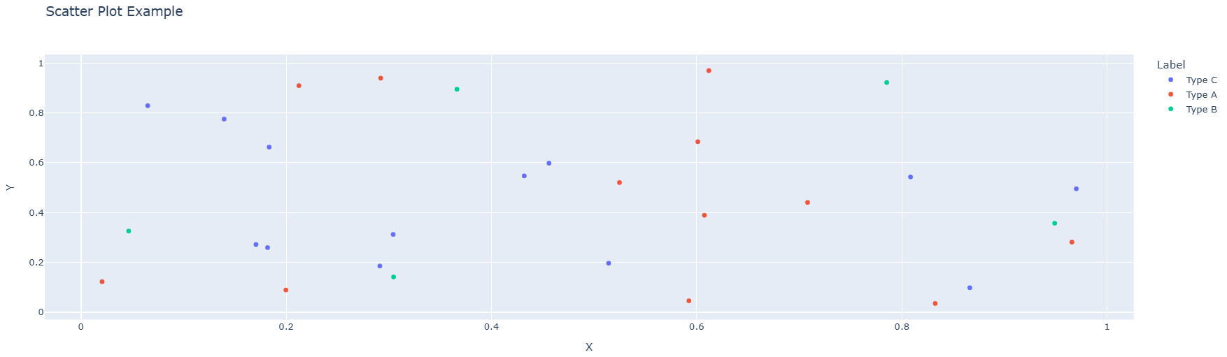
The code above takes data from the table (df_scatter), puts values from column "X" on the x-axis and values from column "Y" on the y-axis. The dots are colored differently based on the "Label" column (like grouping them into categories), and then it shows the chart so you can interact with it! The resulting graph looks like this:
Line Chart
In the previous lesson, you learned that a line chart is used to display data points connected by straight lines, making it ideal for showing trends over time or ordered categories. Use Plotly's px.line() function to create line charts. Take a look at the example below on how to create a line chart with Plotly:
First, create a sample dataset:
# Create a new dataset for demonstration
df_line = pd.DataFrame({
    'Year': range(2010, 2021),
    'Sales': np.random.randint(100, 500, size=11)
})
The code above creates a dataframe with 11 rows, where the "Year" column contains years from 2010 to 2020, the "Sales" column contains random sales numbers.
Now, create the line chart from the sample dataset:
fig = px.line(
    df_line,
    x='Year',
    y='Sales',
    title="Line Chart Example"
)
fig.show()
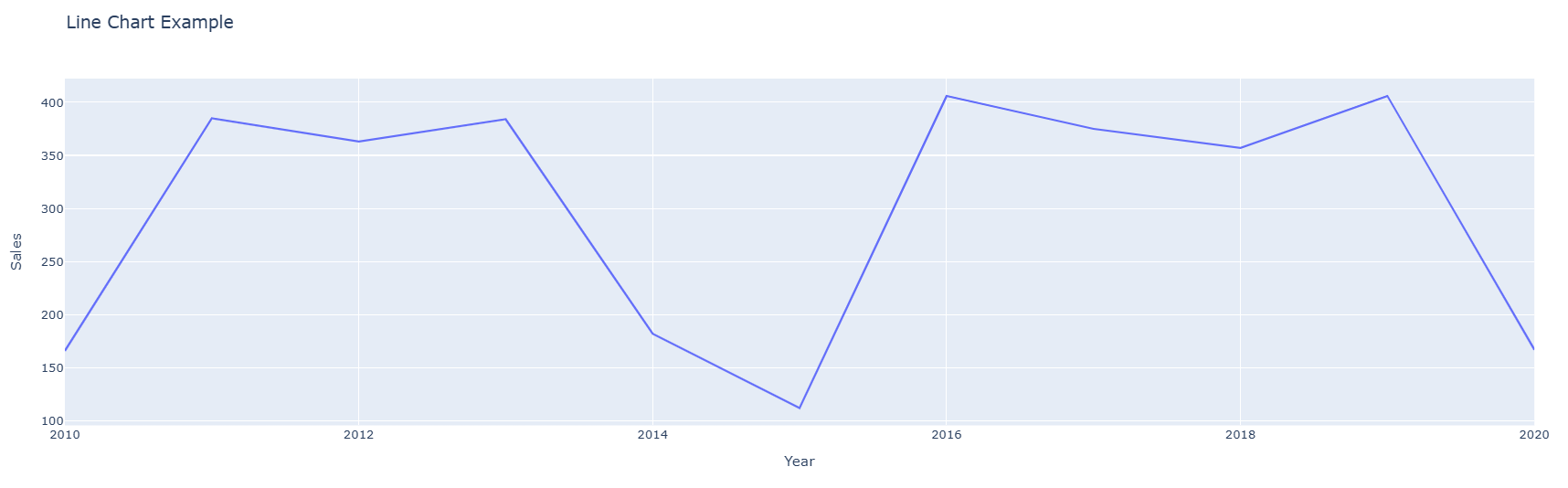
The code above takes data from the table (df_line), puts values from the "Year" column on the x-axis and values from the "Sales" column on the y-axis and then it shows the chart so you can interact with it! The resulting graph looks like this:
Grouped Bar Chart
A grouped bar chart is used to compare multiple categories across different groups. Each group is represented by a set of bars, and each bar within the group represents a different category. In Plotly, you can create a grouped bar chart using the px.bar() function. Here's an example:
First, create a sample dataset:
# Create a new dataset for demonstration
df_bar = pd.DataFrame({
    'Group': ['Group 1', 'Group 1', 'Group 2', 'Group 2', 'Group 3', 'Group 3'],
    'Category': ['A', 'B', 'A', 'B', 'A', 'B'],
    'Value': np.random.randint(10, 100, size=6)
})
The code above creates a dataframe with 6 rows, where the "Group" column contains the group names, the "Category" column contains the categories, and the "Value" column contains random values.
Now, create the grouped bar chart from the sample dataset:
fig = px.bar(
    df_bar,
    x='Group',
    y='Value',
    color='Category',      # Bars will have different colors based on Category
    barmode='group',       # Grouped bar chart
    title="Grouped Bar Chart Example"
)
fig.show()
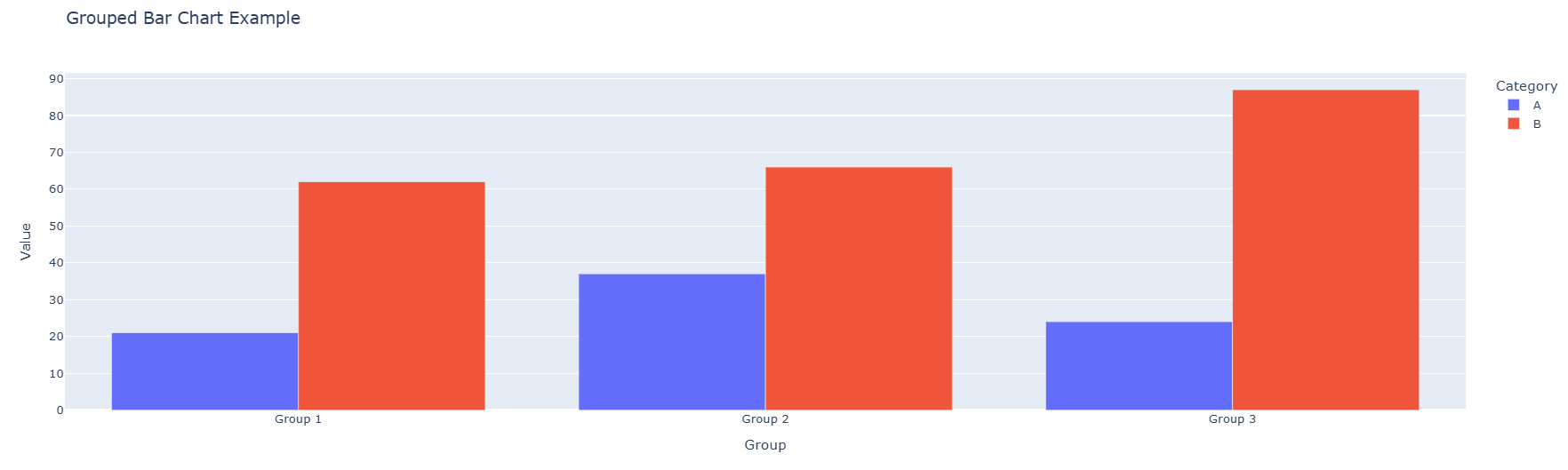
The code above takes data from the table (df_bar), puts values from the "Group" column on the x-axis and values from the "Value" column on the y-axis. The bars are colored differently based on the "Category" column, and the barmode='group' parameter ensures that the bars are grouped by the "Group" column. The resulting graph looks like this:
Customizing Plots
Adding Titles, Labels, and Legends
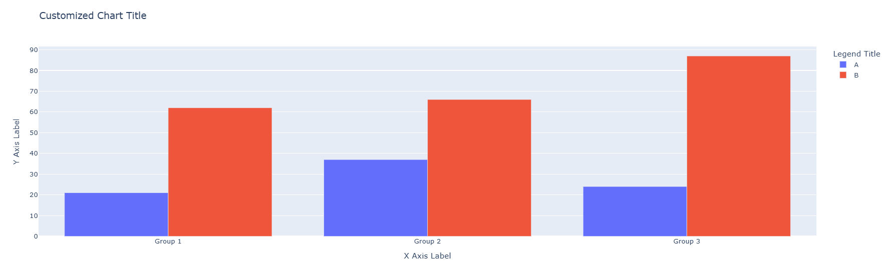
The update_layout function in Plotly allows you to customize the layout of your charts. It enables you to modify various aspects of the chart's appearance, such as titles, axis labels, legends, margins, and more. Take a look at the example below:
fig.update_layout(
    title="Customized Chart Title",
    xaxis_title="X Axis Label",
    yaxis_title="Y Axis Label",
    legend_title="Legend Title"
)
fig.show()
Changing Colors and Themes
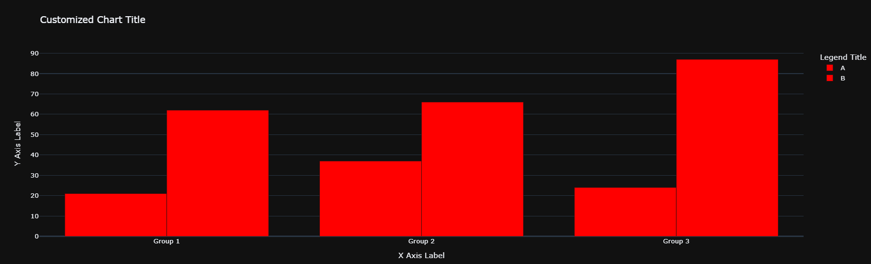
Plotly allows you to change the colors and themes of your charts. You can use predefined color sequences or create your own custom color schemes. Here's an example:
fig.update_traces(marker=dict(color='red'))  # Change marker color
fig.update_layout(template='plotly_dark')    # Change theme to dark
fig.show()
Conclusion
In this lesson, you learned how to create interactive visualizations using Plotly. You explored how to create scatter plots, line charts, and grouped bar charts, and how to customize them with titles, labels, legends, colors, and annotations. Plotly offers a wide range of chart types, and you’ll have the opportunity to explore more of them in upcoming lessons as part of this program. For now, feel free to check out Plotly’s documentation to discover its diverse graphical capabilities.
Practice
Coding Assessment
Practice the concepts from this lesson using this notebook. After completing the exercises, save your notebook to GitHub and submit the link for grading.
Knowledge Check
Question 1: What is Plotly primarily used for?
- Creating static, non-interactive charts.
- Performing statistical analysis on datasets.
- Creating interactive and visually engaging charts.
- Cleaning and preprocessing data.
Correct Answer:
3. Creating interactive and visually engaging charts.
Explanation:
Plotly is a graphing library that specializes in creating interactive charts, allowing users to zoom, hover, and toggle data on or off for a more engaging experience.
Question 2: What does the color parameter in px.scatter() do?
- It changes the background color of the chart.
- It assigns different colors to data points based on a categorical column.
- It changes the color of the x-axis and y-axis labels.
- It changes the color of the chart title.
Correct Answer:
2. It assigns different colors to data points based on a categorical column.
Explanation:
The color parameter in px.scatter() is used to differentiate data points by assigning them colors based on a categorical column (e.g., grouping data by categories like "Type A", "Type B", etc.).
Question 3: What is the purpose of the barmode='group' parameter in a grouped bar chart?
- It stacks the bars on top of each other.
- It groups bars by category side by side.
- It changes the orientation of the bars from vertical to horizontal.
- It hides the legend of the chart.
Correct Answer:
2. It groups bars by category side by side.
Explanation:
The barmode='group' parameter ensures that bars representing different categories are displayed side by side within each group, making it easier to compare values across categories.